Paula Berinstein's Blog, page 3
July 18, 2016
Cool Prizes!
 My Amanda Lester /and the Pink Sugar Conspiracy blog tour starts today, and I'm giving away some really cool prizes:
A $40 Amazon gift card
Two hard copies of the pink book
A copy of the first illustrated Harry Potter book
A copy of the first Harry Potter audiobook
A Nancy Drew videogame (winner's choice)
A surprise paperback (winner picks the genre).
First stop on the tour is The Writer's Inkwell, where you can enter.
Published on July 18, 2016 10:37
•
Tags:
amanda-lester, blog-tour, giveaway
April 25, 2016
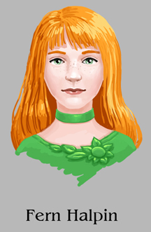
Meet Fern Halpin
 Fern Halpin is a fifth-year student at the Legatum Continuatum School for the Descendants of Famous Detectives. She is Ivy Halpin's sister and best friends with Lucky Ng, Clive Ng's sister. Her boyfriend is Salty Pinchbeck, an emergency medical technician. She and Ivy look a lot alike and are both tiny.
Fern specializes in textual analysis and language and often works with Professor Bill Pickle. She knows everything about the school and Ivy often relies on her for critical information. She first appears in Book 1 of the Amanda Lester series, Amanda Lester and the Pink Sugar Conspiracy.
Published on April 25, 2016 13:21
•
Tags:
amanda-lester, characters, fern-halpin
April 19, 2016
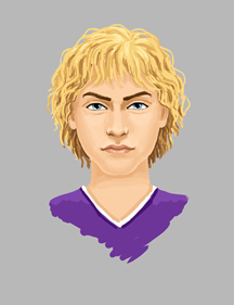
Meet Harry Sheriff
 When we first meet him, Harry Sheriff is a fifth-year student at Legatum Continuatum. He is very good looking, with golden hair and lots of muscles. He is considered to be one of the school's biggest heartthrobs.
Harry is first mentioned in Amanda Lester and the Orange Crystal Crisis, but he doesn't make his first appearance until Amanda Lester and the Purple Rainbow Puzzle.
Published on April 19, 2016 10:54
•
Tags:
amanda-lester, characters, harry-sheriff
April 6, 2016
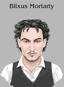
Meet Blixus Moriarty
 Blixus Moriarty is a descendant of Professor James Moriarty, Sherlock Holmes's arch-rival (Moriarty is his great- great-uncle). He is just as evil as his ancestor. He is tall and elegant, with salt and pepper hair.
Blixus first appears in Book 1 of the Amanda Lester, Detective series, Amanda Lester and the Pink Sugar Conspiracy.
Published on April 06, 2016 14:29
•
Tags:
amanda-lester, blixus-moriarty, characters
March 31, 2016
Meet Gaston Thrillkill
 Gaston Thrillkill is a tall and imposing gray-haired bald man in his late forties. He has piercing blue eyes and wears rimless glasses, which he often peers over. Ostensibly tough, he has his weak points, such as a morbid fear of icicles, which explains his tendency to carry a hair dryer around during the winter: he melts them with it. For a long time, Amanda fears him, but she comes to find that he can be sympathetic when necessary. He is of French descent.
Headmaster Thrillkill has put away many criminals, including “Jumbo” Pinchuk, a prominent figure in the Belarus Mafia. He first appears in Book 1 of the Amanda Lester series, Amanda Lester and the Pink Sugar Conspiracy.
Published on March 31, 2016 12:18
•
Tags:
amanda-lester, characters, gaston-thrillkill, headmaster
March 28, 2016
Meet Gordon Bramble
 Gordon Bramble, a student at the Legatum Continuatum School for the Descendants of Famous Detectives, is a pleasant-faced, freckled boy who should know better than to hang around with David Wiffle. The two boys, who are members of Van Helden House, are always making trouble for Amanda and her friends. It's too bad, because Gordon is a smart kid, but he lets David hold him back.
Gordon first appears in Book 1 of the Amanda Lester series, Amanda Lester and the Pink Sugar Conspiracy.
Published on March 28, 2016 08:30
•
Tags:
amanda-lester, characters, gordon-bramble
March 16, 2016
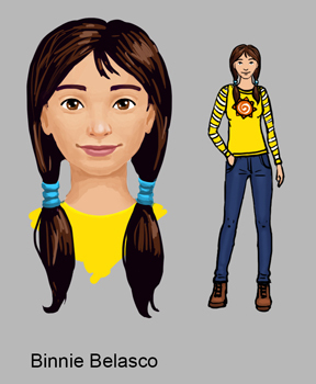
Meet Binnie Belasco

Binnie Belasco is a student at the Legatum Continuatum School for the Descendants of Famous Detectives. She is a tall, skinny, extremely smart girl who has a crush on Clive Ng. She is interested in meteorology.
Binnie makes a passing appearance in the second Amanda Lester book, Amanda Lester and the Orange Crystal Crisis, but really emerges in the fourth, Amanda Lester and the Blue Peacocks' Secret.
Published on March 16, 2016 13:05
•
Tags:
amanda-lester, binnie-belasco, characters
March 14, 2016
Cover Reveal: Amanda Lester and the Blue Peacocks' Secret
Today is the cover reveal for the fourth title in the Amanda Lester, Detective series. There is also a $50 gift card giveaway.
The Kindle version comes out on March 23rd, paperback on March 31st.
This book is intended for a slightly older audience than the first three. Because there is some romance in it, it should appeal more to those 13 and over.
Here is the blurb:
What does a dusty old secret have to do with peacocks?
Everything, as it turns out. When Amanda is knocked off her skateboard by a rare all-blue peacock, she learns that the species harbors a vital secret she must race to uncover. But before she can unravel the mystery, a startling archaeological discovery turns all of Britain against the detectives and threatens their very existence.
As old enemies gather strength and new adversaries emerge, Amanda finds herself dealing with hysterical teachers, a disappearing mentor, a mysterious poisoner, and a would-be magician. With so much at stake and so little time, the last thing she needs is to fall in love.
Published on March 14, 2016 10:17
•
Tags:
amanda-lester, cover, detectives, fantasy, mystery
March 1, 2016
Meet Editta Sweetgum
 Editta lives down the hall from Amanda. She is a friend, but not as close a friend as Ivy and Amphora.
She’s a small, plain girl with dark, limp chin-length hair and brown eyes. She is a whiz with numbers and loves to count things. She’s also superstitious, a trait she gets from her mother, who is said to practice voodoo. She’s a nice girl, but she tends to go off by herself a lot.
Editta first appears in Book 1 of the Amanda Lester, Detective series, Amanda Lester and the Pink Sugar Conspiracy.
Published on March 01, 2016 14:41
•
Tags:
amanda-lester, characters
February 1, 2016
How I Format My Books
Let’s face it: most self-published books aren’t laid out very well. The type looks terrible, the placement on the page is awkward, there’s no pzazz to the design, and the whole thing looks amateurish. That’s why I hired a designer to do the interior of my first Amanda Lester, Detective book. It came out great, and after that, I used what I’d learned from her to lay out the subsequent books.

Here are some sample chapters from Amanda Lester and the Orange Crystal Crisis. Looks pretty good, don’t you think? Here’s what I do to get such a nice appearance:
Do not indent the first paragraph of a section. This includes not only the first paragraph of a chapter, but also of each section within the chapter that’s separated by blank lines and/or a little doohickey. If you look at the books on your shelves, you’ll see that’s what the big guys do. I never noticed that until I started laying out my own books.
When you do indent, don’t do it too much. I use .3” Any more looks like too much.
Use a drop cap for the first letter of a chapter. It adds a little eye candy.
Buy nice-looking fonts and use them. Do not use Times New Roman! The font I use for my text is Garamond Premier Pro. I use Chauncy Decaf for the chapter numbers and titles and the headers. I use ITC Benguiat Std Medium for the book title and Agency FB for the author name. Don’t download these for free. Compensate the designers, for heaven’s sake. They’re unlikely to be wealthy.
Don’t use gigantic text. Twelve-point only looks good if the font runs small in the first place. I use eleven-point. Not only is it easier on the eye, but it also makes the book shorter, which means it’s less expensive to print.
Use the title of the book as the even page headers and each chapter title as the odd page header. Contrary to what I accidentally did in Amanda Lester and the Purple Rainbow Puzzle, do not put a header on the first page of a chapter.

Use an interesting-looking graphic to separate sections. Mine comes from a font called Flourishes and Ornaments.
Use little Roman numerals for the front matter and Arabic numbers for the text proper.
Of course use mirror margins or your pages will look lopsided. And remember that the larger the margins, the more pages in the book. The next time I do this one over, I will make the top and bottom margins smaller and save money.
Just try a couple of these hints on your current book and see if it doesn’t look better!

Here are some sample chapters from Amanda Lester and the Orange Crystal Crisis. Looks pretty good, don’t you think? Here’s what I do to get such a nice appearance:
Do not indent the first paragraph of a section. This includes not only the first paragraph of a chapter, but also of each section within the chapter that’s separated by blank lines and/or a little doohickey. If you look at the books on your shelves, you’ll see that’s what the big guys do. I never noticed that until I started laying out my own books.
When you do indent, don’t do it too much. I use .3” Any more looks like too much.
Use a drop cap for the first letter of a chapter. It adds a little eye candy.
Buy nice-looking fonts and use them. Do not use Times New Roman! The font I use for my text is Garamond Premier Pro. I use Chauncy Decaf for the chapter numbers and titles and the headers. I use ITC Benguiat Std Medium for the book title and Agency FB for the author name. Don’t download these for free. Compensate the designers, for heaven’s sake. They’re unlikely to be wealthy.
Don’t use gigantic text. Twelve-point only looks good if the font runs small in the first place. I use eleven-point. Not only is it easier on the eye, but it also makes the book shorter, which means it’s less expensive to print.
Use the title of the book as the even page headers and each chapter title as the odd page header. Contrary to what I accidentally did in Amanda Lester and the Purple Rainbow Puzzle, do not put a header on the first page of a chapter.

Use an interesting-looking graphic to separate sections. Mine comes from a font called Flourishes and Ornaments.
Use little Roman numerals for the front matter and Arabic numbers for the text proper.
Of course use mirror margins or your pages will look lopsided. And remember that the larger the margins, the more pages in the book. The next time I do this one over, I will make the top and bottom margins smaller and save money.
Just try a couple of these hints on your current book and see if it doesn’t look better!
Published on February 01, 2016 09:56
•
Tags:
book-design, fonts, format, formatting, typography


