
Jason A. Cheek's Blog, page 16
February 2, 2015
the importance of putting in the necessary research time to make sure your novel is accurate
It really doesn’t matter the genre of the story you‘re writing, because if you’re not 100% accurate with any information you’ve written within your book that someone can check you on then at some point in time you will have some reviewer come along and slam you for the mistake. Besides the possibility of being called out on by a reviewer (in my experience usually another writer), I think it’s overall important to have as much accurate information for the quality of the story itself.
There will always be some people who will tear apart your book. None the less I think it’s somewhat easier to accept when someone is just commenting on a storyline or I was caught by this by surprise on Flight when I made a mentioned a 10 cylinder Ford engine at one point of time in the book. Relatively quickly I had a writer point that out in a review that they did of my book that this was not accurate. Although a part of me laughed at having something like this pointed out in a book with demons, werewolves, clerics and paladins, I quickly made the change and updated the incorrect information. None the less it was still upsetting to me that I’d missed something, which became even worse when it was caught and pointed out. All in all I figure that wasn’t bad for my first novel, but it has made me very aware for verifying the information in book two.
In Destiny I have a lot of Military terms that are coming into play. Fortunately for me I am familiar with much of the terminology soldiers’ use from my time in uniform and my current job, which covers Army and Marine jargon for the most part. Of course there are some nuance differences, but for the most part they are relatively interchangeable. Unfortunately this doesn’t help me much when it comes to Navy terms. I’ve been doing my best to get some research done on the subject, but it has been hard to find a good site that lists the true Navy jargon that sailors use day-to-day. To assist me with this I just recently had a retired Commander send me a paper he did in the late 80’s that covers the actual jargon used by sailors. Also, he’s a nice enough guy that I can run terminology that I want to use in the book by him for him to help me tweak.
For some non-military people this might seem like an inconsequential point, but that is where they would be wrong. There are so many ex and active service members out there reading Sci-Fi and Fantasy that it behooves an author to make sure their information is as accurate as possible. Also, I’ve read book and have seen movies where they don’t have the typical military jargon and it really takes away from the quality of the film or book for me on a level that I think even most non-military people pick-up on an unconscious level.
This is important for any topic you’re writing about whether it’s about computer gaming or surfing. Knowing the slang, knowing the culture really gives life to any story. Now-a-day with Youtube.com, googlemaps.com, Facebook.com and all of the other multimedia sites out there we have the ability to really the ability to bring faraway places to life. Anyway, it’s a simple thing to make a better connection with your readers and to make your story that much more solid.


January 30, 2015
A quick update on Destiny's progress
I was planning to have the story released by the first quarter of this year, but I’m still writing the last few chapters. Unfortunately I had a setback with needing to complete one of my VMWare certifications for my day job, which has been requiring several hours of studying a night for January and February. I’m still getting some writing time in, but only about a quarter of what I’d planned on if I was going to meet my first quarter deadline for completion.
The good thing is that I’ve had some time to tweak a few parts of the story that I realized needed a little more depth as to the action going on with the various story lines. Agent Ryan Moss and Beth Kurkowski are back in book two working together for the Extracurricular Action Group. The EAG is a subdivision of the CIA’s SAD/SOG divisions. The Special Action Division is responsible for covert related political, psychological and economic warfare operations, while the Special Operations Group is responsible for most of the high threat military / intelligence operations around the world and chooses their operatives from top tier special missions units such as Delta Force, DEVGRU, MARSOC and ISA. In my universe, the EAG has been created to deal with the recent alien threat.
I just finished a kick-ass chapter that laid out the story line for this group and how it relates to Startüm Ironwolf and sets part of the stage for the storyline in book three and four. When I’d first created the character Agent Ryan Moss of the Counter Terrorist Agency, I just needed a team leader for one of the counter-terrorist assault teams, but as I began writing the story Agent Moss’ character just came to life. It was as much of a surprise to me as it was to many of my readers that he survived the whole ordeal in book one. By the end of the story he had become a main character to the story who I happy brought back in book two.
Anyway, I’m still working hard at getting the story finished, while at the same time making sure I don’t rush. I’d rather have the story take a little longer and make sure it’s right. As you know, weekends are family time, so for now I’m going back to watch some Arrow, Flash & Grimm with my wife.
January 26, 2015
one of the best resources for learning how to write the back cover synopsis for your book that an indie writer can find
Before we get started on today’s blog post I just wanted to explain that work has me buried again, so I’m blogging as time permits. Also, I just found out I have to cram for a certification to keep up my VMWare Certified Professional status, so I had to split my writing time in the evenings with studying for my exam. It will probably mean that I’ll have to push the release of Destiny back a couple months, but I’d rather do that then rush out something still rough. As a good friend of mine reminded me, right now writing is my hobby and Information Technology is my career, so I have to make sure I keep everything moving forward in both fields. But no worries, the book is coming along fine and I’m down to the last 1/5 of the story to finishing writing the rough draft.
It’s hard to rate the importance of the back cover synopsis of your book. It is nearly as important as the cover. I say nearly because the cover is typically what catches readers’ eyes, but your synopsis is the second best tool you have to hold their attention. While this sounds like a fairly simple thing to write, for me it was one of the hardest parts about the entire writing process I did to publish my book.
The goal of your back cover is to build interest in the story, while at the same time not giving your whole story away in a nutshell. Your back cover should give enough information to give people a feel for what your book is about, but leave questions open that need to be answered. Otherwise, why read the book to find out what happens if you’ve already got the whole plot line spelled out on the back of the cover?
Even explaining this process is difficult to say nothing about condensing the elements of your story and making it into a hit movie preview for readers to check out before they decide to purchase your book. Initially I went over the book covers of the writers I loved to read, but even still after sharing my first attempts with my friends and coworkers I discovered I was missing something important to the entire process. While searching through the web I ran across an amazing blog that helped me learn this process titled: Miss Snark, Literary Agent http://misssnark.blogspot.de/search/label/Crapometer-synopsis .
Miss Snark doesn’t maintain her blog anymore. She is a Canadian Literary Agent who created this blog to help writers get through the minefield of the whole publishing process. She has a pre plethora of about the whole publishing process whether you’re trying to go the traditional publishing route or going about it on your own as an Indie Writer. What is really interesting is that she has had a number of new writers send in their synopsis to have her tell them if it makes the cut or not. She lists out all of the points that are good and digs into the problem areas with a stringent tongue. She’s not unduly cruel, but she’s doing her best to show you what Publishers and Literary Agents are looking for. Then she re-writes the sample given to her, in some cases, to how she would picture it should have been written.
While Miss Snark no longer offers this help, there is a huge amount of gems for anyone willing to dig in and go through the old posts to help tweak their style. Even then you will end up writing fifty synopsis before you getting something sounding like you want it to be and by that time you will have driven your friends and close acquaintance crazy with re-reading sample after sample. Even though this is a major pain and might take a month until you feel like you’ve gotten it right, it’s time well spent.
I would also limit your synopsis to be two hundred words or less. This is Amazon’s requirement for their Amazon Breakthrough Novel Award Contest. I figure that’s as good of number as any to keep you within the industry standard for a synopsis. Also from my experience more words then that just makes the writing difficult to read on the back cover of your book.
The first half month I tried writing this I kept summarizing my story, which is the LAST thing you want to do. Towards the second half of the month I started really creating something. I didn’t do it alone, but had a lot of help in determining what sounded good and what didn’t. I used my friends who liked Fantasy and Sci-Fi for this help and then compared what I wrote to the back covers of my favorite writers. What you see on Flight is the final result.
I have to start doing that process soon for Destiny, but I won’t do this until I hand this over to the DODEA Teachers who have volunteered to help me edit my manuscript. I’m sure I’ll be discuss this more in the near future, but for now I wanted to leave you with this advice from my own experiences.
January 20, 2015
my COMPARISON of Amazon kdp to smashwords.com after trying each service for six months and why i'm going back to Amazon.
I recently had a question from Jeff on a previous blog I wrote on May 24th of 2014 titled “STAY ON AMAZON KDP OR GO TO SMASHWORDS? THAT IS THE QUESTION”. The discussion helped make me reevaluate why I was using Smashwords.com and not Amazon’s KDP Select program, which was a good thing. So good in fact that I decided it warranted a blog post on the topic.
For those of you who are not familiar with Amazon’s KDP Select program, authors who use the program promise to not offer any other digital copies of their books from any other services for three months at a time. Amazon’s KDP is the sole proprietor rights to the author’s digital book for distribution. If at any time your book is discovered being offered on another website then they will remove your book from KDP and you will lose your profits for those three months.
One of my concerns were that although I was doing well in sales overall, at the time I was hardly getting any readers checking out my book from the Amazon Prime library, which made me question why I was staying registered with Amazon’s KDP Select program. I had heard of authors who had done well on Smashwords.com and I thought it would be great to be on almost every platform out there. My next concern was that I had received several comments from people interested in checking out my book, but they had an Ipad/Iphone or Nook and were wondering when it would be released on Itunes.com or Barnes and Nobles’ website. The last concern was that I only had one book, which in my opinion limited many of the benefits of utilizing Amazon’s KDP programs. Since my book was selling at my planned pricing point I’d came up with to encourage new readers to check out my writing, I didn’t use any free book giveaways except for what I found on Goodreads.com and self-promoting on Facebook during author meets.
Initially when I went with Amazon’s KDP Program I had a number of coworkers who approached me and said that they’d seen my book advertised in an Amazon email suggesting books they might want to check out based on the reading preferences. This was great news and awesome advertising for me via Amazon and something I felt like stopped showing up after I left Amazon’s KDP Program. Again no hard facts here, but that is the impression I’ve gotten over the span of a year of being within the program and of being outside of the program. Within the first three months my book was out I hit the #23 spot on Amazon’s Fantasy Superhero category. Although that is a small subgroup it is still a huge accomplishment for any writer, new or not. I held around that spot for another three months, which was basically up until the time I left Amazon’s KDP Program. After that my novel continued to sell, but the numbers started to dramatically decrease over the next six months.
I did keep my initial account on Amazon and only used Smashwords.com for all of the other sites. My sales in Smashwords.com were less than stellar. I would put them at the same level of my sales in Amazon’s KDP Program only without the email promotions from Amazon for my book. I felt like on all of these other websites my book was buried in a sea of novels and the companies that were hosting these sites had no need or desire to help promote my work in any way. It has been a real let down. On the flip side if I had a better marketing mind, this might have been a better option for me, but during some of my author meets the fellow writers I spoke with also seemed less than thrilled with their performance on Smashwords.com or were worried about changing what was working for them. After trying this out for myself I can understand their hesitation.
After answering Jeff’s question I realized I would be going back to Amazon’s KDP program once Destiny is ready to be released. Now that I have experience from both side of the coin, so to speak, I have a better understanding of this process. I don’t regret trying out Smashwords.com. If I hadn’t checked it out I would have been wondering the whole time if I’d made a bad call. You know that saying, the grass always looks greener on the other side. Well now I know. Also, I know in time for the release of my second novel.
Anyway, I hope this helps fellow writers out there looking at this same question. Thanks for bringing the question up Jeff.
January 15, 2015
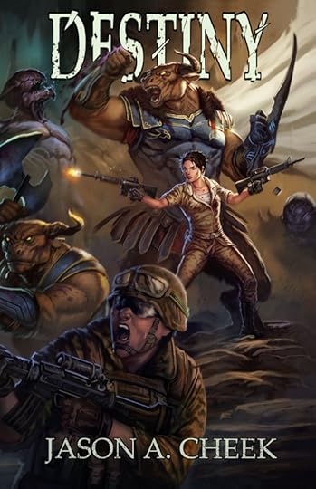
The creation process for the design of the cover for destiny, finished
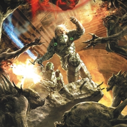
Leo surprised me not even three weeks later with the completed image for the book cover. This was for two reasons. First, getting a cover designed easily takes about around a month and a half to two months if you’re lucky. Second, although we were working out the specifics, we never actually decided this was the final layout to pull the trigger on.
Now with Leo this is not a problem, he is an excellent artist and when we are working on a cover design I feel like we sync with each other. Also as I’ve stated before, while I have a pretty solid idea of the overall design I still trust Leo to make my ideas look good. I stated what I wanted for the main characters and what was important to me on how they looked, while letting him come up with something he thought looked good for the rest of the battle with a little input from me. Doing this allowed the cover to truly rock.
In the image below you see the two main characters for the front cover with the physical and emotional impact and body language I wanted shown. I went ahead and let Leo go with the two assault rifles, even though I had initially wanted a pistol and an assault rifle. Leo didn’t think it would give enough action if I did that and after running the idea by a few people it seemed like he was right. I’m sure this is part of the soldier in me wanting certain action scenes to have certain realism within its design. I know how crazy that sounds when I have Scourge and Minotaurs on the cover along with the Marines. Even so that’s how I feel. I felt with the clip being released on one assault rifle could signify that she is holding two rifles, but only firing them one at a time. Sergeant First Class Megan Driscoll of the Marine Raiders is pretty badass, but even she needs to focus fire.
The only change I made in Leo’s final design was to have the Marine woman given a dog tag around her neck. Due to how this is being released in worldwide, I wanted especially my fans in Australia, Europe, Canada and the USA to have the freedom to picture the soldier’s nationality as they wanted to. Also, in the story there are NATO troops going about doing their thing, but I figured this idea of no country/unit patches would affect readers looking at the cover on a more subconscious level.
The lead Minotaur doesn’t have a double-headed battle axe that he’s swinging one-handed like I’d originally planned, but I like how Leo did his right hand. I think the gauntlet punch comes off better for the overall image design. Also he looks like one powerful warrior.
The screaming Marine on the lower left of the cover and the smaller Minotaurs battle half visible on the front cover I hope will make people want to take a closer look at the cover and what the story is about. I loved how Leo positioned the warriors and brought the battle to life.
Lastly, I also worked with Leo on having the text slipped behind the Minotaur. I wanted it behind his fist and horns, but in front of his billowing cloak to give a sort of 3D effect to the cover. If this is something you'd like for your cover too then just make sure you work with your own artist to have a layer that you can update the font and the position they way you want it to look. Audio book covers and paperback/ebook sizes are different, so you need to be able to re-position the font as needed for each cover design. Having this built into the original image is necessary for this 3D layered effect and has to be done on the artist side. Any digital image can just leave those font layers open for you to adjust or edit or remove as needed. Of course you need to have Photoshop or a compatible software to do the work.
I'm not sharing the complete wrap around cover here just yet, but only the front of the cover portion of the image. There are more Minotaurs and Marines on the spine/back cover of the book. Once I get the book published I'll share out the whole image. Hopefully you all like it just as much as I do. I would love to hear your thoughts.
January 11, 2015
the creation process for the design of the cover for destiny, part three
There are only two more images to discuss before this series of cover discussions is finished, today’s picture which is one more rough draft and then the finished cover. This might seem like a drawn out process, but when you’re putting your money on the line and you’re trying to communicate your ideas to have someone make the vision you have come to life. It takes a lot of work.
The entire writing process, start to finish, is a work of patience and dedication. From what I’ve researched the average time it takes for a professional Fantasy/Sci-Fi writer to complete a novel is anywhere between six months to a year. That isn’t to production. It can easily be another year or two getting all of the contracts, book cover designs and marketing completed, making the overall process take closer to three years and that is for writers who have a publishing house behind them, an agent and are doing this for a living full time.
Indie Writers on the other hand usually have a full time job that is not writing, they have no agent or publishing house behind them and until they have gone through the entire process they are learning the ropes of the industry by themselves. Usually this is done online in-between writing their novel, working their full time job and trying to have family time and friends. There is no publishing house editor or print finisher helping us correct the mistakes to our manuscripts, there is no design department assisting with our graphic design nor is there a marketing team helping us get the word of our story out to people around the world. This is something every Indie Writer must on their own. It’s quite a daunting process, never less many of us push out some pretty amazing work. For myself, the process took a year and a half of focused dedicated work to complete book one and will be possibly longer than that for my second book to be completed. From what I’ve heard that’s amazingly fast for a new writer.
Sorry for going off on a tangent there, but these things are important to remember when it comes to finishing up your novel. This is especially important when it comes to your most important marketing tool, which is your book’s cover. This is the reason I’m spending so much time on explaining this whole process.
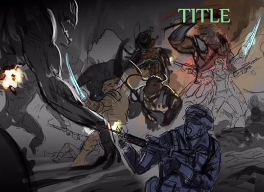
Leo sent me the image back below in response to all of our conversations. While I thought it the image was almost there and I liked the tweaking Leo did with the rearrangement of some of the Minotaurs. There were several aspects we of the image that I still felt needed to be tweaked. The lead Minotaur’s axe was a good idea and might have worked for the final product. I was of two minds about this, but I liked it that the bull had a double-headed battle axe in his hand. Also the motion itself was more interesting and took him out of the previous posing stance. I mean who poses in a battle? The Minotaur towards the middle left was turned around, which I liked. Unfortunately his stance looked wrong for this battle scene. I felt like he would be charging forward swinging back his battle axe to strike and not just standing there. Leo said he had to be careful to not make everything look too posed, but he generally liked my ideas and would work on the image.
Typically this would have meant there would have been one more final image for me to approve before he completed the design, but Leo chose to take this and run. I point this out because if you were dealing with your own artist, the next image would have pulled in the changes you requested. You would approve those changes and pay half the cost of the design up front and then your artist should complete the finished work. That would have been the typical situation. Luckily for me, Leo is a great artist with an amazing feel for design and we communicate well. I think he was just as excited about the image as I was since he knocked it out before getting my final approval, but it worked so no complaints on my side. Don’t think that the cover design is finished there. I’ll share what I like to do in my cover that I think gives it a little bit something extra, but it something you have to work out with your artist. I’ll explain that and show the final image in the next blog post, but for now here is the last in-between rough draft Leo and I shared before the final image was created.
The entire writing process, start to finish, is a work of patience and dedication. From what I’ve researched the average time it takes for a professional Fantasy/Sci-Fi writer to complete a novel is anywhere between six months to a year. That isn’t to production. It can easily be another year or two getting all of the contracts, book cover designs and marketing completed, making the overall process take closer to three years and that is for writers who have a publishing house behind them, an agent and are doing this for a living full time.
Indie Writers on the other hand usually have a full time job that is not writing, they have no agent or publishing house behind them and until they have gone through the entire process they are learning the ropes of the industry by themselves. Usually this is done online in-between writing their novel, working their full time job and trying to have family time and friends. There is no publishing house editor or print finisher helping us correct the mistakes to our manuscripts, there is no design department assisting with our graphic design nor is there a marketing team helping us get the word of our story out to people around the world. This is something every Indie Writer must on their own. It’s quite a daunting process, never less many of us push out some pretty amazing work. For myself, the process took a year and a half of focused dedicated work to complete book one and will be possibly longer than that for my second book to be completed. From what I’ve heard that’s amazingly fast for a new writer.
Sorry for going off on a tangent there, but these things are important to remember when it comes to finishing up your novel. This is especially important when it comes to your most important marketing tool, which is your book’s cover. This is the reason I’m spending so much time on explaining this whole process.
Leo sent me the image back below in response to all of our conversations. While I thought it the image was almost there and I liked the tweaking Leo did with the rearrangement of some of the Minotaurs. There were several aspects we of the image that I still felt needed to be tweaked. The lead Minotaur’s axe was a good idea and might have worked for the final product. I was of two minds about this, but I liked it that the bull had a double-headed battle axe in his hand. Also the motion itself was more interesting and took him out of the previous posing stance. I mean who poses in a battle? The Minotaur towards the middle left was turned around, which I liked. Unfortunately his stance looked wrong for this battle scene. I felt like he would be charging forward swinging back his battle axe to strike and not just standing there. Leo said he had to be careful to not make everything look too posed, but he generally liked my ideas and would work on the image.
Typically this would have meant there would have been one more final image for me to approve before he completed the design, but Leo chose to take this and run. I point this out because if you were dealing with your own artist, the next image would have pulled in the changes you requested. You would approve those changes and pay half the cost of the design up front and then your artist should complete the finished work. That would have been the typical situation. Luckily for me, Leo is a great artist with an amazing feel for design and we communicate well. I think he was just as excited about the image as I was since he knocked it out before getting my final approval, but it worked so no complaints on my side. Don’t think that the cover design is finished there. I’ll share what I like to do in my cover that I think gives it a little bit something extra, but it something you have to work out with your artist. I’ll explain that and show the final image in the next blog post, but for now here is the last in-between rough draft Leo and I shared before the final image was created.
January 8, 2015
The creation process for the design of the cover for destiny, part two
As you all know, I’m a big fan of Fantasy and Sci-fi in general. I’m always collecting images that I think are cool. Over the years I’ve collected probably close to ten thousand images ranging from D&D to Starwars. I spend a lot of time rotating through these images as I write, which always helps to get ideas for new stories churning in my head. So, whenever I start thinking about creating a cover, I immediately go to some of the artwork I love best.
The initial concept idea I had for Destiny’s book cover came from two works of digital art that Ukitakumuki created in the Warhammer 40k universe. Due to copy write issues I’ll just post the links here for your viewing pleasure here: http://ukitakumuki.deviantart.com/art/Last-Chapter-190222071 and http://ukitakumuki.deviantart.com/art/Black-Library-Armageddon-381592220 But I would recommend checking them out for the discussion of the blog post and well just because they are awesome pictures. Even though the themes are Sci-fi based, I was pretty sure they could be re-created into something that worked for my urban fantasy novel.
What I liked best about both pictures is the sense of action, power and movement. It images feel like they were taken in during the battle. The presence that the power-armored marines have is visually palpable. I figured this idea would help bring Destiny’s cover to life if Leo could capture this same feeling in these images.
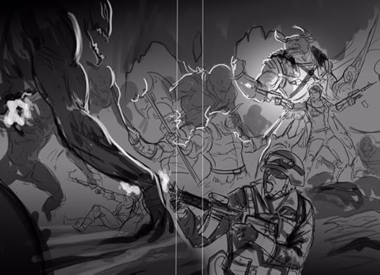
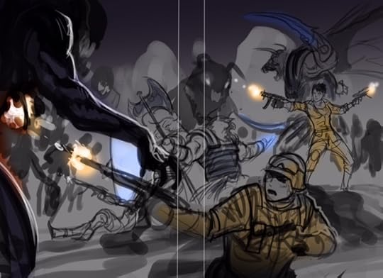
Just to give you a brief background on the scene: A small group of Marines and Minotaurs are battling for their lives against a horde of scourge and demons. You’ll have to read the book to know how this comes about and of course how it ends, but I’m really proud how I was able to work this whole scene into the storyline. He fit the rundown of weapons and armament I’d asked him to include into the scene. He also did a great job showing fully geared combat marines along with the female marine in the center of the action. I wanted her uniform to be slightly different. I wanted her to have the vibe of a feminine heroine, but at the same time in a uniform that made sense and befitted a female marine.
Now remember at this point the image is supposed to look indistinct. The main objective at this point between you and the artist is to get the general figures and over all scene into place with something that you both agree on the image layout and the cost. When Leo sent me back this first image, the one I posted in part one of this blog series, I thought the initial rough sketch looked great. Leo did an excellent job creating the general feel of a cavern and the layout of the characters that I wanted. I gave specific ideas of what I was thinking would look good, but he knows I’m open to him building the scene in a way he thinks is visually pleasing. An example is that I wanted one Minotaur falling back with one of his arms cut off and another running up with a shield and spike, but it didn’t fit within the space of the overall scene. Not to mention there is only so much room on the cover of a book. You want people to actually be able to see the scene. The wraparound he designed helps to get that fully scene feeling, but what’s most important is the front face of the cover. Leo wasn’t sure if he liked the scared marine in the very front bottom left of the picture and wanted to remove him, but he’d included it since it was in his initial rough draft.
I made some suggestions to Leo for him to tweak: First, I wanted the center Minotaur facing directly head on like the leader in the primary image I was asking him to emulate. (Aka this image: http://ukitakumuki.deviantart.com/art/Last-Chapter-190222071 ) Second, I wanted the female marine in the front to look more determined and scared and not that they were kicking ass. Also, I wasn’t thrilled with her firing two assault rifles at the same time, since she’s not Rambo or Arnold Schwarzenegger. I asked that Leo change one of the rifles to a pistol and have the clip kicking out like in this image: http://ukitakumuki.deviantart.com/art/Black-Library-Armageddon-381592220 . Lastly, I wanted to keep the scared marine in the bottom left, but I wanted both hands clutching the gun and for him to look terrified.
Leo and I shot a few several emails back and forth about a couple design features. He was afraid the overall image would look too static with some of my recommended changes. Melee weapons are static in pictures like this, while firing weapons give more feel of the overall action taking place. It was important to me for the Minotaur to be a central character on the cover along with the female marine. Partly because they are central characters and partly because you rarely see Minotaurs in anything except Tauren videos and pictures from World of Warcraft, which is sad really since they are so cool. I mean who doesn’t love a massive Tauren warrior wielding double-headed battleaxes? I also gave him a sample idea of how I pictured the attacking Scourge, here is a link to the image: http://i1-news.softpedia-static.com/images/news2/Namcoi-Bandai-And-Flagship-Studios-Partner-With-Dark-Horse-Comics-For-Hellgate-London-Comic-Book-2.jpg It’s from Mel Odom’s London Hellgate series. A series I highly recommend. Reading Mel Odom’s work really gets the imagination going and I loved the pictures in the graphic novel for the series, really amazing art work. While the Scourge are different, I figured this was an excellent base image to use in communicating some of the specific feel I wanted for the Scourge.
Anyway, it’s my book so I get to decide on the format … at least to a point. Below you’ll find the second rough draft from Leo for Destiny’s cover. Yes, it’s still supposed to look crappy like this.
The initial concept idea I had for Destiny’s book cover came from two works of digital art that Ukitakumuki created in the Warhammer 40k universe. Due to copy write issues I’ll just post the links here for your viewing pleasure here: http://ukitakumuki.deviantart.com/art/Last-Chapter-190222071 and http://ukitakumuki.deviantart.com/art/Black-Library-Armageddon-381592220 But I would recommend checking them out for the discussion of the blog post and well just because they are awesome pictures. Even though the themes are Sci-fi based, I was pretty sure they could be re-created into something that worked for my urban fantasy novel.
What I liked best about both pictures is the sense of action, power and movement. It images feel like they were taken in during the battle. The presence that the power-armored marines have is visually palpable. I figured this idea would help bring Destiny’s cover to life if Leo could capture this same feeling in these images.
Just to give you a brief background on the scene: A small group of Marines and Minotaurs are battling for their lives against a horde of scourge and demons. You’ll have to read the book to know how this comes about and of course how it ends, but I’m really proud how I was able to work this whole scene into the storyline. He fit the rundown of weapons and armament I’d asked him to include into the scene. He also did a great job showing fully geared combat marines along with the female marine in the center of the action. I wanted her uniform to be slightly different. I wanted her to have the vibe of a feminine heroine, but at the same time in a uniform that made sense and befitted a female marine.
Now remember at this point the image is supposed to look indistinct. The main objective at this point between you and the artist is to get the general figures and over all scene into place with something that you both agree on the image layout and the cost. When Leo sent me back this first image, the one I posted in part one of this blog series, I thought the initial rough sketch looked great. Leo did an excellent job creating the general feel of a cavern and the layout of the characters that I wanted. I gave specific ideas of what I was thinking would look good, but he knows I’m open to him building the scene in a way he thinks is visually pleasing. An example is that I wanted one Minotaur falling back with one of his arms cut off and another running up with a shield and spike, but it didn’t fit within the space of the overall scene. Not to mention there is only so much room on the cover of a book. You want people to actually be able to see the scene. The wraparound he designed helps to get that fully scene feeling, but what’s most important is the front face of the cover. Leo wasn’t sure if he liked the scared marine in the very front bottom left of the picture and wanted to remove him, but he’d included it since it was in his initial rough draft.
I made some suggestions to Leo for him to tweak: First, I wanted the center Minotaur facing directly head on like the leader in the primary image I was asking him to emulate. (Aka this image: http://ukitakumuki.deviantart.com/art/Last-Chapter-190222071 ) Second, I wanted the female marine in the front to look more determined and scared and not that they were kicking ass. Also, I wasn’t thrilled with her firing two assault rifles at the same time, since she’s not Rambo or Arnold Schwarzenegger. I asked that Leo change one of the rifles to a pistol and have the clip kicking out like in this image: http://ukitakumuki.deviantart.com/art/Black-Library-Armageddon-381592220 . Lastly, I wanted to keep the scared marine in the bottom left, but I wanted both hands clutching the gun and for him to look terrified.
Leo and I shot a few several emails back and forth about a couple design features. He was afraid the overall image would look too static with some of my recommended changes. Melee weapons are static in pictures like this, while firing weapons give more feel of the overall action taking place. It was important to me for the Minotaur to be a central character on the cover along with the female marine. Partly because they are central characters and partly because you rarely see Minotaurs in anything except Tauren videos and pictures from World of Warcraft, which is sad really since they are so cool. I mean who doesn’t love a massive Tauren warrior wielding double-headed battleaxes? I also gave him a sample idea of how I pictured the attacking Scourge, here is a link to the image: http://i1-news.softpedia-static.com/images/news2/Namcoi-Bandai-And-Flagship-Studios-Partner-With-Dark-Horse-Comics-For-Hellgate-London-Comic-Book-2.jpg It’s from Mel Odom’s London Hellgate series. A series I highly recommend. Reading Mel Odom’s work really gets the imagination going and I loved the pictures in the graphic novel for the series, really amazing art work. While the Scourge are different, I figured this was an excellent base image to use in communicating some of the specific feel I wanted for the Scourge.
Anyway, it’s my book so I get to decide on the format … at least to a point. Below you’ll find the second rough draft from Leo for Destiny’s cover. Yes, it’s still supposed to look crappy like this.
January 6, 2015
The creation process for the design of the cover for destiny, part one
This is going to be a several part blog post about the design process for the cover artwork. I want to walk through the entire process from start to finish showing how a cover concept is brought to life with an artist. At the end of the series I’ll post the finished cover for Destiny that Leo Black just finished creating.
Although for some this might seem obvious, I found that many friends and colleagues that I shared the entire design process with were shocked to see the draft concept designs that lead to the finished design. There was definitely a disconnect somewhere along the way, which is why I thought this series of blog posts discussing the entire process would be helpful for writers designing their cover art.
The most important first step in beginning this process is to know what you want your design to be. There is no way for you to communicate your own idea if you do not have a solid concept of what you want designed. Without a solid idea you’re just going to cause confusion between you and the artist you have chosen to create your design.
The next important step is finding an artist that you know currently creates digital designs of the style that you want to have depicting your books cover. Not every artist is going to have a compatible art style. If you’re looking for anime characters, find an artist who has good examples of their current works. Make sure they are of the quality you want for your cover. Don’t be upset if you go to an anime designer and they can’t do the picture perfect realistic movie shot that you want. I had several friends and family members point me to artists they thought did great work, but up seeing examples of their art work I realized they didn’t fit the level of detail and style that I wanted. So, knowing the style you want for book cover work is extremely important to the successful completion of the entire project.
Another important addition to this step is making sure that you have a solid idea of the current cover designs out there that popular artists in your category are using. You need to know the market of your own genre. As a reader, you know what attracts your eye to a book. Use this critical eye in your own design. You want to make sure your finished product looks professional and will stand out in the sea of book covers.
As an indie writer, there are many areas that we are behind the curve ball, so to speak, when going up against professional writers with the support of a traditional book publisher, but this is one of the few areas we can possible excel over the traditional publisher. Authors working through traditional publishers do not have control over their full design process for their cover art. Instead, some executive in an office gets a brief summary of the story and has one of their people do three quick design concepts and sends it to the author for them to choose which they want to go with. We as indie writers have the ability to actually design our own cover to represent what we think best fits our story.
Unfortunately many indie writers do not use this opening to the best of their ability. It’s understandable. In a way, indie writers are betting against themselves, putting money into a project that they’ve already spent a year or two working on with no promise of getting compensation or guarantee that they will make their money back on their investment. That’s not saying that many of us do not do this for the love of writing, but there is a financial consideration to consider.
Although I cannot post original image I was using as a concept idea for my own cover, I will try to find the artwork on Diviantart.com and post it in the next blog post. Now remember, this first image is just the concept that will be used for the finished design. It's supposed to look crappy like this.
December 31, 2014
Happy New Year for 2015!
Another quick post for 2014. Family time is taking up most of my time the last few days, but that’s how the holidays go. I’ll get back to my normal blog posts starting 2015. For now I just wanted to wish everyone a Happy New Year.
We are having a modern day Raclette for our company, a Swiss tradition that has made its way throughout Europe. Basically cheese and meats with onions and peppers, you can find more information about it here: http://en.wikipedia.org/wiki/Raclette
Hope everyone has a safe and wonderful New Year’s celebration.
December 27, 2014
How do you handle an attack from another author?
Unfortunately this is something that occurs more often than most new writers would think, or then again maybe I’m just naive to a point. For myself, I take my hat off to anyone who can go through the entire process and get their novel completed. Coming up with a story and getting it onto paper (aka a word processor) is by itself is a personal accomplishment, but the entire process of bringing that work to print is something that is truly amazing and for many of us the completion of a personal goal in our lives.
To put your work out there and see people enjoying your story is one of the most incredible feelings I’ve ever felt. Another cool aspect of writing is the other authors that you meet while doing events. Many of the fellow writers I have met have been really fun people to get to know. Fantasy and Sci-Fi writers share so many of the same interests that hanging out and chatting as a group is a blast. While this is wonderful and helps to encourage many of us to continue putting in the huge amount of effort that is required to continuing producing our stories for little if any actual monetary returns, there are those that would bash their fellow indie writers. Sometimes this comes from a simple desire to put other writers down in the belief that doing so will help their books become more popular, while other times it’s a simple desire to be king of the hill. Whatever the desire is that drives these authors; you will at some time be a target of these types of writers.
From all of my research into this subject and my conversations with other more experienced writers. The recommended way to deal with negative reviews is to not reply back, but if you do decide to reply back I recommend staying as professional and non-defensive as possible. Also as an author it is important to get positive and negative feedback from people who enjoy reading the genre that you’ve decided to write in. Although that being said, not everyone is going to be a fan. Still I believe it helps to listen to what’s being said so you can determine how to make your writing even better. Sometimes it’s a simple as grammar or word usage, while at other times it’s the flow or consistency of your story. All of which are important to get feedback on. There will also be those readers who do not appreciate your concept or find something about your subject matter that they don’t agree with or cannot accept. Again this will be something that you will need to determine if this is something you want to work on improving or not. You will never write something that everyone will love. There will always be something about your story that some people find offensive or disagreeable. And you know what? That’s okay. If you wrote a story that no one could complain about then you’d probably have a very boring story that no one would particularly want to read.
While this advice works well with normal readers that for some reason do not like your story, this is much more difficult to do when you have fellow writers purposely trying to tear apart your book or take away your authenticity as a writer. Instead of being part of doing business as a writer, these peers who want to drag you down have suddenly made it personal. Although there are many different options available, it’s hard to know which method is the best approach.
One scary truth is that just being an indie writer breaking into the writing scene is enough to piss off some semi-professional and professional writers. Sometimes it’s a competitive issue, while other times these writers believe you’re just junking up the options out there for readers and taking away from their ability to continue to make the money that they want to make. At the same time, I do not believe this is every professional writer. Going to Youtube.com alone will show you many successful writers who try to give back to the writing community. At the same time, there are some small groups of writers who do target their competition to try to knock them down.
Unfortunately the nasty writers who subscribe to this ideology know how best to hurt your novel and damage your image as a writer. A good example of this is my current run-in with Stephen Blackmoore, which sadly enough I’m still trying to decide how best to deal with. I had never heard of his books before now, although I had a couple friends who know his novels as soon as I mentioned his name. I found out about this writer when I had a nasty one star review left on my book called Flight. The review was specifically worded to attack the validity of my reviews and my authenticity as a writer. There was little to no specifics about plot line or concepts discussed, but that my good reviews were faked. Giving “one star” is another way to get people to see your negative review and to purposely drag down the overall rating of your book.
I didn’t recognize the name Stephen Blackmoore, but I did recognize the attempt for what it was; a direct attack from a fellow writer. Unsurprisingly enough, I wasn’t the only target writer. Brondt Kamffer and Rosemary Fryth were on the same hit list. Brondt Kamffer actually had two books out of the same series that was targeted. All three of us were basically given the same carbon copy message. Google is a wonderful tool. One search on the name Stephen Blackmoore brought up who this individual was and the numerous books that the author had written. Instead of hunting down each of his books and leaving a similar nasty review, which is easy enough to do. I decided to take the higher road and simply link who he was in the review’s comments, discussed how sad it is when writers attack their peers and asked readers interested in my own story to simply make up their own mind as to the quality of my book and writing. Interestingly enough, the profile’s name was instantly changed to KM and I was immediately attacked even further. These additional comments I promptly ignored, taking them as I would a normal negative review. Everything I wanted to say was already said in the first comment. What more was there to add?
A twist to the situation that I wasn’t expecting was receiving an email directly from the author Stephen Blackmoore. He was cordial enough expressing is dislike for writers who participate in such actions and swearing that he was not a part of this attack. Kind words said in private, but none the less I am left in the quandary of what to believe. The evidence seems simple enough. Although it is possible some reader was using Stephen Blackmoore’s name, but if that was the case then why instantly change the Amazon Profile name before contacting me? Is my personal blog so wide read that Stephen Blackmoore was immediately aware of my posting about the situation? I would like to believe Mr. Blackmoore is innocent in all of this, but to be perfectly honest the evidence doesn’t quite fit. I can only list the facts as they occurred and let you, the reader and fellow authors, decide for yourselves.
Bad controversy is something that most writers do not want to be associated with. Although in some situations controversy can increase book sales, I believe the message of a simple blog can sometimes shed light on the nasty practices of some writers in the community that they would rather remain hidden.
Is this the best way to handle writers who try to attack you personally? To blog about their misdeeds after you discover their shenanigans? I’ll let you know as the story develops. To simply get a group of friends together to leave nasty reviews on the other writers’ books feels wrong to me. In my mind there can be no winners in such a situation, only a loosing situation for everyone concerned.
Maybe simply ignoring the review like what is normally recommended would have been the highest possible approach, but for better or worse that was beyond me at this time. I do believe people should be called to account for their misdeeds in one way or another by their own community.
Lastly, I hope this helps those of you who run into similar situations. As always I try to share my own experiences in the hopes that it will help those of you facing similar situations.


