
Suzanne Fagence Cooper's Blog, page 2
March 2, 2018
Victorian Giants: Clementina, Lady Hawarden
'Studies from Life'Clementina, Lady Hawarden: Victorian photographer (1822-1865)
 The photographic object is perishable: as Barthes explains, it is ‘mortal: like a living organism it is born on the level of sprouting silver grains, it flourishes a moment, then ages…Attacked by light, by humidity, it fades, weakens, vanishes’.And if the papery print is mortal, so is the person contained within it. The girls who are lovingly watched by their mother, complicit, aware of their part in the performance of youth and beauty, are long dead. They are now only to be found, to use Barthes phrase, in ‘this image which produces Death while trying to preserve life’. But, in the same breath, we are aware of the paradox that their delightful posing can now only be enjoyed in the hush of a museum, or on a computer screen. The young women have gone, the house has gone, only the fragile photographic paper survives.
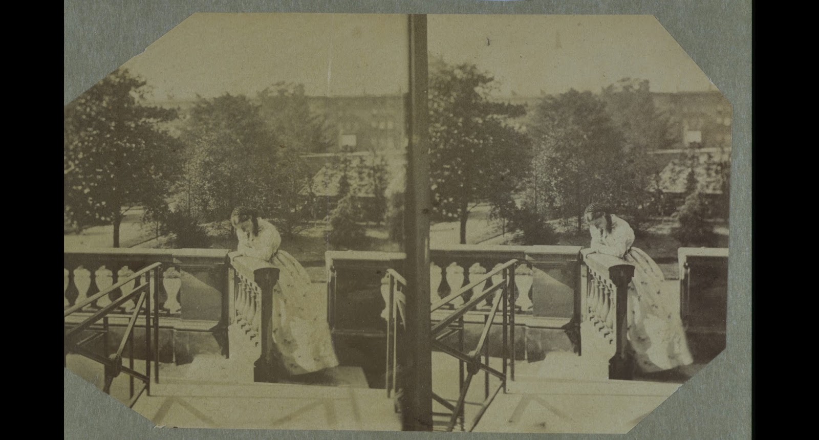
  Hawarden made the majority of her photographs in her home in South Kensington. The newly-built townhouse at 5 Princes Gate was filled with her family of eight daughters and one surviving son. Throughout her career as a photographer, Hawarden was almost constantly pregnant: she had her first child Isabella Grace in 1846 and her youngest daughter was born in May 1864. Yet very few of her pictures represent a conventional family interior. A stereoscopic image of two of her girls stands out from the collection precisely because of its apparent normality. [Figure 1, V&A PH.457:499-1968] Isabella Grace is seated in a tub chair, and young Clementina is on a low stool. One is reading and the other sewing. They are shown in an unostentatious morning room, with prints above the fireplace. These pictures within pictures hint at the artistic connections of the family. The landscapes are etchings by Seymour Haden, in an advanced Whistlerian manner, but there is also a popular print of cherubs from Raphael’s Sistine Madonna. This photograph places Hawarden firmly within her mid-Victorian context. Her daughters are spending their time in suitable feminine occupations. Yet this ordinariness is undermined by the extraordinary fact that we know their mother is standing behind a camera in the corner of the room. She has chosen to record this moment, in duplicate, to be looked at later in a stereoscopic viewer that will make the whole scene appear in 3-D. The complicated doubling and playing with perception is heightened by the girls’ clothes. They are wearing identical dresses with fine dark stripes on a white background, and contrasting cuffs and hems. The stripes of their dresses are at odds with the ivy patterned upholstery on the chair and the insistent diamonds of the carpet and wallpaper. The girls keep their eye on their work, so we can study them in profile. This interior, which corresponds in many ways to the expectations of orthodox Victorian taste, has been made queer or peculiar by Hawarden’s decision to freeze it on the prepared plate of her camera. She encourages us to study it, to note how the focus shifts from one lens to the other, to dwell on the folds of the matching dresses, and to try to resolve the design of the wallpaper. But this is not an experiment she cares to repeat. The majority of her photographs are taken in bare rooms, set with props and screens, or in the open air in Ireland.
 A large area of Hawarden’s home was given over to her work. Two interconnected rooms on the first floor became her studio. Judging from the different prints remaining in the V&A Museum and a few other scattered examples, Hawarden worked with at least seven different cameras. These would have been expensive pieces of equipment, cumbersome to set up, and awkward to store. And her supplies of chemicals would also have to be given house-room.
Hawarden left no written record of her processes. We have to look closely at the photographs themselves to find clues to her working practice and her intentions. A portrait of young Clementina with stained fingers, and wearing a dark apron over her dress, demonstrates that making photographs was a messy business. [figure 2, V&A PH.457:319-1968]
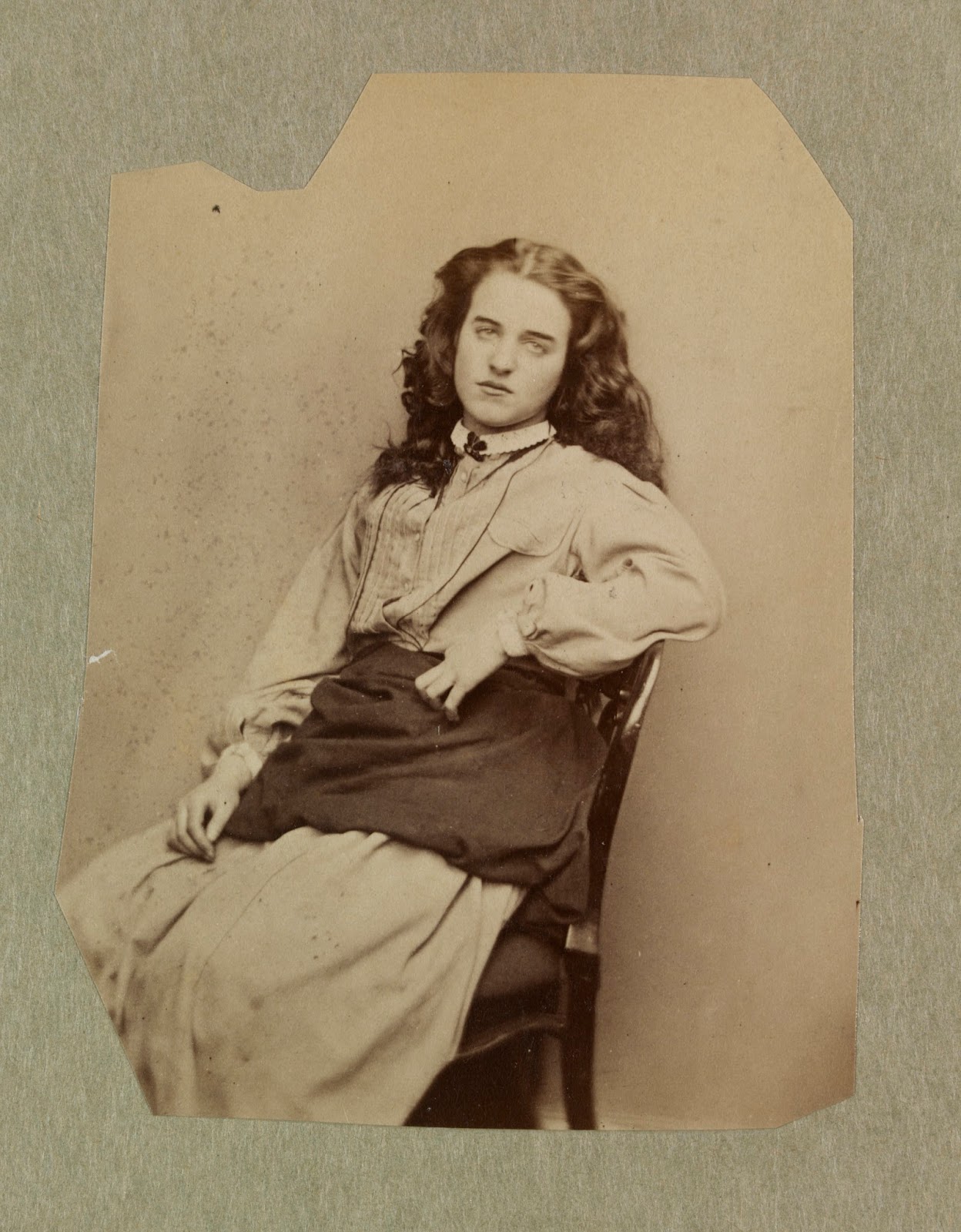 It also suggests that at least one of Hawarden’s daughters helped her in preparing and developing the plates. It is likely that the dark room was on the same floor as the studio spaces. There was a large windowless space that connected the two light-filled rooms; this was usually screened off while Hawarden was working. The darkroom would have required a good water supply. When Julia Margaret Cameron developed her prints, she wrote that she needed ‘nine cans of water fresh from the well’ to complete each one.
  When the family first moved into Princes Gate, the rooms set aside for photography had bare walls. However, towards the end of the 1850s, they were decorated with distinctive patterned wallpaper, which featured as a background to many of Hawarden’s studies. In the photographs, the pattern reads as black stars on a pale background. However, in reality, as Charlotte Gere has pointed out, the paper was printed with deep gold flowers, their pointed petals making them seem star-like. The wall covering was heavy and expensive, and was fixed to batons.
 Of the two main rooms in which Hawarden took her photographs, one looked out onto the road, and the other faced the garden that was shared by the residents. The back room had sash windows and a shallow balcony, while the front room was fitted with casement windows. The family could step through these windows onto a terrace. The liminal open spaces – attached to the house, yet sunny and semi-public – became important elements in Hawarden’s compositions. Like the painters Berthe Morisot and Mary Cassatt, Hawarden discovered that the balcony and the terrace were rewarding sites for female artistic production.
 Hawarden was a woman regularly ‘in confinement’ because of her child-bearing. Yet she found expressive ways of piercing the formal boundaries of her home as her daughters moved delightfully between interior and exterior. The windows, elevated outdoor spaces and even the backdrop of houses across the square all became part of her choreographed landscape of the imagination. She bounced reflections off panes of glass at queer angles. She encouraged shafts of light to make luminous geometry on walls and floor. She moved chairs, girls, dogs and carved wooden owls onto the terrace to form odd interactions. [figure 4, V&A PH. 302-1947] She posed her curved and flounced daughters against the insistent regularity of other people’s houses.
 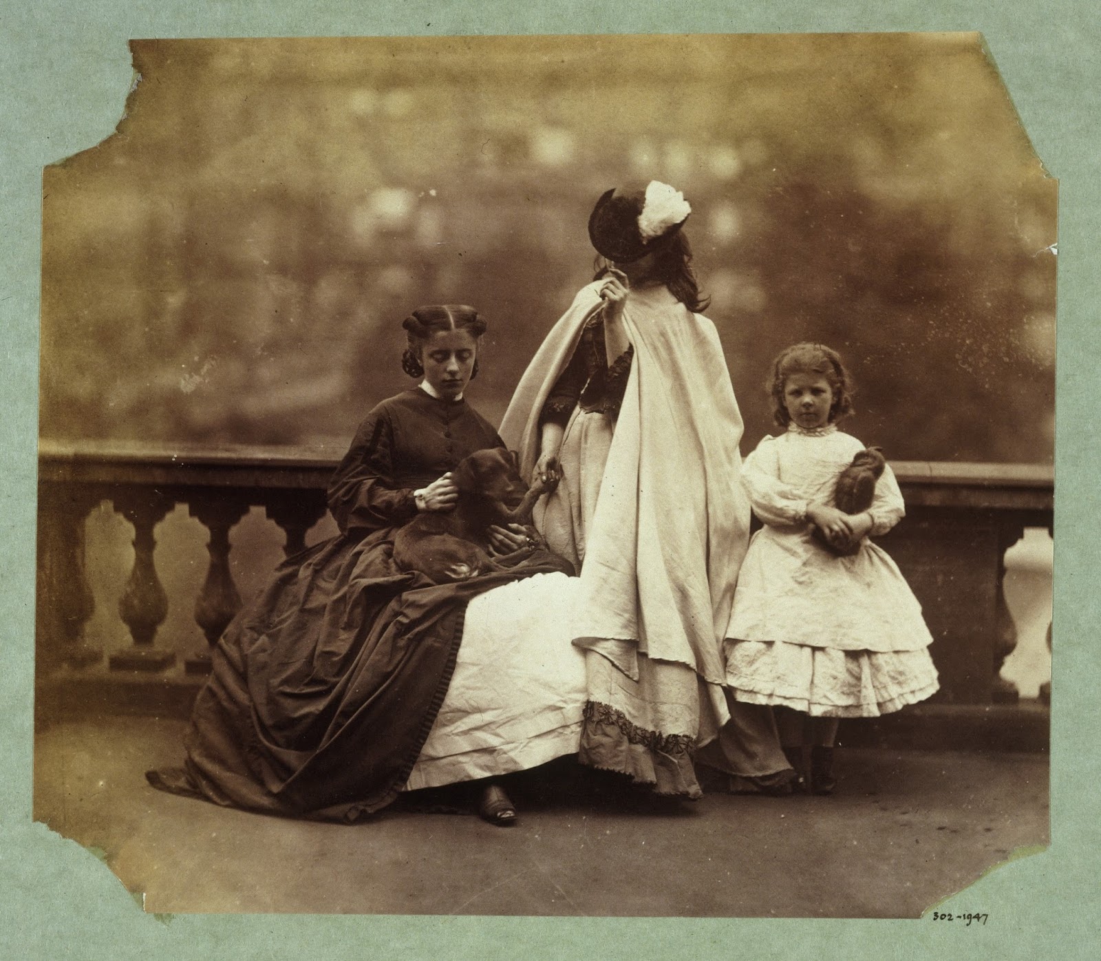 In Ireland she had more room to play with. On her husband’s estate at Dundrum, Hawarden photographed farm workers and animals. She set up an outdoor studio against the wall of a workshop to experiment with portrait compositions. She also took a stereoscopic camera into a river valley to photograph a young woman. [figure 5, V&A PH.457:49-1968]
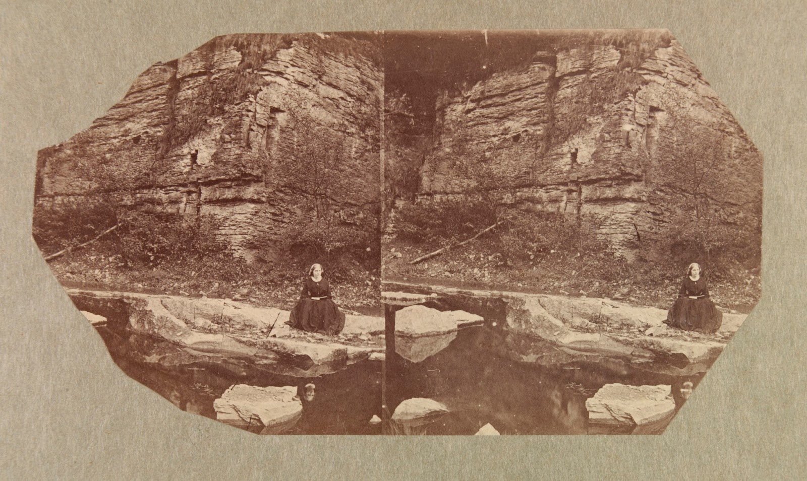 This figure is dwarfed by the cliffs behind her, with sharp marks of cut stone clearly visible on their surface. The river reflects back fallen rock, rock face, and the thoughtful girl who refuses to read the book in her lap. The whole scene is again doubled by the stereoscopic lenses. Her young model is balanced between confinement and release. She appears trapped between the stones that completely fill the background and the water at her feet. However her gaze, up and out of the image, suggests other means of escape: perhaps by creating an image in her mind’s eye, perhaps by the inspiration of a passage in her book, perhaps even by plunging through the mirrored surface of the water and into the unseen depths. Hawarden created a similar sense of alternative realities, beyond the picture plane, in other photographs taken outdoors in Ireland. Her study of a young woman walking away from us, under a canopy of trees, is one example [figure 6, V&A PH.457-1968:149].

The figure is seen from the back. Her skirt is kilted up, in dark folds of fabric, revealing a pale hooped underskirt. This may be practical – to save her dress from the dusty road – but it adds an uneasy element to the scene. It implies exposure, vulnerability. It draws attention to the sway of the woman’s body, and to the delicate play of light and shade throughout the composition. As her feet are hidden in the shadow of her skirts, she almost seems to hover above the surface of the track. She is about to pass away from us, around a corner and into the picture, beyond our reach.
Back in London, Hawarden had less room to manoeuvre. She and her daughters could not roam about with cameras and hitched-up skirts as they did on their private lands in Tipperary. But they did nibble away at the boundaries of convention. Hawarden manipulated the codes of Victorian femininity to her own ends. Often she placed her young women deliberately on the threshold of the public spaces: in one photograph, a gate in the balustrade of the terrace has swung open. [figure 7, V&A PH.457-1968:443]
 This barrier between public and private has always, in other images, seemed impermeable. But this picture makes it clear that the girls could step out and down into the communal space of the square. Hawarden photographed her daughter in no-man’s-land, leaning on the ledge of the balustrade, poised between home and the wide world.
 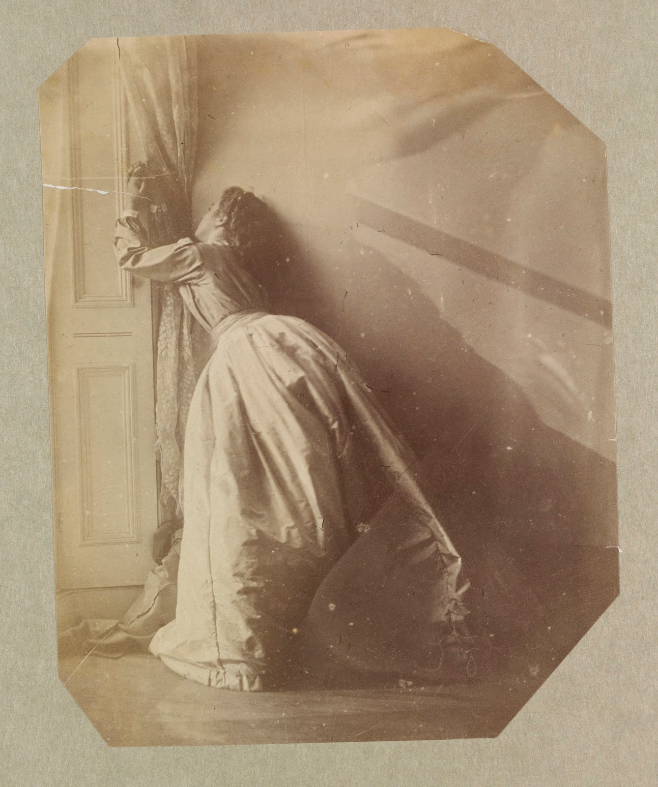 In other compositions, Hawarden played with melodramatic notions of confinement and interiority. She and her girls rigged up elaborate muslin drapes across the windows. Some were plain, others sprigged with ivy-leaves, bringing the outside in. [V&A PH.457: 150-1968 and PH.457: 344-1968]. These semi-transparent swags of material became players in a game of hyper-femininity, as young Clementina grasped, crumpled and twisted them in her out-stretched hands. In one reading of these images, she appears to be protesting against the limitations of the domestic sphere, and the restrictions imposed upon Victorian girls. However, the very fact that she was modelling for her mother, and that they were both complicit in the exaggerated posturing, undermines this interpretation. Both Clementinas, mother and daughter, were collaborating in an undomestic, though private, space. This was no claustrophobic, tight-lipped drawing room scene. These images were created in a light-filled studio. The floors are plain, the boards sometimes left bare, and sometimes covered with rush matting. There are scraps of paper left lying about. Objects are out of place. This was a utilitarian space, with none of the upholstery and carpeting seen in the morning-room stereoscopic photograph. Hawarden’s women are inside a Victorian home, but it is unheimlich.
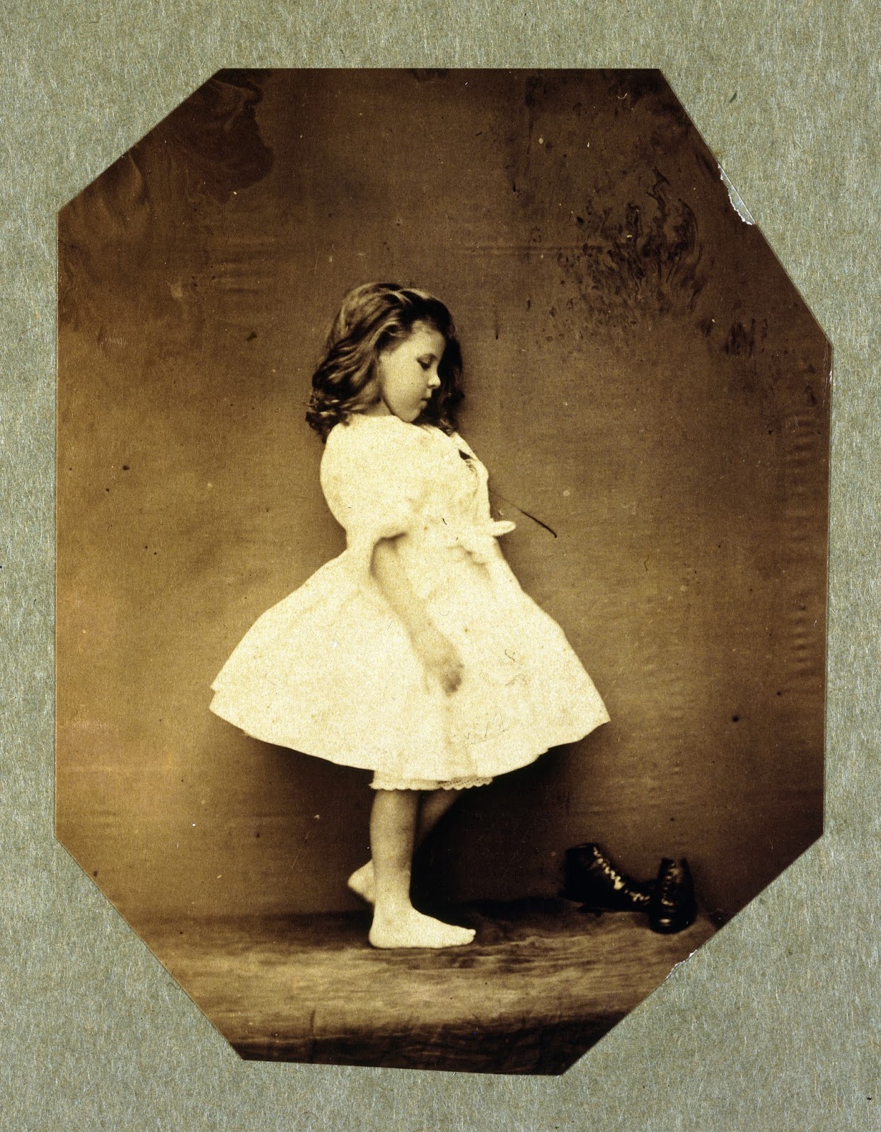
Roland Barthes, Camera Lucida, p.93 Roland Barthes, Camera Lucida, p.92 See Virginia Dodier, Clementina, Lady Hawarden: Studies from Life 1857-64, V&A Publications, London, 1999 p.120 for a floor plan of Princes Gardens Julia Margaret Cameron, quoted by Colin Ford, Julia Margaret Cameron: 19thCentury Photographer of Genius, National Portrait Gallery, London, 2003, p.39 I am grateful to Charlotte Gere for pointing this out during our discussions at The Gendered Interior in Nineteenth-Century Art symposium on 20 November 2013.


January 16, 2018
Ravilious & Co. I've been thinking about Eric Ravilio...
Ravilious & Co.

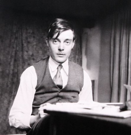
I've been thinking about Eric Ravilious for a long time now - ever since we lived in Lewes, and could see the chalk paths across the Downs that he loved to draw. The exceptional exhibition, 'Ravilious & Co', which has just left Sheffield and will be reassembled at Compton Verney on March 17th 2018, is a reminder of the beauty and seriousness of his paintings. It is a testament to the research and persistence of Andy Friend and James Russell. And it demonstrates the astonishing vitality of Ravilious's artistic circle - the women and men who trained and worked alongside him. It seems a good time to try to pin down the reasons why I find his pictures so engrossing and a continual source of visual pleasure.
Sussex, Summer 1939:
 A tea-table stands in the corner of the garden. The milk-jug and plate of butter are shaded by a battered umbrella. The warm air smells of fresh bread and new hay. Peggy Angus is expecting visitors. She leans on the wall, her cotton dress flapping against her bare brown legs, humming snatches of old tunes. At the end of the track she sees them, dark figures against a chalk-white ground, a man and a woman carrying knapsacks and painting gear. Eric Ravilious and his love Helen Binyon walk up the long lane from Glynde Station. Refugees from the clatter of London, for a few days they can shelter beneath the open skies and lark-song.
Peggy’s cottage, Furlongs, sits beneath the swelling Sussex Downs. It is a place of retreat for her artist-friends, a survivor from quieter times. While Britain prepares for war, a procession of shire-horses and wagons pass her gate, and her front door stands open to the breeze and sunshine. Her fellow-students from the old days at the Royal College of Art make their pilgrimages here. In her small sitting room, beneath a ruby-glass oil lamp, the artists gather: Eric and Helen, Edward and Charlotte Bawden, John and Myfanwy Piper. They share a desire to catalogue the small wonders of the English landscape. Knowing that their world is under threat, the need to paint becomes more urgent. They are the inheritors of the visionary Romantic tradition, heirs to Samuel Palmer. Yet their art is sharp and never sentimental. It is underpinned by a radicalism drawn from the utopias of William Morris. Ravilious makes it his mission to document the ebb and flow of the Downland and its mysterious carved figures, white horses and giants. His incisive eye, his delight in domesticity, his nostalgia and quirkiness suggest parallels with John Betjeman. The lyricism of his watercolours reminds us of Vaughan Williams. Throughout the 1930s Ravilious fashions calm memorials to Englishness: images of white cliffs, greenhouses hung with ripening tomatoes, and ancient paths climbing to the sunlit uplands.
And then the war breaks in. Ravilious, Piper and Bawden join Kenneth Clark’s band of official war artists. Bawden is posted to North Africa and turns his hand to painting the vast theatres of war in Libya, Iraq and Ethiopia. Piper sits with his sketchbook in the smouldering relics of Coventry Cathedral. And Ravilious is offered a commission in the Admiralty. He records coastal defences, submarines and docks around the South Coast and in Norway. Then in the summer of 1942 he is sent to Iceland. On 2nd September his plane disappears over the sea, and he is lost.
**********************************************************************************
By tracing the patterns of friendship between Ravilious, Bawden and their circle, the exhibition offers an alternative history of English art. Furlongs was barely five miles from Charleston, Virginia Woolf’s Sussex home. Like Charleston, Furlongs provided the backdrop to love-affairs and intrigues. But the artistic atmosphere of the two meeting-places could hardly have been more different. The Bloomsbury group were self-consciously modernist. The folk at Furlongs, on the other hand, embraced the traditions of English watercolour painting and wood-engraving. Their work was intimate and evocative.
Ravilious traced the curl of a Swiss-roll with as much care as he mapped the course of a river. He and his friends loved trips to the seaside, DIY and bunting, Bonfire Night and evenings in the pub. Benjamin Britten and Henry Moore crossed their path, but this group of artists chose not to follow their lead. Instead they painted ordinary beauty, glimpsed from a train window. Their visions of Englishness have become more poignant as the years have passed. We now celebrate their legacy in exhibitions, calendars, notecards and fridge magnets. ******************************************************************************
Our first sight of Eric Ravilious is likely to be low key and domestic. He slips quietly into our lives, with his black-and-white designs for the breakfast table. We follow the undulating dot-and-dash around the rim of a bowl. Then we start to feel our way into one of his landscapes, pushing through a wire fence, up a path, over the Downs. Next, we become entangled in a coil of rope washed up in a watercolour. Before we have quite realised what is happening, we are smitten. Ravilious has cast his spell.

Ravilious’s ability to enchant was recognised by his early friends and critics. Fellow-students at the Royal College of Art called him ‘the Boy’. In 1939, his pictures were described as ‘something magic, almost mystic, distilled out of the ordinary’. The taut geometry of his paintings lifts mundane objects, insisting that we take them seriously. A battered bicycle, a loaf of bread, a pot of geraniums, each thing becomes delightful under his touch. And then disconcerting as we acknowledge its peculiarities. He makes us see the curves and edges, the relationship to other things placed beside it. As we look more closely, we notice that Ravilious’s watercolours never try to conceal the skeleton of his drawing beneath the bright washes of blue and yellow and orangey-red.
With a ruler and a pencil he draws a web of lines. They might become ceiling joists or floorboards, a quayside, a runway or young crops in a field. But they are never exactly aligned with our idea of perspective. His rooms are slightly aslant, his table-tops are tilted. He keeps us on our toes, a little anxious that the image could slide away from us or trip us up.
This is one of his magic tricks. Ravilious offers us pictures that at first sight seem straightforward; as he said when he drew the folds of the Sussex Downs, ‘the design was so beautifully obvious’. He holds our attention by making the familiar look fresh. He watches from new vantage points. He makes us question the choreography of his compositions. How could he paint that bedroom, unless he was standing on a chair in one corner? Why did he outline those scissors and spoons on a tray, laid out like a game of Pelmanism?
 This tendency becomes more marked from 1940 when he begins his War work. Ravilious’s paintings and lithographs lead us into empty huts, then down into tunnels hung with maps and out onto icy seas. His eye dwells on the uneasy interludes that punctuate conflict. He shows the steady administrative tasks – telephone calls, filing cabinets, test flights – underpinning the drama of war. Occasionally he treats us to a burst of artillery, blazing from a 9.2 gun positioned high above the coast. But even here he suggests that the soldiers are simply getting on with their job. There is no hurry. We do not know what they are firing at, or whether they hit it. The yellow flash from the gun’s mouth is hardly a sign of modern warfare. Instead it seems like a nod to an earlier tradition of fireworks (which Ravilious loved) or William Blake’s flaming flowers in Songs of Innocence and Experience.

In 1941, the same year that Ravilious painted his bright gun, an appreciation of Blake was published by David Cecil in The English Poets. According to Cecil, Blake’s poems were like ‘a rush of the wind in the tree-tops’ or ‘a fresh gale, racy with the smell of earth’.Ravilious responded in kind. His gun-emplacement is set on a breezy upland. Wind-tossed flowers draw our eye away from the figures, and across waving grasses towards the sea. What are the artillery-men defending? This was the central question for the artists gathered by Kenneth Clark late in 1939 to document the war. It was not simply the ‘green and pleasant land’ that produced Blake. It was the right for a man to sit in a field with his sketchbook, despite the gunfire, in the ‘rush of the wind’. England now meant both Blake and gun-batteries. They co-existed in Ravilious’s watercolour, the pastoral interrupted by a blast.

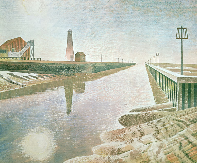
Clark oversaw a thoughtful and energetic project, encouraging modern painters to respond to the new face of combat. This was no exercise in nostalgia. And Clark did not keep his artists out of harm’s way. In Ravilious’s case, with his work for the Admiralty, his subject was the fragile edges of Britain. He painted a coastline defined by new concrete defences and curls of barbed wire, with the pleasure boats drawn up high onto the beach to sit out the war. There is the recurring motif of the lighthouse marking the intersections between land, sea and sky. Ravilious was particularly fond of the stumpy towers at Newhaven, as well as the elegant tension between curved and flat in the lighthouse at Rye. Sometimes in his paintings they shine into the darkness. More often, though, they are unlit, upright and waiting. Very occasionally, as in Belle Tout interior (1939), Ravilious shows us the view from inside the lantern, the sunlight streaming in through the window panes, almost too bright to look at. A calligraphic line dancing across the paper marks the boundary between land and sea.
Ravilious delighted in rippling borderlines. We find them at the scalloped edges of sandbanks as they dip beneath the waters of Rye Harbour (1938).
They mark the gap between grass and tarmac in Runway Perspective (1942).
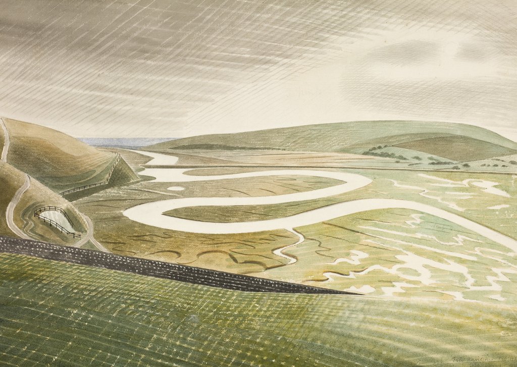
 And most spectacularly, Ravilious created a sparkling thread of water flowing through marshland in Cuckmere Haven (1939). Here the meander of the river is echoed in the ribbon of a chalk path through the grass, and even in the cloud formations. Earth, water, sky are linked and defined by the looping lines of Ravilious’s pencil.
However, he is careful not to let us become lost in a watery maze. A stone wall and a field in the foreground create a gently sloping springboard. From here the acrobatic elements in the composition can rise, soar, twist and come to rest again. In every watercolour there is an underpinning, an architecture which is laid down first. It is rarely quite on the square, and this contributes to the tension between solid and line. But nevertheless, Ravilious mapped the geology of his landscapes and the girders of his underground corridors in pencil, before he explored their more delicate edges and crossing points.
This exhibition allows us to follow the threads back to his early years as an art student, and forward towards his work in Norway and Iceland. It reveals the strands that link him to the avant-garde of the 1920s and his place in a wider circle of artists who wrote and thought and travelled in interwar Britain. It also asks us to consider how the loss of his aircraft in 1942, missing (presumed dead) before his 40th birthday, altered the reception of his art. Above all, these displays allow us to linger, to delight in the complex surfaces of the watercolours, and the enjoy the intricacies of his black and white designs.
Jan Gordon, ‘Influences and Fusion’, The Observer, 14 May 1939, p.14
Eric Ravilious, letter to Peggy Angus, 15 May 1939, in James Russell, Ravilious, exhibition catalogue, Dulwich Picture Gallery, Philip Wilson Publishers, 2015, p.10
Eric Ravilious, Firing a 9.2 Gun, 1941, watercolour on paper, Imperial War Museum
David Cecil, English Poets, from Britain in Pictures series, London, 1941, pp. 9 & 20
I've been thinking about Eric Ravilious for a long time now - ever since we lived in Lewes, and could see the chalk paths across the Downs that he loved to draw. The exceptional exhibition, 'Ravilious & Co', which has just left Sheffield and will be reassembled at Compton Verney on March 17th 2018, is a reminder of the beauty and seriousness of his paintings. It is a testament to the research and persistence of Andy Friend and James Russell. And it demonstrates the astonishing vitality of Ravilious's artistic circle - the women and men who trained and worked alongside him. It seems a good time to try to pin down the reasons why I find his pictures so engrossing and a continual source of visual pleasure.

Sussex, Summer 1939:
 A tea-table stands in the corner of the garden. The milk-jug and plate of butter are shaded by a battered umbrella. The warm air smells of fresh bread and new hay. Peggy Angus is expecting visitors. She leans on the wall, her cotton dress flapping against her bare brown legs, humming snatches of old tunes. At the end of the track she sees them, dark figures against a chalk-white ground, a man and a woman carrying knapsacks and painting gear. Eric Ravilious and his love Helen Binyon walk up the long lane from Glynde Station. Refugees from the clatter of London, for a few days they can shelter beneath the open skies and lark-song.
 Peggy’s cottage, Furlongs, sits beneath the swelling Sussex Downs. It is a place of retreat for her artist-friends, a survivor from quieter times. While Britain prepares for war, a procession of shire-horses and wagons pass her gate, and her front door stands open to the breeze and sunshine. Her fellow-students from the old days at the Royal College of Art make their pilgrimages here. In her small sitting room, beneath a ruby-glass oil lamp, the artists gather: Eric and Helen, Edward and Charlotte Bawden, John and Myfanwy Piper. They share a desire to catalogue the small wonders of the English landscape. Knowing that their world is under threat, the need to paint becomes more urgent. They are the inheritors of the visionary Romantic tradition, heirs to Samuel Palmer. Yet their art is sharp and never sentimental. It is underpinned by a radicalism drawn from the utopias of William Morris.
 Ravilious makes it his mission to document the ebb and flow of the Downland and its mysterious carved figures, white horses and giants. His incisive eye, his delight in domesticity, his nostalgia and quirkiness suggest parallels with John Betjeman. The lyricism of his watercolours reminds us of Vaughan Williams. Throughout the 1930s Ravilious fashions calm memorials to Englishness: images of white cliffs, greenhouses hung with ripening tomatoes, and ancient paths climbing to the sunlit uplands.
And then the war breaks in. Ravilious, Piper and Bawden join Kenneth Clark’s band of official war artists. Bawden is posted to North Africa and turns his hand to painting the vast theatres of war in Libya, Iraq and Ethiopia. Piper sits with his sketchbook in the smouldering relics of Coventry Cathedral. And Ravilious is offered a commission in the Admiralty. He records coastal defences, submarines and docks around the South Coast and in Norway. Then in the summer of 1942 he is sent to Iceland. On 2nd September his plane disappears over the sea, and he is lost.
**********************************************************************************
By tracing the patterns of friendship between Ravilious, Bawden and their circle, the exhibition offers an alternative history of English art. Furlongs was barely five miles from Charleston, Virginia Woolf’s Sussex home. Like Charleston, Furlongs provided the backdrop to love-affairs and intrigues. But the artistic atmosphere of the two meeting-places could hardly have been more different. The Bloomsbury group were self-consciously modernist. The folk at Furlongs, on the other hand, embraced the traditions of English watercolour painting and wood-engraving. Their work was intimate and evocative. Ravilious traced the curl of a Swiss-roll with as much care as he mapped the course of a river. He and his friends loved trips to the seaside, DIY and bunting, Bonfire Night and evenings in the pub. Benjamin Britten and Henry Moore crossed their path, but this group of artists chose not to follow their lead. Instead they painted ordinary beauty, glimpsed from a train window. Their visions of Englishness have become more poignant as the years have passed. We now celebrate their legacy in exhibitions, calendars, notecards and fridge magnets. ******************************************************************************
Our first sight of Eric Ravilious is likely to be low key and domestic. He slips quietly into our lives, with his black-and-white designs for the breakfast table. We follow the undulating dot-and-dash around the rim of a bowl. Then we start to feel our way into one of his landscapes, pushing through a wire fence, up a path, over the Downs. Next, we become entangled in a coil of rope washed up in a watercolour. Before we have quite realised what is happening, we are smitten. Ravilious has cast his spell.
Ravilious’s ability to enchant was recognised by his early friends and critics. Fellow-students at the Royal College of Art called him ‘the Boy’. In 1939, his pictures were described as ‘something magic, almost mystic, distilled out of the ordinary’. The taut geometry of his paintings lifts mundane objects, insisting that we take them seriously. A battered bicycle, a loaf of bread, a pot of geraniums, each thing becomes delightful under his touch. And then disconcerting as we acknowledge its peculiarities. He makes us see the curves and edges, the relationship to other things placed beside it. As we look more closely, we notice that Ravilious’s watercolours never try to conceal the skeleton of his drawing beneath the bright washes of blue and yellow and orangey-red.
With a ruler and a pencil he draws a web of lines. They might become ceiling joists or floorboards, a quayside, a runway or young crops in a field. But they are never exactly aligned with our idea of perspective. His rooms are slightly aslant, his table-tops are tilted. He keeps us on our toes, a little anxious that the image could slide away from us or trip us up.
This is one of his magic tricks. Ravilious offers us pictures that at first sight seem straightforward; as he said when he drew the folds of the Sussex Downs, ‘the design was so beautifully obvious’. He holds our attention by making the familiar look fresh. He watches from new vantage points. He makes us question the choreography of his compositions. How could he paint that bedroom, unless he was standing on a chair in one corner? Why did he outline those scissors and spoons on a tray, laid out like a game of Pelmanism?
 This tendency becomes more marked from 1940 when he begins his War work. Ravilious’s paintings and lithographs lead us into empty huts, then down into tunnels hung with maps and out onto icy seas. His eye dwells on the uneasy interludes that punctuate conflict. He shows the steady administrative tasks – telephone calls, filing cabinets, test flights – underpinning the drama of war. Occasionally he treats us to a burst of artillery, blazing from a 9.2 gun positioned high above the coast. But even here he suggests that the soldiers are simply getting on with their job. There is no hurry. We do not know what they are firing at, or whether they hit it. The yellow flash from the gun’s mouth is hardly a sign of modern warfare. Instead it seems like a nod to an earlier tradition of fireworks (which Ravilious loved) or William Blake’s flaming flowers in Songs of Innocence and Experience.
In 1941, the same year that Ravilious painted his bright gun, an appreciation of Blake was published by David Cecil in The English Poets. According to Cecil, Blake’s poems were like ‘a rush of the wind in the tree-tops’ or ‘a fresh gale, racy with the smell of earth’.Ravilious responded in kind. His gun-emplacement is set on a breezy upland. Wind-tossed flowers draw our eye away from the figures, and across waving grasses towards the sea. What are the artillery-men defending? This was the central question for the artists gathered by Kenneth Clark late in 1939 to document the war. It was not simply the ‘green and pleasant land’ that produced Blake. It was the right for a man to sit in a field with his sketchbook, despite the gunfire, in the ‘rush of the wind’. England now meant both Blake and gun-batteries. They co-existed in Ravilious’s watercolour, the pastoral interrupted by a blast.
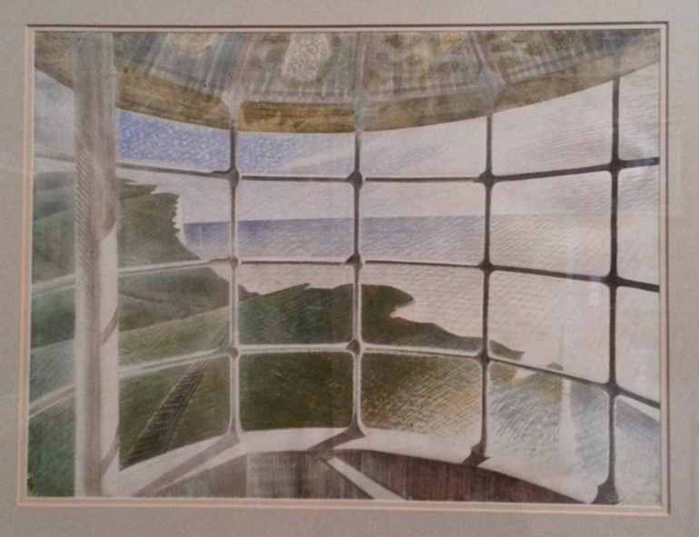
Clark oversaw a thoughtful and energetic project, encouraging modern painters to respond to the new face of combat. This was no exercise in nostalgia. And Clark did not keep his artists out of harm’s way. In Ravilious’s case, with his work for the Admiralty, his subject was the fragile edges of Britain. He painted a coastline defined by new concrete defences and curls of barbed wire, with the pleasure boats drawn up high onto the beach to sit out the war. There is the recurring motif of the lighthouse marking the intersections between land, sea and sky. Ravilious was particularly fond of the stumpy towers at Newhaven, as well as the elegant tension between curved and flat in the lighthouse at Rye. Sometimes in his paintings they shine into the darkness. More often, though, they are unlit, upright and waiting. Very occasionally, as in Belle Tout interior (1939), Ravilious shows us the view from inside the lantern, the sunlight streaming in through the window panes, almost too bright to look at. A calligraphic line dancing across the paper marks the boundary between land and sea.
Ravilious delighted in rippling borderlines. We find them at the scalloped edges of sandbanks as they dip beneath the waters of Rye Harbour (1938).
They mark the gap between grass and tarmac in Runway Perspective (1942).

 And most spectacularly, Ravilious created a sparkling thread of water flowing through marshland in Cuckmere Haven (1939). Here the meander of the river is echoed in the ribbon of a chalk path through the grass, and even in the cloud formations. Earth, water, sky are linked and defined by the looping lines of Ravilious’s pencil.
 However, he is careful not to let us become lost in a watery maze. A stone wall and a field in the foreground create a gently sloping springboard. From here the acrobatic elements in the composition can rise, soar, twist and come to rest again. In every watercolour there is an underpinning, an architecture which is laid down first. It is rarely quite on the square, and this contributes to the tension between solid and line. But nevertheless, Ravilious mapped the geology of his landscapes and the girders of his underground corridors in pencil, before he explored their more delicate edges and crossing points.
This exhibition allows us to follow the threads back to his early years as an art student, and forward towards his work in Norway and Iceland. It reveals the strands that link him to the avant-garde of the 1920s and his place in a wider circle of artists who wrote and thought and travelled in interwar Britain. It also asks us to consider how the loss of his aircraft in 1942, missing (presumed dead) before his 40th birthday, altered the reception of his art. Above all, these displays allow us to linger, to delight in the complex surfaces of the watercolours, and the enjoy the intricacies of his black and white designs.
Jan Gordon, ‘Influences and Fusion’, The Observer, 14 May 1939, p.14
Eric Ravilious, letter to Peggy Angus, 15 May 1939, in James Russell, Ravilious, exhibition catalogue, Dulwich Picture Gallery, Philip Wilson Publishers, 2015, p.10
Eric Ravilious, Firing a 9.2 Gun, 1941, watercolour on paper, Imperial War Museum
David Cecil, English Poets, from Britain in Pictures series, London, 1941, pp. 9 & 20
Ravilious & Co. I've been thinking about Eric Ra...
Ravilious & Co.
I've been thinking about Eric Ravilious for a long time now - ever since we lived in Lewes, and could see the chalk paths across the Downs that he loved to draw. The exceptional exhibition, 'Ravilious & Co', which has just left Sheffield and will be reassembled at Compton Verney on March 17th 2018, is a reminder of the beauty and seriousness of his paintings. It is a testament to the research and persistence of Andy Friend and James Russell. And it demonstrates the astonishing vitality of Ravilious's artistic circle - the women and men who trained and worked alongside him. It seems a good time to try to pin down the reasons why I find his pictures so engrossing and a continual source of visual pleasure.
Sussex, Summer 1939:
A tea-table stands in the corner of the garden. The milk-jug and plate of butter are shaded by a battered umbrella. The warm air smells of fresh bread and new hay. Peggy Angus is expecting visitors. She leans on the wall, her cotton dress flapping against her bare brown legs, humming snatches of old tunes. At the end of the track she sees them, dark figures against a chalk-white ground, a man and a woman carrying knapsacks and painting gear. Eric Ravilious and his love Helen Binyon walk up the long lane from Glynde Station. Refugees from the clatter of London, for a few days they can shelter beneath the open skies and lark-song.
Peggy’s cottage, Furlongs, sits beneath the swelling Sussex Downs. It is a place of retreat for her artist-friends, a survivor from quieter times. While Britain prepares for war, a procession of shire-horses and wagons pass her gate, and her front door stands open to the breeze and sunshine. Her fellow-students from the old days at the Royal College of Art make their pilgrimages here. In her small sitting room, beneath a ruby-glass oil lamp, the artists gather: Eric and Helen, Edward and Charlotte Bawden, John and Myfanwy Piper. They share a desire to catalogue the small wonders of the English landscape. Knowing that their world is under threat, the need to paint becomes more urgent. They are the inheritors of the visionary Romantic tradition, heirs to Samuel Palmer. Yet their art is sharp and never sentimental. It is underpinned by a radicalism drawn from the utopias of William Morris.
Ravilious makes it his mission to document the ebb and flow of the Downland and its mysterious carved figures, white horses and giants. His incisive eye, his delight in domesticity, his nostalgia and quirkiness suggest parallels with John Betjeman. The lyricism of his watercolours reminds us of Vaughan Williams. Throughout the 1930s Ravilious fashions calm memorials to Englishness: images of white cliffs, greenhouses hung with ripening tomatoes, and ancient paths climbing to the sunlit uplands.
And then the war breaks in. Ravilious, Piper and Bawden join Kenneth Clark’s band of official war artists. Bawden is posted to North Africa and turns his hand to painting the vast theatres of war in Libya, Iraq and Ethiopia. Piper sits with his sketchbook in the smouldering relics of Coventry Cathedral. And Ravilious is offered a commission in the Admiralty. He records coastal defences, submarines and docks around the South Coast and in Norway. Then in the summer of 1942 he is sent to Iceland. On 2nd September his plane disappears over the sea, and he is lost.
**********************************************************************************
By tracing the patterns of friendship between Ravilious, Bawden and their circle, the exhibition offers an alternative history of English art. Furlongs was barely five miles from Charleston, Virginia Woolf’s Sussex home. Like Charleston, Furlongs provided the backdrop to love-affairs and intrigues. But the artistic atmosphere of the two meeting-places could hardly have been more different. The Bloomsbury group were self-consciously modernist. The folk at Furlongs, on the other hand, embraced the traditions of English watercolour painting and wood-engraving. Their work was intimate and evocative.
Ravilious traced the curl of a Swiss-roll with as much care as he mapped the course of a river. He and his friends loved trips to the seaside, DIY and bunting, Bonfire Night and evenings in the pub. Benjamin Britten and Henry Moore crossed their path, but this group of artists chose not to follow their lead. Instead they painted ordinary beauty, glimpsed from a train window. Their visions of Englishness have become more poignant as the years have passed. We now celebrate their legacy in exhibitions, calendars, notecards and fridge magnets. ******************************************************************************
Our first sight of Eric Ravilious is likely to be low key and domestic. He slips quietly into our lives, with his black-and-white designs for the breakfast table. We follow the undulating dot-and-dash around the rim of a bowl. Then we start to feel our way into one of his landscapes, pushing through a wire fence, up a path, over the Downs. Next, we become entangled in a coil of rope washed up in a watercolour. Before we have quite realised what is happening, we are smitten. Ravilious has cast his spell.
Ravilious’s ability to enchant was recognised by his early friends and critics. Fellow-students at the Royal College of Art called him ‘the Boy’. In 1939, his pictures were described as ‘something magic, almost mystic, distilled out of the ordinary’.
With a ruler and a pencil he draws a web of lines. They might become ceiling joists or floorboards, a quayside, a runway or young crops in a field. But they are never exactly aligned with our idea of perspective. His rooms are slightly aslant, his table-tops are tilted. He keeps us on our toes, a little anxious that the image could slide away from us or trip us up.
This is one of his magic tricks. Ravilious offers us pictures that at first sight seem straightforward; as he said when he drew the folds of the Sussex Downs, ‘the design was so beautifully obvious’.
This tendency becomes more marked from 1940 when he begins his War work. Ravilious’s paintings and lithographs lead us into empty huts, then down into tunnels hung with maps and out onto icy seas. His eye dwells on the uneasy interludes that punctuate conflict. He shows the steady administrative tasks – telephone calls, filing cabinets, test flights – underpinning the drama of war. Occasionally he treats us to a burst of artillery, blazing from a 9.2 gun positioned high above the coast.
In 1941, the same year that Ravilious painted his bright gun, an appreciation of Blake was published by David Cecil in The English Poets. According to Cecil, Blake’s poems were like ‘a rush of the wind in the tree-tops’ or ‘a fresh gale, racy with the smell of earth’.
Clark oversaw a thoughtful and energetic project, encouraging modern painters to respond to the new face of combat. This was no exercise in nostalgia. And Clark did not keep his artists out of harm’s way. In Ravilious’s case, with his work for the Admiralty, his subject was the fragile edges of Britain. He painted a coastline defined by new concrete defences and curls of barbed wire, with the pleasure boats drawn up high onto the beach to sit out the war. There is the recurring motif of the lighthouse marking the intersections between land, sea and sky. Ravilious was particularly fond of the stumpy towers at Newhaven, as well as the elegant tension between curved and flat in the lighthouse at Rye. Sometimes in his paintings they shine into the darkness. More often, though, they are unlit, upright and waiting. Very occasionally, as in Belle Tout interior (1939), Ravilious shows us the view from inside the lantern, the sunlight streaming in through the window panes, almost too bright to look at. A calligraphic line dancing across the paper marks the boundary between land and sea.
Ravilious delighted in rippling borderlines. We find them at the scalloped edges of sandbanks as they dip beneath the waters of Rye Harbour (1938).
They mark the gap between grass and tarmac in Runway Perspective (1942).
And most spectacularly, Ravilious created a sparkling thread of water flowing through marshland in Cuckmere Haven (1939). Here the meander of the river is echoed in the ribbon of a chalk path through the grass, and even in the cloud formations. Earth, water, sky are linked and defined by the looping lines of Ravilious’s pencil.
However, he is careful not to let us become lost in a watery maze. A stone wall and a field in the foreground create a gently sloping springboard. From here the acrobatic elements in the composition can rise, soar, twist and come to rest again. In every watercolour there is an underpinning, an architecture which is laid down first. It is rarely quite on the square, and this contributes to the tension between solid and line. But nevertheless, Ravilious mapped the geology of his landscapes and the girders of his underground corridors in pencil, before he explored their more delicate edges and crossing points.
This exhibition allows us to follow the threads back to his early years as an art student, and forward towards his work in Norway and Iceland. It reveals the strands that link him to the avant-garde of the 1920s and his place in a wider circle of artists who wrote and thought and travelled in interwar Britain. It also asks us to consider how the loss of his aircraft in 1942, missing (presumed dead) before his 40th birthday, altered the reception of his art. Above all, these displays allow us to linger, to delight in the complex surfaces of the watercolours, and the enjoy the intricacies of his black and white designs.
David Cecil, English Poets, from Britain in Pictures series, London, 1941, pp. 9 & 20
I've been thinking about Eric Ravilious for a long time now - ever since we lived in Lewes, and could see the chalk paths across the Downs that he loved to draw. The exceptional exhibition, 'Ravilious & Co', which has just left Sheffield and will be reassembled at Compton Verney on March 17th 2018, is a reminder of the beauty and seriousness of his paintings. It is a testament to the research and persistence of Andy Friend and James Russell. And it demonstrates the astonishing vitality of Ravilious's artistic circle - the women and men who trained and worked alongside him. It seems a good time to try to pin down the reasons why I find his pictures so engrossing and a continual source of visual pleasure.
Sussex, Summer 1939:
A tea-table stands in the corner of the garden. The milk-jug and plate of butter are shaded by a battered umbrella. The warm air smells of fresh bread and new hay. Peggy Angus is expecting visitors. She leans on the wall, her cotton dress flapping against her bare brown legs, humming snatches of old tunes. At the end of the track she sees them, dark figures against a chalk-white ground, a man and a woman carrying knapsacks and painting gear. Eric Ravilious and his love Helen Binyon walk up the long lane from Glynde Station. Refugees from the clatter of London, for a few days they can shelter beneath the open skies and lark-song. Peggy’s cottage, Furlongs, sits beneath the swelling Sussex Downs. It is a place of retreat for her artist-friends, a survivor from quieter times. While Britain prepares for war, a procession of shire-horses and wagons pass her gate, and her front door stands open to the breeze and sunshine. Her fellow-students from the old days at the Royal College of Art make their pilgrimages here. In her small sitting room, beneath a ruby-glass oil lamp, the artists gather: Eric and Helen, Edward and Charlotte Bawden, John and Myfanwy Piper. They share a desire to catalogue the small wonders of the English landscape. Knowing that their world is under threat, the need to paint becomes more urgent. They are the inheritors of the visionary Romantic tradition, heirs to Samuel Palmer. Yet their art is sharp and never sentimental. It is underpinned by a radicalism drawn from the utopias of William Morris.
Ravilious makes it his mission to document the ebb and flow of the Downland and its mysterious carved figures, white horses and giants. His incisive eye, his delight in domesticity, his nostalgia and quirkiness suggest parallels with John Betjeman. The lyricism of his watercolours reminds us of Vaughan Williams. Throughout the 1930s Ravilious fashions calm memorials to Englishness: images of white cliffs, greenhouses hung with ripening tomatoes, and ancient paths climbing to the sunlit uplands.And then the war breaks in. Ravilious, Piper and Bawden join Kenneth Clark’s band of official war artists. Bawden is posted to North Africa and turns his hand to painting the vast theatres of war in Libya, Iraq and Ethiopia. Piper sits with his sketchbook in the smouldering relics of Coventry Cathedral. And Ravilious is offered a commission in the Admiralty. He records coastal defences, submarines and docks around the South Coast and in Norway. Then in the summer of 1942 he is sent to Iceland. On 2nd September his plane disappears over the sea, and he is lost.
**********************************************************************************
By tracing the patterns of friendship between Ravilious, Bawden and their circle, the exhibition offers an alternative history of English art. Furlongs was barely five miles from Charleston, Virginia Woolf’s Sussex home. Like Charleston, Furlongs provided the backdrop to love-affairs and intrigues. But the artistic atmosphere of the two meeting-places could hardly have been more different. The Bloomsbury group were self-consciously modernist. The folk at Furlongs, on the other hand, embraced the traditions of English watercolour painting and wood-engraving. Their work was intimate and evocative. Ravilious traced the curl of a Swiss-roll with as much care as he mapped the course of a river. He and his friends loved trips to the seaside, DIY and bunting, Bonfire Night and evenings in the pub. Benjamin Britten and Henry Moore crossed their path, but this group of artists chose not to follow their lead. Instead they painted ordinary beauty, glimpsed from a train window. Their visions of Englishness have become more poignant as the years have passed. We now celebrate their legacy in exhibitions, calendars, notecards and fridge magnets. ******************************************************************************
Our first sight of Eric Ravilious is likely to be low key and domestic. He slips quietly into our lives, with his black-and-white designs for the breakfast table. We follow the undulating dot-and-dash around the rim of a bowl. Then we start to feel our way into one of his landscapes, pushing through a wire fence, up a path, over the Downs. Next, we become entangled in a coil of rope washed up in a watercolour. Before we have quite realised what is happening, we are smitten. Ravilious has cast his spell.
Ravilious’s ability to enchant was recognised by his early friends and critics. Fellow-students at the Royal College of Art called him ‘the Boy’. In 1939, his pictures were described as ‘something magic, almost mystic, distilled out of the ordinary’.
With a ruler and a pencil he draws a web of lines. They might become ceiling joists or floorboards, a quayside, a runway or young crops in a field. But they are never exactly aligned with our idea of perspective. His rooms are slightly aslant, his table-tops are tilted. He keeps us on our toes, a little anxious that the image could slide away from us or trip us up.
This is one of his magic tricks. Ravilious offers us pictures that at first sight seem straightforward; as he said when he drew the folds of the Sussex Downs, ‘the design was so beautifully obvious’.
This tendency becomes more marked from 1940 when he begins his War work. Ravilious’s paintings and lithographs lead us into empty huts, then down into tunnels hung with maps and out onto icy seas. His eye dwells on the uneasy interludes that punctuate conflict. He shows the steady administrative tasks – telephone calls, filing cabinets, test flights – underpinning the drama of war. Occasionally he treats us to a burst of artillery, blazing from a 9.2 gun positioned high above the coast.
In 1941, the same year that Ravilious painted his bright gun, an appreciation of Blake was published by David Cecil in The English Poets. According to Cecil, Blake’s poems were like ‘a rush of the wind in the tree-tops’ or ‘a fresh gale, racy with the smell of earth’.
Clark oversaw a thoughtful and energetic project, encouraging modern painters to respond to the new face of combat. This was no exercise in nostalgia. And Clark did not keep his artists out of harm’s way. In Ravilious’s case, with his work for the Admiralty, his subject was the fragile edges of Britain. He painted a coastline defined by new concrete defences and curls of barbed wire, with the pleasure boats drawn up high onto the beach to sit out the war. There is the recurring motif of the lighthouse marking the intersections between land, sea and sky. Ravilious was particularly fond of the stumpy towers at Newhaven, as well as the elegant tension between curved and flat in the lighthouse at Rye. Sometimes in his paintings they shine into the darkness. More often, though, they are unlit, upright and waiting. Very occasionally, as in Belle Tout interior (1939), Ravilious shows us the view from inside the lantern, the sunlight streaming in through the window panes, almost too bright to look at. A calligraphic line dancing across the paper marks the boundary between land and sea.
Ravilious delighted in rippling borderlines. We find them at the scalloped edges of sandbanks as they dip beneath the waters of Rye Harbour (1938).
They mark the gap between grass and tarmac in Runway Perspective (1942).
And most spectacularly, Ravilious created a sparkling thread of water flowing through marshland in Cuckmere Haven (1939). Here the meander of the river is echoed in the ribbon of a chalk path through the grass, and even in the cloud formations. Earth, water, sky are linked and defined by the looping lines of Ravilious’s pencil. However, he is careful not to let us become lost in a watery maze. A stone wall and a field in the foreground create a gently sloping springboard. From here the acrobatic elements in the composition can rise, soar, twist and come to rest again. In every watercolour there is an underpinning, an architecture which is laid down first. It is rarely quite on the square, and this contributes to the tension between solid and line. But nevertheless, Ravilious mapped the geology of his landscapes and the girders of his underground corridors in pencil, before he explored their more delicate edges and crossing points.
This exhibition allows us to follow the threads back to his early years as an art student, and forward towards his work in Norway and Iceland. It reveals the strands that link him to the avant-garde of the 1920s and his place in a wider circle of artists who wrote and thought and travelled in interwar Britain. It also asks us to consider how the loss of his aircraft in 1942, missing (presumed dead) before his 40th birthday, altered the reception of his art. Above all, these displays allow us to linger, to delight in the complex surfaces of the watercolours, and the enjoy the intricacies of his black and white designs.
David Cecil, English Poets, from Britain in Pictures series, London, 1941, pp. 9 & 20
November 15, 2017
The Pre-Raphaelites in TuscanyEdward Burne-Jones, The Mir...
The Pre-Raphaelites in Tuscany
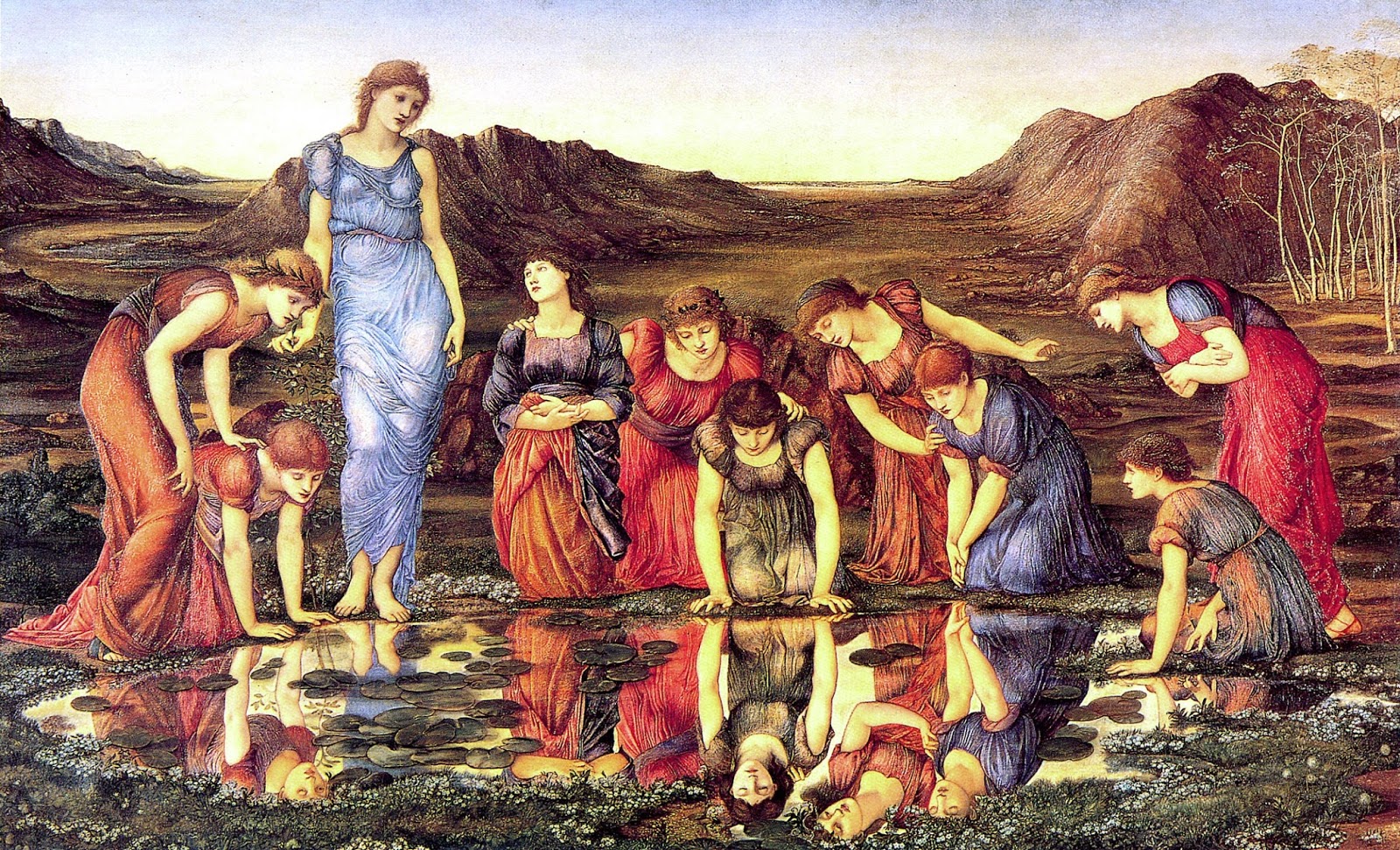
Edward Burne-Jones, The Mirror of Venus, 1875
In the golden autumn of 1859 Edward Burne-Jones and his two friends awoke in Florence. They had already spent several days in Pisa sketching frescoes in the Campo Santo. They were there on the advice of the critic John Ruskin. The young painters had come in search of the real Pre-Raphaelites – artists like Giotto and Fra Angelico who had flourished in Tuscany at the moment when the Renaissance began to emerge from the late Medieval world. And now they were staying in the heart of Florence. On their rambles around the city, as yet untouched by tourism, they stumbled upon angels and Madonnas, tucked away in green cloisters and tiny chapels.
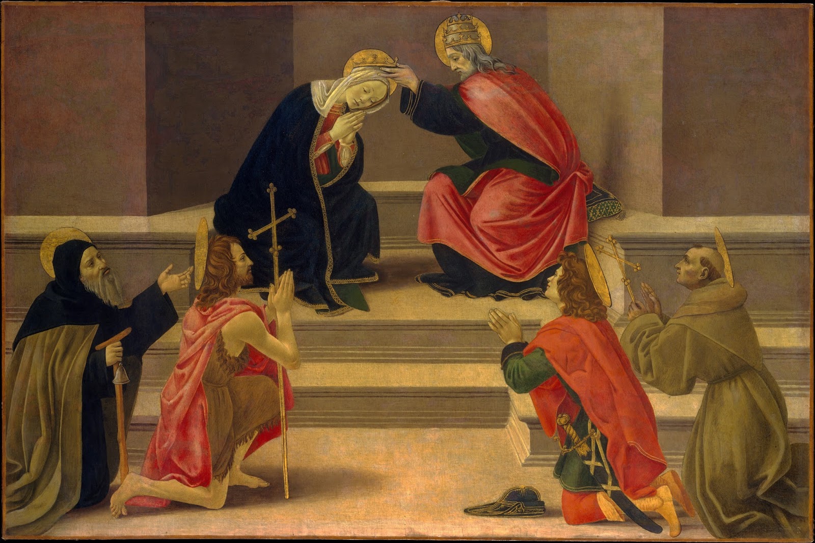
Workshop of Botticelli, Coronation of the Virgin, 1475-1500, owned by Edward Burne-Jones
Above all, they were smitten by Botticelli. Burne-Jones wrote lovingly about ‘a coronation of the Virgin…heaven beginning six inches above our heads as it really does. It was terribly neglected and stuffed up with candles’. In the Accademia, the Pitti Palace and the Uffizi he discovered more delights – ‘the Spring’ and ‘the Dancing Choir’. By the late 1870s, the infatuation with Botticelli was so prevalent among avant-garde British artists, that it was parodied by Punch, and Gilbert and Sullivan. But Burne-Jones was a pioneer in his enthusiasm. The sweetness and otherworldliness of Botticelli’s wistful Madonnas found a new life on his canvases.
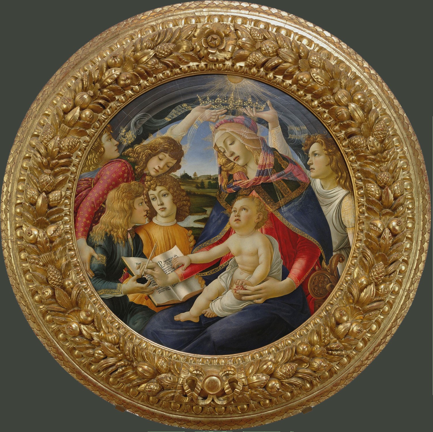
Botticelli, Madonna of the Magnificat, Uffizi, 1481
The impact of this first visit resonated for decades: ‘Oh dear’, he sighed as he finished breakfast in his studio-house in London a while later, ‘when I think that this very morning Florence is going on, and I have to go into that muddle of work upstairs.’ But before he went home, he was able to saunter through Siena, take tea with Elizabeth Barrett Browning, and study the sculpture of Pisano in the Cathedral there.

Siena CathedralI have recently been able to follow in Burne-Jones’s footsteps, leading fellow Victorian art lovers around Tuscany. We revisited the medieval cities that he saw as a young man, and those that he was drawn to as he grew older – Siena, Arezzo, San Gimigniano and of course, Florence. Looking at the early Renaissance through the eyes of 19th century artists and poets, we found our way back to a freshness, a more vivid encounter with well-loved images. The wall-paintings of Gozzoli and Pinturicchio, the altarpieces of Duccio were almost unknown in Victorian Britain. Burne-Jones came home exclaiming, ‘I want big things to do, and vast spaces, and for common people to see them and say Oh! – only Oh!’

Piccolomini Library, decorated by Pinturicchio, 1402-7, Siena CathedralDante’s Divine Comedy was available in English, thanks to Henry Cary, but was still an acquired taste. Burne-Jones’ friend and fellow artist, D G Rossetti did not publish his translation of Dante’s ‘Vita Nuova’ and ‘The Early Italian Poets’ until 1861.

Dante Gabriel Rossetti, Giotto drawing a portrait of Dante, watercolour, 1852, Private Collection
These young Victorians were breaking new ground in their desire to explore and reinvigorate the art of Italy before Raphael. But within a few decades, word had spread, and there were 30,000 English and American residents in Florence, drawn by the climate and the culture.
For my part, as a history student who was enamoured of the Burne-Jones and Rossetti drawings I had seen in the Ashmolean, I came to Florence for the first time in 1989 with my head filled with Pre-Raphaelite drawings of Dante’s Beatrice. The two worlds – the Victorian and the early Renaissance – were intertwined. I saw Botticelli’s heavenly figures, and remembered Burne-Jones’ response to his upbringing in industrial Birmingham: ‘the more materialistic science becomes, the more angels I shall paint.’ These were his prototypes. But it wasn’t just the subjects, but the manner itself that was drawn from the Italian Quattrocento. There was kinship in the delicacy of the swaying figures, the blue of the skies above and the green of their gowns.
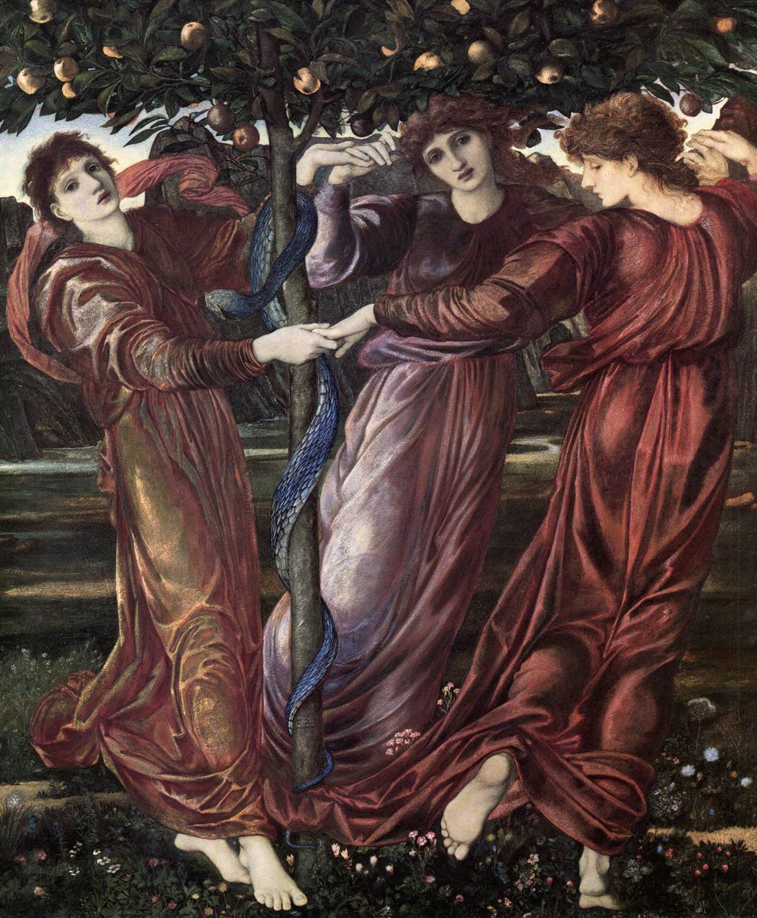
Edward Burne-Jones, The Garden of the Hesperides, 1869-73, Kunsthalle Hamburg
This is a timely tour, giving us a chance to look again at Burne-Jones as we approach another anniversary year, with a major exhibition of his work at Tate Britain in 2018. Without his encounters with the fresco-cycles of Pisa, the refined panel-paintings of Florence, and the solemn church decorations of Arezzo and Siena, his yearnings for the landscape of his imagination would have been unfulfilled. As he wrote to a friend, many years later, ‘I belong to old Florence.’
January 14, 2017
The Flowering of Aestheticism: Lily, Sunflower and Azalea...
The Flowering of Aestheticism: Lily, Sunflower and Azalea
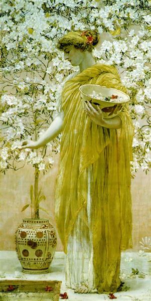
Albert Moore, Azaleas, 1868
Art historians at the University of York are looking ahead enthusiastically to the Albert Moore exhibition, opening at York Art Gallery in April 2017. So, in response to the abundance of flowers in Moore’s work, we have been discussing the theme of floral imagery in Victorian art.
This has given me the perfect opportunity to return to an idea I have been considering for a while. What is the archetypal Aesthetic flower? Does it have to be the lily or sunflower? Or should we be looking more closely instead at the azalea? After all, this flower seems to have its moment in the sun at precisely the same time as the flourishing of the Aesthetic movement in Britain.
The Lily
Some might point to the lily as the most obvious symbol of Victorian Aestheticism. Certainly it becomes one of the attributes of the decadent dandy, the caricatured embodiment of the new movement. In a Punch parody of the Rossettian or Wildean school of poetry, it is linked with that other essential Aesthetic object – the peacock feather:
My love is as fair as the lily flower
(‘The Peacock blue has a sacred sheen’)
Oh bright are the blooms in her maiden bower:
(‘Sing Hey! Sing Ho! For the sweet Sage Green’)
[quoted by Frank Harris, Oscar Wilde, 2007, p.45]
Max Beerbohm, in his imaginative reconstruction of Oscar Wilde’s lecture tour of America, places a lily at the heart of the cartoon. Wilde holds it before him as an emblem of beauty and purity.

Max Beerbohm, The name of Dante Gabriel Rossetti is heard for the first time in the Western states of America, 1882, 1916, ‘Rossetti and his circle’, pubd. 1922
And the lily also took centre-stage in advertising posters for the Gilbert and Sullivan operetta, Patience, which made gentle mockery of the excesses of Aesthetes.

Poster for Patience, c.1890, first staged in 1881
But this flower has a deeper history, one may almost say baggage, which Rossetti and Wilde and their circles would have been unable to shake off. The lily is the flower of the Virgin Mary, and D. G. Rossetti made that explicit in his depictions of Mary early in his career. In The Girlhood of Mary Virgin, 1849, a child-angel tends a Madonna Lily, which has been placed rather precariously on a pile of books.
 Dante Gabriel Rossetti, The Girlhood of Mary Virgin, 1849
For mid-19th century artists and writers, it was also impossible to extricate the lily from more recent associations. John Ruskin’s declaration in The Stones of Venice, (1851-3) that we should
‘Remember that the most beautiful things in the world are the most useless; peacocks and lilies for instance’
had a long afterlife. It became a mantra of modern British art from the 1860s, and one which was very susceptible to satire.
The Sunflower
The sunflower appeared rather later in the Aesthetic canon of beauty, but by the time that Wilde undertook his tour of America in 1882, he and the sunflower seemed almost inseperable. In some cartoons, like Punch’s Fancy Portrait, Wilde wears the sunflower as a kind of ruff, and his body is reduced to a stem.
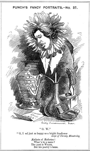
In others, the association is more muted. We see Wilde in his distinctive velvet suit and stockings, with sunflowers poking their heads around his portrait, like coy admirers. But the connection with both the lily and the sunflower is reinforced in the popular song titles that were composed to cash in on his notoriety. These included ‘The Sunflower Polka’, & ‘Dream of the Lily Waltz’.
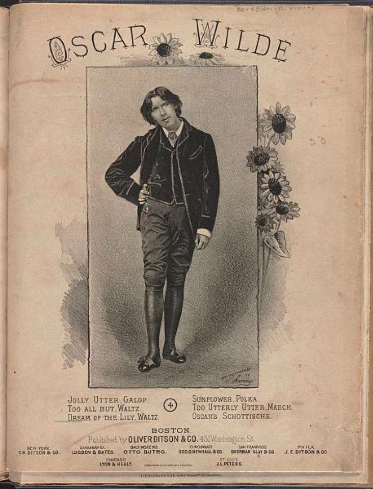
Sheet music celebrating Oscar Wilde’s tour of the USA, 1882-3
So it is clear that these two flowers – the lily and the sunflower – were closely linked with the ideas of Aestheticism in the public imagination. They become part of the vocabulary of extravagance and unstable sexuality that seemed to characterise the movement.
The Azalea
The azalea, on the other hand, was not adopted as a shorthand for ‘Aestheticism’ or ‘Decadence’ by Punch. But that makes it all the more interesting. It was fresh, it had no back-story in art-history, and it was adopted by many key players in the Aesthetic movement as a kind of talisman, or gesture of affinity with avant-garde circles. It seems to be a quiet signal of intent, one that passed under the radar of the popular press. As we shall see, the artists themselves spotted it, and so did the sympathetic critics.
Aestheticism became visible to the art-loving public in the RA’s exhibition of 1868, when experimental works by artists like Watts, Rossetti, Millais and Moore revealed a decisive shift in style and subject – replacing external anecdote and morality with self-sufficient beauty, or as it became known ‘Art for Art’s sake’. This was a movement that was concerned mood and sensory delight, rather than narrative, realism or conventional symbolism.
In their Notes on the Royal Academy Exhibition of 1868, William Michael Rossetti and Algernon Swinburne singled out Azaleas by Albert Moore as an ideal example of the emerging movement in British art. For W M Rossetti, Moore had created ‘a sense of beauty in the disposition of form, and double-distilled refinement in colour’. Even in the manner of writing about this painting, both Rossetti and Swinburne demonstrate the ambiguities and allusivesness that were an essential element in this new style. Rossetti’s roundabout phrases emphasise the inability to pin down Moore’s subject in time or space:
Moore ‘unites with singular subtlety of grace a phase of the evanescent to a phase of the permanent: colour and handling which withdraw themselves from the eye with a suggestion (or as one might say, with a whisper) to statuesque languor or repose of form’. [W. M. Rossetti, Notes on the Royal Academy Exhibition, 1868, part 1, pp.23 & 24]
For W M Rossetti, the choice of Azaleas for this avant-garde work was an essential part of its success. Azaleas were an imported hot-house shrub, found originally in both Asia and North America. Rossetti knew that the flowers would never have been seen in Ancient Greece. And so did the artist, but ‘whether or not they came from America’ is a question of ‘sublime indifference to Mr Moore’. He had picked this plant partly because it is ‘delicate and lovely’. But mostly because it undermined any attempt by the Victorian viewer to read this picture as a study in archaeology. The azalea is deliberately out of place. Moore insists that his audience should leave aside their preconceptions of realism or historical accuracy, and instead consider this work as a construct, made possible in the artist’s studio – a coming-together of ‘delicate and lovely’ things, in a restrained colour-palette.
It is perhaps worth noting that the azalea is not strongly scented. It would be convenient to think that the flowers were included to add another sensory experience to the picture – the suggestion of a heady fragrance that fills the scene. Unfortunately, unlike the lily, this is not the case. It can please the eye and the finger-tips, but it does not smell particularly sweet.
Like Rossetti, the poet and critic Algernon Swinburne also saw this picture as the trigger for his own exposition of the essence of Aestheticism. Azaleas, he suggested, was the perfect example of the new manner of painting, which was more akin to poetry or music, than to history or religion. Swinburne drew attention to this intertwining of the arts, which was a strong thread running through many Aesthetic works, by referring in his review to the avant-garde French poet Théophile Gautier. Both Gautier and Moore are concerned, he writes, with ‘an exclusive worship of things formally beautiful’. [Algernon Swinburne, Notes on the Royal Academy Exhibition, 1868, part 1, p32]
Now Gautier was well known in advanced artistic circles for his synaesthetic writings, which included ‘Symphonie en blanc majeur’ (1st published in Emaux and Camées, 1852) and his works became a touchstone for artists and writers on both side of the Channel. Swinburne was an early fan. He was attuned to looking beyond the surface of a painting and found in Moore’s work an affinity with modern French poetry. However, according to Swinburne, this painting of Azaleas could also be enjoyed as one might enjoy a piece of music. It was intended to stimulate the contemplation of the rhythmic forms of arms and drapery, the harmonious arrangements of pale marble and matting, and the softly falling petals. Swinburne translates this painting into musical terms, suggesting an equivalence between the arts and opening up a space for experimentation:
‘The melody of colour, the symphony of form is complete: one more beautiful thing is achieved one more delight is born into the world; and its meaning is beauty; and its reason for being is to be’. [Algernon Swinburne, Notes on the Royal Academy Exhibition, 1868, part 1, p32]
This is a startling statement. It disengages Moore’s painting from the conventions of morality, anecdote or accuracy. Moore’s Azaleas represents a quiet revolution, a turning-away from Ruskin’s insistence on ‘truth to nature’ and moral truths.
But Moore was not the only artist in the Royal Academy of 1868 to use the azalea as the backdrop to his avant-garde painting. W M Rossetti reads the flowers behind Watt’s Wife of Pygmalion as azaleas too. Again, it would have been impossible for Galatea really to enjoy these ‘delicate and lovely’ blooms. But then, it is also hardly possible that she had been transformed from marble to flesh, so the inclusion of this anachronism reinforces the oddness of the tale. The flowers, with their open petals draw attention also to the curving forms of her hair, the fine pleats of her drapery and her exposed breast. This is a tactile picture that encourages us to imagine tracing all these curves with our fingers – the fragile blooms, the crisping hair, the marble/flesh – will it be warm or cool to the touch?

G F Watts, The Wife of Pygmalion, 1868
Watts was side-stepping the need for historical precision of the sort that was often adopted by Alma-Tadema or Edwin Long. Instead, he created a self-contained image filled with beauty, and abstracted from its classical source.
Azaleas were brought completely up to date in another picture of feminine beauty painted in 1868.
John Everett Millais, Sisters, 1868
John Everett Millais completed a triple portrait of his daughters in that year. The three little girls stand in front of azalea bushes, with the pattern of petals and leaves creating a complex counterpoint to the ruffles of their matching white dresses. The colours of the flowers shade from purest white to rich pink and finally flaming orange-red above the head of Mary on the far left. They seem to suggest the different temperaments of the girls – with Mary placed in profile against the bolder tones, singled out as the unconventional one, the traveller, the independent spirit.
The choice of azaleas to fill the background also raises questions about where these girls are meant to be posed – inside or out? This particular flower is usually found in the in-between space of a conservatory. We cannot see the light source in this painting. The girls in their flimsy frocks are dressed for a party, perhaps, but Carrie holds a small hoop and sticks – suggesting that she would rather be playing outside. Girls and flowers, muslin frills, petals and hair, these may be conventional subjects for a painter to offer his audience. But yet again, the profusion of azaleas creates uncertainties. It opens up the picture for contemplation, rather than closing down our imaginative exploration by being clear-cut. And in each of these Aesthetic pictures, the azaleas are growing. As living plants they defy the usual associations of transience or fading beauty attached to flowers that have been plucked. So they are ideally suited to images of young women, who are still maturing and have not yet faced their own mortality. They may be pot-bound, or confined to a conservatory but they are alive.
Millais was always supremely aware of cutting-edge developments in the art world. Throughout his career he was always able to ride the new waves of style, from the taut, highly-wrought Pre-Raphaelitism of his early years, to the adoption of a more painterly manner in the late 1860s. Like Watts and Whistler, his handling of paint opened out, partly in response to a new appreciation of the 18thcentury British portrait tradition, and partly as a way of offering softer, more suggestive paintings. This change in painting technique was an essential part of the emerging Aesthetic movement – a Venetian love of colour, and a rejection of hard-edged realism.
 James Whistler, Symphony in White no.2: the Little White Girl, 1864
Millais was responding to works by fellow experimental artists like James Whistler in his portrait of his daughters. If Whistler could paint one Little White Girl (1864), Millais could picture three – all with distinct personalities. And if Whistler included a potted azalea in the corner of his painting, Millais would fill Sisterswith exquisitely observed flowers. Always competitive, Millais was prepared to beat Whistler in his creation of an Aesthetic masterpiece.
Whistler used the azalea in his Little White Girl to reinforce the fashionable Japonisme of his interior. The soft pink flowers are juxtaposed with a painted fan, and a piece of imported blue-and-white porcelain on the mantelpiece. Yet this is clearly set in a London drawing room, with the fireplace and looking glass, which reflects another of Whistler’s works hung on the far wall. He was an early adopter of the azalea as a signifier of a new Aesthetic approach – this seems to be one of the first examples of the flower in a British painting. I would interested to hear of others. (Whistler was also a pioneer of the synaesthetic approach to art, exploring the connections between music and painting that were being put forward by Swinburne in his reviews. Whistler’s Little White Girl was retitled A Symphony in White No.2 in 1867, as a response to Gautier’s poem, and as a way of signalling his intention to side-step the expectations of the art-public who expected to be able to read a painting like a novel.)
John Everett Millais, Hearts are Trumps, 1872
The azalea persists as an emblem of Aesthetic engagement to the end of the century. It appears again, for example, in Millais’s scintillating triple portrait of the Armstrong girls, Elizabeth, Diana and Mary, entitled Hearts are Trumps, (1872). Although this has been read as one example of Millais’s ‘selling out’ to conventional taste, to my mind, this portrait is experimental and unconventional. Yes, it seems effortless, but this synthesis of the 18thcentury Grand Manner, with the Orientalist elements of the lacquer screen and the inlaid table, is a glorious example of Aesthetic eclecticism in action. And, beyond this, Millais provides insights into the girls’ characters with a lightness of touch that reinforces the air of naturalism and ease, despite their fancy dress. The azaleas are a tour-de-force of flower painting, again linking the outside – light and air and colour – with the inside, represented by the dark screen that blocks our view on the right-hand side. In this work, Millais seems to be competing with himself. This is painted only four years after Sisters, but it is a supremely confident work, created by an artist who knows how to present the latest Aesthetic ideas to a wider public.
Frederic Leighton, The Garden of the Hesperides, 1892
Like Millais, Frederic Leighton was an adaptable and highly successful painter, who combined Classicism, Aetheticism and sophisticated portrait practice over the course of his career. We catch a final glimpse of the Aesthetic azalea in The Garden of the Hesperides, Leighton’s dreamy, sensual work of 1892. The flower is placed on the lower edge of the picture, and is one of the closest things to the spectator. We can almost reach into the enclosed world of the circular canvas, to touch the leaves – but then we would disturb the white egrets that are sheltering within the plant. The arch of their necks balances the bending head of the serpent, as the azalea balances the golden fruit to the top right, above the reclining girls.
Why does Leighton include an azalea in the no-man’s-land of the myth? Is it a knowing nod to the other artists in his circle? Does the flower represent non-specific exoticism? The azalea cannot be pinned down to a particular location – it could be found in the Himalayas, or Japan, or America, or an English garden-room. It seems deliberately to point to the artificiality of the scene, a place beyond the real world, where the girls are held perpetually in suspense in their painted bubble. It is a scene beyond parody, a self-sufficient idyll. It seems that all the other Aesthetic azaleas have been building up to this point – a space for the arts to come together, where colour and line, music and myth and femininity can be contemplated, where Whistler and Watts and Millais are acknowledged as part of the same project – the creation of a new modern school of British art. Lily, sunflower or azalea? The language of flowers in Victorian painting was far more subtle than we have acknowledged.
June 16, 2016
Historical consultant for BBC1 series 'THE LIVING AND THE DEAD'
The Living and the Dead: BBC1

How did the Victorians lay out their dead? And could they tell how long a corpse had been lying in the woods?
These were the day-to-day questions that were thrown at me by the production team of ‘The Living and the Dead’. The BBC series, starring Colin Morgan and Charlotte Spencer, will be seen for the first time on i-Player (17thJune) and then on BBC1 from 28th June. Described by the writer Ashley Pharoah as ‘Thomas Hardy – with ghosts’, this was a gem of an idea. And I was delighted to become historical consultant for the project.
I was asked to advise on everything from nursery decoration in the 1890s, to Victorian autopsies. Because, although it opens in the glorious meadows of Somerset, these are scary stories, with undercurrents of insanity and the threat of the unknown. The writers wanted to tackle 19thcentury anxieties about the boundaries between superstition and science. And the impact on a young couple, who were thoroughly modern in their outlook about politics, business and the life of the mind.
Since 1837, the Victorians witnessed advances in technology which could have seemed almost magical. The electric telegraph carried words from India to England in a matter of minutes. Sound recordings brought back the voices of the dead. And a fine film of silver on glass capture faces through thin air, and preserved them as photographs. These were wonders. The barriers between the past and the present, the ethereal and the earthly had been transcended. So, what was next? Could science explain ghostly apparitions? Could electricity or radio waves enable us to make contact with the spirit world? These questions were very real for many intellectuals, and worth investigating. The Society for Psychical Research was founded in the 1880s by physicists and philosophers. They carried out serious studies of telepathy and mesmerism. They collected a ‘Census of Hallucinations’. Conan Doyle, creator of the famously logical Sherlock Holmes, was a leading figure in these investigations, writing for the Spiritualist magazine Light throughout the 1890s.
It should not surprise us, then, that Nathan Appleby, the figure at the heart of The Living and the Dead should try to understand the supernatural experiences of his neighbours through a scientific lens. He is a psychologist: a new breed of doctor in a discipline that focussed on the thresholds between the normal and the abnormal. He understands that the workings of the brain, in our conscious and unconscious states, are not yet fully explored. When he encounters a disturbed young woman, it is reasonable for him to want to help her, using his cutting-edge techniques. And yet he becomes increasingly baffled as the series unfolds. Science does not seem to be able to supply the answers, however much he wrestles with the facts.
Alongside Nathan, we have the fascinating character of his wife, Charlotte. The women in this story are just as robust and varied as the men – it is one of the great strengths of the series. Charlotte is an alluring amalgam; a mixture of Bathseba, from Hardy’s Far from the Madding Crowd, and du Maurier’s New Woman. She is a professional photographer. (Cue lots of conversations with the team about Julia Margaret Cameron and Christina Broom.) She is also ready for the challenge of running a new project, bringing in modern machinery to an ancient farm, and seeing the potential of the railway.
 During the course of the series, we see their relationship, tested to its limits by Nathan’s obsessive desire for knowledge at all costs. But let’s not spoil the story!
 So where did my researches take me, as I tried to piece together the very modern world of Nathan and Charlotte, as it came conflict with the older traditions of the farm hands and wise women? I found myself wondering whether a vicar would have a pint in the pub. And what advanced literature his daughter might read. I thought about Charles Voysey and his delightful designs for children.
 And I discovered more than I might like about early forensic medicine. The curator at the Old Operating Theatre Museum sent me some grisly reading about blood flow, body temperature and rigor mortis. So that dealt with the corpse in the wood.
 What about laying out the body? Well, as you will see, the bare bones of information that I supplied were transformed by the directors into a gorgeously lit scene. The camera follows a slow silent ballet around the figure who is being tenderly prepared for burial. This extraordinary piece of choreography shows how the words on the page can take flight, and create a rare magic. We can only imagine what the pioneering photographer Charlotte Appleby would make of it.
March 3, 2016
'Ladybirds, Puffins & Picture Lions : the Art of Children's Books"

World Book Day seems an auspicious time to launch a new lecture -
'Ladybirds, Puffins & Picture Lions : the Art of Children's Books'
From 'Learning with Mother' and 'Paddington Bear' to modern classics by Judith Kerr, Lauren Child & Shirley Hughes, children's books have shaped our understanding of history, art, landscape, even Britishness.
This lecture looks beneath the delightful illustrations, to explore the complex beauties offered to younger readers.
February 18, 2016
Julia Margaret Cameron and 'Hypatia'
1868: The Isle of Wight
 Two women walk across the lawn towards the glasshouse. They do not stop to admire the sea-view. Hurriedly, huskily, one explains her purpose for the morning. Her dark skirts bob over the grass as she side-steps the dishes of chemicals that litter the lawn. Her younger friend follows more cautiously. Her dress is white, cumbersome and criss-crossed with ribbons. She is weighed down by jewellery; an outlandish bracelet winding around one wrist, a web of necklaces at her throat. Her hair is caught up in combs at each temple, and then it flies loose. It is rather a nuisance, tangling in the breeze from the shore, but Marie does not bother to mention it. It would make no difference. When Julia Margaret Cameron is in full flow, she will not be swayed by small inconveniences.
It is the late summer of 1868 and a perfect morning for taking photographs. Marie Spartali is playing the part of Hypatia, mathematician and philosopher of ancient Alexandria. Julia Margaret Cameron is in her working clothes. Her sleeves and skirts are spattered with chemicals. Blotchy blacks and purples mark where nitrate of silver has dripped off the glass negatives and onto her dress. As Julia likes to tell her visitors, ‘I turned my coal-house into my dark room’Marie Spartali is a professional model, and a painter too. She understands the habits of the artist’s studio, the etiquette that usually separates the domestic and professional. But Julia’s way of working is idiosyncratic. The whole Cameron household is caught up in Julia’s enterprise. A girl is waiting by the glasshouse. Julia has trained her staff to work on both sides of the camera. So, in addition to their indoor duties, cleaning, mending and serving at table, Julia’s maids are also her models and her technicians. One of her servants, Mary Ryan, has recently left Julia’s service to marry a young man in the India Office. The Camerons had found her, as a child, begging on Putney Heath. They took her in, taught her to read and write. And to pose. Julia’s close-up photographs of her young maidservants delight in their teenage softness, their dreamy eyes and abundant hair.
Julia Margaret Cameron has created something extraordinary at her home on the Isle of Wight. Not only does she conjure pictures with her stained hands, she shows how women might live – differently and fully. To the girls who come to her – servants, visitors, stray tourists who are swept into the garden to sit before her camera – she is a revelation. Julia is subversive, generous, untidy, wilful. She dresses in flowing red velvet, loves curry and speaks fluent Hindustani. She is often short of cash and always chasing the beautiful.
Mrs Cameron started taking photographs in earnest in the New Year of 1864, when she was 48 years old. Her children were growing up, marrying and leaving home: ‘for the first time in 26 years I am left without a child under my roof’, she explained.Since the earliest days of photography, Julia had been fascinated by this new medium. She was already married and living in India in 1839, when William Fox Talbot and Louis Daguerre both announced that light and shade could be fixed on glass. Through her friendship with the scientist Sir John Herschel, Julia followed each new development. Their correspondence crossed oceans. As she reminded Herschel later, ‘the very first information I ever had of Photography in its Infant Life of Talbotype and Daguerreotype was… in a letter I received from you in Calcutta’.From their letters it is clear that that photography was an unladylike occupation. Still Julia persevered. Her camera and tripod were bulky and awkward. The glass plates which she slid, wet, into the body of the camera were over a foot square. Smearing syrupy collodion onto the glass to create a photosensitive surface was a messy business. Developing the prints required gallons of water: Julia said she needed ‘nine cans of water fresh from the well’ for each photograph.She launched herself into her artistic career with gusto. Her ‘first perfect success’ was a portrait of Annie Philpot. The little girl is unsmiling, sitting in her coat – it was late January – in three-quarter profile. Julia was so delighted that she gave it to Annie’s father immediately. She wrote an excited note explaining how the photograph was ‘taken by me at 1pm Friday Janr. 29th Printed – Toned – fixed and framed all by me’. She began the sitting in the crisp winter sunshine, and finished the print that evening by lamplight. Within two years she had a one-woman exhibition in London at Monsieur Gambart’s French Gallery. 146 prints and glass negatives were on sale for five to ten shillings. She offered a special discount to artists. She threw herself into the quickening art-world of the 1860s, making sure her work was visible to painters and literary men. She sent out parcels of photographs to those she hoped to entice into her studio. She pursued Tennyson until he succumbed, and the reluctant poet was led into the glasshouse. In Julia’s words, the resulting portrait was ‘A column of immortal grandeur – done by my will against his will.’She photographed her famous men nearly life-size. She tousled their hair, illuminated the lumps and bumps of their foreheads, and encouraged them to ‘look at something beyond the Actual into Abstraction’.Even if they behaved themselves, the large scale on which she worked meant that the details in some parts of the photograph were sharper than in others. Julia used this to her advantage. Her portrait heads seemed to emerge from a mist.
Julia Margaret Cameron experimented with the latest technology to create parables, poems and annunciations. She created a light-suffused aura around the beautiful women who sat for her. And she was adamant that no-one should treat her as an amateur. She manipulated, sometimes she got fingermarks on her plates. But she knew what she was doing: ‘What is focus?’ she asked Herschel, ‘and who has the right to say what focus is the legitimate focus?’.So she had set herself the task of making more pictures worthy of a great artist. On this bright autumn morning in 1868, Julia would revive the memory of Hypatia. A scholar in dying days of the Classical world, Hypatia was a potential role-model for Victorian women who sought new ways of expressing themselves. She was brave, clever and pagan. But her story had no happy ending. As a teacher and thinker, she defied the Christian hierarchy and suffered a horrific death. She was stripped, mutilated, martyred on the very steps of the altar by order of the Patriarch of Alexandria. In the words of Edward Gibbons, ‘her quivering limbs were delivered to the flames’.Gibbons’ account of her torture was prurient, verging on the erotic. But Julia Margaret Cameron saw it differently. Her desire was to rescue Hypatia from such voyeurism. She would be shown as a thoughtful woman, a dignified woman, a woman with a voice. In life, Hypatia did not hold her tongue. She refused to marry. She was a scientist. This is what concerned Marie Spartali and Julia as they began to make the photograph – a woman who chose her own path, regardless of risk. And so the maid drew water from the well. They prepared the plates. They set up a head-rest for the long exposure. Marie picked up her fan, gathered her skirts and took her seat before the camera’s Cyclops eye. She sits before us now. Her chin is lifted, and she looks out, and through us, and into the world beyond the frame.
Julia Margaret Cameron, quoted by Brian Hinton, Julia Margaret Cameron 1815-1879: Pioneer Victorian Photographer, Julia Margaret Cameron Trust, 2008, p.5 Julia Margaret Cameron, letter to William Michael Rossetti, 1866, quoted by Colin Ford, p.61 [3]Julia Hay Cameron, quoted by Julia Margaret Cameron, The Annals of My Glass-House, 1874, p.3 Julia Margaret Cameron, letter to Sir John Herschel, 1866, quoted by Colin Ford, p.35 Julia Margaret Cameron, quoted by Colin Ford, p.39 Correspondence between Julia Margaret Cameron and Sir John Herschel, 1864 & 187, quoted by Colin Ford, p.39 Julia Margaret Cameron, quoted by Colin Ford, p.50 Edward Fitzgerald, quoted by Colin Ford, p.46 Julia Margaret Cameron to Sir John Herschel, 31 December 1864, Dante Gabriel Rossetti to Julia Margaret Cameron, January 1866, quoted by Colin Ford, p.70. Over the next decade, Rossetti collected at least 41 photographs by Cameron, including a copy of Hypatia. Edward Gibbon, The History of the Decline and Fall of the Roman Empire, vol. 5, AD 413-415, pubd London: Henry G Bohn, 1854, p.213
February 14, 2016
Paola and Francesca for Valentine's Day
The Living and the Dead: the Victorians and their afterlifea lecture

Paolo and Francesca by Dante Gabriel Rossetti
Watercolour
Tate Britain, 1855
Rossetti's painting of the love affair of Paola and Francesca was drawn from his favourite poet, Dante. In 'Inferno' we read how the pair were doomed to hurtle around Hell for Eternity in each other's arms. Their tale inspired the Pre-Raphaelites to create watercolours, oil paintings and sculptures in their honour. This 'love-beyond-death' theme was a recurring feature of Rossetti's work with his poem 'The Blessed Damozel' evoking the yearning of a dead girl for her living beloved.
My new lecture on 'The Living and the Dead: the Victorians and their afterlife' explores the Victorian obsession with ghosts, mesmerism and Spritualism. It lifts the veil on apparitions and the uncanny in 19th century art. Do contact me for more details : suzannefagencecooper@yahoo.com
October 20, 2014
Effie Gray: Love and Muddle
Writing about women’s lives is always complicated but it is not helped by the way they keep changing their names. Take Effie for example. Where should her biography go on the shelf: under G for Gray, R for Ruskin or M for Millais? And how should my name be indexed: F for Fagence or C for Cooper?
.jpg) Emma Thompson’s new film has finally cut through this confusion by plumping for the title Effie Gray. Effie was a Gray for 19 years before she married John Ruskin, and became Gray again when their marriage was annulled. It also makes it quite clear what audiences should expect. If they hoped to see a movie about Mr and Mrs John Ruskin, then they will be disappointed. This is definitely a marriage seen through one pair of (moist, red-rimmed) eyes.
Emma Thompson’s new film has finally cut through this confusion by plumping for the title Effie Gray. Effie was a Gray for 19 years before she married John Ruskin, and became Gray again when their marriage was annulled. It also makes it quite clear what audiences should expect. If they hoped to see a movie about Mr and Mrs John Ruskin, then they will be disappointed. This is definitely a marriage seen through one pair of (moist, red-rimmed) eyes. Several reviews of the film, which was released on Oct 10th, have complained that Ruskin was not fairly treated. They say that his status as a visionary critic, and decent man, have been underplayed, and instead he we are left with an image of a cold, work-obsessed mummy’s boy. I think this is missing the point. Ruskin was a great writer. He has shaped the way we look at architecture, history, geology, economics, and drawing. But he was unprepared for the intimacy of marriage and found it unbearable. Even his own father admitted that Ruskin was better on paper than face-to-face. So it is difficult to convey on screen the glories of his writing and thinking. But the film-makers do try. They show him as a taste-maker, whose opinions changed the direction of British art. He is seen writing constantly, but also clambering about on scaffolding in Venice. Maybe we should have been shown the electrifying way he could move an audience at his Edinburgh lectures. But writing is a solitary process, and Effie was excluded from this central part of his life. She wanted to help him with his research, copying or drawing for him, but he was reluctant to let her be useful. And so their lack of sympathy hardened.
One of the producers said at an early screening that the film was ‘more hysterical than historical.’ It helps if we embrace this way of seeing it. Of course there are inaccuracies and elisions. The gorgeous figure of Paulizza, Effie’s Austrian admirer in Venice, for example, has been replaced by a dubious Italian Count. Millais looks more like Rossetti, with a hipster beard and luscious lips. (Portraits of Everett show him as a clean-shaven, meticulously dressed middle class fellow who never had to work in a grotty garret.) And the cottage in the Highlands is made to seem much more isolated than it should be. When Effie, Ruskin and Everett travelled to Brig o’Turk in the summer of 1853, they were accompanied by Everett’s brother William, as well as Ruskin’s valet. William stayed in a hotel, just across the lane from the cottage, and other friends dropped in from time to time. But this manipulation of the facts should not detract from the very real tensions in the confined space, which are brought to life on the big screen.
John Everett Millais, A waterfall at Glenfinlas (Effie Ruskin), oil on canvas, 1853This is not a documentary, but a costume drama drawn from cache of letters left by the Ruskins and the Grays. We could quibble about Effie’s insistence on drifting about Venice without bonnet or gloves. To many Victorians that would have been unforgiveable. However, the decision to leave Effie’s hair down – making her look girlish and vulnerable - for much of the film makes a dramatic point. When she decided to leave Ruskin, she smooths her hair and pulls it severely up and off her face. Her changed appearance is a sign of her determination and her ability to take control of her own fate.
The use of Millais’s Ophelia as the poster girl has also caused some tutting among purists. Of course we should not conflate the Ophelia model Lizzie Siddal with Effie Gray. Yet the more you look, the more apposite this image becomes. Not only does it reflect the scene with Effie submerging herself in a bath, it also hints at the troubling issue of mental instability. Ophelia was rejected by the man she loved, and this shattered her peace of mind. Ruskin suggested several times that Effie was unhinged: he claimed she was ‘a maniac in the house’, and said she was suffering from ‘a nervous disease affecting the brain.’ So Effie may not have modelled for Ophelia, but the painting opens up several themes in her story. And it is undeniably beautiful and eye-catching.
Effie Gray was created by the makers of Merchant Ivory films. There is a whiff of Lucy Honeychurch about this new portrayal of a girl transformed by Italy. It is another tale of love and muddle, of misunderstandings.
Effie opens the window of her hotel room, letting the light stream into her little life, just as Lucy did in A Room with a View back in 1985. Effie’s Venice with its tolling bells, colonnaded piazzas, and curious locals is very reminiscent of Lucy’s Florence. Perhaps Mrs. Ruskin’s roses are a nod to Mrs. Honeychurch’s battle with her windswept dahlias. And we can certainly find echoes of Lucy’s fiancé, the uptight, aesthetic Cecil in Greg Wise’s portrayal of Ruskin. Like Cecil, we see Ruskin admiring his beloved as a beautiful object, rather than as a flesh-and-blood woman. Look but don’t touch is the motto of both men. In A Room with a View, we sympathised with Lucy’s experience, her moments of revelation, rather than Cecil’s rejection and despair. And so now we see the failing Ruskin marriage from Effie’s point of view, not her husband’s. As in any marriage, good or bad, there will be two versions of the truth. This new film is very clearly made by Team Effie. The clue is in the title.
Ruskin’s side of the story has been told many times before. If you bought J H Whitehouse’s book, Vindication of Ruskin (1950), you would know what to expect. No doubt the old criticisms will be levelled against Effie again – she was a flirt, ‘too forward for her years’, extravagant, petulant, hysterical. She was undoubtedly difficult to live with at times. She was often unwell, homesick for Scotland and craved society. She was also an unwilling pioneer, pushing for the right to be fulfilled in her marriage – as a mother, as a manager of her own establishment, as a bright woman. Maybe we could have seen a more spirited performance at times, an awareness of Effie’s charisma and erotic capital. But, in the words of one of cinema’s great Odd Couples, ‘Nobody’s perfect!’
Suzanne Fagence Cooper's Blog

- Suzanne Fagence Cooper's profile
- 30 followers
Suzanne Fagence Cooper isn't a Goodreads Author
(yet),
but they
do have a blog,
so here are some recent posts imported from
their feed.

