Michael Gallagher's Blog - Posts Tagged "print-on-demand"
November 2017: Just how easy is it to turn your novels into print?
 I can’t quite believe that I’ve just spent the past four months formatting my five novels for Amazon’s “print-on-demand”…and I still haven’t managed to finish yet. Why so long, you ask? Ah. Therein lies a tale. I downloaded the “easy” template, the 5”x8”, and started pasting in my text, only to discover a couple of kinks in the file that prevented me from doing this easily. No matter. I would format the text myself. Six weeks later I had almost finished all five novels (and made the covers with the downloadable cover templates, which really are a joy to use), when it occurred to me to print out a couple of test pages to see what they would look like. Oh dear. The typeface—11pt Garamond—looked very cramped and small. Nor was there any “leading” (rhymes with wedding), that tiny extra space between lines that allows your eye to travel quickly without losing your place. Back to square one.
You may be wondering why I couldn’t simply “select all” and change the type size to 12pt, then add some leading while I was at it. In fact I could and I did. But I also had to clear all the character spacing I’d put in—which had taken up most of my time—and begin the process over again. Five books. Over a third of a million words in total. Oh yes.
Character spacing, I hear you ask? Anyone who reads ebooks (or poorly formatted paperbacks) will know that you nearly always end up with those four or five words spaced badly across a line every time the first word in the next line is too long to be accommodated. But by decreasing the spacing between the letters, sometimes it can be made to fit. There’s a trade-off, however: gently does it, as the effect can be noticeable. Don’t whatever you do use “scale width”. The results are ghastly.
I also had to make a set of new covers because the books were now longer and fatter, and it’s at this point I learned about a little something called “colour profiles”. Oh, what a learning curve!Computers use an RGB profile (Red, Green, Blue), whereas commercial printing presses require a CMYK one (Cyan, Magenta, Yellow, blacK)—a profile which contains approximately only one third of the colours of RGB. That bright, bright green that practically fluoresces off the page in RGB ends up looking like the dark, dull peel of a lime in CMYK. Not one for surprises, I did the conversion myself (a process that takes a mere couple of clicks in Photoshop—the full version, not Elements; it’s the one thing Elements cannot do), and hey-ho: the dark, dull peel of a lime. At least I could now manipulate it into something a bit more acceptable. Photoshop also allows you to save the file as a “press quality” PDF, which is the kind Kindle asks for (though I suspect they automatically convert those that are not).
The one thing I’ve learned from all this is that every decision is a compromise. I can now see an end in sight (just) and hopefully at some point later this month all my titles will finally appear in print (sigh) without too many surprises or disappointments. To help publicize this, I’ve put together a video. Well, actually there are two videos, identical in every respect except for their soundtracks, and here I would love your help. Which one do I use? Vivaldi or Bach? I’d like to know what you think, especially if you’ve read any of the Octavius Guy books in the past. Only one will replace the previous ones on my website, here at Goodreads, on Amazon’s Author Central, and at Smashwords. But which? The Vivaldi? Or the Bach ?
Happy reading!
Michael
Find me on my website, where you’ll discover regular special offers on all my novels
on Facebook
and @seventh7rainbow


December 2017: Print on demand? Avoid my mistakes, part 2
Print on demand? Man plans, God laughs—so the saying goes, and I imagine the divine one had a good old chuckle about me. I had my PDFs (with the type spaced as best as I could make it); I had my covers made (for the second time). All I had to do was upload them and set the pricing, right? I’d chosen to have colour interiors—not that there’s a lot of colour apart from the small bright red logo of the imprint at the front, a tattered, yellowed recipe book cover in the back matter, and a tastefully-washed out photo of yours truly. Then why bother? Because I was mistakenly under the impression that the printing costs for both were the same. The fixed charge for both full-colour and B&W books is $0.85c, if they’re between 42 and 500 pages. I’d done the math, and figured I could still charge $2.99 per book. So imagine my surprise at my first attempt.
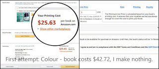
I now know that the printing cost is NOT the fixed charge. The printing cost is a separate issue, and I believe the fixed charge is one of the factors in the 60% royalty calculation. With a printing cost of $25.63, the cheapest a book can sell for (if you peer closely at the tiny writing in the right-hand box) is $42.72, and that’s only if I’m prepared to make no profit whatsoever. Quite how this is computed I have no idea, but figuring that B&W must be cheaper I went back to the drawing board—almost literally, since once again I was obliged to remake the covers with thinner spines (as the paper used in B&W printing is thinner). While I was at it I reformatted those few colour images into B&W in order to get the best results when they’re printed. Different colour images require different kinds of filtering to retain the greatest amount of detail when they’re converted into B&W. With that achieved, I tried again.
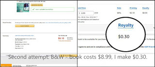
Oh, the sigh of relief when I saw the revised printing costs. This time the book in question—The Bridge of Dead Things—could sell for $8.50…if I was prepared to take nothing for all my efforts. I wasn’t. I priced it at $8.99, and you can see the actual royalty that will come to me with each sale. The majority of the books are somewhat shorter and are priced at $8.50 or less (with each earning me roughly the same profit margin), but I try to console myself with the fact that I have at least brought them in at under $10 a pop (a far cry from the $2.99 I was hoping to charge, however).
I now begin to understand why the template I downloaded was set at 11pt Garamond type and not 12pt. The smaller the font and the absence of any extra leading (rhymes with “wedding”), the fewer the number of pages there’ll be and the lower the printing cost. But 12pt is much easier on the eyes and, as a reader, I know how my heart sinks every time I open a book with small, cramped text. I don’t want that to be the reaction when someone opens one of my novels.
BTW, for those of you who helped me choose between sound tracks for the promo video, the overwhelming winner is…ta da! The Vivaldi. Thank you to everyone who responded and made the decision so much easier. It has now replaced the former videos on my website, on Amazon’s Author Central, at Smashwords, and, fingers crossed, here at Goodreads (I always need the librarians’ help with that).
I don’t know if you’ve noticed the festive season creeping up on us yet, but from the very first “brummm” nothing gets me in the spirit more than this. Wishing you all very happy holidays and a wonderful new year.
Do click! You’re in for a treat. Enjoy!
Happy reading!
Michael
Find me on my website, where you’ll discover regular special offers on all my novels
on Facebook
and @seventh7rainbow
I now know that the printing cost is NOT the fixed charge. The printing cost is a separate issue, and I believe the fixed charge is one of the factors in the 60% royalty calculation. With a printing cost of $25.63, the cheapest a book can sell for (if you peer closely at the tiny writing in the right-hand box) is $42.72, and that’s only if I’m prepared to make no profit whatsoever. Quite how this is computed I have no idea, but figuring that B&W must be cheaper I went back to the drawing board—almost literally, since once again I was obliged to remake the covers with thinner spines (as the paper used in B&W printing is thinner). While I was at it I reformatted those few colour images into B&W in order to get the best results when they’re printed. Different colour images require different kinds of filtering to retain the greatest amount of detail when they’re converted into B&W. With that achieved, I tried again.
Oh, the sigh of relief when I saw the revised printing costs. This time the book in question—The Bridge of Dead Things—could sell for $8.50…if I was prepared to take nothing for all my efforts. I wasn’t. I priced it at $8.99, and you can see the actual royalty that will come to me with each sale. The majority of the books are somewhat shorter and are priced at $8.50 or less (with each earning me roughly the same profit margin), but I try to console myself with the fact that I have at least brought them in at under $10 a pop (a far cry from the $2.99 I was hoping to charge, however).
I now begin to understand why the template I downloaded was set at 11pt Garamond type and not 12pt. The smaller the font and the absence of any extra leading (rhymes with “wedding”), the fewer the number of pages there’ll be and the lower the printing cost. But 12pt is much easier on the eyes and, as a reader, I know how my heart sinks every time I open a book with small, cramped text. I don’t want that to be the reaction when someone opens one of my novels.
BTW, for those of you who helped me choose between sound tracks for the promo video, the overwhelming winner is…ta da! The Vivaldi. Thank you to everyone who responded and made the decision so much easier. It has now replaced the former videos on my website, on Amazon’s Author Central, at Smashwords, and, fingers crossed, here at Goodreads (I always need the librarians’ help with that).
I don’t know if you’ve noticed the festive season creeping up on us yet, but from the very first “brummm” nothing gets me in the spirit more than this. Wishing you all very happy holidays and a wonderful new year.
Do click! You’re in for a treat. Enjoy!
Happy reading!
Michael
Find me on my website, where you’ll discover regular special offers on all my novels
on Facebook
and @seventh7rainbow
August 2019: A guide to formatting for print-on-demand
 There was a time not so many years ago when there were two BIG players on this playing field. CreateSpace and Kindle Direct Publishing. They were not one and the same, as some people believed, though they were both arms of Amazon, and both used identical templates. CreateSpace has now been subsumed by KDP, so I’m not sure whether you can upload to them any longer. Either way, this time preparing your manuscript for publication is all about using downloadable Word templates—and what a bewildering number of templates there are to choose from!
Worry not! Here to help! If your book is a novel then it won’t have a bleed. Stick to the “Trim size without bleed” column. Unless you have a good reason for doing otherwise, choose a standard paperback size. In the UK that’s 5” x 8”. In the US it’s 6” x 9”. Be aware that the template “with sample content” that I downloaded had more than one glitch in it. Fixable, but still annoying. This might be a good place to point out that everything you upload (the completed template—and the cover, if you choose to make your own) needs to be converted into PDFs.
Righty-ho! Time to get down to a bit of cut and paste—front matter, chapters, and back matter. Don’t think about the Table of Contents at all until you have finished everything else. Once you have your text roughly in place, the first decision you will need to make is about the style and size of the font. Choose one that is easy on the eyes. The template I used had 11pt text; I personally wouldn’t go any smaller than that. I opted for 12pt text, which upped the number of pages and the printing costs, and decreased my profit margin in the process…but hey ho! Any internal images used should have been saved at 300dpi (and preferably in B&W, as we shall see later).
All the text done? Now it’s time to make sure the last line on the page of each new chapter is level with that on the next. You may find you have to add a bit of extra space between the chapter heading and the start of the text in order to do this. Great! Now browse through the document. See any badly spaced lines of text, with four or five words hung out to dry because the first word in the next line is too long to be accommodated? By decreasing the spacing between the letters, it can sometimes be made to fit. This is called “character spacing”, and you’ll find it under “format font”; just highlight the text that’s the problem (including the word on the next line) and condense it a tiny bit (bet you anything that vanity publishers don’t do this). There’s a trade-off, however: gently, gently does it, as the effect can be noticeable. Don’t whatever you do use “scale width”. The results are ghastly. As a last resort, you might even consider breaking the odd word with an occasional, well-placed hyphen.
Next decision, and it affects the front matter, the back matter, and the first page of text: what goes on the left and on the right? Grab a few books off the shelf and take a look at how they’re constructed. Typically, important things—like the title page and the first page of actual text—go on the right. You may find yourself adding the occasional blank page to achieve this. Not too many, now, or the conversion will fail. Time to check your pagination is hunky dory, and that your headers, if you are using them, are all correct. By now everything should look perfect. If so, you can finally attend to your Table of Contents.
Next set of questions: B&W or colour for the interior printing? B&W definitely—colour will make the book ridiculously expensive! If you turn your own internal images into B&W yourself, you will have a much greater control of how they end up appearing. You don’t want them to look muddy. And now, what choice of paper? Cream or white? You will need an ISBN, and KDP claims they will provide you with one for free. Only now, when you know exactly how many pages you are dealing with, do you think about your cover—which (phew!) will be in colour. You can create one using KDP’s Cover Creator, or you can download a PDF template (based on your page count and your choice of paper) that shows you where everything has to go.
At this point it might be helpful to talk about something called “colour profiles”. Computers use an RGB profile (Red, Green, Blue) produced by light, whereas commercial printing presses use a CMYK profile (Cyan, Magenta, Yellow, blacK) produced by layering inks over white card or paper. Everything will probably look duller, but especially any bright blues, greens, and reds. CMYK does its best, but it just can’t manage them well. Furthermore, CMYK contains only a third of the colours that RGB does. So, that great florescent green you see on your computer will quite likely print up as a dull, mossy sludge on your cover. Bear this in mind and be prepared for some interesting effects.
So you upload your PDF(s) (the conversion takes forever), and now it’s time to think about pricing. After KDP covers its printing costs (a huge whack), you are meant to receive 60% of what’s left. Quite how they do their accounting is a little unclear, but I do know that if you price your book competitively (say at £6.99), you could end up making as little as £0.25p on each sale. Actually, that’s not quite true. Not each sale. Say somebody orders a book. Amazon then prints two copies and, if the second copy is not ordered immediately, Amazon now sells it on as a second-hand book. The problem? You get no royalties from books that are sold second hand. Hmmm, as Gooseberry would say.
Michael Mills, an author who has gone the self-publishing route, replies:
MM: Hi Michael, I couldn’t agree more and, again, I really wish I had known a lot of these things before embarking on the fascinating, taxing and frustrating journey of publishing my first book. Funnily enough, the bulk of the frustration did not come from the dreaded writer’s block. The most difficult part of the whole process (apart from the editing) was the formatting and uploading to KDP. I had so many problems, most of which stemmed from my assumption that writing the story was by far going to be the hardest part of the journey. I fully expected to sit back, relax and push the “turn my manuscript into a glorious book” button.
MG: Lol! Wouldn’t that be wonderful?
MM: Of course, that was when the scope of what I had to do slowly came into focus. I personally found CreateSpace an easier interface compared to the KDP. I logged into my account not too long ago and was directed to KDP. I sincerely hope they adopt all the things that made it so intuitive. And yet there seemed to be no end to the issues I had trying to upload my custom cover art—mistakes that stemmed from my obvious inexperience at the time. Trust me, I have the test prints to prove it. Knowing the difference between what looks good on a screen and how that will look coming from the printers’ is vitally important if you plan to print your book.
MG: You just hit the nail on the head. If you are lucky enough to have the full Adobe Photoshop, there’s a CMYK button you can click on that shows an approximation of what the colours will look like when printed (it’s not available in Elements, note). In my experience: be prepared to be thoroughly depressed! For those of us who use the free, open source GIMP, that’s not an option. We have to wing it. Just make sure to avoid using bright blues, greens, and reds.
MM: The mistake I made was not making allowances for the spine of the book when designing the cover. This, of course, meant that the title and author’s name was going to be completely misaligned. After a few minutes spent on Photoshop—GIMP works fine too—I was able to manipulate the image using the template gotten from the KDP as a guide. I am happy to say, my persistence paid off in the end. However, the burden would have been infinitely easier to bear had I known what I do now.
MG: Custom covers can be a problem. I’ve never tried using KDP’s Cover Creator, and I hear that it’s a little tricky to use, but I still bet it’s easier than making your own. But I don’t want some generic template-type cover for my books; I want something that reflects the book itself. I’m guessing that you do too. Authors who go the traditional route may or may not be consulted about what they would like their cover to reflect, but they generally don’t get any choice in the matter. I wonder if we self-publish because we like to micro-manage everything?
MM: I hadn’t really given it much thought until now but, I think you are right. When I started having all those issues with my custom cover, at one point I entertained the idea of using one of the generic ones. Although many were very nice and appealing, I just couldn’t get over the niggling feeling of wanting it to reflect my exact vision of it. That sounds a lot like micro-managing to me. I felt like I was settling for a “that’ll do” just to be done with it. There is definitely nothing wrong with any of their templates. In fact, I am not ruling out the possibility of using it in the future but, for now, it’s definitely the custom way for me. I especially want to put my newly learnt skills and knowledge to good use.
MG: Hard won skills acquired through trial and error will always be of use, I reckon, even if the technology changes. It teaches you what to expect. Next month we’ll be covering ways to promote a new book. Oh. And taxes…because by now you will be wondering how to get round that damned statutory withholding rate. See you then?
Next month we’ll be covering ways to promote your new book. Oh. And taxes…because by now you will be wondering how to get round that damned statutory withholding rate. See you then?
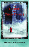 This month’s special offer is for The Bridge of Dead Things. Murky Victorian London. Lizzie Blaylock is about to discover an unusual talent…one that the people around her are keen to exploit. Offer ends on August 31st 2019. You’ll find links and details on my website.
“I read most of the book in one night simply because I couldn't put it down and when I finally did it was five a.m. Wonderfully haunting and exciting it receives five stars from me...”—Brittney L. Divine author, Smashwords Reviewer (5 stars)
Happy reading!
Michael
Follow me on Twitter @seventh7rainbow
find me on my website Michael Gallagher Writes
and on Facebook
and visit Murder Most Cozy for a round up of the coziest Crimes & Thrillers reviews