L.W. Patricks's Blog, page 5
October 13, 2012
Elements of A Good Young Adult (YA) Fiction Character: Studying Katniss Everdeen, Harry Potter, and Ender Wiggin
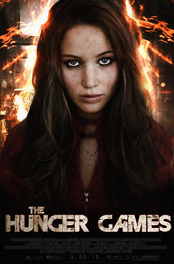 Katniss Everdeen (The Hunger Games, pictured left), Harry Potter, Ender Wiggin (Ender’s Game): Three of my favorite characters in YA fiction. Why is it that I like these characters so much? Are there common elements that these three share that make themselves so extraordinary in my (and I’m sure many of your) mind(s)?
The answer is yes. After analyzing these books, and more specifically, these characters, I’ve noticed five key elements that run parallel through all three stories, and here they are:
The parents are gone:
This is the most immediate element that is present in all three books. Harry Potter’s parents died when he was just a baby, killed by the book’s main antagonist, Voldemort. In Hunger Games, Katniss loses her father at an early age and separated from her mother when she’s chosen to fight in the Hunger Games. Ender is taken away from his family and sent to Space School in order to begin his training as a soldier. No parental guidance means a faster growth for these characters.
The problems are caused by adults
Sometimes, adults suck. They represent authority that young adults want to rebel against. In the case of our three characters, the main problems they face all stem from the actions of an adult. Harry Potter is hunted down by Voldemort, Katniss is thrown into the Hunger Games created by Emperor Snow, and Ender Wiggin is part of a psychological experiment created by adults who run Battle School. Adults makes things difficult for our characters, which in turn make for better stories.
The main character solves his/her own problems:
Every character has problems, it’s what makes their stories so interesting. How they solve it is crucial to the books and the character’s development. Harry ultimately finds a way to defeat Voldemort, Katniss devises a way to allow Peeta and herself to leave the Hunger Games alive, and Ender leads a group into battle to destroy the Alien Buggers once and for all. These characters are the anchor for their respective books and if anyone else but them solved their own problems, the ending would be anti-climatic.
These characters are realistic:
As readers, we want to believe the plausible. We want to sympathize with our main character and know that every action they make leads to consequences and how they react to these consequences is believable and real. Harry’s grief when he loses someone close to him, Katniss sacrificing herself to protect her sister, and Ender feeling the pressures of being a young leader; these are all reactions that you or I would have if we were tossed into the same predicament.
The characters grow:
From the beginning of the story up until the end, these three characters’ experiences allows them to grow into a different person. None of them end up being the same individual they once were. How can they possibly be the same after what they’ve each gone through?
Conclusion:
Well there you have it, the five elements of the YA character that make the most beloved ones so successful. These characters are on their own, separated from the watchful eye of a parent, and pitted against another adult who wants to control them with their authority. At the end of their journey, these characters succeed in solving their problems on their own through a series of their own actions and how they react to these actions is believable and realistic. At the end of their stories, each one of these characters have changed. How they were on the first page is much different than how they are on the last.
-L.W.
Filed under: Insight, Writing Tips, YA Fiction


October 10, 2012
I love being Published – Fantasy flash fiction
 It’s always a great feeling when one of your works is published by someone other than yourself. It means that someone out there really enjoys your work!
With that said, please check out my latest publication over at Fiction and Verse (a wonderful new website with all sorts of fantastic short stories). You can link to my story ‘Beyond the Light’ HERE.
Cheers everyone, and keep on reading!
- L.W.
Filed under: Publications


October 8, 2012
Examining Young Adult (YA) Fiction Book Covers – Urban Fantasy, Horror, Science Fiction Pt 3
We took the time to take a look at the top 10 YA book covers of 2011, according to goodreads, over the past 2 posts. Click HERE for pt. 1 and THERE for pt. 2.
Let’s take a look at the results shall we?
Focus:
80% of the covers had a beautiful woman as one of the main focuses.
20% of them had a woman’s arms or hands.
20% had another male with them on the cover.
Of the 8 covers that did have a characters fully shown, 75% of them were caucasian while the other 25% were unknown.
Of the 8 covers that have characters fully shown, 50% of them acknowledge the reader in some way.
Of the 8 covers that have characters fully shown, 37.5% of them have red hair, 37.5 % of them have black hair, and 25% is undetermined. (Interesting, no blondes).
Colours:
30% had the predominant colours of black, white, and grey.
30% had blue shades.
20% had colours associated with fire.
Aside from the colours on the subject matter itself, 100% focused on only 3 primary colours.
Background:
30% had clouds
20% of the covers had a fire theme.
20% of the covers had a black background (both the images of just hands).
20% involve a cliff
50% had a background associated with the title of their book.
Typography:
80 % are simple texts with some form of embellishment on them
80 % of the letters are in solid white
10% have a tint of color with a white base
10 % orange
Conclusion:
After analyzing the tope 10 covers from goodreads, what can we conclude?
There is almost always a caucasian female model present in the cover.
Most of the covers have only 3 primary colours used (excluding gradients and different shades of those colours).
Half the time, there is an association between the background and the title of the book.
The typography is almost always white in a simple font with some type of embellishment
Now keep in mind, the sample size I took is awfully small and these are covers ranked by the opinion of goodreads only. Whether there is a correlation between book covers and sales is an entirely different story altogether. However if you just want a general idea for your self-published book cover, then the 4 items listed in the conclusion would be a pretty good starting point.
Perhaps I’ll get my partner in crime (a.k.a. the Artist) to try her hand at designing one for me, with this knowledge.
Cheers everyone, and if you like this post, well….LIKE this post and spread it around like hummus.
L.W.
Filed under: YA Fiction


October 6, 2012
Examining Young Adult (YA) Fiction Book Covers – Urban Fantasy, Horror, Science Fiction Pt 2
Welcome to part 2 of my examination of young adult fiction book covers. You can check out part 1 of this post HERE. Without further ado, let’s get into it.
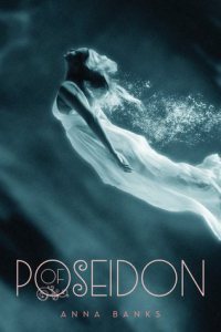
Focus: Girl in white dress swimming in ocean.
Colours: White and and grayish-blue tint for water.
Typography: Simple white with embellishment on the ‘O’ and some curves on the ‘S.’
Background: Dark waters
Summary: A girl in white swimming upwards, with no presence of the reader. The typography is clean and white with a bit of embellishment on the ‘O’ and ‘S.’
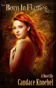
Focus: Beautiful fiery red head staring at the reader.
Colours: Bright reds and orange, clearly accenting the ‘fire’ theme.
Typography: Fancy typography that fits the ‘fire’ theme. It looks to be white with very light shades of orange.
Background: A phoenix and flames.
Summary: A beautiful girl with red hair staring at the reader while a phoenix and fire fills the background. The typography is fancy and has bits of colours to it.
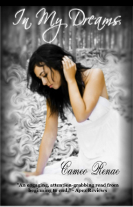
Focus: Beautiful girl lin white staring at the ground.
Colours: White with shades of grey.
Typography: Handwritten text in white.
Background: A forest with wispy clouds floating around on the ground.
Summary: A predominantly white background with a beautiful girl in white dress searching the ground in a forest. The typography is a handwritten white.
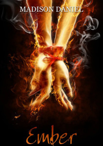
Focus: Two hands, one male and one female, tied together and look to be covered in fire.
Colours: Black, red, and orange.
Typography: Fancy theme, like pen writing, with a red and orange gradient.
Background: Black
Summary: Two hands bound together on fire against a black backdrop. The typography looks like pen writing and has a red and orange gradient.
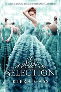
Focus: A young woman in a giant dress staring at the reader.
Colours: Light blues and white.
Typography: Fancy white text that is decorated with a crown atop of it.
Background: Mirrors with the main subjects reflection.
Summary: A young woman decked out in a puffy dress stares at the reader while her image is reflected in mirrors. The typography is a fancy white with a crown to top it off.
That’s it folks, tune in where I’ll summarize what I’ve discovered from this little exploration.
Cheers,
Filed under: YA Fiction


October 5, 2012
Examining Young Adult (YA) Fiction Book Covers – Urban Fantasy, Horror, Science Fiction Pt. 1
They always say ‘never judge a book by its cover.’ But guess what? Sometimes you need a great cover to sell your book, especially if you’re going through the self publishing route.
I thought I’d pick the top 10 book covers of 2012 according to goodreads and, over the course of 3 posts, dissect them and figure out if there are any noticeable patterns. Let’s get started.
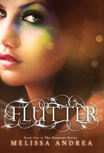 Focus: Beautiful girl looking ambivalent
Colours: Bright and glittery
Typography: Simple text with embellishment in white.
Background: None
Summary: A simple headshot of a girl in her teen with interesting makeup looking impassively at the reader. The typography is clean with background embellishment.
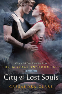
Focus: Handsome man and beautiful girl in a romantic embrace.
Colours: Dark colours with the exception of the main girl, who steals the cover with crimson outfit and hair.
Typography: Gothic with a bit of bleeding on some edges. White colour.
Background: Dark clouds and a bridge. The two subjects superimposed atop, almost god-like.
Summary: A beautiful couple cast against a gothic background with a typography to match.
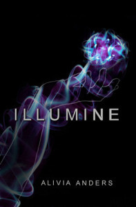
Focus: What looks to be female hands.
Colours: Dark purple contrasted with a light blue. Dark tones overall.
Typography: Clear and simple bold font in white.
Background: Black
Summary: Simple cover with hands manipulating good contrasting colours creating a magic effect. The typography is bold, prevalent, and white.
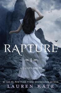
Focus: A woman in an elegant white dress and jet black hair . Has her back turned to the reader.
Colours: Dark greys, white, and black prevalent.
Typography: Fancy typography with a bit of a gothic style. It’s white.
Background: Looks to be a cliffside.
Summary: An image of a young? woman walking away from the reader, headed into an area beyond the cliffs. A lot of mystery to this cover. The typography is a white angelic/gothic twist.
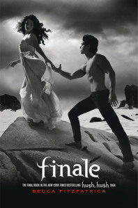
Focus: A beautiful woman in a white dress walking away from a bare chested teenage romeo. No attention paid to the reader.
Colours: Black, white, and grey.
Typography: All in lower case and a fancy calligraphy with flares at the ends of the letters. White colour.
Background: Looks to be cliffside, with crashing waves against the rocks.
Summary: A beautiful couple interacting without any reader focus. Simple black and white colours and a bold, white, lower-case typography that is stylized with flares.
That’s it for today. Tune in for 5 more book covers!
-L.W.
Filed under: YA Fiction


