Elspeth C. Young's Blog, page 9
May 1, 2012
Al Young Studios Art in New Publications

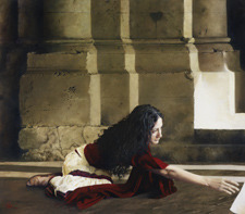
Elspeth's painting of Mary Magdalene (As It Began To Dawn) is the inside front cover of this months' Ensign magazine. Also featured in the issue (p. 144) is her painting of the Book of Mormon prophet, Jacob, currently on display at the Museum of Church History and Art.
 Al's I Shall Be Whole (below) appears in Christ's Gifts To Women by Heather B. Moore and Angela Eschler, recently published by Covenant Communications. And several of Elspeth's artworks, such as the portrait above, appear as cover and interior illustrations for Camille Fronk Olson's newest gift book, Mary, the Mother of Jesus. published by Deseret Book.


April 20, 2012
What am I looking at?

High Valley
by Al R. Young, 2005
By Al R. Young
Several years ago, a good friend visited the studio and gallery. At one point during our visit, we stood a while in the loft above the studio. Four large tonal landscape paintings, after the style of the Hudson River School, filled three of the walls like picture windows.
My guest looked from painting to painting, and, whether moved by the sheer size of the artworks or influenced by something in the treatment of the subject matter, exclaimed with evident anxiety: “I wish I knew what I was looking at!”
Like so many artists, I thought, but did not say: "I wish you did, too!"
For the first 40 years or so of my journey as an artist, I worked primarily in pencil and spent a few years on lithographs. Looking back, I have come to understand that the monochrome decades simplified the task of learning how to visually tell a story--reducing complexity much like the creation of a grisaille. The result was a well honed approach to
the way I compose an image.
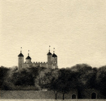
The Tower of London by Al R. Young, 1986
Each medium in which I have worked has been used to refine
various skills in a stair-step progression to oils. From pencil drawings to lithography and then to oils, the thread of that striving is evident. Consequently, I
doubt that my paintings can be fully understood or
appreciated without consulting the pencil drawings and lithographs that preceded them. And while various skills were being developed during those years, I did the same thing a writer does, who lives a while before discovering his own voice, and then goes on to discover what he is supposed to say with it.
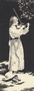
In the Clearing
by Al R. Young, 1998
In the years since I did the paintings my friend and I looked at as we stood above the studio, I moved on to different subjects, a different palette, a different approach to light, and a different regimen of technique. But the need to help people see what they're looking at remains unchanged. To that end, the following may be helpful, at least in terms of the religious art on which so much of my work now focuses.
In each painting, I strive to create an image that helps viewers liken the scriptures to their own lives. Consequently, re-creating scriptural incidents or something like a photograph of scriptural characters is not the objective. Instead, I work to create intensely personal, visual metaphors to scriptural themes, whereby viewers can empathize with a character and bring the resulting insight and encouragement to bear upon the circumstances and choices of their own lives.
To the best of my ability, every aspect of my religious artwork focuses on this overriding purpose. This requires a reconciling or balancing of contemporary and ever-changing ideas (about such things as "accuracy" and "authenticity," for example) with the greater need to touch the hearts and minds of viewers.
The aim is to actually transcend barriers of culture, time, and place; not to re-create them. Consequently, such considerations as the focus of the composition; the number of figures included; lighting; size and dimensions of the work; costuming, material culture, and other aspects of “historical re-creation;” etc., all serve the greater aim of making it possible for viewers to liken the scriptures to self.
Research plays an important part in creating every artwork; nevertheless, I am reminded of something Arnold Friberg once said: Research is only a tool and a servant of truth. It is an aberration of our time that this magic word research
has been inflated out of proportion until it is mistaken for the thing itself. No amount of provable historical fact can ever bring forth a work of art that will move and strike fire into the hearts of men. -- "The Prayer at Valley Forge," Arnold Friberg. Ensign Magazine vol. 3 no. 2 (Salt Lake City: The Church of Jesus Christ of Latter-day Saints, February 1973), center fold (insert)
I Shall Be Whole by Al R. Young, 2009


April 19, 2012
Online artist interviews featured with exhibit
Recorded interviews with Al, Ashton, and Elspeth are now part of the online venue for the Ninth International Art Competition sponsored by The Church of Jesus Christ of Latter-day Saints.
Recorded last February, each interview accompanies the artists' paintings on display at the
Recorded last February, each interview accompanies the artists' paintings on display at the
April 18, 2012
On the 6th anniversary of the Manti Project
By Al R. Young
Today is the 6th anniversary of the beginning of the Manti Project, from which derives the original artworks in the Book of Mormon Collection.
During the six years we have worked on the project, one of the more interesting puzzles we've faced was what to use for text on the Title of Liberty. This anniversary blog post features The Manti Character SetTM (a byproduct of our work on the Manti Project).
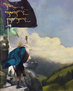
The Title Of Liberty by Al R. Young
This painting, instead of focusing on the creation of the Title of Liberty, focuses instead on its proliferation as the standard raised throughout lands belonging to the Nephites (Alma 46:36).
Assuming a highly refined material culture for the Nephites, my approach to designing not only the writing, but the banner itself, assumed that there would have been a great difference in the rendering of the Title's text between what Moroni wrote upon his torn coat, and the banner that might have been created subsequently to fly over all the towers and fortifications in the land.
Work on a script for such a flag began in early 2007, and because the Anthon Manuscript is the only extant attempt to authoritatively produce a facsimile of Nephite writing, I started by examining the characters it contains.
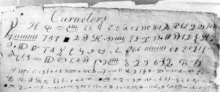
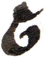
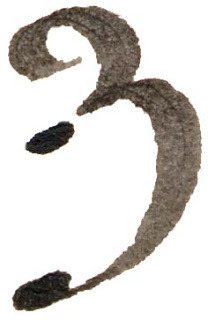
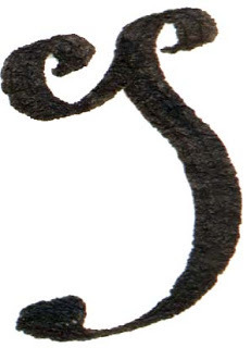
Fig. 1
In addition to preparing to paint the title of liberty, I knew that a character set would be useful, in terms of the Manti Project as a whole, because it could figure in the hypothetical material cultures to be represented throughout the series paintings.
With these objectives in mind, I began by doodling purposefully on page after page of drawing paper, experimenting with ways of not only writing but modifying the style of first one character and then another. About 20 pages were produced in this manner.
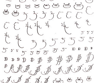
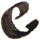
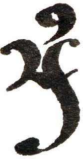
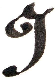
Fig. 2
The next step was to assign phonemes to selected characters. This was done randomly (i.e., the Anthon Manuscript was used only as a starting point for character-shape possibilities). Assignment of sounds to individual characters was done without any consideration for character frequency or possible significance in the Anthon Manuscript.
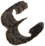
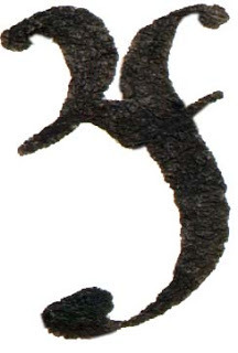
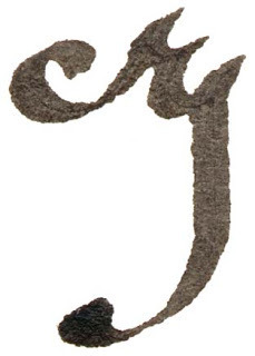
Then, with sounds assigned to an initial character set, the next step was to experiment with whether the whimsical characters could be made to work together aesthetically in the rough-and-tumble of actual transcriptions of speech. The following illustrates an early result.

Fig. 3
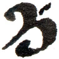
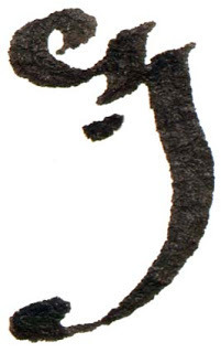
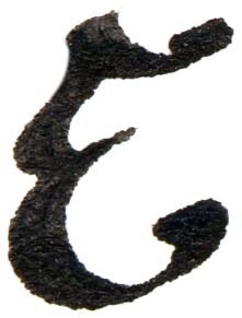
Because the earliest versions of these whimsical characters had been created with only a fine-nibbed pen, I then experimented with a broader pen nib.
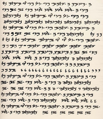
Fig. 4
Somewhere along the way I decided to give The Manti Character Set a life of its own by creating different styles of the characters that could be used to suggest changes in Nephite writing over the many centuries of Nephite history.
The characters that appear on the foreground flag in The Title Of Liberty are a phonetic rendering of the word "memory. " The flag in the background contains the complete text of the title as presented in Alma 46:12.
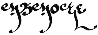
Fig. 5
Part
of giving The Manti Character Set a life of its own involved naming not
only the various character styles that might emerge, but naming the
characters themselves. And since all of this was being done
chiefly for fun, some of the character names were taken from the text
of the Book of Mormon; other names were simply invented. The following
chart presents the basic set of characters with the character in the
first column, followed by the sound assigned to it, the name invented for the character, and the character's number with the Set.
The character style presented here is the Limhi Hand.
CharacterSoundNameNumber

A as in ateAbish10
a as in father or ofOnti8
aa as in atAntionum14
E as in seeEmer62
e as in in or everyEzrom36
Y as in IIsaihah38
O as in goOnidah22
U as in eulogyCumeni4
oo as in lookUbaloth46
u as in upUmnon39

ch as in childrenChemish56
sh as in wishSherrizah34
d as in dayDeseret53
f as in flower and graphNefrah24
t as in tempestTemnon9
th as in the and withEthem51

g as in goodGimno37
h as in how and whoHemlon17
g as in George and JohnJotham21
k as in can and kernelCurlon20
b as in beautifulBasha7
l as in laughLimni54
m as in motherManti29
n as in NancyNephi15
p as in peacePahonti40
r as in runRipla19
s as in see and centSebus31
v as in victoryAmnon1
w as in we and fewMorian50
z as in zenithZeriff26
To date, the following character styles
(or hands) are in various stages of development: Mosiah, Alma, Alma
the Younger, and Shelem Runic.
At the Going Down of the Sun is currently the only other painting in The Book of Mormon Collection that features text rendered in The Manti Character Set.

At The Going Down Of The Sun by Al R. Young
The embossed text appearing in the painting just above the tsuba (or cut guard, which protects the hands from sliding onto the blade), is also a rendering of the word "memory" done in the Alma the Younger HandTM :

The Manti Character Set as well as Alma the Younger Hand are trademarks of Al Young Studios.
Character styles are copyrighted by Al R. Young;however, they may be used for personal, non-profit purposes.
All other uses are strictly prohibited without prior written permission from the copyright holder.


Today is the 6th anniversary of the beginning of the Manti Project, from which derives the original artworks in the Book of Mormon Collection.
During the six years we have worked on the project, one of the more interesting puzzles we've faced was what to use for text on the Title of Liberty. This anniversary blog post features The Manti Character SetTM (a byproduct of our work on the Manti Project).
The Title Of Liberty by Al R. Young
This painting, instead of focusing on the creation of the Title of Liberty, focuses instead on its proliferation as the standard raised throughout lands belonging to the Nephites (Alma 46:36).
Assuming a highly refined material culture for the Nephites, my approach to designing not only the writing, but the banner itself, assumed that there would have been a great difference in the rendering of the Title's text between what Moroni wrote upon his torn coat, and the banner that might have been created subsequently to fly over all the towers and fortifications in the land.
Work on a script for such a flag began in early 2007, and because the Anthon Manuscript is the only extant attempt to authoritatively produce a facsimile of Nephite writing, I started by examining the characters it contains.
Fig. 1
In addition to preparing to paint the title of liberty, I knew that a character set would be useful, in terms of the Manti Project as a whole, because it could figure in the hypothetical material cultures to be represented throughout the series paintings.
With these objectives in mind, I began by doodling purposefully on page after page of drawing paper, experimenting with ways of not only writing but modifying the style of first one character and then another. About 20 pages were produced in this manner.

Fig. 2
The next step was to assign phonemes to selected characters. This was done randomly (i.e., the Anthon Manuscript was used only as a starting point for character-shape possibilities). Assignment of sounds to individual characters was done without any consideration for character frequency or possible significance in the Anthon Manuscript.
Then, with sounds assigned to an initial character set, the next step was to experiment with whether the whimsical characters could be made to work together aesthetically in the rough-and-tumble of actual transcriptions of speech. The following illustrates an early result.

Fig. 3
Because the earliest versions of these whimsical characters had been created with only a fine-nibbed pen, I then experimented with a broader pen nib.

Fig. 4
Somewhere along the way I decided to give The Manti Character Set a life of its own by creating different styles of the characters that could be used to suggest changes in Nephite writing over the many centuries of Nephite history.
The characters that appear on the foreground flag in The Title Of Liberty are a phonetic rendering of the word "memory. " The flag in the background contains the complete text of the title as presented in Alma 46:12.

Fig. 5
Part
of giving The Manti Character Set a life of its own involved naming not
only the various character styles that might emerge, but naming the
characters themselves. And since all of this was being done
chiefly for fun, some of the character names were taken from the text
of the Book of Mormon; other names were simply invented. The following
chart presents the basic set of characters with the character in the
first column, followed by the sound assigned to it, the name invented for the character, and the character's number with the Set.
The character style presented here is the Limhi Hand.
CharacterSoundNameNumber
A as in ateAbish10

a as in father or ofOnti8

aa as in atAntionum14

E as in seeEmer62

e as in in or everyEzrom36

Y as in IIsaihah38

O as in goOnidah22

U as in eulogyCumeni4
oo as in lookUbaloth46

u as in upUmnon39

ch as in childrenChemish56

sh as in wishSherrizah34

d as in dayDeseret53

f as in flower and graphNefrah24

t as in tempestTemnon9

th as in the and withEthem51
g as in goodGimno37

h as in how and whoHemlon17

g as in George and JohnJotham21

k as in can and kernelCurlon20

b as in beautifulBasha7

l as in laughLimni54

m as in motherManti29

n as in NancyNephi15

p as in peacePahonti40

r as in runRipla19

s as in see and centSebus31

v as in victoryAmnon1

w as in we and fewMorian50

z as in zenithZeriff26
To date, the following character styles
(or hands) are in various stages of development: Mosiah, Alma, Alma
the Younger, and Shelem Runic.
At the Going Down of the Sun is currently the only other painting in The Book of Mormon Collection that features text rendered in The Manti Character Set.
At The Going Down Of The Sun by Al R. Young
The embossed text appearing in the painting just above the tsuba (or cut guard, which protects the hands from sliding onto the blade), is also a rendering of the word "memory" done in the Alma the Younger HandTM :

The Manti Character Set as well as Alma the Younger Hand are trademarks of Al Young Studios.
Character styles are copyrighted by Al R. Young;however, they may be used for personal, non-profit purposes.
All other uses are strictly prohibited without prior written permission from the copyright holder.
April 13, 2012
Inspirations: Time is . . .

Haven, by Al R. Young
By Al R. Young
I don't remember when I first heard the axiom: Time is money. The succinctness of the dictum asserts its own truth as though it were left over from the sunrise of creation, when simple sentences framed the making of the world.
It comes, instead, from the pen of Benjamin Franklin, and is part of a 1748 letter entitled Advice to a Young Tradesman. The letter is signed with no more assertion than that of "An Old Tradesman," and this is the short paragraph to which the statement belongs:
Remember, that time is money.
He that can earn ten shillings a day by his labor, and goes abroad, or
sits idle, one half of that day, though he spends but six pence during
his diversion or idleness, ought not to reckon that the only expense; he
has really spent, or rather thrown away, five shillings besides.
The rest of the letter is not without useful advice, nor does it want helpful intent, but what a dreadful, deadly penury of reasoning! To be fair, Franklin is talking to a tradesman and money is his theme. When he comes to the summation of his advice, he begins: In short, the way to wealth, if you desire it . . .
When time was made, as part of the making of the world, it was done by faith; that is, by means of believing, which is the genesis of all action. Time is for believing. Perhaps that is why I like these words from the English poet Phillip James Bailey (1816-1902):
We live in deeds, not years; in thoughts, not breaths;
In feelings, not in figures on a dial.
We should count time by heart-throbs. He most lives
Who thinks most, feels the noblest, acts the best.


April 6, 2012
The $10 easel
By Al R. Young
The $10 Easel in the studio has served well as the workhorse for painting projects since Ashton and I built it in September 2006. And, like most of our do-it-yourself pieces of studio equipment, we keep modifying or adding accessories as projects require. This blog post talks only about the easel's basic construction. Future posts describe the add-ons.
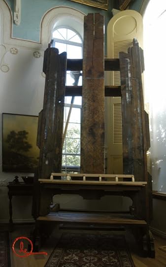
Photograph A - Front view of the easel in the northeast corner of the studio
In the early fall of 2006, we ripped up the carpet, padding, and tack-strip in the studio, kitchen, and pantry. With dislocated furniture and forlorn kitchenware piled throughout the rest of the main floor as though we enjoyed living inside a garage sale, we took a belt sander to the exposed subfloor and spread a frosting of dust over the spectacle. (There are times when do-it-yourself doesn't look like it's going to have a happy ending; that it may not, in fact, ever end.)
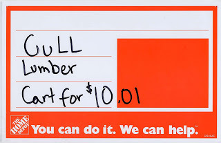
Against this what-have-we-done-to-ourselves backdrop, we went to Home Depot to purchase several 1x6s to finish the edging along a storage area under the shelves in the pantry -- a harmless enough purchase, but we saw this sign taped to a lumber cart at Home Depot (a cart absolutely groaning under a load of warped 2x12s, 2x10s, 2x4s, and assorted board-things too numerous, and too hopeless of use, to name).
As we pushed the cart to the check-out stand and then attempted to load it into our car (not, mind you, into an SUV, or a pickup, or a wire-cage utility trailer), I made note of the expressions on the faces of the people we passed: I've seen spectators less awestruck along parade routes where they had camped overnight just for the privilege of watching.
Then, after arriving home, we faced the challenge of where to store the forest of cast-off trees, so we could still stand in and move about the shop while trying to build a mammoth easel in it. And, of course, the task of building the easel--like our other building projects--would not be a matter of meticulous forethought and measured drawings; but more like trying to conduct an avalanche while standing at the bottom of the mountain.
My objectives in building another easel were to accommodate large-scale paintings (particularly vertical works), take maximum advantage of studio light, and ensure stability for work with heavy panels.
The following diagrams summarize the easel's construction. Great care must be taken to ensure that the weight of the easel is appropriately centered above its base. My technique for painting skies and applying glazes often become quite vigorous. Having a stable easel for any size of painting, but for a large painting especially, is very important, particularly because I dislike painting on any surface that "moves" in response to brushwork.
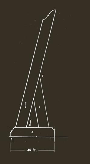
Fig. 1
The base of the easel (a) is a 1x10, b is a 1x12, and c is a 1x10. Both uprights (b and c)
extend all the way to the floor, and are sandwiched between two 1x10s,
each pair of which serves as a runner. Photographs below provide
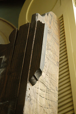
details about configuration and joinery. At e, the "toe" of each upright is set back from the front of the runner a distance of 3 in. The angle at d is 76 degrees.
The profile cut into the front of each 1x10 runner (at the base of the easel, at left in Fig. 1) is designed to preclude toe-stumping while working on paintings. The height of the easel is shown in Fig. 2. The profile of the vertical side is simply ornamental.
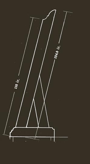
Fig. 2
The following photograph shows the construction of the runners at the base of each upright. (The platform resting on the top on the "inside" runner is a platform added later, and described in a subsequent post.)
Photograph B - Front of a base
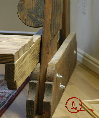
The next photograph shows the joint (labeled e in Figure 1) between the upright side (b) and its back brace (c). The two members of this joint (b and c) are not attached to each other; instead, (b) simply leans on (c) and is held in place by (g) and (f).
Photograph C - Joint between an upright side and its back brace
In the foregoing photograph, (f) is one of two 2x4s attached to (c) -- one attached to one side of (c) and the other attached on the side opposite. These two 2x4s keep (c) from moving laterally, out of under (b). The 2x2 labeled (g) in the photograph, above, is attached to the edge of (b), and keeps (c) in place directly under the weight of (b).
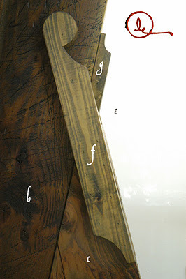
Figure 3 shows the front of the easel.
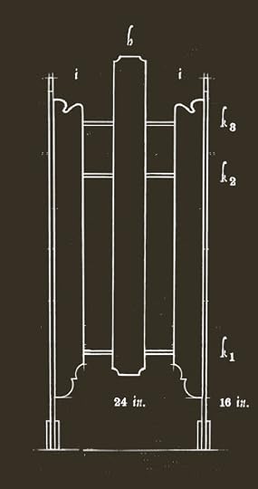
Fig. 3
In this front
view of the easel, the center board (h) is a 1x12 flanked by two 1x10s
(i). The center board (h) is 24 in. above the floor. The flanking
boards (i) are 16 in. above the floor. The three horizontal members of
the frame (k) are 1x10s (each 45 in. long) mounted between the upright sides
(i) of the easel.
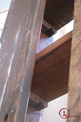
The following photograph looks up into the easel between (i), at left in the photograph, and (h), at right in the photograph. The under side of the horizontal cross members (k1 and k2) show the 2x2 ledges of which they rest. The 2x2s may not be absolutely necessary once the easel is in place; however, during easel assembly each of the two sides of the easel (the pieces appearing in Fig. 2 and Photographs B and C) were assembled and then brought into the studio. And in addition to the pieces appears in the diagram and photographs, the 2x2 ledges appearing in Photograph D were attached to the inner face of each easel upright.
The horizontal cross members (K1, K2, and K3) were also cut and brought into the studio.
Assembling these massive parts was made a good deal easier by the 2x2 ledges because they helped hold the horizontal cross members in place (i.e., while the sides of the easel were being held upright, a horizontal cross member was put in place -- resting on its 2x2 ledges -- and a large furniture clamp was then used to hold the pieces in position while grabbers were installed to secure the joints. This is not the only way we might have assembled the easel, and it isn't even necessarily the best. The important thing to remark is that in a project of this size, assembly is something to think about and integrate into the design from the outset.
Photograph D
In Figure 3, parts (h) and both parts (i) are mounted "inside" the vertical sides of the easel (labeled (b) in Figure 1); that is, the front side of each vertical member (b) is flush with the front surface of (h) and both parts (i). This means that the 2x2 ledges shown in Photograph D are (when mounted to the inner face of the vertical sides of the easel, recessed from the front edge of (b) by the thickness of a piece of 2x, or 2-in., stock.
Finally, along the front edge of the vertical sides of the easel -- (b) in Figure 1 -- are mounted several lengths of wood about 2 in. thick and 20 in. long. These provide a place to clamp bridges, lights, panels (to which reference photographs can be attached),and other tools and accessories required for a project.


The $10 Easel in the studio has served well as the workhorse for painting projects since Ashton and I built it in September 2006. And, like most of our do-it-yourself pieces of studio equipment, we keep modifying or adding accessories as projects require. This blog post talks only about the easel's basic construction. Future posts describe the add-ons.

Photograph A - Front view of the easel in the northeast corner of the studio
In the early fall of 2006, we ripped up the carpet, padding, and tack-strip in the studio, kitchen, and pantry. With dislocated furniture and forlorn kitchenware piled throughout the rest of the main floor as though we enjoyed living inside a garage sale, we took a belt sander to the exposed subfloor and spread a frosting of dust over the spectacle. (There are times when do-it-yourself doesn't look like it's going to have a happy ending; that it may not, in fact, ever end.)
Against this what-have-we-done-to-ourselves backdrop, we went to Home Depot to purchase several 1x6s to finish the edging along a storage area under the shelves in the pantry -- a harmless enough purchase, but we saw this sign taped to a lumber cart at Home Depot (a cart absolutely groaning under a load of warped 2x12s, 2x10s, 2x4s, and assorted board-things too numerous, and too hopeless of use, to name).

As we pushed the cart to the check-out stand and then attempted to load it into our car (not, mind you, into an SUV, or a pickup, or a wire-cage utility trailer), I made note of the expressions on the faces of the people we passed: I've seen spectators less awestruck along parade routes where they had camped overnight just for the privilege of watching.
Then, after arriving home, we faced the challenge of where to store the forest of cast-off trees, so we could still stand in and move about the shop while trying to build a mammoth easel in it. And, of course, the task of building the easel--like our other building projects--would not be a matter of meticulous forethought and measured drawings; but more like trying to conduct an avalanche while standing at the bottom of the mountain.
My objectives in building another easel were to accommodate large-scale paintings (particularly vertical works), take maximum advantage of studio light, and ensure stability for work with heavy panels.
The following diagrams summarize the easel's construction. Great care must be taken to ensure that the weight of the easel is appropriately centered above its base. My technique for painting skies and applying glazes often become quite vigorous. Having a stable easel for any size of painting, but for a large painting especially, is very important, particularly because I dislike painting on any surface that "moves" in response to brushwork.

Fig. 1
The base of the easel (a) is a 1x10, b is a 1x12, and c is a 1x10. Both uprights (b and c)
extend all the way to the floor, and are sandwiched between two 1x10s,
each pair of which serves as a runner. Photographs below provide
details about configuration and joinery. At e, the "toe" of each upright is set back from the front of the runner a distance of 3 in. The angle at d is 76 degrees.
The profile cut into the front of each 1x10 runner (at the base of the easel, at left in Fig. 1) is designed to preclude toe-stumping while working on paintings. The height of the easel is shown in Fig. 2. The profile of the vertical side is simply ornamental.

Fig. 2
The following photograph shows the construction of the runners at the base of each upright. (The platform resting on the top on the "inside" runner is a platform added later, and described in a subsequent post.)

Photograph B - Front of a base
The next photograph shows the joint (labeled e in Figure 1) between the upright side (b) and its back brace (c). The two members of this joint (b and c) are not attached to each other; instead, (b) simply leans on (c) and is held in place by (g) and (f).

Photograph C - Joint between an upright side and its back brace
In the foregoing photograph, (f) is one of two 2x4s attached to (c) -- one attached to one side of (c) and the other attached on the side opposite. These two 2x4s keep (c) from moving laterally, out of under (b). The 2x2 labeled (g) in the photograph, above, is attached to the edge of (b), and keeps (c) in place directly under the weight of (b).
Figure 3 shows the front of the easel.
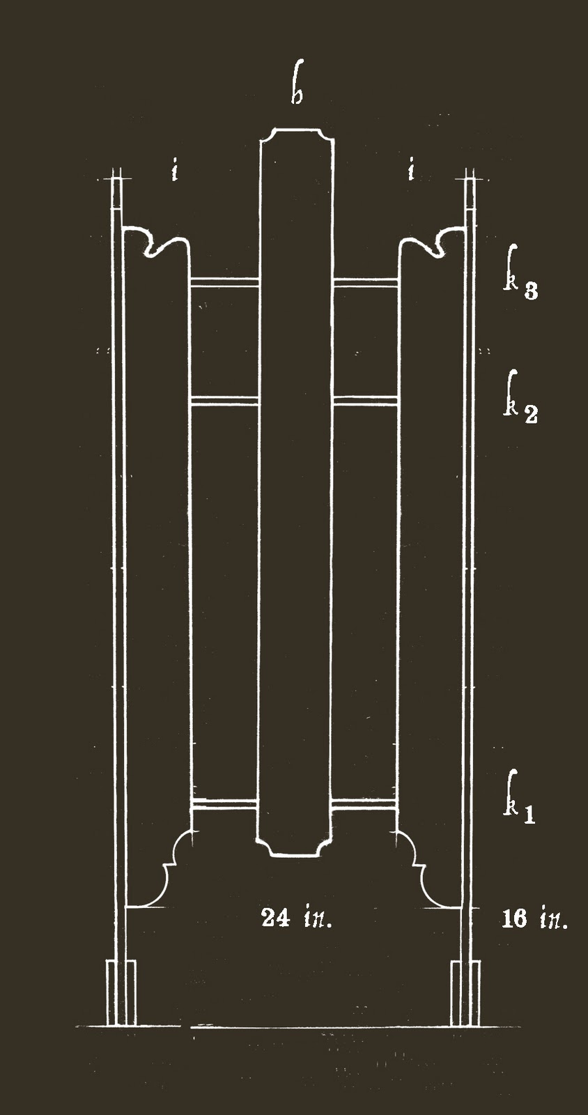
Fig. 3
In this front
view of the easel, the center board (h) is a 1x12 flanked by two 1x10s
(i). The center board (h) is 24 in. above the floor. The flanking
boards (i) are 16 in. above the floor. The three horizontal members of
the frame (k) are 1x10s (each 45 in. long) mounted between the upright sides
(i) of the easel.
The following photograph looks up into the easel between (i), at left in the photograph, and (h), at right in the photograph. The under side of the horizontal cross members (k1 and k2) show the 2x2 ledges of which they rest. The 2x2s may not be absolutely necessary once the easel is in place; however, during easel assembly each of the two sides of the easel (the pieces appearing in Fig. 2 and Photographs B and C) were assembled and then brought into the studio. And in addition to the pieces appears in the diagram and photographs, the 2x2 ledges appearing in Photograph D were attached to the inner face of each easel upright.
The horizontal cross members (K1, K2, and K3) were also cut and brought into the studio.
Assembling these massive parts was made a good deal easier by the 2x2 ledges because they helped hold the horizontal cross members in place (i.e., while the sides of the easel were being held upright, a horizontal cross member was put in place -- resting on its 2x2 ledges -- and a large furniture clamp was then used to hold the pieces in position while grabbers were installed to secure the joints. This is not the only way we might have assembled the easel, and it isn't even necessarily the best. The important thing to remark is that in a project of this size, assembly is something to think about and integrate into the design from the outset.

Photograph D
In Figure 3, parts (h) and both parts (i) are mounted "inside" the vertical sides of the easel (labeled (b) in Figure 1); that is, the front side of each vertical member (b) is flush with the front surface of (h) and both parts (i). This means that the 2x2 ledges shown in Photograph D are (when mounted to the inner face of the vertical sides of the easel, recessed from the front edge of (b) by the thickness of a piece of 2x, or 2-in., stock.
Finally, along the front edge of the vertical sides of the easel -- (b) in Figure 1 -- are mounted several lengths of wood about 2 in. thick and 20 in. long. These provide a place to clamp bridges, lights, panels (to which reference photographs can be attached),and other tools and accessories required for a project.

March 31, 2012
Pioneer Collection added to online gallery
The online fine art gallery at www.alyoung.com now features the Western Pioneers Collection, focusing primarily on people and events in the history of The Church of Jesus Christ of Latter-day Saints.
Elspeth's new painting, I will Uphold Thee , featuring the heroism of the Rollins sisters in connection with the first edition of The Book of Commandments, is among the first images in the new collection.
Each collection in the Commercial Portfolio represents an ongoing focus of endeavor. Collections include:
Heroes of the Book of Mormon - Characters, themes, and incidents from the book
High Valley - Literary and general themes
Western Pioneers - History of the Church of Jesus Christ of Latter-day Saints
The Messiah - The ministries of Jesus Christ
Women of the Bible - Women of the Old and New Testaments
Elspeth completes new painting of heroism

I Will Uphold Thee by Elspeth Young is the newest
oil painting to be added to the new Western Pioneer Collection of
original artworks from Al Young Studios. Seventeen fine-art print
styles and sizes of this new image are now available at www.alyoung.com, ranging in price from $4.50 (4x7 poster print) to $658.00 (full-sized reproduction giclee canvas).
Click here to see a larger copy of the new painting, read the artist's commentary, and look at the selection of available prints.
Based on an instance of religious persecution (on the American frontier in the 1830s), the image features the heroism of two young women who braved mob violence to save pages from the first printing of a scriptural text. I Will Uphold Thee is among the first images in the new Western Pioneer Collection. It is also the 147th image in the
Studios' commercially available fine-art portfolio.
The 17 open-edition prints of this new painting bring to 1,933 the number of prints and giclee canvases available at www.alyoung.com -- exclusive retail outlet for artworks produced by the artists of Al Young Studios.