
BBC's Blog, page 39
June 21, 2012
BBC TV Channel Homepages: Responsive Design

BBC Four homepage designs for smartphone in portrait orientation, and for desktops and large tablets oriented in portait and landscape
Hello, I'm Ste Everington and I'm one of the designers leading the TV & iPlayer product. Last month saw the launch of the new television homepages for BBC One, Two, Three and Four. This blog post aims to give you some insight into the process and in particular our approach to responsive design.
As Dave Killeen mentions in his blog post, the way people view television online is changing and cross platform viewing is becoming ever more popular. This has fuelled the need to change and refresh our BBC TV channel homepages, which hadn't been updated for nearly four years.
We wanted to design an experience that is consistent across the thousands of different devices available, so that you can begin to ignore the device you're viewing it on and focus more on the content.
The idea of having a consistent user experience across any device is something that we often strive to achieve and over the past few years we have evolved the BBC's Global Experience Language (GEL) to accommodate for this. Andrew Greenham blogged about the ongoing development of GEL last week.
When we began this project we had no doubt that we wanted to design these new TV homepages across all devices in parallel. Our early concepts were tailored around what specific devices could do - for example, trying to make use of the standard gestures on different mobile and tablet platforms instead of conventional UI elements (eg buttons).

Early concepts for the BBC TV Channel sites
Working across all devices individually quickly became risky. While one interaction pattern might work beautifully on one device, it felt alien to the user on another.
A good example of this was our navigation.
Navigation varies across devices more than anything else. For example, the use of a back button across Android and iOS devices - Android includes a global back button as part of its hardware, whereas iOS only ever has software back buttons.
Adhering to all the different UI patterns across devices, from the hierarchy to the position of the navigation, would make it very difficult to achieve a consistent BBC experience across all devices - not to mention any new devices that may come out in the future.
Going Responsive
To achieve a truly consistent experience across all devices we opted for responsive web design - a single code base with an optimised layout for the device or screen size you're viewing it on.
While the idea of fluid websites is nothing new, the way in which we design them is rapidly evolving.
In our research phase we quickly noticed that the majority of good examples are mainly blogs and news websites.
Websites such as The Boston Globe and the design journal of Jon Hicks are great examples of using fluid layouts and work brilliantly for text-rich websites.
While they gave us some good inspiration around navigation, our first major hurdle would be to design a framework that would adapt itself around video content as well as text.
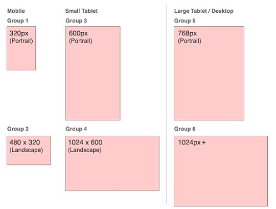
Key breakpoints across a number of mobile, tablet and desktop devices. A breakpoint is the point at which a browser "jumps" to the next layout based upon browser width and orientation.
We looked across a large number of devices and common screen sizes to finally decide upon six different groups (based on breakpoints) to act as the foundation for our responsive framework.
The smaller sizes were relatively easy; 320 pixels by 480 pixels is a very common screen size for most smart phones.
Working out different tablet sizes was a little more tricky. There is a very fine line between a large smartphone and a small tablet.
Then of course there's the Apple iPad - although only one device, we can't fail to ignore its popularity.
We knew that our framework would ultimately have to work across any screen size. However, these six breakpoints provided us a great starting point and gave us something substantial to design and test against.
For the smaller groups, we purposely kept these layouts simple, using either a one or two column layout and sticking to design principles we set in some of our existing mobile sites - such as the current mobile website for iPlayer.
Going up through screen sizes, we start to introduce the horizontal carousel for browsing content when we get to a small tablet landscape.
A number of user testing sessions, carried out by Amelia Still, have show this to be a great way for people to browse and discover new content and this is the main area where we are different from many other responsive sites.
The one question that this constantly raised, and one that I'm sure all designers are sick of hearing, was, "where is the fold?".
While it is true that for the carousel to work it must all be visible in a single view, it is very difficult to predict exactly where 'the fold' will lie. To help us decide upon an optimum size for the carousel we looked at a number of statistics across common browser sizes as well as the space taken up by the browser chrome across different devices.
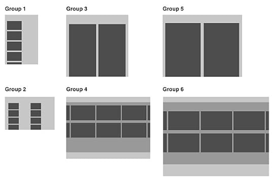
Our current layouts across different sizes. Groups one to five currently use fluid layouts, resizing to fill the screen, and group six is fixed.
The other key component to designing the responsive framework was orientation (or browser aspect ratio).
When in a landscape orientation we use the full width of the browser to showcase our 16:9 programme images. This plays into the widescreen format of television and allows us to create a better framework for video content.
As we switch to a portrait orientation, we unpack the content vertically and the site begins to feel more traditional.

Interaction and layout changes for browser orientation
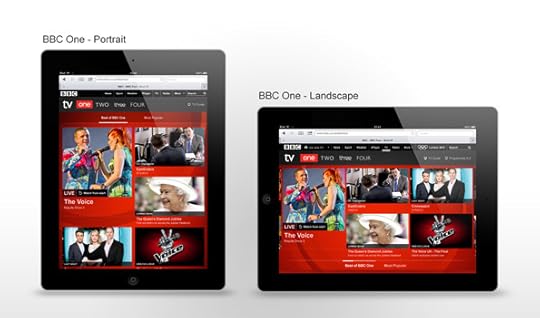
How these layout changes look on the BBC One website
User Journeys
Over time we have built up a good knowledge of key user journeys through iPlayer. We wanted to apply this insight to our work on the new TV channel pages. Most of these user journeys can be broken down into two groups, tasks and browsing. Or as we like to think of them, "I know what I want" and "I don't know what I want".
I know what I want...
This is all about TV planning. Some good examples of this are tasks such as:
"What is on BBC One right now?"
"Was EastEnders on last night?"
"What time does The Apprentice start"
For these kind of tasks we designed the TV Guide which is part of our global navigation and provides a wide cross section of channels at a glance.
We also designed a mini channel guide, present on all the new TV homepages.
As these kind of tasks are very structured it is very important to keep certain elements - such as the TV guide - consistent across devices.
User research has shown us that this allows content to quickly be scanned and easily be understood. "I like it to be uniform so there isn't another learning curve", as one participant said in a user testing session.

The new BBC Three homepage in the living room, helping plan TV viewing
I don't know what I want...
Another key driver for this project was to surface content to our audiences that they wouldn't have otherwise discovered. The simple grid and large 16:9 images in the carousel area allow you to quickly scan through a lot of content. BBC Three, for example, has three main sections:
Best of BBC Three
Most Popular
Feed My Funny (Comedy exclusives)
These sections can be easily accessed from the bottom of the carousel, however we also allow people to scroll seamlessly between each section. This increases your chance of stumbling upon that great piece of content that you never knew existed.
We also took TV scheduling into consideration to make the pages feel more dynamic - so content changes between peak and off-peak times. As Dan Taylor mentions in his blog post, online simulcast viewing is steadily increasing.
This creates an interesting opportunity to reflect the scheduled nature of TV online - an area which previously has been famously detached from a linear schedule.

Image sizes change to reflect peak and off-peak. We would like to expand on this in the future.
We designed a number of different promo types and sizes that The BBC's editorial teams can use to populate each channel. And this has allowed us to reflect the individual identity of each channel much more.

BBC Three - then and now

BBC Four - then and now
Old versus new and beyond...
In the new websites we really pushed the branding and identity of each channel whilst still keeping in line with each channel's brand kit. We've also achieved the BBC's first fully responsive website from smartphone up to desktop.
It has been a huge learning curve for everyone involved, design and tech, and we still have a lot more to come.
We are currently revising our responsive framework, reducing the number of breakpoints and developing a solid and adaptive grid for future BBC products. Improved mobile designs and a responsive TV guide are also in the pipeline along with a heap of other exciting things.
A number of other people contributed greatly to the UX and design of this project: Yasser Rashid, Mark Timson, Oliver Rich, Kathryn Leach (Design team) Amelia Still (User testing) Henny Swan (Accessibility)
I love feedback, so please feel free to leave any comments on our design process below.
Ste Everington is a Designer, BBC Future Media User Experience and Design


June 19, 2012
BBC iPlayer: Live Restart
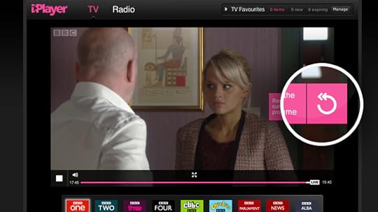
Even if EastEnders has nearly finished when you start watching it online, you can press a button and watch it from the beginning
My name is Henry Webster and I’m an Executive Product Manager in Media Services at the BBC – it’s my job to deliver our live video and audio content via IP (Internet Protocol), such as to BBC iPlayer and Connected TVs.
Today marks a major step in the evolution of BBC iPlayer with the launch of 'Live Restart'.
A first in the UK, ‘Live Restart’ enables audiences to rewind and restart live TV on BBC iPlayer without waiting for the programme to end.
So, if you’re stuck in a traffic jam, or delayed on the tube and miss the critical start of your favourite BBC programme when you get in, with one click you can skip back to the beginning of that live programme.
Unlike your typical PVR, there is no need to have previously been watching or recording the show. Whenever you join, with one click, viewers can either restart the programme that they are currently watching, or scroll back to watch programmes from the previous two hours.
My team are continuously working away to deliver great innovations to audiences around video playback.
I’d like to highlight some of the work that has gone on behind the scenes to support this new way of watching television.
The technology that allows us to offer this new functionality is part of a wider strategic move to embrace HTTP chunked streaming for delivering our online video.
Instead of using a point-to-point streaming protocol such as RTMP as we have done in the past, this method breaks up the H.264 video into chunks and delivers them as HTTP packets in much the same way as the we deliver our text rich web pages today.
There are a number of reasons why we have taken this approach; firstly it allows us to scale our video operation to a much greater extent than we have been able to before.
We already use Content Delivery Networks (CDNs) to help us with video delivery, but a move to HTTP streaming means that instead of relying on their capacity to stream video from specialist video servers, we are now able to use their cheaper and more abundant HTTP serving capacity.
The increased capacity that we can realise this way means that we are more likely to be able to support the ever growing audiences that are turning to their IP connected devices to watch TV and listen to radio.
This is especially important in a year when we will be streaming more live video to more people than ever before with the Euro Football championships, Radio 1’s Hackney Weekend, Wimbledon and the London 2012 Olympics, to name but a few key events.
In turn the improvement in distribution will also allow us to make quality improvements across the board.
The use of HTTP chunked streaming has enabled us to significantly improve the video experience by utilising advancements in adaptive bitrate playback.
This means that regardless of the bandwidth available to you locally you should get a largely uninterrupted video experience offering the very best quality video your connection can support.
The live restart functionality that we are launching on the iPlayer today is typical of the cool new interactive features that we can drive using HTTP streaming.
As we can keep all the video chunks as we distribute them, we can offer them to be viewed again later, or even store them more permanently.
This has the major advantage over most PVR type products in that you don’t need to have planned your viewing in advance! If you walk in twenty minutes after the start of the latest episode of Silk, you can now with one click, jump back to the start of the programme. Try it for yourself.
To do this we have linked up the programme schedule data with a rewind-able live stream which means, where rights allow, that you should easily be able to navigate back to the start of the currently live programme, pause and resume a live stream or look back at anything that happened in the last two hours.
We are using the same behind-the-scenes technology to drive the new experiences we have in store for the Olympics in our exciting new Live Interactive Video Player. Gary Lineker can give you a quick guided tour, where you can see a sneak preview of what’s in-store for the Olympics
These innovations have touched virtually every piece of our video over IP delivery chain and the move to HTTP streaming has been a challenging one as it has required us to completely re-think our distribution platform.
I must, therefore, take this opportunity to pass on my sincere thanks to all those who helped us pull this together from within the excellent team that we have within the BBC, but also from our partners at AtoS and Adobe with whom we have worked very closely to get to grips with the new technology and in designing and building everything that we are using to roll this out as a live service.
It’s always great hear your feedback, so please try it out and let us know what you think.
Henry Webster is an Executive Product Manager in Media Services at BBC Future Media
June 18, 2012
Expanding the BBC's Global Experience Language
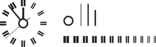
The lines of the BBC clock inspire some of GEL's iconography
I'm Andrew Greenham, Creative Director for the BBC Global Experience Language (GEL) and part of the User Experience and Design team for BBC Future Media.
In this post I'd like to talk about some of the additions to the BBC Global Experience Language and give an overview of the new BBC design guidelines and patterns for Mobile, IPTV and Tablet devices. You can see the recently updated GEL site at bbc.co.uk/gel.
In February 2010 BBC UX&D Head of Design Bronwyn van der Merwe's blog post gave an insight into the process of developing the new Global Experience Language, or Global Visual Language 3.0 (GVL) as it was known back then.
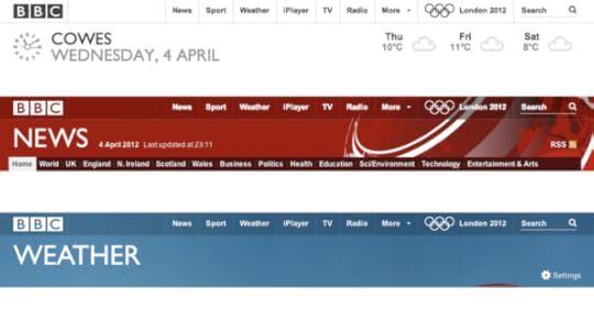
The rollout has continued over the past year and a half and has included the launch of BBC Proms, Desert Island Discs and the new BBC Weather site at the end of last year.
Following the initial design phase, Bronwyn and Creative Director Ben Gammon worked with Research Studios and the wider BBC UX&D team to deliver the new Global Experience Language.
In June 2010 the GEL rollout began with the initial launches across BBC News, Food and Doctor Who sites, to name just a few.
The rollout continued through 2011 and included the launch of BBC Proms, Desert Island Discs and the new BBC Weather site at the end of last year.
The GEL website: a reference point for designers
Alongside the initial 2010 launch, a BBC GEL website also went live showcasing the new styleguide and design patterns library as a resource for designers working on BBC services.
Our early GEL guidelines and patterns were very web-centric. Over the past eighteen months we've been working to expand the guidelines for other platforms and at the end of last year an updated edition of the GEL website went live; this now includes guidelines and patterns for Mobile, Tablet and IPTV devices and also includes a dedicated Accessibility section.
As with the original GEL web styleguide, the framework for the guidelines on each platform is based around a set of Foundations, Building Blocks and Design Patterns. Where there is specific and fundamental knowledge essential to effective design on a particular platform or device, we've also introduced a 'Design Considerations' section. This section serves as a best practice introduction for designers new to working across, what may be for some, previously unfamiliar platforms.
The 'Foundations' section for each platform includes information on the underlying universal grid; this is scaled to reflect the various device resolutions and a canvas on which a series of flexible layouts can be created. It also includes global elements such as the toolbar, local masthead and footer; elements that can downloaded from the GEL site as Photoshop or Illustrator templates.
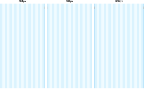
The Universal Grid for desktop web showing a three-column page template overlaid (at 50% actual size). The wider 336px column supports the standard advertising formats.
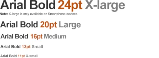
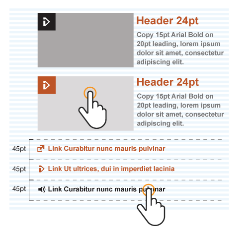
The 'Building Blocks' section includes the page elements such as typography, iconography and information on using images. We've also included examples of typographic formatting and module layout.
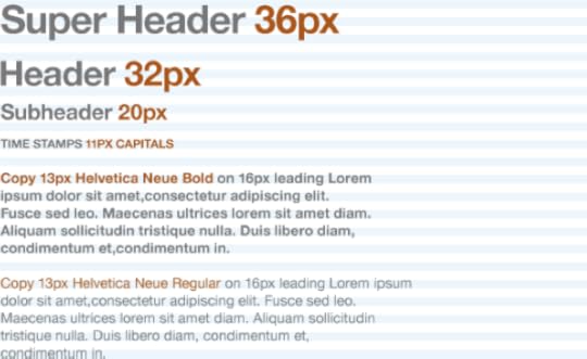
An example of the GEL typographic format showing suggested type size hierarchy (actual pixel size)
GEL for Mobile
The GEL guidelines for mobile followed soon after those for the web. Using the desktop web guidelines as a starting point Ux Designer Stephen Robertson developed a styleguide and patterns for mobile devices. Adapting GEL for the smaller screen sizes, this covered both featurephone and smartphone and was considerate of D-pad and touch screen input.
The universal grid for mobile naturally needs to work at a smaller resolution, but like its desktop web counterpart, provides a framework for maintaining consistent padding values and aligning content modules and text.
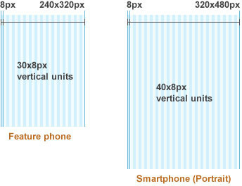
The Mobile Universal Grid for Featurephone and Smartphone screen sizes (at 50% of actual size)
This grid also needed to reflect device orientation and includes both landscape and portrait formats.
On Mobile, where possible, we've tried to set a typographic standard that maintains the same bold typography and contrast of type sizes, however technical limitations on some devices means that it is not always possible to support this format in its purest form. In some cases where Arial is not available, device specific fonts will be used in its place.
GEL Mobile Typography (actual pixel size)
We've also included downloadable psd templates that provide a starting point for some of the common mobile content modules.
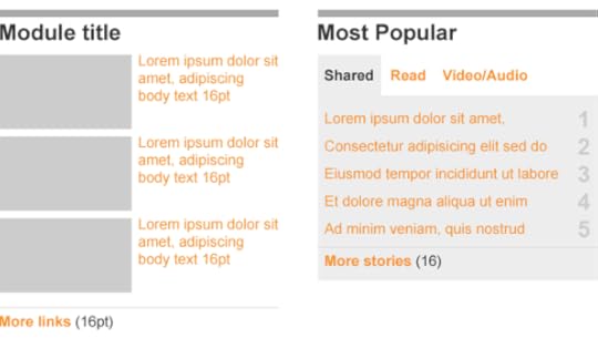
Templates for two common mobile content modules
GEL for IPTV
Developing effective guidelines for IPTV offered up many challenges. The key to adapting GEL for TV was to get a clear understanding of platform limitations and provide designers with the fundamental principles for designing for television. For example, Device Considerations includes guidance on TV specific display issues such as flicker, bloom, colour contrast and alignment to screen safe areas.
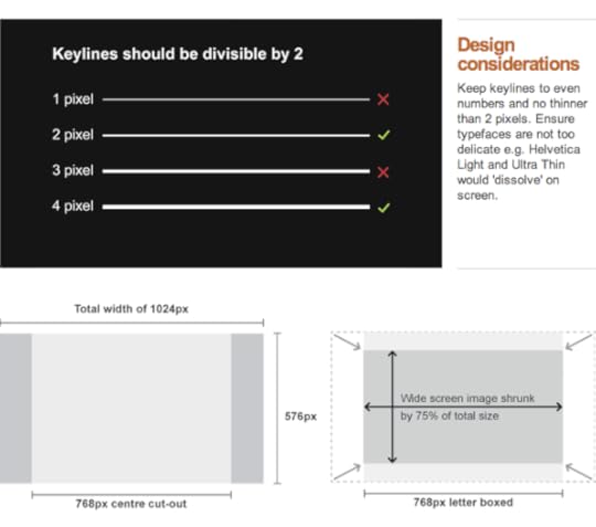
How to avoid flicker on a TV interface (top) and Designing for different aspect ratios
Where possible we wanted typography on TV to reflect the bold styling we have on the web, mobile and tablet. Getting the GEL typography right is all about applying a confident hierarchy and creating dramatic contrast between the headers, sub headers and body copy. Due to the legibility challenges on TV we have a much larger minimum font size, so headers are larger still to maintain the desired contrast.
As with mobile devices, even the most modern IPTVs and set top boxes can be limited in the fonts they can support, but again where possible we recommend using Arial or Helvetica Neue.
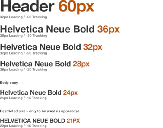
GEL Connected TV Typography
In addition to the traditional and essential TV Safe Areas we've also introduced a universal grid for TV to help maintain consistent padding and alignment of elements.
One of the biggest challenges in adapting GEL for TV platforms was in the application of colour. In GEL for web, the use of colour was deliberately flat; background images may include rich imagery and gradients, but in core user interface components we've deliberately avoided the use of gradients and drop shadows. This creates a more contemporary feel that is both sharp and clean. In early GEL concepts for TV interfaces a direct translation of this philosophy left the UI feeling too stark and in danger of looking clunky. This is exaggerated by the fact that on TV the user interface is presented at a much larger size.
Naturally the audience has come to expect a more 'televisual' treatment of graphical elements on IPTV platforms that leans more towards a suggestion of 3-Dimensional space. With this in mind we've adapted GEL specifically for TV and introduced guidelines that specify a controlled use of gradients and drop shadow where appropriate. Used sparingly these can help prioritise information by creating a sense of depth on TV.

Creating colour gradients: GEL includes very specific guidelines for creating subtle gradients and drop shadow for the television UI
It's important to note that limited support for extensive colour palettes on some IPTV platforms can mean that effective gradients are difficult to achieve.
GEL for Tablet
Up until recently GEL didn't extend to include any design guidelines for tablet devices. With an increasing number of BBC services being developed on this emerging platform, Senior UX Designer Simon Rooney set about creating an initial set of guidelines that provides a foundation for further design development.
As with the other three platforms there were also some specific device considerations that we needed to highlight; for example, one of the key points to consider is that tablet devices are unique in that the context in which they are used can change considerably. With this in mind we needed to write guidelines that reflected both orientation and reading distance (close, medium and far). Naturally this meant providing flexibility around font sizes and considering how the grid would adapt at a range of resolutions.
As with a number of smartphones, the lack of hover state on touchscreen devices also meant standards for links needed to be adapted to aid their discoverability. GEL guidelines for desktop specifies an underline for links on hover; on tablet we specify a combination of bold type and colour to differentiate links from body copy and signify a clear action state on interaction by changing the link colour when tapped. We felt that the colour change felt cleaner than using underlines for specifying links or the action state.
On tablets, a combination of bold type and colour differentiate links from body copy
In addition to establishing best practice and tapping into some of the unique features of the tablet platform, we also wanted to give designers an overview of the established gestures and a guide to best practice.
The Design Patterns
With the Foundation and Building Blocks as a starting point for each platform, the GEL Design Patterns provide more specific detail around common pan-product design components.
When developing the patterns it was crucial that we adapted each accordingly rather than trying to shoe-horn an interaction pattern developed for one platform on to another for the sake of consistency. It was crucial to play to the strengths of each platform and be considerate of the things like the control device for each platform (Mouse, Remote control/D-pad or Touch).
The Accordion is just one example of how design patterns have been adapted across the platforms. Initially this was developed as a web design pattern:
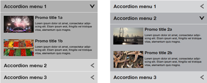
Accordian Menu (desktop) with different elements expanded
Then adapted for the smaller screen size on mobile…
Accordian Menu (mobile) in collapsed and expanded state
…and finally modified to be considerate of the remote control input and introduction of selection highlight used for IPTV:
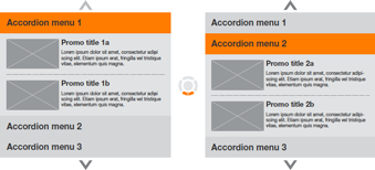
Accordian Menu (IPTV) with two different elements expanded
A new global toolbar
We've recently designed and launched a new global toolbar. This is currently being rolled out across both bbc.co.uk desktop and mobile sites.
The objective of this redesign was to make the toolbar work harder to expose the breadth of BBC content. In addition to making the global links more prominent to increase visibility, we've also provided the ability to promote upcoming events such as London 2012 in the toolbar.
On desktop the previous version of the toolbar didn't offer a great deal of flexibility in terms of integration with banner graphics and we were keen to offer a variant that could be blended more effectively with the visual treatment of the wide variety of BBC sites. This led us to design a wider variety of toolbar variants with a greater range of background translucency. We offer transparent light (20% black), medium (40% black) and dark (70% black) in addition to opaque white, black and grey variants.
White and transparent versions of the toolbar
For example the transparent light variant of the toolbar on the BBC Weather site blends nicely with the various weather ambient background images when overlaid. The default white version of the toolbar is used across the core BBC sites such as the Homepage and Search.
On the very latest version of the new toolbar that sits across more recent GEL sites, we've also introduced a new treatment for the 'more' panel; this serves as an index to other BBC sites. This is implemented as a pushdown panel on opening; the rationale behind transitioning the toolbar to white when selecting the 'more' link or search field was to signify that the toolbar is entering a global mode and therefore references the white variant seen on the Homepage and Search pages.
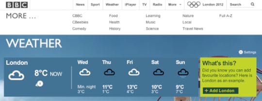
The toolbar turns white when 'more' or 'search' are selected
The mobile version of the toolbar can be seen on the new mobile homepage, BBC Sport Olympics and BBC News sites. Due to the reduced width, the global links have been collapsed into a Menu pushdown panel that echoes the functionality of the desktop version.
A new set of GEL icons
With the aim of making GEL even more distinctive we worked with the design agency RGA to update the original set of GEL icons. Whilst keeping the bold and simple style of the original set we've modified the icons to make them more "ownable" and also to meet the requirements of new product features.
The BBC clock is a strong BBC "signature" element and we used this as inspiration for the visual style; where applicable basing stroke width and angle of line upon those found within the clock face.

The BBC Clock, the strokes that make it up, and (top right) the application of the visual language in icons
The design of the each icon involved exploring a number of potential options
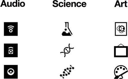
While it was important to adhere to the aforementioned visual design principles, we were careful not to deviate from established iconography that was instantly familiar to the user. The audio icon was a good example of this; initial concepts explored a new approach to representing audio but we ultimately reverted to the more traditional right facing speaker icon with some subtle updates to the visual styling.
The need to design for universal appeal also played a part in the design of the Science category icon; while we loved the intricacy of the DNA strand, we opted for the beaker as it was more easily recognized and had a stronger association with the subject.
The design process also involved two rounds of user testing to validate the new icons both as stand-alone artwork and more importantly in the context of the web page.
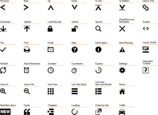
A sample of the updated GEL icon set
For more on the new GEL icons you can download the icons styleguide (PDF) and other assets from the iconography section of the GEL website.
More GEL to come…
GEL has always been about encouraging designers to build upon the guidelines and to develop new design patterns. With that in mind, GEL is still evolving, we're working to make the design language more distinctive whilst at the same time, continuing to take on board the requirements of new BBC products.
We’re already expanding upon these new cross platform guidelines; BBC News on mobile and the recently launched BBC TV channel homepages use responsive design and build upon the GEL mobile, tablet and desktop guidelines by treating them as a continuum.
My colleague Ste Everington will blog about the BBC’s new TV channel homepages soon.
For more information go to bbc.co.uk/gel.
Andrew Greenham is Creative Director for the BBC Global Experience Language (GEL) and part of the User Experience and Design team for BBC Future Media.
June 15, 2012
What's on BBC Red Button 16th - 23rd June

Trooping the Colour
Watch uninterrupted coverage of Trooping the Colour, the Queen's Birthday Parade on the Red Button. There's continuous live coverage from the events without any commentary.
Available on all platforms
Freesat/Sky/Virgin Media/Freeview:
Sat 16th June, 10:30am-1:05pm
Hackney Weekend 2012

Sub Focus performing at Radio 1's Big Weekend in Bangor
Live coverage and highlights from Hackney Weekend 2012 are available to view via the Red Button. On Sky, Virgin and Freesat there's a minimum of two streams at all times, showing sets from four stages. We'll also be showing individual tracks from some of the BBC Introducing acts, alongside the big hitters!
Artists include: Sub Focus, Michael Kiwanuka, Rizzle Kicks, Example, DJ Fresh, The Maccabees, D'Banj, The Vaccines, Rudimental, deadmau5, Delilah, Flo Rida, Jack White, Sean Paul, Swedish House Mafia, Labrinth, Azealia Banks, David Guetta, Chase & Status and Nas.
Available on all platforms
Freesat/Sky/Virgin Media/Freeview:
Sat 23rd June, 4:00pm-2:00am
ZingZilla's Zing Along
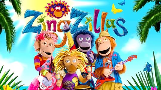
Panzee, Drum, Zak and Tang
Press the Red Button to sing and dance along with the ZingZillas! Viewers can take a special trip to see DJ Loose at ZingZilla Island to learn ZingBop dance moves, and words to six of your favourite Big Zing songs. Each song features lyrics and a bouncing coconut to highlight each word as it's sung so parents and children can zing along!
The words to the songs are also available on CBeebies Grown-ups.
Available on all platforms
Freesat/Sky/Virgin Media:
Mon 18th June, 06:00am-7:00am
Tue 19th June, 6:00am-7:00pm
Wed 20th June, 6:00am-7:00pm
Thu 21st June, 6:00am-7:00pm
Fri 22nd June, 6:00am-2:30pm
Freeview:
Mon 18th June, 06:00am-10:00am
Tue 19th June, 6:00am-10:20am
Wed 20th June, 6:00am-10:00am, 3:00pm-5:00pm
Thu 21st June, 6:00am-10:00am
Fri 22nd June, 6:00am-8:45am
London Collection
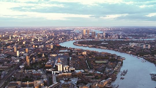
Aerial view of London, looking east towards Canary Wharf
The London Collection is an archive collection that celebrates the people and places of London. Highlights are available on the Red Button and the full archive collection is available online at BBC Four Collections. There will be various programmes on both BBC Two and BBC Four which are supported by this collection.
Available on all platforms
Freesat/Sky/Virgin Media:
Mon 18th June, 7:30pm-4:00am
Tue 19th June, 7:30pm-4:00am
Wed 20th June, 9:55pm-4:00am
Thu 21st June, 7:30pm-4:00am
Fri 22nd June, 10:30pm-4:00am
Freeview:
Wed 20th June, 9:55pm-04:00am
CBBC Extra
Press red on the CBBC channel this week where there's load of cool stuff including Chris and Dodge's blog, answers to some of your questions and your very own horoscopes Yonko style. Also, read the jokes that made Chris and Dodge LOL to see if they will have the same effect on you.
Available on all platforms
Freesat/Sky/Virgin Media:
Fri 22nd June, 3:00pm-6:00pm
Sat 23rd June, 7:00am-10:00am
Freeview:
Sat 23rd June, 7:00am-9:45am
News Multiscreen: Video Choice
Every day the BBC News On Demand team rounds up the day's news to bring viewers a two-minute bulletin of headlines. On weekends the tone becomes more conversational when Red Button viewers can watch a topical interview in 'Five Minutes with...' or a round-up of the week's weird and wonderful videos in Odd Box.
Five Minutes With... / Odd Box: Weekends (around the clock)
Please note, this service will close June 20th.
Available on Sky and Virgin only
CBeebies Red Button
BBC Red Button welcomes younger viewers and grown-ups with a sense of adventure to the big, bright and fun world of CBeebies interactive!
Your children's favourite characters are at the heart of the interactive TV experience. Satellite and digital terrestrial viewers will have slightly different offerings
from one another. This has enabled the Red Button team to offer the best games tailored to each system.
CBeebies Red Button is available on the CBeebies channel, and via page 5900 on other channels.
Available on Freeview and Sky only
BBC Sport Multiscreen**
Catch up on all the latest Sport via the BBC Sport multiscreen. Headlines are available around the clock with up to five additional streams available to cover the best that BBC Sport has to offer.
Please note that Red Button sport timings are subject to change at short notice.
For the latest information refer to the BBC Sport website.
Highlights
Euro 2012 - Live coverage with alternative audio and rolling highlights.
Olympics - Torch Relay: Live coverage of the Olympic Torch relay.
Tennis - Live coverage of the Aegon Championships from Queen's Club in London.
**Note all Red Button times are subject to change at short notice
Digital Public Space: In Space Everybody Can See You Stream

The moment when the Globe to Globe production of Venus and Adonis finally finished transcoding just after midnight on May 1st.
Last August the BBC and Arts Council England formed a partnership to deliver a new platform for digital arts, The Space.
My team started to build it during August last year, and we launched thespace.org on May 1st, delivering a multimedia, multi-platform,cross-genre, global arts service that supports video, audio, articles, image galleries, games, interactive applications and live streams and is available on smartphones, tablets, computers, smart TVs, and Freeview HD (Channel 117 if you want to have a look).
It was a bit of a rush.
From nothing a small group of us created a design and user experience, developed a content management system based on a very customised Wordpress instance, coded responsive design templates to work on a variety of screen sizes, built a transcoding system, procured a cloud-based content management and content delivery network, went through a cycle of user testing, contracted two live streaming suppliers, procured a bespoke VOD (video on demand) application for Freeview HD, launched a Freeview HD channel, and went live with a global site that works on more-or-less any modern browser and quite a few older ones.
After forty days in my own special wilderness, I'm coming up for air after what were certainly the most exciting days of my life at the BBC. On a few occasions I've found myself wondering what on earth I was thinking on the fateful day last year when I muttered 'why don't we build this ourselves' to Tony Ageh and Mo McRoberts, but I don't regret any of it.
We took on the task knowing it would at best be very difficult and at worst prove to be impossible. There have been many late nights and early starts. So many screens, so many refreshes. So many contracts, so many lawyers. So many cables, so many encoding profiles.
A 'normal' launch goes through a well-trodden path of various pre-launch closed trials, betas, test, fix, test, and launch, but we had no time for this. Instead I had to rely on having a fantastic hand-picked team, a very open approach to project management, very brief and very few meetings, upfront agreement that we'd fix problems as they were identified, and a dose of good luck.
Launch Day
On the night before launch, Paul Coghlan, Dirk-Willem Van-Gulik and Jon Stuart had been working their way through some last-minute video transcodes, builds, changes and fixes; Mo McRoberts was online and about to hop on the train from Glasgow to London; and I was waiting for the transcoding of the Globe to Globe production of Shakespeare's Venus and Adonis in six South African languages to complete. And we'd just watched the News At Ten announcing our go live the next morning, meaning that an audience of millions would be expecting us to be there when they woke up...
The picture at the top of this post shows the progress window of our custom built local transcoder based on the open source ffmpeg/x264 encoders and Manzanita transport stream multiplexer to provide all the formats needed for both web streaming and Freeview HD MHEG broadcast. It runs on bootcamped Win 7 iMac, and turns a single HD video file into six profiles for all web devices and TV, and then uploads it to the cloud.
It shows the moment when the final go live video transcode queue completed after midnight, meaning we had a full set of content for launch. I'd been waiting for it to complete for hours.
The site went live when Mo took down the holding page on thespace.org. He actually did it at about 0130 on May 1 from the dining car of the Glasgow to London Sleeper train, just after he passed Carlisle. He'd promised it'd happen before Carlisle, but I was willing to forgive him.
I arrived home in the early hours, excited by the knowledge that we were live, but aware of the 'known unknowns' and 'unknown unknowns' that we would face in the coming months.
The following morning I attended the launch event at the Royal Festival Hall, bleary-eyed and unshaven, and then headed to Television Centre and checked with Alex Russell that Freeview HD channel 117 was working, before firing up the array of devices in the office to make sure all was well across our promised platforms, devices and browsers.
We were getting 800 requests per second during much of the morning, and the cloud hadn't complained one bit. Jon Stuart had done well.
What Do You Reckon?
Soon after launch we started to receive a variety of messages from people who had come to The Space to have a look around. These offered a healthy mix of general and specific positive feedback; and a smattering of snags, bugs, and suggestions. But the response from around the globe was overwhelmingly positive, which made our efforts over the previous months feel totally worthwhile
We don't have a system for logging compliments, but we do have one for logging bugs. You can email us with your bugs at 'contactus@thespace.org'. Every single issue is logged on JIRA, and every single one will be addressed. We need users of thespace.org to help identify bugs and make suggestions for future enhancement. This is invaluable to us, so I thank all of you who have done so, and ask that you continue.
With a small team with a constant flow of stuff to do, prioritisation of these issues is one of the hardest parts of our job. Our mission is to a good experience across all devices, browsers, operating systems, in the midst of unpredictable OS and browser upgrades.
And we are striving to make the space as usable as we can for users who have sight, hearing, cognitive and motor accessibility requirements.
So, how did it go? We had over 250,000 users in the first week. Within in first 3 days we managed to get a good experience on 95% of browsers. An so far we have had only one hour when part of the site went down. I won't tell you whose fault that was because I'm a nice person.
Coming Live from The Space
As well as the recorded performances and interactive artworks we have also hosted seven live streamed events, ranging from a two hour performance of Britten's War Requiem from Coventry Cathedral to three sets of seven hour streams over three days from Vanilla Galleries.
These required close and sometimes hair raising coordination across my team, the venues, and third party suppliers to the venue and to the space. We worked Skype group messaging to the bone. If I ever need a reminder of what working to a live broadcast deadline feels like, I have those chat logs to refer to. Steve Allen worked magic with the live events, facing chaos and adversity with levels of calm only found in someone who is planning to launch a lunar explorer in his spare time.
The Space Team
My team are the real stars in the firmament of The Space, and I knew we could pull it off once I'd pulled this small group of very talented people together, gave them a mission, asked them to trust each other, and added a bit of fuel and the occasional drop of oil
Mo, Paul and Steve have been absolutely heroic, and without them there would be a void rather than a space.
Vibeke Hansen and Caroline Smith continue to evolve and enhance the user experience and design of the space. You'll see some significant changes appear in the next month or so.
Aaron Dey made all of our machines talk to each other, despite them being from many different generations and being across the OS divide.
Robert Gummesson keeps the transcoders firing on all cylinders, and has recently configured them to wrap subtitle files in to the video profiles.
Jon announced he was moving to Vietnam, but pointed out that we rarely saw him anyway, and that we wouldn't notice the difference, and he continues to keep the machines humming away nicely in the cloud.
And last but by no means least, Dirk-Willem Van-Gulik and Brandon Butterworth - our 'tech overlords' - keep an eye on the big picture and keep us connected to the rest of the BBC's technology folk.
Running The Space
The team that operate The Space - Hilary Bishop, Sally Taft, Mike Osborn, Ana Lucia Gonzalez and Dora Somerville - turn the empty vessel that we have built into a fresh offering every day, using the amazing variety of material that we receive from the commissioned arts organisations. They greet with joy the green 'queue completed' message on our transcoders and fear its evil twin, the red 'failed to upload' error...
We've made a few substantive changes recently, with new releases every week, and we have many more up our sleeves as we make our way towards the end of phase on in November. We've upgraded our search function quite substantially, and have started to create collections pages to house the ever-increasing volume of material. We'll also be implementing page templates that offer a greater number of items and build on our accessibility features.
We hope you continue to enjoy the space, and i thank you again for the comments and suggestions. My favourite so far comes via Facebook: 'pretty much the best thing online EVER'.... which is over-egging it a little, but gives us something to aim for in the best way we can.
PS, iOS users - we've found that in several cases, users need to clear their cache and / or delete and reinstall the web-app icon on iOS to pick up the new code and be able to enjoy the fixes and features that we have deployed!
Jake Berger is Head Of Technology and Distribution, thespace.org and Programme Manager, Digital Public Space, BBC Archive Development
June 14, 2012
BBC Sport on Mobile

A dedicated video index displays the live video available on the BBC Sport mobile website
Hello - I'm Lucie Mclean, senior product manager in BBC Future Media and responsible for BBC Sport services on mobile devices.
During this first full week of Euro 2012 games, we've been testing some exciting new ways to enjoy the football, which I'm delighted to unveil to you all
today.
Ahead of England's clash with Sweden tomorrow, you can now watch all the Euro 2012 matches broadcast by the BBC directly on your mobile - live, and on
demand, as well as highlights from all games. And that video will be available on 3G and wifi, so you can keep up and catch up with all the action wherever
you are.
You can access the video through the existing BBC Sport website via your mobile or tablet, or via the new mobile-optimised sport homepage
Video is available in the UK on iPhones and iPod touches with iOS 5.0 and above, on the iPad and on Android devices with OS 2.2 and above.
Audience research shows that users are increasingly looking to the web on the go, getting the content they want when, and where, they want it. Huge numbers
of people already enjoy live and demand video on their desktop, at home or office, and text and data services on their mobile. By offering video across
mobile devices we aim to give sport fans the complete picture wherever they are.
We have also redesigned the Sport homepage on mobile devices, in part to showcase the new video, but also to bring in line with the BBC Sport website's new-look launched in February.
This new design provides easy access to the latest news, live scores and results plus all the new live and on demand video now available. It has been
developed using an approach called 'responsive design', adapting to your mobile phone's screen size and capabilities. Responsive design enables us to
efficiently deliver appropriate experiences to the huge (and growing) range of devices. My colleague, Chris Russell, Head of Product for News, explains more about responsive design at the BBC here.
These new features are part of our overall strategy to offer the best BBC Sport
content across four screens
and ensure audiences never miss a moment of big sporting events.
And Euro 2012 is just the start of a unique summer of Sport on the BBC. We'll be bringing you Wimbledon, F1 (including the British GP from Silverstone),
the Open Golf and of course the Olympics, all available live and on demand on your mobile device.
Our mobile Olympics service will include up to 24 live video streams, detailed schedule and results and also access via BBC Sport Olympic apps on iOS and
Android.
And post-Games we'll be making further responsive improvements to the Sport mobile site, together with the launch of a BBC Sport app.
Delivering live and on demand video across a range of tablets and mobiles is complicated, and there are instances where we still have a few bugs to iron
out. We have taken the decision to get these services out to you now so that they can start to use and enjoy them, but also so we can listen, learn and
improve them. Please do send us your thoughts and feedback - it will play a crucial role in how we continue to improve. You can send feedback to mobile@bbc.co.uk or comment below.
Lucie Mclean is Senior Development Producer Product Manager, Mobile Sport and 2012, BBC Future Media (corrected 14 Jun)
June 13, 2012
BBC Weather: Getting More Granular
Since my last blog post 3 months ago the BBC Weather team have been quietly busy. We have been working closely with our colleagues in the BBC Weather Centre to move to a new, more complex forecast data model from the Met Office.
This new data set gives us more granular data, both in terms of the number of forecast points across the UK (a tenfold increase), and in terms of granularity and frequency of the forecasts themselves.
The new data was rolled out in time for the start of the Torch Relay, which enabled the BBC Weather Centre to give more detailed forecasts along the Torch Relay route. Today we rolled out a change to the BBC Weather website to make the most of this rich new data set.
A Tight Squeeze
The most dramatic improvement we have implemented today is hourly forecasts for UK locations.
You can see in the image below that 24 hours' worth of data is a lot of information to squeeze onto the page and still make it readable and user friendly.
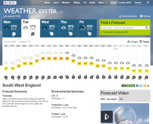
A 24 hour forecast for Exter Devon, with a graphical layout
We developed and audience tested various layouts, and finally came up with two options.
The first view is a 'graphical' layout which shows the forecast data divided by time on the horizontal axis and the range of temperatures on the vertical axis. The scale of the vertical axis automatically adjusts depending on the maximum and minimum temperatures, maintaining a fixed space on the page.
The first day shown is a moving window, showing the remaining weather for the current day, whereas the following days' forecast shows a full 24 hours of weather.
As you might expect the granularity of the weather data reduces the further ahead in time you go. So as you move from two to three days ahead, the forecasts go from hourly to three-hourly. In the near future we will also be introducing 'Further Ahead' extending us out to nine days of weather forecasts.
Back to the challenge of space… in addition to the most common forecast data that users want (temperatures, weather icon/type and wind speed) we had the challenge of also displaying additional information like humidity and wind direction.
To keep things nice and compact we've introduced a hover-over state, which shows all the additional forecast data:

Additional weather forecast data which comes up when you hover the mouse over a weather icon.
However we also recognised that many users prefer an expanded tabular view of weather forecast information, which does not rely on the hover-over box, and is therefore more accessible.
This second, 'table', layout (the button to switch between the views is below the "Find a Forecast" box) takes up more page real estate but gives the full detailed forecast at one glance, which may be preferable to some users.
If you're using cookies, the browser should remember your preference the next time you come back to visit the BBC Weather website.

The detailed table view of the 24 hour weather forecasts
To accommodate the new page design we moved around other elements on the page.
You will now find the regional forecast text summary under the forecast data, in line with the environmental summary data (UV, Pollen and Pollution) and the regional forecast video.
In the near future we'll be further improving this section by adding colour scales to highlight the severity of the environment summary data, much like we use colour for the temperature scales.
Better World Weather
In addition to delivering hourly forecasts for UK locations, we now also have three hourly forecasts for international locations - a vast improvement from our previous day/night only forecasts.
You can see in the example below that we have adapted the same layout of graph and table views to work for both UK and international forecast data.
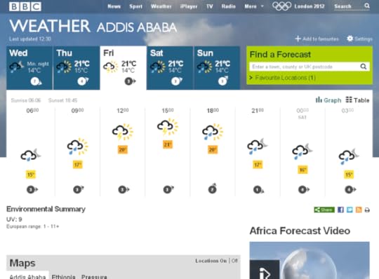
An example of an international weather forecast using the Graph view
Other Improvements
In my last post I mentioned we had implemented RSS feeds on our forecast pages, but one reader keynet pointed out that we had in fact only implemented the three day forecast RSS feed:
The "Observations" RSS feed appears to be broken since Monday this week, the example given on your RSS page for Manchester (http://newsrss.bbc.co.uk/weather/forecast/9/ObservationsRSS.xml) for example gives "Temperature: N/A (N/A), Wind Direction: N/A, Wind Speed: N/A, Relative Humidity: N/A, Pressure: N/A, N/A, Visibility: N/A" London is same. Forecasts are still working though.
In today's release we have also added in the Observation RSS feed to our forecast pages, which is available from the same RSS icon (the unblurred box below).

The observations RSS feed is now available alongside the 3 day forecast RSS feed
We've also added a link directly to the 'UK Monthly Outlook' from the weather homepage http://bbc.co.uk/weather as many users didn't know it was accessible from the 'More UK Weather' page.
As mentioned above we've got a few more improvements coming soon - nine day forecasts and improved designs for the environmental data. I'll come back with another blog update as soon as we release this next set of improvements, and in the meantime I look forward to your feedback and comments.
Jo Wickremasinghe is the Head of Product for BBC Weather in BBC Future Media
June 12, 2012
Homepages for Scotland, Wales, and Northern Ireland
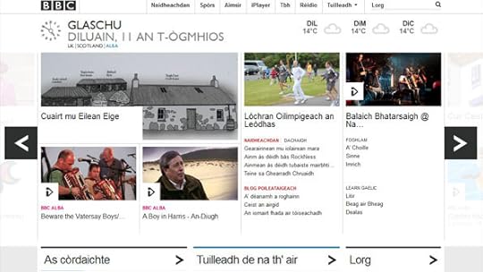
The BBC Homepage in Gaelic, for a user in Glasgow
Back in November when the new BBC Homepage launched, my technical counterpart James Thornett and his boss Phil Fearnley described how the team intended to evolve the product over time and improve the homepage for all users.
As homepage editorial lead, I’m happy to announce a significant new development as the BBC nations’ homepages become an integral part of the main homepage product.
So what's changing?
From today, if you change your location to a place in Wales, Scotland or Northern Ireland, you will see navigation and content from the country you’ve selected, alongside other content of interest UK wide.
This change enables us to more fully and appropriately respond to cultural, political and topical interests across the UK.
From next week, users who set their location in the Nations will be able to navigate between different editions of the homepage – so if you’re in Scotland, for example, you will be able to see:
A choice of one homepage version for the UK, one more specifically focused on Scotland, or one in the Gaelic language featuring content from BBC Alba (pictured)
Promotional areas in the main ‘carousel’ of the different country editions which will contain more events, programmes and information from local editorial teams
Local TV and radio listings, weather and, at a later date, news, travel information and sports news.
This week, we’re giving users a sneak preview of the five new homepages before making the final switchover next week:
http://beta.bbc.co.uk/wales/ - BBC Wales
http://beta.bbc.co.uk/scotland/ - BBC Scotland
http://beta.bbc.co.uk/northernireland/ - BBC Northern Ireland
http://beta.bbc.co.uk/cymru/ - BBC Cymru (in Welsh)
http://beta.bbc.co.uk/alba/ - BBC Alba (in Gaelic)
Today’s launch marks an important step in the journey towards offering users the opportunity to personalise their homepage.
And in uniting our homepages within a single set of technologies, we have eliminated the need to build, service and maintain separate sites.
This saves money, and means that nations and indigenous language homepages will develop iteratively alongside the UK-wide editions. The site continues to develop so your comments and feedback are very welcome.
Clare Hudson is Executive Editor, BBC Homepage, Search, and Navigation
June 11, 2012
New Beta Homepages for Radio Stations
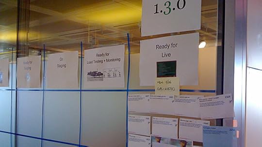
The planning wall in the Radio & Music product office.
Today sees a significant step towards the new Radio and Music product with the release of new beta station homepages for most of the BBC's radio stations.
This is the biggest change since the updates which I blogged about in February. It is the result of work by Andrew Scott's Radio & Music team in Future Media, and our editorial colleagues in Mark Friend's department, Audio & Music Interactive.
These pages are being released under a "Beta" banner, meaning they are not yet fully complete, and will not yet replace existing homepages (with the exception of Asian Network and 5Live Sports Extra which have already moved over to the product).
The reason we are releasing them now is to gather feedback on both audience needs and technical issues, which will help us ensure any major concerns can be dealt with before the product is launched later this year. Take a tour of the new features on our Welcome Page.

Consistent navigation across stations, showing link to welcome page
The most significant thing about this beta release is it shows how we're working to bring all of the BBC's radio stations together into one easy to use product, replacing the widely diverging designs, back end systems and technology that currently exist.
Our aim has been to put audience needs first, using a combination of usage data analysis, user testing and audience research to ensure that radio listeners get even more from BBC Radio.
Easier access to BBC Radio
The first thing you'll notice if you click around between stations is that we are trying to make things simple by using a consistent template across every station. Once you "get" how one station works, you don't have to re-learn it for a different station. For example, the link to the station schedule is in the exact same place for every station.
Later this year we'll be enhancing the look and feel to ensure that the character of each station is brought out even more.
We have listened to feedback from users and moved away from the pure "carousel" approach that many people didn't like with our earlier test site.
Greater control over your radio
With greater accessibility to radio comes greater control over content. One key feature that we are prioritising is the ability for the user to "Favourite" programmes and clips, by clicking the "Add To Favourites" link.
This allows users to save items to listen to later, and quickly get to the content they want via the Favourites page, giving a more personal and simple experience.
Add to Favourites
We have made this feature available to logged-in users only, so you can quickly get to your Favourites wherever you are and on all your devices. As more and more people use multiple devices - laptops, desktops, tablets, smartphones - this really makes sense.
So, if you see something at work you want to listen when you are at home, simply log in, click the "+" button next to the item, and quickly find it again via Favourites later.
Over time this feature will become widely available on all radio pages.
Discover more great content
With this beta release, we have made listening live extremely prominent (most online streaming is to live radio, not on-demand), creating a large space where we will progressively enhance the live experience.
Currently we are offering just the basics around the on-air programme and what's coming up next, but in the future we will use this space to surface more relevant content and context, whether that's related links or audio clips, archive content, live video, audience feedback or synchronous programme information.
The live tab offers information and content that enhances the live experience.
Alongside listening live, we're using a "tabbed" approach to present a wider range of content to users in a digestible manner. By having separate tabs which you can click though, we can expose content grouped by, for example, genre (e.g. Radio 4 comedy), automation (e.g. Popular Shows) or by editorial curation (e.g. Highlights).
Responsive pages
In line with the BBC's four screen strategy, to allow access to BBC Radio when and where you want, we are working to make the new station homepages work in a responsive manner across desktop and tablets, regardless of screen size. By "responsive", I mean that the homepages will detect and adapt to the particular device you access them on, giving you the optimum size and format for the screen you are using.
Unlike the new TV channels sites, for now we have taken the decision to offer different views of the station sites for mobiles (from the same code base) to ensure that as many mobile devices can quickly access BBC Radio on the go as possible. We work closely with the TV & iPlayer team, so will learn from what they are doing with a fully responsive design for the future.
Let us know what you think
Lastly, and most importantly, we want to hear from you with your thoughts on the new station homepages. You can complete a survey, send us an email (radiobetafeedback@bbc.co.uk ), comment below, tweet with the hashtag #bbcradiobeta or use our Feedback page.
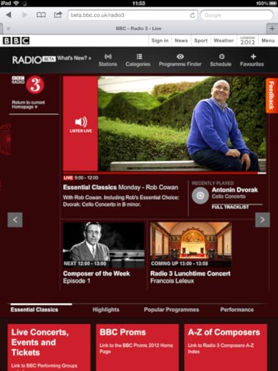
Screenshot of Radio 3 Station Homepage on an iPad oriented in Portrait
Chris Kimber is Executive Product Manager for the Radio and Music product
June 8, 2012
What's on BBC Red Button 9th - 16th June
London Collection
Aerial view of London, looking east towards Canary Wharf
The London Collection is an archive collection that celebrates the people and places of London. Highlights are available on the red button and the full archive collection is available online at BBC Four Collections. There will be various programmes on both BBC Two and BBC Four which are supported by this collection.
Available on all platforms
Freesat/Sky/Virgin Media:
Tue 12th June, 10:00pm-4:00am
Wed 13th June, 10:30pm-4:00am
Freeview:
Tue 12th June, 10:00pm-12:50am
Trooping the Colour
Watch uninterrupted coverage of Trooping the Colour, the Queen's Birthday Parade on the Red Button. There's continuous live coverage from the events without any commentary.
Available on all platforms
Freesat/Sky/Virgin Media:
Sat 16th June, 10:30am-1:30pm
Freeview:
Sat 16th June, 10:30am-1:00pm
Springwatch
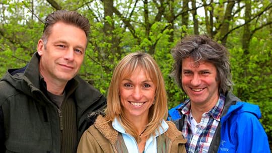
(LR) Chris Packham, Michaela Strachan, Martin Hughes-Games
Your stunning photos of spring, direct from the Springwatch Flickr group are available to view via the Red Button. For more Springwatch content including more webcams and all the photos go to bbc.co.uk/springwatch.
Available on all platforms
Freesat/Sky/Virgin Media:
Sat 9th June, 6:00am-7:00pm, 10:30pm-6:00am
Sun 10th June, 6:00am - Mon 11th June, 8:00am
Mon 11th June, 7:30pm - Wed 13th June, 6:30pm
Wed 13th June, 10:30pm - Thu 14th June, 4:15pm
Thu 14th June, 7:30pm-4:00am
Freeview:
Sun 10th June, 6:30pm-8:00pm
Tue 12th June, 8:10pm-9:50pm
Thu 14th June, 8:55pm-10:20pm
CBBC Extra
Press red on the CBBC channel this week and join Chris and Hacker. T. Dog as they introduce exclusive clips from a wealth of CBBC goodies including all-new Deadly 60, Wingin' It and Friday Download.
You can also read Chris and Dodge's blog, answers to some of your questions, read your horoscopes and see if the jokes that made Chris and Dodge LOL will have the same effect on you.
Go on, press red... You know you want to!
Available on all platforms
Freesat/Sky/Virgin Media:
Mon 11th June, 3:00pm-6:00pm
Tue 12th June, 3:00pm-6:00pm
Wed 13th June, 7:00am-10:00am, 3:00pm-6:00pm
Thu 14th June, 7:00am-10:00am, 3:00pm-4:15pm
Fri 15th June, 3:00pm-6:00pm
Freeview:
Thu 14th June, 7:00am-10:00am
News Multiscreen: Video Choice
Everyday the BBC News On Demand team rounds up the day's news to bring viewers a two-minute bulletin of headlines. On weekends the tone becomes more conversational when Red Button viewers can watch a topical interview in 'Five Minutes with...' or a round-up of the week's weird and wonderful videos in Odd Box.
Five Minutes With... / Odd Box: Weekends (around the clock)
Available on Sky and Virgin only
CBeebies Red Button
BBC Red Button welcomes younger viewers and grown-ups with a sense of adventure to the big, bright and fun world of CBeebies interactive!
Your children's favourite characters are at the heart of the interactive TV experience. Satellite and digital terrestrial viewers will have slightly different offerings
from one another. This has enabled the Red Button team to offer the best games tailored to each system.
CBeebies Red Button is available on the CBeebies channel, and via page 5900 on other channels.
Available on Freeview and Sky only
BBC Sport Multiscreen**
Catch up on all the latest Sport via the BBC Sport multiscreen. Headlines are available around the clock with up to five additional streams available to cover the best that BBC Sport has to offer.
Please note that Red Button sport timings are subject to change at short notice.
For the latest information refer to the BBC Sport website.
Highlights
Euro 2012 - Live coverage with alternative audio and rolling highlights.
F1 - Highlights from the Canadian Grand Prix.
Tennis - Live coverage of the Aegon Championships from Queen's Club in London.
**Note all Red Button times are subject to change at short notice
BBC's Blog

- BBC's profile
- 28 followers

