
BBC's Blog, page 2
March 6, 2014
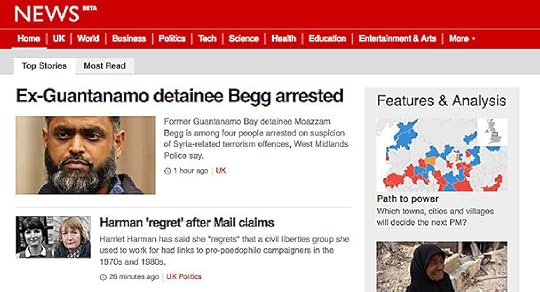
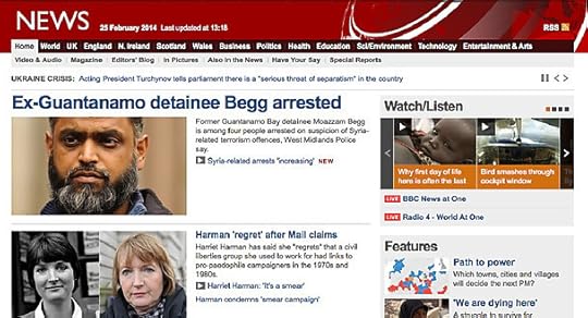
New search results page for mobile in beta
Hi I’m John Barratt, Senior Product Manager for BBC search.
I'm pleased to tell you that yesterday a new search results page that is optimised for mobile devices was launched as a beta.
For the past year, if you performed a search on http://www.bbc.co.uk/ from a mobile device, you would have received the main desktop search results page, where ‘pinch and zoom’ was required to resize the page to an appropriate size. This wasn’t a great user experience and with the mobile search audience more than doubling in the past 12 months, we wanted to improve their experience urgently.

The resulting mobile-optimised, search results page allows you to search quickly and efficiently across News, Sport, TV & Radio, iPlayer and Editors Choice. The search query and results page will resolve to your handsets orientation and screen size. We’ve looked to test this across a range of screen sizes from the small to medium screens such as the Samsung Galaxy S3 mini, HTC Desire to the iPhone 5 onto the extra-large devices including the Galaxy S3, Note 2, HTC One, so we should have you individual screen covered.
If you are unable to reach the mobile-optimised results page, you may have previously accepted a cookie that will redirect you to the desktop version. To remove this, please navigate to the footer of any BBC page and select the Mobile Site link (if you can see the Desktop Site link, then this cookie has not been set) or alternatively, open your browser settings and clear the cookies (generally stored under privacy), and then navigate to Search.
If you would prefer to keep using the desktop results page, this can be reached by selecting the Desktop Site link in the footer.
2014 promises to be a big year for search in the BBC. We’ll be taking your feedback and tracking how you use the service to help guide the design of our fully-responsive search results page. We will also have completed our migration to a new search engine that will give us more freedom to tune the results, providing better quality results for searches.
The beta gives us a great opportunity to get some direct feedback on both the mobile-optimised search pages and Search in general. So please add your comments below or pass your feedback via the link at the bottom of the mobile search results page.
John Barratt is Senior Product Manager, Search, BBC Future Media


March 5, 2014
Testing mobiles: Mobile Compatibility Program
Hello, I'm Paul Rutter, Test Manager for POD Test in Mobile Platforms, Programmes and On-Demand, BBC Future Media.
In my last blog post, "Testing BBC iPlayer for Android Downloads" I mentioned how our Android products are installable on over 3000 different devices. In addition to this vast range of devices, there’s also different firmware versions and operator customisations to consider. For iOS we too have hardware and firmware fragmentation to consider. That’s for native applications. For responsive web products the hardware/firmware considerations are even greater.
More and more people are using mobiles and the BBC has many products that audiences enjoy on an ever-increasing range of mobile handsets and tablets. We need to better understand, internally, what are our supported devices across our range of products and also to better inform our audience on what devices they can expect to get the best experience with on our products.
In addition, we’ve always worked with manufacturers to evaluate new devices that are yet to hit the market to make sure that they are technically capable of supporting our products and that the experience of our products on the device will be acceptable. We want to make this a more robust and formalised process.
To address these issues, we’ve rolled out a Device Compatibility Testing program in my team. We are calling it the BBC Mobile Compatibility Program.
What are we trying to achieve?
The program is expected to provide the following:
• A better understanding of what our supported Mobile devices are across BBC mobile native applications and responsive web products
• Evaluation of pre-production devices for compatibility in meeting technical requirements for BBC mobile products
• Evaluation of pre-production operating system updates
• Advice on classification of devices for product specific features
• Maintained results, fedback to manufacturers and the audience
• Initial focus is on Android, in particular BBC iPlayer, BBC Media Player, BBC iPlayer Radio and BBC Sport
We hope the program will cover all BBC mobile products in the future.
How devices are chosen:
In order to ensure the cost effectiveness of committing to support a device, we have set fair criteria each must meet to determine whether they should enter the BBC Mobile Compatibility Program.
Further information on how devices are selected for BBC iPlayer features (including the downloads service) is available on the BBC iPlayer help pages.
Once we have run the MCP on all devices that meet the selection criteria, we will continue to work our way through other devices in order of popularity in the UK and BBC usage.
How is the Testing performed?
We are trying to run as much of the testing outside of our products. We have developed an Audio-Video (AV) Test Harness application that allows us to select and play representative video content, at different bitrates, on the device to perform our video playback evaluation.
We are working to integrate our DRM solution and add samples of our audio streams into the AV Test Harness. This will allow us to evaluate DRM video downloads support and audio playback evaluation outside of the respective products (BBC iPlayer and BBC iPlayer Radio).
Longer term we are hoping to offer access of the AV Test Harness to manufacturers so they can perform some level of compatibility testing themselves before submitting a device to the BBC.
In addition to the AV Test Harness evaluation, we also perform smoke testing of core functionality of the BBC iPlayer, BBC iPlayer Radio, BBC Media Player and BBC Sport products.
As mentioned above, longer term we hope to extend this to the full range of BBC native applications as well as responsive web products.
The output
Once testing is complete we update our results matrix and create a short report per device. This can then provide any or all of the following:
• Advice to Product Owners around device compatibility
• Recommendations to enable/disable particular product features
• Product defects to be reviewed by a product owner and prioritised within a development team
• Defects relating to the device and/or operating system itself which are fed back to the manufacturer
I hope this insight has been interesting and if you have any questions please feel free to comment below.
Paul Rutter is Test Manager, POD Test in Mobile Platforms, Programmes and On-Demand, BBC Future Media
March 4, 2014
BBC News website: responsive design in beta
Hello, I'm Niko Vijayaratnam and I'm a Senior Product Manager in BBC News looking after the News site.
Today I'd like to tell you about some changes on both the existing and responsive versions of the News website that you may notice over the next week or two related to the rollout of our responsive website.
Beta - responsive site in desktop view
Existing site in desktop view
What's changing?
Over the next couple of weeks we'll be showing a selection of our audience a more prominent option to view the responsive 'beta' site on tablet and desktops - In the UK, around 5-10% of the audience will see the following banner presented at the top of the existing site when viewed on a tablet or desktop. Internationally, this percentage will be lower.

The responsive site will display a banner inviting feedback on the product
If you choose to view the beta (by clicking 'take me there'), you'll be taken to the responsive site which will display a banner inviting feedback on the product.
Note: If you aren't in the sample who will be shown the banner on the existing site, you can still click on the 'mobile link' at the bottom of the page to view the beta on your tablet or desktop
Why are we building a responsive website and what is it?
Every week, the BBC News website (including our World Service news sites) gets around 115 million visits and the number coming from mobiles and tablets is increasing all the time to the point that these devices now account for 43% of unique browsers to www.bbc.co.uk/news - this means we truly need to think 'mobile-first' at the BBC when building our online products.

When you take into account the variables listed below which come into play when our audiences visit BBC News online, building a premium experience (like our existing website) that's the same across all these different variants becomes impossible, unless you build web pages that are too large to load in a reasonable time on a large proportion of devices (which is definitely not what we want to do!):
different browsers;
five different internet connection types (broadband, GPRS, Edge, 3G and 4G);
different screen sizes and pixel resolutions;
touch gestures;
mouse and keyboard interactions;
etc...
Like most digital sectors, we are using responsive design to keep up so that we can offer the best experience possible to our audiences, no matter what combination of device, browser, connection etc... they are using. You can see how the responsive site works at different screen sizes on desktop by adjusting the size of your browser window to see how the content automatically flows and re-adjusts to the screen size i.e. it is one site that works across all screens.
Two of our development leads, John Cleveley and Tom Maslen have written at length about the details of our responsive development approach which is an excellent resource for anyone wanting to understand how we've built the responsive site.
What is a beta?
We often release new services or redesigned versions of existing ones which are sometimes badged as ‘beta’ services i.e. you can see the word 'BETA' appended to the News logo.
By using the term 'Beta', we mean that the service is not completely finished but it still does everything it’s designed to do e.g. it follows the same rules for cookies and privacy as existing services.
As mentioned above, the beta version of our responsive site is running along side our existing site on tablet and desktop. If you view our site on a mobile browser, you'll have seen that our responsive website is already available on mobiles by default. On tablet and desktop however it is still in 'beta' - on these devices today you won't see our responsive site when you visit www.bbc.co.uk/news unless you click on the "mobile site" link at the bottom of the page - otherwise you'll receive our existing site by default.
Why are we promoting the beta version of the responsive website?
Because only a very small percentage of our tablet and desktop audience have seen the beta until now it is very difficult for us to get feedback on it without prominently offering a way to access it - therefore, we are introducing the banner shown above on our existing site to entice some of our audience to try out the responsive beta and tell us what they think.
Testing new products in the open like this is the best way to get real feedback from real users, which helps us improve the service. That’s what we call ‘iterative design’.
What is different about the beta?
The beta on tablet and desktop is designed to be simpler than our existing site and of course it is optimised for different screen sizes - Using the beta we hope you'll be able to find the content you're looking for faster and more easily.
If you have never viewed the responsive website on your tablet or desktop device, please spend a little time exploring it and send us some feedback. We'd love to hear what you think so that we have the opportunity to make any changes before rolling it out further - this will only happen once we are satisfied that the beta site meets the high standard we have set ourselves.
So please do give feedback on the beta and I'd also be interested in your comments.
Niko Vijayaratham is Senior Product Manager, BBC News
February 27, 2014
BBC Programme pages: content driven responsive redesign
I am David Marland, Technical Development Lead for bbc.co.uk/programmes.
Since October 2007 /programmes has been a continuous rolling archive detailing BBC Programme information for TV and Radio. The central BBC programmes data store (PIPs) has accumulated over 1.6 million individual episodes and /programmes surfaces a page for every single one. This means a permanent URL and historical record, even after they have stopped being available to watch or listen. Some programmes have had special attention and have a complete archive going back even as far as 1942.
/programmes publishes a vast amount of content with pages such as (deep breath): brands, series, episodes, clips, episode guides, broadcast histories, galleries, credits, tracklists, chapters, character profiles, contact details, live blogs, collections, seasons, day schedules, week schedules, a-z lists, programme search, categories and even experimental QR codes.
All of this makes /programmes a big project, but it is not a BBC brand in its own right. Visitors don't generally arrive on the homepage, but rather The Voice website, The Archers website, Doctor Who or the Radio 4 schedule. /programmes is intended to invisibly power these brands, which is achieved through extensive collaboration with teams from all over the BBC.
What's new today
As of today the homepages for individual programmes, known as the brand page, have been relaunched with a new design. This design is responsive, making it flexible for all devices and joins the A-Z, Category and Schedule pages that were built this way last year.
A programme page on different devices
The main change is that the new brand page has a clear area at the top showing how to find the latest episodes. Previously the information in the top panel would move around as episodes became available or expired. The new panel has clear boxes for On demand (iPlayer/iPlayer Radio) and Next on (upcoming broadcasts on TV/Radio). These panels will not move, even if they are empty. Previously many visitors would keep searching the page for available episodes, even when there weren't any to find. Now the answer is given immediately in the same space. Links to related podcasts, clips and even information on how to purchase have been promoted to this area allowing you to always find some way to enjoy the programme. A greater emphasis has been placed on new programmes, with a "New Series" flag on TV indicating when something is fresh.
The brand page is a fully responsive page, meaning it fits no matter how wide your screen is. This is necessary with the explosion of mobile and tablets in the marketplace. 39% of visitors are now arriving from these devices (mobile 24%, tablet 15%) and we have to ensure the pages are suitable for all. The pages are touch friendly with larger hit areas for links, swipe-able carousels and no content in hover states, but they are not touch-priority. The detection of a touch capable browser doesn’t mean touch is in use, so all interfaces must support both scenarios.
Soon we will be rolling out the remaining pages as part of this responsive rebuild. /programmes releases updates to the site every two weeks so there are always tweaks and improvements happening.
How we built it (the technical bit)
It wouldn't be possible to build and maintain a website so big without a framework and some principles. Once this system is in place new pages can be constructed in a very short period of time, and automatically match the look and feel of the rest of the site.
Our intention is to build a website using content driven, progressively enhanced, responsible web design.
Content Driven
/programmes is built from the URL upwards. It important to know which content truly belongs on a page, especially when building a responsive page. If some content can be sacrificed on mobile due to lack of space, then it has to be questioned whether it belongs on the desktop too. We look at the content and see if it has a canonical URL of its own. If so then by default we show a link to it and if there is enough space on the page we may choose to lazy load the content with JavaScript. This is strictly only used on content that has a page of its own. Mobile users and those without JavaScript MUST be able to able to get to the same content.
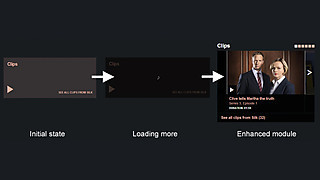
The latest clips carousel on the Silk brand page
The example above is the latest clips carousel on the brand page. The brand page URL is http://www.bbc.co.uk/programmes/b01hzsch. The carousel is a way of showing a sample of the most recent clips for that programme, but there is already a page that has that list so by default the brand page will just show a link that page. If there is room JavaScript will bring the first 6 items from the list into the main page. As the clips box is generally outside the initial viewport this usually happens before the user has seen it.
The benefits of this approach is that the initial page download is much faster as we don't have to prefetch the content to generate the whole page, and we are sending less data to the user in the first response. This also helps where /programmes can't rely on caching to be fast. Due to the archive nature of the site you don't have to navigate far before you're on a page nobody has visited recently and it will be noticeably slower to load. By requiring less data in the first request we can help speed up requests where caching alone is not enough.
On the brand page this lazy-load technique is used for the "Clips", "Galleries" and "You might also like" boxes. Promotions (high priority links to key content) do not use this technique as they do not have a home of their own. Their home IS the brand page, so they are there from the beginning.
JavaScript is used, but as a light touch and is NEVER as a core requirement of a page. Any link that is activated through JavaScript must work without it, which also has the benefits of allowing all links to be opened in a new tab. Using href="http://www.bbc.co.uk/blogs/internet/p...#" in links is not allowed.
Images
Images are generally the largest source of download size for a webpage and on responsive webpages images of several sizes are needed, due the the unknown sizes of the containers they may be in. We have taken the "Content driven" approach to images too. On aggregation pages containing many links to programmes the core content of the page is the list of links to other pages. As the canonical home of each image is the programme page, having it in the aggregation page is a visual enhancement. Therefore by default these aggregation pages don't display an image and the image of appropriate size for the current container width is loaded in via JavaScript. Also, only the images that are currently visible are loaded. As you scroll the page, the images you are about to reach are pre-loaded. This has the benefit of only downloading images that you view, which can save up to 1MB on longer pages if the user doesn't scroll. A similar technique is also used by the Responsive News team, who have open-sourced their solution as Imager.js.
Icons are another source of images that could use bandwidth, so for iconography we have chosen the route of an Icon Font. The main benefit is the core set of GEL icons is just 8kb to download. All the icons can then be used multiple times on a page, at different sizes and in different colours, without incurring further downloads.
CSS
We have setup a CSS framework making extensive use of Sass. This has allowed us to build CSS in a very modular way, creating vast amounts of reusable code. We follow the BEM syntax, which does introduce extra markup into the HTML. However this is mitigated as the back end system allows the HTML to be generated easily and gzip is highly efficient at compressing repetitive HTML. The modular components we use are detailed on the /programmes Styleguide, which describes common patterns across /programmes. Re-using these patterns makes building a new page from scratch very fast and minimises the need to write additional CSS. The /programmes global.css is currently only 15.4kb after gzip and this powers everything regarding layout so far. The remaining responsive pages shouldn't need to increase that too much further.

CSS modular components
Our CSS is constructed "mobile-first" with media queries defining breakpoints for changes in layout where needed. Continuing with our "Content driven" approach, we allow tweakpoints outside of the main set of breakpoints if an individual component needs to make some adjustments in its own design.
Sass allows us to easily support both old and new browsers. Internet Explorer 8 and below do not support media queries, and therefore cannot do proper responsive pages (without a JavaScript-intensive polyfill). We use a Sass component named Breakup that allows us to name and wrap blocks of media queries. We can then generate a separate stylesheet for IE8 and below that serves the "desktop" set of media queries unwrapped. This means there is no need to write the code twice for different browsers.
By following these principles we have rebuilt /programmes pages to be robust, semantic, accessible and future-proofed for devices we don't even know exist yet. The codebase is maintainable and scalable to support the vast size of the site as it grows even further.
As we rollout responsive views of the rest of the page types remember to take a look at the evolving styleguide and keep an eye on the ever expanding archive.
David Marland is Technical Development Lead for bbc.co.uk/programmes.
BBC Programme Pages: Content Driven Responsive Redesign
I am David Marland, Technical Development Lead for bbc.co.uk/programmes.
Since October 2007 /programmes has been a continuous rolling archive detailing BBC Programme information for TV and Radio. The central BBC programmes data store (PIPs) has accumulated over 1.6 million individual episodes and /programmes surfaces a page for every single one. This means a permanent URL and historical record, even after they have stopped being available to watch or listen. Some programmes have had special attention and have a complete archive going back even as far as 1942.
/programmes publishes a vast amount of content with pages such as (deep breath): brands, series, episodes, clips, episode guides, broadcast histories, galleries, credits, tracklists, chapters, character profiles, contact details, live blogs, collections, seasons, day schedules, week schedules, a-z lists, programme search, categories and even experimental QR codes.
All of this makes /programmes a big project, but it is not a BBC brand in its own right. Visitors don't generally arrive on the homepage, but rather The Voice website, The Archers website, Doctor Who or the Radio 4 schedule. /programmes is intended to invisibly power these brands, which is achieved through extensive collaboration with teams from all over the BBC.
What's new today
As of today the homepages for individual programmes, known as the brand page, have been relaunched with a new design. This design is responsive, making it flexible for all devices and joins the A-Z, Category and Schedule pages that were built this way last year.
A programme page on different devices
The main change is that the new brand page has a clear area at the top showing how to find the latest episodes. Previously the information in the top panel would move around as episodes became available or expired. The new panel has clear boxes for On demand (iPlayer/iPlayer Radio) and Next on (upcoming broadcasts on TV/Radio). These panels will not move, even if they are empty. Previously many visitors would keep searching the page for available episodes, even when there weren't any to find. Now the answer is given immediately in the same space. Links to related podcasts, clips and even information on how to purchase have been promoted to this area allowing you to always find some way to enjoy the programme. A greater emphasis has been placed on new programmes, with a "New Series" flag on TV indicating when something is fresh.
The brand page is a fully responsive page, meaning it fits no matter how wide your screen is. This is necessary with the explosion of mobile and tablets in the marketplace. 39% of visitors are now arriving from these devices (mobile 24%, tablet 15%) and we have to ensure the pages are suitable for all. The pages are touch friendly with larger hit areas for links, swipe-able carousels and no content in hover states, but they are not touch-priority. The detection of a touch capable browser doesn’t mean touch is in use, so all interfaces must support both scenarios.
Soon we will be rolling out the remaining pages as part of this responsive rebuild. /programmes releases updates to the site every two weeks so there are always tweaks and improvements happening.
How we built it (the technical bit)
It wouldn't be possible to build and maintain a website so big without a framework and some principles. Once this system is in place new pages can be constructed in a very short period of time, and automatically match the look and feel of the rest of the site.
Our intention is to build a website using content driven, progressively enhanced, responsible web design.
Content Driven
/programmes is built from the URL upwards. It important to know which content truly belongs on a page, especially when building a responsive page. If some content can be sacrificed on mobile due to lack of space, then it has to be questioned whether it belongs on the desktop too. We look at the content and see if it has a canonical URL of its own. If so then by default we show a link to it and if there is enough space on the page we may choose to lazy load the content with JavaScript. This is strictly only used on content that has a page of its own. Mobile users and those without JavaScript MUST be able to able to get to the same content.
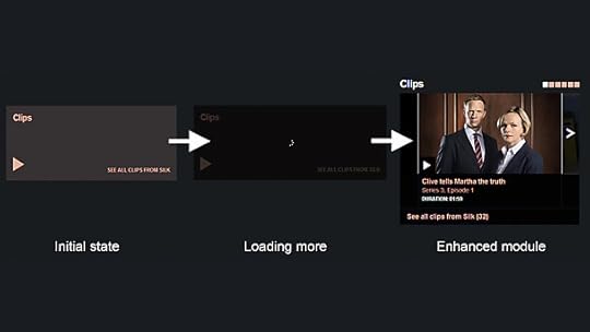
The latest clips carousel on the Silk brand page
The example above is the latest clips carousel on the brand page. The brand page URL is http://www.bbc.co.uk/programmes/b01hzsch. The carousel is a way of showing a sample of the most recent clips for that programme, but there is already a page that has that list so by default the brand page will just show a link that page. If there is room JavaScript will bring the first 6 items from the list into the main page. As the clips box is generally outside the initial viewport this usually happens before the user has seen it.
The benefits of this approach is that the initial page download is much faster as we don't have to prefetch the content to generate the whole page, and we are sending less data to the user in the first response. This also helps where /programmes can't rely on caching to be fast. Due to the archive nature of the site you don't have to navigate far before you're on a page nobody has visited recently and it will be noticeably slower to load. By requiring less data in the first request we can help speed up requests where caching alone is not enough.
On the brand page this lazy-load technique is used for the "Clips", "Galleries" and "You might also like" boxes. Promotions (high priority links to key content) do not use this technique as they do not have a home of their own. Their home IS the brand page, so they are there from the beginning.
JavaScript is used, but as a light touch and is NEVER as a core requirement of a page. Any link that is activated through JavaScript must work without it, which also has the benefits of allowing all links to be opened in a new tab. Using href="http://www.bbc.co.uk/blogs/internet/p...#" in links is not allowed.
Images
Images are generally the largest source of download size for a webpage and on responsive webpages images of several sizes are needed, due the the unknown sizes of the containers they may be in. We have taken the "Content driven" approach to images too. On aggregation pages containing many links to programmes the core content of the page is the list of links to other pages. As the canonical home of each image is the programme page, having it in the aggregation page is a visual enhancement. Therefore by default these aggregation pages don't display an image and the image of appropriate size for the current container width is loaded in via JavaScript. Also, only the images that are currently visible are loaded. As you scroll the page, the images you are about to reach are pre-loaded. This has the benefit of only downloading images that you view, which can save up to 1MB on longer pages if the user doesn't scroll. A similar technique is also used by the Responsive News team, who have open-sourced their solution as Imager.js.
Icons are another source of images that could use bandwidth, so for iconography we have chosen the route of an Icon Font. The main benefit is the core set of GEL icons is just 8kb to download. All the icons can then be used multiple times on a page, at different sizes and in different colours, without incurring further downloads.
CSS
We have setup a CSS framework making extensive use of Sass. This has allowed us to build CSS in a very modular way, creating vast amounts of reusable code. We follow the BEM syntax, which does introduce extra markup into the HTML. However this is mitigated as the back end system allows the HTML to be generated easily and gzip is highly efficient at compressing repetitive HTML. The modular components we use are detailed on the /programmes Styleguide, which describes common patterns across /programmes. Re-using these patterns makes building a new page from scratch very fast and minimises the need to write additional CSS. The /programmes global.css is currently only 15.4kb after gzip and this powers everything regarding layout so far. The remaining responsive pages shouldn't need to increase that too much further.
CSS modular components
Our CSS is constructed "mobile-first" with media queries defining breakpoints for changes in layout where needed. Continuing with our "Content driven" approach, we allow tweakpoints outside of the main set of breakpoints if an individual component needs to make some adjustments in its own design.
Sass allows us to easily support both old and new browsers. Internet Explorer 8 and below do not support media queries, and therefore cannot do proper responsive pages (without a JavaScript-intensive polyfill). We use a Sass component named Breakup that allows us to name and wrap blocks of media queries. We can then generate a separate stylesheet for IE8 and below that serves the "desktop" set of media queries unwrapped. This means there is no need to write the code twice for different browsers.
By following these principles we have rebuilt /programmes pages to be robust, semantic, accessible and future-proofed for devices we don't even know exist yet. The codebase is maintainable and scalable to support the vast size of the site as it grows even further.
As we rollout responsive views of the rest of the page types remember to take a look at the evolving styleguide and keep an eye on the ever expanding archive.
David Marland is Technical Development Lead for bbc.co.uk/programmes.
BBC Travel beta updated
Hello,
I’m very happy to tell you that after 6 months of extensive work to improve many aspects of the service, the new version of the BBC Travel News product is returning again as a beta.
We’ll be iterating and gathering the feedback until the service has been fully developed and is meeting the expectations of its audience.
More information about the initial scope of the beta can be found in my earlier blog post.

BBC Travel beta on three screens
The current improvements are mainly “behind the scenes”, but guarantee reliability and the highest quality of the data, that is ever so important in a case of the BBC services.
We have also introduced a new feature of ordering the incidents by severity, distance or incident type, which will allow the users to customise the service in a way that works best for them in particular circumstances (for example “sort by severity” is the default state on desktop but we believe that on mobile “sort by proximity” will give the information in a more relevant way).
You will see more features appearing within the next months, starting with the next mode of transport, and we hope that you will find them useful and intuitive. We’d like to hear your feedback so please do share your comments with me and the team by commenting on this post, or alternatively contact us at travel.beta@bbc.co.uk.
Karolina Iwaszko is Product Manager, Travel & Navigation
February 25, 2014
New BBC Mobile Accessibility Guidelines
Hi I’m Henny Swan and I work in the Accessibility team which is part of BBC Future Media. We provide tools, training, and support to teams within the BBC so that they can deliver web content and applications that are accessible to disabled audiences.
In June last year we published a draft of the BBC Mobile Accessibility Standards and Guidelines. Since then we've been listening to feedback, reviewing the standards and guidelines, and refining techniques so that today the standards can finally come out of draft. To help showcase techniques and best practices we have housed them in their own HTML app with offline storage so they can act as both a reference site as well as a prototype to showcase best practices. You can grab a copy of the BBC Mobile Accessibility Guidelines from the BBC Future Media Standards and Guidelines site.
The Standards and Guidelines are written for BBC.co.uk content developed for UK audiences and for use with the technology commonly available in the UK. They are intended as a standard for BBC employees and suppliers to follow however they can also be referenced by anyone involved in mobile development.
The standards and guidelines are organised into 11 topics. Each is listed with HTML, Android and iOS techniques, examples and evaluation criteria. As accessibility is a shared responsibility there are sections for User Experience, Editors and Developers where roles and responsibilities are defined and a summary of those issues most relevant to the role are listed.
We define standards as best practices that can easily be tested with specific criteria that is not subjective and is technologically possible to achieve with current assistive technology on mobile devices. These are issues that must pass internal tests. Guidelines are best practices that are less testable but considered core to accessible mobile website and apps. As such these should pass tests where possible.
At the BBC we consider accessibility standards and guidelines to be only the first step in delivering accessible experiences for our audiences. We aim to not just make access to news, TV, radio, weather, sport, entertainment and learning accessible but also fun, engaging and above all easy for all our users.
We've evolved the standards and guidelines with a number of apps, Weather, iPlayer, iPlayer Radio, News and Sport, testing out rationale and techniques on web, Android and iOS. The BBC Weather app was built from the ground up with accessibility in mind for both Android and iOS. A lot of work went into focus management and logical content ordering to make complex data for hourly forecasts over 5 days comprehensible to screen reader users and visually easy to follow.
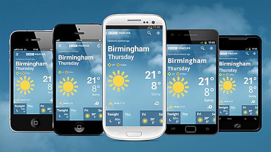
The BBC Weather app on Android and iOS phones
I would love to hear your feedback. Either leave a comment or email us at AccessibilityTeam@bbc.co.uk.
Henny Swan is a Senior Accessibility Specialist, UX&D, BBC Future Media
February 24, 2014
#newsVANE at BBC News Labs
BBC News Labs is part of BBC Connected Studio’s pan-BBC innovation and collaboration programme.
I'd like to introduce you to a new project called #newsVANE.
Background
The BBC is approaching a new challenge: In coming months and years, we will have a fast-growing abundance of content items tagged and interconnected by semantic web technology.
To give a sense of the scale involved, the BBC is broadcasting hundreds of hours of News every day, globally, in thirty languages, in TV, Radio, and web page formats. For every hour of material there are hundreds of topics mentioned, all of which can be connected with semantic technology.
Add to this the many thousands of hours of BBC News Archive we plan to publish.
While this is an amazing situation to be in, and while it will help the BBC tell powerful and interconnected stories even more effectively, it gives rise to a new challenge.
The Challenge
For any given linked data topic or Storyline, there is going to be a profusion of associated pieces of content, from the BBC and elsewhere. So how do we select the best, the strongest, the most appealing, emotive, and relevant content from this array of connected items? How do we avoid a confusing myriad of options, and steer our users toward the best experience?
This presentation can be found at the BBC News Labs Slideshare account
Tools: the Data
We have at our disposal a plethora of data sources from BBC R&D, internal BBC News systems, other private BBC systems, publically open data providers (Gov, ONS et al), and internet feeds.
These data sources have various properties that might be used to help us signal, select and prioritise, and perhaps even "leap across the connections” to the next, most resonant and contextually relevant content items and news “Storylines”.
One especially interesting data source is The Juicer, in which we have over 650,000 News articles tagged with 150,000+ semantically connected topics. This is a platform we have previously been using to support prototyping, and we now want to use this repository of Journalism as a data source in itself. Among other things, The Juicer allows us to measure the frequency of topic occurrence within various slices of the News, and also the patterns in co-occurrences of topics with one another.
The Approach: #newsVANE
#newsVANE is the umbrella project for a set of prototypes to explore the possibilities during 2014. The question we are asking in the #newsVANE project is:
How might we use combinations of our data sources to generate scalable relevance tools, so that we can promote the best connections across millions of content items & topics?
Dashboard & Infographic Prototypes
We are prototyping with combinations of these data sources to produce dashboards and infographics as a way to test emergent ideas with Journalists and and with ad-hoc user testing.
Some early ideas include the compilation in a dashboard of various data sources: feeds, timeline of the emergence and development of news, trending topics and stories on social media and in our content… The kind of tool that journalists could be keen on firing first thing in the morning.
We also focus our attention on the exploration of semantic referencing of news, in the hope that some patterns or correlations will emerge.
If you are interested in finding out more, you can follow us and receive updates via these platforms:-
Matt Shearer is Innovation Manager, BBC News Labs
February 19, 2014
College of Technology: { develop: BBC } conference, behaviour driven development, loudness
The BBC College of Technology website is a relatively new site launched last year to provide resources around broadcast technology, software engineering and business systems. Andy Wilson, the head of the College of Technology wrote about the website launch in a previous post.
At the tail-end of last year the College of Technology ran the { develop: BBC } 2013 event bringing together the best developers from the BBC and companies like Google, Facebook and the Financial Times. It seemed obvious to take advantage of the fact that we had a group of world class speakers assembled, so we made some films with them and their equally talented BBC counterparts.
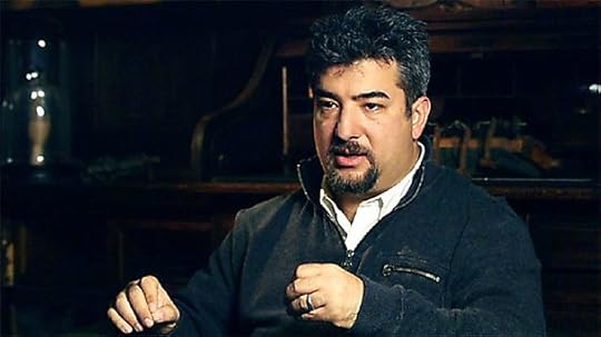
Kevin Goldsmith is Spotify's director of engineering
Kevin Goldsmith (Spotify's director of engineering) presented his insights into building a culture of excellence in engineering. He shares his secret ingredients for running successful engineering teams. Kevin believes that if you set bright, creative people on the right path and let them go, they will deliver something better than you could ever have imagined. On the importance of communication skills the BBC's Nic Ford chimed in with a lovely observation: "You can be Einstein but if you can't communicate Relativity, you're gonna be stuck in a patent office."
As we move towards a world where everything is mobile and the challenge of internet connectivity to access content becomes increasingly important, we thought it would be good to explore the difficulties and possible solutions to making the web work offline with Jan Jongboom, a Firefox OS Contributor, and Jake Archibald of Google Chrome. Why do developers love building apps for different platforms when they could build a single website with friendly URLs and easily updatable content? Well, It's all about caching and with apps it is easier to simply display the most recent content and only fetch new content when a connection is available. But what is needed on the web is a way to give developers control to judge, on a connection by connection basis, whether or not they need to go to the internet or not. Jake and his colleagues are working on just that.
The third film in the develop: BBC series focuses on optimising content for different browsers and breaking the 1000ms barrier. It features Google’s Ilya Grigorik and will be published soon.
If develop:BBC was all about bringing the best minds together at a single event then sharing the BBC and wider industry's best practice is a core aim of the website.
Demonstrating best practice in areas like Behaviour Driven Development is a crucial part of that mission. In our film about improving software testing Rebecca Salsbury, head of core engineering at BBC News & Knowledge, explains how BDD focuses on application behaviour from the user point of view and helps teams to translate the business requirements into a clear and simple language that developers can then implement.
Finally, it's all about loudness. The BBC Academy have been presenting a series of events around the UK to raise awareness of loudness and audibility issues in TV sound among BBC staff, indies, freelancers and external suppliers. Sound is a massive issue and as the single biggest topic of viewer complaints, we made a short film with broadcast engineering trainer John Heraty to support the cause of maintaining consistent sound levels that don't irritate our audience's ears. Sound advice indeed (other lame loudness puns available on request).
I'll report back here when there are any significant updates to the website and if there's anything you'd like to see more (or less of) please leave a comment below.
Jim Downie is a senior producer within the BBC Academy and is responsible for the development and commissioning of content on the College of Technology website.
Building the Winter Olympics Web Pages
Hello,
Six months ago I blogged about the development of BBC Sport's Correspondent pages - Sport's first fully responsive web pages. Since then we have been working hard creating a whole range of Winter Olympics pages such as the Sochi 2014 homepage, discipline pages e.g. snowboarding, the medal table and schedule.
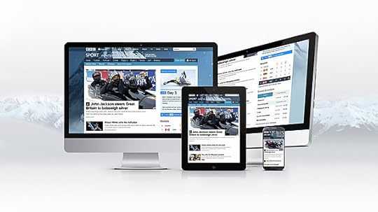
The Sochi 2014 homepage across devices
In this blog post I want to go into a bit of technical detail on how we built these pages and how this applies to future responsive content. You may also be interested in reading Johnathan Ishmael's recent blog post which details how our colleagues built pages supporting live text commentary and live video and audio for Sochi.
A race against time
Working to strict deadlines is a challenge that every developer on Sport quickly learns to deal with - we cannot move events in the sporting calendar, so we have to plan carefully and manage our time effectively. Given that we have three major events this year: the Winter Olympics, FIFA World Cup and the Commonwealth Games, much of the development work put into Sochi has been in developing a framework that will make building other Sport pages not only easier but achievable given the time constraints.
The best developers are lazy (bear with me) - wherever possible we want to avoid writing new code. Moving towards fully responsive web-pages and semantically structuring our information around type (e.g. today's stories, audio and video highlights, long-form articles), rather than platforms (desktop vs. tablet vs. mobile), goes a long way towards removing duplication of effort. In addition to this, in collaboration with other BBC product teams such as News, we have come up with an approach that allows for maximum re-use of anything new that we develop…
The recipe for a page
To construct a page, we need three things: components, a page template which gives these components structure within the page layout and the layout configuration which configures each component within the page.
Component
A component is a self-contained building block - each page is composed of a number of these. To aid re-usability each component is decoupled from other components - there are no cross-dependencies but we can use a "publish-subscribe" JavaScript mechanism to communicate across components on the client-side if necessary. The component itself is responsible for fetching data from services, processing this (filtering / ordering / adapting data) before rendering itself - usually as a block of HTML. Decomposing the content into components not only facilitates effortless re-use but it also provides us with a common vocabulary about which we can describe different page between team members (e.g. UX&D, editorial, development and product).
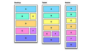
The composition of the Sochi 2014 homepage is illustrated below. Each coloured section marks a different component:
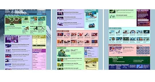
The homepage is quite long, so here it is split into 3 sections (top/middle/bottom).
Multiple instances of the same component can be displayed on the page in different locations, as demonstrated by the components labelled "Audio Video 1" and "Audio Video 2" above.
Each component has an associated set of CSS (we have found that using the BEM methodology is a natural fit here) and may have an associated JavaScript module which adds behaviour. Components adapt to the space in which they are contained by fluidly resizing and changing their internal layout where necessary. Components can either be "baked in" to the initial page's HTML response, or post-loaded with Ajax.
Page Template
A page template defines the overall structure of the page. It provides slots into which components can be placed. For example, the following shows a simplified version of the event index page template which is used to power the Sochi 2014 homepage:
The
The "event index" page template knows how to structure components, but it is not tied to the Winter Olympics. The layout itself adapts according to the space available - in the example above, the layout changes from multiple columns at a wide viewport (e.g. typical desktop screen size) to a more vertically stacked layout as it is constrained towards narrower screens. We use a responsive "grid" specified by the GEL team to ensure internal spatial consistency on the page and with other BBC products.
Multiple components can share the same slot. For example, the "medal table" and "event schedule" shown above are both placed in slot C.
Layout Configuration
In addition to decoupling components from each other, we also make every effort to decouple the components from the content itself. For example, there is nothing in the "headlines" component shown above that forces it to display Sochi 2014 stories - it has a responsibility to present a list of editorially managed headlines but is not tied to the Winter Olympics.
Layout configuration is the part that provides context - it configures a particular page by defining the following for each component:
•Their slot within the page template (the location in which they are homed);
•The service from which they should fetch their data and the configuration of this service request;
•Hints on how they should display.
Layout configuration is the least re-usable of the three ingredients. Therefore it is important that it is lightweight i.e. concise and easy to create and maintain. For the Sochi 2014 homepage, a sample of the layout configuration as represented by JSON looks something like this (some property names have been changed for clarity):
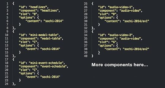
Layout configuration for the Sochi 2014 homepage
The BBC Sport editorial team are able to change the layout of the page by applying overrides to this configuration (by hiding / showing components or changing the location at which they are displayed).
Developing for the long-term
With development cycles that are tied to the Sporting calendar, it can be easy to fall into the trap of setting all of your goals around the next "big" event. However, we do try and find some time to invest in tasks that whilst not meeting immediate, short-term goals, will pay off in the long-term through more efficient development, better automated testing, or a higher-quality product.
The viewporter is one such tool that meets this criteria. It's a very simple in-browser tool for testing web sites at various screen sizes. We created this tool over a few days in collaboration with UX&D earlier last year and have recently open-sourced the code. You can try the viewporter out for yourself or view the code on GitHub:
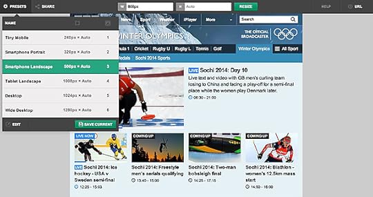
The
The road to Glasgow
Hopefully this blog post has given you some idea of how we build pages within BBC Sport. Over the coming weeks and months we are going to be applying these techniques to both the World Cup 2014 and Commonwealth Games pages.
William Bamford is a Senior Software Engineer in BBC Sport
BBC's Blog

- BBC's profile
- 28 followers

