
BBC's Blog, page 17
June 13, 2013
The Secret Life of the Cat: Interactive infographics
Hi I’m an editorial designer for BBC News and recently my teammates and I have been working on an interactive feature to accompany and enhance the BBC Two Horizon programme The Secret Life of the Cat.
Ever wondered what your cat gets up to once it leaves the cat flap? The Horizon programme, in collaboration with the Royal Veterinary College, set off to a Surrey village with GPS trackers and collar ‘cat cams’ to find out.

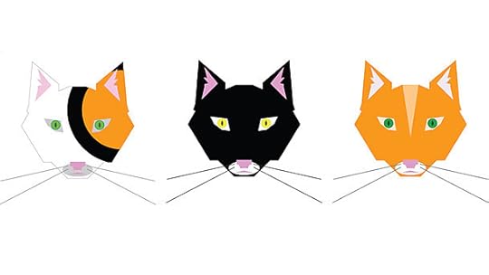
Cat tabs
While the idea seemed light-hearted to begin with there was some serious science behind it. We know more about wild tigers than our cuddly feline roommates and this project aimed to fill that information gap. The study, the largest of its kind ever conducted in the UK, also offered interesting challenges for our team.
Wanting to make our content fun as well as educational we decided to arrange the information around 10 of the cats tracked by the research team. In order to do this we made clickable 'cat tabs', illustrations of each of our 10 cats which would serve as the main navigation around the content.
When a user chose to click on a tab it would take them to a new page of content about that selected cat with information about their character and roaming habits as well as video of their activities.
None of us had illustrated cats before and it turns out it's tough to get right. We have discarded art boards full of cat disasters: stylized robots, cheap clipart and several rather evil looking specimens.
Rejected illustration
After a few rounds we established a style we were happy with and wanted the illustrations to be slightly sprawling over the top of the page in a ‘cat-like’ way. It was also important we carried that same style across all platforms.
Editorially we built the content up from feature phones (small screens, no JavaScript) where we wanted the most basic experience to be a scientific profile of each cat. As we progressed upwards into smart phone territory we added the illustrations and stacked the various cat profiles behind a drop down menu.
The different profiles also became more enhanced with static maps of each cat's daily journey and clips of cat cam footage. Once into tablet and desktop space we went to town. We made the maps clickable so that the different cat routes would lead the user back to each cat profile page, we added cat cam video panels navigated to from an individual cat image as well as the clickable cat tabs mentioned previously.

The design for different screen sizes
Lucy Rodgers, the editorial lead on this project, describes the experience:
“The cat project was a perfect one for the Visual Journalism team as we specialise in visualising large amounts of data in an engaging way. The key to the success of the project was collaboration from the start, getting the programme producers talking to the designers, developers and editorial strands of the website team to find out what content would be needed and when.”
A key aspect to the work was mapping the data. Developer Noah Veltman, our visiting Knight-Mozilla OpenNews Fellow, worked on parsing and sequencing tens of thousands of raw GPS readings into a usable format and then used that data to build prototypes using mapping tools like Leaflet and D3. He experimented with a variety of different views like a heat map, a comparison of one cat's movements on different days and a chart of total distance travelled, before settling on the time-lapse of a day in the life of a particular cat as the most interesting view.
All these elements were being assembled by developers Marina Shchukina and Steven Atherton with help from Chris Finch. They were often coding while we were still figuring out aspects of the design.

The desktop, mobile and tablet view
Working in such an agile way has its advantages and drawbacks. It’s easier to make design decisions when they can be seen in a browser, but as we work to such tight deadlines it can create unexpected complications such as compatibility in older browsers, responsive coding complications and so on.
This more joined up way of working with development, design and editorial teams collaborating from the start, is the inevitable future for our team in my opinion.
A lot of hard work went into this feature and I’m grateful to have worked on it alongside some very talented people. I would be interested to hear what you think.
Helene Sears is an editorial designer for BBC News.
Read more about developing the cat-cams for The Secret Life of the Cat on technologist Alia Sheikh's blog and more about the programme on the BBC TV blog.


June 12, 2013
Storyline Data Model: Sharing the ontology for BBC News
I’m Robin Pembrooke and I’ve recently joined the BBC as the new head of product for News and Weather in Future Media.
In my first blog post I’m going to be telling you about a new data model concept called Storyline which we hope will provide the basis for innovative online journalism partnerships.
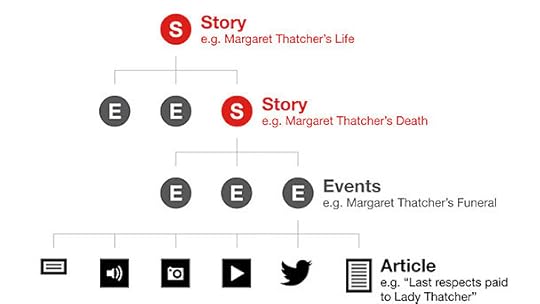
Conceptual representation of the Storyline Model
For more details about the above image please see the BBC Ontologies page.
The BBC believes in distributing its work to the wider industry in order to benefit users and other online publishers.
One aspect of this is the thinking around the use of metadata in BBC News stories, how we tag our articles, pictures and video clips to make our content easier to find and more accessible
This year a group of like-minded data architects from a number of UK publishers, including The Guardian and The Press Association, have been informally working on a data model that supports how stories like these are told and they’ve found a lot of common ground in their thinking.
They’ve created what looks like a really interesting and viable model which we’re beginning to build prototype services around. The model has been provisionally called Storyline and we’ve published it on this page alongside other BBC Ontologies.
We believe it will help create more compelling user experiences about evolving News stories, particularly in showing how stories develop over time.
We’re interested in exploring how this could be used as a tool to drive co-operation on stories between different news organisations.
Do get in touch with either myself or Jeremy Tarling if you would like to be involved. We’re very interested to hear views from other news and media companies on how the model could evolve in a way that benefits everyone.
This is a first step in what we hope will be an ongoing programme of active partnership activity from the BBC News Online team both in the UK and overseas. I will be interested to hear your feedback.
Robin Pembrooke is head of product for BBC News and Weather.
June 11, 2013
BBC Food: Your Favourites
Hi I’m Andy Pipes, executive product manager for Knowledge & Learning (K&L) which looks after the BBC Food website.
Today we are announcing some changes to how you can bookmark recipes on BBC Food. This blog post outlines the changes and the reasons behind them.
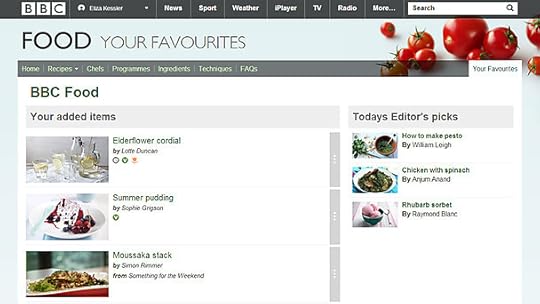
Your Favourites on BBC Food
Goodbye Binder, Hello Favourites
In the past the BBC’s websites have had different ways for the audience to share, collect and annotate BBC content. To ensure audiences have a consistent experience we’ve begun to standardise the way that we describe these actions.
You might have noticed, for instance, that the button to allow users to share pages on Facebook, Twitter and Google is now consistent on News, Sport, BBC iPlayer, Food and most other BBC websites. You can read about this in my colleague Mark Channon’s blog post.
Radio iPlayer already allow users to save their favourite programmes using the Add to Favourites button when a list of episodes or series is displayed. As of today, BBC Food will share this function.
The current Recipe Binder will become Your Favourites. Saving a recipe to Your Favourites is as simple as clicking the green Add to Favourites button that appears next to the recipe title.
Removing an item from your favourites is just as easy. Follow the link to Your Favourites to see a list of your saved recipes. Click on the grey vertical bar to remove a favourite from your list when on the Your Favourites area.
For anyone with recipes saved on their current Binder, we will move your saved recipes over to your Favourites list. Those recipes will be stored against your BBC iD, which means that you can still take your Favourites with you on any device or screen you happen to be logged in to.
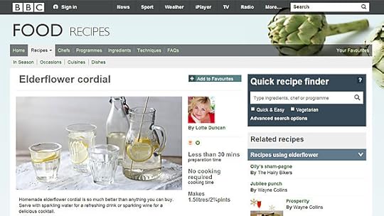
The Add to Favourites button
What happened to filters, notes and search?
The old Binder service included a filter and search function which allowed users with many saved recipes to easily pull out the one they wanted to access. Unfortunately this feature is not yet part of the new Favourites area.
This was a difficult decision based on the fact that just 0.07% of visitors to the Food website used this search facility in the Binder. The seldom-used feature, Notes, is also being closed as we move on to the new platform. The small number of people who used this service have been advised to copy their Notes before the upgrade to BBC Favourites to avoid disappointment.
If you have questions or comments about the updates, please ask them in the section below and we will do our best to answer any queries.
Andrew Pipes is the executive product manager for BBC Knowledge & Learning.
BBC Online Briefing: Q&A
I see the BBC Online Briefing as a great platform to inform the companies we work with about the exciting things going on within Future Media.
After a busy day ,including live demos from the Connected Studio team and a brilliantly provocative Audiences session from Julian Dickens, Ralph Rivera and I sat down for a Q&A with Kirsty Wark.
Here is a film of Kirsty grilling us about the closure of DMI which broke as a story earlier that day, posing questions about our plans and strategy from members of the audience in BBC Radio Theatre.
In order to see this content you need to have both Javascript enabled and Flash Installed. Visit BBC Webwise for full instructions. If you're reading via RSS, you'll need to visit the blog to access this content
Watch the Q&A
Jane Weedon is controller, Business Development.
Delegates reaction to the Q&A:
@GinaFegan:'With DMI we weren't able to fail fast and fail forward!' Ralph Rivera #bbconline @d_media_network
@apadmi: We think building companion apps for every TV show is a brilliant idea ;) #BBCOnline
@turnipshire: @RalphRivera surely good games developers are native online storytellers? #bbconline
June 9, 2013
New BBC Weather app for Android and iOS
I’m James Metcalfe, senior product manager for the BBC Weather website and as my editorial colleague Liz has mentioned on the BBC Editors blog, today we launch our native mobile apps for Android and iOS.
The Android version is now available from the Google Play store and the iOS version is available from the iTunes store.

The BBC Weather app on multiple=
While most users have traditionally visited the BBC Weather site on their desktop, we have seen a huge increase in mobile use over the past year. It is with this in mind that we have been working on a truly mobile BBC Weather offer for our audiences.
The results are clear, easy to use apps that are now available for the majority of visitors to BBC Weather, covering 82% of mobile weather visitors. Features include:
Location aware five-day forecasts and 48 hours of UK based hourly forecasts.International locations and three hourly forecast details.Extra detail for each hour including Visibility, Humidity and Pressure.Settings to change your app preferences.Ambient transitions to provide more context about the weather at your location.Accessibility for screen readers via voice over. An Android widget with a five-day overview.BBC design principles with usability at the core.
Native or hybrid HTML5?
We wanted to provide the best user experience we could for mobile devices. Based on our research, 80% of respondents said a simple uncluttered forecast was most important and this focused our design approach, which my colleague Stephen will discuss in more detail soon.
Through prototyping and user feedback sessions we clarified our designs and also investigated the use of HTML5 hybrid apps along with a purely native app. Deciding our approach was not easy as both have advantages.
However, based on feedback, speed and simplicity were highlighted as particularly important on the move and to present forecast data quickly we chose to develop native code. We could take full advantage of location and data management whilst interactions, transitions and animations were far easier to implement.
It has provided us with the foundations in which we can continue to enhance and expand new features using the best of native or even HTML5 as it becomes more responsive to our needs on mobiles.
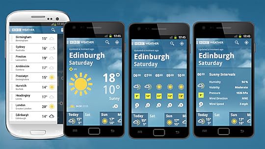
Different ways to view content
The major features of the apps are the same for both platforms but there are subtle differences in the interactions to take advantage of the familiar navigation on your phone. The iOS app has been created to ensure the best standards and guidelines have been followed so all interactions menus and settings should be very familiar to iOS users, such as a left navigation menu with search and edit functionality.
The major difference for Android is the use of the action bar for search and the ability to offer an interactive home screen widget, which we are pleased to include in this first version. We added some fun stuff too like bumping two phones together to share your favorite locations over Near Field Communication (NFC).
We have also managed a quick update in time for launch to include the new Android standard navigation drawer which was announced a few weeks ago at the Google developer conference.
Testing for multiple devices
As there are so many variations of mobile device on the market there was some concern about building two apps for release at the same time. How could we test effectively on the huge variation of devices that our audience use?
We decided to automate testing through the use of the Behaviour Driven Development (BDD) framework Cucumber to define scenarios in plain language and wrote Calabash step definitions that turn behaviours into automated code our apps understand, then simulate the interactions common to mobile phones such as swiping a screen.
We are already comfortable using BDD and felt this approach would give us the best possible coverage whilst automating the common tests would free up our testers to focus on less common interactions.
We automated these tests as part of our deployment and for the first time integrated with a hosted device lab that would run all of our scenarios on a wide range of phones overnight. This provides a collection of screenshots which we were then able to use to quickly confirm the behaviour was as expected on many devices.
We have also verified through Beta testing with hundreds of users that the apps work on as many devices as possible.
We are aware however that to cover every device combination would be almost impossible, especially for Android. So if you do see any bugs please let us know using the feedback link in the app and provide details of your phone and operating system.
We have worked hard to make the apps accessible by checking the colour contrasts of images and considering text to speech devices. My colleague Al Duggin will write more about accessibility on the Internet blog soon but if you have further feedback on how the app performs via screen readers please let us know.
Feedback
We will be adding additional features such as sharing and longer range forecasts to the apps and our mobile site, but would also like to know your views on what you want from a weather app. We have already considered forecast maps for mobile and this is something we will look at as we re-evaluate this section for the desktop site.
We will keep a close eye on all of your comments so do please let us know how you find your experience using the app. As well as via reviews in Google Play and the iTunes app store you can contact us via twitter @BBCWeather, via our contact form or leave a comment below.
When leaving a comment or reporting a problem it would be a great help if you are specific about which device you are using and which version of the operating system you have installed (which can usually be found in the ‘about’ section of the settings menu on your device).
I hope you find this BBC Weather app a valuable addition and look forward to hearing your feedback.
James Metcalfe is senior product manager for BBC Weather.
June 7, 2013
What's On BBC Red Button 9 - 15 June
This week on BBC Red Button you can sing along with the ever popular Horrible Histories karaoke and dance along with interactive DJ sensation DJ Yoda - and then sit back and enjoy international show jumping live from the Olympic Park.
DJ Yoda

DJ Yoda
DJ Yoda presents 6 Mix, live from BBC Radio 6 Music. Watch DJ Yoda present 6 Music’s Friday Night Party from 10pm, including an exclusive audio visual mix fusing Yoda’s unique sound with stunning visual effects, video and graphics.
Available on Freesat/Sky/Virgin Media/Freeview
Fri 14 June, 10:.0pm-12.00am
Horrible Histories Karaoke

Horrible Histories Karaoke
Grab your hairbrush, take a trip back in time and sing along with the biggest names in history. From Vikings to Dickens, Joan of Arc to Rosa Parks, rock your socks off to the CBBC Horrible Histories Karaoke!
Available on Freesat/Sky/Virgin Media/Freeview
Sat 15 June, 12.00am-6.00am
Springwatch 2013
Available on Freesat/Sky/Virgin Media/Freeview
Mon 10 June, 8.00pm-6.00am
Tue 11 June, 6.00am-7.00am, 8.00pm-6.00am
Wed 12 June, 6.00am-12.30pm, 3.15pm-5.45pm, 8.00pm until Thu 13 June 12.30pm
Thu 13 June, 2.00pm-5.45pm, 8.00pm-9.30pm
Sport Highlights
Watch the drama and excitement building at the Canadian Grand Prix with the driver tracker and forum and don't miss the top-class international show jumping live from the Olympic Park in London. The world's top 40 riders are competing including Team GB gold medallists from the 2012 Games.
For information on timings see the BBC Sport website. Note times are subject to change.
Don't forget you can follow us on Twitter at @BBCRedButton. Answers to frequently asked questions about BBC Red Button can be found on this page.
The Red Button video stream is now available to Virgin Tivo users when they press red.
Links: DMI and BBC Online Service Review
Hi everyone it’s been an eventful few weeks for BBC Online, so here’s a quick run-down of the main news stories and opinions over the last month.

Digital Glastonbury
The main news story was the announcement that the BBC will close its Digital Media Initiative (DMI). DMI started in 2008 and intended to move the BBC’s production and archive operations to a fully integrated digital way of working. The scrapped project will have cost £98.4mllion.
BBC director of operations Dominic Coles on the About the BBC blog:
"We are very aware that the mistakes made must not happen again. We never forget we are spending Licence Fee payers’ money and we will learn some hard lessons from this experience. By their nature technology projects, especially those that attempt to break new ground, are high risk. This is not unique to the BBC. But in future we will do more to mitigate those risks. We will be quicker to act when projects are not delivering."
"The corporation said the initiative had been badly managed and outpaced by changing technology, and that to carry on would be throwing good money after bad."
The BBC Trust review of DMI can be found on the BBC Trust's website as a PDF.
The announcement, along with news that the BBC's chief technology officer has been suspended, was reported extensively across online news portals and beyond.
Days later The Guardian reported that Trust chairman Lord Patten was warned that the Digital Media Initiative technology project was “doomed to failure” a year ago.
The news of the closure of DMI happened on the same day as the BBC Online Briefing. Director of Future Media Ralph Rivera answered questions about the project and its failings at the BBC Online Briefing. Some of his responses were captured in tweets:
“Our biggest challenge was that we weren't able to fail fast "…
“I hope it doesn't take away from our ability to take on risk"
You can find more information about the Industry Briefing on the blog and the BBC Commissioning website.
The BBC Trust released the findings of their Online and Red Button service review with the results concluding that the BBC serves audiences well across TV, computers and mobile.
The Guardian reported:
"A largely clean bill of health for BBC Online, which reaches 22 million people each week, was marred by the criticism that its online local news, considered the 'most important product in the BBC Online portfolio', is not as good as coverage of UK and international news."
And Advanced Television picked up on the recommendation that Online and Red Button should merge:
"It also wants to see the convergence of online and Red Button to see Connected Red Button – as available in Virgin Media homes – spread. It said that as the BBC Red Button “increasingly becomes a gateway to access BBC Online,” it would be sensible to bring them together under a single service license. This would help them to complement each other in the future, the Trust said."
While The Independent reported on the failure to reach the target 65 per cent of the UK adult online population by 2013:
"The report also revealed that audience appreciation index (AI) figures have fallen from a high of 83 in 2008 to 78 in 2013. The AI dropped as low as 72 last year, following changes to the site including a relaunch of the BBC Online news service."
Last week the BBC Trust announced its approval for the BBC to offer radio content for download to align it with the current TV catch-up offer on iPlayer. This means radio programmes will be available to download for offline access from 2014.
"For many folk, this has been a long-time coming. It means they will be able to download shows at home and listen to anywhere – this includes underground stations and even other countries where iPlayer isn’t available to stream."
The release of BBC iPlayer on Windows 8 phones was announced on the Internet blog but the lack of support for Windows 7.5 was criticised by the Inquirer
"It's bad news for Windows Phone users who haven't yet got the latest version of Microsoft's mobile operating system though, as the BBC announced today that the app will not be supported on Windows Phone 7.5, despite having promised that it would make an appearance on older devices."
The BBC has revealed plans for a “truly digital” summer of Glastonbury coverage.
Pocket Lint:
"The BBC says it wants to take what it learnt from the Olympics and other major events held in the meantime - such as Hackney One Big Weekend - and bring a different view to the UK's largest music festival."
And finally, the BBC Trust has also upheld a complaint that the clock on the BBC homepage was "inaccurate and misleading", reflecting the time on a users computer as opposed to the accurate GMT time. Picked up by the Daily Mail, the story soon created buzz on Twitter:
@kcorrick: No matter the result: that a) someone complained abt this b) BBC Trust thought it worth taking seriously, says good things abt UK #bbcclock
An article in the Guardian expressed sympathy:
"Time measurement has vexed humanity throughout history – even before Einstein discovered that, from the complainant's point of view, a moving BBC clock ticks more slowly than a still one..."
Thanks everyone and have a good weekend.
Eliza Kessler is the content producer for the BBC Internet blog.
New Bitesize Infographics: Illustrating the Knowledge & Learning product
I’m Rebekka Campbell and I’m an editor in BBC Learning. I lead teams who make content for schools, teachers and students and one of my projects involves commissioning new infographics (information graphics) for BBC Bitesize.
Bitesize is the BBC’s online study support resource which is used by millions of students every year for help with coursework, classwork and exams. Later this year Bitesize is due to become part of the new Knowledge and Learning (K&L) website. Find out more about the new product from executive editor Chris Sizemore.

The Knowledge & Learning Beta
This is a great opportunity for us to update and improve the content we provide for our audiences. Bitesize already contains a rich mixture of online text and audio study guides, quirky video and interactives, quizzes and games. Powerful infographics will help to bind this wide range of content together visually making it feel like a diverse but cohesive whole.
The importance of infographics in creating a sense of unity applies not just to Bitesize but to the whole of K&L’s content. For young people and adults alike, ‘a picture is worth a thousand words’. As you’ll see from the examples below, complex topics can come to life when illustrated with rich and dynamic images.

Higher Business Management: The value of information (Sun and Moon Studios)
Creating these new infographics was a hugely exciting and challenging project.
We started by auditing the 15,000 pages of Bitesize content made in several different languages – English, Welsh, Scottish Gaelic and Irish Gaelic as well as French, German and Spanish.
Then we had to define a new visual style and apply this to the 6,000+ new images.
Throw in the requirement to make them display responsively on screens of different shapes and sizes, including phones and tablets, all in the midst of radical curriculum overhaul across the UK, and you begin to get an idea of the scale of the project.
It’s a huge job but we’re making great progress as you’ll see from the examples in this post.
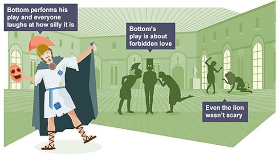
The new Bitesize infographics range from the data-rich and informational to the highly illustrative, such as this one which summarises part of Shakespeare’s A Midsummer Night’s Dream:
Key Stage 3 English: A Midsummer Night’s Dream (D8)
And this based on a key theme of Robert Louis Stevenson's novel Dr Jekyll and Mr Hyde:

GCSE English: Dr Jekyll and Mr Hyde – themes (Destrukt)
As well as this hard hitting one which represents the Prague Spring of 1968:

GCSE History: The Prague Spring (Kanoti)
And this which brings playful humour to the subject of levers:

GCSE Design and Technology: Class 2 lever (Jaywing)
We have hundreds of colourful diagrams representing topics as diverse as Business Management and Physical Geography:
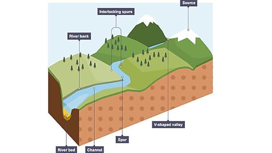
GCSE Geography: Features of landscapes shaped by rivers (magneticNorth)
We’ve also used data visualisation, a classic form of infographic which is widely used in BBC News coverage too:
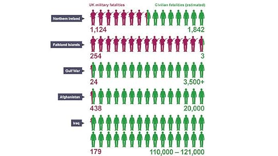
GCSE Religious Studies: War fatalities (Mr B & Friends)
And we have commissioned hundreds of scientific and mathematical diagrams, graphs and shapes:
Key Stage 3 Science (JayWing)
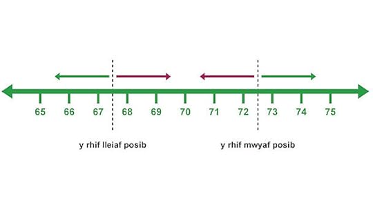
TGAU Maths: Number line (Infuze)

Key Stage 3 Maths: 3D diagrams (Infuze)
To achieve a sense of cohesion it was essential that we defined a consistent style for our images. Working with other teams, including BBC News, the K&L User Experience and Design team (UX&D) have created a new infographics styleguide.
Initially developed for curriculum content, it is now being adapted and used to enable other teams to create images for the wider K&L audience. These will appear in topical articles, features and a wide range of factual content. This example was created for BBC Food and demonstrates the price difference between champagne and other sparkling wine:
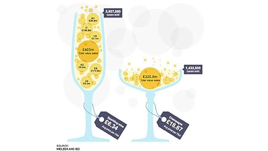
BBC Food: Champagne or sparkling wine? A battle of the bubbles (Positive Studios)
The new styleguide will help to tie K&L’s content visually to the rest of the BBC as well as giving K&L a distinctive look and feel all of its own. The styleguide has also enabled us to work effectively with a wide range of independent production companies and illustrators outside the BBC.
The guide defines everything from colour palette, to the font size and style for labels, to the illustration style, to use of texture.
The team are also developing an assets library of reusable parts and this helps us to work in a much more efficient way. It means you only need draw a dog once for example, and then next time you need a similar dog (or a test tube, a house or the axes for a line graph…) you can take it out of the library and reuse or adapt it.

An extract from the K&L Infographics Styleguide
Next steps include the development of graphics designed to be viewed on a mobile and exploration of the challenges that smaller screen sizes pose, as well as interactive infographics and interaction patterns. We are also looking at the development of more complex, composition-led infographics that combine typography, data visualisation and illustration.
At each stage of development we’ve tested our approach with audiences and incorporated their feedback.
The project is a brilliant example of the power of collaboration both within the BBC and with external partners. We’ve brought together Editorial and UX&D teams working across four nations on pan-UK content. These teams have worked with a wide range of teachers, students, educational consultants and independent design agencies around the UK.
We’ve created a new visual style which will help to unite a range of diverse and complex content. The next step is to get all this great new content live and out to the audience. Watch this space!
Rebekka Campbell is an editor in BBC Learning.
June 5, 2013
BBC Online Briefing: CBBC & CBeebies and the evolution of games
I’m Patrick Healy, head of product for the Children’s Interactive division.
My colleague Simon Lumb (product manager for Games Grid) and I recently gave a presentation at the BBC Online Briefing discussing the future of CBBC and Cbeebies online and how we used the Games Grid platform and the Connected Friends feature to support the new CBBC TV series called The Dumping Ground.

The online landscape for children
Connected Friends is the name given to a feature on the CBBC site that allows users to play games against their real world friends. The user needs to register on the CBBC site and once they have been allocated a display name by our system they can connect to and play games against their friends via the MyCBBC profile page.
You can find out more about connected friends and The Dumping Ground TV show in the video below.
In order to see this content you need to have both Javascript enabled and Flash Installed. Visit BBC Webwise for full instructions. If you're reading via RSS, you'll need to visit the blog to access this content
Find out more about CBBC Connected Friends
You can also find out more about Connected Friends in the presentation from our session which you can find by following this link. In this PDF we have outlined the challenges we face including an outline of our Multi-player games service and how Games Grid, our high score and rewards platform, is helping us develop reusable games features that drive our audience to return to unlock game rewards and share their scores.
Please take a look at the presentation and the video and let me know what you think by leaving a comment below.
Patrick Healy is head of product for Children’s.
Delegates reaction to the CBBC & CBeebies and the evolution of games session:
@joeldavey: Loved the user sign in demo at #bbconline
@camyule: HTML5 & Unity are amongst the gamedev skills CBBC are looking for from indies. Not quite our experience, but reassuring to hear #bbconline
@trevoridge: Awesome to see CBBC doing phased launches and data driven game design. #bbconline
@m_boesch : Over 1700 games on BBC.co.uk "Continue to expand our Mobile games offer, developed in HTML5" #BBCOnline downloads.bbc.co.uk/commissioning/…
June 4, 2013
Perceptive Radio: Object-based broadcasting
My name is Tony Churnside. I'm a media technologist for BBC Research & Development (R&D) and I specialise in the design, creation and assessment of new ways of producing and experiencing audio content. I'm also the technical director of the New Radiophonic Workshop.
On the May 22 BBC R&D launched a Perceptive Radio and there was quite a bit of media interest in the story so I decided to write an overview of the technology that drives the device.
I originally published this over on the BBC R&D blog but thought it would be a good idea to include the post here in order to gather some feedback and stimulate discussion which might influence our future work. So if you have a comment please post it below and I'll do my best to respond.
This is an overview of what we think object-based broadcasting might be, how it's different to traditional broadcasting and what benefits it could potentially bring to our audience.

Recently there have been a number of public facing experiments (here and here) which have explored various aspects of taking what we describe as an object-based approach to broadcasting.
Broadcasting began with mono radio. The same single signal was produced and broadcast to everyone. Everyone heard the same thing using a similar device and we didn't worry too much about things like the environment where audiences were listening.
Since then, broadcasting technology has come on a long way: from stereo (an additional channel), to black and white pictures, to colour pictures. Now HD pictures and 5-channel surround sound are broadcast every day.
These are all marvellous developments but fundamentally we are still sending the same signal to the whole audience. ‘So what’s wrong with that?’ you might ask.
When the whole audience listened to radio using what was essentially a small wooden box containing a single loudspeaker there was nothing wrong with sending the same signal to everyone. But that is not how people consume content anymore.
Today the number of different devices that can be used to consume linear BBC content (TV and Radio) is very large and thanks to improved mobile technology and the popularity of headphone listening the environments in which audiences consume linear content also vary widely. Sending the same signal to everyone inevitably results in compromise somewhere along the line.
Designers/developers have gone some way to solve this problem on the web with responsive design. The same information is provided to web viewers but the design and layout is adapted in response to the device the viewer is using to look at the page.
So how do we do the equivalent of responsive design for TV or Radio? The reason websites are able to respond dynamically is that they are not linear video streams, they are real time visualisations of data.
Common assets (text, pictures, sound and video) are used in the visualisations, but metadata exists which determines how these assets are displayed in response to the type of device asking to display them.

It is the application of this logic to linear media that results in an object-based broadcasting.
Take a radio drama as an example. Rather than broadcasting the stereo loudspeaker signals which contain a pre-mixed mixture of dialogue, narration, sound effects, music and background atmospheres, each of these sounds is sent as a separate audio object.
Along with these objects some metadata is included which describes when and where these sounds should occur and how loud they should be. All this is broadcast to a receiver. The receiver then reassembles the audio objects in accordance with the metadata.
Because this reassembly is happening in the receiver, the objects can be reassembled slightly differently for each listener by locally changing the metadata.
Once a linear piece of content is represented in this way it allows us to do some interesting and exciting adaptations in the audience’s device. For the sake of simplicity I’ve split these into four different types of adaptation.
1. Adaptation to suit the device or system: This is akin to responsive design and is perhaps the most obvious advantage. Someone viewing content on a mobile phone is likely to want a different version of the programme to someone viewing on a large screen. With the programme represented as objects the viewer could be given differently framed video or a different audio mix to best suit their system.
2. Adaptation to suit the environment: For example in the presence of a lot of background noise the viewer might need the dialogue to be louder in the mix.
3. Adaptation to suit the person: It may be that one listener prefers a different mix between the foreground and background sound to another. Or perhaps a viewer of the news is very interested in a particular sports team. An object-based approach could allow a viewer to have the programme content tailored to their taste or mood.
4. Full interactivity: The concept of object-based media is not really new. Computer games have been doing this for some time. In order to interact with a computer game the whole experience has to be driven by mutable data. It could be possible to create a fully interactive programme. Imagine choosing where to sit in a concert hall during a broadcast of classical music or navigating the houses in Albert Square during an episode of EastEnders.
An object-based approach could enable all these types of adaptation but it is still early days and there are hard research questions that we need to answer. Questions such as: ‘How much can these adaptations really improve the overall quality of experience?’ ‘How do we limit these adaptations to retain creative control of a shared experience?’ ‘How do we deal with phenomena like media bubbles and conformation bias?’ ‘What are implications of this for the writing and production process?’
But by doing experiments like this (with Mudlark building a prototype object-based radio), this (with Radio Drama looking at object-based production) and this (with 5 live looking at customisable football coverage) we hope to be able to answer some of these questions.
Thanks to Jasmine Cox for designing the lovely object-based broadcasting graphic.
Tony Churnside is a media technologist for BBC Research & Development.
Find out more about future audio formats and other projects on the BBC R&D website.
BBC's Blog

- BBC's profile
- 28 followers

