Don M. Winn's Blog, page 36
February 7, 2012
Very Basic Heraldry Part Three – Ordinaries
When knights first started using designs on their shields, the designs were very simple. The only purpose of the designs was to identify the knight carrying the shield. So simple shapes and only two colors on the shield were enough to do the job. These basic shapes are called ordinaries.
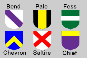
Here are a few of the most common ordinaries:
Bend – one wide diagonal stripe across the shield
Pale – one wide vertical (up and down) stripe down the middle of the shield
Fess – one wide horizontal (sideways) stripe across the middle of the sheild
Chevron – One big upside-down V in the middle of the shield
Saltire – A big X shape across the whole shield
Chief – one wide horizontal (sideways) stripe across the top of the shield
Later on in history, when shield design got much more complicated with animals and other elements included, these basic shapes were still used as part of the more complicated designs.
I decided to use a kind of fess in the coat of arms for my character, so the silver/white 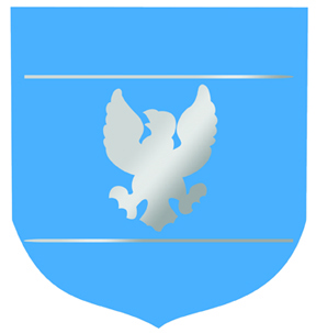 eagle is inside of a wide horizontal stripe across the middle of the shield. I did break tradition a little and instead of using a solid stripe, I just used an outline for the stripe (in silver/white) and left most of the shield blue. It's a little different from historical shields, but I decided I have a really good reason for doing it. The outline of the fess on my character's shield actually depicts some unique tools that are going to be important elements in the story. Stay tuned over the next few months and find out why!
Parents and kids, try making your own coat of arms. Make it as personal as you can…something that really shows who you are!


January 31, 2012
Very Basic Heraldry Part Two – Variations, Animals, Colors and Metals
Here's some more heraldry basics. Sometimes shields had patterns on them. These patterns are called variations. A shield could have variations over the whole shield or only on part of it. The patterns are usually made with two colors. I chose not to have a pattern on my character's coat of arms because I thought it would be easier for the illustrator. But here's a list of the most common shield variation names:
Barry – horizontal (sideways) stripes
Paly – vertical (up and down) stripes
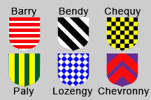
Bendy – diagonal stripes
Chequy – a pattern of squares, like a checkerboard
Lozengy – a pattern of diamonds, like a diagonal checkerboard
Chevronny – a stripe-like pattern of upside-down v-shapes
Historically, there doesn't seem to be any reliable explanation for why certain designs or animals were chosen to be part of a coat of arms. It seems that the owner of the coat of arms just chose whatever they liked. For example, one person could include a lion in their coat of arms and say that it stood for bravery and courage, while another person could have a lion on there and say that it stood for nobility and royalty. And both of them would be right.
The main colors used in coats of arms were gold/yellow, silver/white, blue, red, green, purple, and black. Gold/yellow and silver/white were considered metals. Blue, red, green, purple and black were considered colors…in the language of heraldry, colors are called tinctures.
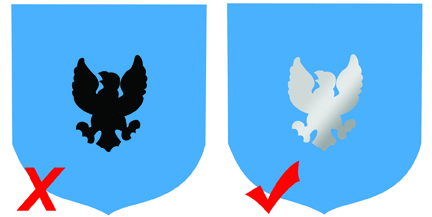
For my character, I chose to include an eagle in the coat of arms, because I wanted the eagle to represent wisdom and quick-thinking and far-sightedness. So I decided to have a black eagle on a blue background. But when I did some more research, I discovered that I had broken the Rule of Tincture.
The Rule of Tincture states that you may not have a metal on top of a metal in a coat of arms or a color on top of a color (there are a few historical exceptions). This rule existed because the whole point of carrying a coat of arms on a shield was to allow others to identify a knight from far away. It can be difficult to tell the lighter metals (gold/yellow and silver/white) apart at a distance, just like it could be difficult to see a dark blue lion on a black background from far away. But it would be easy to recognize a gold lion on a black background from far away. The contrast between the dark and light colors helps.
Well, I learned my lesson, and my character now has a coat of arms that follows the Rule of Tincture with a silver/white eagle on a blue background. If you think it still looks a little incomplete, don't worry. Stay tuned for the third and final part of my Very Basic Heraldry series where I will explain what ordinaries are.


January 23, 2012
Very Basic Heraldry Part One – Why Have a Coat of Arms?
I'm working on a new book right now. It's a chapter book for young readers with a medieval theme. So in order to really get to know my main character, it always helps me (because I am a very visual person) to see what my character looks like. I started thinking about the character's hair and eye color and face and height and all of those important things. Then I thought about his clothes, and while I was doing that, I realized that I wanted this character to have a coat of arms. That meant I had to do a little research on heraldry. I'll share some of what I've learned in a three-part blog. Here's part one: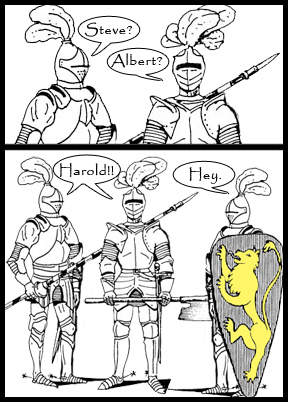
Heraldry is (in part) the study and creating of coats of arms. A coat of arms, in its simplest form, is a personal design on a shield that identifies the knight that carries that shield. Why was this even necessary? Because from far away a bunch of knights in armor all look the same. It would be hard to tell who was who. You could compare that to trying to watch a football or soccer game where nobody was wearing a name or a number and you were too far away to see the players' faces.
When a knight had a coat of arms painted on his shield, other people could recognize him right away. So knights and others would come up with their own personal coat of arms. They would have different colors or shapes or patterns or animals on their shields. Or maybe they would have different colors of shapes AND patterns AND animals. But whatever they chose, it had to be different from everyone else's shields. Coming soon…Very Basic Heraldry Part Two - Variations, Animals, Colors and Metals.


January 4, 2012
Coming Soon…
2012 is off to a great start over here at Cardboard Box Adventures. Right now there are a lot of projects in the works. Here's a quick update…
First on the agenda is a new, completely redesigned CBA website. Right now it's in the hands of the programmers and I hope it will be up and running by February. The new website has a crisper, cleaner look and should make navigation easier and more intuitive. It should also be better for viewing on tablets. Make sure to check out the current website now so you can see the difference when the new one goes live.
The newest addition to the CBA picture book collection is going to be called 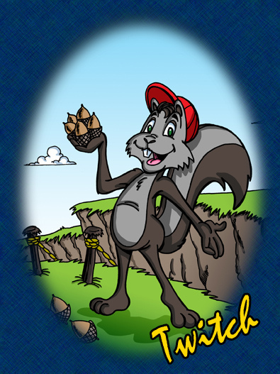 Twitch the Squirrel and the Forbidden Bridge. The manuscript has already gone through the final editing process. It's been tweaked and re-tweaked. I've seen sketches for most of the illustrations now, and they're going to be amazing! Dave Allred is doing a great job on them. This new story is action-packed and encourages children to respect their parents' rules and to recognize that many times those rules are meant to keep kids safe. I think that kids will come up with interesting answers to the questions at the end of this story. Right now I am hoping I can officially release Twitch sometime in February. Stay tuned for more information.
I am really looking forward to Cardboard Box Adventures entering a new phase of publishing in 2012. This year I will be releasing the first CBA chapter book. It is intended for grades 3 and up and I decided to write it because when I visit elementary schools, the older students often ask for something more than picture books. The idea for writing this book grew out of their questions. I have written the first draft of the story already and I'm working on editing it now. I will let you know more soon, but for now I will just say that I'm really excited about this book!


December 20, 2011
How Interactive Books are Good for Kids
A recent study reported by the BBC found that teenagers whose parents had been actively involved in helping them with their reading at the beginning of their school careers could read at a level of about six months ahead of their peers by the time they are 15. Imagine how much more of an advantage can be developed when parents help kids with reading even before they start school.
Helping children with reading doesn't have to consist entirely of teaching them to read. An enormous benefit can be had simply by reading with your children and then talking about what you have read. This helps them gain familiarity with the usage of new words, experience thinking about a story, and the ability to verbalize ideas about why characters do what they do. All of this is invaluable to them as they advance in their education. The study reported by the BBC stated that "parents did not have to be particularly well-educated themselves for this impact to be achieved. What was important was that parents read books regularly with their children – such as several times a week – and that they talked about what they were reading together."
When it comes to young children, this is true of all books, including traditional and electronic/interactive books. Some people have expressed concern about interactive books detracting from the reading experience, but interactive books can be a great, convenient, portable way to help kids practice their reading skills, improve their vocabularies, and make a connection with a story on a different level. And like all books, the biggest benefit for young children happens when a parent is there to share the story with their child and talk about it with them before, during, and after the reading. That's what helps most of all.
If you are interested in finding interactive books that you can read and discuss with yourchildren, I'm happy to announce that two of my books, The Tortoise and the 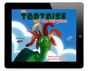 Hairpiece (in English and Spanish) and The Higgledy-Piggledy Pigeon are available as interactive books for the iPad and iPhone through a partnership with InteractBooks. As aspecial promotion this week, they are available for half-price ($1.99) starting the evening of Tuesday, December 20. All of the books include questions for discussion at the end that you can use as a starting point for talking about the stories. To access the books, download the free InteractBooks reader from the iTunes App Store and purchase the books from within the app using your Apple ID. You can also watch a video preview of The Tortoise and the Hairpiece.


