Tim C. Taylor's Blog, page 12
August 22, 2012
New formats coming for The Reality War
Book2: The City of Destruction
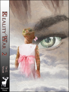
The second (and concluding) novel in my The Reality War mini-series was published for Kindle last month. Yesterday, I allowed the first book’s entry in Amazon’s ‘Select’ program to lapse, and so I published both books to Smashwords, which means they will be popping up in a few weeks on iTunes, Nookstore, Sony, Kobo etc.
The second book is all laid out, ready to make the paperback edition, but the cover design is not quite ready. There will definitely be a paperback for the second book this year, one way or another.
I’ve been waiting a long time for them both to appear in print. Then I can start sending them out to reviewers who prefer paperbacks, not least to the local press here in Bedford. I did contact the local press when I set up a Bedford-based publishing company, and again when I released an eBook novella based partially in Bedford (well, Elstow, strictly), but no interest. I was surprised about that, so I’m hoping for more of a reaction to 200,000 words in paperback set in various versions of Bedfordshire, and where local figure, John Bunyan, is in fact… (best not give too much away).
If you’re interested in finding out about The Reality War, I’ve posted some articles and interviews about it here.

Book1: The Slough of Despond


Adventures in typesetting: poetry book layouts and printer’s ornaments
I’ve been laying out some poetry paperbacks this week for Watermark Publishing and Greyhart Press. I think poetry is my favourite of all genres to format (at least in print) because it gives licence to design the page, in a way that would be too distracting for fiction (or, at least, most fiction… Jeff Noon’s asked me for some interesting shapes.) It also gives licence to over-design too, so it is a good idea to have someone to beta test your layout before committing to publication.
I thought I’d share a couple of ideas I’ve used, and some problems I’ve faced. One day, this will make it into the second edition of my book on laying out print books.
Fleurons and blank pages
‘Fleurons’ are decorative markings used in typesetting to denote borders, acts as spacers and scene dividers, or simply to add design fair. They are traditionally flowers, as the name suggests, or at least horticultural. In practice, they don’t have to involve vegetation, and there’s a spectrum running from the kind of large fleuron that might decorate the title page of a Regency romance, down to the smaller and more modest typographic mark that’s often called a ‘dingbat’, or… (and Frankie Howerd would have loved this) a printer’s ornament.
With a bit of imagination, you can make subtle enhancements to not-so-flowery books. For example, I produced the eBook version of Hauntings, a ghostly anthology where the print layout (a wonderful job by Storm Constantine) used a small skull as a dingbat. That was effective, but not without problems with the image file. Make sure you are using images rather than symbol fonts, and use high quality gif format files and not jpgs or anything copied and pasted between Word files. The eBook version of Hauntings looked awful until the publisher supplied me with a decent gif file for the skull.
Fleurons and dingbats are examples of what’s often called line art, which — despite its origins — in practical terms today means that the image is black and white (not shades of grey), or has a strictly limited number of colours.
Without going too technical, jpeg compression often leads to fuzzy grey edges around images that should be black and white; the gif format keeps them crisp. Amazon’s guidance for coding Kindle books tells us to always use gifs for line art, and that’s good advice for print books as well as eBooks.
The best way to get hold of a fleuron is to buy some royalty-free stock art, for example from Fotolia I have seen fleuron fonts (there’s an example in the image above) but in my experience, they never work when distilling the PDF and uploading to Createspace — I don’t think they are properly formed fonts.
Anyway, let’s get back to the poetry…
Poetry books are often slim volumes. If you’re using a printer such as Createspace, the way the minimum cost works out means that you will probably won’t pay any more printing costs if you add a few more pages. Therefore, unless your poems are mostly single page, I would suggest starting each new poem on a facing page because it looks neater and makes it easier to flick through and find the poem you want. [You do this by inserting an ‘odd page’ section break. There’s more about this in my book, but you don’t need to buy it, because I’ve posted the info on my blog here]
I did this recently for one of the Watermark books, but it did mean a lot of blank pages were inserted automatically in order to obey the instruction to start new poems on a facing page. Our solution was to insert a fleuron centred at the bottom of the blank pages, leaving headers and footers blank. I think it looks excellent. Why not experiment yourself?
It does need a little section-breaking trickery, and this is how to do it in Microsoft Word:
Reveal formatting (hit the ‘show/hide’ button that looks like a reversed paragraph mark) to see what’s going on.
You should already have a ‘section break (odd)’ at the end of the preceding poem section.
Before this section break, insert a new section break of type ‘next page’
Hit the enter key so you have a paragraph on the new page, and set to normal style to make sure there are no hidden nasties from the paragraph definition.
Insert picture, selecting your gif file. If you decide you want it bigger or smaller, do not resize in Word, instead resize in a drawing package (that can resample properly), save at the right size, and try again.
Click on the image to bring up the Picture Tools ribbon menu. Select the ‘Position’ command ,and set to centred and bottom.
Change the footers/ headers for your new section to turn them off. The way I work, I just need to click on the footer and select ‘different first page’ and it all goes away. If you need to do more and go changing header/ footer definitions, make sure the header/footer is not linked to the previous section and (easy to miss, this) that the following section is not linked back to the one you’ve just inserted.
That should be all you need to do, but as with anything involving sections, double check you haven’t broken your header/ footer layouts. To check, you had best create a PDF and view in the twin-page mode, because that’s where you get to see any blank pages.
If sections and footers make your brain hurt, then you aren’t alone. Try running through the instructions I referred to earlier to get the hang of the basics first.
Well, I had planned to write more — including potential Kindle formatting disasters — but I have several books I’m supposed to be editing right now, and I’d better get on with that. I’ll post soon.


July 23, 2012
Summer Splash Blog Hop is now open!
I’ve taken a break from the gale-force winds buffetting our tent (we’ve got good pegs and guys — no problem) to borrow a kind person’s computer to tell you the final part of the Summer Splash Blog Hop puzzle… where to find it! You can go straight there by following this link — the place is stuffed full of authors with fantastic prizes. For my offerings, click on one of the blog hop banners or this link for details of eBooks, paperbacks, and a completed but unpublished novel that I’ve got on offer.
Okay, back to my holiday… until next weekend.


July 22, 2012
Summer Splash blog tour starts tomorrow
 Win lots of prizes including Amazon vouchers, Kindle Fire (not sure what you get there if you’re not American), and lots of book-related things across approximately 80 sites.
Click here for the prizes I’m offering.
You need to visit the central Summer Splash website for details on the other participants and the grand prizes. Unfortunately, the address hasn’t been announced yet, so I can’t tell you where it is. But I can get you started with some other participating sites, and I’m sure they will link to the main site once it comes on stream
Jolea M. Harrison’s site — epic fantasy author
D.B. McNicol — Mystery romance writer
C.J. West – Suspense novelist
And check Twitter for the tag #Summerhop — it’s already buzzing


July 17, 2012
A nice problem to have
 One of the things I do to feed my family is produce books for other authors and publishers. It doesn’t pay a lot and it take up a lot of time, but I love to be a part of the creative process (which is exactly what I predicted in my original musings: On the Importance of Making Things). I mean, let’s face it, I’ve had a part in creating far more books in the past 6 months than I could possibly write myself in a lifetime.
Unfortunately I have so many people wanting me to lay out their books for them that I’m now at the stage of having to turn away work. My turnaround time for laying out books has lengthened to 4-5 weeks. Clients who have contacted me already are fine because I’ve reserved slots for you. If you were considering employing me to produce your books, then feel free to get in touch to check the latest situation.
One of the clients I’ve worked with over the past few months has been author Jeff Noon and his artist friend, Curtis Leon Fee. A couple of his back catalogue titles have just been published in Kindle editions. They were a lot of work but I’ve very pleased with them, and I think Curtis did such a stunning job on the artwork that I’ve shown off his artwork here. (and just wait till you see the new website he’s creating for Jeff…) If you click on the images, it should take you to a Kindle Store. If you then click on the image in the Amazon sales page you should be able to zoom in to an even more detailed version.


July 11, 2012
Microsoft Word layout tip: view gridlines to anchor pictures
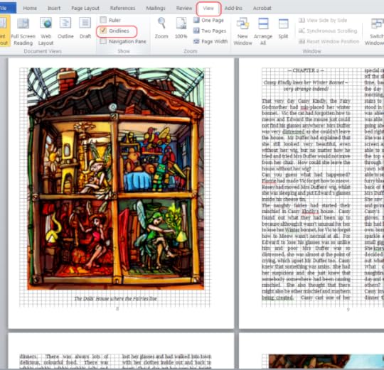
I posted a few days ago about gutters and margins for printed books. The flip-side of setting margins is keeping everything that gets printed within those margins. The easiest way to fall foul of this, and get those dreaded”you’ve got something outside of the printable area” errors, is with images. If you get as far as being ready to print, or in the internal viewer in Createspace, then this can cause a real headache.
The way to avoid this is to get in the habit of turning on the ‘view gridlines’ option in Microsoft Word every time you use images. You don’t need it on all the time, just whenever you are laying out an image or changing any page setup parameters.
This is a screenshot of me working on a children’s book: Cassy Kindly and the Naughty Christmas Fairies (my son loves it). I’m in Word 2010 here. I’m sure it’s available in 2007 but I’m not sure how far back it goes in terms of Word versions. If you drag the image around the page, it’s very easy to place it outside of the printable area. But with gridlines on, that will be obvious.


July 10, 2012
The Reality War Book2: Read it today!

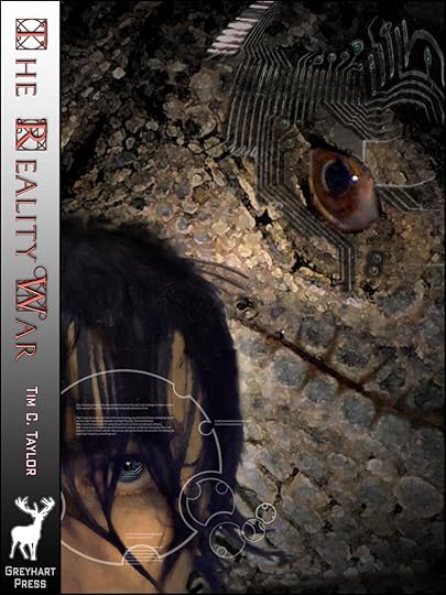
Book2: The City of Destruction
My second novel, The Reality War Book2: The City of Destruction is working its way through Amazon’s servers towards publication in the Kindle Store. If you have the eBook version of book1, then you don’t have to wait for Amazon, you can get it now. At the back of book1 is a link to an internet web address where you can find instructions on how to download a free copy of book2. You’ve got 6 months to download, so no rush!
The initial price at the Kindle Store will be $2.99 or £1.99
A paperback edition will follow shortly and in a couple of months, the eBook will be available in other formats (I’m tied to an exclusive distribution arrangement with Amazon for a while longer).
The second book finishes the mini-series and is 110,000 words (the first book was 95,000 words). Here’s the blurb:
Radlan — Karypsic’s human twin. The survivors on both sides of the Reality War now face the hardest battle of all: how to live in the new realities they have made, worlds changed beyond belief, forged in a terrifying war.
Time…
Time is running out — the Reality War is escalating.
Time is corroding — the past is becoming unreliable, causality splintering.
Time…
Time is the early Jurassic. This is the where the great battle of the Reality War will be fought / was always fought/ was never fought because the war once won could never have occurred, and the losing side will never have existed. It is now that the riddle of Paradox One will be answered.
But the riddle has many possible solutions, and only the winner of the Reality War gets to choose.
Book1: The Slough of Despond
The Reality War is a science fiction, time travel adventure set in past, present, future and alternate versions of Elstow, Bedford, and even a bit of Wilstead (all locations in North Bedfordshire, England). In fact, it’s the same geography that inspired the settings of the book The Pilgrim’s Progress by John Bunyan. I’ve written before about the links between my novels and The Pilgrim’s Progress, and in this second book, you see more hints of who John Bunyan really was 
If you enjoy the novels and short fiction of Stephen Baxter, then I like to think you would enjoy The Reality War too.
The artwork, which I think is absolutely stunning, is from Andy Bigwood.


Congratulations to our Hedgeland competition
Thanks to everyone who’s commented so far on Ann Nyland’s guest post: Doctor Who and Theories of Time. Ann was generous enough to offer two eBooks as prizes for people who joined in, and I can announce the winners were:
Maria Staal and Michael Drakich. Congratulations to you both and you will be contacted shortly with your winnings.
 As a general point, if you don’t have a Kindle, Nook, Kobo or other eReader device, then that doesn’t mean you can’t read eBooks. Most suppliers of eBooks also provide free reader apps. Amazon support most devices (PC, Mac, iPhone, iPad, Blackberry, Android phones and tablets) with their reader apps which you can download for free here.
Thanks, Ann, for your great post.


July 6, 2012
How to Set Margins: Microsoft Word vs. Createspace vs. Traditional Typesetting
I’m currently working on a paperback and eBook layout commission for an illustrated children’s book: Cassie Kindly and the Naughty Christmas Fairies. The body text is in two columns, although the delightful illustrations of this 22-page book (which my six-year-old son loves, by the way) are full width. In my book, Format Your Book for Createspace, I suggest sticking to the Createspace template page setup defaults for novels, and seek advice if you need something more unusual. This is very much the latter case.
Before laying out the new book, I just popped into the Createspace site to check the margin guidelines, and was reminded once again of how something that is really very simple causes more confusion that it deserves to. So I thought I’d write this post to de-mystify.
Let me start by telling you the simplest way to think about margins. Once we’ve done that, I’ll move onto some of the other terms you will hear and why you will hear them. I’m going to assume for now that we’re talking here about a standard fiction novel, of 200-500 pages.
Each page has four margins: top and bottom margins are as simple as they sound. You also have an inside margin (between the edge of the page that disappears into the binding and the start of the area where text is printed) and an outside margin (from the end of the text area to the outer edge of the paper).
Notice I said inner and outer margins, and not left and right. Open up a paperback book and you will see a page on the right (a ‘facing’ page) with the inner margin (disappearing into the binding) on the left side of the page. You will also see a page on the left with its inner margin (disappearing into the binding) on the right. Don’t worry, there’s a diagram coming in a minute…
If you’re wondering about gutter margins, don’t! Gutter margins don’t exist as far as you’re concerned. In the Microsoft Word page setup, set gutter margin to zero. All you need to think about is the inner margin,
You don’t see the inside edge of the paper because it’s eaten by the binding. And some of the inner part of the page is visible but doesn’t lie flat because it is bent sharply into the binding. The more pages you have, the more of the inner edge of the sheet appears to be consumed by the binding.
If you want the text area of the page to look evenly surrounded by margins (which is generally a good idea), then it follows that the inner margin should be larger than the outer margin. That is because you must ‘give up’ some of the inner portion of the sheet to accommodate the binding.
And so you need mirrored margins. The inner margin needs to be on the left for all facing pages, and on the right for all non-facing pages. Take a look at a physical book and you will see the truth of this.
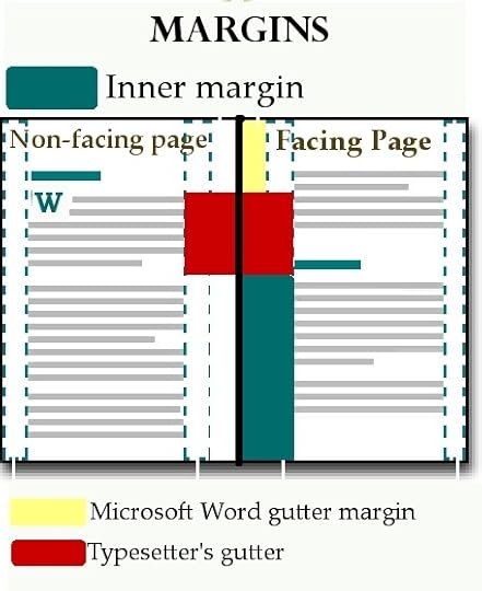
Here’s a diagram, adapted from Microsoft’s online help for Word, where I’ve shown some different types of margin.
In the approach I’ve just described above, I said you should concentrate on the inside margin. That’s in the diagram in the blue-green colour. The inside margin is the gap between the beginning of the text area and the inside edge of the page. In a bound book, some of this gap will appear as a margin, and some will disappear into the binding. In order for the margins in the bound book to appear equal either side of the text, the inside margin actually has to be wider than the outside one, as with the diagram.
The yellow margin is the Microsoft Word gutter margin. In Microsoft Word terms, when you setup mirror margins, you have an outside margin, inside margin AND a gutter. You can see the inside margin here in the gap between the yellow gutter margin and the text area. I have theories on why Microsoft do this, but I’m telling you that if you want to move away from Createspace default page setups and define your own margins in Word, then it’s much simpler to set the gutter margin to zero and only consider the inside margin. That’s right! Don’t let the gutter margin overcomplicate matters; ignore it!
Which leads us to what I’ve called the Typesetter’s Margin. If you hang around the Createspace Community pages (the forums) then you will come across a fair number of regular (and very helpful) contributors who come from the traditional typesetting profession. They will often talk about the gutter as the inner gap between the text area on two pages. This is the traditional meaning of the term ‘gutter’ in typesetting. I’ve shaded this in red.
As for Createspace themselves, their guidance seems to use the term gutter and inner margin interchangeably, even though in their Word templates they set values for both inner and gutter margins.
See, I told you it was overcomplicated!
So, to summarise:
Always use mirrored margins.
If your book is a standard novel (in terms of formatting and length) then stick to the Createspace defaults (which I’ve shown below).
If you want to set your own margins. Set the gutter margin to zero and just use the inside margin.
If you read people talking about how they’ve set margins, be very cautious because people use the terms inside margin and gutter margin to mean different things.
How to choose the inside margin size
Here are the current guidelines from Createspace.
Page Count
Inside Margin
Outside Margins
24 to 150 pages
.375″
at least .25″
151 to 400 pages
.75”
at least .25″
401 to 600 pages
.875″
at least .25″
More than 600 pages
1.0″
at least .25″
By ‘inside margin’ I’m certain Createspace are referring to my definition of inside margin: the blue-shaded area in the diagram above.
If you compare with the default page setup coming out of the Createspace (which is a 0.75” + .0.13” = 0.88” inner margin) then that looks right for a typical novel of around 425 pages. On the other hand, use your common sense in scenarios such as the big jump between 0.375” and 0.75” at around 150 pages in this table. A 0.75” inner margin at 151 pages will look large and won’t balance well against a 0.25” outer margin.
If you live in the US (and so it’s quick and cheap to mail proof copies to yourself) it’s worth playing around in advance of your publication by trying out a few margin settings (and fonts, font size, and leading/ line height). In fact, it’s worth putting various options into private projects that you set up just to trial these settings. You can put a different margin setting in each Word section (the page setup can be set independently for each section — see the chapter on sections in part 1 of my book.) To see the true effect of margins, though, you will need to change the page count, because large page counts mean more of the page is snaffled by the binding.
I have some speculations as to why Microsoft have a separate gutter margin, but I’ll leave that to another day. If you scratch your head over margins, I hope this post has helped. Feel free to fire away with questions.
 For more about sections, margins, and everything else you need to know to format your Microsoft Word document for print-on-demand, I have written a book, imaginatively titled Format Your Book for Createspace, priced $2.99/ £1.95 for Kindle and $5.99/ £4.99 in paperback.


I’ve won the Liebster Blog Award
I was delighted to be given a Liebster Award by blogger TheBrontëSister. Liebster Awards are a kind of virtuous chain letter or Ponzi scheme for bloggers. The idea is you pick your five favorite sites with under 200 followers (which I do qualify for!) and give them the award. Now it’s my job to award other bloggers the Liebster, which I will do in due course.
Like any good chain letter, you need to pass on the rules which are as follows
1. Thank your Liebster Blog Award presenter on your blog
2. Link back to the blogger who presented the award to you
3. Copy and paste the blog award on your blog
4. Present the Liebster Blog Award to 5 blogs of 200 followers or less who you feel deserve to be noticed (see below)
5. Let them know they have been chosen by leaving a comment at their blog.
I shall certainly be awarding my Liebsters soon, but for now, thank you to Angela, the Bronte Sister.
This is the fun side of blogging and tweeting, something I would do a lot more of if only I could spare the time. It’s a thrill to connect up with people from so many backgrounds all over the world. Some, such as The Bronte Sister, you establish a lasting connection with, but others I bump into on Twitter or through a forum post or comment, and have a brief chat and worthwhile connection, and then never come across again. I like both of these models, which is why I sometimes follow semi-random people on my Twitter account. Why follow only people with the same interests as yourself?
I was thinking this morning about the Liebster and all this social networking and it reminded me of a thrill I had at university where I also chatted with someone from a different background. This was shortly before the world wide web was invented. There were no such things as internet browsers; the internet certainly existed but it was essentially a NATO military system that academic networks hooked into… such as Aston University where I studied. You could chat with people. Either they were people in the UK academic network (ie your student friends) or they were US military personnel. At the time, it was massively exciting to think I could chat to someone in the USA, and probably at some secret underground military base.
Nowadays you can do that on your smartphone. When I was at Aston University in Birmingham, England, I remember at the time using a VT220 terminal in the library building to access a VAX minicomputer from which I would remotely log into the sexy Sun Sparcstation lab (the best bit there was that the Sparcs would be in use by a class but could simultaneously handle my remote login). The Sparcs would talk to a PAD hosted on another VAX cluster (Packet assembler/ disassembler). This would connect up through a satellite link to publicly visible internet nodes in the US (which were all military, I could never see US academic networks, though I guess they were there but private). Something like that, anyway. It all seemed very exciting at the time.
Now it seems easy to connect up; the interest is in the communication and not the technology, which I guess is only for the best (although as an old tech-geek I can only admit that grudgingly).


