Josh Neufeld's Blog, page 8
September 25, 2013
This weekend I’ll be at MICE in Cambridge
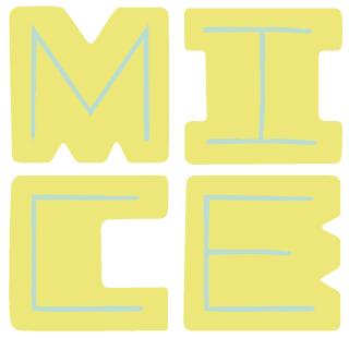 I’ll be a special guest this weekend at the fourth annual Massachusetts Independent Comics Expo (MICE). Like SPX, APE, MoCCA, et al., MICE focuses on the art making comics as opposed to commerce and memorabilia. In addition to the exhibitor area, there are workshops for children and adults, as well as panel discussions on the craft and relevance of the comics form. MICE is free and open to the public. And for the first time, this year MICE is expanding to two days!
In addition to copies of A.D., The Influencing Machine, A Few Perfect Hours, Katrina Came Calling, The Vagabonds, Titans of Finance, and even Keyhole (!), I’ll be selling homemade print mini-comics of Stowaway, the previously online-only story I co-created for The Atavist last year. I’ll also have A.D. giclée prints for sale—proceeds go to ongoing hurricane relief efforts in New Orleans.
On Saturday afternoon at 3:30 I’ll be appearing on a panel called Comics and Journalism. Moderated by Dave Kender, other panelists include Colin Tedford and Nick Thorkelson. It’s sure to be interesting.
Here’s an interview MICE did with me. They ask me about being a so-called “cultural ambassador” with the State Dept., my creative process, working with Harvey Pekar, the state of comics today, and more…
If you’re in the Boston area this weekend, come say hi. (And bear with me if I seem a bit tired at the show—I’ll be driving up from Brooklyn Saturday morning with fellow special guests Chris Duffy, Nick Abadzis, and Mike Cavallaro!)
Details:
Massachusetts Independent Comics Expo (MICE)
September 28–29, 2013 (Sat.: 10am – 6pm; Sun.: 11am – 4pm)
University Hall, 1815 Massachusetts Ave, Cambridge, MA


September 17, 2013
Evolution of a book cover: Republic of Outsiders
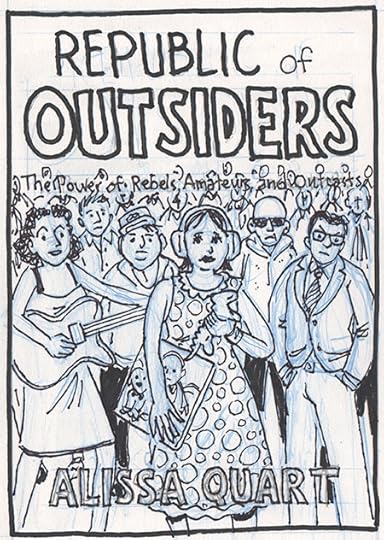
I illustrated the cover of Alissa Quart’s new book, Republic of Outsiders: The Power of Amateurs, Dreamers and Rebels (The New Press), and I thought I’d take you through the whole process.
The book is about how a diverse group of outsiders who seek to redefine a wide variety of fields—from film and mental health to diplomacy and music, from how we see gender to what we eat—are succeeding in various ways in changing the status quo. So from the get-go the initial concept was to show a large crowd of people on the cover, something to convey the idea of “here comes everybody.” The book’s particular subjects—including an Occupy Wall Street “alternative banker,” a transgender activist, an autistic artist, and indie musician Amanda Palmer—would be prominently featured at the front of the crowd. I wanted the art to “bleed,” to extend past the edge of the cover, to help convey the “infinite” size of the crowd of amateurs, dreamers, and outcasts (at that point the book was subtitled “The Power of Rebels, Amateurs, and Outcasts”).
My initial sketch looked like this:
The client was pretty happy with the sketch, with their only major comment regarding the Amanda Palmer figure. Because of some recent negative press, they asked me to downplay her somehow—suggesting I “anonymize her, so she could be a more generic glam genderbending figure.” I pointed out that with my cartoony style I doubted many people who would recognize the character as Amanda Palmer, but I was happy to do as they asked.
We also agreed that I would hand-letter the title and other cover lettering. Given that, the client felt the subtitle needed a little more air. At that point, I came up with the idea of the crowd holding signs making up the words of the subtitle. I thought it further sold the concept of this group being paet of a movement effecting change on society.
This was my first attempt at the pencils (the blue outline shows the bleed and the crop marks of the actual book dimensions):
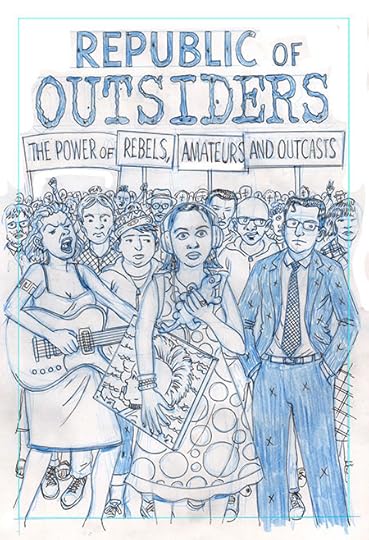
Although generally happy with the pencils, the client asked for some changes. There was some concern that the central figure (based on a real-life autistic artist was “too prominent and particular.” One way they suggested to do that was to eliminate the plastic iguana she was holding and make her expression less vacant; the second adjustment took care of another unresolved issue, which was how to display the author’s name. They came up with the idea of setting in a foreground sign which also would partly cover the autistic character. In addition, feeling that the “Amanda Palmer” avatar was too aggressive, they asked me to tone down her expression a bit as well.
At this point, I was a bit concerned about the changes being requested because frankly I thought they weakened the impact of the image. My understanding of the project was that the people on the cover were outsiders dancing to the beat of their own drums—and succeeding by doing that. And my feeling was the client’s suggestions were making the cover blander and less memorable. But… in the end, they were the client (who is always right ;->). I expressed my reservations and made the changes they asked for. (I also found out later that there were some legal concerns regarding the autistic artist character, who is only referred to by her first name, Katie, in the book…)
Finally, they asked me to replace the chunky “Outsider” title lettering with a simpler “font.”
This is what the second round of pencils looked like:

By this point, the client and I were pretty much on the same page, and they gave me the go-ahead to proceed to inks. Wait! There was one more last-minute change: the subtitle of the book was changed from “The Power of Rebels, Amateurs, and Outcasts” to ”The Power of Amateurs, Dreamers and Rebels”. So, here are the inks:

After a little more back-and-forth (thankfully, nothing too onerous), they gave me permission to color the piece, which I did in PhotoShop. As is my wont, I went with a reduced color palette, focusing mostly on greens and yellows, with a optimistic blue sky and red lettering to really pop. Here’s how it looked:

The first color treatment made it all the way up the line to publisher, but she felt the palette was “too retro.” The client’s direction was to “maybe lighten the skin tones and add a bit more cyan to the clothes, so they’re not so contrasty with the sky.” Given how “unrealistic” the original color treatment was, I was prepared for some pushback, and thought their comments made sense. So I warmed up the skin tones and made a few other adjustments (including making the “Katie ” painting a bit more distinctive from the rest of the scene). I thought the changes relieved the “monotony” of the original color treatment while staying true to my original concept:

Success! Everyone liked the new color treatment. So I was done, right?
Wrong! When it came to mocking up the book, the artwork on the right-hand side didn’t extend far enough to cover the bleed on to the dust cover flap. Left as-is it would show the art “fading away”—which I thought undermined the “infinite” feeling of the crowd. They also wanted the line “author of Branded and Hothouse Kids” added underneath the author’s name. So… I went back to the drawing board (literally) and extended the artwork to the right (as well as adding the “author of” line in PhotoShop, using a font of my lettering). And, voila:

We were finally done! This is how the “mechanical” (front, back, flaps, and crop marks) looked on publication:

The book came out last month, and it’s been cool seeing my work on the cover—a first for a book I did not myself draw.
After all the back and forth, I obviously felt very connected to the process, and to all the individual decisions that led to the distinctive final product. So I was a bit chagrined when this image was brought to my attention: the cover of Eric Alterman’s 2008 book, Why We’re Liberals: A Political Handbook for Post-Bush America (Viking), illustrated by the very brilliant Tom Tomorrow…
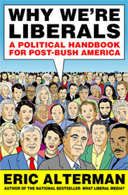
Oops! I don’t remember ever seeing that book cover before, I swear!


September 13, 2013
Meeting up with Mohammed from Bahrain in NYC for a cup of coffee!
If you read “Bahrain: Lines in Ink, Lines in the Sand,” then you remember one of the subjects of my piece was the young Bahraini cartoonist Mohammed. He did not fare so well after the abortive “Pearl Revolution,” with his work being censored and him been expelled from university. Over the last few years, Mohammed has had some ups and downs, but things improved for him this year: he was able to return to school, he started a cartooning & illustration business, and he won a competition sponsored by the U.S. State Department which enabled him to come to the U.S. for a few weeks this summer.
While Mohammed was here he spent an all-expenses paid week in White River Junction, Vermont, at the Center for Cartoon Studies, where he took a graphic novel workshop with Paul Karasik. While Mohammed was there, he participated in lectures, collaborative exercises, book discussion sessions, events, and group critiques. And after that experience—which he loved—he came down to the Tri-State Area, and he and I got to hang out in Brooklyn one recent afternoon.
Over the years I’ve kept up with the “characters” from A.D., following their lives as they continue to rebound and regroup from Hurricane Katrina. And it was nice to be able to do the same with Mohammed, to see that he is well and is continuing to pursue his passions. In an interesting twist, Mohammed wrote and drew this piece —in my voice—commemorating our Brooklyn “reunion.” (He photoshopped in my signature.)

Flattering depiction, don’t you think?
I welcome him to my studio and gave him a little tour of Prospect Heights. We never did have that cup of coffee, but we grabbed a cone from Mister Softee, strolled through Grand Army Plaza, and made a quick stop at Bergen Street Comics. Mohammed really enjoyed the visit; here’s a “selfie” we took of the actual visit (with me holding the framed print of his piece)…


September 4, 2013
Influencing Machine Korean edition cover
Just for poops & chuckles, I thought you’d like to see the cover of the Korean language edition of The Influencing Machine, published by Doddle Saeghim. They took the art from the last page (with Brooke’s head blown up a bit) and colored it—in a much louder style than I use in the book itself. They also added a bunch of shadows.

P.S. Anyone out there have a Korean URL for the book? I can’t seem to find it…


August 22, 2013
Influencing Machine featured on 1book140 (The Atlantic.com’s Reading Club)—Twitter convo tonite!
 This month The Influencing Machine is one of two graphic novel’s being read on 1book140, The Atlantic.com’s Reading Club. And tonight at 7pm EST, writer Brooke Gladstone and I will be taking part in a live Q&A via Twitter. Please join in the conversation!
1book140 has been running since May of 2011 and they’ve read & discussed works by living authors and by dead authors; they’ve read thrillers, mysteries, beach reads, science fiction, poetry, history, and travel writing. Some of the previous entries from the 1book140 reading list include Margaret Atwood’s The Blind Assassin, Haruki Murakami’s Kafka on the Shore, Joe Hill’s Heart-Shaped Box, Kurt Vonnegut’s Slaughterhouse Five, P.G. Wodehouse’s Right Ho, Jeeves, Charles Dickens’ David Copperfield, Umberto Eco’s The Name of the Rose, Lev Grossman’s The Magicians, Ray Bradbury’s Something Wicked This Way Comes, China Mieville’s The City & the City, Patti Smith’s Just Kids, John Green’s The Fault in Our Stars, F. Scott Fitzgerald’s The Great Gatsby, and Adam Johnson’s The Orphan Master’s Son. And they’ve even read comics before, including Scott McCloud’s Understanding Comics, Art Spiegelman’s Maus, Alan Moore & David Lloyd’s V for Vendetta, and Neil Gaiman & Sam Keith and Mike Dringenberg’s Sandman Volume 1: Preludes and Nocturnes.
1book140 is currently being run by J. Nathan Matias, and the process seems very democratic. Books are nominated on by readers and the finalists are voted on in online polls. And now, after some runoff voting (against very esteemed competition), The Influencing Machine—along with Chris Ware’s masterwork Building Stories—has emerged as this month’s 1book140 selection! The first two weeks of August were spent on Building Stories and now it’s our book’s turn.
Tonight from 7-8pm EST, Brooke & I will be sitting by to answer any and all questions related to our collaboration. To join in, tweet your question to #1book140; we’ll do our best to respond!


July 19, 2013
Adventures in Comics Journalism
 A new piece of mine was published today in The Mint, India’s second largest financial paper (and “a content partner of The Wall Street Journal“). I was commissioned to do the 100th edition of their weekly full-page (tabloid-sized!) comic, “The Small Picture” —and the editor and I decided to do it about the field of comics journalism. The result, “Adventures in Comics Journalism,” can be read here.


June 4, 2013
My comics and sketches in Steve Heller’s COMICS SKETCHBOOKS
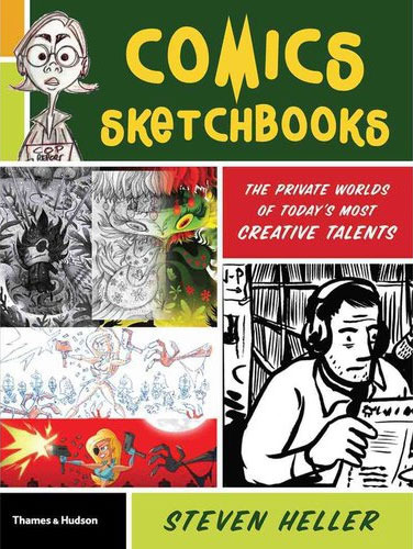 Last fall, just when I was learning the ropes of the Knight-Wallace Fellowship, I received a contributor copy of Steve Heller’s Comics Sketchbooks: The Private Worlds of Today’s Most Creative Talents (Thames & Hudson).
When Heller first approached me about being in the book, I immediately felt my stomach clench. Like most cartoonists I’m pretty insecure about my art; most times, it’s bad enough to see my finished work in print—the idea of exposing my half-assed doodles and thumbnails felt really risky. But how could I turn down an invitation from design legend (and former New York Times chief art director) Steve Heller?
My first problem was that I don’t really have a sketchbook per se. I’ve kept my sketchbooks since high school—and thanks to my packrat mother, have artwork dating back to when I was four years old. (No matter how brave I am, I wasn’t about to show any of that!) But I really had to dig deep into old work to find anything suitable. For one thing, the purpose of my sketchbooks has radically changed as I’ve gotten older and as my career has progressed. In going through all the old books, I was amazed how they reflect my evolution as an artist and as a cartoonist.
In high school, I kept a sketchbook to draw character ideas for various superheroes I created, or to do full-color “pin-ups” of some of my favorite Marvel or DC heroes. My friends and I at Music & Art High School would also trade our sketchbooks and draw in each other’s books, so they were ways of having samples of each other’s work for posterity. For awhile after I graduated from college, I kept a sketchbook at my day job at The Nation magazine, just to keep my skills fresh. That was the first time I really used a sketchbook for doodling and sketching, and as a record of the world around me: my girlfriend, co-workers, guest speakers, people on the subway, and the like. (I was also losing interest in superhero comics around that time, and was casting about for another way to express my artistic impulses.)
Then, in the early 1990s, when Sari and I embarked on a round-the-world backpacking trip, I took along the Eric Fischl/Jerry Saltz book Sketchbook with Voices (Van Der Marck Editions, 1986; now re-issued). The book is essentially filled with blank pages, but at the top of each page are instructions from contemporary artists of that period; ideas which served as jumping-off points for various drawings. Oftentimes I would ignore the directives and just draw or paint whatever I felt like during my travels, but the ideas in the book are sharp and fresh, and often helped me when I needed a little prodding. That was also an important period where I did very little comics work, instead just sketching from life and painting watercolor landscapes and the like. The book helped me unlearn a lot of bad habits I had picked up during my youthful years as a wannabe superhero cartoonist. I kept Sketchbook with Voices all throughout my travels through Southeast Asia and Central Europe, and it’s filled with all sorts of memories—and even a few illustrations I’m not too embarrassed to look back at.
Nowadays, however, my “sketches” tend to be highly directed, either character studies or thumbnail layouts for scripts I’m working on—not so much “sketches” as preliminary drawing for finished comics.
The trip down memory lane was less painful than I feared, and I found a selection of things to submit for the book. I answered a few of Heller’s questions for the profile section, sent everything off, and then basically forgot about it. As I mentioned, the book arrived at my door just as I was immersing myself in my fellowship. Believe it or not, it wasn’t until the fellowship was over (last month) that I was finally able to check out the book.
One thing I really appreciated was Heller’s acknowledgment (in his introduction) of the inherent vulnerability evoked by the project, whose subtitle, “The Private Worlds,” etc. really rings true for me. (And I was relieved to see that a lot of the contributors admit that they too don’t spend a lot of time sketching for sketching’s sake.)
That said, the book features quite an impressive list of contributors, including masters like Crumb, Burns, Seth, and Mazzucchelli. It’s always instructive to see the sketchbooks of guys like that—like peeking into their brains and feeling a bit of the spark of their creative process. Another one of my long-time favorites, cartoonist Mark Alan Stamaty, gets really metaphysical about his sketchbooks, talking about how they’re attempts to explore what mystifies him in life, to get to deeper meanings, to discover new paths. And he quotes Matisse, who, when asked to explain one of his paintings, said, “If I could explain it, I wouldn’t have painted it.”
I loved looking at Peter Kuper‘s sketchbook work, much of it from his recent sojourn to Oaxaca, Mexico. Peter Kuper’s Comics Trips: A Journal of Travels Through Africa and Southeast Asia (NBM, 1992) was the only comic book I took with me on my round-the-world backpacking trip. Comics Trips is part comic, part sketchbook, and part photo album. It’s punctuated by beautiful watercolor sketches, ticket stubs and collages, and humorous photo essays like “Toilets of the World.” Comics Trips was a huge influence on my own travel work, and the main inspiration behind A Few Perfect Hours. So it was exciting to me to see more recent sketchbook work from Kuper—the images are energetic, filled with personality, and vibrating with color.
I loved reading British cartoonist Posy Simmonds comments, and looking at her sketches from one of my favorite recent graphic novels Gemma Bovary. Carol Tyler‘s work was a revelation. With cartoonist/friend Lauren Weinstein it was cool to see the various styles at work in her sketchbooks, from intricate inked landscapes to watercolor figure drawing. That’s another great function of a sketchbook: to play around with styles you don’t normally use in your professional work.
I really identified with what David Heatley says about struggling to retain the energy of his thumbnail sketches. There’s definitely a spontaneity, looseness, and economy to my sketches that I struggle to evoke in my more polished work. For this reason, my buddy & fellow cartoonist Dean Haspiel is always encouraging me to publish my sketches/layouts as completed comics—more on that later.
Upon returning to the States after our backpacking adventure, Sari and I ended up in Chicago, where I soon got hooked into the cartooning scene. I happened to get to know Chris Ware a little bit during that time, and he once gave me a very useful bit of sketchbook advice. His own sketchbooks were filled with hilarious one-pagers and strips which he did for fun—and as far I know, never published. Anyway, Chris recommended that I use my sketchbook to write and draw open-ended comics stories, to just go ahead with Panel One and see where it led me. I normally work in a very controlled way—full script, layouts, pencils, inks—so I followed his advice a little bit, and found it very useful in un-blocking my creative channels. Spontaneous sketchbook comics were a very good way of breaking habits and rethinking the comics-making process.
 Still, old habits die hard—the only sketchbook comics I’ve ever published are the humorous travel tip “How to Squat;” and the one-page sketchbook comic in Comics Sketchbooks. Created almost 20 years ago, in the piece I muse upon the very purpose of a sketchbook. So meta! Even though it’s quite an old piece, it still reflects my questions about the whole sketchbook practice, and I still find it an amusing little story.
# # #
P.S. Ironically, this past year I sketched more than I had in years. All during my fellowship I used my Moleskine notebook to sketch speakers who came in for seminars and presentations. I collected over 50 of those sketches in a booklet I printed up and gave to each of my fellow Fellows at the end of the year.
P. P.S. Regarding Steve Heller. He shows up as the art director from hell in Bob Fingerman’s Minimum Wage (originally published in the 1990s by Fantagraphics). I’ll never forget the scene where Fingerman’s sweaty stand-in, Rob Hoffman, an up-and-coming illustrator, visits Heller’s offices at the Times to show his portfolio. The Heller character whips through it like a flip book, never actually looking at the images, and sends Rob on his way. I read that scene right before I myself went in to show Heller my illustration portfolio. Talk about bad timing! However, he was kind enough to actually look at my work and gave me a few specific pointers before he rejected me. Well, I guess he didn’t technically reject me—he did give me the coveted contact list of all the art directors at the Times (the heads of the various sections), and eventually I did get a piece published in the paper’s Travel section. (It’s still up on my illustration website!) That was the last contact I had with Heller—I think he left the Times not oo long afterward—until he contacted me out of the blue to be part of this book. Clearly, in his mind at least I had grown as an artist in the intervening decade. Thanks, Steve!


May 30, 2013
A.D.: New Orleans After the Deluge academic links
[cross-posted from A.D. on Smith]
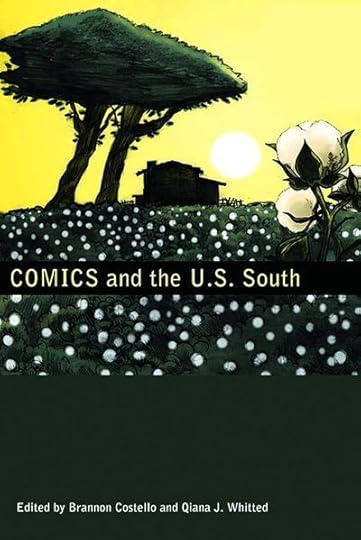 I just stumbled upon a long essay about A.D.: New Orleans After the Deluge in the new book Comics and the U.S. South, edited by Brannon Costello and Qiana J. Whitted (University Press of Mississippi, 2012). The essay, “A Re-Vision of the Record: The Demands of Reading Josh Neufeld’s A.D.: New Orleans After the Deluge,” is by Anthony Dyer Hoefer, a professor at George Mason University. And a PDF of the essay is available as a free download right here.
Leaving aside the fact that I was stunned to see 30 pages of academic writing devoted to A.D., I was excited to see how much Dr. Hoefer gets from the project—particularly its online component, which debuted on Smith Magazine. He focuses on A.D.‘s “pedagogical impulse” and how it uses the comics form to expose the highly mediated way in which we were informed about Hurricane Katrina. In this context, Hoefer quotes the great Scott McCloud from Understanding Comics, “No other artform gives so much to its audience while asking so much from them as well.”
As with many other reviews and discussions of A.D., I learned a lot from Hoefer’s essay: it’s always fascinating to see the things that readers pick up from my work that I didn’t consciously intend to put there—and are really just an accidental result of the never-ending attempt to simply make “good comics.”
Hoefer’s essay is the latest (and greatest) in a number of academic resources related to A.D. that are available online. Since A.D.‘s book publication, it has been used as a common read text for a number of colleges & universities, including the the University of Wisconsin, the University of Alabama, and SUNY Brockport. My wonderful and talented wife Sari Wilson wrote an extensive teacher’s guide to A.D., and there are other online resources, bibliographies, and so on for both high school and college students. Since Hurricane Katrina is clearly a historical event which we will be studying for generations to come, I figured this would be a good opportunity to list all A.D.‘s academic resources in one place:
Pantheon teacher’s guide—thematic connections, teaching suggestions, discussion activities
UW-Milwaukee: English 101: Intro to College Writing—Writing and Visual Culture—tips on analyzing A.D. rhetorically
Graphic Novel Hovel: a Universal Resource for Visual Literature—a high school English teacher analyzes the book’s plot, characters, themes, setting, style, and viewpoint
Hurricane Katrina bibliography (SUNY Brockport)—extensive supplemental list
Filtering Catastrophe Through Comics—a presentation I did for the Villa Gillet/N+1 panel “Catastrophe Practice”; with great debt to an essay by University of Chicago PhD candidate Margaret Fink Berman, which helped me organize many of my thoughts
Let me know of other useful links out there!


May 29, 2013
Sari Wilson & I have a new piece in the comics anthology The Big Feminist BUT
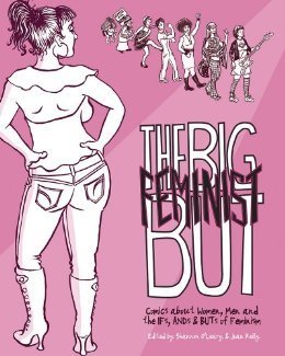
Back in December I encouraged you to support the KickStarter campaign for the new comics anthology The Big Feminist BUT (I love that title!), and now, a few scant months later, it exists in printed form, ready for your purchase!
This beautiful 200-page softcover—whose full title is The Big Feminist BUT: Comics about Women, Men and the IFs, ANDs & BUTs of Feminism-–is edited by Joan Reilly and Shannon O’Leary, and features contributors like Hope Larson, Jeffrey Brown, Vanessa Davis, Emily Flake, Shaenon Garrity, Gabrielle Bell, Justin Hall, Ron Rege, Lauren Weinstein, Liz Baillie, Abby Denson, Jesse Reklaw, Kat Roberts, and Dylan Williams. It also includes a brand-new collaboration of mine and Sari’s (she wrote it and I drew it) loosely based on her experiences as a fact-checker for Playboy Magazine.
The book asks:
“What do we really mean when we start a sentence with the disclaimers, ‘I’m not a feminist, BUT…’ or ‘I am 100% a feminist, BUT…’ What do our great big ‘BUTs’ say about where things stand between the sexes in the 21st Century? We asked some of the most talented ladies (and gentlemen) working in comics and animation today, along with some of the smartest writers we know, to ‘but’ into the heated discussion about the much more level but still contradictory playing field both sexes are struggling to find their footing on today. Fans of Bitch Magazine, Jezebel, Love and Rockets, Wonder Woman, Girls and Mad Men will all find something to enjoy here, as will anyone who likes to read thoughtful, compelling, top-notch comics!”
I couldn’t say it any better—order your copy now.
Here’s a sample page from Sari & my piece (the original art of which was purchased by a KickStarter funder):


May 9, 2013
Instead of Coffee, I’ll have TCAF
 This weekend, we’re heading to Toronto, Canada, for the Toronto Comic Arts Festival, more commonly known as TCAF. It’s my first visit to TCAF, and my first visit to Toronto since I was a ten-year-old for a hernia operation (!). It seems like I’ve been hearing about TCAF forever, and this year—seeing as we’re in Ann Arbor, MI—it was more geographically feasible to visit. We’re also making it a family vacation, taking Phoebe out of school and everything. We’ll drive up to Toronto on Friday, stay for the festival, and then hang around for another couple of days to see the sights. I’m excited!
My expectation is that TCAF will be more like a European comics festival than an American-style comic convention. (Since I finally made it to Angouleme last year, I now fully appreciate the difference.) My favorite U.S. conventions—by far—are MoCCA and SPX—and I basically avoid all the rest of them when I can. My hope and expectation is that TCAF will join their ranks. The panels and programming look particularly promising—some of the panels I hope to make it to include Gilbert Hernandez, Michael Kupperman, Art Speigelman & Seth in Conversation, and Adventure Time!
I’ll be taking part in a panel myself, called Comics & Politics, on Saturday from 4:00–5:00 pm. My fellow esteemed panelists are Sarah Glidden, Rutu Modan, and Matt Bors, and the discussion will be moderated by Nicole Marie Burton. That’s Saturday, May 11, at the Toronto Marriott Bloor Yorkville Hotel, Forest Hill Ballroom. More details here.
When I’m not at a panel, or seeking out buddies I haven’t seen in a while, I’ll be seated at table #112 in the Atrium, alongside Colosse and Sophie Yanow. I’ll have copies of A.D.: New Orleans After the Deluge, The Influencing Machine, A Few Perfect Hours, and a mini-comic I put together just for the occasion. Hope to see you there!
Toronto Comic Arts Festival
May 11-12, 2013
Toronto Reference Library (TRL)
789 Yonge Street
Toronto, Ontario, Canada
M4W 2G8