
Yuko Shimizu's Blog, page 5
May 10, 2011
Tequila!
Many of my drawings appear on the pages of magazines and newspapers. They get read, and go into recycles in a week, or a month, or in the case of newspapers, in a day at the most.
I am very much in peace with it. In fact, I feel that it keeps the artists humble, and down to earth. There is nothing pretentious about drawings that goes to garbage bin in a day. I like that.
But of course, every once in a while, when some special project comes knocking on the door, and they are beautiful 3D objects. Now, that is nice too. And exciting.
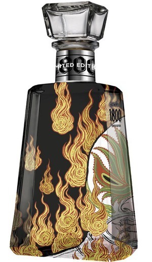
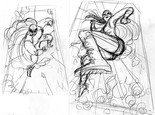
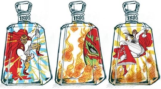
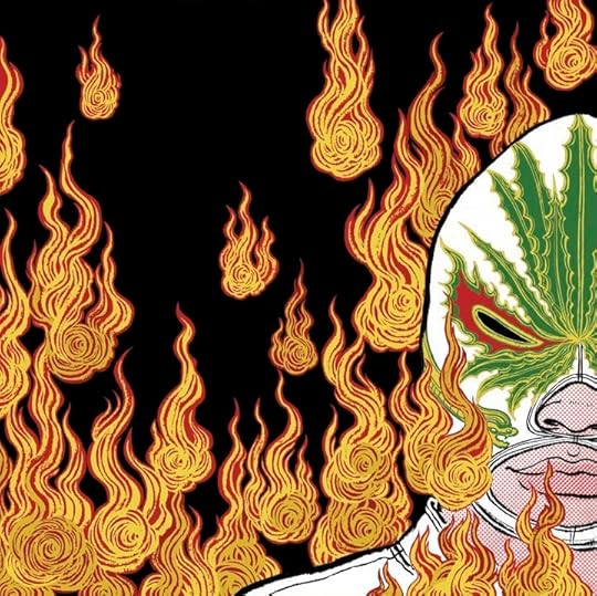
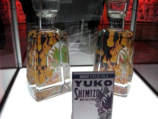
Close to a year ago, I had a chance to create a drawing for 1800 Tequila's limited edition Essential Artists series, in theme of Lucha Libre. If you know me, you know my passion for all things Mexico, so it was a really exciting opportunity for me.
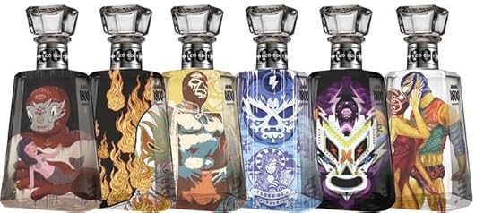
The product finally got the official release on Cinco De Mayo, last week on May 5th, at Hudson Hotel in New York City during a release event that was organized by 1800 Tequila and Vice Magazine. There are five other bottles in this series from different artists in various style..
The Essential Artists 1800 Tequila should soon come out to fine liquor stores near you.


April 21, 2011
13 Assassins
Japanese people take "new year" very seriously and are superstitious about "first" anything to predict how well the year is going to be. For example, "first dream of the year" is believed to be the best if you have dreamt of 1)Mt. Fuji 2)hawk 3)egg plant. Why egg plant? Not sure. But I am not making these up!
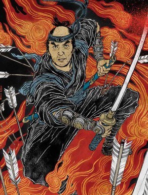
In this long, cold and snowy winter in New York, my work day started on January 3, Monday. Sunny. My first job of the year was to walk down to Magnolia Pictures office near my studio for the screening of an epic 2 hour + long new samurai film 13 Assassins directed by Takashi Miike, who is very popular with his horror films such as "Ichi The Killer" and "Audition". The project wa to create a poster. Now, if this 'first job of the year' would predict my 2011, then I have to say I had an amazing start of a year.
On and off for about two month, I worked with Matt Cowal, VP Marketing/Publicity of Magnolia Pictures. I have to say I had such a fun time working on this.
The main actor of the film is Koji Yakusho, who played Miyamoto Musashi in a popular Japanese TV series in the 80s, which I was obsessed as a kid. And I get to draw him! Now, this didn't happen even in my "first dream". My dear friend and illustrator/calligrapher Ai Tatebayashi contributed beautiful lettering for the poster design.
Find more about 13 Assassins and watch the trailer here. 13 Assassins will be released in the theaters next Friday, April 29th.


Before we go, let's talk about things that gets me in the 'mood': i.e. Reference materials.
There were of course, a lot more things I had looked at, of course, but these three are staples when I work on samurai theme. From left, Heroes & Ghosts Japanese Prints by Kuniyoshi. I initially bought this book for my first job for Rolling Stone Magazine years ago, and have been heavily referencing since. Center is a book of art by Kawanabe Gyosai. On the right is relatively contemporary Miyata Masayuki's papercut illustrations that accompanied Eight Dogs' Tale by writer Yamada Futaro, which was initially published on Asahi Newspaper in early 80s.
Miyata Masayuki is not well known outside of Japan, but he was a genius. I wanted to share some of the pages from this book.


April 15, 2011
Quick Fish.

Many of the jobs I do, it takes hours and hours, sometimes days and days of drawing. It was not my original intention, but during the course of close to 10 years of working, I somehow became known as an illustrator who does detailed works.
Not that I have issues with that, but maybe because of that, I don't get calls to do a lot of New York Times Op-Ed illustrations. A lot of fellow Drawgers work on them on regular basis. But I don't even recall when was the last time I worked with them. (I do work with The New York Times in other sections quite often.)
When Alexandra Zsigmond of Op-Ed called me for today's paper, it was no brainer to just do it. I was craving for: 1) quick drawing that starts and ends in half a day 2) topic that is not related to my home country of Japan, as I have been working on so many of them in recent months.
It was a fun story by Ray Holborn about that we should not feel guilty eating fish, because in a long run, it is a lot more sustainable than making your main diet meat based.
While "Japanese people eat sushi every day" is a total American myth. I can indeed eat sushi every day, or three times a day if I can, so the article was a great news.


When I got a call of approval from Alexandra around 5:30, I decided to pack up my stuff (and my dog) and leave the studio early. Yes, I have other work to take care of, but they can wait. It was just too nice to be inside.
We walked along the Hudson River for about 40 blocks (half of the time, my dob wanted to be carried around. He is a 4 pound dog after all), and enjoyed the Someiyoshino Cherry flowers in full bloom.


March 22, 2011
art in the time of disaster.

I have been learning about a lot of things in last ten days. I have been learning a lot about what has happened in Japan. I have learned how to watch TV news on my iPod, how to get my calls go through to my parents without busy signal (sometimes I have to call like 10 times), or collect enough information from various sources to assess what is right, what is wrong and what is just pure lie.
But more importantly, I have been learning a lot about responsibility of art and being an artist.
This is a rare moment when I look at the world and the world of art and design from a victim's point of view.
Well, I am technically not a victim. My family and friends are doing OK, although going though some tough times and inconveniences. I don't even know a single person in the area directly hit by this disaster.
Yet, the world outside Japan sees "Japan as the victim" and treat us, Japanese people abroad, as victims, and therefore, for the first time (and hopefully the last time) I am seeing the world from a completely different point of view.
I contribute illustrations to newspapers and news magazines. I do illustrate tough topic like ongoing war. But I have never had a chance to stand on the point of the view of what has getting illustrated.
And then I got this link to Fast Company blog post by John Pavlus. He captured my unorganized thoughts for the last ten days into very easy to read article which makes you think, regardless of you agree with him or not.
I wanted to share this with you, especially that those who are reading this are mainly people in the creative field.
http://www.fastcodesign.com//1663419/...
I personally do not mind the specific poster in question here. At the same time, I cannot agree more with Mr. Pavlus' view toward design (in general) during the time of disaster, and responsibility of the artists who create them.
Aren't some of the designs popping up on my and your facebook links, just too quick, too easy, and too smart, and sometimes feel like each designer is rushing to create the most clever image? Doesn't it sometimes feel like it is a competition of a sort? Did they even have enough time to research the subject matter, do they know about the specific areas in Japan and culture, or did they think through of what was the message in the images before creating the images in rush?
If it it was too long to read my mumbling, you can skip and just read here:
During the time of disaster, those who are affected need to see sympathy, hope and encouragement more than anything.
They last thing they want to see another image of disaster, like a blood spilling flag.
This is something I have learnd that wanted to share with you today.
Thank you very much for those who read all the way down to here.
March 3, 2011
Grand Central Terminal
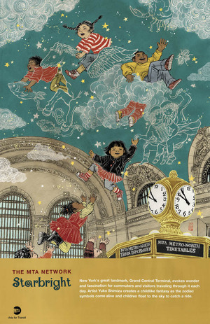
It will be a while till you will start seeing them at subway stations in New York, but I just got my copy of the MTA poster and got excited, so I wanted to share it with you a bit early.
MTA Arts For Transit usually commission around 3 artists a year to create posters. Posters are usually posted around NYC area subway and train stations and stay there for a few month.
I (and often my dog) take subway down to my studio from my home every day. It is very much a part of my life. (always buy 30 day unlimited pass!) So, it was obviously very exciting I was chosen as one of the three for 2011.
The challenge was that the audience is "everyone who uses MTA subways, busses and trains". It is easier to come up with ideas when the audience is narrow and targeted. To make something that is 'for everyone' is so broad, I was at first a bit lost.
Then soon, I organized my idea and decided to work with something that relates strongly to my personal experiences.

As a kid, I lived in a New York suburb for 4 years. My father, who had a job in an office in Pan Am Building (now Met Life Building) which is directly connected with escalators from Grand Central Terminal, commuted on Metro North commuter railroad every day.
Once in a while, my parents took me and my sister to come visit Manhattan on the same train. I clearly remember arriving at Grand Central for the first time, walking into then very dirty but still very stunning main concourse and looking up at a huge ceiling of stars and my jaw just dropped.
It was 1977. Grand Central was beautiful, but dingy. My mother told me to always stay with her while walking through the concourse, and never to use public bathrooms at the station. A lot of the store fronts were closed. There were a few that sold cheap coffee or egg roles. I liked them as a kid. I still think about the egg role treat we ate on the train on the way back to our home in Westchester, and kind of miss it.
Now, I walk into all the fun stores that sell everything from gourmet food to fancy gifts, and I use their clean bathroom. Restored ceiling is bright and shining in my favorite color: teal. But every time I walk back into Grand Central Terminal, I feel like I become the kid in 1977 again.
By the way, the Asian girl on the top of the illustration is me. Of course, me when I was younger.
If you are interested, you can own this poster, and the proeeds help to maintain the Transit Museum.
Big thank you to Amy Hausmann and Lydia Bradshaw of Arts for Transit.


February 14, 2011
my dog, a proud Mexican!
I aquired a five year old dog last May. It was sort of like an accident. I was not looking to get a dog, well, not just yet. He just decided to be part of my lif.
Since then, I cannot think of a life without him.
He is sweet, friendly, well behaved, and keeps me great company.
When I was going to teach a workshop in Mexico last summer and needed to create a poster to announce the event, I wasn't sure what to pick as a subject. It should be something Mexican, but it shouldn't be a typical cliche.
Then I looked at the couch in my studio where he sleeps just like he always does while I work. Oh, of course, this is it! He is a proud Chihuahua, a Mexican. What is more appropriate than drawing him in the poster?
He became a bit of a star in the small town. Only thing was taht has was actually not there. Next time I am flying out to Mexico, he should come with me. See the motherland himself.
Happy Valentine's Day to you all.
February 5, 2011
Currently at the Society of Illustrators
Ah! It's ben SOOOOO long since I have posted anything here. I tend to try and wait till I have enough time to write a good process post. And that time has not come for a while. My life has been hectic since last fall. I finally gave up on the idea of keeping 'one person office' and started to have an awesome helper come in once a week to keep track on office stuff. It's been amazing.
Soon, I should be able to get back to posting more.
But for now, rather than keeping quiet, I decided to post three images that are currently being shown at the Society of Illustrators Editorial and Book show. Two of the covers from DC Comics Vertigo series The Unwritten (editor: Pornsak Pichetshote). And the double page spread opener which I recently finished for PLAYBOY (AD: Rob Wilson).
I will try and post process of those images soon.
December 1, 2010
vampires & diapers.
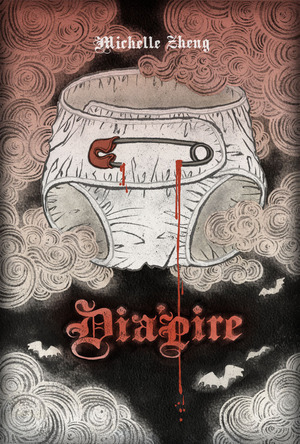
I totally judge books by their covers.
Let's be honest, we all do. I can be categorized as a book-worm, but still I always have piles of unread books sitting around in my apartment, mostly because I couldn't resist buying them for their beautiful covers. To add to this, I have countless design books on book covers, also piling up. I just bought one yesterday, and was drooling on it all last evening. (check this out: The Art of American Book Covers 1875-1930 by Richard Minsky)
When John Gall, one of my favorite contemporary book designers, contacted me for 30 Covers 30 Days challenge, it was like dream coming true. I still secretly have a list of people I would LOVE to work with, and he was obviously one of them, for my love of his gorgeous Haruki Murakami covers, 10 times better than the original Japanese version. Drool.
Non profit organization National Novel Writing Month encourage people to spend November writing the first draft of a novel. John's idea was to invite 30 designers and illustrators, each create a book cover, start to finish, within 24 hours from the brief.
Mine was on November 29th, I was given three synopsis to choose from. The one I picked was Dia'pire by Michelle Zheng. Story about a pathetic and funny diaper wearing vampire.
There are some amazing covers created by amazing talent, all within 24 hours, and you can see all of them on the link here.


November 18, 2010
"life" according to Keith Richards
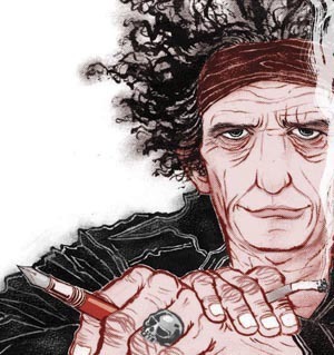
People often ask me: "what was your very favorite assignment?". Now, this one is hard to answer. Every assignment (or at least, most of assignments) is fun in different ways. Sometimes because I love working with that AD, another times because the client let me do whatever I want, or article is interesting, good fee, etc, etc. But I have to admit, every once in a while, there comes a project that I tell my self "Yes! I have been working as an illustrator to get this assignment!".
And, this was one of them.
Rolling Stones came to Japan for the first time, yes, for the first time, in 1989, for Steel Wheels world tour. Japan is known for their strict drug law, therefore, Rolling Stones was banned from entering Japan, for precaution, until then. Did you know that Paul McCartney ended up in Tokyo jail for possession of small amount of marijuana in the early 80s? Paul was allowed back in first time since his arrest on the same year, if I remember correctly.
All the ultra-expensive Rolling Stones tickets got sold out in like 30 minutes. I was so sad, I ended up begging the president of an ad agency I worked with (I was working in a PR department of a big corporation back then) to get the tickets. And then, the first Rolling Stones concert... I was in heaven.
Nicholas Blechman, AD of New York Times Book Review, somehow must have sensed that I am a Rolling Stones fan. I don't know how. But he also knew I am a Keith Richards kind of a girl. (I am, with little skulls here and there...) He said: "I thought you would enjoy drawing all the lines in his face". I did, Nicholas, I did. Thank you.
Keith's autobiography "Life" is now in bookstores near you. Oh I should get a copy too!


