
Yuko Shimizu's Blog, page 3
August 22, 2012
how the hell I finished the most complicated illustration ever.
FastCompany is one of my favorite magazines. Once I said that to an illustrator friend, he looked very surprised and asked me why I like reading a business magazine.
Maybe it has something to do with my corporate background (I was in corporate PR for 11 years before I went back to art school). Maybe it is something to do with that I constantly think of myself, a freelance illustrator, as a small business, not more so, but as well as being an 'artist'.
When FastCompany called me for a double page opener, I got really excited. Then I took subway down to their beautiful office in World Trade Center overlooking WTC Memorial for a meeting, and soon realized what I got myself into! It turned out to be, as far as I can remember every editorial job I have done in past ten years, the most complicated piece I would ever end up working on.
I will show you the result first.

The story was about Coursera, an innovative online higher learning which may change the way we think of college education. They wanted a space filled with different students from all over the world listening to a professor talk. Oh boy, what did I get myself into??? But for my favorite magazine, I should just try to do the impossible!

Initial sketch after the meeting. 'it's good, but we want more people fitting into the spread'. Oh boy.

So, here is the revised sketch. We decided to slightly distort the perspective, so students are smaller as they go farther away from the professor.
Sketch get approved! Now what? Non stop drawing for days and days.

Here is me drawing. Non stop for days. I have downloaded some college student photos, but I soon ran out of characters, and started filling this out thinking of some of my personality-filled friends and acquaintances.

I cannot thank my studio-neighbor Jungyeon Roh enough. I finished the drawing on Friday, then I had to take off to speak at Illustration Conference ICON7 in Rhode Island. While I was traveling, she helped me as coloring assistant. This was what I asked Jungyeon to do. fill in the basic colors, so I can tweak and fix when I came back on Monday morning.

Here are some details of finish. Every single student here is different. Because I ran out of ideas, I sneak in some people I know, like the red-head beard guy is my current studio-mate Jacob Thomas, and I am the one on the right hand corner with bangs with red polka-dot dress...
Here are some details of finish. Every single student here is different. Because I ran out of ideas, I sneak in some people I know, like the red-head beard guy is my current studio-mate Jacob Thomas, and I am the one on the right hand corner with bangs with red polka-dot dress...

And some Jewish men from neighborhood, as well as my friend Sara Varon's former Olympian boxer husband in du-rag, aged Harry Potter, single mom and maybe even Stefan Bucher makes the cameo.

I cannot believe I finished this! And this is how it looks in the magazine. (They flipped it the other way) What's cool is I subscribe to the iPad version.

To be honest, I am not sure where I had the energy and stamina to start and finish this on time. But, isn't it also what I love about my job?: accomplishing something unknown, scary, and not sure if you are able to do it. Then you just do it, and the satisfaction you get from getting it done!
Last but not least, big thank you to Creative Director Florian Bachleda (who has been extremely nice and supportive since I was just starting out) and Art Director Alice Alves. Thank you for challenging me with creativity.
And here is a little extra: the view of 9-11 Memorial from Fast Company office! Oh wow.

Maybe it has something to do with my corporate background (I was in corporate PR for 11 years before I went back to art school). Maybe it is something to do with that I constantly think of myself, a freelance illustrator, as a small business, not more so, but as well as being an 'artist'.
When FastCompany called me for a double page opener, I got really excited. Then I took subway down to their beautiful office in World Trade Center overlooking WTC Memorial for a meeting, and soon realized what I got myself into! It turned out to be, as far as I can remember every editorial job I have done in past ten years, the most complicated piece I would ever end up working on.
I will show you the result first.
The story was about Coursera, an innovative online higher learning which may change the way we think of college education. They wanted a space filled with different students from all over the world listening to a professor talk. Oh boy, what did I get myself into??? But for my favorite magazine, I should just try to do the impossible!
Initial sketch after the meeting. 'it's good, but we want more people fitting into the spread'. Oh boy.
So, here is the revised sketch. We decided to slightly distort the perspective, so students are smaller as they go farther away from the professor.
Sketch get approved! Now what? Non stop drawing for days and days.
Here is me drawing. Non stop for days. I have downloaded some college student photos, but I soon ran out of characters, and started filling this out thinking of some of my personality-filled friends and acquaintances.
I cannot thank my studio-neighbor Jungyeon Roh enough. I finished the drawing on Friday, then I had to take off to speak at Illustration Conference ICON7 in Rhode Island. While I was traveling, she helped me as coloring assistant. This was what I asked Jungyeon to do. fill in the basic colors, so I can tweak and fix when I came back on Monday morning.
Here are some details of finish. Every single student here is different. Because I ran out of ideas, I sneak in some people I know, like the red-head beard guy is my current studio-mate Jacob Thomas, and I am the one on the right hand corner with bangs with red polka-dot dress...
Here are some details of finish. Every single student here is different. Because I ran out of ideas, I sneak in some people I know, like the red-head beard guy is my current studio-mate Jacob Thomas, and I am the one on the right hand corner with bangs with red polka-dot dress...
And some Jewish men from neighborhood, as well as my friend Sara Varon's former Olympian boxer husband in du-rag, aged Harry Potter, single mom and maybe even Stefan Bucher makes the cameo.
I cannot believe I finished this! And this is how it looks in the magazine. (They flipped it the other way) What's cool is I subscribe to the iPad version.
To be honest, I am not sure where I had the energy and stamina to start and finish this on time. But, isn't it also what I love about my job?: accomplishing something unknown, scary, and not sure if you are able to do it. Then you just do it, and the satisfaction you get from getting it done!
Last but not least, big thank you to Creative Director Florian Bachleda (who has been extremely nice and supportive since I was just starting out) and Art Director Alice Alves. Thank you for challenging me with creativity.
And here is a little extra: the view of 9-11 Memorial from Fast Company office! Oh wow.


August 6, 2012
posting on Facebook realtime (and talking to strangers while I work).

One time a friend jokingly said that I have a 'full time position at Facebook'. What she meant was, that I was on it a lot. Yeah, OK, true. Especially when my studio-mates or neighbors are away and I am the only one on the floor. I need some social life.
I have a private page that I only accept people I personally know as 'friends', where I mainly talk about non-work. And, there is this public page where anyone can join and post or comment. Initially I was a bit skeptical. I felt it was a bit too arrogant, or something like that. But the more I do, the more I like it.
I get e-mails from total strangers often. Asking for questions or favors, and sometimes messages can be long and take time to read them all. It can be a bit heavy and charged, and often I don't have enough time to write a nice answer back. So, I put them aside, and end up never having time to write back. But with Facebook, everything is short and quick, and I can jump into conversation short and quick too.
I like watching other artists' process. It is like peeking into the back stage. So, I want to do the same on my page too. However, often, there is non-disclosure agreement, or I have to be careful what I can show and not show because the clients have the first publishing right.
Some clients can be a bit easy on artists though, like DC Comics whom I have been working monthly for close to four years. They usually put the finished art up on the web the day after I submitted it.
So, here came my first experiment to put every step on FB real time, from sketch to the final.
Some of you may have already seen them all, but I thought it was nice to keep the record here. And it was really fun communicating with strangers while I kept working and making progress.

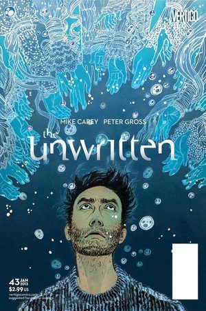
1) July 17 (Tuesday)
sketching Tuesday morning... cover for The Unwritten's latest issue #43. We usually starts earlier in the month, but I was busy as well as the team was at ComiCon the weekend before.
Editor Shelly Bond's memo was: "I think Tom should be on the cover, since we haven't had him in a while, and besides, Tom has a new scruffy look, which is very attractive. But I also would love to see your drawing of unicorn too" .

2) July 20 (Friday)
Sketch got accepted in a day or so. I was finishing up other projects. Starting to ink this one as final.

3) same morning, trace the sketch onto watercolor paper and started penciling. My pencil underdrawings are usually so much looser, but this one is all about his face, so I go into details. Paper is TH Saunders Waterford cold press, pencil for underdrawing is usually HB so it is light and erases easily. (pencil for sketches are usually 3B to get the drawing down quickly)

4) same afternoon around 3PM. This is what I wrote on FB:
Face is pretty much done inking. Now I can take a late lunch break before a conference call at 4PM (with another client).
I usually don't use photos for face, but this is such big part of the image, I decided to downloaded whole bunch of photos of men looking up for reference. Though, it doesn't look like any particular one of the photos at the end. (just small details count, like how the eye balls sits, etc. )
india ink is from Dr. Ph. Martins Black Star Matt. Brush is a Japanese calligraphy brush. (more details on my supplies on FAQ page)

5) July 23 (Monday)
I worked till late on Friday, and took the weekend off to spend with a house-guest from Paris. Back to drawing table again. Close! The hands are of Victorian ladies. Used fantastic Fashion book from Taschen as reference and inspiration to get all the details in. when it is all about simple and graphic composition, balance between bold composition and intricate small details becomes the key. It cannot be too much about the details, or too much just about compositions.

6) July 24 (Tuesday)
One week from the sketches got started was the deadline day. I jump started on coloring the night before, and got most of the color scheme and details done. With fresh eyes, more into minor details, then to graphic design laying out all the text and logo. (I have been doing most of designs since issue #28) Color is entirely done on Photoshop CS5.5. Very long and complicated process. I often get asked things like 'how do you color the lines?' or 'how do you put textures?' But really, there is no one simple answer to those questions. Many different ways to color different part of a drawing. Hours and hours, and hours, of work.

7) same day in the afternoon. Tadaaaaaa! It's DONE. I had spent way too much time laying the text out, but finally I was happy. I wanted the text to to sort of flow up the water with the bubbles. Editors let me do a lot smaller title treatment, and the title is fading out...
As you can see, this issue won't come out for a while, but other issues keep coming out every month.
Thanks for reading! And, hey, talk to you on Facebook?
posting on Facebook realtime (and talking to strangers while I work).
One time a friend jokingly said that I have a 'full time position at Facebook'. What she meant was, that I was on it a lot. Yeah, OK, true. Especially when my studio-mates or neighbors are away and I am the only one on the floor. I need some social life.
I have a private page that I only accept people I personally know as 'friends', where I mainly talk about non-work. And, there is this public page where anyone can join and post or comment. Initially I was a bit skeptical. I felt it was a bit too arrogant, or something like that. But the more I do, the more I like it.
I get e-mails from total strangers often. Asking for questions or favors, and sometimes messages can be long and take time to read them all. It can be a bit heavy and charged, and often I don't have enough time to write a nice answer back. So, I put them aside, and end up never having time to write back. But with Facebook, everything is short and quick, and I can jump into conversation short and quick too.
I like watching other artists' process. It is like peeking into the back stage. So, I want to do the same on my page too. However, often, there is non-disclosure agreement, or I have to be careful what I can show and not show because the clients have the first publishing right.
Some clients can be a bit easy on artists though, like DC Comics whom I have been working monthly for close to four years. They usually put the finished art up on the web the day after I submitted it.
So, here came my first experiment to put every step on FB real time, from sketch to the final.
Some of you may have already seen them all, but I thought it was nice to keep the record here. And it was really fun communicating with strangers while I kept working and making progress.

1) July 17 (Tuesday)
sketching Tuesday morning... cover for The Unwritten's latest issue #43. We usually starts earlier in the month, but I was busy as well as the team was at ComiCon the weekend before.
Editor Shelly Bond's memo was: "I think Tom should be on the cover, since we haven't had him in a while, and besides, Tom has a new scruffy look, which is very attractive. But I also would love to see your drawing of unicorn too" .

2) July 20 (Friday)
Sketch got accepted in a day or so. I was finishing up other projects. Starting to ink this one as final.

3) same morning, trace the sketch onto watercolor paper and started penciling. My pencil underdrawings are usually so much looser, but this one is all about his face, so I go into details. Paper is TH Saunders Waterford cold press, pencil for underdrawing is usually HB so it is light and erases easily. (pencil for sketches are usually 3B to get the drawing down quickly)

4) same afternoon around 3PM. This is what I wrote on FB:
Face is pretty much done inking. Now I can take a late lunch break before a conference call at 4PM (with another client).
I usually don't use photos for face, but this is such big part of the image, I decided to downloaded whole bunch of photos of men looking up for reference. Though, it doesn't look like any particular one of the photos at the end. (just small details count, like how the eye balls sits, etc. )
india ink is from Dr. Ph. Martins Black Star Matt. Brush is a Japanese calligraphy brush. (more details on my supplies on FAQ page)

5) July 23 (Monday)
I worked till late on Friday, and took the weekend off to spend with a house-guest from Paris. Back to drawing table again. Close! The hands are of Victorian ladies. Used fantastic Fashion book from Taschen as reference and inspiration to get all the details in. when it is all about simple and graphic composition, balance between bold composition and intricate small details becomes the key. It cannot be too much about the details, or too much just about compositions.

6) July 24 (Tuesday)
One week from the sketches got started was the deadline day. I jump started on coloring the night before, and got most of the color scheme and details done. With fresh eyes, more into minor details, then to graphic design laying out all the text and logo. (I have been doing most of designs since issue #28) Color is entirely done on Photoshop CS5.5. Very long and complicated process. I often get asked things like 'how do you color the lines?' or 'how do you put textures?' But really, there is no one simple answer to those questions. Many different ways to color different part of a drawing. Hours and hours, and hours, of work.

7) same day in the afternoon. Tadaaaaaa! It's DONE. I had spent way too much time laying the text out, but finally I was happy. I wanted the text to to sort of flow up the water with the bubbles. Editors let me do a lot smaller title treatment, and the title is fading out...
As you can see, this issue won't come out for a while, but other issues keep coming out every month.
Thanks for reading! And, hey, talk to you on Facebook?
May 11, 2012
things I have learned so far.

I am used to public speaking. I even enjoy it. Most of time my audience is art school illustration departments. I even have multiple slide shows ready to pick and choose from to meet each school's needs. It became easier as I did more.
But, this time, it's different.
In a week, I will be speaking at a design conference in Spain called OFFF.
Audience consists of designers of different practices. I am assuming not many of them would be illustrators, or into illustration for that matter.
I had been thinking of what to speak for a few months. Getting a bit nervous, to be honest. I have to come up with something that works to broader spectrum of commercial arts.
I finally came up with an idea of sharing things I have learned in ten years of working as creative professional.
Many (MANY) mistakes I had made, and perspectives I have earned from that.
Yesterday morning, I quickly jotted down some of the topis I may be able to share with them. They are in rough stage.
And, just to test out the water of how this would be received, I posted the original scribble onto my Facebook page.
Then I realized.
I happens to be graduation season, and those who are newly starting in the real world are looking for some advise. Yes, of couare, I remember that.
And this scribble, surprisinly, got received well among them.
So, I am sharing this here too, for more of those new baby birds flying out to the real world.
There are typo, there are odd grammer, but I am posting it as is.
Sometimes it is good to share an early process of thinking (= an artist's brain fart).
Now, I go back into my Keynote and start constructing the actual presentation. Hopefully, I will be done by the end of the weekend.
And, happy graduation to my seniors, and all rest of teh students out there.
April 26, 2012
The Man Who Sailed His House
Dear Yuko,
I really enjoyed reading your postings on Drawger (as a lawyer who'd rather be an illustrator it is a nice escape from reality!), but it seems like these days you don't update Drawger very often - I think your most recent post is January 12. The reason I like your postings so much is that you explain how you do things, which is really useful for rank amateurs like myself. I was wondering if you post more regularly on another website? If so, are you able to let me know what that website is?
Kind regards
I saw this e-mail in my inbox this morning when I got to my studio.
Yes, I have just been thinking about updating my Drawger. Actually, for quite a while. Whenever I go on a business trips to different schools, often students or instructors tell me how much they like my posts because they show not just the final piece, but the process where they can learn.
Life is not easy. We never have time. Work load has been a bit of insane status since beginning of this year, second semester in teaching is always more work than the first semester (not sure why, but winter weather adds to it, definitely). Multiple business trips to lecture and teach (because travel is my hobby and reason for me to get outside of NYC), also, getting my website redesigned, by awesome web design studio, but I still have a lot of work to do myself.... yada yada yada... We never have time.
That is true. but the e-mail this morning woke me up. I'VE GOT TO UPDATE MY BLOG RIGHT NOW!
So, before going into the regular routine of a day's work in the studio, I am posting this now. It is for you, Mr. A.C.G.
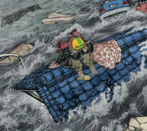
Since the new Communication Arts Illustration Annual came out, I decided the first post after hiatus is one of the winning piece, which I worked with GQ for their October 2011 issue. AD was Chelsea Cardinal.

The story, titled The Man Who Sailed His House, was an amazing story of survival of one man during Japan's earthquake/tsunami in March 2011. He was washed about 1Km ashore on the roof of his house when he was rescued days later.
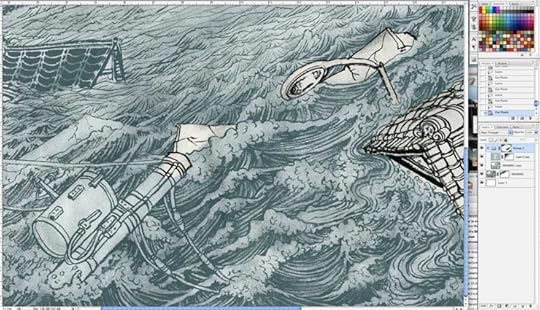
Above is the b/w version of the drawing for a double page opener. About 30" x 22". India ink with brush on watercolor paper.

I made three initial rough sketches and sent them to Chelsea. She picked the bottom left, from which I made more fefinied sketch (which is still rather loose).

There are way more than what you see here, but some of the reference materials I had found on various news sites on internet. Really charged photos..., to be honest, it wasn't so fun staring at them for days, although the project itself was fun.
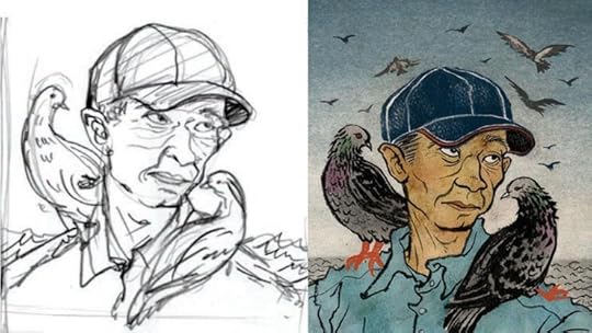
the one in the middle with a man waving his hand is the only photo there was of Hiromitsu, the main character of this story. (And thus I knew why they needed to hire an illustrator for this project).

I was quite happy with the color. Very nutral, with only bright thing behing his helmet, which is the same color as the big fire far away.
... then some emergency happens right before the image goes to print. The full article was not available when I finished my illustration. And we found out that there are specific color references clearly written in the final article. So, the color needs to be tweaked around. But it was such last minutes decision, GQ production department had to take care of it.
Below is the final result. Red roof, yellow shoes, white helmet....

There was one more spot illustration in the print version of GQ, which was Hiromitsu's portrait. Also, what was new to me, was that they asked a few more on top for the iPad version of the magazine, some of which are posted below the portrait.


If any of you are interested in this amazing story, you can read the article on GQ website.
On another note, I will try (TRY!) to post at least one or two process from now on. I will either post other works that got accepted in Communication Arts, or related Japan tsunami piece I recently did for Japan Times.
Till then...
January 12, 2012
Shout / Stauffer/ Weber final interviews
I had been interviewing fellow illusrators and publishing the article in a Japanese magazine called ILLUSTRATION (イラストレーション)for a little more than two years. The magazine is now going through a big direction change, and the popular feature of foreign (from Japanese point of view) illustrators have ended for now.
Illustration Friday has been kind enough to publish the full English version of the interviews on their site, and the last of them are up right now.
Shout Brian Stauffer Sam Weber
I specifically recommend these intervies to illustration students and starting out illustrators, who are working really hard but sometimes have doubt in their future as a professional artist. I am sure their words will inspire you, and encourage you to keep going.
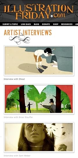
December 22, 2011
Happy Winter Solstice.
I don't like it when day light savings time ends, and day gets shorter and shorter. I get the annual winter blues.
Today is Winter Solstice. Yes, the shortest day time of the year. And, there is something to celebrate: Look at the bright side, the day can only get longer from here on!
Well, of course, colder weather awaits in front of us in January and February. But I always feel like today is the day I can exhale and think that the worst has passed.

Have a very Merry Christmas, happy Chanukah, and whatever religious or non religious holiday you are celebrating. And, a happy new year.
See you again in 2012, everyone.
PS: This illustration was originally created for The Atlantic Magazine's Gallery section, published in the middle of the horrible winter last year.
Today is Winter Solstice. Yes, the shortest day time of the year. And, there is something to celebrate: Look at the bright side, the day can only get longer from here on!
Well, of course, colder weather awaits in front of us in January and February. But I always feel like today is the day I can exhale and think that the worst has passed.
Have a very Merry Christmas, happy Chanukah, and whatever religious or non religious holiday you are celebrating. And, a happy new year.
See you again in 2012, everyone.
PS: This illustration was originally created for The Atlantic Magazine's Gallery section, published in the middle of the horrible winter last year.
December 1, 2011
Killed Job of the Year 2011
It's December. This is the time of the year when I look back and give the light of the day to the sadly killed jobs for one reason or another. Yap.
This year, it happened in January, and I knew immediately that it was going to be my "killed job of the year"
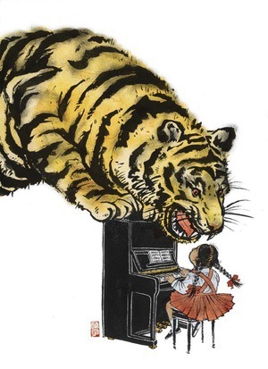
My first TIME Magazine cover that never was.
Yap.
When TIME called and asked me to do an illustration, that, by itself, I was really excited. I have worked with TIME in past, but not so often, so phone call from them is always exciting.
I think the good thing was that when they initially said 'half a page or full page" later turned into "maybe possibly cover", then "maybe possibly a cover and interior illo", I didn't take it too seriously.
Oh of course, I did take the job very seriously. But I have worked long enough to know not to keep my hopes too high when I hear something that sounds just too good to be true. (Although, I know Tim and Edel and a few others here on Drawger have done multiple TIME covers in past. For me, it is still a dream. And I am in peace with it. )
When eventually, the magazine has decided to go with a photo for the cover, I wasn't surprised. The photo felt more like TIME to me anyway.
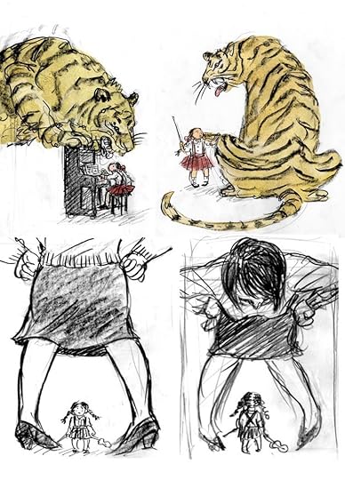
It was a bit sad when eventually neither of my illustrations got published. But hey, the one with the tiger and piano got accepted into both American Illustration and Society of Illustrators annual, and then published in my first monograph (I will talk about this book some other time). I cannot ask for more. Thank you Andree Kahlmorgan and Emily Crawford for giving me an opportunity to work on an image that I am really proud of.
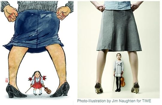
I found the image on the right on TIME website. Works so much better in photo than illustration, I think.

PS: Comments welcomed. But do not write things like "illos are better than photos" kind of stuff, please. Thanks!
September 7, 2011
The Influentials

Tomorrow evening at The Visual Arts Gallery is an opening for a show The Influentials. It is a show of SVA female alumni and their mentors showing works together side by side. I don't know how I got to invited to be in this show of mainly fine artists, many of them very established, but anyway, I will be showing, together with Thomas Woodruff, who was my undergraduate illustration instructor, then grad school personal advisor, and currently my boss/chair at BFA Illustration program where I have been teaching since 2003.
I wasn't sure what to show at first. I wanted to show something I hadn't shown anywhere, which, in process, is not illustration.
When last severely cold winter was getting started, University of the Arts kindly invited me to participate in the Von Hess Artist Residency, to create a limited edition multi separation offset print with the master printer Amanda D'Amico. Since the print got finished, I was looking for an opportunity to show. So, this will be what I will be showing. Without Amanda's literary 'master' skill, I would have never be able to make this 6 color separation prints. Although the original image was created last year for Blowup show at the Society of Illustrators, this new version is nothing like digital print outs.
Opening reception is tomorrow. (invite on the bottom of this post).
If you have time, or if you are already planning on opening hopping at Chelsea's new gallery season, please schedule a stop at The Visual Arts Gallery.
Big thank you to everyone at the gallery, everyone at UArts, especially Matt and Amanda, and Thomas Woodruff.


The Influentials
Tomorrow evening at The Visual Arts Gallery is an opening for a show The Influentials. It is a show of SVA female alumni and their mentors showing works together side by side. I don't know how I got to invited to be in this show of mainly fine artists, many of them very established, but anyway, I will be showing, together with Thomas Woodruff, who was my undergraduate illustration instructor, then grad school personal advisor, and currently my boss/chair at BFA Illustration program where I have been teaching since 2003.
I wasn't sure what to show at first. I wanted to show something I hadn't shown anywhere, which, in process, is not illustration.
When last severely cold winter was getting started, University of the Arts kindly invited me to participate in the Von Hess Artist Residency, to create a limited edition multi separation offset print with the master printer Amanda D'Amico. Since the print got finished, I was looking for an opportunity to show. So, this will be what I will be showing. Without Amanda's literary 'master' skill, I would have never be able to make this 6 color separation prints. Although the original image was created last year for Blowup show at the Society of Illustrators, this new version is nothing like digital print outs.
Opening reception is tomorrow. (invite on the bottom of this post).
If you have time, or if you are already planning on opening hopping at Chelsea's new gallery season, please schedule a stop at The Visual Arts Gallery.
Big thank you to everyone at the gallery, everyone at UArts, especially Matt and Amanda, and Thomas Woodruff.


