
John Coulthart's Blog, page 306
June 24, 2011
Friedrich and Schinkel
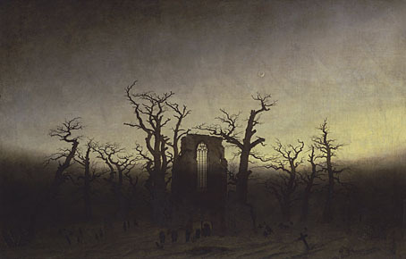
Abbey among Oak Trees (1809 or 1810) by Caspar David Friedrich.
More from the Google Art Project. In these views we get to see some of the subtleties in the work of Caspar David Friedrich (1774–1840), a master at rendering fine gradations of light and shade. The paintings are from the Alte Nationalgalerie, Berlin, and Google's photographs look far better than any book reproductions I've seen (assuming you have a decent monitor).
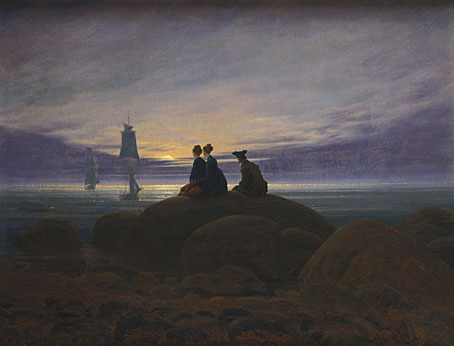
Moonrise over the Sea (1822) by Caspar David Friedrich.
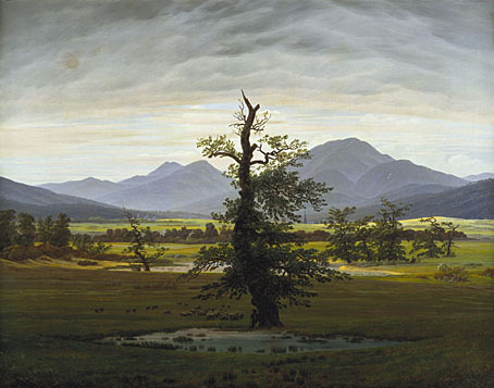
Solitary Tree (1822) by Caspar David Friedrich.
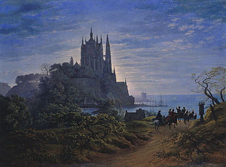
Gothic Church on a Rock by the Sea (1815) by Karl Friedrich Schinkel.
At the same gallery are these paintings by Karl Friedrich Schinkel (1781–1841), for a while a painter pursuing similar atmospheric ends. He apparently abandoned painting for architecture and stage design after seeing Friedrich's work. Many of his paintings feature architectural fantasies where Friedrich, in true Romantic style, tended to favour ruins.
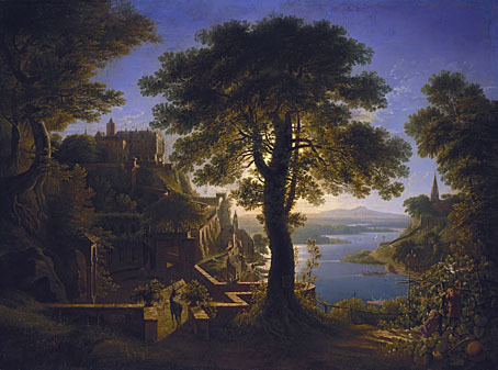
Castle by the River (1820) Karl Friedrich Schinkel.
Previously on { feuilleton }
• Winter light
• The art of Karl Friedrich Schinkel, 1781–1841


June 23, 2011
Morlocks, airships and curious cabinets
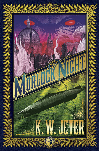
Things I was working on late last year continue to percolate or, if you prefer, build a head of steam. My cover for KW Jeter's Morlock Night appears in a short piece by Rick Poynor in July's Creative Review. That feature is prompted by the British Library's Out of the World exhibition. Nice to see something of mine with Hannes Bok's illustration for Who Goes There? by John W Campbell, the story which was filmed as The Thing from Another World, and later, John Carpenter's The Thing.
Morlock Night is also one of my contributions to the lavish Steampunk Bible which editors SJ Chambers and Jeff VanderMeer have been promoting for the past couple of months. USA Today ran a feature on the book which included my piscine airship among the selected illustrations.
Next up will be the Thackery T Lambshead Cabinet of Curiosities for which I've provided a number of illustrations and decorative title pages. Jeff V has a preview shot of the cover. That will be out next month. More later.
Previously on { feuilleton }
• The Steampunk Bible
• Steampunk Reloaded
• Steampunk overloaded!
• Vickers Airship Catalogue
• The Air Ship
• Dirigibles
• More Steampunk and the Crawling Chaos
• The art of François Schuiten
• Steampunk Redux
• Steampunk framed
• Steampunk Horror Shortcuts
• The Airship Destroyer
• Zeppelin vs. Pterodactyls
• The Hetzel editions of Jules Verne
June 22, 2011
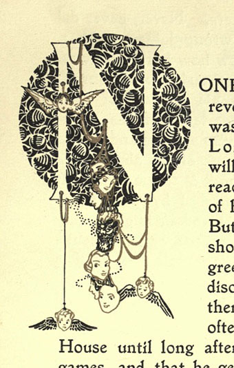
The Happy Hypocrite by Max Beerbohm
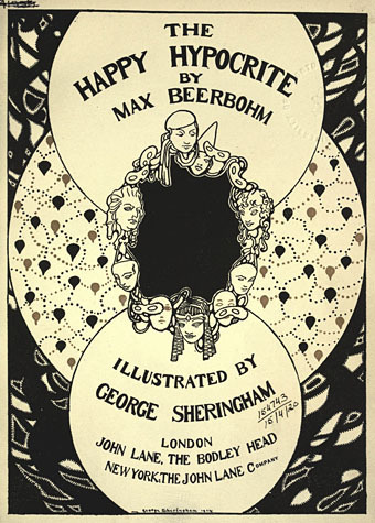
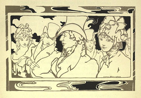
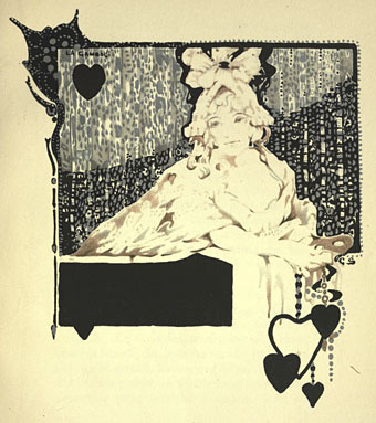
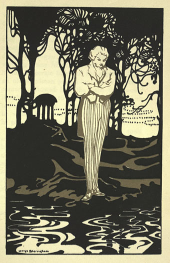
The spirit of the 1890s persists in this 1915 edition of a story the splendid Max wrote originally for The Yellow Book in 1896. Originally subtitled "A Fairy Tale for Tired Men", The Happy Hypocrite is a typically light-hearted affair concerning the misadventures of one Lord George Hell. The setting is the Regency era so beloved of many of the London Decadents, Aubrey Beardsley included, and the rather fine illustrations are by George Sheringham whose style was distinctive enough to avoid any Beardsley pastiche. The copy preserved at the Internet Archive includes a number of full-colour plates but time and the vicissitudes of reproduction haven't done them any favours, hence the concentration here on the monochrome drawings.

Elsewhere on { feuilleton }
• The illustrators archive
Previously on { feuilleton }
• The art of George Sheringham, 1884–1937
June 21, 2011
The art of Aloys Zötl, 1803–1887
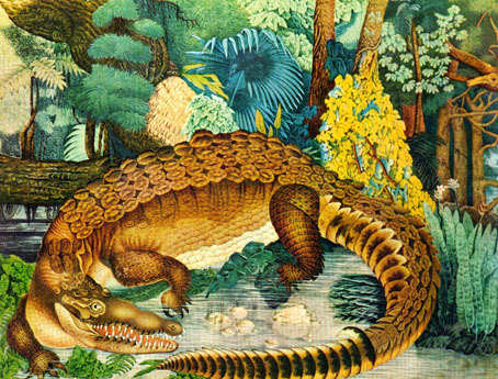
Le caïman (1849).
Two things that everyone seems able to tell you about Austrian artist Aloys Zötl is that his idiosyncratic bestiary was hailed by André Breton as a Surrealist precursor, and that Zötl's paintings were published in a lavish edition by Ricci in 1977 with accompanying text by Julio Cortázar. Typically for a Ricci book, those editions now sell for excessive sums so we're left to scour the web for his pictures. Considering their age and Surrealist connections its surprising that there isn't a decent online collection anywhere. A number of prints can be found on those auction sites which blight the pictures they don't own with watermarks. Better to look at the examples on this blog or this page at the André Breton site where the copies are small but include quotes from the Ricci volume.
Elsewhere on { feuilleton }
• The fantastic art archive
Previously on { feuilleton }
• Fantastic art from Pan Books
June 20, 2011
Max Reinhardt's Dream
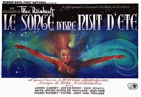
In which the great German theatre director goes to Hollywood to show America how to stage Shakespeare. Nearly everyone who was anyone in pre-war German cinema passed through Max Reinhardt's Deutsches Theater in Berlin so it seemed natural that he'd gravitate eventually to film himself. The 1935 production of A Midsummer Night's Dream was directed by William Dieterle but it's very much a Reinhardt production, especially in the fantastic opening scene where the fairies dance into the moonlit sky on paths of mist accompanied by Mendelssohn's music. With its blend of music, dance and lavish production design Dieterle's film gives us some idea of the harmonising artistry at work in Reinhardt's stage productions.
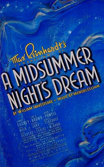
There are other reasons to recommend this version over later adaptations, not least James Cagney's performance as Bottom. A fifteen-year-old Mickey Rooney played Puck although he's frequently more annoying than mischevious. Then there's the mystery of whether that's the young Kenneth Anger uncredited in the role of The Changeling Prince. Anger has always claimed it was him (he was a child actor for a while), Anger biographer Bill Landis agrees but plenty of other people have disputed the claim in recent years. The best viewing I had of the opening sequence in which the Changeling appears was on a big screen in a season of Kenneth Anger's films in 1990. Whether Anger played the part or not, the charm of Dieterle's film subtly invests The Magick Lantern Cycle, from the glittering surfaces in Eaux D'Artifice and the artificial forest in Rabbit's Moon, to the appearance of Mickey Rooney's Puck on a TV screen in Scorpio Rising. Anger's later works were productions of Puck Films, their motto "Lord, what fools these mortals be!"
Ideally the magical opening scenes would be on YouTube but it seems not. This scene, however, gives an idea of the atmosphere, while Doctor Macro has stills and more information.
Previously on { feuilleton }
• The Midsummer Chronophage
• Another Midsummer Night
• A Midsummer Night's Dadd
• William Heath Robinson's Midsummer Night's Dream
June 19, 2011
Cthulhu under glass
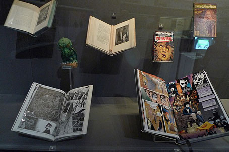
Having had two separate visitors to the British Library's Out of this World exhibition tell me that some of my work was featured there, it's been a good to finally discover what was on display. Many thanks to John Keogh for notifying me of his exhibition photo set which includes the above shot of the relevant display case. This is an odd collection for what's been widely advertised as a science fiction event. Pages from my 1988 adaptation of The Call of Cthulhu are in there along with other fantasy and horror titles including Neil Gaiman's Sandman, Incarnate by Ramsey Campbell, an edition of Fantasy & Science Fiction with Robert Holdstock's Mythago Wood on the cover, and a Sidney Sime illustration for Lord Dunsany's Gods of Pergana. Cthulhu originates out of this world, of course, and that phrase is general enough to encompass other genres.
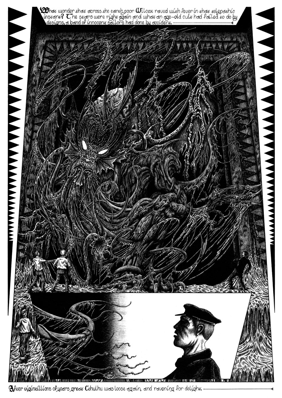
This page from the climax of Lovecraft's story was the first drawing I made of the living Cthulhu, all earlier representations following Lovecraft's scheme of the creature manifesting throughout history in different human artworks and religious icons. Since most of those representations are highly stylised I wanted to make the awful reality seem a lot more visceral and even incoherent, hence the mass of flailing tentacles and ropes of slime. This is also the only full view you receive, everything else is fragmentary and allusive so there's space for the reader's imagination. I think the book in the library display is the Lovecraft anthology The Starry Wisdom but The Call of Cthulhu is also present in my Haunter of the Dark collection which includes a couple more portraits of "the green, sticky spawn of the stars".
Out of this World is a free exhibition which will run to September 25th, 2011.
Previously on { feuilleton }
• Signals from Mars
• CthulhuPress
• Cubist Cthulhu
June 18, 2011
Weekend links
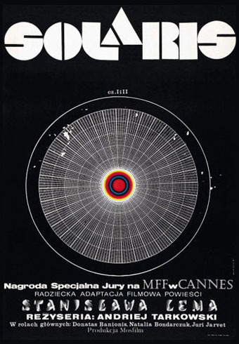
Polish poster by Andrzej Bertrandt for Andrei Tarkovsky's 1972 film of Solaris.
• Stanislaw Lem's Solaris receives its first ever direct English translation by Bill Johnston (only on Audible for the moment), all previous editions having been sourced from a poor French translation. An all-too-common state of affairs for non-English fiction where bad or bowdlerised translations persist for years.
• Now that Minnesota politician Michelle Bachmann is running for US president it's a good time to examine her views when (theoretically) her actions could one day impact on us all. The Daily Beast gathered together some of her worst pronouncements, including the following about gay people: "It's a very sad life. It's part of Satan, I think, to say that this is gay." Her husband describes his attempts to counsel (ie: cure) gay teenagers with the words "Barbarians need to be educated." It's no surprise that both these people find confirmation of their views in the usual narrow interpretation of Christian doctrine. Not all American Christians are this ignorant or offensive, of course. The Heartland Proclamation calls for "an end to all religious and civil discrimination against any person based on sexual orientation and gender identity and expression".
Journalist Andrew Sullivan in 2003 proposed a label for people like Bachmann: "I have a new term for those on the fringes of the religious right who have used the Gospels to perpetuate their own aspirations for power, control and oppression: Christianists. They are as anathema to true Christians as the Islamists are to true Islam." It's a term that ought to have more widespread use.
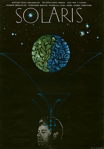
Czech poster for Solaris. No designer credited.
• Probing the secrets of psilocybin: "Scientists at the Johns Hopkins University School of Medicine have zeroed in on the dose levels of the 'sacred mushroom' chemical capable of yielding positive, life-changing experiences, while minimizing the chance of transient negative reactions in screened volunteers under supportive, carefully monitored conditions."
• Rick Poynor relates a visit to the Frederic Marès Museum, Barcelona, home to the 50,000 objects Marès collected over his lifetime. Further details of the collection can be found at the museum website.
In her 1969 essay "The Pornographic Imagination," [Susan] Sontag insisted that Story of O could be correctly defined as "authentic" literature. She compared the ratio of first-rate pornography to trashy books within the genre to "another somewhat shady subgenre with a few first-rate books to its credit, science fiction." She also maintained that like science fiction, pornography was aimed at "disorientation, at psychic dislocation."
If so, that aim is far more interesting than what most generic "mainstream" novels set out to do. No one could describe O as predictable or sentimental. Its vision was dark and unrelenting; everything about it was extreme. Sontag also compared sexual obsession (as expressed by Réage) with religious obsession: two sides of the same coin.
Carmela Ciuraru on the story of The Story of O by Pauline Réage.
• "No hay banda! There is no band. It is all an illusion." David Lynch will be opening a Club Silencio in Paris (Montmartre, of course).
• Sad to say that Chateau Thombeau is now closed but Thom has begun a more personal journal here.
• Picture galleries of the Vorticists at the Tate here and here. Related: Into the Vortex.
• Illuminated Persian pages from 1604 at BibliOdyssey.
• Tape drawings by Chris Hosmer.
• Miles Davis and co. at the Isle of Wight Festival, 1970: part 1 | part 2 | part 3 | part 4
June 17, 2011
Land art
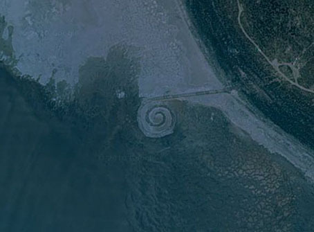
Spiral Jetty.
Reading this story about an ownership dispute over Robert Smithson's Spiral Jetty in Utah had me searching out his celebrated artwork on Google Maps. It's easy to find since Google have many of the well-known pieces of 1970s land art marked on their satellite views. Having found Smithson's construction I went looking for a few more.

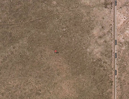
City.
Less easy to find, since it's not marked and the artist forbids visitors, is Michael Heizer's enormous and enigmatic City, an earthwork complex he's been constructing in the Nevada desert since the early 70s. From the air it looks like a secret military base, the art area being the diagonal arrangement of structures on this view while the squares to the right are the artist's home. I've been fascinated by this creation ever since a part of it, Complex One, was featured in Robert Hughes's The Shock of the New, not least for Hughes's assertion that these remote works impel an act of pilgrimage on any would-be visitors. This page has more about City and some of the few photos which have been released of its structures. See also A Sculptor's Colossus of the Desert and Art's Last, Lonely Cowboy.

Roden Crater.
Equally remote, and for the time being inaccessible to the public, is James Turrell's Roden Crater in Arizona, an extinct volcano which Turrell has been converting into an enormous viewing space for astronomical events and the transitory effects of natural light. This was begun in 1978 and seems like it may actually get finished, unlike Heizer's construction site. This NYT article discusses the work's history while Paul Schütze has recent photos of site details as well as a free download of some of the music he's composed for the interior.
Lightning Field.
On a different scale altogether, and not at all visible from the air, Walter De Maria's Lightning Field is 400 stainless-steel poles placed in a grid formation in a New Mexico field. The presence of the rods is intended to draw lightning from passing storms, an effect which results in spectacular photographs. The pilgrimage concept operates here as well; this blog post is a detailed account of a visit to the area.
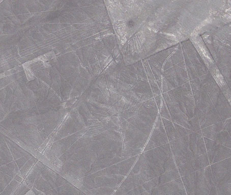
Nazca Lines.
North America has a few other land art sites, details of which can be found here. I left those for a look at something bigger than all of them, the Nazca Lines on the Nazca Plateau in Peru. When it comes to big gestures, the South Americans are still the ones to beat.
Previously on { feuilleton }
• The art of Jim Denevan
• The Underwater Sculpture Gallery
June 16, 2011
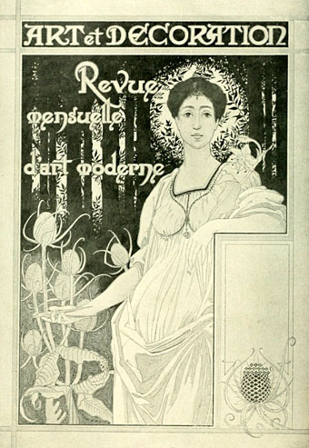
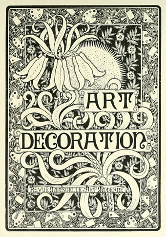
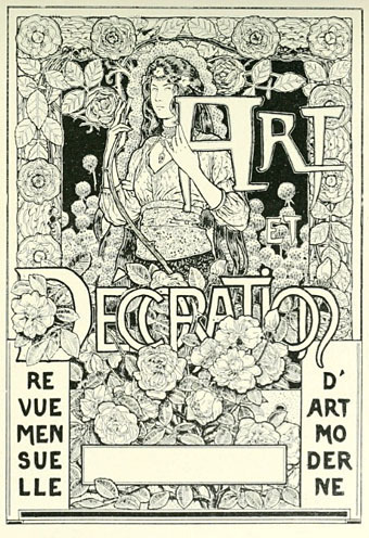
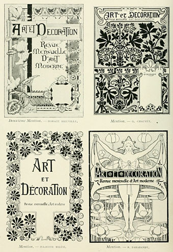
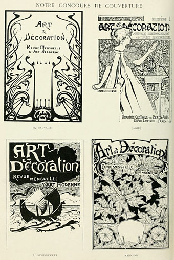
Art et Décoration
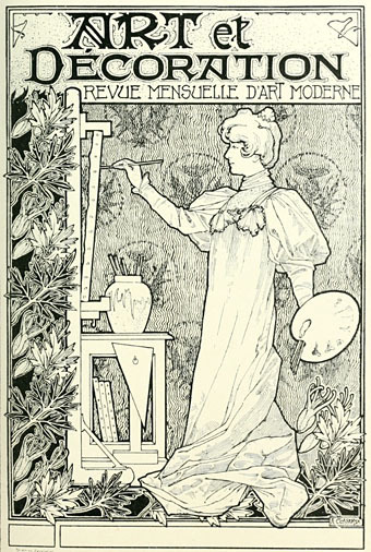
Another Art Nouveau journal partially submerged from the world's libraries, Art et Décoration was a French equivalent of The Studio, launched a few years after its British counterpart in 1897. The examples here are from a cover design competition in the first issue which yielded the usual complement of decorous muses and florid borders; The Studio used to hold similar competitions. For now the Internet Archive only has the four issues of A&D, the first two then numbers 41 & 42. Here's hoping that more become available, I'm naturally curious to see how they treated the Exposition Universelle of 1900.
Previously on { feuilleton }
• Ver Sacrum, 1898
• Deutsche Kunst und Dekoration
• Jugend Magazine revisited
• The Studio & Studio International
June 15, 2011
Joyce in Time

A post for Bloomsday. James Joyce made the cover of Time magazine on two occasions, each instance following the publication of his two greatest works. Ulysses was first published in France in 1922 but had to wait until 1934 to be presented in full to the American public after a trial for alleged obscenity. The edition for January 29, 1934 (left) included a review of the novel:
Is it dirty? To answer the man in the street in his own language, Yes. With the exception of medical books and out & out pornography, the only book of modern times that can compare with it for outspokenness in barnyard and backhouse terms is the late D. H. Lawrence's Lady Chatterley's Lover. But Ulysses is far from being "just another dirty book." Judge Woolsey decided that its purpler passages are "emetic," rather than "aphrodisiac"; that the net effect of its 768 big pages is "a somewhat tragic and very powerful commentary on the inner lives of men and women."
I can imagine Joyce being amused (if not exasperated) by some of the ironies in this piece, not least for his novel having a "man in the street" as its central character, and that declaration, "Yes" (from the man in the street's wife), being the very sign of affirmation upon which the narrative resolves.
Time for May 08, 1939 fares better in its review of Finnegans Wake although they still had to ask on behalf of the prurient reader: "Is the book dirty?" The answer? "Censors will probably never be able to tell." Of greater interest is the description of the author which follows the review:
In appearance Joyce is slight, frail but impressive. He stands five feet ten or eleven, but looks as if a strong wind might blow him down. His face is thin and fine, its profile especially delicate. He wears his greying, thinning hair brushed back without a part. Joyce reads and writes sprawling in bed or on a couch but he does not like it known. He is very formal in public, in restaurants prefers straight-back chairs in which he sits bolt upright.
He dresses with conservative elegance, never goes out without a slender walking stick, which he manipulates expertly, accenting the delicacy of his beringed hands (he has a passion for rings). His voice is soft, rich and low with a gentle, melancholy brogue. He is rather vain of his tenor, which he likes to join with his son's bass at small family celebrations.
For a list of Bloomsday events around the world, consult Google.
John Coulthart's Blog

- John Coulthart's profile
- 31 followers

