
Rachel Andrew's Blog, page 5
January 1, 2018
So that was 2017
Time for another of these roundup posts where I look back, baffled at how quickly time has passed.
TripIt tells me that I spent 158 days on the road last year, visiting 56 cities in 16 countries and travelled 184,988 km. That did include a holiday in Nice, but otherwise my travel was conference or CSS Working Group related. I also got to attend Google I/O which I enjoyed far more than I had imagined I would. A huge thank you to all the conference organisers who have invited me to share my thoughts about CSS on their stages, and the attendees who have listened, and asked great questions that will inform what I do next.
Newcastle upon Tyne for Frontend NE
Lisbon, Portugal for the Netcentric Summit
Oxford, UK for Render Conf
Seattle, Boston, Washington DC, Chicago, San Francisco and Denver for An Event Apart
San Francisco, USA and Freiburg, Germany for Smashing Conf
San Francisco for Google I/O
CSS Working Group meetings in Seattle, Paris, San Francisco and Tokyo
Reading, UK for the Breaking Borders meet up
Berlin, Germany for CSSConfEU
Athens, Greece for Frontend United
Amsterdam, The Netherlands for CSS Day
San Jose, USA for Fluent
Brighton, UK for Patterns Day
Rovinj, Croatia for Web Summer Camp
Krakow, Poland for the GDE Summit
Stockholm, Sweden for NordicJS
Toronto, Canada for Web Unleashed
Dublin, Ireland for 404.ie
Braga, Portugal for MirrorConf
Bochum, Germany for RuhrJS
Nantes, France for DevFest Nantes
London for Mozilla View Source and also for Google Developer Group DevFest London
I ran several workshops on CSS Layout over the course of the year, including in-house at The BBC on behalf of Mozilla.
CSS Grid shipped
Having been wandering the globe talking about CSS Grid for almost five years, Grid finally shipped in browsers in 2017. This was good, as I didn���t really want to be some kind of CSS vapourware lady. I knew Grid was important the first time I read the initial spec. I had no idea how my championing of the specification would change my life, and allow me to get to work with so many interesting people.
There is so much I could link to from this year relating to CSS Grid, here are some personal highlights.
When Firefox, Chrome and Safari all shipped Grid within a couple of weeks in March.
At An Event Apart in Seattle, when Rossen Atanassov pulled up a slide of an email from me in 2014, when I���d been chasing up Microsoft to update their grid implementation.
I wrote the documentation for Grid on MDN - and followed it up by publishing a similar set of material on Flexbox.
I���ve responded to questions from the community with a number of pieces on Smashing Magazine:
CSS Grid Gotchas and Stumbling Blocks
Naming Things in CSS Grid Layout
Using CSS Grid: supporting browsers without grid
My 2016 talk on Grid was published by An Event Apart, while that talk was recorded prior to Grid shipping, the information is still all pretty relevant and I���m glad to have a recorded version.
My work was mentioned at both the Google Developers Experts Summit, and Chrome Dev Summit.
What has been fantastic is that the community has, in the most part, given credit to the work that Jen Simmons and I have been doing to promote Grid, and layout in CSS. As have people from the various browser vendors. I don���t do this stuff to be internet famous, however recognition means I can get work that pays the bills and therefore continue to work on CSS. I can continue to create learning materials, and show up at community conferences and everything else I do as an independent person who cares about the web.
If you���ve shared my stuff or remembered to reference my work when writing about Grid, thank you. It means a lot.
Multi-column Layout
My main interest in CSS is layout, both for the web and also for print and EPUB. Which meant that reviving work on the Multi-Column layout specification was entirely relevant to my interests. We republished the specification as a Working Draft, in order to work through and fix the outstanding issues, leading Drew to suggest I was regressing the web. I have a lot to learn as a spec editor, but I am enjoying doing so.
As part of this work I���ve been learning how to write tests for Web Platform Tests, I wrote about that for 24 ways this year, as working on tests is a brilliant way to start contributing in a meaningful way to the platform.
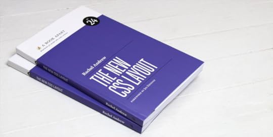
Book no.22 - The New CSS Layout
I wrote another book, and in October it was published by the lovely folk at A Book Apart. The feedback has been amazing. I really wanted to place Grid and Flexbox into the overall picture of layout in CSS. To explain where we came from, and where we are heading.
Smashing Magazine
From November 1st I���ve been the Editor in Chief of Smashing Magazine. I landed there right in the middle of their major site relaunch, and I feel as if I���m still finding my feet. We have some fantastic content coming your way in 2018 - I know because I read all of it! I���m very keen to help make Smashing the best place for practical content for web developers, stuff that helps you to do you job better.
I���ve updated our guide for writing for Smashing, and we are always keen to hear from potential authors.
Shipping Perch and Runway 3
Drew and I shipped a major update to our products in 2017 - Perch and Perch Runway 3 launched in March. We also went to making a free download available for testing for the first time, and it has been fantastic to see new people discover the products for the first time.
We���re especially keen on the Perch Runway Headless CMS mode, and the Webmention functionality we���ve also added this year.
Announcing Notist
In addition to Perch and Runway we���ve been working on a brand new product. Notist aims to be a hub for your speaking events, and the resources that go along with them. We announced in the last part of 2017 and we���ll be launching very soon.
We���ve added the ability to import your Lanyrd data in preparation for launch. You can read about that here.
CSS Layout News
I���ve continued to send my weekly CSS Layout News email. Tomorrow will be Issue 127 and there are now over 7,800 subscribers. I���ve had some lovely sponsors this year, who have helped with the cost of sending out the email.
Not all work
Work and life have always merged into one thing for me, and quite purposely. I���m doing the things I want to be doing, that I find important, and along the way trying to find ways to make a living out of it. I have lots of things I like to be doing that don���t involve running a business, writing code or CSS specifications.
Running
I���ve had something of a disastrous year as a runner. At the end of 2016 I had more surgery on my elbow, which has given me back use of my right hand and a lot less pain. However the problems caused by one wonky arm have plagued me all year as I have bounced between hip and ankle injuries caused by how much out of alignment things are. In the final weeks of 2017, things seem to be improving, I���ve started CrossFit, wonky arm and all, and I���m hoping to be fit and well to run the Berlin Marathon in 2018 as I���ve got a ballot place. Berlin is my favourite city in the world, doing the marathon there will be amazing.
I did get to do my 100th Parkrun. Drew and I managed to sync up our progress so we could run our 100s together at Ashton Court. In addition to parkruns close to home I did my first Canadian parkrun, with Drew at Beach Strip in Toronto, revisited Crissy Field in San Francisco, and visited Waterstown in Dublin.

An ���empty nest���
My daughter graduated from college this year, we didn���t get to do the whole graduation thing as she was already working as a performer in Bulgaria. She has been working ever since, and we���ve just enjoyed Christmas together after she finished a run playing Cinderella in Wales. She went away to college at 16, so her not being around all of the time is fairly usual. However, she is now independent of us, doing her own thing, exactly as it should be.
I���m glad that she still wants to hang around with us. That we���ve come out the other side as close friends, which makes it almost more sad she lives in another city! However I���m grateful for the fact that via Instagram, or Facebook and Twitter we can share our lives.
Learning to fly
For the last 12 years, any spare money I had was being directed into school and then college fees for my daughter. I���ve not had the chance to indulge any hobby of my own that cost money. The aforementioned empty nest means that I can for the first time spend a bit of money on fulfilling a dream of my own, and so I���ve started to train for my Pilot���s License. It is the hardest thing I have ever tried to do, but that just makes it more appealing as far as I���m concerned. I���m currently ���on the circuit���, until I can safely land the Cessna 150. My landings are best described right now as interesting, and no-one wants an interesting landing!
I did set up a Slack for people who fly or who are interested in flying. Sign up here.
2018
Goals for 2018? To get Notist launched, and also to promote Perch Runway more to people who didn���t already use Perch.
To bring together the work I���ve been doing on CSS into one place. I���ve got some lovely illustration that I haven���t quite had chance to implement yet, as part of an effort to combine a lot of the stuff I���m doing. That���s a pretty immediate goal - I���d hoped to do it over Christmas but the need to move our server infrastructure to Germany while things were quiet took precedence!
To get the outstanding issues in the Multi-column Layout spec tidied up, with a solid test suite.
To update my online CSS Workshop with the new material I have. I need to spend a week recording video. It���ll all be available to existing subscribers too.
To progress towards my Pilot���s License. I���d love to think I could get it in 2018, however the weather and my travel schedule might mean it takes longer, which is fine. The aim is to be a safe pilot, not to finish in the minimum number of hours. I���d love to get all the written exams out of the way though.
To work on some tough but realistic fitness goals as I continue to work to sort out the mess my elbow has caused.
To enjoy the speaking engagements I���ve already lined up this year. I���m already doing my new An Event Apart talk, and I have a few new things to talk about this year at the various events I���ve been invited to.
Happy 2018.


December 20, 2017
How should we resolve percentage margins and padding on grid and flex items?
The CSS Working Group would like your opinion. There is a longstanding issue in both the CSS Grid Layout and Flexbox specifications.
From the CSS Grid specification:
Percentage margins and paddings on grid items can be resolved against either:
their own axis (left/right percentages resolve against width, top/bottom resolve against height), or,
the inline axis (left/right/top/bottom percentages all resolve against width)A User Agent must choose one of these two behaviors.
Note: This variance sucks, but it accurately captures the current state of the world (no consensus among implementations, and no consensus within the CSSWG). It is the CSSWG���s intention that browsers will converge on one of the behaviors, at which time the spec will be amended to require that.
Authors should avoid using percentages in paddings or margins on grid items entirely, as they will get different behavior in different browsers.
The flexbox specification has the same wording.
What is the problem here?
A percentage has to be resolved against something. If you give a grid item a margin-right of 10%, you would probably expect that 10% to be calculated as 10% of the width of the grid area. What happens however if you give the item a margin-bottom of 50%? Do you expect it to resolve to 50% of the total height of the grid area or do you expect it to calculate 50% from the width? The spec allows for both, and browser implementations are split.
You can see the problem in this very simple CodePen. We have three column tracks which are each 120 pixels in width. The margin-right applied to each track resolves to 12 pixels, 10% of 120.
In Chrome and Safari the margin-bottom resolves to 60 pixels. 50% of the width of 120 pixels is 60 pixels.
In Firefox and Edge the margin-bottom uses the height of the grid area and so in this case resolves to 150 pixels as I have put a height on the grid and items are stretching.
If you remove the height on the grid container you will see how Firefox now completely collapses the container as there is now no height to resolve against. Chrome will keep the container at 60 pixels - that being the margin.
We see the same variance in Flexbox, however in Flexbox we resolve against the flex container as the containing block. However you can see in the below example how Chrome uses 10% of 500 pixels for the margin-right, and 50% of 500 pixels for margin-bottom. Firefox uses 10% of 500 pixels for margin-right and 50% of 300 pixels for margin-bottom.
The fact that percentages resolve from the width is essentially a throwback to the old days of layout on the web where we didn���t have great control over the height of things. The width was the measurement we could control and so became the dominant measurement.
The ���aspect ratio hack���
One reason to follow the Chrome behaviour here is that it allows the percentage-based padding ���aspect ratio hack��� to work on flex and grid items. There is an excellent write-up of the interoperability issue on Bram.us - Vertical margins/paddings and Flexbox, a quirky combination, the issue is also detailed on Flexbugs and Gridbugs.
However, perhaps a better solution is to properly solve the aspect ratio issue, while also deciding on one solution for margins and padding in general.
We want your feedback!
The CSS Working Group would love to know your thoughts on this issue. As you can see above this is not an issue when using horizontal percentage margins and padding, this continues to work as it always has done. The issue is with vertical margins and padding. Would you prefer the Chrome behaviour, of the Firefox one? Other than the aspect ratio padding hack, are you using vertical margins and padding for any other reason?
You can comment directly on the GitHub issue with thoughts and use cases. It would be great to get this particular interoperability problem solved.
Also posted to the CSS WG Blog.
November 13, 2017
CSS Survey Roundup
As part of preparing for the An Event Apart talk that I���m giving for the next few shows, I published a survey. I wanted to have some more data on how people were using CSS and how they felt about new CSS features. This post is an initial roundup of some of the things I learned - thank you to everyone who completed this.
Who completed the survey?
543 surveys were completed. I had asked people to submit details of a specific project so it may be that some people completed the survey for multiple projects. I���d also left the majority of questions skippable, therefore totals won���t be 100% for some questions.
The people who completed the survey said that they were (in the context of this project):
Answer
Percentage
Total
A freelancer
19.22%
104
Employed, working for external client
31.05%
168
Employed, working on in-house project
37.34%
202
Working on own company site
4.07%
22
Working on a side project
5.91%
32
Other
2.40%
13
The ���other��� responses included students working on projects, and volunteers on non-profit sites.
I also asked people to describe their personal skills level, as you would imagine this was a fairly self-selecting bunch of CSS-ers and so people categorised themselves with very few exceptions as either Intermediate or Expert. What was interesting however was that 37% of people selected the answer, ���Used to consider myself an expert but need to update skills for all this new stuff!���
What were the projects?
Something I was really keen to get were responses from people working on large projects for bigger companies. I am half of a tiny little company, and my experience of big companies is only as a consultant, or dropping in to lead a workshop. That���s a very different experience to working on a project day to day at that scale. As it turned out, the majority of responses were from people working in such an environment.
There were many project with large teams, and where multiple people are working on the CSS in addition to plenty of solo efforts. 27% of respondents were working completely alone on a project, however when asked how many people worked on the CSS part of a project 48% of people indicated they were the only person who touched the CSS.
There was a good split of completely new work, and additions to existing projects.
Question: Is this project?
Answer
Percentage
Responses
A completely new site or application
32.47%
175
A complete replacement of an existing site or application
35.81%
193
An addition to an existing site or application
9.09%
49
Work on an existing site or application (eg. your company website, or your work is on the product itself)
22.63%
122
I also asked who owned the CSS part of the project. 65% of respondents stated that they were the owner, with almost 4% admitting that no-one would claim responsibility for it!
Elderly CSS
One of the challenges of adopting shiny new techniques is when your site consists of older CSS. I wondered just how old the CSS was that was out there, so this question was for those not working on a brand new project. How old is the oldest CSS in your project?
There were a surprising number of projects with code dating back over 10 years, around 8% of projects. This became less surprising when I started to think about it - we updated the UI of our product Perch this year. The UI that we replaced has code dating back to launch in 2009.
Yes, there are still tables for layout and font tags out there. I asked the same question from the stage at An Event Apart in San Francisco which mirrored these results.
Features & Frameworks
I wondered exactly what CSS people were using, or thought they might use and whether the responses included a lot of framework use.
Just over 31% were using a third party framework. The majority of that (22%) was Bootstrap, in addition we had Foundation at 3% and a few people for each of the following frameworks.
Angular
Ionic
Bulmar.io
Purecss
Tachyons
Respondents seemed pretty happy to use new CSS. Of total responses the below table shows how many people currently used new features.
Question: Which of the following CSS features are currently used in your project?
Feature
% using
Number using
Flexbox
83.27%
438
CSS Grid
23.76%
125
CSS Shapes
3.42%
18
CSS Custom Properties (CSS Variables)
20.34%
107
calc
65.97%
347
CSS Transforms
76.81%
404
CSS Animations
69.20%
364
Feature Queries (@supports)
31.37%
165
However, common threads emerged when asking people why they don���t use some new CSS (assuming there is a project need for it).
There are a lot of people who believe that creating fallbacks equates to ���two sets of layout code���.
There are lots of people searching for magic polyfills to make things look ���the same��� in old browsers.
There are other people assuming that using a feature means also using ���bloated polyfills���
Many people believe Grid needs to become ���more mature���, whatever that means. I���m going to believe that they mean like cheese. If it gets to a point where it smells so funky we have to keep it on the back step - use it then!
CSS Variables get a lot of mention, in terms of no support in IE11 and the fact that a lot of their functionality can be implemented via a pre-processor.
The need to support IE11 as a browser that is fully supported and has the same experience as other modern browsers is a big theme throughout.
Those old browsers then
Defining browser support is an interesting thing. What does supporting a browser mean? For me it means people can access and use the features of the site or application, not that it looks identical to everyone.
In the survey 10% of people defines support as ���looks the same���. 55% chose the option of, ���the majority of features must render in the same way, but we���re ok about some finishing touches not being there for all browsers���. 34% were closer to my thinking with ���We are happy to serve a simpler version to older browsers in our support list, but all functionality should be usable���.
Internet Explorer support is often what people think about when we talk about old browsers. Just over 38% of respondents had IE11 as the oldest IE they needed to support. The breakdown is as follows, nice to see the really old IEs disappearing from the picture for most people.
Question: What is the oldest version of IE/Edge that your project has to support?
Version
% with that as oldest supported IE/Edge
IE6
1.32%
IE7
0.94%
IE8
6.39%
IE9
19.74%
IE10
24.06%
IE11
38.72%
Edge
8.83%
With older versions of other browsers, citing support for ���the last 2 versions��� was very common. Although lots of people said they didn���t test in older versions of Firefox or Chrome, perhaps the benefit of evergreen browsers is people stop fixating on a version number and instead look at feature support?
I asked about testing on mobile devices and while almost 17% of people had access to a device lab the top testing method was to look on your own phone and any others that are around. 43% of people used Browserstack or another online tool and 48% had used an emulator.
Deciding on which browsers to support with data
65% of people had access to analytics to make browser support decisions and in the free text responses about how decisions are made to support browsers, the majority of responses cited knowledge of what browsers were visiting the existing site or others with similar traffic. A very common way to decide on support based on data was a percentage of visits - if a browser had 1% or 2% or more of the traffic it is supported.
Many people working in large companies reported that the decision was made higher up than them, and therefore they didn���t know they just had to work with it.
How do you feel when a new CSS feature is announced?
I���m always happy to see new features in CSS or in any part of the web platform. My last question asked what people felt when something new was announced. A lot of people - and this survey was always going to be somewhat self-selecting - said they were excited however there were other responses that came up on multiple surveys.
���It will be a long time before we can use it��� is a very common response, reflecting the high level of support people want to offer to older or nonsupporting browsers.
There are a lot of people who have a somewhat outdated understanding of how features get into browsers, and how interoperable something like Grid Layout is at the point of shipping. There is an assumption that new things in browsers will be buggy and fragile for years. I hope we can start to change that viewpoint.
A lot of people mention they feel overwhelmed, another new feature to learn (and all the workarounds). One person just put, ���tired���.
I���ve been thinking about all of these points a lot. I���m not exactly a shiny new developer myself, and my own product supports IE9, so there is no ivory tower here. However what makes the difference between being excited and able to play with new things with confidence, and just feeling burned out by it all and annoyed that you can���t use all of it immediately? I have thoughts about that, but I���ll leave them for some other post.
October 10, 2017
Launching today: The New CSS Layout
I am author or co-author of 22 books, book number 22 is The New CSS Layout, published by my good friends over at A Book Apart, and launching today.
Book number 22 only happens because 15 years ago I said yes to book number 1. It was 2002, and I was approached to write a couple of chapters of a book to be published by Glasshaus. I left school at 16 to study dance, so to say that I felt underqualified to write a book is very much an understatement. I decided that it was just a couple of chapters and if it was terrible they would find someone else to complete the work. I said yes. It must have been ok, as here we are today.
In The New CSS Layout I���ve tried to use my 20 year experience as a web developer, along with my knowledge of shiny new specifications like Grid Layout, to put these new layout features into context. I think that is important, as the majority of the questions and confusion around new specifications are due to a misunderstanding of how CSS layout works at all. In a world of frameworks and abstractions, it is easy to become separated from the concepts that underpin everything that we do. To really take advantage of everything we have now, we need to understand where it came from and why it works.
My aim is that after reading this book you���ll have a better understanding of how Flexbox and Grid Layout work, and be able to put that knowledge into practice. However my real hope is that you take away something more than just knowledge of those individual features. If I could give you anything it would be the ability to dig into and understand new features for yourself, to be free to play, experiment and develop new ideas.
You can find details of the contents here, and buy your own print or e-book copy over on A Book Apart. I really hope you like it.
October 9, 2017
Announcing Notist
As you might have noticed, I speak at quite a few conferences. For each event I create a page on this site linking to the slides, code and some other resources. I pull those together on my speaking page, which lists my upcoming and past events.
I created the pages on this site using our product Perch Runway and the Collections feature, in order that I don���t have to completely duplicate content I link talks and events and then add the specific things for each event. Other things that I do after speaking at an event is collect tweets, Instagram posts, photos and write-ups, plus the conference video if it is published. This process takes a long time however, and even when I collect them - they often don���t make it onto my site.
What if the whole process of creating individual talk pages and speaker portfolios could be made easier? That���s what Drew and I are trying to do with Notist, a product which we are announcing today and will be inviting people to beta test very soon.
What will Notist do for you?
Before the event you set up a page for a brand new talk, or copying details from an existing one as a starting point. That will give you a nice short URL to pop onto your slides. You can set that to go live at on the day of the event, ready for people to access your slides and other content.
After the event any social media posts that seem to relate to your talk will be pulled into a list in order that you can select and display the ones you think represent your talk well. You���ll also be able to post video of your talk, link out to write-ups and reviews. We���ll never post anything to your profile that you haven���t approved, of course!
Once we have your upcoming and past events, and all your selected media from them, we���ll use that to display a list of past and upcoming events. You���ll also be able to create a profile using the best of that collection - somewhere to point people to in order to promote yourself as a speaker.
There are lots of interesting things we can do around this idea, but we���ll be starting with the basics and building it out based on what our first speakers would find most useful.
Trusting your data to yet another third party
We���ve all been burned by services we love and rely on suddenly vanishing. Drew and I are very keen on enabling people to own their own content - our main product is a self-hosted CMS. We���re all about giving people tools to do that. However it is also very convenient to log into a site someone else maintains and just add your content.
We���ve considered this from the start, and built right into the software will be three ways you can ensure your content lives on, even if we go away.
You���ll be able to export your data in a useful format.
You���ll be able to add a CNAME of your own at Notist, so your data will be hosted on Notist but displayed on your domain. If we were to go away you could repoint that domain and set up your own site with your listings with the exported data.
We���ll have an API, so you can republish data from Notist on your site.
We really hope we won���t go away of course, and we will be charging for some features in order that we have a sensible business model from the outset. Given that Perch is now over 8 years old, we know more than a little about creating a sustainable business on the web.
Think this sounds interesting?
Sign up over at Notist! We���re accepting GitHub signups at the moment, mostly because we know our initial audience are likely to be the tech speakers we already know. We���re intending to also add LinkedIn and other methods in future.
You can also follow us on Twitter, Facebook and Instagram. We���ve got some fun ideas around this whole speaking thing that we will enjoy sharing with you as we get ready to launch Notist!
Multi-column Layout Level 1 published as a Working Draft
In a previous post I noted that I had become co-editor of the Multi-column layout specification over at the CSS Working Group, and last week the first publication of that specification in over six years happened, taking the spec back to Working Draft status - Working Draft of Multi-column Layout published 5 Oct 2017.
Taking the specification back to Working Draft reflects the number of changes that have happened over the past few years, and also the changes still to make. If you want to know more about the various levels a specification goes through, take a look at this post which explains specification levels and process.
I posted to the CSS Working Group blog to announce the publication. As mentioned there I am very aware that browser incompatabilities have caused many developers to be wary of using multicol. The first step to getting those issues fixed in browsers, is to get the specification fixed. I hope I can help with that!
It���s the first specification I���ve been an editor on, so I���m still figuring out the process and finding out about the various tools that the CSS Working Group have to make working on specifications easier. That is interesting in itself, and will hopefully make me a more useful person to have around the Working Group.
Please do raise any issues you spot in the spec, or comment on those already raised. I���ve also set up a repo to collate more general Multicol related stuff. So you can always post things there that aren���t realy a direct spec issue. One thing I���d like to know about are non-Web user agents that use the spec, given the use of the specification in EPUB and print output. One of the reasons I was attracted to work on the spec was the crossover between web and print, as I���ve done a reasonable amount of work with tools such as Prince, and in creating CSS for EPUB.
Onwards to better layouts of a columnar nature!
August 8, 2017
Changes to the Grid Spec and taking on Multi-Column layout
Last week I was in Paris for the CSS Working Group face to face meeting. At the CSS WG we have two kinds of meetings. Every week there is a teleconference, which members call into. In addition we have a face to face meeting a few times each year, where as many of us as are able sit in a room together and go through various issues. If you want to know what is discussed at either of these then it is all minuted in IRC, the logs are posted to www-style after the meetings. In addition if we discuss a particular GitHub issue, the discussion is logged against that issue with any resolution.
In this post I wanted to detail a couple of issues likely to be of interest to readers of this blog.
Grid specification changes and news for Flexbox
At the meeting we discussed a range of related issues, these stemmed from a request that the grid-gap properties not be reset by the grid shorthand. You can read the issue here #1036, which also includes the full IRC log of the discussion.
The resolution for the original issue is that the grid shorthand will be changed to not reset these properties. Furthermore, the gap properties were discussed and it was resolved to undo the original resolution that made specific grid-gap properties (grid-column-gap, grid-row-gap and grid-gap) in favour of column-gap, row-gap and a gap shorthand. There is an issue raised here 1696 although the actual resolution is detailed in the discussion of 1036 above.
These new properties will be detailed in the Box Alignment specification, and be available to other layout modes where they make sense. Multi-column layout already has column-gap, the only difference being that if you do not set a value for column-gap you get a gap (the spec suggests 1em), gaps in other layout methods default to 0.
The good news with regard to making these more generic gap properties is that other layout method they make obvious sense in, is Flexbox. So ultimately browsers may support gaps in flex layout, meaning that we won���t need to do weird things with negative margins to get a neat gap between flex items.
Given that people have already implemented grid layouts using the grid-gap properties it is likely that browsers will alias the old names to the new for the foreseeable future. Right now the spec, nor browsers have been updated but it is worth keeping an eye on that change being made. You could of course use both properties now just as you do for vendor prefixed properties - browsers will ignore column-gap and use grid-column-gap for now.
Co-editing Multi-column Layout
The Candidate Recommendation of Multi-column layout was published on the 12 April 2011, and the specification has languished since then. There are a whole bunch of issues that haven���t been added to the draft of the spec. If you have ever used Multicol you will know there are a good deal of interoperability issues right now.
I care about multicol for a number of reasons. We don���t have anything else that does this sort of thing in CSS, and being able to take a bunch of stuff and split it into columns is sometimes useful on the web. I also have an interest in CSS as used for print - where specifications like multicol are used far more frequently. Therefore, I volunteered and have been accepted as a co-editor of the specification, to see if I can help get things moving again for the spec and ultimately for the interop issues that mean people can���t use it reliably.
It will be the first spec I have edited, and work begins with a good bit of archeology through the old mailing list archives to dig out all of the old issues and resolutions and make sure we have those listed. I can then start to work through them. How much time I have really depends on balancing this work with work that pays the bills. All of my work on CSS is voluntary and self-funded right now - including travel to meetings. I feel as if in the past couple of years I���ve found the stuff I am best at, and that is generally useful to the web. I���d love to have the time to just work on specs like Multicol, write tests and dig up interop issues as I���ve started doing for Grid Layout, write about and teach this stuff - without it all being a side project of the work that pays the bills!
July 29, 2017
GridBugs
There is an excellent list of Flexbox bugs, curated by Philip Walton and Greg Whitworth. It���s a site I���ve referred to many times while working on my own projects or writing articles. I thought it might be useful to have a similar listing of CSS Grid Layout issues as we discover them.
I had this thought two days ago, thinking I���d spend an hour or so listing the ones I knew about. Two days later I���m emerging from an interoperability rabbit hole, having properly looked into and documented the first seven.
Add your gridbugs
If you think you have found a Grid interoperability issue, I would love to add it to the list. Start by posting an Issue on the GridBugs site. I���m happy to help you figure out and log the issue with the browser concerned or against the specification. I would ask one thing. Please create a Reduced Test Case of your issue first. If you post your entire layout asking why it doesn���t work in a certain browser, I will be raising one eyebrow sternly in your general direction. The examples already listed against issues are the sort of thing you should produce.
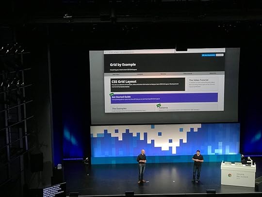
If you just want to learn how to use Grid Layout, I would suggest checking out my resources over at Grid by Example. If you have a general Grid ���How do I …?��� question, I have an ongoing Grid AMA. Once again though, I am far more likely to help if you can do a bit of work to create a clear question with a reduced example first.
July 28, 2017
Perch, Patterns and Old Browsers
Last month I had the pleasure of speaking at the very first Patterns Day in Brighton, the videos from the event are starting to go online and I can recommend all of them. It really was an excellent event, with a great mix of speakers on the subject. I���ve embedded the video of my talk below. You can also see the slides here, and the Perch Pattern Library is online at patterns.perchcms.com.
July 20, 2017
Why display: contents is not CSS Grid Layout subgrid
You won���t get far through a conversation about subgrid in CSS Grid Layout without someone suggesting that display: contents solves most of the problems anyway, so do we really need subgrid? This really isn���t the case, display: contents does indeed solve a class of problems, but these are different problems to those that subgrid would help us with. In this post I take a look at the different use cases.
If these features are new to you, I have written previously about the very useful display: contents which is in Firefox and is in the process of being implemented in Chrome. I���ve also written about the dropping of the subgrid feature from the Level 1 CSS Grid Layout specification. These posts would provide some useful background context to this one.
Subgrid moved to Level 2 of the CSS Grid Specification
Vanishing boxes with display:contents
Video demonstrating sub grid and display:contents
My example layout
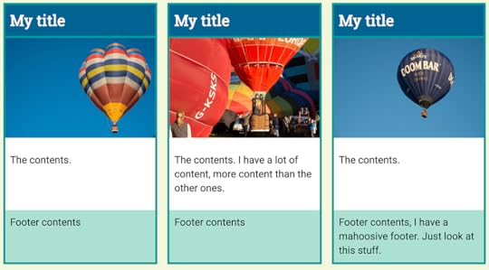
This is the sort of layout you get from someone who lives under the blissful assumption that content will emerge from the CMS with perfectly even line lengths.
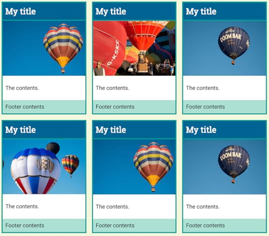
At first glance this looks like a pretty straightforward grid layout, which we can create with just a few lines of code.
.grid {
display: grid;
max-width: 960px;
margin: 0 auto;
grid-template-columns: repeat(3, 1fr);
grid-gap: 20px;
}
However, when the real world of content happens to our layout we end up with something like this:
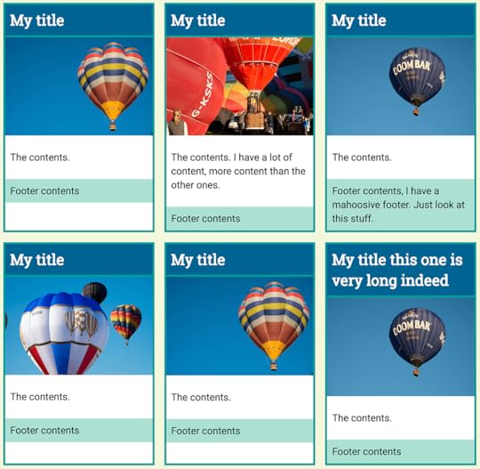
The items inside each card are not direct children of the grid container and therefore we have no way to line up the internal elements with each other.
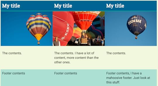
The best I can do is to make each card a grid container itself, or a flex item and use that to push the foster down to the bottom. This is a bit neater but what I really would like is for the card internals to also line up in rows.
The subgrid feature that was removed from the level 1 specification would allow us to achieve this. I can���t show you working code, but I can explain how it would work with our design.
Each card has four child elements, making four rows. The title, the image, the content and the footer.
The elements with a class of .card are a direct child of the grid container, so they participate in grid layout - meaning that our cards display in rows and columns. We need four rows for the elements in our card, so I set the card to span four rows of the grid. We would then need to set the card itself to display: subgrid, this would mean that the four child elements of our card would now participate in the parent grid layout and slot one into each row. As each card would do the same, the rows across the entire grid would line up.
.card {
border: 4px solid rgb(24,154,153);
background-color: #fff;
grid-row: auto / span 4;
display: subgrid;
}
There are no implementations of this. I based my example code on the proposal that was removed from level 1, already a revised and simplified proposal from earlier versions of the spec. In reality we would need to do a little more work to get gaps round the cards and not the internal rows, however we could get our internal rows aligned with each other fairly easily.
Can display: contents achieve the same thing?
What display: contents does is remove the box of the element it is applied to. This is useful if you have an element required for semantic rather than visual purpose and want its children to participate in a grid or flex layout.
If you take the following example, of two sets of HTML. They are identical, other than that one has a class of flex and the other grid.
One
Two
Nested One
Nested Two
One
Two
Nested One
Nested Two
We can make two very simple layouts, one for flex and one for grid. I am adding borders to the container, and the direct children of the container.
.flex {
display: flex;
border: 8px solid rgb(3,99,143);
}
.flex > * {
flex: 1;
border: 8px solid rgb(24,154,153);
}
.grid {
display: grid;
border: 8px solid rgb(3,99,143);
grid-template-columns:
repeat(4,minmax(200px, 1fr));
grid-gap: 8px;
}
.grid > * {
border: 8px solid rgb(24,154,153);
}
You can see how only the direct child elements become part of the grid or flex layout. The nested elements display in block flow.
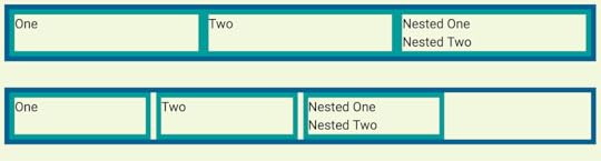
The items that contain nested elements have a class of nested. We can target that and see what happens if we change the display value of those elements to contents.
.nested {
display: contents;
}
If you are using Firefox or Chrome Canary you will see that the nested items now begin to participate in the grid and flex layouts, as the box of their parent has disappeared meaning that they act as if they were direct children of the flex or grid item.

However, they have not become direct children. I used a selector that would only target direct children to apply borders and add the flex property. Our items have no border and the flex items have not had flex:1 applied so are using the default flex properties.
You can also see that the border on the item with display: contents has gone, as the box has gone. You cannot apply backgrounds and borders to an item with display: contents. This then, is a big reason why display:contents can���t patch a lack of subgrid. If we return to our earlier example with the cards that we want to line up, we could apply display: contents to the card, which is the direct child of the grid.
.card {
border: 4px solid rgb(24,154,153);
background-color: #fff;
display: contents;
}
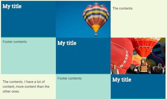
However, as we are using auto-placement to lay out our cards, once the outer box is removed the internal items from each card now participate in grid layout and so are auto-placed. We now get the title in the first grid cell, then to the right the image, then the contents, then we move onto the next row for the footer. Then the next card begins.
You could change the flow of these to column, which would stack them up but then you would need to decide how many rows there were in order to force the wrapping into columns.
To get anywhere close to the layout we hoped for we are going to need to place each item on the grid, ensuring that the parts of our card are placed where we want them. This is the CSS required for one card:
.card:nth-child(1) h2{
grid-column: 1;
grid-row: 1;
}
.card:nth-child(1) img{
grid-column: 1;
grid-row: 2;
}
.card:nth-child(1) .inner{
grid-column: 1;
grid-row: 3;
}
.card:nth-child(1) footer{
grid-column: 1;
grid-row: 4;
}
You can see the full worked example in the following CodePen - you need to use Firefox or Chrome Canary to see the display as in the screenshot below.
Note that this actually doesn���t get us what we want. We have lost the background and borders and spacing around the cards. We have lost auto-placement and the ability to have as many rows of cards as are needed. This is not a good use of display: contents and is exactly why we need sub grid in Grid Layout.
When should you use display: contents?
Once we have implementations in all our browsers I think there will be plenty of great uses for display: contents. The time to use it is when the element you are removing has no box styling - backgrounds, borders and so on. It should help us to maintain good semantic structure, while also being able to get the layouts we want. Let���s hope we also get subgrid support soon, as between these two features we���ll add a great deal more power to our grid layouts.
To help encourage adoption of display: contents in more browsers then you could head over to Edge UserVoice and give the feature an upvote. The subgrid feature has been moved to Level 2 of CSS Grid Layout. If you have thoughts and use cases for subgrid then please do write those up, if you ping me about them I���ll add them to my list for when this is discussed. Remember that it is while a specification is in the early stages that you get the chance to have your requirements be part of the discussion and hopefully then solved by the resulting spec.
Rachel Andrew's Blog

- Rachel Andrew's profile
- 13 followers

