
Rachel Andrew's Blog, page 2
August 26, 2019
Get Ready For CSS Grid Layout - 2nd edition
In late 2015 I wrote a ���brief��� for A Book Apart, entitled Get Ready For CSS Grid Layout. The book was published in January 2016, some fourteen months before we had Grid Layout in Firefox, Chrome and Safari. Now, the 2nd edition of that book is released, Get Ready For CSS Grid Layout is a fundamentally rewritten brief guide to grid, in many ways a follow-on to that first edition. This posts rounds up some of those changes, and my thoughts on rewriting a book that launched 14 months before the specification it described was available to use in production.
At the time of writing the initial guide, I thought that grid was perhaps closer to shipping than it was. However the specification, and implementations, still had a way to go before grid was ready to use. However that little book, taught many people the basics of the spec. Along with the other writing and speaking I had been doing for over three years by that point, it formed part of my attempt to evangelise and teach this upcoming layout method.
Two years on from grid shipping in browsers, and four years on from my proposing this topic to A Book Apart, it was time to update this guide. Revisiting my words of almost four years ago, was interesting. Much of the book was accurate, describing the main features of grid layout, how to create a grid and place items on it. However, throughout all of the examples, were skinny tracks used as spacing between grid cells. This was due to the fact that, at the time of writing, the gap properties had not been specified for Grid Layout. As the book went into production, the (now renamed) grid-gap, grid-column-gap, and grid-row-gap properties were added to the specification, I added a note, but it was too late to do a full rewrite.
More fundamentally however, I felt that the book encouraged a use of grid that I would now deem problematic. One of the features of grid layout is that you can completely separate the visual layout from the document structure. No longer tied to normal flow, it is possible to move things around, perhaps to reflect different layouts for different breakpoints. What I was less aware of in 2015, was how this usage could potentially disconnect the logical order from visual display and create problems for many users. This feature remains a powerful part of grid layout, however until we find a way to solve the accessibiliy issues it brings, not a feature I want to give such a priority to in a book. Certainly not without warning of the need for careful testing with a variety of users and devices.
The addition of the gap feature enabled many of the things about grid we love to use today. Using skinny tracks to create space between items, meant that auto-placement couldn���t be used in those layouts, as grid would try to place items into the gap. Therefore the previous book featured auto-placement far less than this 2nd edition. The amount that people use auto-placement has in general been a surprise to me. The ability to place items accurately was always the main draw when I first looked at grid, and the initial Internet Explorer 10 version had no auto-placement included.
While the book is now teaching the present rather than a peek into the future, I do finish by taking a look at Grid Level 2 and the subgrid feature. This is a coming soon feature, implemented in Firefox Nightly. It was nice to be able to bring this little book up to date, teach the spec as I teach it today, look to what is coming next, and perhaps inspire a new bunch of people to use and understand Grid Layout.
Get Ready For CSS Grid Layout, 2nd edition is published by A Book Apart in ebook and print-on-demand versions. Available from A Book Apart.


July 25, 2019
Announcing Smashing Print Magazine
Life at Smashing Magazine never stops throwing new surprises and challenges my way. When I came on board as Editor in Chief of the online Smashing Magazine, I didn���t expect to find myself editing a print magazine. However here we are, with our very first edition of Smashing Print.
Where the online magazine often covers very immediate subjects, technical topics that can be out of date in a few months, I wanted the content of the print magazine to be more timeless. Perhaps to capture a snapshot of where we are now. A take on today that would make interesting reading 10 or more years from now. We have headed right in with what I think is one of the biggest issues of the current few years, that of privacy and ethics.
I chose authors who I knew had interesting things to say on the subject, but then let them choose how to fulfil the brief of writing on this subject. Reading the pieces as a collection I have enjoyed the places in which the different takes on the subjects meet and diverge, these essays raise as many questions as they provide answers and I hope that they make you think.
This is essentially a pilot issue. We hope to be producing this in this format twice a year, assuming that the feedback is good! Taking a magazine to print is no small task for our little team, and we are all very excited to see what you make of it.
You can read my editorial and Vitaly���s article in this preview PDF, or buy your copy here. It���s worth noting that Smashing Members will receive a copy included in their membership.
June 4, 2019
Grid, content re-ordering and accessibility
I have long been concerned about the potential accessibility problems that grid layout could cause. These essentially centre around the concept of disconnecting the source from the visual display.
As a short explanation, values of display - other than none, do not change the logical order or visibility of your content. So, the order that things are in the source, is the order that they are tabbed to, and the order they are read out by a screen reader. If you mess around with the order - be that with flexbox flex-direction: row-reverse, or grid-auto-flow: dense, or by positioning items with grid layout - you risk making a very odd and disconnected experience. I���m not an a11y expert, for a much better description see:
The Dark Side Of The Grid: Visual Order
Source Order Matters
Flexbox and the keyboard navigation disconnect
When people first start using grid they do pretty basic things, and so for a couple of years we haven���t really been running into this too much in the wild. However, it seems that all of a sudden I���m seeing really great tools and tutorials pop up, that make me worry. You���ve all learned grid, you are now doing neat stuff with it, and some of that stuff is potentially terrifying from the content reordering standpoint. It has to be said, most of the people publishing these tutorials are also adding a warning about this issue, and I���m glad that the message is out there. I think I have included that information in every one of my grid talks one way or another. However we know that not everyone is so diligent, and the code of those tutorials will not always be used with such care. Recent examples are:
Using the grid shepherd technique to order data with CSS
Grid Generator
Webflow Grid
Creators of these things, please don���t see this as me calling you out personally, I needed to include them to demonstrate the things people are doing which are cool but also potentially problematic in the wild.
I think this is something we sorely need to address at a CSS level. We need to provide a way to allow the tab and reading order to follow the visual order. Source order is a good default, if you are taking advantage of normal flow, a lot of the time following the source is exactly what you want. However not always, not at every breakpoint. If we don���t give people a solution for this, we will end up with a mess. We���ve given people these great tools, and now I feel as if I���m having to tell people not to use them. Some people won���t, because they know and care. Many others will because they either don���t know, don���t care, or are using some visual grid builder which does not expose this information to them.
For developers, and those writing tutorials reading this, please do consider these issues in your excitement to use Grid Layout. Please ensure the issue is raised in any talk, tutorial, or tool you create. A pretty good way to check that you haven���t made a terrible mess is by using the Tab Stops Checker in the Accessibility Insights tool.
For those working on a11y and CSS, this has been discussed before, however given the things I am starting to see in the wild, I think this has to have some urgency behind it. We���re can���t keep asking people to abstain from using the powerful and fun tools we���ve handed them. We need to offer a way to use these things safely, particularly before we end up with a lot of tools which auto-generate grid code.
May 22, 2019
CSS Grid subgrid lands in Firefox Nightly
For the CSS Grid fans who have been following along, last night the subgrid value for grid-template-columns and grid-template-rows landed in Firefox Nightly. Download a copy of Nightly and give it a go!
To help I have created some things for you to read and play with:
My initial write-up of the feature in Smashing Magazine.
The documentation for the feature on MDN.
Examples over at Grid by Example
The recent talk I have been doing - the latest was yesterday at Codegarden - has slides and more demos.
A post on this blog regarding one of the less obvious patterns subgrid will help us with.
Regular readers will know that this is a feature I have been very keen to ensure is made available, spec historians might enjoy earlier writing on the subject:
A 2015 post about why I felt we needed to keep the subgrid feature
A post from 2016 about the revised subgrid specification which would have tied subgrid to both dimensions. I am glad we dropped that idea.
My post when the feature was moved to Level 2 in 2017.
A year ago I explained the First Public Working Draft of Grid Level 2.
If nothing else, I have staying power when advocating for the things I believe are important! Now it is over to you.
If you are looking at subgrid and find something which looks like a browser bug in Nightly - something where the specification says one thing and the browser is doing another - you can raise that over at Bugzilla. The main bug for implementation is here. If you look at the ���Depends on��� section you can see other issues already raised. If you find something new, raise a new issue.
If you find something that is not in the specification but you think that it should be, or realise there is a problem building a certain pattern which seems like a subgrid use case, log that with the CSS Working Group as an issue on the spec itself.
Head over to the Chrome bugtracker and star the bug there to show your interest in implementation. Don���t add ���me too��� type comments, just hit the star. By doing so you���ll get updates if any comments are made on progress.
I���ll be talking about the feature next week at CSSConf EU, I���m very excited that everyone will be able to actually take a look at my demos, though I now have some slides to update. I���ll also be covering subgrid in my upcoming layout workshops, for example in a few weeks at SmashingConf Toronto.
May 7, 2019
A design pattern solved by subgrid
I���ve been playing with this early implementation of the subgrid feature in Firefox, and it occured to me that subgrid could solve a less obvious use case.
In Grid Layout you can target the end line of the explicit grid with -1. The implicit grid being the grid you create with grid-template-rows and grid-template-columns. However if you are using an implicit grid, for example to create as many rows as you need to load in your content, you can���t target the end of that grid with -1. This means you can���t easily span something to the end of your grid.
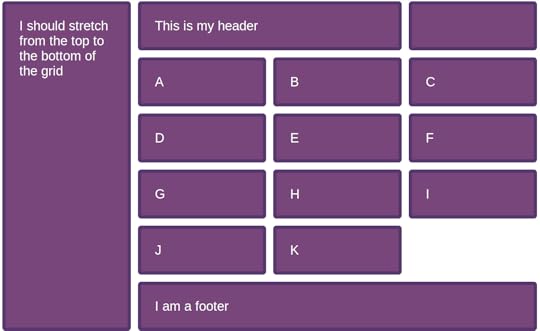
It turns out that subgrid will let you do this. In this CodePen I am creating a four column, three row grid. The ul element is placed in row two, spanning three columns. The aside is placed in row 1, spanning to row -1.
I make the ul a subgrid, so the items can lay themselves out in the columns defined on the parent. As we only have a subgrid for columns the ul has an implicit grid for rows, so as many rows as we need are created. These all go into that one auto sized row of the parent, which stretches to accomodate them. Here is an image of what that looks like. The subgridded bit being the list items A to K. You can see these line up with the direct child elements in the header as they are using the same column tracks.
I���m very glad we held out for one-dimensional subgrids, as I think there are probably more non-obvious patterns we can use this feature for.
Getting involved with the web platform
I spoke at An Event Apart yesterday, you can see my slides and resources here. One of the themes of my talk is that anyone can contribute to the web platform, and CSS in particular. I had loads of questions from atttendees about this so here is a quick list of getting started suggestions, with a focus on CSS as that���s what I know best. If anyone has similar advice for people wanting to work on other parts of the web platform, let me know on Twitter and I���ll link it up.
Get familiar with the specifications
To be able to contribute to specifications you first need to be able to read them. Thankfully modern specs are a lot more readable than they used to be. I wrote an article for 24 Ways last year about researching a property in the CSS specifications, which is a good start in terms of learning to read a spec.
This will be helpful to you as a developer, you���ll be able to look at the source rather than read an interpretation someone else made of it. It may well also offer up initial ways to contribute, you might spot a spec that has issues related to diagrams that are needed, or come across a typo. If there is already an issue raised for something you should be able to follow it to the CSSWG GitHub repo, and if you spot something yourself, you can raise an issue.
Respond to issues that request feedback from authors
When the Working Group talk about authors, they are talking about people who write CSS, so that is web designers and developers - but also people who write CSS for other media. Sometimes we have issues that need feedback from authors. There are a few of us who will use Twitter to send people to these issues. Me, Jen Simmons, Lea Verou and Amelia Bellamy-Royds are all good people to follow in that regard.
If you have a use case, or some other thoughts on the issue, add a comment. While there are some authors represented in the Working Group, we���d generally rather not become the voice of all authors, so your feedback will be welcomed.
Raise issues for things that you need
Do you believe there is a use case we haven���t solved yet? Have a search in the issues list to see if other people have already raised something similar, if you can���t find it, raise an issue yourself. Write up the use case, explain why you need this feature and the problems with any existing solutions. Perhaps it is something that people are already doing with JavaScript, as an example see the issue about Masonry layouts. Perhaps something you can do in native mobile environments, or in print, but not on the web. Point to these examples to show that the pattern is needed.
As I said in my talk yesterday, don���t worry that you haven���t got the solution, or even that your suggested solution might be unimplementable. It takes many heads to actually create new CSS, and that is what the CSS Working Group is for. It may be that your use case is ultimately solvable in a different way to what you imagined, but knowing that authors need a thing is a very good place to start. These suggestions do get brought up at meetings, while it may seem that othing happens on an issue for a long while, it isn���t because we aren���t interested. It is likely that the things it touches just haven���t been a recent focus.
Write tests
I mentioned the Web Platform Tests project to a few people after my talk yesterday. Writing tests is a very good way to get into the world of the web platform, it is also an excellent way to contribute as it takes work off the plate of specification authors. Also for 24 Ways I wrote about how to get started.
Other ways to help
Stepping away from contribution to the specifications directly, having something written up in a spec is only the first step - we also need to have browser implementations, and we need those to work according to the specs. If we take the subgrid feature for Grid Layout, we know that is being implemented right now in Firefox, I���ve been playing with an early implementation. However it is not currently being worked on in Chrome. A two-minute way to help there is to head over to the Chrome bug and star it to show your interest.
If you find a browser bug - especially with new features - you may be the first person to encounter it. Have a search on the browser bugtrackers and log it if you can���t find a match. Learning how to create a reduced test case is a skill you need to hone to be involved in a lot of this work, reducing and reporting issues a good way to practice!
Chromium
Firefox
Webkit
Writing up your ideas for features, or your desire to see a feature implemented is also very useful. It demonstrates a need for that feature from authors, and that can help inform the roadmap for browser vendors as well as the working group. Also, if you are a person who has done the work of understanding a spec and thinking deeply about a feature, you can encourage more authors to get excited about it by sharing it in an easy to understand way. Pretty much all of the writing and speaking I do is along those lines, particularly when talking about new features. It definitely takes time to get to a point where you can understand from a spec along how a feature will work, with no implementation to test against, I don���t assume everyone wants to spend that time. Instead I write things which explain the feature as if it already existed, and make diagrams or mocked up examples to show how it works. That approach worked well for Grid Layout, it meant I could get people interested long before they could really play with it.
There isn���t really one way into standards work, it requires curiosity, willingness to understand issues from many points of view, free time unless you have an amenable employer, and often a fair bit of tenacity. There are rarely immediate results! Start by following along with our work via the GitHub issues, comment on relevant things, and learn to read specs. You will probably find that you become more involved over time if this is something that you enjoy doing, and you will definitely learn a lot!
April 16, 2019
CSS Subgrid News and demos
A couple of weeks ago I spoke at Frontend NE in Newcastle, a big part of my talk was explaining what the CSS Grid Subgrid feature from Grid Level 2 would contain. With no implementation to work with, I had mocked up a bunch of demos using DevTools for that talk.
En route to San Francisco to Smashing Conf, where I was running a CSS Layout workshop, I was given access to a Try build of Firefox Nightly, which has an early implementation of the feature. This does mean I need to redo some slides for my talks in May so they can use real screenshots, but I���ll take that for actually getting my hands of the feature and being able to try the demos for real!
I posted a couple of screenshots on Twitter, and I will be publishing all of my examples over at Grid by Example once the feature is behind a flag in regular Nightly. However for everyone who had better things to be doing than looking at Twitter over the weekend here are a few screenshots. These include links to my CodePen examples so you can see the code for the subgrid elements. I���ve highlighted the grid and subgrid in Firefox DevTools to help you see what you are looking at.
Subgrid for columns and rows
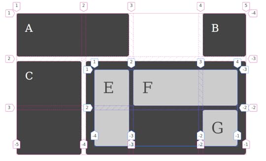
In this case the subgrid is on columns and rows of the parent. This means that there is no implicit grid in the subgridded area, as both dimensions are tied to the available tracks on the parent grid.
CodePen example for subgrid columns and rows.
Subgrid for columns only
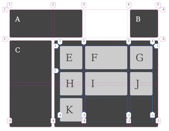
In this case I have used a subgrid for columns. This means I can use implicit grid tracks to add as many rows as needed for the items. The rows use their own sizing, just as a nested grid would without subgrid.
CodePen example for subgrid columns
Subgrid for rows only
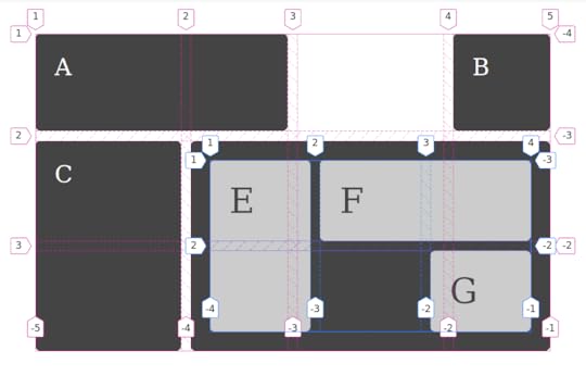
In this case I have made the rows a subgrid, and defined columns as normal in fr units. As you can see the column tracks do not line up with the parent as they are using their own grid definition.
CodePen example for subgrid rows
I���m so excited to be seeing this in progress, and also to be able to teach it in my workshops and talks. For more background on subgrid, here are some links.
Slides and resources from Frontend NE
CSS Grid Level 2: Here Comes Subgrid
Firefox: implement grid layout for subgrid
Chrome: implement subgrid
Grid Level 2 specification
April 12, 2019
Are nested grids like nested tables?
A thing I keep hearing, and especially when talking about subgrid is, ���nested grids … isn���t that like tables within tables in the olden days?���
It is not. This is why.
When you want to use grid layout, what you are doing is changing the display property on a containing element, asking it to lay out its children as grid items. That���s what display: grid means. It means ���make me a block level container with grid item children���. Those child elements then behave in the way brought to us by grid layout.
The same is true if you say display: flex, except those child elements behave like flex items.
In both cases, the children of those flex and grid items go right back to normal flow. The block and inline layout that elements use by default on the web. This is the reason why if you write some HTML it doesn���t all mush together in one long unreadable line.
If you don���t want the children to go to normal flow, then you can change their display value. Make your grid item become a grid container itself. The idea behind the subgrid feature of grid layout is that it will be possible to opt those grid items which have become a grid container into the track sizing defined on their parent grid - if you want to - rather than defining grid-template-columns or grid-template-rows for that new set of grid items to sit on.
Semantic markup creates these nested structures, we then decide which layout method we want to use to lay out the content we create. So while nesting grids is a quick way to explain a structure, it���s not something special we are doing. We���re just using CSS to change the value of display, one level at a time.
If you want to compare that to HTML tables as used for layout, and I lived through that era, we were doing something very different. There we would create a table structure, often tables within tables, and then poke our content into the gaps we had created. We weren���t taking semantic HTML and changing the display method used on it, we were creating a layout structure in HTML then shoving our design into the gaps, shattering it into bits as we did so. We removed all sensible order and structure, rendering it inaccessible to screen readers or anything trying to parse that information.
So do not worry, talk of nesting grids has nothing to do with nested tables.
If you want to understand more about display I have kicked off a little series over at Smashing Magazine with Digging Into The Display Property: The Two Values of Display. To learn about subgrid, I have an article about subgrid too, and most of my talks this year cover subgrid in some way.
March 12, 2019
Upcoming CSS Layout Workshops
I am increasingly spending my time giving CSS workshops, both in-house for teams and public ticketed workshops. I have a few planned over the next few months which still have availability, and would love to book in further workshops later in the year. Get in touch if you would like me to come to your company or event and deliver a workshop.
Upcoming workshops
The following are all full day workshops entitled ���Next Steps With CSS Layout���. They assume attendees already have some CSS and HTML knowledge and want to really understand how layout works today now that we have flexbox and grid layout.
Smashing Conf San Francisco, 15th April 2019
Frontend United Utrecht, 16th May 2019
Smashing Conf Toronto, 24th June 2019
Smashing Conf NYC, 17th October 2019
Learning CSS by writing CSS
With any of my workshops I can tailor the level and focus depending on who I am training. In my workshops attendess write code all day. There is no looking at slides, I demonstrate everything in code with the attendees working alongside me. This means that by the end of the day attendees have worked examples of everything they have learned.
As I am never tied to a pre-prepared slide deck, this means that I can tailor the workshop on the fly if necessary to meet the needs of attendees, and to answer questions as they come up during the course of the day.
Learn CSS from me
I have been a web developer for over 20 years at this point. I write CSS for my own products, do CSS audits for other people and am actively using the techniques I describe in my own work. However I���m also a CSS Working Group member, and therefore am involved in the creation of new CSS. As a spec editor I���ve had to learn a lot about how CSS really works, and I can share this with attendees.
In addition to practical skills and deep knowledge, I am an experienced teacher. I���ve written over 20 books on CSS and related topics, I spend much of my life on the road leading workshops and presenting at conferences. My workshops build on this experience of teaching, and on the questions I get asked at each event I present at.
Even if you think you know CSS quite well, I promise you will find some lightbulb moments of ���so that���s why this works!���
February 21, 2019
CSSconf EU, Grid Layout, and me
I don���t apply to many Call for Papers right now, because I just get so busy. If a CFP isn���t going to announce for a few months, I don���t want to apply and then have some other thing fill that gap before the decisions are made. One CFP I do tend to put an idea into, is the one for CSSconf EU. That conference has a special place in my heart. It���s a CSS conference by people who love CSS, and who also care about the people who write and create CSS. It is also held in my favourite city in the world, Berlin. A note to the wise is that it is possible to get me to agree to all kinds of things if they involve a trip to Berlin!
This year I���m very happy to announce that my proposal was chosen, and I���ll be back in Berlin at the end of May with a presentation called Hello, Subgrid. I���m going to be talking about new features of the Grid Layout specification. I don���t know if we���ll have a browser implementation of subgrid at that point, however I���ve never let lack of browser code stop me sharing an idea!
The first time I spoke about Grid Layout at CSSconf EU was in September 2014, which may seem a little premature in retrospect given that Grid didn���t escape from behind browser flags until 2017. However it was at that conference that I really understood how exciting Grid was going to be to other CSS developers. I spent the entire conference just talking to people about Grid, and I also got to meet several people from Igalia who were working on the Chrome implementation at the time. You can find the video of that talk on YouTube, it���s surprising how much of the information is still completely accurate, though I think I have got far better at teaching the spec in the intervening years.
I also spoke at CSSconf EU in 2017, this time on the subject of Where does CSS come from?. That talk was a chance to share something I am really passionate about, encouraging people to become involved in the creation of CSS, and to give feedback to the CSS Working Group and browser vendors.
I���m really looking forward to the next installment of my CSSconf EU story. If you would like to be there too, and it really is a lovely event, tickets are now on sale.
Rachel Andrew's Blog

- Rachel Andrew's profile
- 13 followers

