
Moira Butterfield's Blog, page 44
May 21, 2017
Time Goes By • Abie Longstaff
I love picture books that give a sense of time moving - especially those where the seasons change in the background.
In 'Dear Daddy' by Philippe Dupasquier, Sophie writes to her father who is away at sea.
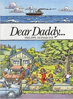
It's a very sophisticated picture book. Using a clever split-scene layout, it shows us both Daddy's and Sophie's world, and deals with complicated conceptual ideas of time. Children can see that the seasons change for Sophie but not for her father, who is in a different time-zone. All this is accomplished in remarkably few words due to Dupasquier's busy, detailed illustration style.
 This was one of my favourite pages. It shows the split screen of the season where Sophie is, and above where her dad is. My sisters and I loved it because we grew up in Hong Kong, which is depicted in the upper section.
Across the Fairytale Hairdresser series, Lauren Beard and I do have the seasons change, but I've never managed it in one single book - and I'd love to try!
 It's summer in The Fairytale Hairdresser and Aladdin
 And winter in The Fairytale Hairdresser and Father ChristmasFor me, the most beautiful book showing seasonal change is 'I am a Bunny' by Ole Risom and Richard Scarry.
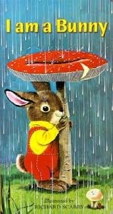
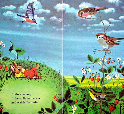
My mother read this book to me, and I read it to my own children. It is a perfect example of a simple, yet exquisite, picture book - one where poetry meets art. I find it almost meditative in quality and very moving. Nicholas, the bunny, has a real appreciation for his world, and the illustrations reflect this:
I suppose I'm thinking about seasons, and change, because I'm moving on from the Picture Book Den. I've loved being a part of the Den for years now and I'm sorry to go; but it feels right to have a change. I'm sure I'll be popping up somewhere else soon but for now: thanks to my fellow Denners, and to readers of the blog.
See you around! :)
In 'Dear Daddy' by Philippe Dupasquier, Sophie writes to her father who is away at sea.

It's a very sophisticated picture book. Using a clever split-scene layout, it shows us both Daddy's and Sophie's world, and deals with complicated conceptual ideas of time. Children can see that the seasons change for Sophie but not for her father, who is in a different time-zone. All this is accomplished in remarkably few words due to Dupasquier's busy, detailed illustration style.
 This was one of my favourite pages. It shows the split screen of the season where Sophie is, and above where her dad is. My sisters and I loved it because we grew up in Hong Kong, which is depicted in the upper section.
Across the Fairytale Hairdresser series, Lauren Beard and I do have the seasons change, but I've never managed it in one single book - and I'd love to try!
 It's summer in The Fairytale Hairdresser and Aladdin
 And winter in The Fairytale Hairdresser and Father ChristmasFor me, the most beautiful book showing seasonal change is 'I am a Bunny' by Ole Risom and Richard Scarry.
My mother read this book to me, and I read it to my own children. It is a perfect example of a simple, yet exquisite, picture book - one where poetry meets art. I find it almost meditative in quality and very moving. Nicholas, the bunny, has a real appreciation for his world, and the illustrations reflect this:

I suppose I'm thinking about seasons, and change, because I'm moving on from the Picture Book Den. I've loved being a part of the Den for years now and I'm sorry to go; but it feels right to have a change. I'm sure I'll be popping up somewhere else soon but for now: thanks to my fellow Denners, and to readers of the blog.
See you around! :)


Time Goes By - Abie Longstaff
I love picture books that give a sense of time moving - especially those where the seasons change in the background.
In 'Dear Daddy' by Philippe Dupasquier, Sophie writes to her father who is away at sea.
It's a very sophisticated picture book. Using a clever split-scene layout, it shows us both Daddy's and Sophie's world, and deals with complicated conceptual ideas of time. Children can see that the seasons change for Sophie but not for her father, who is in a different time-zone. All this is accomplished in remarkably few words due to Dupasquier's busy, detailed illustration style.
This was one of my favourite pages. It shows the split screen of the season where Sophie is, and above where her dad is. My sisters and I loved it because we grew up in Hong Kong, which is depicted in the upper section.
Across the Fairytale Hairdresser series, Lauren Beard and I do have the seasons change, but I've never managed it in one single book - and I'd love to try!
It's summer in The Fairytale Hairdresser and Aladdin
And winter in The Fairytale Hairdresser and Father ChristmasFor me, the most beautiful book showing seasonal change is 'I am a Bunny' by Ole Risom and Richard Scarry.
My mother read this book to me, and I read it to my own children. It is a perfect example of a simple, yet exquisite, picture book - one where poetry meets art. I find it almost meditative in quality and very moving. Nicholas, the bunny, has a real appreciation for his world, and the illustrations reflect this:
I suppose I'm thinking about seasons, and change, because I'm moving on from the Picture Book Den. I've loved being a part of the Den for years now and I'm sorry to go; but it feels right to have a change. I'm sure I'll be popping up somewhere else soon but for now: thanks to my fellow Denners, and to readers of the blog.
See you around! :)
In 'Dear Daddy' by Philippe Dupasquier, Sophie writes to her father who is away at sea.
It's a very sophisticated picture book. Using a clever split-scene layout, it shows us both Daddy's and Sophie's world, and deals with complicated conceptual ideas of time. Children can see that the seasons change for Sophie but not for her father, who is in a different time-zone. All this is accomplished in remarkably few words due to Dupasquier's busy, detailed illustration style.
This was one of my favourite pages. It shows the split screen of the season where Sophie is, and above where her dad is. My sisters and I loved it because we grew up in Hong Kong, which is depicted in the upper section.Across the Fairytale Hairdresser series, Lauren Beard and I do have the seasons change, but I've never managed it in one single book - and I'd love to try!
It's summer in The Fairytale Hairdresser and Aladdin
And winter in The Fairytale Hairdresser and Father ChristmasFor me, the most beautiful book showing seasonal change is 'I am a Bunny' by Ole Risom and Richard Scarry.
My mother read this book to me, and I read it to my own children. It is a perfect example of a simple, yet exquisite, picture book - one where poetry meets art. I find it almost meditative in quality and very moving. Nicholas, the bunny, has a real appreciation for his world, and the illustrations reflect this:
I suppose I'm thinking about seasons, and change, because I'm moving on from the Picture Book Den. I've loved being a part of the Den for years now and I'm sorry to go; but it feels right to have a change. I'm sure I'll be popping up somewhere else soon but for now: thanks to my fellow Denners, and to readers of the blog.
See you around! :)
May 14, 2017
Step-by-step Picture Book Writing in Layers • Natascha Biebow
 Betty Crocker's Rainbow Surprise Inside Cake - writing in layers!In my writing and teaching, I have recently begun to play around and reflect on the process of creating a picture book in a different way.
 Picture this:
 Have you ever tried drawing something and been frustrated that it doesn’t turn out quite like you intended?
 Uh-huh, I hear you nod.
Have you ever watched someone drawing something and admired their apparent ease? Like this!
Yes, I hear you nod.
But is it easy?
If you look closely at this process, you will notice that it’s a question of layering – starting with the outline, very sketchy, with a light touch of the pencil. Then, the artist adds more shape, a bit more texture, rubbing this bit out, adding that bit there, playing with the idea. Slowly, the general shape begins to emerge!
It’s usually not a question of starting out with a fully-formed piece of work and trying to edit that because, frustratingly, well, you can’t START with cake.
You have to put in all the ingredients – and you have to first decide WHICH ONES? – and then lovingly bake your picture book story so it rises and is light and fluffy and just right for young readers.

If you try to start with cake and keep fussing, adding new and interesting toppings, it may LOOK marvelous . . .

. . . BUT if the cake isn’t right in the first place,
 it will never work.
 Coming back to our artist’s process:
First, the artist sketches out the idea with a light touch, testing it out in the space, finding its shape.
 from ART90OP's from youtube.com/acrylicpaintingtechniques
 You can try pacing out your picture book into 12-14 spreads.
Look for a way into your story, find a strong hook.
Next, the artist adds stronger, darker lines and details to define the initial sketches.
 from ART90OP's from youtube.com/acrylicpaintingtechniques... sure you have an opening that hooks in the reader and an ending that bookends the opening and gives the story a satisfying conclusion, a twist or that 'aw' factor. Check your plot doesn’t read like a list, with everything having the same weight, that there is a clear climactic turning point.
 Now, the artist adds colour and texture, in layers – look how it’s added depth!
 from ART90OP's from youtube.com/acrylicpaintingtechniques
 Check your characters’ motivations. Make sure readers will care about your protagonist. Add voice. Make it the story only you could have written or illustrated.
Then, the artist stands back and observes. He adds the final touches.
 from ART90OP's from youtube.com/acrylicpaintingtechniques
 At last, ta-da! The result is a picture that sings, that speaks to its audience.
 from ART90OP's from youtube.com/acrylicpaintingtechniques Watch the artist at work!
 Creating picture books is a frustrating business. Not only do you have to have that singular commercial idea, but it has to be written with voice, style, pace and emotional depth to leave the reader with a feeling of satisfaction, a laugh, a tear, an ‘aw’ moment.
Many of my students are frustrated at the fact that it doesn’t all come together at once, that you can’t edit something that isn’t yet on the page. And this is just it – you must first sketch it out and play with the idea, like the artist. THEN you can add layers, erase, add and shape and depth.
Annoyingly, when you stand back – and you must read your work aloud and try to be objective, like a reader – you notice things that must be edited further and changed. And when you make these changes, often new things unravel. Argh!
Once you have a working draft, it is time to add in the texture, the final toppings, the ta-da! to give the story pizzazz and make it really shine.

Here, a good technique is to go through and look carefully at each word. Use the highlighter revision technique. Read it aloud again.
But working in this way is rewarding and gives the creator permission to experiment, to start with a sketch and PLAY around a bit before investing time and effort in fine-tuning their work. See all those multi-coloured Smarties in the Rainbow Surprise Inside Cake (below)? Go on, have a play, taste a few even, and figure out the heart of your story cake – the nugget of your story – before rolling up your sleeves to add the rest of the layers.
Betty Crocker's Rainbow Surprise Inside Cake - writing in layers!________________________
Natascha Biebow
Author, Editor and Mentor
May 7, 2017
Looking at illustration: traditional printmaking in children's picture books • Paeony Lewis
 Last autumn I enrolled on a print-making course. I began with the brilliant idea of producing my own illustrations for one of my picture-book texts. Unfortunately as the course has progressed my brilliant idea no longer feels quite so brilliant! I've begun to wonder if it's still logical to use traditional printmaking techniques in the digital 21st century.
 Traditional printmaking allows multiple prints of the same image, but this isn't necessary as picture books use digital printing. Even so, different printmaking processes also have identifiable visual characteristics. Plus there's the bonus of looking handmade which is a quality that's become appreciated since we've become saturated with uniform digital images. Therefore maybe there is a niche for picture books that use traditional printmaking? Or perhaps traditional printmaking has been adapted by illustrators?
In this blog post I share my musings and picture book research. I've concentrated on just two types of *relief printmaking (*where ink is applied to uncut, raised areas). I've tried to make techniques clear for those who know nothing about printing; and for those of you who are experts please feel free to correct me!
Traditional wood engraving and woodcut
Wood engraving is a long-established traditional method of relief printing. The wood is carved and the ink is rolled over the raised areas of wood and a print is then taken.
 These images are from a 1987 prospectus produced by Macmillan Publishers which offered limited edition prints from the original 19th-century engraved boxwood woodblocks. The original engraved block is on the left and the reversed, printed 'electro' version from Alice's Adventures in Wonderland is on the right.
 In the 19th century the Dalziel brothers were chosen to engrave Sir John Tenniel’s drawings for Lewis Carroll’s Alice’s Adventures in Wonderland and Through the Looking-Glass. Boxwood was used as it’s hard and can withstand several thousand impressions, but after that the block is too worn. However, Victorian illustrated books flourished with the help of a new commercial process called ‘electrotype’ which enabled metal copies to be made of the original woodblock, allowing for far greater print runs, albeit a little of the original detail would have been lost. If you're interested here's a good blog post on the Alice illustrations.
Looking at the wood block above you can see how the engraver carved lines to create shape, texture, light and shade. Hatched lines are closer together where darker shading is needed. Deeper, wider lines give more emphasis.
We're now In the 21st century and have digital printing so in theory wood engraving/electrotype isn’t vital for illustrations in large runs of printed books. Even so, this distinctive form of illustration has unique individual characteristics and a few illustrators still use this time-consuming method, including the award-winning John Lawrence (more on him later).

American illustrator, Mary Azarian, uses a method called woodcut. It's similar to engraving but woodcuts use the side grain and incorporate the natural grain and pattern of the wood, whilst wood engraving is finer and uses the end-grain which has a closer texture.
Mary Azarian handcolours her wood-cut prints, rather than producing multiple woodblocks for each separate colour. The colour is therefore rich, with more variation and tones. In many of the illustrations it's almost as though the lines of the carved wood act as an outline.
 Snowflake Bentley (1999 Caldecott Award) is one of many books illustrated by Mary Azarian.
 Houghton Mifflin (reprinted 2014)
 I have a small pile of cheap soft wood waiting to be cut, but I'm not very good at
 sharpening my tools and wood blunts tools very quickly,
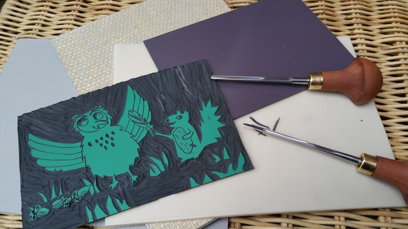
so for the moment I've concentrated on linocut.
Linocut
Not as easy as a potato-cut print, but softer to carve than wood and cheaper. Linocut is literally the carving of a sheet of ordinary hessian-backed lino. Manufacturers have also created new vinyl surfaces such as Softcut, Easy Carve and Japanese Vinyl (see image below). Linocut does not have the esteemed heritage of wood engraving, but is a 20th-century development that uses the same tools and techniques. The principles of cutting are similar, although the lines aren't quite as fine as wood engraving as lino is less robust.
 Different lino/vinyl surfaces
One of my simple linocuts (Japanese vinyl) being inked. It won't only be shades of pink!

A large printing press applies even pressure to the linocut.
It can also be done by hand, though applying enough pressure can be tricky.
 The Haunted House by Kazuno Kohara,
 Macmillan 2008One contemporary illustrator who has used linocut in her four picture books is Kazuno Kohara. Her first book is still my favourite, The Haunted House, as it combines deceptively simple illustrations with a delightful, fun story.
With bold simplicity, Kohara’s linocut illustrations use black ink on orange paper. The white ghosts may well be white tissue paper (a process called chine-collé) - I'm guessing!
 White tissue paper?
 Guessing how an illustration is produced can be fun.
Some of the lino cutaway tool marks can be seen on the pages as flecks of black ink and this adds to the handmade feel of the artwork. In later books Kohara has removed these marks for a cleaner image and I suspect this may be because if you don't know the reason for the black marks you might think they were a printing error, rather than an interesting part of the print that many linocutters deliberately leave.
 Tool marks in the cutaway areas of lino.
I also like the occasional use of thin ink, so the orange paper peeps through, as this gives texture to the page.
 Inside Kazuno Korhara's The Haunted House, Macmillan 2008
 Another linocut picture book: Here Comes Jack Frost
 by Kazuno Korhara, Macmillan, 2009. I adore the simple illustrations.
The lines are clean apart from the stars that appear to have been loosely dug out
of the lino, which gives an effective smudged appearance.
So Kazuno Kohara has taken a traditional method of relief printing and produced stylistic illustrations that are contemporary whilst having identifiable linocut characteristics.
This Little Chick by John Lawrence,
Walker Books, Candlewick Press 2013 Earlier I mentioned John Lawrence. He's an acclaimed illustrator and wood engraver who also uses linocut in his children's picture books. His engraved illustrations are more traditional in appearance and make excellent use of the properties of relief printing. There's a wide variety of patterns, lines and shapes, and colour too.

John Lawrence has contributed to over 200 books, including Lyra's Oxford (Philip Pullman). For many of his later picture books, including This Little Chick, he has preferred to use vinyl (linocut). There's a Guardian article here which includes an interview that mentions a vinyl sheet might cost 50p, whilst a much smaller piece of boxwood costs over £100. Plus vinyl is very much easier to carve, especially if you're going for bold lines rather than intricate engraving.
 Inside This Little Chick, John Lawrence
 Close up of part of the sheep's characterful linocut marks,
 giving attractive texture and vitality.
Each white line is a tool mark, digging into the vinyl/lino.
After having assumed Lawrence's illustrations were all traditionally produced, I've just read that some of his picture books, including The Little Chick, Tiny's Big Adventure and Seahorse use Lawrence's traditional vinyl/linocut prints and then digitally play with them to form collages and add texture and colour. This makes sense as I did wonder at the colourful complexity of some pages - in relief printing you need to apply each coloured ink as a separate block. Therefore here's an illustrator and printmaker who has retained the original qualities of wood engraving and linocut, whilst using a computer to scan the prints and then play with them on the page. This allows new designs, complexity and flexibility. The flexibility is very important as editors frequently need changes.
 Seahorse: The Shyest Fish in the Sea,
 by Chris Butterworth, illustrated by John Lawrence
Walker Books 2007
 The Little Black Fish by Samad Behrangi,
illustrated by Farshid Mesghali
First published 1968,
this edition 2016 Tiny Owl Publishing
One illustrator who didn't have access to computers in the 1960s was Farshid Mesghali. This Iranian-born artist inspired me with his illustrations for the award-winning The Little Black Fish. First published in the late sixties, Mesghali used linocut prints, often printed over what I assume is a background monoprint. (A monoprint as a one-off image where paper is laid over worked ink or impressions are made on the back of the paper that lays over ink - it's a very spontaneous form of printing, favoured by artists.) Personally I adore the swathes of textured ink of the monoprint that contrasts with the bold patterns of the linocut prints. This was exactly what I'd been thinking about for my own picture book illustrations.
 Seagull illustration from The Little Black Fish
 I really feel Mesghali has used the intrinsic properties of linocut prints in this seagull illustration. There's a handmade vibe from the tool marks that also add texture and movement. The overprinting of the waves and seagull's feet give an impression of turbulence. The limited colours from separate linoblocks allow the red beak to shout 'danger'and draw our attention to the fish eye. As I'm not always a fan of excessively detailed prints, I like the way a visual impact is made with just a few detailed feathers.
 Another illustration from The Little Black Fish. This time the linocut fish are inside the seagull's stomach.
 The effectiveness of the background monoprint can be seen.
I wonder if Mesghali would have used digital options too if they'd been available in the 1960s? With my own prints I've been concentrating on using only traditional techniques, mainly because digital manipulation is discouraged on the course I'm doing. However, there are more design options available with the use of computers and most picture book readers are only concerned that the illustration looks good. Also, if one mistake is made or an editor asks for a change, then a new linoblock or woodblock would need to be carved. For example, my embarrassingly amateur diving owl looks too angry and there are errors. Therefore, although I've carved a second block for an additional colour, it'll all need to be dumped, which is quite time consuming.

It doesn't have to be wood or lino
 Animal Babies in the Forest by Julia Groves,
Child's Play, 2016
One of a series of four board books
Relief printing doesn't have to only include wood or lino. Foam, card and polystyrene pizza bases are all options. Sometimes they're just the catalyst for an illustration.
The illustrator, Julia Groves, is always in search of new ways to incorporate relief printing into her books. She discovered a love of printmaking at Cambridge School of Art and went on to study Fine Art Printmaking at Brighton University before completing an MA in Children's Book Illustration at Anglia Ruskin. To me, her illustrations manage to combine a stylish simplicity with warmth and she's an illustrator who makes good use of digital design whilst retaining a homemade feel. Here's what she says:
"My children’s book illustrations have evolved out of my love of printmaking, an obsession with a less-is-more aesthetic and a bold, but sometimes restricted colour palette. Although I work primarily in Photoshop, I always begin with a traditional print, drawing or even just a printed texture. It is important to me that my final work, although digital, retains a hand-made aesthetic. I also love to create typography from traditional wooden letterpress as well as cut-paper."
 Julia Groves: Ink is applied to a relief block and printed in black.
 The print is then scanned and coloured digitally in separate layers in Photoshop.
"I've discovered that traditional methods of printmaking can be both time-consuming and frustrating, but there is a wonderful sense of achievement in the hand-made. The combination of traditional and digital works well for me and allows me the freedom to change a colour at the press of a button, whilst retaining a sense of the origins of printmaking. The main advantages of creating illustrations digitally for children’s books are that they are easy to amend and ready for publishing, unlike original artworks which need to be delivered and scanned before printing."
 From the Animal Babies series by Julia Groves, Child's Play, 2016
___________
All the illustrators in this blog post have different styles, whilst managing to incorporate traditional relief printmaking techniques. The process of printmaking seems to inspire their art and nowadays that is what's important, not the ability to make multiple prints of the same image (though that's useful for selling prints at galleries!). So I'll continue with my printmaking course and I won't totally give up my 'not-so-brilliant' idea of illustrating one of my picture book texts (maybe purely for my own pleasure?!).
 By the way, I'd love to hear of other children's picture-book illustrators who use relief printing.
Paeony Lewis
www.paeonylewis.com
Looking at Illustration: traditional printmaking in children's picture books • Paeony Lewis
Last autumn I enrolled on a print-making course. I began with the brilliant idea of producing my own illustrations for one of my picture-book texts. Unfortunately as the course has progressed my brilliant idea no longer feels quite so brilliant! I've begun to wonder if it's still logical to use traditional printmaking techniques in the digital 21st century. Traditional printmaking allows multiple prints of the same image, but this isn't necessary as picture books use digital printing. Even so, different printmaking processes also have identifiable visual characteristics. Plus there's the bonus of looking handmade which is a quality that's become appreciated since we've become saturated with uniform digital images. Therefore maybe there is a niche for picture books that use traditional printmaking. Or perhaps traditional printmaking has been adapted by illustrators?
In this blog post I share my musings and picture book research. I've concentrated on just two types of *relief printmaking (*where ink is applied to uncut, raised areas) although I may look at screenprinting and other methods in the future. I've tried to make techniques clear for those who know nothing about printing; and for those of you who are experts please feel free to correct me!
Traditional wood engraving and woodcut
Wood engraving is a long-established traditional method of relief printing. The wood is carved and the ink is rolled over the raised areas of wood and a print is then taken.
These images are from a 1987 prospectus produced by Macmillan Publishers which offered limited edition prints from the original 19th-century engraved boxwood woodblocks. The original engraved block is on the left and the reversed, printed 'electro' version from Alice's Adventures in Wonderland is on the right. In the 19th century the Dalziel brothers were chosen to engrave Sir John Tenniel’s drawings for Lewis Carroll’s Alice’s Adventures in Wonderland and Through the Looking-Glass. Boxwood was used as it’s hard and can withstand several thousand impressions, but after that the block is too worn. However, Victorian illustrated books flourished with the help of a new commercial process called ‘electrotype’ which enabled metal copies to be made of the original woodblock, allowing for far greater print runs, albeit a little of the original detail would have been lost. If you're interested here's a good blog post on the Alice illustrations.
Looking at the wood block above you can see how the engraver used lines to create shape, texture, light and shade. Hatched lines are closer together where darker shading is needed. Deeper, wider lines give more emphasis.
We're now In the 21st century and have digital printing so in theory wood engraving/electrotype isn’t vital for illustrations in large runs of printed books. Even so, this distinctive form of illustration has unique individual characteristics and a few illustrators still use this time-consuming method, including the award-winning John Lawrence (more on him later).
American illustrator, Mary Azarian, uses a method called woodcut. It's similar to engraving but woodcuts use the side grain and incorporate the natural grain and pattern of the wood, whilst wood engraving is finer and uses the end-grain which has a closer texture.
Mary Azarian handcolours her wood-cut prints, rather than producing multiple woodblocks for each separate colour. The colour is therefore rich, with more variation and tones. In much of the illustrations it's almost as though the lines of the carved wood act as an outline.
Snowflake Bentley (1999 Caldecott Award) is one of many books illustrated by Mary Azarian. Houghton Mifflin (reprinted 2014)
I have a small pile of cheap soft wood waiting to be cut, but I'm not very good at sharpening my tools and wood blunts tools very quickly,
so for the moment I've concentrated on linocut.
Linocut
Not as easy as a potato-cut print, but softer to carve than wood and cheaper. Linocut is literally the carving of a sheet of ordinary hessian-backed lino. Manufacturers have also created new vinyl surfaces such as Softcut, Easy Carve and Japanese Vinyl (see image below). Linocut does not have the esteemed heritage of wood engraving, but is a 20th-century development that uses the same tools and techniques. The principles of cutting are similar, although the lines aren't quite as fine as wood engraving as lino is less robust.
Different lino/vinyl surfaces
One of my simple linocuts (Japanese vinyl) being inked. It won't only be shades of pink!
A large printing press applies even pressure to the linocut.
It can also be done by hand, though applying enough pressure can be tricky.
The Haunted House by Kazuno Kohara, Macmillan 2008One contemporary illustrator who has used linocut in her four picture books is Kazuno Kohara. Her first book is still my favourite, The Haunted House, as it combines deceptively simple illustrations with a delightful, fun story.
With bold simplicity, Kohara’s linocut illustrations use black ink on orange paper. The white ghosts may well be white tissue paper (a process called chine-collé) - I'm guessing!
White tissue paper? Guessing how an illustration is produced can be fun.
Some of the lino cutaway tool marks can be seen on the pages as flecks of black ink and this adds to the handmade feel of the artwork. In later books Kohara has removed these marks for a cleaner image and I suspect this may be because if you don't know the reason for the black marks you might think they were a printing error, rather than an interesting part of the print that many linocutters deliberately leave.
Tool marks in the cutaway areas of lino.I also like the occasional use of thin ink, so the orange paper peeps through, as this gives texture to the page.
Inside Kazuno Korhara's The Haunted House, Macmillan 2008
Another linocut picture book: Here Comes Jack Frost by Kazuno Korhara, Macmillan, 2009. I adore the simple illustrations.
The lines are clean apart from the stars that appear to have been loosely dug out
of the lino, which gives an effective smudged appearance.
So Kazuno Kohara has taken a traditional method of relief printing and produced stylistic illustrations that are contemporary whilst having identifiable linocut characteristics.
Walker Books, Candlewick Press 2013 Earlier I mentioned John Lawrence. He's an acclaimed illustrator and wood engraver who also uses linocut in his children's picture books. His engraved illustrations are more traditional in appearance and make excellent use of the properties of relief printing. There's a wide variety of patterns, lines and shapes, and colour too.
John Lawrence has contributed to over 200 books, including Lyra's Oxford (Philip Pullman). For many of his later picture books, including This Little Chick, he has preferred to use vinyl (linocut). There's a Guardian article here which includes an interview that mentions a vinyl sheet might cost 50p, whilst a much smaller piece of boxwood costs over £100. Plus vinyl is very much easier to carve, especially if you're going for bold lines rather than intricate engraving.
Inside This Little Chick, John Lawrence
Close up of part of the sheep's characterful linocut marks, giving attractive texture and vitality.
Each white line is a tool mark, digging into the vinyl/lino.
After having assumed Lawrence's illustrations were all traditionally produced, I've just read that some of his picture books, including The Little Chick, Tiny's Big Adventure and Seahorse use Lawrence's traditional vinyl/linocut prints and then digitally play with them to form collages and add texture and colour. This makes sense as I did wonder at the colourful complexity of some pages - in relief printing you need to apply each coloured ink as a separate block. Therefore here's an illustrator and printmaker who has retained the original qualities of wood engraving and linocut, whilst using a computer to scan the prints and then play with them on the page. This allows new designs, complexity and flexibility. The flexibility is very important as editors frequently need changes.
Seahorse: The Shyest Fish int he Sea, by Chris Butterworth, illustrated by John Lawrence
Walker Books 2007
The Little Black Fish by Samad Behrangi,illustrated by Farshid Mesghali
First published 1968,
this edition 2016 Tiny Owl Publishing
One illustrator who didn't have access to computers in the 1960s was Farshid Mesghali. This Iranian-born artist inspired me with his illustrations for the award-winning The Little Black Fish. First published in the late sixties, Mesghali used linocut prints, often printed over what I assume is a background monoprint. (A monoprint as a one-off image where paper is laid over worked ink or impressions are made on the back of the paper that lays over ink - it's a very spontaneous form of printing, favoured by artists.) Personally I adore the swathes of textured ink of the monoprint that contrasts with the bold patterns of the linocut prints. This was exactly what I'd been thinking about for my own picture book illustrations.
Seagull illustration from The Little Black Fish I really feel Mesghali has used the intrinsic properties of linocut prints in this seagull illustration. There's a handmade vibe from the tool marks that also add texture and movement. The overprinting of the waves and seagull's feet give an impression of turbulence. The limited colours from separate linoblocks allow the red beak to shout 'danger'and draw our attention to the fish eye. As I'm not always a fan of excessively detailed prints, I like the way a visual impact is made with just a few detailed feathers.
Another illustration from The Little Black Fish. This time the linocut fish are inside the seagull's stomach. The effectiveness of the background monoprint can be seen.
I wonder if Mesghali would have used digital options too if they'd been available in the 1960s? With my own prints I've been concentrating on using only traditional techniques, mainly because digital manipulation is discouraged on the course I'm doing. However, there are more design options available with the use of computers and most picture book readers are only concerned that the illustration looks good. Also, if one mistake is made or an editor asks for a change, then a new linoblock or woodblock would need to be carved. For example, my embarrassingly amateur diving owl looks too angry and there are errors. Therefore, although I've carved a second block for an additional colour, it'll all need to be dumped, which is quite time consuming.
It doesn't have to be wood or lino
Animal Babies in the Forest by Julia Groves,
Child's Play 2016
One of a series of four board books
Relief printing doesn't have to only include wood or lino. Foam, card and polystyrene pizza bases are all options. Sometimes they're just the catalyst for an illustration.
The illustrator, Julia Groves, is always in search of new ways to incorporate relief printing into her books. She discovered a love of printmaking at Cambridge School of Art and went on to study Fine Art Printmaking at Brighton University before completing an MA in Children's Book Illustration at Anglia Ruskin. To me, her illustrations manage to combine a stylish simplicity with warmth and she's an illustrator who makes good use of digital design whilst retaining a homemade feel. Here's what she says:
"My children’s book illustrations have evolved out of my love of printmaking, an obsession with a less-is-more aesthetic and a bold, but sometimes restricted colour palette. Although I work primarily in Photoshop, I always begin with a traditional print, drawing or even just a printed texture. It is important to me that my final work, although digital, retains a hand-made aesthetic. I also love to create typography from traditional wooden letterpress as well as cut-paper."
Julia Groves: Ink is applied to a relief block and printed in black. The print is then scanned and coloured digitally in separate layers in Photoshop.
"I've discovered that traditional methods of printmaking can be both time-consuming and frustrating, but there is a wonderful sense of achievement in the hand-made. The combination of traditional and digital works well for me and allows me the freedom to change a colour at the press of a button, whilst retaining a sense of the origins of printmaking. The main advantages of creating illustrations digitally for children’s books are that they are easy to amend and ready for publishing, unlike original artworks which need to be delivered and scanned before printing."
From the Animal Babies series by Julia Groves, Child's Play 2016All the illustrators in this blog post have different styles, whilst managing to incorporate traditional relief printmaking techniques. There are many other forms of traditional printmaking, such as etching and screen printing, but I'll leave that for another time. Until then, I'll continue with my printmaking course and won't totally give up on my 'not-so-brilliant' idea of illustrating one of my picture book texts (purely for my own pleasure!).
Paeony Lewiswww.paeonylewis.com
April 30, 2017
Are Pictures A Writer's Business? Pippa Goodhart
I teach courses on writing picture books, and quite often students tell me that they have been told by books or other courses that they have learned from other writing teachers a ‘rule’ that an author mustn’t include any notes about design or illustration along with their texts. To me, that’s wrong. Very wrong. The joy of picture books is the playing of the words, the pictures, and the book itself, together to perform a story. If the originator of the story, usually the author, isn’t thinking about aspects of the book beyond the words they supply right from the story's inception, the result is going to be more limited than it should be. There’s a reason why many of the very best picture books of all time (Rosie’s Walk, Elmer The Elephant, Goodnight Gorilla, This Is Not My Hat, Handa’s Big Surprise, and many more) have been written and illustrated by the same person. By thinking of the pictures and words together, they have honed the two to work together in powerful ways. It’s no surprise that most of those books have very short texts. Creators who illustrate as well as write, trust the illustrations to show most of the story, and they use the text to tease the reader into reacting to the pictures, or they bring the pictures to life with dialogue. They know that children ‘read’ pictures, even when they can’t all ‘read’ texts. Publishers usually have both editors and designers, but, traditionally, it’s the editor who is the first gate keeper for a publisher, deciding which texts to let in to further discussions which might then include designers. A recent publishing experience has made me wonder whether publishers should always work along that set path towards a book.I had a picture book story idea about a rabbit who wants some space for himself, away from the noise and activity of the other rabbits around him. So he runs to an empty space, and he draws a red line to define ‘his’ space in which he can read his book in peace. Of course he then finds that being alone in a space can become lonely, and he wants to re-join his friends, but is now stuck because he’s made the rule about nobody crossing the line. You can read the book if you want to find out how that problem gets resolved! But my point here is that I felt that story was one which could be mostly shown in pictures, and then need very little text. So I wrote it, describing what the pictures would show. Here’s an early version on which my artistic sister had made comments and sketches.

And I drew amateur sketches too, just to help me work out quite how the book might work.

I sent my text which was mostly illustration and design ideas to a couple of big publishers who had published me in the past. They didn’t want it. I don’t know if the illustration notes put them off. I hope not, and I suspect they just didn’t feel that story was for them. But just then I read about a new children’s book publisher that was growing from an existing publisher of beautiful adult comic books. That was Flying Eye, just starting up within Nobrow. So I sent my story to Sam Arthur of Flying Eye. He, and his partner in the business, are both from a design background. Suddenly it was the design idea (coming from an author!) that was of real interest. This felt so different from the way I'd worked with other publishers!

Rebecca Crane illustrated My Very Own Space very beautifully, and Flying Eye have published it equally beautifully, with felty thick paper within a hardback cover with gloss highlights and a fabric trimmed spine. All of Flying Eye’s picture books are beautifully conceived and produced, and they are winning major prizes (perhaps most notably Shackleton's Journey by William Grill winning the Kate Greenaway Medal). I wonder if other publishers should include designers alongside editors as first filters on story proposals that come in?

Boast alert! Last week My Very Own Space was the Observer’s Book of the Week.
So, yes, do dare to add notes about potential illustrations or design … but do it wisely, explaining story content and presentation rather than stepping onto the illustrator’s toes by detailing visual things that have no direct relevance to the story.
April 23, 2017
What Makes a Classic? • Lynne Garner
 You know you're a classic when you become a statueI was recently asked what was on my bucket list. This bucket list could include anything including being an author. After pondering for some time, I finally came to the conclusion I'd like to write a picture book that was classed as a classic. The conversation continued onto what I considered to be a classic. My first step to answering this question was to consider what my classics are, and they included:
 Going on a Bear Hunt The Hungry Caterpillar The Tiger Who Came to Tea A Bear Called Paddington Make Way for Ducklings Where the Wild Things Are Elma The Patchwork Elephant
I was then asked, "So what makes these classic?" I began to break down what I thought made a classic picture book and this is what I came up with:
A good storyI suppose that's obvious but also very subjective. I think it can be said that a good story is one that resonates with a huge number of people from diverse backgrounds. Something that entertains the reader regardless of who they are. I'm not sure if there's a common thread in any of the titles I've listed as they're all different, with a different voice and feel. But they all have that certain something, whatever that is.
LongevityTo become a classic I felt it safe to assume it would have to be around for a long time. Not knowing the original publication date of my classics, I did a little research and discovered:
Going on a Bear Hunt - 1989The Hungry Caterpillar - 1969The Tiger Who Came to Tea - 1968A Bear Called Paddington - 1958Make Way for Ducklings - 1941 Where the Wild Things Are - 1963Elma The Patchwork Elephant – 1968
So, the oldest has been around for 76 years (Make Way For Ducklings) whilst the youngest is Going on a Bear Hunt, a mere 28 years old.
So, longevity can't be the only thing.
SalesFrom the publisher’s point of view, it must be sales. They're not going to keep a book in print if it doesn't sell reasonably well on a continuous basis. So, who are buying these books and why do they continue to sell? Obviously, marketing. Thinking about it I don't think I've been in a book shop in the last few years and not seen copies of Going on a Bear Hunt, The Hungry Caterpillar and The Tiger Who Came to Tea for sale. These books also have merchandise attached to them and it's not uncommon for an entire table to be filled with the books and the merchandise. This makes purchasing them a no-brainer.
However, people are creatures of habit and if you're going to buy a book as a present then rather than take the chance you're going to purchase one you enjoyed as a child. So, the longer a book stays in print the wider audience it's going to reach.
Some books don't age wellI've tried to discover what the average shelf life for a picture book is and have been unsuccessful. However, I remember an editor telling me not to expect my how-to craft book to in print after five years. I asked why and the reply was, "They just don't age well." I believe this is true of some of the picture books I read as a child. I'd never buy them today, they contain views, beliefs, actions etc. that just no longer acceptable. So are never going to make the classic list.
So, what does make a classic a classic?
I wish I knew. I'd then be able to use that knowledge to write my own and tick that box on my bucket list "write a classic."
Any suggestions would be welcome.
Regards
Lynne
Last but not least whilst researching this topic I rediscovered this fab post asking the question "why do some picture books stay in print?" If you've stuck with us from the start then you may have read it because it appeared on this very blog in February 2014 and was written by our very own Paeony Lewis. If you have the time simply click on the link above and have a read.
April 16, 2017
The Power of ‘Again’ • Lucy Rowland
 Our guest this week at the Picture Book Den is Lucy Rowland, who is both an exciting new picture book author and an experienced children's speech and language therapist. So far Lucy has picture books coming out with Bloomsbury, Macmillan and Nosy Crow.
One of the best moments for me as a writer so far was reading my first picture book to my friend’s little boy. William was just over two at the time and he was like a sponge - soaking up new words like water. We were sitting in the park and, just as I closed the book, William turned to me and said one word: ‘Again!’
Well, obviously I was over the moon. This was the first book I’d ever written and I felt it had just passed the MOST important test. However, we had places to go and lunches to eat so unfortunately, William had to make do with a piggy-back ride to the café instead.
 It got me thinking though. ‘AGAIN’ - it’s such an important word. A word parents often dread as they play the same game for the 15th time or have to endure the ‘Frozen’ Sound Track on repeat. ‘AGAIN! AGAIN!’ is what the Teletubbies cry before repeating the exact same video clip that we’ve all just seen!
 But children love it. They love repetition. As a Speech and Language Therapist, I talk about repetition a lot. Children have to hear a new word many times and in many different contexts before it is firmly cemented in their vocabulary. Books are therefore fantastic language-learning tools because they allow children to hear new words in a variety of different sentence structures throughout the story.
I love some of the old traditional tales that I was read as a child, like The Gingerbread Man and The Three Little Pigs. With their repetitive refrains, is it any wonder that these stories are still popular today? From the first time they hear the story, many children can join in with the wolf by the time he has reached the third little pig’s house, shouting ‘Then I’ll huff and I’ll puff…’

This kind of repetition helps children to actively participate in the telling of the story. It’s probably one of the reasons why We’re Going on a Bear Hunt is so successful. It’s certainly a huge hit in our language groups at school and works brilliantly with children who may struggle with language in other situations.
Finally, with repeated readings of books, children are offered the opportunity to hear new words over and over (and over and over)… and this is exactly what we want. Not only do children get immense enjoyment out of repetition but it is also educationally effective and, for an author or illustrator, what higher praise is there for a book than a child asking for it ‘AGAIN!’
 Lucy has several picture books coming out this year, including The Birthday Invitation. Written by Lucy Rowland and illustrated by Laura Hughes, it will be published by Bloomsbury on 4th May 2017.
 April 9, 2017
Omitting the F Word: Parental Censorship of Picture Books • Jonathan Emmett

I sometimes describe writing a picture book as like writing a script, because picture books are often read aloud to a child by an adult. I want the reader to give a good performance, so I think it’s essential that a picture book text reads well aloud. However a good script is only the beginning of a good performance; a good picture-book performer will add a great deal themselves, creating character voices and sound effects and adjusting the timing and delivery of lines to make them funnier, more suspenseful or more dramatic.
 It wasn’t until I read a Slate article entitled
I Censor the Books I Read to My Child. I’m Not Ashamed!
that it occurred to me that a performer might actually TAKE something from the script as well. And, as an author/script-writer, I am troubled by this.
It wasn’t until I read a Slate article entitled
I Censor the Books I Read to My Child. I’m Not Ashamed!
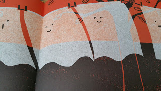
that it occurred to me that a performer might actually TAKE something from the script as well. And, as an author/script-writer, I am troubled by this.The article’s author, YiLing Chen-Josephson, runs The Picture Book Club, a subscription service through which she handpicks books for young children (and their parents). I’m guessing that one of the books she does NOT recommend to her subscribers is Maurice Sendak’s miniature picture book classic Pierre, which she describes reading to her own son in the article.
If you’re not familiar with Pierre then – SPOILER ALERT! – let me tell you that it’s a cautionary tale about a small boy, Pierre, who professes not to care about anything whatsoever. When a polite, but hungry, lion calls at Pierre’s home and asks Pierre if he may eat him, Pierre says, “I don’t care!” So the lion takes the boy at his word and swallows him whole. Fortunately Pierre’s parents are able to extract their son before any lasting harm is done and – having experienced the trauma of being eaten alive – Pierre now cares about what happens to him. To quote Sendak’s final line “The moral of Pierre is: CARE!”
 Maurice Sendak’s Pierre is a cautionary tale of a small boy who is hugely indifferent to everything.
Since “parental censorship” is in the title of this post, you've probably guessed that Chen-Josephson took it upon herself to censor Sendak’s classic. Having read the plot outline above, you might assume that she cut out or re-edited the scene where the small boy is EATEN ALIVE by the hungry lion. But, no, the object of Chen-Josephson's disapproval was Pierre’s absolute indifference. Here’s how she puts it in her own words:
You’ve read enough to recognize what’s at stake here: The child in this book doesn’t care. Are you ready to introduce your own darling boy to the phrase “I don’t care” and, with it, to ennui, to disaffection, to insubordination?So now, whenever Chen-Josephson reads the book to her son, she rescripts Pierre’s dialogue so that instead of saying, “I don’t care!” he says “I … care!”.
It seems to me that Chen-Josephson has entirely failed to grasp the point of a cautionary tale, which is to show how negative characteristics can have unfortunate consequences for their owners. By turning Pierre into a caring child, the message her son is likely to draw from the story is that bad things can happen to nice children, rather than the message Sendak intended, which was that bad things can happen to children who are dismissive and indifferent.
After explaining how she improved on Sendak’s storytelling, Chen-Josephson goes on to relate how several of her friends censor the picture books they read to their children. She gives three examples of how parents respond when they come across the F word in picture books. NO! Not that F word – I mean "FAT"!
One father I heard from avoided the word fat at all costs, turning even The Very Hungry Caterpillar from a “big fat” insect to a “great big” one. Another parent said she left the word alone when it was used to describe an animal but would replace it when it was used about a person. Another specifically sought out books where fat was used descriptively and without judgment since she didn’t want her child to think that the word should carry negative connotations.
 Apparently some parents baulk at Eric Carle's use of F word in The Very Hungry Caterpillar
I suspect that all three parents described above would censor my use of the F word in my picture book story The Santa Trap . Über-brat Bradley reveals his plan to trap Santa with the words, “I’m going to catch the fat fool and take every present he’s got.”
 One of Poly Bernatene’s illustrations of brattish Bradley in The Santa Trap.
It’s quite clear that the word “fat” is intended to have a negative connotation in this context. However CONTEXT IS EVERYTHING! Like Pierre, The Santa Trap is a cautionary tale. The story makes it clear that Bradley is an irredeemably awful child whose monstrous behaviour leads to his eventual downfall, while Santa, the object of Bradley’s abuse, is the unflappably benign and ultimately triumphant hero of the tale. I think that most children that hear this story will recognise that using the word "fat" to insult someone should be bracketed with the other unacceptable behaviours that Bradley engages in such as stealing tigers from the local zoo. And if a child does not recognise this, then the adult reading the story can use Bradley's example as an opportunity to discuss why this is an unacceptable way to behave.
I think the same principle can be applied to most stories that contain the sort of parental-anxiety-inducing content that parents like Chen-Josephson might wish to censor. And I’d argue that the parent-child picture book reading experience is an ideal setting for a child to encounter such content. Sooner or later, a child will encounter an uncaring character or hear the word “fat” being used inappropriately, on a TV screen or in the real world. Surely it’s better for them to come across these things in a picture book, with a parent on hand to discuss and explain them with, than on their own?
So, if you’re reading a picture book to a child and you’re tempted to censor something, why not try using it as an opportunity for discussion instead? You're probably be doing your child a favour and I'm sure the author would thank you for it too!
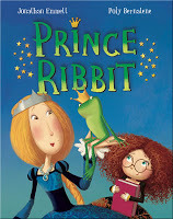 Jonathan Emmett's latest picture book is Prince Ribbit, illustrated by Poly Bernatene and published by Macmillan Children's Books. WARNING: This book contains graphic images of interspecies osculation which some parents may find objectionable.
Find out more about Jonathan and his books at his Scribble Street web site or his blog. You can also follow Jonathan on Facebook and Twitter @scribblestreet.
See all of Jonathan's posts for Picture Book Den.
April 2, 2017
Never Too Grown Up for Picture Books • CHITRA SOUNDAR
I love picture books – to read on my own, to read aloud to my nephews and to write. But the side-effect of writing picture books is that I also have to perform the book – or as I call it – Sing for my Supper. I usually sing a modified version of Old MacDonald Had a Farm – all it requires is enthusiasm.
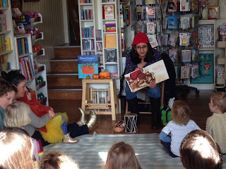 Notice the cap and the drums...When I get invited into schools, I usually have to do sessions with children from Reception to Year 6. Reception, Year 1 and Year 2 are perfect for the picture books. I tell stories, we make up stories together and they love reading from the picture books.Then for Year 3 and Year 4 – I read from my chapter books and discuss the stories for their inner meaning of justice and fairness. That’s all good.
But what happens when I go into Year 5 and 6 classes? They are too old for my picture books and definitely not interested in my younger chapter books. At first I used to show my books for 30 seconds and then say, “I write for younger kids, let’s do some writing ourselves.” I would never bring out my books again thinking they might not be interested. Then one day it occurred to me that I could use picture books in Upper Key Stage 2 too, as long as I use them effectively to draw them in and bring a different perspective. Here are some ideas I use in Key Stage 2 classrooms with my picture books. Maybe as a writer in schools or a teacher you might be able to use them too.
Idea #1: Convert my fictional story into a non-fiction activity I read the story aloud in class and then use the book as a jumping off point to discuss non-fiction that underpins the text.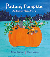 For example Pattan’s Pumpkin is the retelling of an ancient legend – but when I use it in KS2 classrooms, I engage the children in the setting – the beautiful UNESCO protected Sahaydri Mountain Range and talk about the fauna and flora of the region. I bring in some information sheets about the region, the animals etc and the class works in groups to create non-fiction booklets about the mountains, or animals or India depending on which topic interests them.
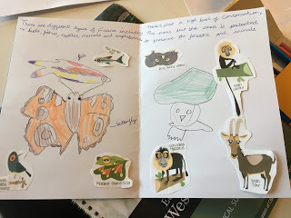
Of course teachers love this workshop too as it covers a bit of geography, science, reading and I sneak in a bit of Maths. Check out the teaching ideas I share with teachers here.
Idea #2: Picture Book Story Board WorkshopIn this workshop, I talk about the layout of a picture book as a writer. I show them my notebook where I break up text into spreads, draw boxes to figure out what might go into each spread. I talk about page-turns, exciting events and story mountains. Then I give each table a story that I am currently working on. Each group then designs the picture book turning into designers and illustrators. They have to break out my text into spreads and put illustrations and words into 12-box grid. Each group comes up with a different design and they love to compare and discuss their reasons.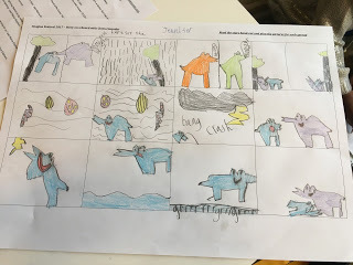
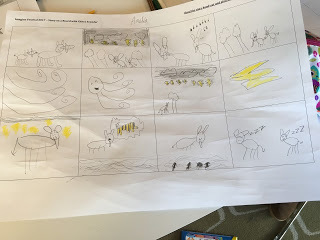
Idea #3: Plan Your Own Picture BookThis workshop is a combination of the other two. First I tell them a story from one of my picture books. Especially one that has a pattern – usually from one of the titles from the Farmer Falgu series.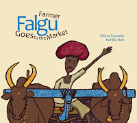 For example, in Farmer Falgu Goes to the Market, my character goes on a journey and encounters problems throughout his journey and in the end finds resolution.Then I invite the class to throw ideas into a big story salad. Can we make Farmer Falgu go somewhere else? Whom will he meet? What problems will he face? So far we have sent off Farmer Falgu to the moon, to the undersea and to alien planets. The children decide the characters Farmer Falgu meets, the obstacles in his way and the resolution.
Some children of course then change course and find their own characters and that’s okay too. Once we have discussed the basics, then either in pairs or on their own, they plan their storyboard. Some develop the whole story while others enjoy telling the story to everyone else. Read more stories that were developed in classrooms here. The important thing is then the children engage with the picture book without guilt. They are often told they are too old for it. When they are allowed to, they enjoy it very much – but in a very different way.
So if you’re a picture book author who is nervous to go into older classes, you can move up from Reception, take off your costume and do workshops with the older kids too.
 Chitra Soundar writes picture books and young fiction and is published in the UK, India, US and many other countries. Follow her on Twitter @csoundar and find out more about her at www.chitrasoundar.com.
 Notice the cap and the drums...When I get invited into schools, I usually have to do sessions with children from Reception to Year 6. Reception, Year 1 and Year 2 are perfect for the picture books. I tell stories, we make up stories together and they love reading from the picture books.Then for Year 3 and Year 4 – I read from my chapter books and discuss the stories for their inner meaning of justice and fairness. That’s all good.

But what happens when I go into Year 5 and 6 classes? They are too old for my picture books and definitely not interested in my younger chapter books. At first I used to show my books for 30 seconds and then say, “I write for younger kids, let’s do some writing ourselves.” I would never bring out my books again thinking they might not be interested. Then one day it occurred to me that I could use picture books in Upper Key Stage 2 too, as long as I use them effectively to draw them in and bring a different perspective. Here are some ideas I use in Key Stage 2 classrooms with my picture books. Maybe as a writer in schools or a teacher you might be able to use them too.
Idea #1: Convert my fictional story into a non-fiction activity I read the story aloud in class and then use the book as a jumping off point to discuss non-fiction that underpins the text.
 For example Pattan’s Pumpkin is the retelling of an ancient legend – but when I use it in KS2 classrooms, I engage the children in the setting – the beautiful UNESCO protected Sahaydri Mountain Range and talk about the fauna and flora of the region. I bring in some information sheets about the region, the animals etc and the class works in groups to create non-fiction booklets about the mountains, or animals or India depending on which topic interests them.

Of course teachers love this workshop too as it covers a bit of geography, science, reading and I sneak in a bit of Maths. Check out the teaching ideas I share with teachers here.
Idea #2: Picture Book Story Board WorkshopIn this workshop, I talk about the layout of a picture book as a writer. I show them my notebook where I break up text into spreads, draw boxes to figure out what might go into each spread. I talk about page-turns, exciting events and story mountains. Then I give each table a story that I am currently working on. Each group then designs the picture book turning into designers and illustrators. They have to break out my text into spreads and put illustrations and words into 12-box grid. Each group comes up with a different design and they love to compare and discuss their reasons.


Idea #3: Plan Your Own Picture BookThis workshop is a combination of the other two. First I tell them a story from one of my picture books. Especially one that has a pattern – usually from one of the titles from the Farmer Falgu series.
 For example, in Farmer Falgu Goes to the Market, my character goes on a journey and encounters problems throughout his journey and in the end finds resolution.Then I invite the class to throw ideas into a big story salad. Can we make Farmer Falgu go somewhere else? Whom will he meet? What problems will he face? So far we have sent off Farmer Falgu to the moon, to the undersea and to alien planets. The children decide the characters Farmer Falgu meets, the obstacles in his way and the resolution.

Some children of course then change course and find their own characters and that’s okay too. Once we have discussed the basics, then either in pairs or on their own, they plan their storyboard. Some develop the whole story while others enjoy telling the story to everyone else. Read more stories that were developed in classrooms here.
 The important thing is then the children engage with the picture book without guilt. They are often told they are too old for it. When they are allowed to, they enjoy it very much – but in a very different way.
 So if you’re a picture book author who is nervous to go into older classes, you can move up from Reception, take off your costume and do workshops with the older kids too.
 Chitra Soundar writes picture books and young fiction and is published in the UK, India, US and many other countries. Follow her on Twitter @csoundar and find out more about her at www.chitrasoundar.com.


