
Todd Klein's Blog, page 59
August 29, 2022
GASPAR SALADINO in THE AVENGERS Part 2
 All images © Marvel. From THE AVENGERS #110, April 1973
Continuing my overview of Gaspar Saladino’s lettering for this important Marvel Comics team book, in addition to lettering quite a few covers (as discussed in Part 1), Gaspar was often assigned to letter just the first story page of many issues. I suspect the idea was to make that page more exciting when potential buyers looked at it, to help clinch a sale, and I will add that it worked on me. On these, Gaspar always credits the letterer of the rest of the story, but this plan was mainly used for less experienced or less dynamic letterers, and the difference is clear when you see it. I think Gaspar was paid extra for these, and it shows in the work, he always seems to give more care to the story titles and credit blocks, as on the first one, above. Saladino also lettered a few full stories for the title. Note that my images on these are not from the original comics but from reprints, so the brightness and colors are not accurate to the originals, but the lettering looks fine.
 From THE AVENGERS #117, Nov 1973
The title on this story is full of Gaspar’s drippy horror style and texture. His burst balloons are also full of energy.
 From THE AVENGERS #118, Dec 1973
Here the Saladino page 1 treatment was used on an early lettering job by Tom Orzechowski. A few years later, Tom was doing wonderful title and credit work of his own, but at this point, he was a newcomer, and not yet as accomplished.
 From THE AVENGERS #137, July 1975
On this one, rather than use his own Avengers cover logo, Gaspar does a new one that works well in this giant word balloon title.
 From THE AVENGERS #138, Aug 1975
Writer Steve Englehart’s story title mimics Robert A. Heinlein’s “Stranger in a Strange Land,” but Saladino’s version of STRANGER makes it visually interesting.
 From THE AVENGERS #140, Oct 1975
Penciler George Tuska left plenty of room for this story title, and Saladino makes good use of it. They would work together on “The World’s Greatest Superheroes” comic strip in a few years.
 From THE AVENGERS #147, May 1976
This story title almost predicts DC Comics’ CRISIS ON INFINITE EARTHS in the 1980s.
 From THE AVENGERS #150, Aug 1976
This story title could have been a cover logo if Saladino hadn’t already designed a better one.
 From THE AVENGERS #151, Sept 1976
This more crowded cover needed a smaller title, but it’s still bold and full of impact.
 From THE AVENGERS #154, Dec 1976
Here’s a rare example of a Saladino page 1 on a story lettered by John Costanza, usually he did his own. The treatment of ATTUMA adds to the unsettling camera angle.
 From THE AVENGERS #156, Feb 1977
Has Doctor Doom’s name ever held more dark energy and menace?
 From THE AVENGERS #157, March 1977
Gaspar lettered this entire story, so gets to put his own name in the credits for the first time. He might have used a pen name, as in past stories, but must have felt it was okay to use his own by this time. Over at DC he was still not getting printed credit for his work, but that would start later in 1977.
 From THE AVENGERS #159, May 1977
Look at the subtle lightning symbol in this title. Gaspar was always adding creative touches.
 From THE AVENGERS #160, June 1977
There’s only so much you can do with a sedate title like this one, the large size helps.
 From THE AVENGERS #161, July 1977
The lower case A’s in ANT-MAN are a nod to his small size.
 From THE AVENGERS #162, Aug 1977
Perspective in the title adds depth and interest.
 From THE AVENGERS #163, Sept 1977
Three styles in the title that all work together, and the rough DIE adds excitement.
 From THE AVENGERS ANNUAL #8, 1978
A busy cover, but Saladino’s title stands out.
 From THE AVENGERS #168, Feb 1978
Larger names in the credits add importance. Gaspar went smaller for the letterer and colorist to save space, and perhaps to indicate a lesser role for them.
 From THE AVENGERS #173, July 1978
Texture and a heavy, rough outline on OBLIVION add excitement.
 From THE AVENGERS #181, March 1979
Lower case in the title adds interest and helps emphasize HEROES.
 From THE AVENGERS #182, April 1979
Here lower case works differently but still effectively to gain attention.
 From THE AVENGERS #184, June 1979
Another fine title, DEATH always grabs the eye.
 From THE AVENGERS #188, Oct 1979
Saladino lettered this entire story, so gets to add his first name in script to the credits, his favorite way of doing that. The extended E in ELEMENTARY is a rare misfire in my opinion, it reads more like an F. And for the first time, Gaspar uses his cover logo in the title, sort of. Not quite the same.
 From THE AVENGERS #192, Feb 1980
The brush lettering in NIGHTMARE is something Gaspar excelled at.
 From THE AVENGERS #211, Sept 1981
I find this large and wordy credit block amusing because it’s meant to be a dialogue between letterer Janice Chiang and writer/editor Jim Shooter, but it’s all done with Gaspar’s elegant and distinctive lettering.
 From THE AVENGERS #281, July 1987
I was surprised to find Gaspar lettering this entire story, late for him at Marvel, and he’s using his L. P. Gregory pen name, so perhaps hoping DC wouldn’t notice.
To sum up, the details of Saladino’s story lettering are below.
#110 April 1973: page 1 only
#117 Nov 1973: page 1 only
#118 Dec 1973: page 1 only
#137 July 1975: page 1 only
#138 Aug 1975: page 1 only
#140 Oct 1975: page 1 only
#147 May 1976: page 1 only
#150 Aug 1976: page 1 only
#151 Sept 1976: page 1 only
#154 Dec 1976: page 1 only
#156 Feb 1977: page 1 only
#157 March 1977: 17pp
#159 May 1977: page 1 only
#160 June 1977: page 1 only
#161 July 1977: page 1 only
#162 Aug 1977: page 1 only
#163 Sept 1977: page 1 only
ANNUAL #8 1978: page 1 only
#168 Feb 1978: page 1 only
#173 July 1978: page 1 only
#181 March 1979: page 1 only
#182 April 1979: page 1 only
#184 June 1979: page 1 only
#188 Nov 1979: 18pp
#192 Feb 1980: page 1 only
#211 Sept 1981: page 1 only
#281 July 1987: 22pp
That’s a total of 81 pages. Other articles in this series and more you might enjoy are on the COMICS CREATION page of my blog.
The post GASPAR SALADINO in THE AVENGERS Part 2 appeared first on Todd's Blog.


August 28, 2022
And Then I Read: RECKLESS – LIVING SHADOWS

This is the second book in Cornelia Funke’s Reckless series. Jacob Reckless has a portal into another world, one filled with difficult magic, dangerous people, and deadly curses. In the first book we saw how Jacob learned to navigate this world and become a treasure hunter in it, but one of those deadly curses was laid upon him. In this second book he is trying desperately to find a way to lift the curse and survive, along with his companion and friend Fox, a shape-shifter, and helped by a greedy dwarf, Valiant. Jacob wants to find a treasure that may help him, and that involves tracing and recovering several body parts of a long-dead sorcerer. Another treasure hunter is on the same trail, and has no compunctions about killing Jacob and his friends to get there first, and there are plenty of other roadblocks and perils along the way.
I wanted to like this series as much as Funke’s brilliant “Inkheart” one of some years ago, but I didn’t. Jacob is not a likable character for one thing. He’s manipulative, sneaky and self-centered. I did find his companion Fox more appealing, but that wasn’t enough to make the series work. The first book had more character development, this one seemed plot-driven and action-adventure took precedence over character. I doubt I will bother to read later books in the series. Mildly recommended for creative magic and world-building.
Reckless Living Shadows by Cornelia Funke
The post And Then I Read: RECKLESS – LIVING SHADOWS appeared first on Todd's Blog.
August 26, 2022
GASPAR SALADINO in THE AVENGERS Part 1
 All images © Marvel. From THE AVENGERS #108, Feb 1973
Gaspar Saladino did quite a lot of work for this important Marvel Comics title, including the design of the distinctive logo seen here, which is still being used in Marvel films. I’m going to split my survey into two parts, doing covers in this part, and inside pages in the second. Early on, Marvel’s main cover letterers were Artie Simek and Sam Rosen, but Sam stopped lettering in late 1972, which may have opened the door for Gaspar Saladino to step in on covers like this one. There’s no one thing I can point to as the Saladino style, but it all looks like what he had been doing for DC Comics for years. Gaspar’s fine work was well known in the industry, and he’d already been asked to do some Marvel logos, as you can see.
 From THE AVENGERS #109, March 1973
The bold rough outline around the first balloon on this cover is typical for Saladino.
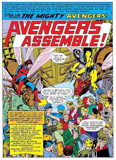
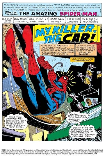
 From THE AVENGERS #110, April 1973
The creative way X-MEN fits into the balloon here show’s Saladino’s skill.
 From THE AVENGERS #111, May 1973
The other main cover letterer stepping in around this time was Danny Crespi, and his work is often close to that of Saladino, so I might get a few wrong, but there are subtle differences in the way they approached small open lettering and regular balloon lettering, and this looks like Gaspar to me.
 From THE AVENGERS #117, Nov 1973
These almost rectangular balloon shapes are similar to what Artie Simek often did, but the letters inside them are by Saladino. The balloon border for Namor is also very much a Gaspar thing.
 From THE AVENGERS #118, Dec 1973
The small burst around THIS IS IT! is very Saladino on this one.
 From THE AVENGERS #120, Feb 1974
Another tough call, but I see more Saladino here than anyone else.
 From THE AVENGERS #121, March 1974
The creative treatment of TAURUS signals Saladino on this cover.
 From THE AVENGERS #122, April 1974
Again, many subtle style points suggest Saladino.
 From THE AVENGERS #123, May 1974
Here I would point to the serif I in ISSUE in the bottom caption. It’s something often considered bad lettering, and most pro letterers would never do that, but Gaspar iked it at the beginnings of words.
 From THE AVENGERS #124, June 1974
The artfully uneven style in the bottom caption is pure Gaspar.
 From THE AVENGERS #125, July 1974
FEATURING in the bottom caption is very Gaspar, the top cation looks like type except for the exclamation point, so possibly added later.
 From THE AVENGERS #129, Nov 1974
The style of KANG is very Saladino on this one, as is the treatment of the open letters in the burst.
 From THE AVENGERS #130, Dec 1974
Only the bottom caption here is lettered by Gaspar, the character names are type.
 From THE AVENGERS #132, Feb 1975
ELECTRIFYING is very Saladino. If you look closely at the lettering in the top balloon, notice many of the horizontal strokes in the letter E are slightly arched, something Gaspar did and Crespi didn’t.
 From THE AVENGERS #133, March 1975
Danny Crespi lettered this cover, which I’m showing as an example and contrast. Notice his balloon lettering is wide and done with a wedge-tipped pen, like Gaspar’s, but the horizontal E strokes are straighter, and the S and O are more rounded. In the bottom caption the open lettering is quite different from what Saladino usually did, the shapes are uneven and bouncier for one thing, and the heavy outline around HOODED ONE is more his style. Also notice how some letters seem to lean to the left.
 From THE AVENGERS #134, April 1975
Gaspar’s balloon lettering style is clear here, but he used an alternate style Y in SLAY, something he also did at DC occasionally.
 From THE AVENGERS #142, Dec 1975
The style of THE in the top caption is pure Gaspar, something he learned from DC’s Ira Schnapp.
 From THE AVENGERS ANNUAL #9, 1979
Saladino lettered just one AVENGERS ANNUAL cover.
 From THE AVENGERS #187, Sept 1979
The open letters in the bottom blurb again have that Saladino touch of being uneven but somehow in just the right way to add interest.
[image error]From THE AVENGERS #189, Nov 1979The style of HAWKEYE with added texture is pure Saladino.
 From THE AVENGERS #190, Dec 1979
This bottom blurb is full of Gaspar’s creepy styles.
 From THE AVENGERS #192, Feb 1980
This blurb is a tough call, but notice the notch in each R is below the center of the horizontal stroke (more so on the second one), a typical Saladino style point.
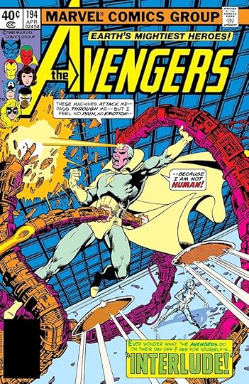 From THE AVENGERS #194, April 1980
Gaspar’s balloon lettering style is clear on this cover.
 From THE AVENGERS #201, Nov 1980
All right, I’m going to skip some now, you get the idea. I’ve always loved this cover, and feel sure it’s lettered by Gaspar.
 From THE AVENGERS #207, May 1981
Saladino’s spooky style is in the large letters of this caption.
 From THE AVENGERS #214, Dec 1981
This blurb is the last one in the series I think was lettered by Gaspar, it’s again full of his spooky style and texture.
To sum up, I found Saladino lettering on these covers: 108-111, 117-118, 120-125, 129-130, 132, 134, 142, 187, 189-190, 192, 194-196, 198-199, 201, 203-207, 209-210, 214, Annual 9. That’s 36 in all. Other articles in this series and more you might like are on the COMICS CREATION page of my blog.
The post GASPAR SALADINO in THE AVENGERS Part 1 appeared first on Todd's Blog.
August 25, 2022
GASPAR SALADINO in ASTONISHING TALES
 All images © Marvel. From ASTONISHING TALES #22, Feb 1974
This title ran 36 issues from 1970 to 1976. Gaspar Saladino’s involvement was minor, but just enough to call for a separate article in my opinion. He lettered two covers and four first story pages where the rest was by someone else, as he was being hired to do by Marvel in the 1970s, but on this book it’s a bit more complicated than that. His first cover, above, has three captions by him. Note the way the open letters in the first two are joined in places, a good clue, and the word GRANITOR in the third caption uses letter shapes he liked that few others used. It’s possible he also lettered the logo, but I’m not sure about that, so I haven’t counted it for him.
 From ASTONISHING TALES #33, Jan 1976
His other cover has balloons in his style, the angular S in THIS is typical, and it’s hard to see but the burst in the second balloon has small gaps in the border, something few letterers were doing. The caption is very angular, and not like the usual work of Danny Crespi, the other main cover letterer at the time.
 From ASTONISHING TALES #28, Feb 1975
I believe Marvel thought Gaspar’s title page lettering would help sell their comics, especially when the regular letterer’s work was not so accomplished, and I think that’s why he did some of that on this title. As part of the credits, he names Karen Pocock (later Karen Mantlo), who lettered the rest of the issue, but the style of her pages is quite different.
 From ASTONISHING TALES #32, NOV 1975
Here’s where it gets complicated, though. Rich Buckler’s Deathlok carries on an internal narrative with his built-in computer, an early example of narrative captions, and the computer ones needed to look like some kind of digital readout. On this cover that was done with type, or perhaps an alternate font on an IBM Selectric typewriter, and most likely not by Saladino. He did the story title and the regular captions, but the credits are by someone else, possibly Charlotte Jetter, who lettered the rest of the story.
 From ASTONISHING TALES #34, March 1976
Saladino’s involvement on this first page is even less, he did the story title, including the smaller parts of it lower on the page only. I think the balloon and computer-style lettering are by Karen Manto, as is the credits block. This speaks to how highly editor Marv Wolfman thought of Gaspar’s work, I would say, hiring him for just the story title.
 From ASTONISHING TALES #35, May 1976
Gaspar’s final work on the title is another page 1, but this time he did all the lettering on it except for the recurring top caption.
To sum up, Saladino lettered two covers: 22 and 33, and worked on these four story pages:
#28 Feb 1975: page 1 only
#32 Nov 1975: page 1 only
#34 March 1976: page 1 only
#35 May 1976: page 1 only
Other articles in this series and more you might like are on the COMICS CREATION page of my blog.
The post GASPAR SALADINO in ASTONISHING TALES appeared first on Todd's Blog.
August 24, 2022
GASPAR SALADINO in AMAZING SPIDER-MAN
 All images © Marvel. From AMAZING SPIDER-MAN #118, March 1973
This book and character are one of the most important at Marvel, and the series began in 1963 and continued with this numbering until issue #441 in 1998. Gaspar Saladino worked on it for a short part of that run, from 1973 to 1980, first doing cover lettering, then adding page 1 lettering, where the rest of the story was by someone else, plus one full story. Saladino had plenty of work at DC Comics in those years, but had apparently decided to expand his customer base to other publishers in the 1960s, and that continued at Marvel in the 1970s and 1980s, but I found no work by him on this book after 1980. The cover above, his first, is full of his distinctive display lettering at the bottom in several styles, and the balloons also show his style points, like the shape of the I in the thought balloon, and the way the open letters of ATTACK are connected in the burst. At the time, most Marvel cover lettering was by either Artie Simek or Sam Rosen, but Sam stopped lettering in late 1972, and Simek died in early 1975, opening the door for different letterers on covers. The main one that stepped in other than Saladino was Danny Crespi, though I don’t find much of his work before 1974 on covers. Other Marvel regulars like Morrie Kuramoto and Irv Watanabe also did some, other freelancers like John Costanza were sometimes given covers, and when a late cover came in, anyone might be handed the assignment. At times type was also used in that situation. I’ll look at covers first, then inside pages.
 From AMAZING SPIDER-MAN #119, April 1973
Danny Crespi’s cover lettering is sometimes hard to tell apart from Gaspar’s, and I might get a few wrong, but I’m doing my best to present an accurate list, any I’m not sure of won’t be included. Here the styles in the bottom banner have Saladino’s crisp corners, and the balloon lettering is more angular than what Crespi did.
 From AMAZING SPIDER-MAN #122, July 1973
This balloon lettering is narrower than what Gaspar usually produced, but still has his style, and the construction of the open letters at the bottom is also typical for him.
 From AMAZING SPIDER-MAN #123, Aug 1973
At times Crespi seemed to be imitating Saladino, which makes identification harder, but in general Gaspar’s work is more angular and Crespi’s more rounded. The almost rectangular first balloon here is something Artie Simek often did, and Saladino might have gotten that from him, but his letters inside are much different.
 From AMAZING SPIDER-MAN #126, Nov 1973
The lettering on this cover is again very angular, look at the sharp points of the burst for instance, and the creative placement of THE over the K in KANGAROO is a very Saladino touch.
 From AMAZING SPIDER-MAN #129, Feb 1974
Notice the way the notch in the right side of the R in PUNISHER is below the center, a Saladino style point. The style of THE in THE JACKAL is also one he often used, picked up from DC’s Ira Schnapp.
 From AMAZING SPIDER-MAN #130, March 1974
The way the very square letters of HAMMERHEAD extend above and below the baselines is typical of Saladino, as is the style of the arrow caption.
 From AMAZING SPIDER-MAN #131, April 1974
The best clue to Saladino’s lettering here is the shape of the question mark in the last burst balloon, but it’s all typical of his work.
 From AMAZING SPIDER-MAN #134, July 1974
The scary style of TARANTULA is very Gaspar here, as is the style of the EXTRA banner. In the first balloon, the open letters are not typical for him, and might have been revised by someone else like Danny Crespi at the editor’s request. On the other hand, SHREDDED in the thought balloon is typical Gaspar open lettering.
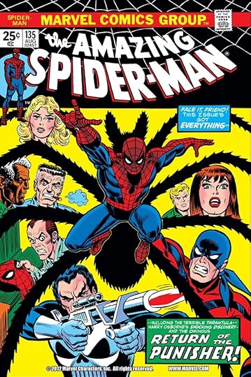 From AMAZING SPIDER-MAN #135, Aug 1974
A tough call, but the smaller lettering is more like Saladino than Crespi.
 From AMAZING SPIDER-MAN #136, Sept 1974
This one is again similar in some ways to Crespi’s cover lettering, but there are subtle differences that suggest Saladino to me.
 From AMAZING SPIDER-MAN #141, Feb 1975
The shapes of the open letters in the balloons say Saladino to me, the caption is harder because of the black fill.
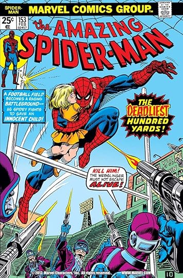 From AMAZING SPIDER-MAN #153, Feb 1976
The very angular small lettering in the balloon is pure Saladino, the burst is again hard to be sure about because of the black fill, but DEADLIEST is certainly by Gaspar.
 From AMAZING SPIDER-MAN #172. Sept 1977
In the late seventies, Crespi was doing most of the cover lettering, but Saladino still did some as well. This looks like Gaspar’s work to me.
 From AMAZING SPIDER-MAN #186, Nov 1978
The way some of the open letters in the upper blurb are joined is very Saladino. The bottom banner caption uses type.
 From AMAZING SPIDER-MAN #200, Jan 1980
Both the open lettering next to Spidey and the bottom caption are typical Saladino work of the time.
 From AMAZING SPIDER-MAN #208, Sept 1980
There’s something about the shapes of THE TWIN TERROR that’s very Saladino, angular in a particular way.
 From AMAZING SPIDER-MAN #210, Nov 1980
The best Saladino style point in this cover is the shape of the question mark in the first caption. And that’s all I can find for him on covers.
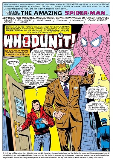
 From AMAZING SPIDER-MAN #150, Nov 1975
This is the first of Saladino’s “page 1” contributions. On each, he puts the name of the letterer who did the rest of the story in the credits, but take a look at any of these issues and you’ll see the style of later pages is quite different. Marvel seems to have done this to make the issues more appealing to readers, it certainly worked on me!
 From AMAZING SPIDER-MAN #155, April 1976
Look at Gaspar’s amazingly creative story title here! It’s better than what appeared on the cover, and better than most Marvel story titles in general.
 From AMAZING SPIDER-MAN #156, May 1976
This is the only full story lettered by Saladino for the book, and the only one with his name in the credits, using his first name only in script, as he liked to do. For earlier story lettering at Marvel, he often used pen names like L. P. Gregory, but by this time, Gaspar must have felt secure enough in his popularity at DC to put his name on the page. He wasn’t the only one, John Costanza was lettering for both companies at the time, and using his own name at Marvel. DC did not yet allow lettering credits most of the time, that would start in 1977. I love the creativity of THE MIRAGE.
 From AMAZING SPIDER-MAN #159, Aug 1976
Then it was back to page 1 only with no credit, but anyone who was paying attention would have seen Gaspar’s style in this title. I think he was fine with no credit as long as he was paid well, and these probably paid more than regular page rate, I’m guessing double.
 From AMAZING SPIDER-MAN #160, Sept 1976
Some letterers like Costanza did not get the page 1 Saladino treatment, but others like Sam Rosen’s brother Joe did, perhaps because his work was quite small, and Marvel thought this would grab more readers.
 From AMAZING SPIDER-MAN #161, Oct 1976
Lots of extra lettering work on this page’s newspaper, and the treatment of NIGHTCRAWLER is full of menace and energy.
 From AMAZING SPIDER-MAN #163, Dec 1976
Great banner around the title here. I wonder what the letterers doing the rest of the issues thought about these?
 From AMAZING SPIDER-MAN #165, Feb 1977
On some credits blocks like this one, Saladino uses a handsome Art Deco style that adds class to my eye, and his title is again full of energy.
 From AMAZING SPIDER-MAN #169, June 1977
Some of this credit block could have been copied from the previous one, but Gaspar didn’t bother with that, he just lettered it all. Quicker that way, too.
 From AMAZING SPIDER-MAN #191, April 1979
A smaller credit block here and a larger title, plus a rare case of Saladino allowing Marvel to paste in the logo rather than just creating a new version. The title would have worked better if he had.
 From AMAZING SPIDER-MAN #192, May 1979
The last of these page 1’s, and another amazing title. Other letterers like Jim Novak were sometimes given the same page 1 preference, but it seemed to die out gradually in the early 1980s. I know if I was lettering for Marvel then, I would have been campaigning for the chance to do my own page 1, and that idea may have prevailed eventually.
To sum up, I found Saladino lettering on these covers: 118-119, 122-123, 126, 129-131, 134-136, 141, 153, 172, 186, 200, 208, 210. That’s 18 in all. Below are the details of his story lettering.
#150 Nov 1975: page 1 only
#155 April 1976: page 1 only
#156 May 1976: 18pp
#159 Aug 1976: page 1 only
#160 Sept 1976: page 1 only
#161 Oct 1976: page 1 only
#163 Dec 1976: page 1 only
#165 Feb 1977: page 1 only
#169 June 1977: page 1 only
#191 April 1979: page 1 only
#192 May 1979: page 1 only
That’s a total of 28 pages. More articles in this series and others you might enjoy are on the COMICS CREATION page of my blog.
The post GASPAR SALADINO in AMAZING SPIDER-MAN appeared first on Todd's Blog.
August 23, 2022
GASPAR SALADINO in AMAZING ADVENTURES
 All images © Marvel. From AMAZING ADVENTURES #17, March 1973
Here we go with articles about the lettering work of Gaspar Saladino on covers and story pages for Marvel Comics in the 1970s and 1980s. I’ve already covered his Marvel work from 1967-1968, as well as his Marvel logos and house ads, which can be found on the linked pages. The challenges faced in identifying his work at Marvel in these years is different from those I faced for his DC Comics work. For covers, his main competition early in the 1970s was Artie Simek and Sam Rosen, whose styles are quite different from Saladino, so easy to pass by, but Danny Crespi also started doing cover lettering in the early 1970s, and at times his work is closer to Gaspar’s than either Simek or Rosen. I’ve written lots about Danny’s cover lettering beginning HERE. He may, in fact, have been imitating Gaspar on occasion. Generally Crespi’s cover lettering is more rounded than Saladino’s, but there are times when it’s hard to tell them apart. I’ll make the best call I can on each cover, some will probably be wrong, and if I’m not sure, I won’t count them for Gaspar. In the late 1970s, there’s another problem when Jim Novak is working at Marvel, because he imitated Saladino’s styles very closely, even copying style points no one else was using, but so far I’ve found his style is different enough from Gaspar’s work at the time to make a confident judgements. Again, if I’m not sure I won’t call them for Gaspar. As far as inside pages, it’s much easier there, because all stories are credited. Gaspar sometimes used pen names like L.P. Gregory, but his style is easy to pick out, and anything by Jim Novak would have his name on it. There is one slightly tricky point: Saladino was often asked to letter just the first page of stories otherwise lettered by others, including that person’s name as letterer, but these are also usually easy to spot, as the style of the other pages is quite different. So onward, covers first, then inside pages. AMAZING ADVENTURES is the first title alphabetically, and the lettering on the cover above, which also features his logo for THE BEAST, seems clearly in his style to me.
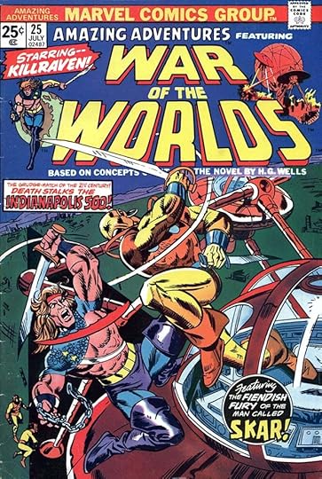
 From AMAZING ADVENTURES #18, May 1973
With the next issue, this science fiction feature began. The lettering in the circle at top right is easy to identify as Saladino, as it uses his wide, angular balloon lettering, and the bottom caption is also by him, note his style point of the upper right leg of the K in KILLRAVEN ending in an angle. The type caption was probably added later by someone else.
 From AMAZING ADVENTURES #20, Sept 1973
On this cover, the round blurb looks like Gaspar’s work to me, I’m not as sure about the word balloons, but I think they’re by Saladino. Usually one person did all the cover lettering for a comic, but at Marvel there seem to be more split decisions, perhaps due to last-minute additions or editorial changes after the first round was done.
 From AMAZING ADVENTURES #21, Nov 1973
The lettering on this one looks like Saladino to me, not sure why type is used in the blurb on the left, possibly the wording was changed after the cover lettering was turned in, but Gaspar did sometimes use type in this way, either press-down type or headline type from a headline machine.
 From AMAZING ADVENTURES #22, Jan 1974
This is a tough call. Some things suggest Saladino, but the heavy balloon borders are not something he did often, and the heavy outline around the second line in the caption is also unlike his work. Probably by Crespi, not calling it for Gaspar.
 From AMAZING ADVENTURES #23, March 1974
Another tough call. The treatment of RATTACK looks like Saladino, but the bottom caption doesn’t as much, though it may be distorted by the reverse photostat to make the lettering yellow on black. I’m calling it for Saladino.
 From AMAZING ADVENTURES #24, May 1974
Both blurbs here look like Gaspar’s work to me.
 From AMAZING ADVENTURES #25, July 1974
These blurbs are by Saladino, note the handsome script in the circle, which is similar to his handwriting.
 From AMAZING ADVENTURE3S #27, Nov 1974
Both these blurbs are by Saladino, the rounded E’s in the top one are something he often did for science fiction covers.
 From AMAZING ADVENTURES #31, July 1975
Saladino’s final cover lettering for the series, this is all very much in his style, though the top blurb might have been reduced, there seems to be too much open space in the caption around the lettering.
 From AMAZING ADVENTURES #22, Jan 1974
The first example of page 1 only lettering by Saladino on this title. The repeating top blurb above the credits is by someone else, the rest is by Gaspar. See below for a page actually lettered by Charlotte Jetter, the credited person.
 From AMAZING ADVENTURES #22, Jan 1974
Another page from the story lettered by Jetter, and looking quite different. I think Gaspar was paid extra, maybe double his page rate, for these page one jobs, which certainly make the story more inviting to read to my eye.
 From AMAZING ADVENTURES #33, Nov 1975
Another page 1 only job with a strong, effective Saladino title. The letterer of the rest was Karen Mantlo, wife of writer Bill Mantlo.
 From AMAZING ADVENTURES #36, May 1976
The final page 1 example from this book with another creative story title.
To sum up, I found Saladino lettering on these covers: 17-18, 20-21, 23-25, 27, 31. That’s nine in all. Below are the details of his story lettering.
#22 Jan 1974: page 1 only
#33 Nov 1975: page 1 only
#36 May 1976: page 1 only
Other articles about Saladino’s lettering are on the COMICS CREATION page of my blog.
The post GASPAR SALADINO in AMAZING ADVENTURES appeared first on Todd's Blog.
August 22, 2022
GASPAR SALADINO AT MARVEL 1967-68
 All images © Marvel. From FANTASY MASTERPIECES #11, Oct 1967
Gaspar Saladino was first hired as a letterer by DC Comics editor Julius Schwartz in the fall of 1949, and Julie and his office mate editor Robert Kanigher kept Gaspar quite busy from that point on working on their stories. In the beginning he worked regular office hours at DC, from nine to five Monday through Friday, first in the DC production room, then at a desk in Schwartz and Kanigher’s office. When he had time he also lettered stories for other DC editors. Gaspar found many DC artists were former classmates from his high school, Manhattan’s School of Industrial Art, and he soon made or renewed those friendships as they worked together. In the early 1950s, he would sometimes do lettering jobs for other publishers at the request of one of those artists, side work that he probably did at home or in the artist’s studio, but that stopped around 1953 as he continued to get more and more work from Schwartz and Kanigher.
Something changed around 1963. Perhaps his growing family was an incentive to add other clients to his workload, perhaps it was again requests from artist friends. He started working for Western Publishing (Dell and then Gold Key), often with artists Mike Sekowsky or Jack Sparling. In 1966 he expanded this side work to other publishers like Harvey and King Features, and in 1967 he began working at Marvel Comics. There’s no way to know in what order his work there was done, but the cover above is among the first batch issued with October cover dates, and it’s the only cover he lettered in this period. It was the last issue of the series, and the cover was one of those last-minute Marvel bullpen collaborations, so Saladino’s lettering helps pull it all together, and there’s lots of it. The style is quite similar to his DC cover work in places, a bit different in others, as if he was trying not to be recognized. The rest of his Marvel work from this time was on inside pages.
 From NOT BRAND ECHH #3, Oct 1967
Letterers at DC and other companies never received printed credits at the time, so while Gaspar was well-known in the comics industry, he was not yet known to fans, but working on Marvel stories presented a problem: Marvel DID usually list letterers in their story credits, a policy fought for by long-time Marvel letterer Artie Simek. It may not have been possible for Gaspar’s Marvel work to remain a secret, but he clearly didn’t want to announce it, so on this early story, perhaps his first, he solved the problem by using the symbols that indicate swearing in comics instead of a name in the Letterer slot of the credit box. His lettering in this and other NOT BRAND ECHH stories is smaller than his DC work, probably to fit things in better, and perhaps a request from the writer or editor. The story title is pure Saladino, even having his style of R in CHARLIE AMERICA where the indent on the right side is below the center of the middle stroke. This and the cover above are the only Marvel work by Gaspar with an October cover date.
 From FANTASTIC FOUR ANNUAL #5, Nov 1967
There were quite a few Saladino lettering jobs in Marvel books with November cover dates, and Gaspar had come up with a solution for the lettering credit problem: a pseudonym. He used the name L. P. Gregory, made from the names of his three children: Lisa, Peter and Gregory. Anyone who knew him and his work could have figured it out either by the style or the name, but at least it gave him plausible deniability if someone at DC complained. He wasn’t ever under contract to them as far as I know, but the DC editors did have sway as a major source of income. Roy Thomas seems to have liked his work on humor, as here.
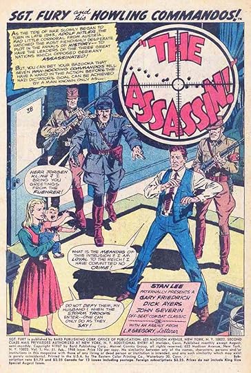
 From SGT. FURY #48, Nov 1967
Gaspar worked on a variety of Marvel titles for several writers. He was a good choice for this war book, since he was lettering many of DC’s war stories, though here his title and sound effect are imitating the work of Artie Simek.
 From TALES TO ASTONISH #97, Nov 1967
He also worked on Stan Lee stories like this one. I love his treatment of LIGHTNING in the title. Marvel and Stan were fond of nicknames in the credit block, so here he’s Scowlin’ L. P. Gregory.
 From TALES OF SUSPENSE #95, Nov 1967
The title treatment on this story is unusual for Gaspar, perhaps it was roughed in by penciller Gene Colan, an artist Gaspar worked with for years on DC romance stories.
 From THE X-MEN #38, Nov 1967
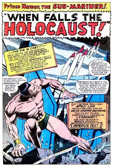
Here Saladino again imitates Simek in the title word DOOMSDAY, while his treatment of SHADOW reminds me of the pulp magazine logo. Gaspar’s lettering seems to be getting a bit larger now, even though there’s lots of it on this team book. Clever nickname for the letterer.
 From THE AVENGERS #47, Dec 1967
Roy Thomas must have liked Gaspar’s work, here’s another issue he wrote that Saladino lettered. The word MAGNETO again has the electric look of LIGHTNING, seen earlier.
 From TALES TO ASTONISH #99, Jan 1968
The title of this story is again in the style of Artie Simek, whose recurring top line is above it. The writer is Archie Goodwin, who would later move to DC.
 From NOT BRAND ECHH #6, Feb 1968
This musical parody is more like something from MAD than the usual fare in this title, and Saladino handles the lettering well.
 From SGT. FURY #51, Feb 1968
Here Saladino’s lettering is looking more like his DC work of the time, and he’s given the word LETTERER in the credit box a nice script treatment.
 From CAPT. SAVAGE AND HIS LEATHERNECK RAIDERS #2, March 1968
Another war book, and the title is again in Simek’s style to match his top blurb above it.
 From SGT. FURY #53, April 1968
Another war story with a Simek-style sound effect, but the title is more like the work of the other veteran Marvel letterer Sam Rosen. I like what writer Gary Friedrich gives Gaspar to letter about his own work in the credit block.
 From IRON MAN #2, June 1968
This Iron Man story again has a title in the style of Artie Simek. The credit box is quite large and elaborate with open lettering.
 From NOT BRAND ECHH #8, June 1968
One more humor story for writer Roy Thomas and artist Gene Colan, even more crowded with lettering than the previous ones, but it all works fine. And with that, Saladino’s time at Marvel ended for a few years. He would return in 1971, more often starting in 1973, and eventually even use his own name on some stories, but was the reason he stopped at this point due to pressure from DC? Hard to say, but possible. He did continue to work occasionally for Western Publishing, but did no other freelance work outside of DC for the years 1969-70. Another reason could be the increased workload he was getting at DC after Ira Schnapp was retired in late 1967 or early 1968. Once that happened, Gaspar was doing most of DC’s logos, house ads and cover lettering in addition to his story work, so it might have just been a matter of his being too busy for a while to work elsewhere.
To sum up, in addition to the cover of FANTASY MASTERPIECES #11, Saladino lettered these stories:
NOT BRAND ECHH #3, Oct 1967: Original Origin of Charlie America 3pp
FANTASTIC FOUR ANNUAL #5, Nov 1967: This Is A Plot? 3pp
SGT. FURY #48, Nov 1967: If Britain Should Fall… 20pp
TALES TO ASTONISH #97, Nov 1967: Namor the Sub-Mariner 12pp, The Hulk 10pp
TALES OF SUSPENSE #95, Nov 1967: Iron Man 11pp
X-MEN #38, Nov 1967: The Sinister Shadow of Doomsday 15pp
THE AVENGERS #47, Dec 1967: 20pp
TALES TO ASTONISH #99, Jan 1968: Namor the Sub-Mariner 11pp
NOT BRAND ECHH #6, Feb 1968: Best Side Story 7pp,
SGT. FURY #51, Feb 1968: 20pp
CAPT. SAVAGE #2, March 1968: 21pp
SGT. FURY #53, April 1968: 20pp
IRON MAN #2, June 1968: 20pp
NOT BRAND ECHH #8, June 1968: 6pp
That’s a total of 199 pages. More articles about Gaspar you might enjoy are on the COMICS CREATION page of my blog.
The post GASPAR SALADINO AT MARVEL 1967-68 appeared first on Todd's Blog.
August 21, 2022
And Then I Read: THE SECOND MRS. GIOCONDA by E. L. Konigsburg

Konigsburg is an author of novels for young readers that are equally suited for older ones. Her work is always surprising, her subjects quite varied, and her approach is unusual and refreshing. This book is historical fiction of a sort, but also about many other things. The title character was the model for Leonardo da Vinci’s most famous painting, The Mona Lisa, but she only comes into the story at the very end. The book is about Leonardo’s life and relationships with patrons as seen through the eyes of a street urchin, Salai, who the painter takes in as an apprentice. Salai is a thief and a charming smooth talker, and it’s clear Leonardo does not value him for his artistic abilities, which are modest, but for his company, his insights, and his companionship. They both become friends of Beatrice, the wife of the Duke of Milan, where Leonardo has his studio, and one of his major patrons. Beatrice is wise, and insightful, but not a great beauty, and her marriage is political rather than based on love. Over time she wins the affection and love of her husband with a little help from Salai and Leonardo, but then is swept away into politics so they see little of her. Much of the book details the many interests and projects of da Vinci, and how he decides where to spend his time and energy. Salai is sometimes a scoundrel, but just as often helpful to his master, and their relationship is complex and well described, making the meat of the story. How the Mona Lisa came to be is a quiet theme in the background, one that only jumps forward at the very conclusion, and I was surprised that the story ended without more about the actual painting, but in retrospect, it’s a fine book as it is, and highly recommended.
The Second Mrs Gioconda by E L Konigsburg
The post And Then I Read: THE SECOND MRS. GIOCONDA by E. L. Konigsburg appeared first on Todd's Blog.
August 19, 2022
GASPAR SALADINO’S NEWSPAPER STRIP LETTERING
 From LANCELOT Daily, March 16 1970, all LANCELOT images © NEA.
In addition to his vast amount of comic book work, Gaspar Saladino also lettered three newspaper strips that I know of. There could be others. Recently I discovered this short-lived strip, LANCELOT by Paul Coker Jr. and writer Frank Ridgway using the name Penn. It ran from March 16 1970 to April 29 1972. Coker was already a regular writer/artist for MAD by this time, and he would have known Saladino’s lettering from there, so it makes sense he might have asked Gaspar to letter this strip, though in the beginning some of the strips are lettered by Coker himself, and that also happened at the end. There were both Sundays and Dailies, but I’ve only found a printed newspaper run of the Dailies. The first Daily, above, certainly looks like Saladino lettering to me, though Coker probably did the balloon borders.
 From LANCELOT Daily, March 26 1970
Here’s another early one I think is lettered by Coker, the style matches his art, but he probably was happy to hire Gaspar to allow him more time to draw the strip.
 From LANCELOT Daily, Dec 25 1970
This Daily, rearranged so I can run it larger, has some fine and distinctive Saladino sound effects.
 From LANCELOT Sunday, June 27 1971
I found only two printed Sundays, clipped from unknown newspapers and a few examples of Sunday original art, partial example above, with great swear symbols by Saladino. All those few examples are lettered by Gaspar.
 From LANCELOT Daily, March 11 1972
Gaspar’s final lettering is on this Daily, the last few weeks were lettered by someone else, probably Coker himself. There’s another even more obscure strip with art by Paul Coker written by Duck Edwing, HORACE AND BUGGY, which ran about six months in 1971. Edwing was another MAD creator who often used Saladino lettering on his strips. I’ve found no newspaper run for this, only a few clipped strips and a few examples of original art. Of those, most have lettering by Coker, I saw two that might be lettered by Gaspar. With so little evidence, I can’t credit him with anything on HORACE AND BUGGY, perhaps someone else will be able to do that if they have the printed strips. For LANCELOT I counted 581 Dailies lettered by Saladino, the rough equivalent of 290 comics pages, as the usual method was to do two dailies on a sheet of comics art paper. For the possible 90+ Sundays, the few examples I found were lettered by Gaspar, so I’m going to conservatively award him 80 Sundays. Since these were larger and about the same amount of work as two comics pages, I will guesstimate it as 160 pages of comics lettering, or — in total — the equivalent of 450 pages of comics lettering for this strip. And he was doing it at a time when he was very busy at DC Comics!
 All THE VIRTUE OF VERA VALIANT images © Los Angeles Times. Daily Oct 11, 1976
The next strip that Saladino lettered, and this one is well documented, is THE VIRTUE OF VERA VALIANT by Stan Lee and Frank Springer, which ran from Oct 11, 1976 to Aug 28 1977, a total of 48 weeks. It was a humorous/dramatic soap opera strip based loosely on the TV series “Mary Hartman, Mary Hartman,” or at least inspired by it. It’s easy to imagine how Gaspar was recruited to work on this, he was already freelancing at Marvel, so familiar to Lee, and had worked with Frank Springer at DC. There were two collections of the strip issued in book form, but I don’t have those. I found images online, mostly in newspapers that ran it. Surprisingly, though they syndicated the property, the Los Angeles Times did not. I was able to find printed examples of all but the final week of strips and confirmed Saladino lettered all of those, and there’s no reason he wouldn’t have lettered the final week. Images drawn from the papers like the one above (I’ve stacked the panels to make them larger) are not very clear or well focused, but you can still see Gaspar’s lettering style coming through. I also found some original art on auction sites, which give a better look at the art and lettering.
 From VERA VALIANT Sunday, Oct 17 1976
Four panels from the first Sunday. Saladino’s wide, angular style is easy to identify, and there are other style points like the shape of the bold Italic I in the third panel and his distinctive question mark in the second.
 VERA VALIANT Daily, Jan 24, 1977 courtesy of Heritage Auctions, ha.com
Here’s the original art from a daily strip, still hard to see in this format, so I’ll stack the panels below.
 VERA VALIANT Daily Jan 24, 1977 courtesy of Heritage Auctions, ha.com
A much better look at the art and lettering. The white correction paint in the balloons is interesting, it looks like Gaspar drew the balloon shapes first, then added the tails, or perhaps Springer added them when inking the art, then the section of each balloon where it met the tail was painted out, and in some places art inking that had crossed into the balloons was also painted out. Springer clearly did the creator box. Interesting to see that the man’s lower lip didn’t get inked in panel 2.
 VERA VALIANT Daily March 14, 1977
On this Daily you can see a typical Saladino sound effect crossing the panel borders.
 VERA VALIANT Sunday March 20, 1977
Part of a printed Sunday page found online, a nice large scan that shows off the lettering well. The elegant logo is type-based, but probably enhanced by whoever did it to make the swashes larger. That doesn’t look like Saladino’s work to me, but it might be.
I can’t be sure there was a Sunday page on August 28, 1977, but it seems likely, so the 48 weeks of the strip meant there were 288 Dailies and 48 Sundays. Both Sunday and Daily strips were done larger than comics pages of the time. As I described above, a page of comic book art paper turned sideways held two Daily strips, and was about the same amount of work as one comics page, while the Sundays were considerably larger and about the same amount of work as two comics pages. Therefore, I would count this as roughly the equivalent of 240 comics pages. The strip seemed popular at first, but Stan Lee was soon writing one about THE AMAZING SPIDER-MAN which I think did much better, and that may be why he dropped this one. Some of the papers I found it in replaced it with Lee’s Spider-Man strip.
 Promotional image © DC Comics, from The Chicago Tribune April 3, 1978
Gaspar’s other newspaper strip lasted much longer and had a higher profile. It was produced by DC Comics and distributed by the Chicago Tribune/New York News Syndicate. It ran Dailies and Sundays from April 3, 1978 to Feb 10, 1985. Initially titled THE WORLD’S GREATEST SUPERHEROES and based on DC’s Justice League of America, in October of 1979 it was retitled THE WORLD’S GREATEST SUPERHEROES PRESENT SUPERMAN, and in 1982 the title shrunk to simply SUPERMAN. Daily and Sunday strips followed the same continuity until Jan 8, 1983. From that point on, the Dailies told stories in continuity while the Sundays were puzzle and activity pages named THE SUPERMAN SUNDAY SPECIAL until the end of the run. Even the syndicate’s main papers like The Chicago Tribune were no longer carrying the strip by that time.
I’ve been able to look at examples of about 98 percent of the strips, at least one Daily and the Sunday, to look at the lettering, and Gaspar Saladino did most of them. I know from doing some myself that the six Daily strips were always lettered together, so if one is by Gaspar, they all are. I filled in for him a few times, and I found one Sunday lettered by Ben Oda, but the amount of lettering work by Gaspar on this strip was massive, and always artful and entertaining. As with VERA VALIANT, examples I’ve pulled from the printed newspapers are of poor quality, but I’ve also found some original art to show, and another fine resource is strip writer Paul Kupperberg’s website, where he’s published excellent images of most of the strips he wrote. Thanks for that, Paul!
 This and following strip images are © Tribune Content Agency and DC Comics. Daily April 3, 1978
Here’s the best image I can get of the first Daily. Saladino’s lettering adds excitement, as always, with a burst, a scroll caption, and larger display lettering for NO! in the last panel. I often did production work on the strip, and I did the creator credits block. It was later modified to imitate the signatures of writer Martin Pasko and penciller George Tuska, inker Vince Colletta liked what I did and we kept it.
 Daily Oct 2, 1978
This original art courtesy of Heritage Auctions, ha.com, gives a much better look at the art and lettering. Since the original art was done larger than comics art of the time, the lettering was also larger, giving Gaspar more room to be creative. I like the burst in the last panel.
 Sunday Oct 22, 1978
Here are half the panels from a Sunday stacked so you can see them better. I did the logo, which was only used by some papers depending on the size and layout they chose (there were several), Gaspar did the full name credit box. I may have done the corrections in the last panel indicated by blue pencil, I think making a period into an ellipsis (three dots) in the first caption and adding a double dash to the last one.
 Daily June 4, 1979
A Daily with some Saladino sound effects. Incidentally, artist George Tuska was not very good at doing the S symbol on Superman’s chest. I often corrected them, and may have here.
 Sunday Aug 5, 1979
Partial original art from this Sunday with the later version of the logo using figures of DC’s three best-known heroes. I like Superman’s thought balloon in the last panel that begins with ?!.
 Sunday, Oct 14, 1979
The first Sunday with the revised strip title. Superman was in the movies at the time, and DC and the syndicate must have felt he was the best selling point.
 Daily Oct 10, 1980
One panel from this Daily that’s all Saladino. Wow indeed!
 Sunday, April 4, 1982
From here on the better examples are from Paul Kupperberg’s website. A good look at Gaspar’s lettering, and this might be another S symbol I or someone in the DC production department corrected.
 Sunday, June 20, 1982
A good example of a Sunday in color. The penciller is now José Delbo. The logo is the one created by Ira Schnapp in 1940.
 Sunday Aug 15, 1982
The strip’s title has been shortened to just “Superman.”
 Daily Dec 25, 1982
A fine holiday greeting lettered by Gaspar.
 Superman Sunday Special March 13, 1983
These Sunday pages written by Bob Rozakis were a mix of Superman lore and puzzles. Some papers ran them even when they didn’t use the Dailies. The logo is by Gaspar except for the Schnapp “Superman,” this is the only example I found using it.
 Daily Aug 9, 1983
Meanwhile, the Dailies continued to tell action-filled stories written by Kupperberg. Great sound effect by Saladino here.
 Daily Nov 12, 1984
Paul’s final storyline brought in Superman’s parents from Krypton. I love the newspaper lettering by Gaspar.
 Daily Feb 9, 1985
The last two panels of the Dailies.
 Sunday Feb 10, 1985
And the final large panel of the last Sunday. This was a well-done comic strip in my opinion, though telling dramatic stories in this format was always a challenge, especially as the strips kept getting smaller in many papers.
Here are the details of the strip lettering. I’m just going to list dates, as listing week numbers gets too confusing. All are lettered by Gaspar Saladino except a few by me (TK) and one by Ben Oda.
April 3 1978 to Feb 4 1979: 44 Sundays, 264 Dailies
(Feb 5 1979 to March 11 1979: 5 Sundays, 30 Dailies TK)
March 12 1979 to May 17 1981: 98 Sundays, 588 Dailies
(May 18 1981 to May 23 1981: 6 Dailies TK)
May 24 1981: 1 Sunday
(May 25 1981 to May 30 1981: 6 Dailies TK)
May 31 1981: 1 Sunday
(June 1 1981 to June 6 1981: 6 Dailies TK)
June 7 1981 to Sat July 4, 1981: 4 Sundays, 24 Dailies
(July 5 1981: 1 Sunday TK)
July 6 1981 to Sat April 17 1982: 15 Sundays, 240 Dailies
(April 18 1982: 1 Sunday TK)
April 19 1982 to Sat June 20 1982: 8 Sundays, 54 Dailies
(June 21 1982 to June 26 1982: 6 Dailies TK)
June 27 1982: 1 Sunday
(June 28 1982 to July 11 1982: 2 Sundays, 12 Dailies TK)
July 12 1982 to Sat Jan 22 1983: 27 Sundays, 168 Dailies
(Jan 23 1983: 1 Sunday Ben Oda)
Jan 24 1983 to Oct 2 1983: 36 Sundays, 216 Dailies
(Oct 3 1983 to Oct 8 1983: 6 Dailies TK)
Oct 9 1983: 1 Sunday
(Oct 10 1983 to Oct 15 1983: 6 Dailies TK)
Oct 16 1983: 1 Sunday
(Oct 17 1983 to Oct 22 1983: 6 Dailies TK)
Oct 23 1983 to Nov 5 1983: 2 Sundays, 12 Dailies
(Nov 6 1983: 1 Sunday TK)
Nov 7 1983 to Nov 12 1983: 6 Dailies
(Nov 13 1983: 1 Sunday TK)
Nov 14 1983 to Feb 10 1985: 65 Sundays, 390 Dailies
That’s a total of 304 Sundays and 1,962 Dailies by Saladino, which is the rough equivalent of 1,589 pages of comics lettering. And it’s all excellent work, too.
To sum up, Saladino’s lettering on these three newspaper strips is about the same amount of lettering work as 2,279 pages of comics. And all done on top of his prolific work for DC Comics and others!
Other articles about the work of Gaspar Saladino can be found on the COMICS CREATION and LOGO LINKS pages of my blog.
The post GASPAR SALADINO’S NEWSPAPER STRIP LETTERING appeared first on Todd's Blog.
August 18, 2022
GASPAR SALADINO in MAD
 All images © E.C. Publications, Inc., From MAD #147, Dec 1971
I’m including MAD with DC Comics for the purposes of this Gaspar Saladino index, even though it was never a DC comic. MAD began as a humor comic book in 1952 at E.C. under editor Harvey Kurtzman, and early issues often included comic book and comic strip parodies lettered by Ben Oda. It changed to magazine size with issue #24 in 1955, and perhaps to make it look less like a comic book, nearly all the text was set in type, including rectangular word balloons for drawn stories. Hand lettering was still used occasionally, especially when comic strip parodies were done, as happened a few times a year, and Ben Oda continued to letter those for a while. Other letterers I can’t identify also did some.
Beginning in 1966, Saladino came on board as the go-to person for things needing hand lettering. Oda continued to do some work for the magazine, but Gaspar’s lettering was the most frequently seen, and again, not in every issue, generally for comic strip parodies, sometimes in other places. He did lots of fine work for MAD until they began cutting back on his involvement in 1992, and eliminated it in 1995. This may have been a cost-cutting measure, and also a way to make the magazine easier to produce, as all the lettering could be done digitally by that time. Gaspar did only one front cover for the magazine, above, and it’s a fine example of his best display lettering, the kind of thing he’d do for logos. I hope he was paid well for it!
Saladino also lettered a few back covers, I’ll show those along with all his inside page work. I looked for his lettering through the end of 1998 and found no more than what I’ve listed here. In some cases, it was hard to decide what to list and how to count it. I think Gaspar would sometimes letter a few words here and there for signs or sound effects, perhaps when he came to the MAD offices to drop off and pick up work. I’m not counting those here, and it’s not always clear if they are by him or not. Toward the end of his time at the magazine, while they were cutting back on his work, Gaspar was only doing the sound effects for Duck Edwing pages, so I’m counting that work differently than full page lettering.

 From MAD #100, Jan 1966
The first work by Gaspar I found was on some Puzzle Pages by Al Jaffee. By 1966, the magazine had been sold by founder William M. Gaines to the owners of DC Comics, so for the entire time Saladino worked for the magazine, they shared some resources, which might be how he came to work for MAD. There’s lots of lettering on these pages, but I remember hearing that the magazine paid well, better than regular comics, so perhaps that worked in Saladino’s favor.
 From MAD #104, July 1966
Comic strip parodies were another area that Saladino often worked in at MAD. This six-panel strip stretched across two pages, I’ve combined them onto this image. The work is less than half of the two pages, but I consider it the equivalent of one page of lettering.
 From MAD #107, Dec 1966
Often a feature would include parodies of a bunch of different comic strips. The art was quite well done, and Gaspar tried to imitate the lettering styles of each strip, but his own style tended to show through on many of them. It was fine work all the same.
 From MAD #111, June 1967
The MAD artists were highly skilled, so mashing together comic strips and real people was something they could handle well. Gaspar’s lettering helped make it effective.
 From MAD #117, March 1968
Peanuts was a strip that MAD parodied often, and Saladino’s lettering for it does have some elements of Charles Schulz’s work, but at times looks too polished, as Schulz’s lettering was often a bit rougher.
 From MAD #124, Jan 1969
At times there were simply comic strips that looked like comic strips.
 From MAD #125, March 1969
Here’s a close look at two strip parody panels. Gaspar’s lettering is about as close to the original styles as the art, yet the letter shapes are still recognizably his.
 From MAD #135, June 1970
MAD’s parody of “Ripley’s Believe It Or Not” was a continuing feature often lettered by Ben Oda, but Gaspar did a few of them too. Later, after Ben passed, they found someone else with a style similar to his.
 From MAD #161, Sept 1973
A close look at two panels from another Ripley parody showing Saladino’s fine work in better detail.
 From MAD #163, Dec 1973
While the majority of the book used set type, comics style fake ads added variety.
 From MAD #181, March 1976
The magazine often did multi-page magazine parodies, this Saladino-lettered strip took up less than half a page in the issue, but it’s as much work as a comics page, and that’s how I’m counting it. I should note that, while DC Comics began crediting letterers in 1977, MAD never did.
 From MAD #200, July 1978
Another example of Saladino lettering being used for variety. The center of each page is type, so the notes work better as hand lettering.
 From MAD #221, April 1981
Al Jaffee’s “Mad Fold-In” was a much loved feature on the inside back cover of the magazine for decades. Usually he painted in his own lettering, but Gaspar did a few of them, no doubt saving him time.
 From MAD #233, Sept 1982
Another one. Note the odd gaps in the lettering to allow it to form the right message when the cover was folded in.
 From MAD #244, Jan 1984
This is an odd use of Saladino’s skills, but the numbers are easy to read, and I recognize his lower case work on “hr.,” “min.” and “secs.”
 From MAD #265, Sept 1986
MAD didn’t parody comic books as often as comic strips, but when they did, Gaspar was, of course, the perfect letterer, as on this example by artist Angelo Torres. Saladino also did the title logo.
 From MAD #274, Oct 1987
Note the writer on this page, Don Edwing. He was writing for several of the MAD artists, including Don Martin, who he would essentially replace soon.
 From MAD #276, Jan 1988
When he did, he used his nickname, Duck Edwing, and he clearly appreciated the support of Gaspar Saladino’s lettering on his pages, and nearly always used him. Gaspar did fine work on many Edwing pages.
 From MAD #278, April 1988
In fact, Edwing’s work often relied on large sound effects, as Don Martin’s had done, though Martin and other MAD artists did their own sound effects. Edwing relied on Saladino for his in these years, and Gaspar didn’t disappoint.
 From MAD #284, Jan 1989
Here Gaspar lettered on work by MAD veteran Jack Davis, one of several former E.C. artists who returned to this magazine over time.
 From MAD #288, July 1989
This page is the only place where Saladino’s name appeared in MAD as far as I can tell, though it’s not exactly a lettering credit. They do have his home town correct. Gaspar’s display lettering adds a lot to this otherwise dull page.
 From MAD #303, June 1991
This Saladino lettering appeared on the back cover of the issue. He did the top display lettering, the balloon, and I think the small blurb on the crayon box.
 From MAD #307, Dec 1991
More traditional comics lettering appeared on this back cover written by Edwing.
 From MAD #309, March 1992
Another example of wonderful, exciting Saladino lettering for Duck Edwing art.
 From MAD #311, June 1992
Then in 1992, the Edwing pages changed. The balloons were now done with type, though Gaspar continued to do sound effects. I’ve therefore counted his work on these differently, generally crediting him with one page of lettering for up to three pages of Edwing art. This was probably a cost-saving measure at the time.
 From MAD #318, April 1993
Other changes behind the scenes brought MAD directly under the control of DC Comics management by this time. Even though MAD had it’s own office and staff, they were now in the same building as DC, and on the masthead, DC executives were listed as staff. This must have made doing an article about the highly-promoted death of Superman in the comics an easy choice for MAD, and perhaps even one that was requested. Saladino was the perfect lettering choice.
 From MAD #319, June 1993
Gaspar did one more MAD back cover assignment, again related to comics.
 From MAD #333, Jan-Feb 1995
This strip was the final Duck Edwing one with full Saladino lettering, and features a terrific title by him.
 From MAD #340, Oct-Nov 1995
The last Saladino lettering I found in MAD was his faux logos for this feature, but the balloon lettering is done digitally with a poorly-designed font apparently made from Gaspar’s lettering. I know Gaspar didn’t do it, as he had no interest in digital lettering, so probably a MAD staffer created it. Comparing it to the previous strip, you can see how much better Saladino’s hand lettering looks. This font was used a few more times, and then other comic book fonts were tried, but they never worked well in MAD, and the magazine soon stopped doing comic strip parodies for the most part, or did them in ways where balloon lettering wasn’t needed.
To sum up, Gaspar lettered one front cover for the magazine, #147, and three back covers on issues 303, 307 and 319, four covers in all. Below are the details of his inside page lettering.
#100 Jan 1966: Mad’s Puzzle Page 2pp
#101 March 1966: Mad’s Puzzle Page 2pp
#104 July 1966: Betty 1pp
#107 Dec 1966: Mad’s Puzzle Page 3pp, The Mad Comic Strip Characters’ Forum on Current Affairs 4pp
#111 June 1967: Comic Strip Heroes Taken from Real Life 4pp
#117 March 1968: Will Success Spoil Charlie Brown? 4pp
#123 Dec 1968: Adventures of the Red Baron 3pp
#124 Jan 1969: A Mad Look at Bugs 3pp
#125 March 1969: If Comic Characters Were Psychoanalyzed 4pp
#126 April 1969: If Comic Strips Covered the Burning Issues of the Day 3pp
#127 June 1969: Further Adventures of the Red Baron 3pp
#130 Oct 1969: If This “Nudity Trend” in Movies Ever Spreads to The Comics 4pp
#135 June 1970: Mad’s Modern Believe It or Nuts 1pp
#137 Sept 1970: If the World’s Great Painters Drew the Comics 4pp
#142 April 1971: Mad’s Modern Believe It or Nuts 1pp
#148 Jan 1972: If the Characters in “Peanuts” Aged Like Ordinary People 4pp
#161 Sept 1973: Mad’s Modern Believe It or Nuts 1pp
#163 Dec 1973: Union Officials 1pp
#181 March 1976: Sidney The Sophomore 1pp
#200 July 1978: How to Read Between the Lines 4pp, When Those “Old Line” Comic Strips Follow the New Wave 3pp
#222 April 1981: Inside Back Cover 1pp
#229 March 1982: The Adventures of Artie 1pp
#233 Sept 1982: Inside Back Cover 1pp
#242 Oct 1983: Mad’s All-Inclusive Do-It-Yourself Peanuts Comic Strip 2pp
#244 Jan 1984: Mad’s All-Inclusive “Monday Night Football” Betting Pool 1pp
#249 Sept 1984: If The Real World Caught Up With Today’s Comics 3pp
#265 Sept 1986: Cat Thoughts 2pp, If Superheroes Needed Extra Money 1pp
#273 Sept 1987: Legendary Pizza Events Through History 2pp
#274 Oct 1987: Clever Ways To Get Out Of Embarrassing Situations 2pp, Abra-Cadaver 1pp, The Plot Sickens 1pp
#276 Jan 1988: Duck Edwing Looks At Superman 2pp
#278 April 1988: The Stupifying Suicide Situation 1pp, The Disastrous Desert Drama 1pp, The Macabre Morticians’ Melodrama 1pp (All by Duck Edwing, hereafter DE)
#279 June 1988: DE 1pp, 2pp, 1pp
#280 July 1988: DE 2pp, Gary Hart Land 2pp
#281 Sept 1988: DE 1pp, 1pp, Foolproof Ways to Suck Up to Grandparents 2pp, DE 1pp
#282 Oct 1988: DE 2pp, 1pp
#283 Dec 1988: DE 1pp, What Is a Supernerd? 2pp, DE 1pp, 1pp
#284 Jan 1989: DE 1pp, Careers for Athletes Past Their Prime 2pp, DE 1pp, Only When You’re In a Hurry 2pp, DE 1pp
#285 March 1989: Some Classic Examples of World Class Boredom 2pp, DE 3pp
#286 April 1989: DE 3pp
#287 June 1989: DE 1pp, Stupid Pet Owner Tricks 2pp, DE 1pp, 1pp
#288 July 1989: New Comic Book Superheroes Based On Real People 5pp, DE 1pp, Deceptive Ways to Get Junk Mail Sender to Excitedly Open Your Reply 1pp, DE 1pp, 1pp
#289 Sept 1989: DE 1pp, 1pp, 1pp
#290 Oct 1989: Mad Suggestions for Reducing the National Debt 2pp, DE 1pp
#291 Dec 1989: DE 1pp, 1pp
#292 Jan 1990: DE 3pp
#293 March 1990: DE 1pp, 1pp, Party Games for One 2pp, DE 1pp
#294 April 1990: DE 1pp, 1pp, The Real Reasons You Can’t Bring Your Friends Home 2pp, DE 1pp
#295 June 1990: DE 1pp, 1pp, If Famous Movies Were Made Into Comic Strips 4pp
#296 July 1990: DE 3pp
#297 Sept 1990: DE 1pp, 1pp, 1pp
#298 Oct 1990: DE 2pp
#299 Dec 1990: DE 1pp, 1pp, 1pp, The 9 Real Reasons Why Your Parents Won’t Let You Have a Pet 2pp
#300 Jan 1991: DE 1pp, A Mad Squint At Some Born Losers 2pp, DE 1pp, 1pp
#301 March 1991: DE 1pp, 1pp, 1pp, A Mad Guide on How to Look Upscale 2pp
#302 April 1991: DE 3pp
#303 June 1991: DE 1pp, 1pp, 1pp
#304 July 1991: DE 1pp, 1pp, 1pp
#305 Sept 1991: DE 1pp, 1pp, 1pp
#306 Oct 1991: DE 1pp, 1pp, 1pp
#309 March 1992: DE 3pp
#310 April 1992: A Mad Commentary 3pp, If Blondie Entered the Real Workplace 3pp
#311 June 1992: DE 1pp (sound effects and/or signs only, hereafter SFX)
#312 July 1992: DE (SFX 3pp) equivalent to 1pp
#313 Sept 1992: DE (SFX 3pp) = 1pp
#315: Dec 1992: DE (SFX 3pp) = 1pp
#316 Jan 1993: DE (SFX 3pp) = 1pp
#317 March 1993: DE (SFX 3pp) = 1pp
#318 April 1993: Superman R.I.P. 3pp, DE (SFX 3pp) = 1pp
#319 June 1993: DE (SFX 4pp) = 1pp
#320 July 1993: A Kid’s Guide to Things That Go Bump in the Night 3pp, DE (SFX 3pp) = 1pp
#321 Sept 1993: DE (SFX 2pp) = 1pp
#322 Oct 1993: DE (SFX 2pp) = 1pp
#323 Dec 1993: DE (SFX 2pp) = 1pp
#324 Jan 1994: DE (SFX 3pp) = 1pp
#325 Feb 1994: What if Superman Were Raised by Jewish Parents? 2pp, DE (SFX 3pp) = 1pp
#326 March-April 1994: When Today’s Controversial Issues Totally Invade the Comics 2pp, DE (SFX 2pp) = 1pp
#327 May 1994: DE (SFX 2pp) = 1pp
#329 July-Aug 1994: Dick Tracy, Bachelor 3pp
#331 Oct-Nov 1994: DE (SFX 2pp) = 1pp
#332 Dec 1994: DE (SFX 2pp) = 1pp
#333 Jan-Feb 1995: The Dysfunctional Family Circus 1pp, DE 2pp, DE (SFX 1pp) = 1pp
#334 March-April 1995: DE (SFX 1pp) = 1pp
#335 May 1995: DE (SFX 2pp) = 1pp
#336 June 1995: DE (SFX 2pp) = 1pp
#340 Oct-Nov 1995: Superhero High 3pp (faux logos by Gaspar only)
That’s a total of 240 pages or the equivalent in my estimation. More articles in this series and others you might like are on the COMICS CREATION page of my blog.
The post GASPAR SALADINO in MAD appeared first on Todd's Blog.
Todd Klein's Blog

- Todd Klein's profile
- 28 followers

