
Todd Klein's Blog, page 322
January 3, 2012
STEVEN BOVÉ'S DC LOGOS Part 1
Image © Steven Bové. All other images © DC Comics, Inc., except as noted.
Steven Bové is an artist and graphic designer who spent a few years in the DC Production Department, and while there designed about a dozen logos for the company. He's not well known in the comics community, except by those who worked with him, including myself. Steve joined DC in 1986, about two years before I left staff there to go freelance full-time, and he quickly became my right-hand man in the office, someone I could depend on to get things done well and quickly. We've stayed in touch since then, and I thought I'd spotlight his logo work here. I'll let Steve introduce himself:
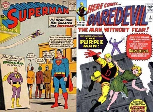
"I grew up around comics and remember Superman #163 vividly. The cover just got my attention. The coloring was particularly effective. I remember trying to copy the graphics (a favorite pastime) of that and many other comic covers. At that time comics were everywhere, in every candy store or barbershop. But it was Daredevil #4 that really made the difference for me. There was this energy about it and the strong cover graphics were completely unique at the time. I don't believe I had ever seen WHITE used as a background color choice and that was unusual.
Daredevil © Marvel Characters, Inc.
" I was a kid, but most teachers recognized my artistic potential and that would lead to a more focused path. I joined DC in 1986 and really just went to work. It was all a blur from the moment I walked into the Production Department: think fast, work fast and deliver quality. It put me in demand from editorial and would often confuse where it was I was best suited. Todd Klein, the lead production artist, looked at me one day and said just as he was leaving to go freelance, "I knew I could go the minute you arrived." I felt the weight of the world on my shoulders at that point. To make matters worse I was constantly bugging editors to look at my art and help me to eventually get it in print."
As I've told Steve, I still feel bad about laying that burden on him!
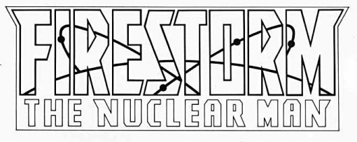 The first DC logo assignment Steve was given was this one, in 1987. Steve remembers:
"Firestorm was a very interesting character and I knew I could come up with something stronger than the font that was being used at the time. Richard Bruning, Art Director, focused me by saying, "Remember, the character in essence is a modern concept". That was the key and made the execution very easy. What made it work for me was the overlay with the nuclear symbolism in the letters. This would end up being a trademark of my logo work as I strived to get the characters' symbol in the letter shapes."
What Steve is talking about is that the symbolic atom art inside the main letters is done on a separate overlay so it could be held in a color, a technique we'll be seeing in some of his other logos. I like this design. The large open letters are easy to read even with the atom art in black, as shown here. In style they're block letters with strong angled stroke ends and extra points at each upper corner. No curves anywhere, which makes the contrast of the atom art, which is all curves, more effective. The second line is also block letters, but to my eye it's not as effective because the stroke widths are not consistent. For instance compare the wide angular strokes on the Ns and very wide angular strokes on the M with the much narrower ones on the rest. It still reads fine, and all ties together well. The surrounding box gives the logo a second or third color option, making it more likely to read well on a cover. The atom art, by running through the open letters, adds a surprising amount of depth to the logo, which would otherwise be completely flat, an excellent design choice.

And here's the logo's first appearance on issue 65 of the title, looking good even with the atom art still in black.

Here's another cover with the atom art in white and without the surrounding box. Still works well for me.
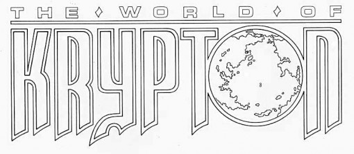
Also in 1987 Steve designed this logo for a four-part mini-series explaining Superman's homeworld as revamped by John Byrne. The letterforms of the word KRYPTON are based on the interior title lettering by John Workman, seen here from issue 1:
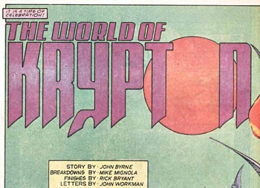
Workman's title is effective, with that very unusual Y giving the word an appropriately alien look. Steve has added inner shapes for all the letters, with some adjustments for better readability, including making the O smaller and less overlapped. And, of course, he's put a map of the imaginary world in the O as well, continuing his theme of art inside open letters. The top line uses DC headline type in a font similar to Eurostyle, I believe from an optical typesetting machine, spread out to fill the width of the logo nicely. While John's idea was original, Steve's development of it makes it a better logo design.

Here it is on the first cover, showing how the double outline worked to allow a second color. This miniseries was followed by two more in a similar theme, and Steve's logos were seen on those as well. I'll cover them next.
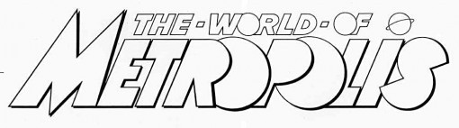 This logo, which is all Steve's design, is very Art Deco in style, which seems appropriate for the subject to me, as it looks back to Superman's origins in the 1930s while still appearing stylish today, as Art Deco has remained in the design arsenal of comics and other media. The letterforms are mostly simple geometric shapes with the centers missing from the rounded parts, and overlapped to add a feeling of depth and also make the word shorter in width, a clever idea. The Daily Planet globe is positioned as both a symbol to fill out the top line and as a dot over the I in METROPOLIS. I like this logo a lot, though there is one small thing that bothers me: the lower corner of the S overlapping the I. All the other overlaps are left over right, that one should have been as well. In all, a fine design, and it's interesting to see how much some of the letters can be overlapped and still read well. The shape of the S and the missing openings carries the design into almost abstract territory, and is a delight to see.

Here it is on the first cover, looking quite nice, though spoiled a little by that ugly type box right below it.
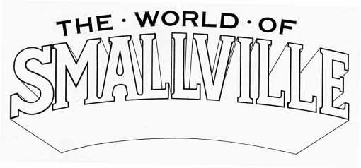
The third miniseries had this title. This is again all Steve's design, using a letter style with serifs for SMALLVILLE. The serifs are somewhat inconsistent: wider on the S than elsewhere, for instance, but in general they follow the style of many serif fonts, with the exception of the A, where the center stroke is rounded. Not sure why Steve chose that, but it works fine. The entire logo is curved, with SMALLVILLE having a deep telescoped drop-shadow,where all the connecting strokes have been left out below the letters to create a large open space, a technique often used by Gaspar Saladino in his logos. THE WORLD OF is in set type in the font Copperplate, which is very wide and has tiny serifs, both tying into the lower word and contrasting it. The solid letters of the top line also contrast with the open letters of SMALLVILLE. By itself, this would be a competent but unexciting logo, but there's more:
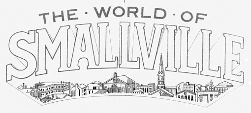
On an overlay Steve has drawn some buildings representing downtown Smallville, making great use of the open space in the drop-shadow. I particularly like the way the church steeple extends up into the space between the V and I. This addition makes the logo really work to say something unique about the subject, a fine job.

Here it is on the cover of the second issue, looking good. The contrary perspectives of the buildings and the dropshadow make it seem like a window into another scene has been opened, an inviting idea that I love.
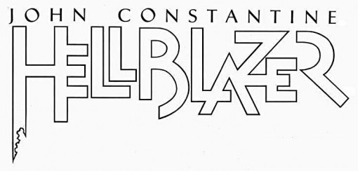
In addition to designing logos himself, Steve was also sometimes asked to do final pen and ink renderings of logo designs by others. That was the case with the original HELLBLAZER logo designed by Dave McKean, above. Steve did this outlined version of the main word, while the the top line is set type in the font Trajan.

Here it is on the first issue's cover, looking quite good over the painted McKean art, though I can't say I like the color choice.
More Bové logos in Part 2. You can find lots more logo studies on the LOGO LINKS page of this blog, too.


January 2, 2012
And Then I Read: BATMAN ODYSSEY 1 & 2

Images © DC Comics, Inc.
I'd been wondering what happened to this 13-issue series by Neal Adams. It disappeared for a few months, and is now continuing with issues 7-13 restarting at number 1. I've completely given up trying to make sense of the overall storyline on this one. I still find the art amazing in places, and pretty nice overall, though some of the exaggerated facial expressions I don't care for as much. Batman riding dinosaurs and giant bats, teamed up with a caveman version of himself and a dinosauroid verison of Robin in a prehistoric underground world? Frankly it sounds like a BATMAN comic from the late 1950s, when the storylines got really strange. Neal's dialogue is generally entertaining, and if you skip over the "plot development" sections and just go with the flow, this is pretty fun.

Cool stuff! Neal Adams art remains so, full of energy, realistic details, and great layouts. Even his talking head pages, like the first few in issue 1 are full of dynamic energy that makes you want to look at the art carefully.
Recommended for the art, mildly so for the writing.
January 1, 2012
First Night music in Ocean City
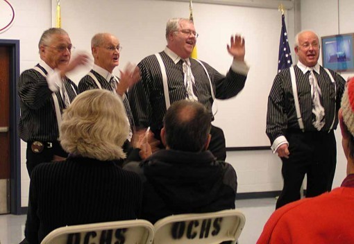
Yesterday evening Ellen and I enjoyed a variety of live music in Ocean City at their First Night celebration. We arrived in town about 4:30 PM and began with a pretty good dinner at the High School Cafeteria. Then we caught the Barbershop Quartets show also in the High School. There were two quartets, above is Sea Chord. Both groups were good, singing not only traditional Barbershop songs like Rosie, but also newer material from the fifties, sixties and seventies in pretty good arrangements.
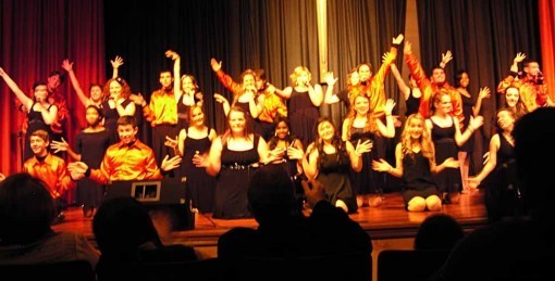
Next we walked a few blocks to the Tabernacle church where the Harmony Show Choir put on a fine show. This was "Glee" with real high-school age kids. There were some shaky moments, a few performers were visibly nervous, but on the whole the group was quite good, and a few of the soloists were excellent and seemed ready for the big time. All the numbers included some dancing, and that was often quite good as well. The repertoire was mostly from the 1960s and 70s, with a few broadway numbers. One favorite of ours was a charming arrangement of "Feelin' Groovy" by Simon and Garfunkel, where the word "groovy," perhaps considered too corny for today, was omitted until the very last word. It worked.
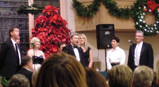
Another short walk to St. Peter's church brought us to "Broadway by Request," where the audience were given numbered tickets and a program with a list of about 100 Broadway songs from about 50 different shows. The performers drew numbers, and the audience member with the matching ticket got to choose the song. A nice idea, but each singer was assigned certain songs, and in this performance, one guy was chosen about six times while others not at all. The singing was great, the piano accompaniment was also excellent.
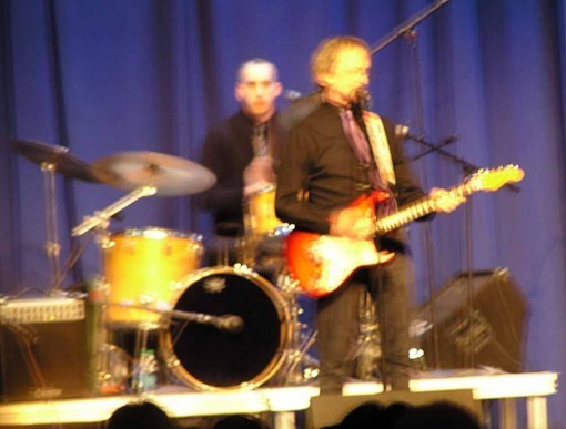
Next we took a longer walk to the Music Pier on the boardwalk to hear "Peter Tork and Shoe Suede Blues." This was a crowded venue, and we were pretty far back, so my pictures were blurrier than usual, but Ellen and I both thought we would not have recognized Peter from his "Monkees" days anyway. As a blues band, the four were pretty good. Peter and another guitarist switched off playing lead and rhythm, and there was a drummer and bassist. They did some fifties and sixties pop songs, as well as more traditional blues like "Wild About My Lovin'." Peter was mildly entertaining as a speaker between numbers, and no doubt to satisfy his audience, they did two Monkees songs, "I'm a Believer," and "Daydream Believer," and Tork played keyboard on both of those.
That show ended around 10 PM, and we oldsters decided it was time to go home, and we were asleep before midnight. More acts we might have caught included Jim Albertson storytelling, Doo Wop, a Gospel Choir, Carl Howell folk music, a String Band, several magic shows, Zydeco, songs from "Annie", "Trout Fishing in America," rock bands, and the Ocean City Pops Orchestra, among others. And fireworks at midnight. Pretty good event, it was our first time there, but I'd certainly go again.
December 31, 2011
More Website Updates

This morning I finished updating the LETTERING ARCHIVES on my website. The page linked leads to lots more pages detailing all my work in comics from the beginning (1977) through the end of 2011, in these categories: Inside Pages, Covers, Logos and Other Stuff. It makes me tired looking through it, but if you have any interest in what I've done, there it is if you want it. There are probably other pages on my site that could use some updating, but that's all I have time to do now.
Also, it's a small thing (literally), but all my website pages now have the letter K "favicon" (short for favorite icon) embedded in them. This means that, when you view one of my pages in most browsers, the K will appear at the beginning of the page address, and in some browsers, like Firefox, it will also appear if you save one of my pages in your Bookmarks Bar. My blog, on the other hand, has the matching T favicon, which will do the same thing.
I'm not a code guy, so it's with some probably unearned pride that I managed to figure out how to do this, with help from info found online, and in the case of the blog, help from the creator of my blog template. It wasn't easy. One roadblock turned out to be some code which had "curly" quotes rather than straight ones. Who knew code was so particular?
Now, when I use Firefox, which is most days, I have my blog and website favicons in the bookmarks bar of my browser to remind me of this small triumph that I spent way too much time on.
December 30, 2011
Poker Break at The Borgata
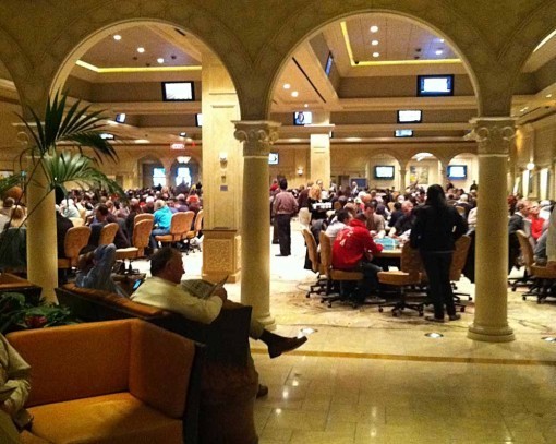
Once again it's been too long since I had time to play poker in Atlantic City, but I managed to get there today. (It helps that DC Comics is closed all week!) I sat down at a $1-2 No Limit Hold-em table at about 10:30 AM and played for about 1.5 hours, winning a few small and medium sized pots, but also losing a few. No big, dramatic hands. At noon I broke for lunch a few dollars ahead.
After lunch I sat down at another table and played for two more hours. This time I was getting better cards and in bigger hands. My $200 stack of chips went up and down in larger bites. Early on I was dealt 4-6 in the big blind, and no one raised, so I was in the hand with about five people. The flop came 6-6-6, giving me quad sixes! This was a potential Bad Beat Jackpot winner, if my sixes were beat by a better hand, so that got my attention! I checked the first round, and a player to my left bet $10. Everyone else dropped out, I called, and it was just the two of us. Next round I bet $20 and she called. Things were looking promising, at least she had a playable hand. Another round of $20 bets (didn't think a big raise would have been called), and I won against her full house. No Bad Beat payoff.
At one point I was up about $5o and found a pair of Aces in my hand. I got into a bidding war with another player, but the cards on the table didn't look promising for me. I had a flush draw, but otherwise just my Aces. When he went all-in for $135 I couldn't call, and that brought my stack down considerably.
I had decided to leave at 2:30, and it was 2:15. I'd only have a few more hands to play, and my stack was down to $100, meaning I was behind $100. I was dealt Ace-Jack, which seemed promising, and the flop turned up another Jack and two low cards. Another player bet $20. I decided it was time for a big move: either double up or go home broke. I went all in. He called. I figured I had about a 50-50 chance of winning with my pair of Jacks, putting him on a possible two pair or even trips (three of a kind). Luckily for me, another Jack came out on the River, giving me trip Jacks, and a big win.
The very next hand I was dealt Ace-King. The flop brought out another King, giving me a pair. I bet strong, and took that pot, too. At 2:30 I left the table ahead $70. A nice payoff for a fun few hours of poker. Wish I could play more often.
Website Update
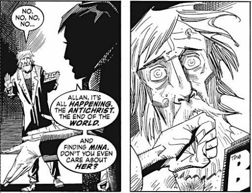
Image © Alan Moore and Kevin O'Neill
I've just updated my CURRENT PROJECTS page for the first time in about six months. Next I'm working on updating my Lettering Archives pages, which have been languishing untouched since the end of 2009. So hard to find time for this stuff…
December 29, 2011
And Then I Read: WONDER WOMAN 3

Images © DC Comics, Inc.
This issue had a real surprise for me, a major change to Wonder Woman's origin. I won't say too much about it to avoid spoiling it if you haven't read it yet, but it's a bold move that could well change a lot of things for the character if it's kept to.
The story takes place on Paradise Island among the Amazons, but the atmosphere is much different from past versions. The women of the island seem much harsher, more like soldiers, and there's nary a smile to be seen anywhere. Of course, the battle in issue 2 is mostly to blame for that, and many of the Amazons blame Diana for bringing her troubles to their shore. The presence of the goddess Strife does nothing but encourage the very thing she's named for, and the somewhat alien-looking Hermes of this revamp isn't able to do much to help.

The art by Cliff Chiang continues to be very appealing. His characters all seem quite young, and I like that look for the series. In addition, his somewhat stylized approach works well for me — it moves the art toward an animation style a little, but not too much.
Highly recommended!
December 28, 2011
And Then I Read: DARK HORSE PRESENTS 2 & 3

Images © Dark Horse Comics and the respective copyright holders.
At 80 pages and 104 pages for these issues, DHP is THE major anthology book in comics right now. What makes them even more fun to read are appearances by long-time Dark Horse (and other) characters that haven't been published in a while.
Issue 2 wraps ups a "Concrete" story full of humanity and charm. I'd but the book just for this if it were in every month. If only Paul Chadwick could put them out that fast…

A new series, "Number 13″ by Robert Love and David Walker runs in both issues, a post-apocalypse story with oddly morphed characters (by radiation, one would think), one of which seems to be a cyborg of some kind who doesn't seem to know much about himself. He comes to the rescue of a young girl, and things develop from there. Worth reading.
Neal Adams' "Blood" leaves mine cold, I'm afraid. Yes, the art is cool in places, but there's lots of violence and gore, not my thing. And I'm not finding the story easy to follow or particularly well written.
The "Finder" serial by Carla Speed McNeil in both issues is another futuristic tale about a package/message delivery guy who seems to need the skills of an acrobat and the mind of an escape artist just to do his job. Like it.
"Marked Man" by Howard Chaykin is okay, but as he often does, Chaykin chooses a rather unlikeable anti-hero as his main character, and sets his story in a sordid underworld of con-men, so while some of the storyline is entertaining for its sarcastic humor and earthy wisdom, it's hard to like any of the characters.
Michael T. Gilbert's "Mister Monster" serial continues in these issues. It's fun and funny, though visually very frenetic, and I found it somewhat tiring to read. The jokes are pretty broad, and the characters cardboardish, but this is still fun. Best taken in small doses, though.
"Rotten Apple" by Chuck Brown and Sanford Greene is a new serial with some attractive art that reminded me of Sean Murphy, but I found the story a little hard to follow. Mercenaries of two camps trying to find a treasure in the desert is the starting point, after that it confused me.
"Snow Angel" by David Chelsea is light-hearted fun, the sort of thing that should appeal to kids, even younger than those likely to see this anthology. I enjoyed it.
"The Wraith," a one-shot in issue 2 is also kid-friendly, looking much like an animated TV show. Not a lot of story to it.
"Murky World" by Richard Corben is typically weird and mind-bending, and while I couldn't follow the story that well, I loved it all the same. These chapters seem like bits of a larger story, and they may well be. Another treasure in the desert, but a quite different one.
"The Treatment" by Dave Gibbons is the cover feature in #3, and lead story there. It's a special forces cop story in a futuristic setting, and while it's visually effective, not really my kind of thing. But certainly well written and drawn.
Issue 3 also has an interview with Jim Steranko and an excerpt from his remastered "Red Tide," originally published in 1976. I missed it then, and I'm impressed with this excerpt. The art is excellent, two large panels per page in a painted style, very film noir with wonderful lighting effects. The text runs below in standard type. While it's great, I don't really feel it's quite comics. More of an illustrated novel in my opinion.
Lots of fine work here, no real klunkers. Recommended!
December 27, 2011
Tigger & Leo's other new toy

Ellen found and ordered it online. It's called "Fling-ama-String." Above the top part shown here is a hook you put over a doorknob. At the bottom is an elastic band that goes under the door and up around the inside knob. These hold the device in place on the door. After adding batteries, you turn it on, and a long white belt rotates along the length of the toy. There's a stretchy nylon string attached to the belt, and as the string travels over the top, it gets flung out onto the floor to attract the cats, but then is quickly drawn back inside as the belt turns, until it comes out the top again.
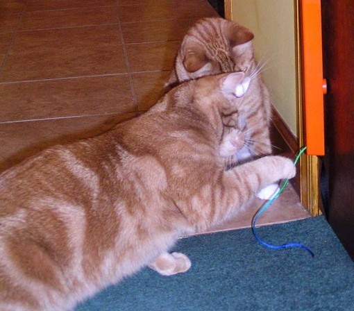
So far we've run it twice, about 15 minutes each time. You have to watch while they play, in case of accidents, but it seems pretty sturdy and they haven't destroyed it yet! The paw pounce is something Leo keeps trying…
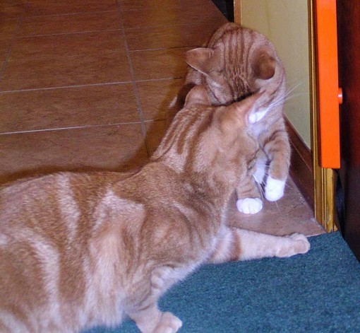
…but that doesn't work often, as it's gone pretty quick! (Occasionally he snags the string with a claw and stops it for a few seconds. When pulled, the little motor just waits for the tension to be released.)
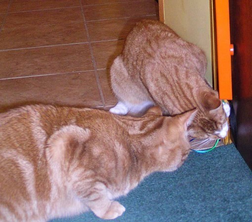
Tigger had better luck grabbing the string with his mouth, but then wanted to hold it with his paw, and that didn't work, it just disappeared again.
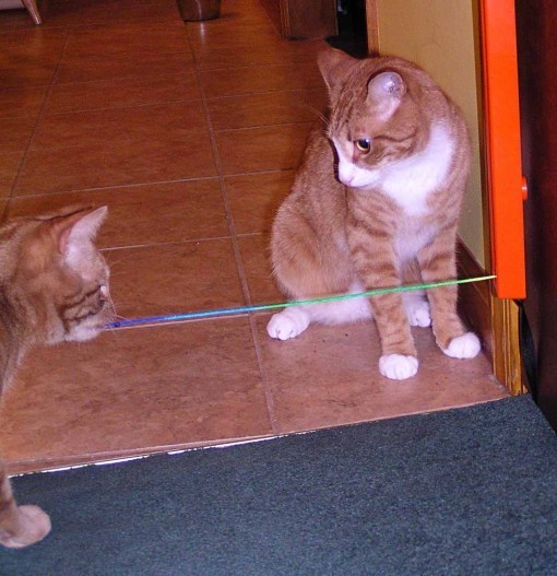
Leo tried that, and got a good grip with his teeth and PULLED the string almost all the way out! But then didn't know what to do with it, and let it go. This technique, if continued, could possibly wreck the toy, so we'll see how things go. I have to say, it certainly keeps their interest better than most toys.
Below is an Amazon link, if you're interested.
Christmas visits
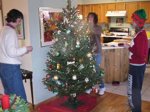
We're home from our holiday visits, first to Ellen's sister Ann's house, where the elves: Ellen, Ann and Cristina decorated the tree. We spent Christmas eve and morning there.
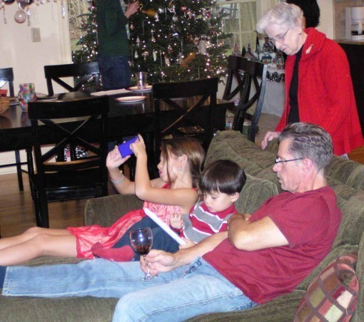
Christmas afternoon we went to my brother Doug's for more gifts and a big party and dinner. Here's Doug taking a rare break from cooking to enjoy a few moments with daughter Haley and son Dylan, with my mom looking on.
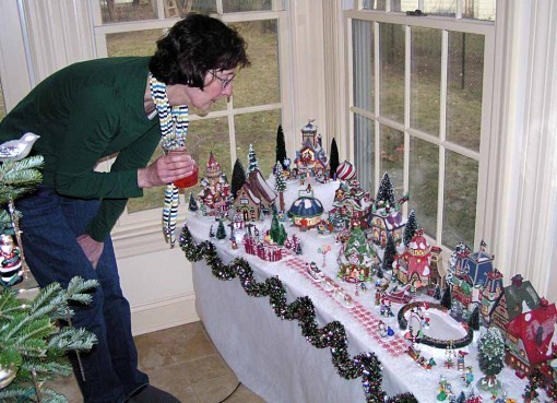
Ellen admires part of the large Christmas village display Doug puts up every year, this is about a third of it, with a large Christmas tree in the center, just visible on the left.
Now we're home, and getting back to work! I'll have another cat blog this evening, then back to regular blogging.
Todd Klein's Blog

- Todd Klein's profile
- 28 followers

