
Todd Klein's Blog, page 320
January 26, 2012
Visiting DC Comics in the 1960s Part 1
Note: all images below © DC Comics, Inc. except as noted.
When you were a kid reading comics, did you ever wonder about who made them? Did you ever want to visit the place they were made? It sounds like a great idea to me, but sadly it never occurred to me then. What can I say, I was a dumb kid sometimes. What makes it more frustrating is that I would have had an excellent chance in the 1960s of visiting what were then the offices of DC Comics at 575 Lexington Avenue, as seen at A in the above map. Our family had two maiden aunts who lived together in an old rent-controlled apartment near the corner of 53rd street and Second Avenue in Manhattan, at B on the map, a mere five minute walk away! If only I'd known that the company would give tours to kids who wrote or called or even just showed up there, though they usually only did so on Thursday afternoons. I loved comics as a kid, and on our regular visits to see our aunts in Manhattan I always took that opportunity to beg my parents for some of the many dazzling comics displayed on every corner newsstand, unlike at our rural New Jersey home, where I had no nearby place to find them. Sometimes I and my brothers, or just me alone, were allowed to stay with the aunts on our own for a few days, as they loved kids. Would it have been easy to get them to take me to visit the comics company? You bet.
Recently I saw a post on Facebook by writer Pat McGreal where he mentioned he'd been one of the lucky kids to make such a visit, and I knew several other people in comics who had also been visitors there regularly, so I thought I'd get as much info on this subject as I could and blog about it. Here's Part 1.

Photo © Alan Kupperberg.
The stepped skyscraper with glass facade in the center of this photo is 575 Lex as it looks today. (And while a lot of folks have provided information for these articles, I have to give a special shout-out of thanks for Alan Kupperberg, who has given me the most help!) It was built in 1958, and originally called the Grolier Building. Alan says "it was clad in gold-colored sheathing." I haven't been able to find a picture of that. The current look comes from a major renovation in 1990, and it's now called the SkyGrid Building.
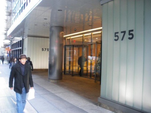
Photo © Alan Kupperberg.
Here's the entrance today, probably not too different from the earlier look except for the color. I'm not sure when National Periodical Publications (as DC Comics was then known) moved to this site, but I'm guessing not too long after it opened. They were certainly there by 1960. As the decade opened, NPP (as I'll call it here) had been a relatively stable family-owned business for about 25 years. Heading the company were Irwin Donenfeld (son of previous publisher Harry Donenfeld) and his partner Jack Liebowitz. While times had been tough for a while during the 1950s, super-heroes were making a comeback thanks largely to the Silver Age revival spearheaded by editor Julius Schwartz in books like THE FLASH, GREEN LANTERN and THE JUSTICE LEAGUE OF AMERICA, though the books of Superman editor Mort Weisinger and Batman editor Jack Schiff were also quite successful.

Here's a layout of the tenth floor where the NPP offices were, from a sketch by Alan Kupperberg (we'll see his complete sketch later). In addition to the editors mentioned above, Phyllis Reed was editing the romance comics, Robert Kanigher was editing the war comics as well as WONDER WOMAN. Larry Nadle was editing the humor line, including licensed books like THE ADVENTURES OF BOB HOPE, and Murray Boltinoff and George Kashdan were assistant editors under Schiff and Weisinger, and perhaps others. The Production Room was run by Sol Harrison with his assistant Jack Adler, both having started in the printing end of comics in the late 1930s Both were colorists. Production artists Joe Letterese and Morris Waldinger were here, as was Ira Schnapp, the company's staff logo designer and cover lettering man. All three of those men were letterers. Running the darkroom was Walter Herlitschek. Also on staff, I believe, was Gerda Gattel, proofreader and in charge of the library, where back issues were kept in bound volumes, and Milt Snappin, in charge of the film negative library. Milt was also a letterer. Then, as when I worked there, staffers often supplemented their income with some sort of freelance work on the side. The bosses, Liebowitz and Donenfeld, may well have been on a different floor.
Beginning in 1961, four friends and comics fans from Boston visited the NPP offices several times. I'm not sure if the regular Friday tours had begun at that time, but if so, they weren't part of it. Rick Norwood was nineteen that year, a freshman at MIT, so he and his friends Al Kuhfeld (now Ellen Kuhfeld), Durk Pearson and Bill Osten were older than the kids the company considered their main audience, but Norwood had had a number of letters published in GREEN LANTERN and other DC comics and struck up a friendship with editor Julius Schwartz. Norwood asked if the four could visit him, and Julie agreed. They rode a train down to New York for their visits. From their reports it sounds like they spent most of their visiting time with the editors.
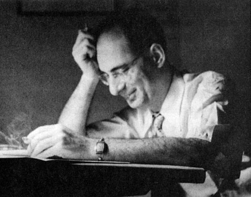
Photo of Julius Schwartz probably by Jack Adler, from "Man of Two Worlds" by Schwartz
Of Schwartz, Norwood remembers: "He was infinitely gracious, and made me feel welcome. He even pulled out a number of unpublished Golden Age pages and allowed me to take Polaroid snapshots of them. And he gave me permission to publish my own Doctor Midnight story in my fanzine, since he had no idea of ever reviving that old character. Schwartz gave me several scripts, by John Broome and Gardner Fox, and I saw that Schwartz had done extensive rewrites on them."
Ellen Kuhfeld says: "Julie Schwartz — what a sweetheart! I don't remember much specific about the visit (except for some Murphy Anderson artwork) but it was both comfortable and enjoyable. Since we both traveled in fannish circles, Julie and I would meet now and then across the years. And we always remembered one another."
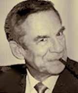
Photo of Robert Kanigher probably by Jack Adler
Norwood recalls: "Robert Kanigher liked to argue. When I ventured to criticize, mildly I thought, a Wonder Woman script he had written, he lit into me. What did I know about writing! How dare I criticize a professional like himself!"
 Kuhfeld adds: "One shock came in Robert Kanigher's office when he showed us pencils for an early METAL MEN. They were staggeringly beautiful. After years of Andru and Esposito artwork, I didn't have a very high opinion of the two. Seeing Ross Andru's pencils convinced me that he was an artist, and Esposito was positively ruining his art. As for Kanigher, he and I never hit it off that well."
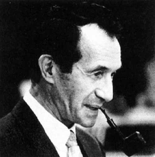
Photo of Jack Schiff by Jack Adler.
Norwood says: "Jack Schiff was too nice. He knew more mathematics than I did as a Freshman math major at MIT. But when one of his artists brought in pages, dropped them on his desk, and walked out, Schiff read over the pages and said they weren't drawn the way the script said they should be drawn. Instead of calling the artist back to redo the work, Schiff started working on an extensive rewrite to make the story match the art. None of the other editors would have stood for that kind of sloppy artwork for a minute."
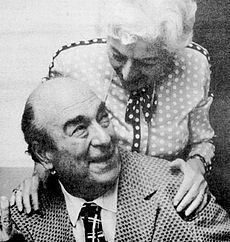
Photo of Mort Weisinger and Gerta Gattel probably by Jack Adler.
Kuhfeld says: "And then there was Mort Weisinger. Definitely a larger-than-life character, but not one I'd loan money to, nor bring home to meet the folks. Even so, he had the highest percentage of readable comics at DC, to my youthful mind. Even today I'd rather read an issue of SUPERMAN'S GIRLFRIEND LOIS LANE than an issue of BATMAN back during those days when Zebra Batman and Rainbow Batman walked the Earth, and Buzzsaw Batman careened dangerously above it.

"Now, this was maybe a year after the Great DC Contest (where readers were challenged to find as many errors as possible in a story full of them). I took fifth place. I mentioned that to Mort, and said I'd not seen my prize. 'Oh, that!' Mort said. He got up and rummaged about, and found some original art. 'Here!' And he handed over the first prize original art. Which leads me to suspect winners 1-4 didn't get their prizes either. I mean, okay, it was only comic-book stuff — but it was comic stuff promised to comic fans by a comics editor. I felt uneasy taking it, but had some claim to it; and none of the winners would likely have gotten any of the prizes if I hadn't. I think that takes care of the 'loaning him money' part.
"Then, on the way down in the elevator, Mort told us he had an interesting story in a forthcoming LOIS LANE. 'Lois is trying all kinds of crazy schemes to feel Superman's balls. She wants to see if they match Clark Kent's.' That's a quasi-quote — the only part I swear to is the 'feel Superman's balls' in regard to Lois' schemes. That takes care of having him meet the family."
Norwood says: "Mort Weisinger was nice — to me — and introduced me to Jerry Siegel. But on a later visit I saw him being almost unimaginably verbally cruel to E. Nelson Bridwell, who was working at DC at the time."
Todd here adding that, while I never met Weisinger, I've heard stories about him, and every one indicated he was often a horrible person. These seem to confirm that.
Most of the artists working for the company have always been freelancers, aside from those who worked in the Production Department doing art corrections and putting together things like letter columns and covers. Regular company artists would often come to the offices and do some of their work there, either to finish up, make changes, or just for the opportunity to spend time with the staff. They would sit at an empty desk or drawing board wherever there was one available, often in the Production Department, but sometimes in the offices along the hall.

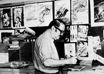
Gil Kane photo by Jack Adler.
Rick Norwood remembers: "I saw Bob Kane at a drawing board drawing a Batman page, refuting the story that he 'never' drew Batman after the early issues. Carmine Infantino was also very nice to this callow young fan. And I watched Gil Kane drawing a Green Lantern page."

Kuhfeld says: "Somebody was sitting at a desk talking on the phone while casually using a large, extra-long-hair, calligraphy brush to ink one of the the magenta separations for an issue of ACTION COMICS. Back then I did occasional editorial cartoons, but I've never been able to use a brush that long, or that casually. I was more the crow quill type."
This sounds to me like a staffer, and when I asked, Ellen remembered his name was rather short and began with an A. I think it was Jack Adler, above, who did a lot of the cover coloring, and sometimes the actual color separations. Ellen said he was filling in the left side of the A in ACTION COMICS with black ink. That sounds like color separations work all right, so they must have been doing some or all of the covers in-house, though the interior seps were done elsewhere, I believe.
Thanks to Anthony Tollin for putting me in touch with Ellen Kuhfeld, and Ellen for putting me in touch with Rick Norwood. Thanks to both for these great memories and stories. I'll continue next time with a visit to the offices in 1964. You can find more posts you might enjoy on the new COMICS CREATION page of my blog.


January 23, 2012
Lettering Sampler print HAND COLORED available

Image © Todd Klein, all rights reserved.
I've recently colored nine copies of my black and white print from 1993 (had ten but ruined one), so they are once more available on the BUY STUFF page of my website. (Scroll down to see it.) My price is $32 plus shipping. It's been unavailable for over a year, and there's no telling how long they'll last, so act soon if you want one.
January 21, 2012
Rereading: EMAN, THE EARLY YEARS

© Joe Staton and First Comics, Inc.
As should be clear from the cover, I bought this from the creators at last year's San Diego Comicon. When E-MAN first appeared from Charlton Comics in 1973 I absolutely loved it. I found it fresh, funny, charming, and intelligent. Also very hard to find in my part of central New Jersey! Despite driving around to several towns to look, I missed several issues of the original 10-issue run and it took me a few years to find them all. Then too, Charlton's printing quality was the worst in the business, so even though I enjoyed these and other books they put out at the time, it wasn't too hard a decision to sell those badly-printed issues later. When the title came to First Comics originally, they reprinted the issues and I enjoyed them again. First continued with new material which I also read, but didn't enjoy quite as much as the Charlton run. Now First Comics is attempting a comeback led by Ken F. Levin, and this is, so far, the only book they've put out. I was happy to get it, though, as it reproduces those Charlton books on good quality glossy paper with reconstructed coloring, and adds a few things I didn't see from CHARLTON BULLSEYE. I've finally read it, and found the stories just as good as I remembered.

Writer Nicola Cuti, who I got to know well when he worked at DC Comics, is clearly having a great deal of fun with the whole superhero idea in these stories. Nick was always good at coming up with cool ideas, and they're tons of them here. To begin with, a hero who is made of pure energy but can take any sort of material shape, is a venue for all kinds of fun, from the sort of humor that Plastic Man embodied to sophisticated science fictional ideas. His girlfriend, Nova Kane is another great character: a college student putting her way through school as a stripper. Though the art and stories stayed pretty mild, artist Joe Staton showed that he could do sexy and funny as well as great action and nice character moments. I don't think Joe's work has ever had a better showcase, and Joe must think so too, as he keeps coming back to the feature and bought the rights to it as well.
Not every issue here is a gem, but there are plenty of fine moments to enjoy. Highly recommended! Not sure where you can get this, but try your local comics shop.
January 20, 2012
And Then I Read: THE DC COMICS ART OF BRIAN BOLLAND

Images © DC Comics, Inc.
Like the deluxe oversized book of Adam Hughes DC cover art, which this resembles, this is an excellent collection of great art, and also entertaining commentary by the artist. Brian Bolland has been creating highly realistic and detailed linework art since the mid 1970s, and it's appeared on hundreds of DC Comics covers since 1979. Bolland has also drawn one famous (or infamous) graphic novel, THE KILLING JOKE written by Alan Moore, and the twelve-issue series CAMELOT 3000 for DC, but after those early efforts he's primarily been a cover artist for the company. Since this is an art book first, I thought it would take me a fairly short time to look through it and remember and enjoy Brian's work, but I found his commentary so much fun to read that I spent quite a few hours perusing it. The format is generally: one full-page image on each right-hand page, smaller images, sketches, and commentary on the facing page. One might wish that every single image could be a full page, but I think that would have made a duller book, and I approve of the format.

The commentary is rather small type, leaving maximum room for the art used, but I didn't mind that. Brian's insights into his own work, his relationship with DC and their editors, the comics business and those in it, his understanding of what makes a good cover, and many other stories and anecdotes are quite a delight.
Two small Bolland stories of my own. I met him when he came to the DC offices during the time he was working on CAMELOT 3000, and told him how much I loved his work. I occasionally bought original comics art from DC artists in those days, and I asked Brian if he would sell me one of the CAMELOT covers. He seemed very suspicious of the idea, as if I was trying to con him somehow, and said he'd think about it, but never did agree to sell me one. In reading this book I learned that Brian was unhappy about having to use an inker on the book, and the covers were the only thing he'd inked himself, so I can understand better now how he wanted to keep them. Other DC artists like Dave Gibbons later told me Brian was rather suspicious by nature, perhaps with good reason, I don't know.
Brian also tells the story of the backwards N in his signature. It was originally an act of protest for having to use someone else's cover design layout on the first two issues of CAMELOT 3000. After that he decided he liked it and kept it for everything. While it's much looser now, back then Brian's signature was extremely even and type-like, looking very much as if he'd done it with actual rub-down type such as Letraset used to make then. When we talked about his covers, I offered to save him a little time on the one he was just working on then and put his signature down in actual type for him. Again, Brian looked at me with suspicion, as if this were some kind of trick. He didn't accept my offer. Later I realized he'd reversed the N on the signature, and I always assumed it was to let people know it was done by hand. Now I finally know the whole story.
Very highly recommended!
January 19, 2012
Incoming: ABSOLUTE PROMETHEA BOOK 3

Image © America's Best Comics/DC Comics, Inc.
Just arrived here yesterday, though I think it's been out in the shops for a few weeks. As with previous books, and all the DC Absolutes, it's superbly printed on thick, glossy paper, much larger than the original versions. New things are the covers, the slipcase cover, and quite a lot of additional material including an Alan Moore script and all the Promethea appearances in other ABC books. The issue 32 poster is here in a size that folds twice to fit into the book, so much larger than the one in the previous hardcover but still a lot smaller than the original poster version, which was huge. This one is large enough to actually read if you have the patience and good eyesight, though I wouldn't recommend it. In all this entire three volume set is a wonderful thing and does the material proud.
January 18, 2012
Creating IT IS Part 2
Images © Dave Gibbons and Todd Klein, all rights reserved.
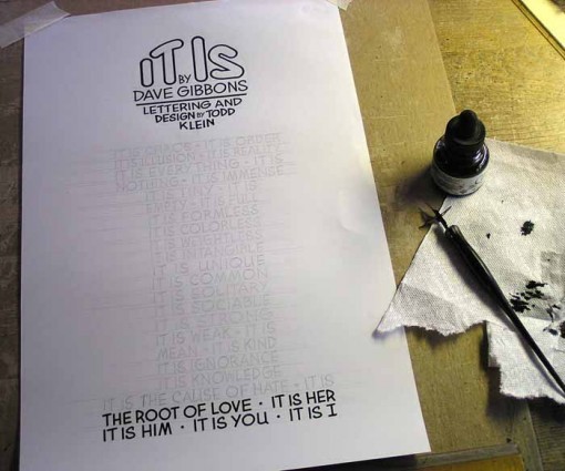
Once I had the print layout finalized it was time to redo the text by hand, using the layout (where the text was in one of my lettering fonts) as a guide. I made an enlarged printout of the text area and on a light box traced over the layout on a new piece of 11 by 17-inch one-ply Strathmore drawing paper with a plate or smooth finish. Since the lettering does not take up the entire print area, I was actually able to work a little larger than printed size this time, usually a good thing, and since the letters were relatively large it didn't take as much effort to produce them as in some previous prints. Above you can just make out the pencilled letters with horizontal guidelines to keep the lines level, and the top circle and bottom two lines have been done.

For everything except the title and the small words "BY" I used a dip pen with a Speedball FB 5 point. The FB series was discontinued many years ago, but I still have a few. Unlike the regular Speedball points, the ink reservoir flips open, as shown above. This makes for much easier cleaning. The mechanism, consisting of two interlocking metal pieces, one above and one below the main point shaft, is somewhat fragile, though, so you have to open and close it carefully. Like the B series, the FB series had round tips, perfect for making rounded letters of even weight.
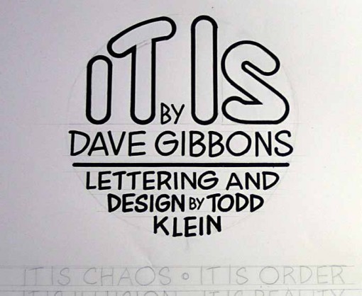
Here's a close look at the top circle. For the open title I used a Faber-Castell TG-1 technical pen size 2, first outlining inside the shape, then the outside, and filling black between. I kept in mind Dave's comments about the title, making it as rounded as possible, and a much better match for the rest of the lettering. A straight edge (actually the side of a small triangle) was used on all the vertical strokes of the main letters, and on the title. There I also used circle templates for the round bits.

When I was done, and had erased the pencil lines, I scanned the lettering at a high resolution, then spent quite a few hours and days cleaning up and improving the scan. Above is a close detail of the original scan, and the same area after cleanup. This is the most time-consuming part of the process.

Here's the entire scan after cleanup. If you compare it to the approved computer layout in the first part of this article, you'll find a few other changes. I went with round bullet dividers between lines rather than the diamond-shaped ones, a better match for the lettering, and in the last two lines I suggested a change of line order that Dave okayed, so that it goes from third person to second person to first person, which I thought read better. One area I improved on the layout is that all the stroke widths on the lettering are now the same, no matter the width of the letters themselves. In the layout they were narrower on narrower letters, and wider on wider ones, an unavoidable side-effect of the process there. This gives a more even look to the lettering overall.
 In Adobe Illustrator I combined this new lettering scan with the existing layout, added the tiny text at the bottom with © and printing info, and once more emailed a copy to Dave for his approval. He loved it, so it was time to print copies! I'd decided to go with pure white card stock for this one, it seemed to work well with the stark, abstract nature of the content. And, for the first time, I decided to do a smaller print run. All my previous prints in this series have been 500 copies, this one would be 250. While the first two prints with Alan Moore and Neil Gaiman had sold out quickly and gone into second (and third for Alan) printings, the rest have not yet sold through the first printing, and I thought I might save some painting time and shipping costs by cutting back on the print run. If they do well, I can always do a second printing.
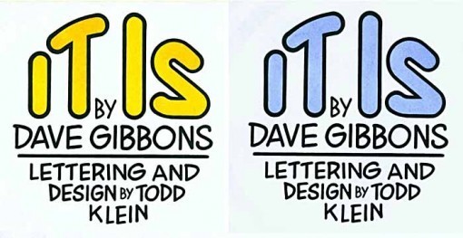
Speaking of painting, I tried several watercolor samples to fill in the open title, and these two were the ones I liked best, a gamboche yellow and an ultramarine wash. Dave preferred the blue, and I agreed it seemed to suit the print best, so I spent about two weeks painting each print. I also signed them, and shipped them to Dave in England to add his signatures. It was now December, and too late to get this print out before Christmas, but that was just as well, as it's such a busy time of year.

They came back safely with Dave's signatures on them, and are now ready for release. Dave and I are both very happy with the finished product, and hope you'll find it worth ordering. You'll find info about that and more about the creation of all my prints on the SIGNED PRINTS page of my blog. We thank you for your interest and support!
January 17, 2012
Creating IT IS Part 1

Images © Dave Gibbons and Todd Klein, all rights reserved.
These days I most often meet up with Dave Gibbons at the San Diego Comicon, and we try to have at least a brief chat to renew our friendship and work partnership of about 30 years. (I've written about that HERE and HERE.) Such was the case in 2010, and it was then that I asked Dave if he'd be willing to do a signed print with me. I've been sending him the prints as they came out, so he was aware of the concept. I said he could be the writer, the artist, or some of each, as he liked. Dave agreed, saying he only wanted to write, which was okay with me. I was busy with earlier prints until March of 2011, when I reminded Dave about this project, and we talked ideas via email. In June he sent me a first draft of the poem he'd written titled "It Is." It was fairly short, a list of contrasting statements, an abstract idea that would be hard to add art to, but I liked it. We discussed it further, and Dave expanded it a bit and rearranged some things, delivering the second and final draft in August. About the design, Dave wrote:
"What I'm thinking is something really simple in design. Basically, a field of lettering that has the negative space of the letter "I" in the center of it. The idea is that "I", as a persistent object, don't really exist; rather "I" am the ever-shifting, dynamic effect of all that is happening in the field of perception. The lettered text could be varied in size, style or color, as appropriate. The challenge would be to write and letter it to fit…"
With those ideas in mind, I did some rough layouts in pencil to see what might work.

Here's the first. I thought a lower-case I would have more visual interest than an upper case one, and pursued that idea throughout. This is just a basic layout around a large i.

Here I wanted to see how the text would look alone, thinking I could make the large i a shape that would run behind the letters. The text was so short, though, that it didn't seem to work.

I went back to the earlier idea, this time trying to give each line of lettering a distinctive style reflecting the meaning. Kind of ran out of steam on this, so I decided to try working it up on the computer in Adobe Illustrator.

My first attempt followed the variety of styles idea, and I got this far and decided it wasn't working. Too much like a font catalogue, and I thought it read as more of a gimmick than a poem. I put the project aside for a while, and when I came back to it I had a new idea.

Since the amount of text was relatively small, why not put it INSIDE the i shape? And in that role, a consistent style would work best rather than a variety of styles. I'd use one of my display lettering fonts, widening or narrowing the width as needed to fill out the shape. For the title, I'd draw something in Illustrator to fill the upper curve of the sphere. Here's my first try a that, which I sent off to Dave for his comments. He liked the idea, but thought the lower shape looked too much like the number 1.

The next version solved that by giving the letter slab serifs on both sides at the top of the vertical stroke. This helped to fit the text in, and also gave the design more symmetry, a win all around. But what to do with all that white space? I asked Dave, but he didn't seem to have any ideas, so I tried a few things, and liked this idea best:

A series of concentric rings radiating from the center and getting gradually darker gray toward the outside. I thought it gave the image some depth and even some apparent movement, as we tend to see that in such patterns.

One other idea I'd suggested to Dave that he'd rejected was to have the sphere also be the iris of a large eye. I couldn't resist giving it a try here, but Dave still didn't like the visual pun.

One last version makes two major changes: moving the center of the radiating circles to the sphere, which seems to work better, and putting a white area behind the lettering to separate it from the circles, for better reading and to give it more of a shape. Dave and I both liked this, but Dave wasn't happy with the title, saying it was too angular. I told him that I planned to do all the lettering by hand using this as my layout, and I'd address that issue then.
More about that in Part 2, and you can read about the creation of all my prints on the SIGNED PRINTS page of my blog.
January 16, 2012
New Signed Print with Dave Gibbons!

Image © Dave Gibbons and Todd Klein, all rights reserved.
I'm pleased to announce the latest signed print in my alphabetical series, in partnership with Dave Gibbons, is now on sale on the BUY STUFF page of my website. Dave has written a poem focusing on the ever-changing nature of our internal perception, that which makes up our own personal "I." I've designed and hand-lettered it.
The print measures 11 by 17 inches and is printed on pure white Wausau cardstock in black, with the title on each hand-painted by me in an ultramarine wash. Each print is individually signed by Dave and myself. My price is $20 plus shipping. The print will be placed in a protective plastic sleeve and mailed in a sturdy mailing tube. Ordering with other prints will decrease the shipping cost.
Dave and I are very happy with this collaboration, and hope you'll find it worth ordering. Note that, for the first time, the print run will be limited to 250 copies, half that of my previous prints, so you might want to order soon to avoid missing out. Dave and I thank you for your support and hope to hear from you!
A detailed description of the creation of the print will appear on this blog in the next two days, as well as on my SIGNED PRINTS page, where you can read about the making of all my prints.
January 15, 2012
Dave Gibbons knows WHAT IT IS!
Details tomorrow!
And Then I Read: THE SKULL OF TRUTH

© Bruce Coville, cover illustration © Gary A. Lippincott.
Bruce Coville has written quite a few novels for children or young adults (hate that term, but that's what the booksellers use), and this is the first one I've read. It's part of a series titled "Magic Shop Books," but each is a stand-alone story, I believe. Looks like they all feature a different child and locale with the stories tied by the magic shop of Mr. Elives, which is full of real magical objects and appears or disappears at the owners' will. In this book, Charlie Eggleston finds his way into the shop and becomes fascinated with a human skull. Almost without being able to help himself, he steals the "Skull of Truth" and brings it home with him. Of course it's magic, and begins to speak to him in his mind, but rather than being scary, it's kind of annoying: lots of bad jokes and scarcastic comments, as well as some interesting stories, but the thing won't shut up.
Complications ensue when Charlie finds out the downside of his act: anyone who speaks to the skull is forced to tell the truth. This does not go well for him at home or at school, and soon the skull is affecting Charlie's entire family with funny results, for the reader if not for him. There's also a dark threat looming, something evil is after the skull, and Charlie might just be in the way. Mr. Elives wants the skull back, too.
This book is an entertaining adventure story with a good dose of humor, and it also has some wise things to say about the moral choices involved in how truthful people are, and what it means to tell the truth. Instructive, but not in a pedantic way, it's all part of the fun. A good read, and I might try more of Coville's books. Recommended.
Todd Klein's Blog

- Todd Klein's profile
- 28 followers

