
Todd Klein's Blog, page 314
April 3, 2012
And Then I Read: GONE TO AMERIKAY
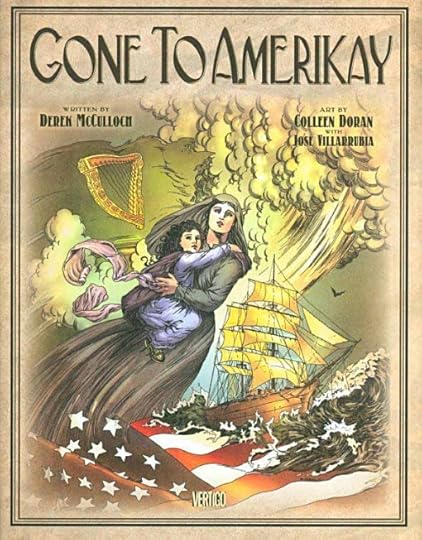
Images © Derek McCulloch and Colleen Doran.
This is a charming and entertaining work of fiction with lots of history in it, focusing on the experience of Irish immigrants coming to New York City. It follows three storylines from three times: the 1870 story of a wife and mother trying to make her way in a harsh city but finding some good friends among fellow immigrants and others, as well as many perils; in 1960 a young man with a guitar arrives dreaming of a career on the stage, and finding little encouragement at first, but eventually a singing partner who helps him in some doors; and in 2010 a rich Irishman comes to the city trying to find out more about some people and music from his own past. As you can imagine, all three storylines eventually entwine and inform each other, but there are plenty of surprises along the way. Crime and criminals, con men and soulful singers, even a few ghosts.
I enjoyed this book, both for its well-told story and wealth of information. My only frustration was with the music. Songs and singing are an important part of the story, and while we have characters singing lyrics, I would love to be able to hear the tunes, or at least see some printed music. Would have made a great postscript.
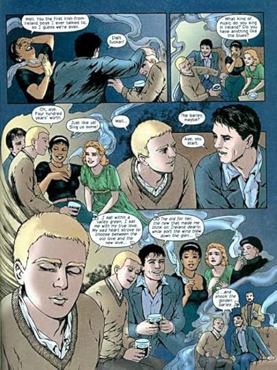
The art by Colleen Doran is equally appealing. Realistic in some ways, but with characters that are still somewhat idealized, which worked fine for me. My only minor caveat is that there isn't much movement in the art, it's like a series of snapshots rather than a film. But the drawing is excellent, and the storytelling works well otherwise. The colors by José Villarrubia are rich and naturalistic, helping to fill out the atmosphere of believability. Well done all around.
Recommended.


April 2, 2012
The past week's "Logos of the Day"…

Image © DC Comics, Inc.
…on my "Todd Klein, artist" page on Facebook include: Lucifer, Bat Lash, DC Comics Presents, Sword of Azrael, Hawk & Dove, Plastic Man, and the one above. Listings include the designers, dates, and first publication. You can get to the page in the link in the left margin of this page, and keep up with the daily posts by "Liking" the page if you're a Facebook member.
This Year's San Diego Hotel Room Lottery

Last year I made out really well in the annual online application for hotel rooms for Comic-Con, getting my second choice hotel downtown. This year, while the application process went as smoothly and I had my 20 hotels chosen and the application sent within 6 minutes of the site going live, not so good. Didn't get any of my chosen hotels, but I did at least get a room, in Mission Valley, about 5.5 miles from the convention center. It's on the free Con shuttle route at least, and shuttle travel time is listed as 15-20 minutes, so I guess I can live with that (even if, as I would expect, actual travel times are longer). And the room rate is about $100 less per night than most downtown hotels. I'll give it a try, and see how I like staying a few miles out of town. I know I'm going to miss the chance for a quick hotel crash before dinner, but otherwise it may be fine. Sure would like to know who got all the downtown rooms. They can't all be going to vendors and exhibitors, can they? I'm guessing the so-called time-stamp system of processing orders isn't really working, seems more like a pure lottery from what I've been reading from others. Some got good rooms, some got none. So, could be worse. I then booked my airline flights, and that cost as much as a room in Mission Valley for 5 nights. I could have saved a hundred or two by flying at inconvenient times, but that's not worth it to me either.
I will be at the Con this year, assuming I get my Pro badge. If you're going, perhaps I'll see you there.
April 1, 2012
Logo Study: SHADE THE CHANGING MAN
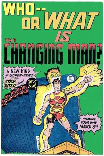
Images © DC Comics, Inc.
The very first logo for this series created, plotted and drawn by Steve Ditko is one that only a few people ever saw, and it's probably lost forever. Editor Jack C. Harris remembers,
"Ditko came up with his own version right from the beginning. If I recall, the name SHADE was designed to look as if the individual letters had been made out of paper blowing in the wind. The rest, THE CHANGING MAN, was very fluid lettering casting a shadow of Ditkoish patterns. I loved it, but the powers that be at the time didn't think it was sophisticated enough for the DC line. I thought they were wrong then, and I still do today."
This would have been in late 1976 or early 1977, just a few months before I started at DC. Too bad, I would have loved to have seen Ditko's logo. When I asked Jack if he was involved at all with the logo that was used, he added,
"No, it was commissioned by the higher ups. Steve didn't like it either."
So, who would have made the decision to turn down Ditko's logo and come up with a new one? Jenette Kahn started at DC as the new Publisher in January 1976, and she brought a new sense of style that looked beyond comics to designers and artists like Milton Glaser and Andy Warhol, so my guess would be this was her decision.
The first thing that saw print relating to the book and character was the house ad above, which uses only THE CHANGING MAN, very similar to the final logo. The dot shading is there, and the word THE in open type. The rest of the lettering on the ad is by Gaspar Saladino, but the logo letters are definitely not his style. When I first began thinking about this, John Workman seemed a possible designer, but I asked him, and John didn't remember doing it. Then I recalled the work of Bill Morse, who lettered the first six issues of the book, and I thought it might be his.
Bill Morse only worked in the DC Production Department for a short time, and in fact his was the spot I filled when I started there in 1977. I had come on for two weeks to fill in for him while he was on vacation, and when he came back he gave his notice, so we only worked together a week or two. John Workman was a friend of Bill's, and they kept in touch, so I asked John for his email so I could find out about the logo.

I'll get to the logo in a minute, but first I wanted to share Bill's memories about working as letterer on the book. Bill wrote:
"I remember that whole comic was odd. The mysterious Steve Ditko would sneak into the office and meet with – hmmm, I think it was Jack Harris editing that book? – but he definitely didn't want to be spotted by anybody else.
"Harris told me that Ditko had requested me as letterer on the book, which didn't make any sense to me. I think more likely Ditko asked for a letterer who could work small, and Harris thought of me. I was very excited to be working on Ditko's original pencils, but he also pencilled in all of the lettering, in a very tiny hand, (pretty decent actually but not quite pro-level), which I think we've seen maybe in some of the Mr. A material. His pencils for the lettering were pretty dark, and it was hard to erase after I had completed my lettering.
"I remember, early on in my brief lettering "career", requesting of Jack Adler that, whenever possible, to ask the pencilers NOT to pencil in any rough lettering on books I would be lettering – it was distracting and confining for me. Most of them complied. But Ditko was a different story. From the way Harris described him, he seemed paranoid if anybody tried to mess with his established way of doing things. Might just pull the plug on the project because a letterer had requested him to leave the balloons blank.
"And the part of me that felt flattered that somehow Steve Ditko had asked for me to letter his new book, also felt frustrated that I couldn't meet him, or even pop my head into Harris's office and say 'Hi Steve, I'm Bill Morse, the letterer on Shade. I'm a big fan of yours!'"
I have to say I shared some of Bill's feelings about Ditko. I was also a big fan, and lettered a few stories he did for DC. I also wanted to meet him, but always seemed to miss the chance. "Oh, he just left," Jack Harris would tell me with a teasing gleam in his eye. Finally one day Jack brought Ditko into the Production room and I finally got to see him, hear him talk a little, and briefly say hello and tell him how much I enjoyed his work.
Okay, back to the logo. Bill says,
"As for that logo, that's where my memory gets fuzzy. I'm certain that I didn't conceptualize it. Somebody gave Bob LeRose a rough pencilled version. Some of the design elements look like I could have originated them, but some I wouldn't have used, like that odd abstract shape surrounding "The Changing Man". And I don't think I would have used that perspective on "Shade", which doesn't seem to meld with the rest of the logo. I'm pretty sure that I received a somewhat rough pencil version from LeRose, and finished it while inking it. The word CHANGING looks most like the style I liked back then, and that stippled shading inside was definitely me."
Sadly, Bill passed away in 2010, so I'm really glad I had the chance to ask him about this, and I found his comments quite interesting. If you compare the word CHANGING to the house ad above, you'll see it's exactly the same except for a thin white line separating the shading from the heavy outline. This would have been done so the shading could be held in a color other than black, as it often was. MAN is shorter and has a different style A, but it's similar. the word SHADE, on the other hand is in a completely different style, one I recognize as that of Gaspar Saladino. And as Bill says, it doesn't seem to mesh well with the rest of the logo at all, being in deep 2-point perspective. Perhaps Gaspar was asked to do a logo first, and whoever was making decisions about it only liked his word SHADE and added it to the rest of Bill Morse's existing lettering? Bill mentions a layout. The only staffers I can think of who might have done that are Sol Harrison or Joe Orlando, with Orlando being the more likely person, but that's just a guess. So, I'm putting this final logo down as a victim of "design by committee."
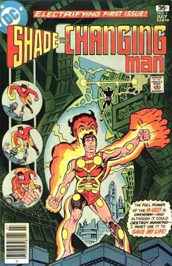
Here it is on the first issue cover, and despite all the things I've said above, I have to admit I always kind of liked it, and thought it went well with Ditko's art. Good thing I never told him that!

In 1990 editor Karen Berger brought the character back for a new run that was quite popular, and helped forge the direction for the imprint she began, Vertigo. The logo was designed by staffers Richard Bruning and Curtis King, who worked with type in various fonts to create a logo with two levels: THE CHANGING MAN smaller and morphing through the word CHANGING, atop SHADE in very large and thick open block letters. While this has something of a ransom note about it, I like it too.

Here it is on the cover of the first issue working quite well with the psychedelic painted art of Brendan McCarthy.

When the book was folded into the new Vertigo line in 1993, Karen Berger must have felt a new logo was called for, and she commissioned one from designer Rian Hughes. This was quite an early logo assignment for Rian. Here's what he had to tell me about it:
"I think it was a case of getting an awkward set of words to hang together cohesively – "Shade, the Changing Man" is a bit of a mouthful. So – emphasis on Shade, which is "changing" – getting larger from left to right. A very obvious concept, but it seems to work.
"We happen to have three counters, (note: the openings in the A, D and E of SHADE.–Todd) and "The Changing Man" neatly fits within them, one of those happy typographic gifts that you sometimes come across. The outline version lifts it out of complex backgrounds more easily."
I like this logo as well, so I guess I've never met a SHADE logo I didn't like. The way the letters of SHADE are joined gives the word an appealing shape, and using all lower case is a good idea, too. Here it is on the first cover:

The double outline allows the dark areas to be held in a color, really letting it pop on this painted art.
Hope you've enjoyed this brief logo study. You can find lots more on my LOGO LINKS page.
March 31, 2012
Incoming: THE NEW TEEN TITANS OMNIBUS Vol. 2

Image © DC Comics, Inc.
Arrived yesterday, another very thick and heavy volume with excellent paper and printing. 736 pages covering two years of Titans in their own books, annuals, and an issue of BATMAN AND THE OUTSIDERS. I lettered a few of the stories, but I remember enjoying reading all of them. Should be available near you soon.
March 30, 2012
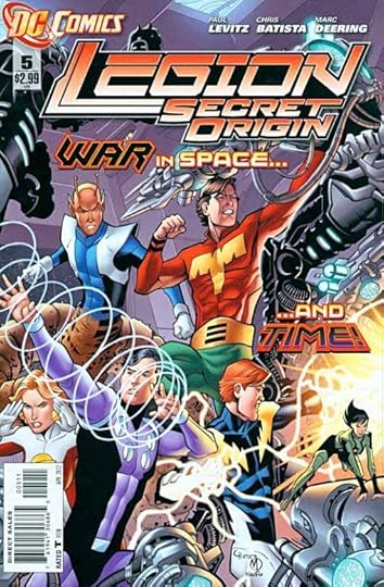
And Then I Read: LEGION SECRET ORIGINS 5
Images © DC Comics, Inc.
Writer Paul Levitz is doing some interesting things in this series to expand the early days and weeks of the Legion as seen previously. On the top level we have the early Legionnaires, the ones Superboy first met and a few others, tackling their new roles as heroes with wide-eyed wonder and enthusiasm. Then we have their founder, the wealthy R.J. Brande trying to deal with the bureaucrats that are not so sure about this Legion thing, and also the target of repeated assassination attempts. Below that we have a shadowy group who seem to be pulling the strings of power in much of this future society, and they're not happy with this new threat to their power. It makes for interesting contrasts and a richer story than just focusing on the kids.
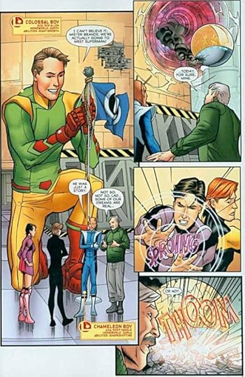
The art by Chris Batista and Marc Deering is quite appealing. It has a warmth to it that much of comics art today lacks. You'd like to be friends with these kids, as he portrays them, even the somewhat annoying ones like Brainiac 5. Batista's work has excellent design and structure. The figures pop from their backgrounds, never getting lost in the details, and he's no slouch with action scenes, either. I like it a lot.
Recommended.
March 29, 2012
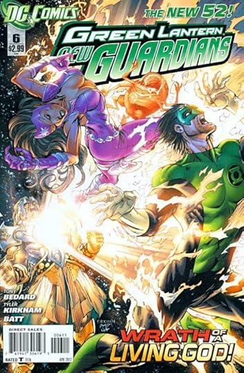
And Then I Read: GREEN LANTERN NEW GUARDIANS 6
Images © DC Comics, Inc.
Kyle Rayner and his rainbow coalition (sorry, it's just the obvious catch-phrase) are on a giant construction called The Orrery, sort of a model solar system, but larger than life-size, if that makes any sense, and they've split up to investigate several of the different worlds. On each they find a large, imperious statue that comes to life. It's a being named Archangel Invictus. He's very powerful, and as you might guess, a religious zealot who seems to consider all the creatures in The Orrery his children, as in the Biblical way. One by one he defeats the ring-bearers, and even several together. Can nothing stand against him? There's one color missing who might provide an answer.
I like the way the colors work together in Tony Bedard's story, when they do, and the setting is interesting, though the villain is rather predictable. Some nice character moments and even some humor lightens what could be a ponderous story.
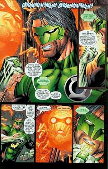
The art by Tyler Kirkham and Batt is quite good, up to the high standard that's been the norm on most of the Green Lantern books lately. It's a pleasure to look at.
Recommended.
March 28, 2012
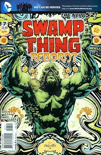
And Then I Read: SWAMP THING 7
Images © DC Comics, Inc.
Things have come to the crisis point for Alec Holland. The Parliament of Trees, the heart of The Green, is being destroyed. The Rot is not only infesting an area of the southwestern U.S. but has taken over his one-time love Abigail Arcane and hopes to put her in the center of its new power. Holland has resisted the call to take on the mantle of Swamp Thing once more, and now it might be too late. That's what most of this issue confronts, and I found it gripping, despite most of the action being seen from a distance, and much of the conflict going on in Holland's own mind.
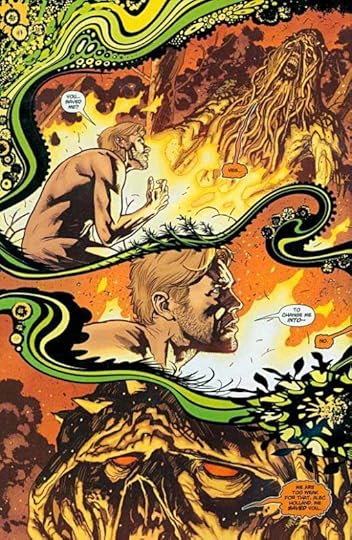
I found Yanick Paquette's art on this issue to be absolutely riveting and brilliant. He's used a psychedelic plant-based theme between the panels on many pages that is quite beautiful, and it provides wonderful contrast to the often horrific scenes in the panels themselves. Somehow this combination adds depth and resonance to the whole that is transcendant. The page layouts are diverse and creative, the sort of thing I've only seen recently from J.H. Williams III. This is really fine work! The coloring by Nathan Fairbairn and lettering by Travis Lanham also add much to the entire package. I loved every page.
Highly recommended.
March 27, 2012
And Then I Read: JUSTICE LEAGUE 6

Images © DC Comics, Inc.
Here's the conclusion of the first story arc in this flagship title for The New 52. We have a group of seven familiar heroes, but all of them new, revamped versions joined almost against their will to fight the menace of Darkseid, who has appeared among them making the usual sorts of threats. Darkseid is also on a mission here, as we find out in this issue. He's looking for someone. While much of this issue is spectacular fighting, there are a few other things going on. We have a framing sequence of sorts about an ordinary man who finds himself in the midst of the fighting, and is writing about it. Back in Darkseid's home we have Superman being tortured until he is freed by Batman, with some interesting hints about what Darkseid's minions are doing with Superman's tortured flesh. And as an epilogue we have a sequence featuring the mysterious woman in red, titled "Pandora," with all that name implies, apparently. There are some nice character bits along the way, as I've come to expect from Geoff Johns, and he gives Cyborg, the sort of new member of the group, the heroic moment at the center of the fighting, though Superman also gets a good one.
What's different about this Justice League? For one, they don't get along very well, and each seems to have a personal agenda. At this point they're only a team because everyone thinks they are, I guess. Sort of a dysfunctional team, the kind that Marvel and WildStorm have been doing for years. We can assume they'll stay together, but a real team seems a way off. And on the final page we have a new threat, the kind that a team is probably needed for, so there's that.

The art by Jim Lee and a trio of inkers is terrific, no surprise there. I particularly like the sass and energy he gives to Wonder Woman, but all the characters are well done. And of course, Jim is great at action, of which there is plenty here.
Recommended.
March 26, 2012
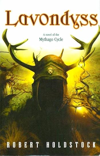
And Then I Read: LAVONDYSS
© estate of Robert Holdstock, cover art © Larry Rostant.
The first book in this series, "Mythago Wood," blew me away with its rich stew of mythic figures come to life in an ancient forest in rural England, much larger on the inside than it seems from the outside, as well as much older, deeper and stranger. "Lavondyss" is nearly as good, which makes it quite excellent!
The book is divided into two halves; the first following a young girl, Tallis Keeton, growing up near the Ryhope Estate, which holds the Wood in question. She is full of the kind of powers that would have branded her a witch in times past, and seems to draw all kinds of magic out of the forest, even though she can't actually enter it herself. She wants to — her brother disappeared there, and she wants to find him — but it isn't until the end of the first part of the book that she finally penetrates that mysterious place. Meanwhile, she meets and befriends a character who is clearly the classical composer Ralph Vaughan Williams, one of my favorites (loved that!) and finds some help from her dad and the gardener at their farm. But it's some strange women/spirits from the forest that give her the most guidance, teaching Tallis to make special masks and dolls that allow her to access her powers.
In the second half, Tallis is swept away into the wood by a handsome young man on horseback who may be related to another man, a scientist named Wynn-Jones, who disappeared into the forest in the first book of the series. Tallis and Scathatch each want to penetrate to the secret wintery heart of the forest for their own reasons, and on the way they do meet and are joined by Wynn-Jones, now a very old man acting as a shaman for a primitive tribe in the forest. The plot gets quite complicated in the second half, and at times is somewhat mysterious and confusing, but everything does get explained eventually, and the few weeks Tallis expected to be in the Wood turn into a lifetime, as it seems to be for everyone from our mundane world who enters.
Though the second half did drag a bit here and there, in general I loved this book. The layers of myth and magic are many, and fascinating. The characters are somewhat plot-driven by their various quests and stories, but still appealing for the most part, and the writing is quite good. What this series reminds me of is a somewhat more modern version of George MacDonald's "Phantastes," another favorite, perhaps informed by Campbell's "Hero with a Thousand Faces." It's a very tasty stew for fantasy fans, and I'll certainly be looking for and reading the rest of the series.
Highly recommended.
Todd Klein's Blog

- Todd Klein's profile
- 28 followers

