
Todd Klein's Blog, page 312
April 27, 2012
Baby Possums
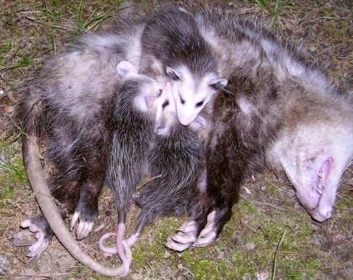
I came downstairs this morning while it was still dark to do my stretches, and let Tigger and Leo out on the screened porch as I usually do. A half hour later it was starting to get light, and I saw that they were staring intently at something on the ground about a foot away from the porch, a gray mass. I went out for a closer look, and it was an apparently dead mother Opossum with three pretty large and alive babies.
What to do? I knew we couldn’t raise the babies, but Ellen would want to try if nothing else was possible. I left them alone for a while just in case the mother was “playing dead,” as possums do, but this was an unlikely place for that, and when I went out for a closer look it was clear the mother was cold and stiff. I’m not particularly fond of possums, but they do us no harm and probably some good eating things like grubs. And, as with most animals, the babies were cute, and I wanted to help them if I could. When Ellen came down she suggested we try to contact Steve Serwatka, a licensed animal rehabilitator in our county. We’d seen him do some animal outreach programs for kids with animals he’s rehabilitated but that are not releasable back into the wild, and he seems like a good person with a heart of gold for animals.
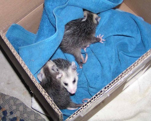
I was able to find his phone number online, and called. I woke him up (sorry, Steve!), but he said he could take the baby possums, and gave me his address and directions. As Ellen said, thank God for people like this! I went out with a box and a towel and put the babies into it. They were a bit squirmy, but not hard to handle. I put the box in the garage on a heating pad, and they burrowed into the blanket. Then I went back out and carried the mother well out into the woods behind the house to let nature take its course.
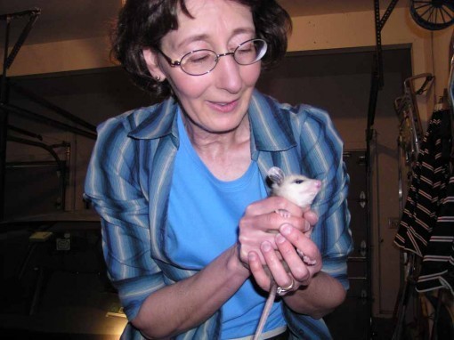
Ellen just had to pick one up for a minute. After we had breakfast, I drove them over to Steve’s house, about a 15 minute drive, and he was there to take them. He brought me into his animal workroom, filled with cages and equipment. He looked the babies over, said they were in quite good shape, and that they should be fine. I filled out a form, and gave him what I think is a generous donation to help with his work, which I’m sure is always in need of funding. Here’s a link to Steve’s Facebook page, if you’d like to see a bit more, though there isn’t a lot there about his rehab work.
For us, the problem is solved, and we’re very grateful. For Steve, the work is just beginning. Thanks again, Steve!


April 26, 2012
And Then I Read: THE FLASH 7

Images © DC Comics, Inc.
There are several things that put this title among the ones I look forward to the most. The art is terrific (more on that below), and the writing is often just as good. Writers Francis Manapul and Brian Buccellato are not merely telling a story, they’re playing with the artform, trying things that break away from the expected, predictable comics experience. For instance, pages 2 and 3 of this issue are made up of nine large panels, and it’s a countdown, one second per panel counting horizontally and then down. But each of the vertical rows is a separate part of the story, a different camera, different characters. This is really smart and creative storytelling. Other parts of the issue are nearly as good, with (as usual) a great incorporation of the book’s title into a dramatic double-pager, an amazing multi-panel spread of Flash going all out on the Cosmic Treadmill, and a terrific surprise that awaits him on the next page. And that’s not even the finale. Between all the action scenes are some fine character moments, too.

I don’t have room for a spread here, but this is a pretty cool page too. Manapul’s art really shines in this book with it’s unique combination of hard action overlaying soft gray shading and watercolor technique. I love it.
Highly recommended!
April 25, 2012
And Then I Read: DARK HORSE PRESENTS 7

Images © Dark Horse Comics and the respective copyright holders.
DHP continues to entertain me. Not every story is a winner in my view, but the percentage of stories I like is always well over 50%, which I think is pretty good for an anthology. How are they doing it? A combination of previewing new properties and using already popular ones in new stories. Here’s a rundown of this issue.
HELLBOY VS. THE AZTEC MUMMY. I love Hellboy, and this story is all by Mignola, something of a rarity lately. Mike is still exploring Hellboy’s time in Mexico, and this is great stuff. Love it.
SKELETON KEY: LOST PROPERTY by Andi Watson. I found this episode delightfully inventive and playful, as the three characters, two girls and an animal, are trapped in a museum devoted to lost things. Like socks and passports and Dodos, for instance. Love it.
BLOOD CHAPTER 6 by Neal Adams. While the art is masterful, the story does nothing for me. In fact, I find the level of gore and violence offputting.
MARKED MAN PART 7 by Howard Chaykin. Again, like the art, but he story of a hitman with no scruples and those after him with none either does little for me. Some snappy dialogue, but little else I really like.
SKULTAR CHAPTER 1 by M.J. Butler and Mark Wheatley. This is a fun new parody of sword and sorcery tales like those of Conan and other Robert E. Howard properties. The characters play it straight, as they should, but the developments of the plot are so absurd they become funny. The art is well done, if a bit loose for my taste. Or maybe it’s the mix of open linework over painted color that seems a bit odd. Like it, though.

USAGI YOJIMBO: BUNTORI by Stan Sakai. It’s been a long time since I visited the world of Stan’s rabbit Ronin, and it’s just a charming and entertaining as ever. Despite being quite violent, Sakai’s cartoony style makes it much more fun for me than the hyperrealism of Neal Adams, above. Love it.
CONCRETE PARK CHAPTER 1 by Tony Puryear. An urban jungle sort of story with echoes of Los Bros Hernandez in the execution. I can’t say I found the story very interesting.
THE SPEAKER by Brandon Graham. Another charmer in simple art style with lots of interesting visual symbolism and a story that kept surprising me. Liked it.
ADVENTURES OF DOG MENDONÇA AND PIZZA BOY CHAPTER 4 by Felipe Melo and Juan Cavia. The final chapter in this preview. Each has had a story within the story that I liked better than the main one. Only just okay in my book.
FINDER THIRD WORLD PART 7 by Carla Speed McNeil. Another final chapter. I’ve enjoyed this look into McNeil’s world overall, though this concluding chapter seems a bit odd. Interesting idea, but kind of a strange ending. Liked it.
April 24, 2012
And Then I Read: WONDER WOMAN 7

Images © DC Comics, Inc.
Okay, about-face. I disliked issue 5 of this series so much (because of the way the Greek pantheon was being portrayed) that I skipped issue 6. With artist Cliff Chiang returning for this one, I decided to give it another chance, and I liked it much better. The focus is on Hephaestus, the Greek weapon-maker, and his portrayal is much more appealing to me than some of the other recent introductions. I always felt bad for Hephaestus, he seemed to get a lot of mockery from the other gods and storytellers both, but here he’s shown as a workman who knows his tools, his workers, and has lots of insight into Diana as well, perhaps more than she does. An Amazon mystery is revealed: how exactly are new Amazons conceived, and what happens to male Amazon babies? Brian Azzarello’s answer is clever and feels appropriate, and Diana’s reaction is quite interesting as well.

Cliff Chiang’s art is still top notch in my book, and it’s great to see him back. Some of the other Greek gods and godlings (if that’s the right word. Sub-gods?) I still don’t like so much, but in general this issue got me back into the story and looking forward to the next issue.
Recommended.
April 23, 2012
And Then I Read: AQUAMAN 7

Images © DC Comics, Inc.
A new storyline begins this issue, and it brings to light some characters from Aquaman’s past; a group of heroes known as The Others. At least, they seem to be heroes, and as the issue opens, one of them is being hunted down by longtime Aquaman villain Black Manta, usually a good indication. Meanwhile, Arthur and Mera are helping ships caught in a fierce Atlantic storm, and later are looking into the strange artifact Arthur recovered from the sea floor last arc, one that matches the symbol on his belt. It’s a good opener with lots of action and some interesting developments.

Artist Ivan Reis is back to full pencils this time, which means the art is back to excellent in every way, as far as I’m concerned.
Recommended.
April 22, 2012
SQUIRREL!!
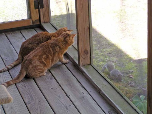
This week I needed to empty one of our bird feeders, and I put the leftover seed right in front of our screened porch, thinking the cats would enjoy seeing the wildlife they’re always watching up closer. It worked almost too well — Tigger and Leo, our red tabbies, became obsessed with the squirrels, chipmunks, mice and birds that came to eat the seed.
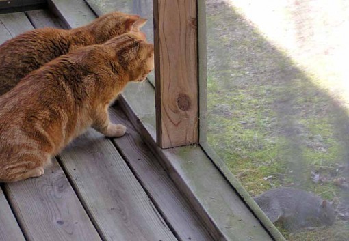
You can see how intensely focused they are on this gray tree rat. At times we couldn’t even lure them away with their own food, they were so anxious to get back out there. Guess I won’t do that again, but it was entertaining.
April 21, 2012
Logo Study: THE BOZZ CHRONICLES

Images © James Bret Blevins and David Michelinie (writer).
This logo study began in an unusual way. In January of 2010 I received an email from Jeff Sharpe wondering if I knew who’d designed the logo for this Marvel/Epic series from 1985. He’d recently bought the logo at an auction. I didn’t, but I asked if he could send me a high-resolution scan and told him I’d try to find out.
I did ask around, but my resources for Marvel logo design information are limited, and I drew a blank, so I put it aside. Recently I’ve begun a series of daily posts on my “Todd Klein, artist” page on Facebook (link in the left margin of this page) titled “Logo of the Day.” Each day I put up a logo scan and give the designer’s name, if known, the date and first appearance, and sometimes other brief information. Recalling my Bozz logo scan, I posted it about a week ago, saying the designer was unknown, but guessing the series artist James Bret Blevins might have been involved. Bret is on Facebook also, so I messaged him about it. A few days later I got a confirming email and three logo sketches! Designer found. I asked Bret if he had any memories of the project and the logo, and here is some of what he wrote:
“I have many warm memories—those were very early days for me as a professional—only a year or so after I had started at Marvel. I worked with Archie Goodwin and Margaret Clark, and I believe, if my memory is correct, that BOZZ was the second Epic comic contract, after Jim Starlin’s DREADSTAR Epic book. BOZZ is one of the highlights of my comic book career—I loved the time period and subject matter, and had a blast researching all the Victorian trappings and designing the characters. I was twenty-three, freshly arrived on the east coast, loved being in and around NYC, and the atmosphere at Marvel in those days was heady and fun—more like a loose ongoing party than a serious business. The royalty system had only recently been implemented, and the direct market/comic shop distribution changes were opening up opportunities for variety and experimentation, which the Epic division was designed to encourage. The future seemed bright and everyone I knew and collaborated with seemed to be having a good time creating comics for an expanding audience.
“I was approached by David Michelinie about working together on a creator owned book for Epic–he presented outlines for several scenarios, and BOZZ was the one I jumped at. I’m still fond of those characters, and I poured all my energy into doing the best job I could. I was always straining against the deadlines, and in fact was unable to do justice to my ambition, though I’m proud of what I was able to manage under the time pressure and at that young inexperienced age. The love for the material is evident when I look back at the work—David did a wonderful job bringing those characters to life, and the plots were engaging, inventive and just plain FUN. I did my best to compliment his sensitive plotting/scripting—I felt great empathy for Bozz himself—confused and overwhelmed by a complicated world he didn’t understand—a world that often made no sense (and still doesn’t). David and I also shared a whimsical sense of humor that I loved expressing through the situations, storytelling, acting and staging—and the higher quality paper and printing of the Epic imprint allowed me to use very fine-lined, old fashioned pen and ink rendering on sections of the artwork.
“In retrospect I wish that I had found some way to continue working on BOZZ beyond the original six issues (for one of which I was only able to contribute a cover). I hated to leave the project, and I recall the reasons as a combination of modest (by 80′s standards) sales and financial pressures (retaining ownership of the property meant substantially lower page rates than working on a Marvel-owned book). I also regret not building on the collaborative chemistry David and I developed—I let the disappointment I felt over my incapacity to continue the project affect my communication with David, and we only worked together one other time, on a Marvel adaptation of the third Indiana Jones movie.”
Here’s the first of the three logo sketches Bret sent me:

As you’ll see, this is pretty close to the final logo. It’s hand-drawn, but the style of the letterforms looked familiar to me, and I soon realized I had a font named Campanile that was quite similar, one of a set of fonts published in a book and CD by Dover Books called “24 Victorian Display Fonts.” Here’s a quick mockup by me using the font:

While the letterforms are similar, there are many subtle changes in Bret’s hand-drawn sketch, the most obvious being the height of the letters. Bret’s version also has thinner strokes overall, and if you look at the letters closely you’ll see most are altered in small ways. If fact, I find Bret’s version more elegant in general, and the swash under THE is a great addition.

The second Blevins sketch puts Bozz’s head in the O, which doesn’t work as well for me, though I do like the expression on the face.

And the third sketch combines the previous two ideas. Bret says:
“I don’t recall officially being asked by Archie to design the logo—in my memory the sense of a freewheeling creative atmosphere was part of the appeal of the entire Epic idea. I probably just jumped on the opportunity as part of my enthusiasm for the entire undertaking. I’ve always loved the melodramatic, eccentric mood evoked by the Victorian era currently in vogue again as Steampunk), and relished using THE BOZZ CHRONICLES as an excuse to hunt down and buy a shelf full of Victorian reference. I’m sure I combed through that material and found typeface elements that seemed to convey the spirit of the book. I am unable to remember the name of the artist who rendered the actual logo that was purchased at auction (it’s been almost 30 years!), but I know he did many logos for Marvel.”
After reading this, I realized that the finished logo had been rendered by someone else, so I sent Bret a list of possible designer names, mostly Marvel staffers I thought might have been there in 1985. The name Jim Novak rang a bell for him. He said, “I’m almost sure it was Jim Novak, because some faint distant wail from my subconscious kept prodding me that the last name sounded like Nowlan, but I knew Kevin hadn’t done it.”

Here’s the finished logo produced by Jim Novak, who kept all of Bret’s first design intact (that must have been the one the editors liked best, and I concur), though Jim made the letterforms more consistent and added an outline around everything so the logo would work better against cover art. Here is it on the first issue cover:

I feel gratified that I’ve solved the mystery of this logo design, with the help of Bret as well as Jeff Sharpe, who sent me the logo scan. Wish they were all this easy! If any readers have similar information, please send it my way. You can find more logo stuff on my LOGO LINKS page, and on the Logo of the Day feature on my “Todd Klein, artist” page on Facebook.
April 20, 2012
And Then I Read: NIGHT FORCE 2

Images © DC Comics, Inc.
This issue expands the story back into history, opening with an interesting scene featuring one of this country’s founding fathers confronted by three ominous and frightening figures. Through the rest of the issue we rejoin Baron Winters and his new companions (I guess) Zoe Davis and James Duffy as more of the background puzzle is unraveled, connecting Zoe and James to the mysterious trio. Along the way Zoe hears some shocking personal news about a child she doesn’t even remember having, and James is threatened by the Baron’s pet leopard. Then there’s the witch, Kassandra Fey who has more bad news for Zoe and James recalls the horrific events surrounding his father’s death.

The art by Tom Mandrake seems to be getting both a little looser and more sure-footed, thereby improving the flow of the story and the realism of the characters. And Mandrake proves he’s the perfect choice for this kind of story with a great mix of atmosphere, energy and good storytelling.
If you like comics that mix horror, the supernatural and human drama, you’ll enjoy this book. Recommended.
April 19, 2012
And Then I Read: DOTTER OF HER FATHER’S EYES
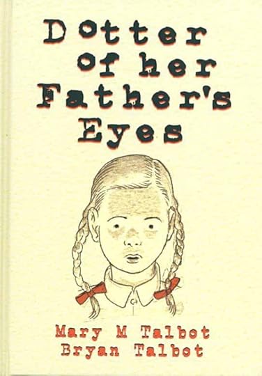
Images © Bryan Talbot & Mary Talbot.
The latest book from Bryan Talbot is a collaboration with his wife Mary, and it’s a biographical work. Two, actually, as there are two narratives intertwined. One follows the life of Mary herself from early childhood through marriage to Bryan and beyond, but focusing on Mary’s relationship with her father, a teacher and James Joyce scholar. The other thread follows the life of Lucia Joyce, daughter of the famous writer and HER paternal relationship. Both are complex, but Lucia certainly seems to have had a much worse time of it, trying desperately to forge a career for herself outside her family circle, but always being sucked back into an abusive relationship with both parents. Mary had her own struggles, but in a time when independence was more accepted.Both tales are well told, and the intercutting makes a somewhat tenuous connection come together in ways that only good comics can achieve, and this is certainly that.
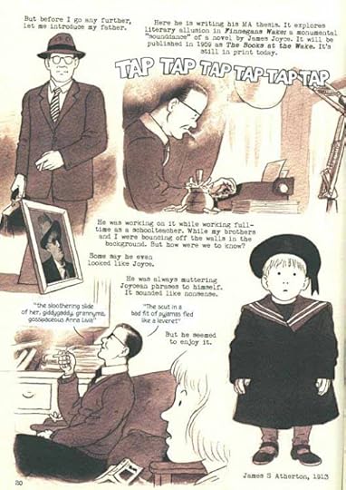
Bryan’s art is charming and the two story threads are each given a color scheme: sepia for Mary and indigo for Lucia, with occasional full-color interludes or moments inside each part. The style is somewhat cartoony, particularly in the use of dots for eyes in many places (appropriately), though the art is realistic enough to give the reader a sense of historical time and place, and the characters are quite lifelike in general.
I wasn’t sure what to expect from the title, but I knew I’d be in good hands with Bryan, and Mary’s writing is also quite good, making this an enjoyable read from start to finish. Recommended.
April 18, 2012
Return of the Chuck

Photo from avesphoto.com and probaby © by them.
Ever since we’ve been living in our house in the south Jersey woods we’ve had at least one of these elusive night-singing birds nesting nearby. If you are lucky enough to find one sleeping on a tree branch during the day, that’s about what it would look like. I’ve never seen one here, though they’re present from mid-April through September every year. Mostly we know they’ve arrived when we start hearing their calls after night has fallen. This year’s bird arrived and started calling early Monday morning. Yesterday evening I was able to record it on my phone:
I’ve increased the volume, so the background noise is also louder, it’s not this loud usually, but I wanted to make it easy to hear. This species is a “name-sayer,” it says its name, or something reasonably close. Unmistakeable, though it can be confused with a close relative the Whippoorwill, another name-sayer. Once you hear the two birds calling, the difference is clear. Whip calls are quicker and don’t have that deliberate space between the first two notes.
The return of the Chuck is a sure sign of warm weather returning, and sure enough we’ve just had two summery hot days, though today it’s cooler again. The Chuck may not call now until temperatures warm up a bit more again. We like hearing them. Sometimes there are rival birds nearby and there will be a vociferous call and response vocal duel between two or three of them for a few minutes, but they don’t usually call more than 10 minutes at a time, and mostly just after dark or just before dawn. We’ve had occasional complaints from overnight guests, but we’re used to them and often don’t even wake up.
Night calling birds are fairly uncommon, and this is one I like having around, even if I never get to see him in the daytime.
Todd Klein's Blog

- Todd Klein's profile
- 28 followers

