
Todd Klein's Blog, page 214
August 11, 2015
And Then I Read: GREEN LANTERN 42
 Image © DC Comics.
While not saying so exactly, this book has been rebooted with a new version of Hal Jordan. Same writer and artist team, new look and direction. Here he’s a scruffy, long-haired bounty-hunter with no power ring, but instead a power glove that acts unpredictably. It’s not such a bad change, really, and I can see how a writer would want to go in this direction rather than rehashing all the old Hal Jordan material of the last 50 years or more. Hal has a criminal in tow, and an assistant of sorts, and is at the helm of a cool starship. More Star Wars than GL Corps, but kind of fun. And he’s faced with a problem of things turning to stone in some way he hasn’t figured out yet. A familiar figure is lurking to be revealed on the last page, bringing the story back into more familiar territory, and we’ll see where it goes next.
Recommended.


August 9, 2015
Ira Schnapp and the Farley Post Office
 Ira Schnapp watercolor by Jack Adler, 1960s
I’m currently doing a lot of research on long-time DC Comics letterer and designer Ira Schnapp for a new blog article, and in that process I’ve taken a close look at one of the more puzzling and mysterious aspects of his early life and career, his claim to have designed the huge inscription running across the top of the James A. Farley Post Office Building in New York City. I’ve come to some new conclusions about that, and felt it deserved a separate article, so here it is.
 Superboy and World’s Finest logos © DC Comics
Ira is best known in comics as the designer of many well-known logos such as these, and beginning with his redesign of Joe Shuster’s SUPERMAN logo in 1940.
 Hawkman House Ad © DC Comics
Ira is also revered for his classic display lettering on house ads like this one that ran in most DC titles from the 1950s-60s, as well as the cover lettering on nearly all of the company’s books in those years. While that period of his career is well known and documented, little is known about Ira’s work before 1940.
 Early post card of what’s now called the Farley Building
Ira himself told stories about his early work to a number of artists and others, and prominent among his proudest accomplishments was his claim to have designed the letters in the massive inscription running across the east side of the Farley Post Office that fills two entire blocks from 31st to 33rd Street on the west side of 8th Avenue.
 The inscription is thought by many to be the official motto of the U.S. Post Office: “Neither snow nor rain nor heat nor gloom of night stays these couriers from the swift completion of their appointed rounds.” The quote is from Herodotus’ Histories from about 450 B.C., and was chosen by William Mitchell Kendall of the building’s architects, McKim, Mead and White. The Post Office has NO official motto. The building was constructed from 1908 to 1912, and opened for business in 1914.
 Section of inscription, Trajan’s Column, Rome
The letters in the inscription are inspired by those on the ancient Roman monument known as Trajan’s Column, as seen above. These letter forms have traditionally been used for centuries on classically-based buildings like many designed by McKim, Mead and White. But did they actually design the Farley Building inscription as part of their architectural plans?
 I saw this large Dover paperback online, and decided to buy it for further research. This edition is a reproduction of a work originally published in four volumes from 1915 to 1920, and is a handsome book well worth the $10 I paid for it online.
 Inside I found this front elevation of the Farley Building, which includes the inscription, though it’s too small to see here.
 A closer look at one section of that drawing shows the inscription as part of the architectural plan, not very precise, but certainly in the style of the final carving.
 This period photo from the book shows the actual inscription is very much in the style of Trajan’s Column, with the letters carved using the v-cut method.
 An example of a v-cut R show’s how the stone is carved at angles on both sides of each stroke until it meets in a central line. A side view of this carved letter would show each stroke is v-shaped. This is a standard style of carving inscriptions, used on Trajan’s Column and ever since.
 Many of the building plans in the Dover book show similar inscriptions worked out in detail by the architects.
 Here’s one for the Bank of Montreal with the v-cut lines shown in the letters on the drawing.
 And a period photo from the book of the finished inscription.
 The firm of McKim, Mead and White were so enamored of the Trajan style, they used it everywhere on their plans, even on titles that describe things but aren’t part of the actual building. There are no very detailed plans of any of their inscription carvings, but the Dover book only has a small selection of the plans needed for the actual buildings, and I have no doubt there were more detailed plans of all the inscriptions they designed.
So where does that leave Ira Schnapp’s claim to have designed the letters on the inscription? First, let’s see how big the carved letters are. Using the scale on the front elevation plan, I estimate that the letters are about two feet high. They could well be larger, but let’s use that as a ballpark figure. Even a detailed drawing of the inscription by the architects would have had much smaller letters, I’m guessing two inches high at most. So, how did the letters get from the drawing to the slabs of stone to be carved? That’s where someone like Ira could come in!
Ira Schnapp was born in Sassow, Austria in 1894 I believe (possibly 1893). He emigrated to New York in 1900 at the age of six. He was part of a large working-class Jewish family that took up residence in New York’s Lower East Side. Nothing is known about his schooling, but it’s likely it did not get past high school. When the Farley Building was being constructed, Ira was a teenager, probably age 18 when it was completed. So how did such a young person from his background get involved in such important work? This is the most puzzling mystery of Ira’s career. My only guesses are through an art teacher at his school, or some kind of apprentice program with the stone-cutters actually given the commission to carve the inscription. A project like the Farley Building would have taken many builders, companies, and craftsmen, sub-contracted for all the special needs of the job. We don’t know who actually did the carving, but it’s quite possible they might have hired or taken on a young man like Ira who showed a talent for working with letters.
If you look up Ira Schnapp on Wikipedia, it says, “Upon his arrival in the United States, Schnapp was already a skilled stonecutter, engraver, and graphic designer. In 1911, while still only 19 years old, Schnapp was hired to hand-carve the engraving on the front of the main branch of the New York Public Library: “MDCCCXCV • THE NEW YORK PUBLIC LIBRARY • MDCCCCII”. He then worked designing and engraving stamps for the United States Post Office Department, and in 1914 was hired as a stone carver for the post office. Schnapp personally designed the lettering, and hand-carved, the famous slogan “Neither snow nor rain nor heat nor gloom of night stays these couriers from the swift completion of their appointed rounds” in the facade of the James Farley General Post Office.”
I think this is completely wrong. First, Ira couldn’t have arrived with all that training at age 6. Second, Ira spent the rest of his life as a graphic artist, letterer and logo designer. If he had learned the trade of stonecutter, why didn’t he pursue it further?
In 2012 I talked to artist Neal Adams about Ira. Neal knew him near the end of his time at DC Comics, and enjoyed hearing Ira’s stories about his life and work. On the subject of the Farley Building letters, Neal reported that Ira showed him some large, folded up tissue or vellum layouts. Neal said Ira took them out, and started unfolding them, and unfolding them further, until huge letters were revealed, or in some cases just parts of letters. Neal’s jaw dropped with amazement as he told me these were from the work Schnapp did designing the huge carved letters on famous New York City buildings like the James A. Farley Post Office Building on 8th Avenue between 31st and 33rd streets. “Do you think he also carved the letters?” I asked Neal, and he said emphatically, no. Ira was not a carver, he was an artist, a designer. He formed the letters using those tissues. I think this is right.

So, what makes sense to me is that Ira greatly enlarged the architect’s design for the inscription, a task that would have required a good deal of skill and knowledge about letters on his part to do well. The best method I know of doing it, and one I learned myself in high school art class, is the grid method. Above is a Trajan R about two inches tall with a grid drawn over it. The red lines are 1/4 inch apart both ways. If you draw a similar grid on a very large piece of tracing paper or vellum with the grid lines 3 inches apart, then copy each section of the letter as it appears in each square of the grid, you will have a very similar letter about two feet high.
As to how it was transferred to the stone for carving, here’s a graphite transfer technique I also learned in high school. Once your shape is perfected on the front of the paper, flip it over and trace the outline carefully with a soft pencil, making as precise a dark line as you can. Turn the paper back to the front and lay it on the surface to be transferred, in this case probably a slab of white marble. Tape it down to keep it from moving, then draw heavily over the outline again on the front. The graphite you put on the back will transfer to the stone. You can try this yourself on a small scale, it works great.
And that’s what I think Ira Schnapp meant when he said he designed the inscription. He didn’t actually design the letters, but enlarged and perfected them. Perhaps he also transferred them to the stone for carving. And, on such an important project, this was still quite an exciting chance to show what he could do with letters, setting Ira Schnapp on a path that would in time prove him a master letterer and designer.
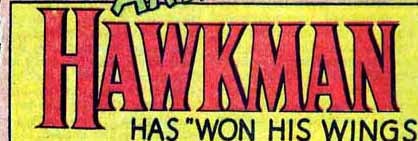 Remember that Hawkman house ad from near the beginning of this article? I think the HAWKMAN logo shows the influence of the Trajan letters that Ira worked with so early in his career. Even the thicker lines on the right side of each letter suggest carving to me. Ira didn’t forget his early training, and neither should we, but I hope we can be more realistic about what he actually could have accomplished.
August 6, 2015
And Then I Read: JUPITER’S LEGACY BOOK 1
 I think this is the last Mark Millar project I’m going to try. He keeps putting out books with great artists that sound interesting and get accolades, but they don’t work for me. For one thing, they’re so mean-spirited. Everyone is out for themselves and violently cruel about it, or is a victim of those who are. There’s no one I care to root for. There’s no chance of a feel-good moment. It’s all the most hellish and rotten aspects of humanity given special advantages and allowed to run rampant. In this case, we have a group of elderly super-heroes who have been granted their powers many years in the past on a trip to an uncharted island. Today, they’re still trying to do good, but their children, also with powers, are complete screw-ups of various kinds that seem to do nothing but cause trouble, abuse their gifts, and/or each other, and treat ordinary people like dirt or worse. Actual super-villains seem almost nice by comparison. Can’t recommend this, pretty as the art is.
August 5, 2015
And Then I Read: FLASHMAN by George MacDonald Fraser
 I’ve long been curious about the “Flashman” series by Fraser, and finally decided to read this first one, published in 1969. Harry Flashman was a minor character in an early British school-boys novel, “Tom Brown’s School Days,” which I liked. There he was a bully and a villain. In this book he’s no better. Worse, if anything, though as he narrates the story in his old age, at least Harry Flashman is honest about his own character failings and bad deeds. The other thing that interested me is the way the author has woven Flashman’s story into many aspects of true history. Here it’s the British army in India and Pakistan in 1839. Flashman’s role is made up, but the history is accurate, and the monumental mis-management and huge blunders made by the British was fascinating in a train-wreck sort of way. While I can’t say I liked Harry at all, he’s put through so many battles and tortures both mental and physical that by the end I had some grudging respect for his ability to survive against such high odds. If you like historical fiction with elements of bawdy adventure and sly commentary on the failings of humanity, this series may be for you. I’m not sure if I will read more, but I’m tempted.
Recommended
August 3, 2015
And Then I Read: DOCTOR FATE #1
 Image © DC Comics.
I’ve always like Doctor Fate, especially his mystic/magical side, and writer Paul Levitz is playing up that angle here. The art by Sonny Liew reminds me a lot of the art of Gabriel Bá and Fabio Moon, last seen at DC on DAYTRIPPER, and also a little of Shawn McManus, who had a good run with this character. In short, the art is loose but confident, somewhat cartoony yet covering the full range of human emotion and character acting. It’s far from the muscular skin-tight super-hero look of some versions of the character, and that’s fine with me.
Paul goes right back to the Egyptian roots of the Helmet of Fate that conveys magical power, in this case to a reluctant hero, a medical student named Khalid who really doesn’t want to be chosen. His girlfriend, Shaya, another med student, and his parents round out the regular folks cast, while on the mystic side we have Egyptian gods Anubis on the attack, and Bastet bestowing the helmet, all amid a huge storm flooding Brooklyn. Both the art and the story are a great mix of realism and fantasy without the muscles and posturing. A refreshing and enjoyable book. I’m looking forward to more.
Recommended
August 2, 2015
Pulled From My Files #33: FAUX DC COVERS
 Images © Rob Liefeld Inc.
During the run of SUPREME written by Alan Moore in the 1990s, which I lettered, many homages to DC Comics of the Silver Age were present, from storylines to characters to lettering and logo styles. For SUPREME #52B dated Sept. 1997, a feature called “A Cover Gallery Supreme” included a number of faux covers in the DC Silver Age style with art by Rick Veitch and logos, trade dress and lettering by me, all in the style of Ira Schnapp, the man doing that work at DC at the time. When Checker Books reprinted the SUPREME series in two trade paperbacks in 2002, they left out that feature, but did include some of the covers on the inside back cover of one trade paperback, above. These were lots of work, but also lots of fun to do, it gave me a chance to emulate the styles of Ira Schnapp, which I grew up with, and always liked, even if they do seem old-fashioned now. The logos and trade dress were worked up on the computer (from hand-drawn layouts), but the cover lettering was all done by hand. Here are some scans of that lettering, done on vellum, which I still have.

 My understanding of Ira’s work came from looking at the printed comics of my youth in collected DC editions and other books of old covers, but there are things I would do differently today to make it more like Ira’s work. For instance, in the balloon above, each M should have vertical, not slanted, sides.

 The variant script E in the first part of the caption above was something Ira used occasionally in large display lettering, but probably not in caption boxes like this.

 Of course, it was meant to be an homage, not an exact copy of Ira’s lettering, so it was perfectly fine for the job. And it’s inevitable that it would end up looking like a mixture of Ira’s and my own styles, as that’s what it really was, probably with a little of Gaspar Saladino, a major influence on my lettering, thrown in as well.
August 1, 2015
And Then I Read: CITIZEN OF THE GALAXY 3
 Image © estate of Robert A. Heinlein and IDW.
My opinion of this series is largely unchanged by the final issue: an honest effort to adapt a Heinlein novel to comics form, but it falls short in some areas, particularly in representing the author’s voice, very important to any Heinlein work. However, this final issue did work better for me than the first two because it covers a subject Heinlein excelled at, shady family business politics, and in this case the dialogue does carry the story well. Thorby has arrived on Earth stunned by the discovery he’s an extremely wealthy and important man, the “Rudbek of Rudbek,” but soon finds he’s expected to play a figurehead role to his uncle who has held all the real power since Thorby’s parents disappeared when he was a small child. Thorby soon learns the lay of the land, makes a few new friends, and decides he has to challenge his uncle. That challenge will not be easy, but in the author’s hands it plays out brilliantly.
I do still think it’s possible to adapt a Heinlein novel to some sort of comics format, but perhaps not the traditional one. And other books would lend themselves better than this one. Still, as I say, nice try and worth a look for the Heinlein completist.
Mildly recommended.
July 30, 2015
And Then I Read: ASTRO CITY 24
 Image © Juke Box Productions
What a great cover that is. I think it’s the best ape cover I’ve ever seen, and DC used to do lots of them in the 1950s-60s. What makes this one so good, aside from the wonderful art by Alex Ross (which looks even better on the actual cover than it does on this scan), is the fact that this gorilla is NOT interacting with people in some silly way, he’s totally into his drumming, and that’s just what he obviously loves to do.
Inside, Sticks, the gorilla isn’t nearly as happy. He’s been practically forced into joining a super group, and he’s not feeling it as a career, even though he has what it takes to fight crime. It’s music that he wants to pursue, but when he tries going back to the group he joined last issue, it soon puts them in danger again. Writer Kurt Busiek has a solution, though, and it’s an excellent one. Have a read and see.
Recommended.
July 29, 2015
And Then I Read: GOING POSTAL by Terry Pratchett
 The leader of the Discword city of Ankh-Morpork, Lord Vetinari, has an interesting method of hiring high-ranking government officials. He appoints condemned criminals. Moist von Lipwig is one, a clever con-man whose career of crime has brought him to a dead end, literally. Or, he can become the new Postmaster General of Ankh-Morpork. Seems like an easy choice, but as Moist soon finds out, the postal service is not only defunct, the very building he’s supposed to run is crumbling, rotting, and filled to the rafters with undelivered mail. Moist tries to run for it, but Lord Vetinari has appointed a tenacious warden — a very strong and unkillable golem named Pump. Wisely, Moist decides to make the best of it.
The decline of the mail service is due to a new and much faster system of sending messages called Clacks, a complex system of visual semaphore sent from tower to tower across the country. That system also has it’s problems, due to mismanagement and failing equipment, and Moist sees a chance to gain traction by challenging the Clacks and their owner, promoting the mail as a much cheaper and (somehow) faster service. Moist is at home with the kind of scam this seems to be, or is it? With help from his very aged employees, Pump and his golem friends, and other unexpected allies, Moist actually might make a go of this mail thing. And the invention of the postage stamp is just the kind of racket he knows well — it’s as good as printing money, especially when people start collecting the stamps instead of using them. But Reacher Gilt, the pirate in control of the Clacks, has other ideas…
Great read, not only clever and insightful, but often very funny. The characters are more than punchlines, though, and their struggles against bureaucracy and human nature are epic. As a former stamp collector, this book delighted me, but I think it would appeal to almost anyone. Highly recommended.
July 28, 2015
And Then I Read: GREEN LANTERN LOST ARMY 1
 Image © DC Comics.
A new GL title, but not really all that new, as it continues the stories of several familiar characters: John Stewart, Arisia, Kilowog, and Guy Gardner, as well as two newer Lanterns, Xrill-Vrek and Two-Six, and a wild card in the person of Krona, who has been both a Guardian in the deep past, and a villain more recently, I think. We are thrown into a new story, or at least it’s new to me, perhaps it continues from a series I haven’t read. There are intriguing elements and mysteries galore. Writer Cullen Bunn handles the characters well, artist Jesus Saiz handles them equally well visually, and I enjoyed reading this issue. At least we’re not in a massive cosmic battle for once, a good thing in my book. Earth is far away, as the title suggests, the characters are lost. That can work in the sense that any kind of story is possible. I’ll keep reading this one to see how it goes.
Recommended.
Todd Klein's Blog

- Todd Klein's profile
- 28 followers

