
Todd Klein's Blog, page 213
August 25, 2015
And Then I Read: A SAILOR’S STORY by Sam Glanzman
 Image © Sam Glanzman
This handsome 8.25 by 11 inch full color trade paperback is the first I’ve seen of Dover Publications’ new series of comics reprints. I have lots of Dover books on my shelves, they’re known for quality but inexpensive reprints in a vast number of categories, and I welcome their entry into comics. They’ve done a fine job of reproducing the art from the original Marvel graphic novels of 1987 and 1989, with new material added. 164 large pages for $19.95, a bargain, and a treasure.
There have been few comics written in this genre: autobiographical accounts from World War Two in graphic form. Yes, plenty of ex-G.I.’s wrote and drew war comics, and elements of those were often drawn from their experiences, but they were usually presented as fiction. This book is full of real stories from young Sam’s time as a sailor on board the destroyer U.S.S. Stevens in the South Pacific, where he began serving not long after Pearl Harbor, and saw lots of action through the end of the war. From his accounts, Sam was an average guy from upstate New York who was ill prepared for war, but gamely tackled everything asked of him, from scrubbing decks to manning ammunition stations in combat at sea. While it seems to be true that the sailor’s life is somewhat easier than that of a soldier in war, sudden death is just as common, as the destroyer dealt with submarines, kamikaze pilots, and crazed Japanese soldiers on remote islands. Glanzman is particularly good as showing how war affected the men aboard his and other ships, as well as giving insight into how war devastated the many islands they visited. Sam’s art style is along the lines of Joe Kubert, in that it’s a little loose and full of personality. His writing and art together make this memorable.
An excellent and important work, and highly recommended.


August 24, 2015
And Then I Read: UNDER WILDWOOD by Colin Meloy
 Image © Carson Ellis
This is the second book in a new fantasy trilogy (the first was simply “Wildwood”) by the singer/songwriter of the group “The Decemberists,” illustrated by his wife. While they do at times hearken back to classic fantasy tales, they also mix in modern elements in a way that makes them feel fresh, a trend I like. The illustrations also have a fresh approach, simple and stylized in some ways, but with lots of detail in others. They make a great addition to the story. Colin and Carson live in Portland, Oregon, and have crafted a fantasy version of that city’s Forest Park for their series, The Impassable Wilderness, a large woods filled with magic, talking animals, people from old tales like a Bandit King and his band, as well as dangerous shape-shifting assassins and an underground mole kingdom. Magic keeps the population of nearby Portland from noticing or getting into this place, though there are some who desperately want to, as well as some people from Portland who are trapped in the edges desperately trying to get out.
Prue McKeel is a teenage girl we met in the first book who has some Wildwood blood in her, and a little subtle magic that allowed her to enter the wood to rescue her baby brother, along with her friend Curtis. Prue is back home in mundane Portland, trying to fit in at school, while Curtis chose to stay in Wildwood, joining the Bandit King’s band. Both are beset by new trouble in this book, with Prue attacked by one of those shape-shifting assassins, and Curtis dealing with new threats inside Wildwood. They are soon both back in the struggles of Wildwood, and eventually together again. We also follow the sisters of Curtis who are placed in a horrible child-labor factory masquerading as an orphanage at the edge of Wildwood whose owner is trying desperately to break through the magic barrier into the wood so he can pillage its natural resources. Then there’s the political struggle for control of the many diverse areas inside the magic barrier that has made some outcasts and others powerful.
This is a long book, but the kind where length means lots of entertaining reading. The characters are well-developed and fun to read about, full of good and bad qualities like real children/people, even if some are animals, and there are lots of them. The plot is complex but satisfying, and the adventure engrossing. The only down side to this second book in the trilogy is that it leads directly to the third volume, “Wildwood Imperium,” without very much of a satisfying conclusion in this book. I’ll be reading that soon.
Recommended
August 23, 2015
And Then I Read: SUPERMAN #42
 Image © DC Comics
Superman’s secret Identity is unraveling. First he revealed his secret to Jimmy Olsen to gain an ally, but then he found himself compromised by some unknown online messenger. Now Lois Lane learns the truth, and things soon promise to get further out of control if Clark Kent is outed by the group “Hordr” that contacted him. Meanwhile, Clark and Lois are under attack from a real-world group of assassins. Condesa, a former Hordr member, has offered to help by getting them into the secret Hordr campus, but can she be trusted? Writer Gene Yang continues to do a good job of keeping me intrigued, though his placement and organization of the Hordr campus is a bit hard to swallow. Romita and Janson’s art continues to appeal to me. I plan to continue reading!
Recommended
August 22, 2015
And Then I Read: JUSTICE LEAGUE 42
 Image © DC Comics
Before I get into the story, I have to mention I like seeing the Darkseid logo I designed for the Super Powers toy version (in the 1980s) on the cover here.
The Darkseid War continues, and there are several plot threads running, all of them interesting. We have Superman and Lex Luthor on Apokolips; Darkseid and his lieutenants (I have a notion that Darkseid would never consider any higher ranks below himself); Wonder Woman and some evil characters, joined by Metron; Mister Miracle and a woman named Myrina Black, wanted by Darkseid; and finally, a group of JL members trying to get answers out of Metron, with interesting results. All handled well by writer Geoff Johns, all intriguing. I actually find Darkseid himself the least interesting player here, he’s so one-dimensional. The new characters are much more nuanced. Top level art, as usual on this title, by Jason Fabok.
Recommended.
August 21, 2015
And Then I Read: GREEN LANTERN LOST ARMY 2
 Image © DC Comics
The storyline in this series is a cross between the episodic — a group of Green Lanterns lost and wandering, encountering hostiles and fighting them — and the larger story of the Green Lanterns and their world — the role of Krona among them, the mystery of the power source they find, and in the final reveal, a larger connection to the past. It’s not bad, but what really caught my attention this time is the excellent art by Jesus Saiz, and the even more impressive coloring…apparently also by Jesus Saiz, since there is no separate colorist credit. Saiz does an amazing job of capturing dramatic lighting and subtle shapes within the lines that one usually only sees on covers. Exceptional work.
Recommended.
August 20, 2015
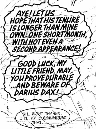
Pulled From My Files #34: BIG Lettering
 When comics lettering was all done by hand, most of it was rather small, with the average letter being about 1/8th inch high. Sometimes the script called for much bigger lettering for a particular character who was either very large himself, or meant to be scary or impressive. Here’s an example from SUPREME, I don’t know the issue. Larger letters like this allowed me to get more calligraphic, this style is my version of Blackletter.
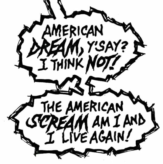
 Another example from SUPREME, again, no idea which issue, but the character is MacroSupreme, VERY large, and his lettering is, as you can see, about three times larger than normal. This style is done with a larger B-series dip pen, perhaps a B-4 or B-3, and it’s what’s known as display lettering, usually seen on cover blurbs or titles rather than in balloons.
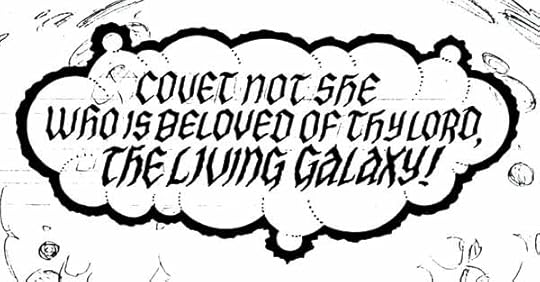 Another calligraphic style from SUPREME, similar to the first example. My favorite part of this one is the balloon shape made of various size spheres, and the edges of those spheres indicated by dotted lines.
 Finally, I think this is from SHADE, THE CHANGING MAN, the Vertigo series written by Peter Milligan, issue 50. More display lettering in a spooky style. The only drawback to big lettering is that it covers up more of the art. These days, artists are usually asking for smaller lettering rather than larger!
August 19, 2015
And Then I Read: ASTRO CITY 25
 Image © Juke Box Productions
Amanda Hammacher seems to be lucky in all things. Her mother was the super-heroine Hummingbird, and now Amanda has taken on that role as the new Hummingbird. She has a wonderful life, and many girlfriends, both her own age and her mother’s, but something is wrong. Amanda’s body is changing in unexpected ways, and that requires a trip back to the hidden city in Peru where, as a baby, Amanda was given gifts of power, but also a curse.
This is sort of a retelling of the Sleeping Beauty story, though the character doesn’t sleep. In some ways, she has sleep-walked through her childhood, and only awakened to the threat of her enemy as an adult. The guest art by Jesús Merino is excellent, and the writing is too, as always. A tale of girl power.
Recommended
August 17, 2015
And Then I Read: DOCTOR FATE #2
 Image © DC Comics, Inc.
Writer Paul Levitz and artist Sonny Liew are doing a great job of making fresh, fun super-hero comics in this title. Khalid Nassour is the reluctant recipient of the helmet of Fate, and spends much of this issue being harried and bullied by the helmet, the spirit of an ancient Egyptian priest, Nabu, who insists he’s just the right person to wear the magic helm he doesn’t want, and the evil spirit dogs of Bastet, who wants the helm and Khalid’s death. Reluctantly, Khalid takes on the power of Fate to save his father, and attempt to deal with the crashing plane seen on the cover. Meanwhile, Khalid’s girlfriend wants him to get back to his studies, and his mother could use some help and support, too. I like the art very much, it still reminds me of Ba and Moon, but that’s not a bad thing. Liew’s characters are wonderfully expressive and emotional, Khalid seems very vulnerable yet equally powerful when he must be. Even the page layouts and staging are appealing. This is quickly becoming my favorite DC comic.
Recommended
August 13, 2015
And Then I Read: BRAVO FOR ADVENTURE by Alex Toth
 Image © Alex Toth estate
The only thing wrong with this handsome, oversized hardcover is that it’s not thicker. Imagine Errol Flynn as a reckless but talented stunt pilot working for a film company in the 1930s, and you have the main character, Jesse Bravo. Jesse has lots of pilot pals, and one rival, Bo Bannon, who has captured the lead role in an upcoming plane picture. Jesse agrees to do stunt work on the film, and has a run-in with Vivi Powell, the daughter of the director and Bo’s girlfriend that has sparks flying. Meanwhile, a gangster and his gang are after Bo for welching on some bad debts, and are headed to the film shoot, as are Jesse, his fellow pilots, and Vivi. The plot threads collide in a glorious and gory action thriller that is every bit as entertaining as the films they look back to.
Alex Toth’s writing on this story is excellent, and so is his art. That’s no surprise, but Toth went through a process of simplification throughout his career, and to my eye, this book done in the mid 1970s catches Toth at the perfect balance between the more detailed work of his earlier career and the very sparse and simple work of later. I can’t think of any other Toth work I’ve enjoyed looking at more.
As to why there weren’t more Bravo adventures, it’s the usual story of bad business decisions, bad timing (this could have been as popular as Dave Stevens’ “Rocketeer” a decade or two later I think), and perhaps Toth’s own haphazard approach to his work. He talked of more, and teased with sketches and samples for years, but nothing was ever finished. Too bad.
We can certainly enjoy and celebrate what we do have, and I encourage you to do so. I can’t recommend this book highly enough!
August 12, 2015
And Then I Read: THE SPIRIT #1
 Image © Will Eisner Studios and Dynamite.
This is the latest attempt to produce new stories about Will Eisner’s best-known creations. There have been some in the past I liked, but none that I thought could match Will Eisner’s own work. This time I thought things started well, with a recap of The Spirit’s origin, and nice introductions for Chief Dolan and his daughter Ellen, the Spirit’s love interest. But oddly, the Spirit himself doesn’t really appear in the rest of the issue. Instead the focus is on the Chief and Ellen, then the new detective team of Sammy Strunk and Ebony White trying their skills on the mean streets of Central City. They have some humorous moments, but are not a substitute for the masked man in my opinion. The art followed a similar trajectory for me, I liked it a lot in the opening sequence, but as the story went on the faces and anatomy lost focus and quality, ending up too puppet-like. I did love the lettering by Dave Lanphear, even though he’s using another new studio name, “A Larger World Studios,” so it’s unlikely anyone will know it’s him. The coloring by Brennan Wagner was also fine. Was this a case of a new artist biting off more than he could chew? I don’t know, but I can only mildly recommend it.
Todd Klein's Blog

- Todd Klein's profile
- 28 followers

