
Brian Clegg's Blog, page 88
September 25, 2014
Science facts and black holes
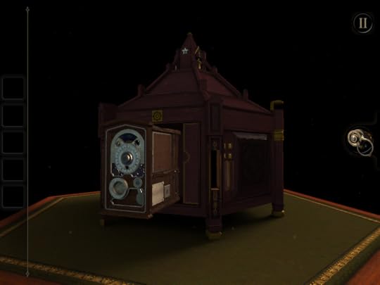
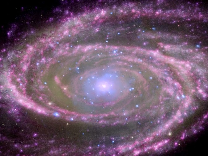 Chandra image of the black hole (or not)
 at the centre of spiral galaxy M81As any regular readers will know, I have a habit of banging on about the nature of science - that it isn't about establishing the 'truth' about reality, but rather about developing models that produce as close as possible results to what is observed, and that these models are inevitably provisional and could always be thrown out as new data becomes available.
This not saying 'anything goes' or 'all theories have equal value.' We will typically have a best theory of the moment, and the only sensible thing is to use that until something is established to have better credibility. But it does mean we shouldn't treat our models as certainties.
Sometimes when the model suffers a defeat it is patched up - as in the introduction of inflation to the big bang model. This isn't always a good thing as it can lead to epicycles - effectively taking a bad model and making it more and more complex and obscure to match observation. Other times the old model is genuinely thrown away.
Different areas of science have to be more or less loose with the models they accept. Cosmology, for instance, suffers hugely from the fact you can't do experiments in the lab and there is no opportunity for repetition. Inevitably, then, cosmological models are particularly at risk of revision or rejection as new data emerges. This is why I have always been very uncomfortable with saying that the universe began with* the big bang 13.7 billion years ago, something you will generally hear stated as fact by pretty well anyone doing science presentation on TV. (Naming no names.) I understand why they do this - there is a huge temptation to over-simply under media pressure. I've done it myself. But what they really should say at least once is 'when I say this happened, please take this as having an unsaid proviso "this is our best current theory, but it may well change in the future."'
A recent paper suggests that one of the keystones of modern cosmology, black holes, don't exist. There have been mutterings about black holes in the past, but this a mathematical proof that they can't form. The paper hasn't been peer reviewed yet, so there's a big proviso to this, but it's entirely possible it's true. If so, in some ways it's a relief. We would still have near black holes, doing all the things currently ascribed to black holes by astrophysicists and cosmologists. We would still have spaghettification. But we wouldn't have all the uncomfortable weirdness and breakdown of theory provided by the event horizon and the singularity.
However, my point here isn't so much the implications of the proof, if true. Rather it's that here again is something that we all knew was speculative, but have spoken about far too often and too long as if we were dealing with fact. It's time scientists and science presenters were rather more, erm, scientific about the way they presented what we know - and don't know.
* Technically just before (this is inserted to keep John Gribbin happy)
Image Credit: X-ray: NASA/CXC/Wisconsin/D.Pooley & CfA/A.Zezas; Optical: NASA/ESA/CfA/A.Zezas; UV: NASA/JPL-Caltech/CfA/J.Huchra et al.; IR: NASA/JPL-Caltech/CfA


September 24, 2014
What to do with a fish kettle
 I am always interested in books about autism, in part because like most people with a scientific background, I share some traits with those on the spectrum. I've previously reviewed, for instance Simon Baron-Cohen's book
The Essential Difference
, and most fascinatingly, if rather hard work, Richard Maguire's
I Dream in Autism
. So it was with real interest I agreed to take a look at a copy of Michael Barton's A Different Kettle of Fish, in which he, a physics student with high functioning autism, describes what it's like to take a trip into London.
I am always interested in books about autism, in part because like most people with a scientific background, I share some traits with those on the spectrum. I've previously reviewed, for instance Simon Baron-Cohen's book
The Essential Difference
, and most fascinatingly, if rather hard work, Richard Maguire's
I Dream in Autism
. So it was with real interest I agreed to take a look at a copy of Michael Barton's A Different Kettle of Fish, in which he, a physics student with high functioning autism, describes what it's like to take a trip into London.My first opinion was that it is a very slim book at just 80 pages of large, well-spaced print, which for £10 seems a little skimpy. Nonetheless I would recommend it to get some insights into a different way of looking at the world. Our biggest difficulty in sharing the world with people on the autistic spectrum is understanding why and how they see and feel things differently. It is partly about the way we so often say things we don't really mean, and partly in the sensory overload they can feel with the need to process everything that most of us ignore or don't notice in the first place.
One thing that did irritate me slightly was the constant mention of strange sounding euphemisms and idioms. Time and again, Barton tells us he doesn't get what is being said, because it sounds weird. But we all think this the first time we hear such an expression, then we assign a meaning to it, just like any other vocabulary. 'Sausage' sounds weird if you don't know what it means. It would really have helped if Barton could have explained why someone with autism can't learn what a euphemism codes for and assign a meaning to it. Unpacking the experience and explaining would have meant so much more than coming up with more and more examples with no context. Later in the book he does admit to learning them most of the time, but notes he has to learn them first, where most people seem to pick them up naturally - I'm not sure this is true. I think we all think 'What???" the first time we hear about a red herring, say. What is more interesting and informative is his failure to understand indirect requests like 'Can you pass the salt?' (Response: 'Yes.')
I was also slightly suspicious that the author was trying to find 'funny' meanings in announcements to the extent that he at least once created one. I can absolutely understand being amused by an announcement saying 'This is an announcement,' or a sign saying 'Dogs must be carried' - plenty of people who aren't on the autistic spectrum laugh at this kind of thing too. You regularly see them on Facebook and the like. But when Barton tells us a tube announcement says 'Please let other people off the train first,' with its implication that no one will make the first move, it smacks of constructed humour - because the actual announcement is 'Let customers off the train first, please.' (You can even hear it by clicking the play button at the top of the post.) The exact wording, by not having that 'other', and the fact that the announcement is on the platform speakers, not the train speakers, makes it much clearer that this is addressed to people who aren't on the train. The announcement makes perfect sense.
Overall, the book is still quite a good way to get the message across to some who aren't aware of people on the autistic spectrum. The bumf says the book is aimed at everyone from children aged 8 plus to adults, but I think it would be best confined to the 8-12 range (in which case, the pricing should be seriously reduced).
You can find out more about the book, or purchase it, at Amazon.co.uk and Amazon.com.
September 23, 2014
The New Tyson Fight
.jpg) Neil deGrasse TysonOne of the interesting aftermaths of the Scottish Referendum debate was that I have seen a number of people saying 'A lesson to learn is don't trust the traditional media, get your information from social media.' I know where they were coming from, but there are two dangers here - one is that (even more than watching, say, Fox News) you won't get information you will get propaganda, and the other is that even when you aren't being told what you want to hear by your friends and political allies, a lot of internet sources are unreliable. The Tyson story I want to tell you illustrates this doubly.
Neil deGrasse TysonOne of the interesting aftermaths of the Scottish Referendum debate was that I have seen a number of people saying 'A lesson to learn is don't trust the traditional media, get your information from social media.' I know where they were coming from, but there are two dangers here - one is that (even more than watching, say, Fox News) you won't get information you will get propaganda, and the other is that even when you aren't being told what you want to hear by your friends and political allies, a lot of internet sources are unreliable. The Tyson story I want to tell you illustrates this doubly.The Tyson in question is not Mike, but science populariser and astronomer, Neil deGrasse Tyson. I was surprised the other day to hear that Tyson was being pilloried for making up quotes to support an argument. The argument in question is that a lot of people (including many in the media and our elected representatives) are extremely ignorant about science and so (I presume) aren't well equipped to make decisions about science teaching and science funding. This is an argument I strongly support - but clearly not by making up data.
There seem to be three quotes that have caused the furore. Tyson claims that:
George Bush made a speech after 9/11 distinguishing 'we from they' by saying 'Our God is the God who named the stars.' Yet lots of named stars have Arabic names - Bush made a silly argument, claimed Tyson.A congressman uttered the sentence 'I've changed my views 360 degrees on that issue.' Which showed basic ignorance of what 360 degrees is.A newspaper headline in New York City: 'Half the schools in the district are below average.' - Tyson claims 'we have to re-think the foundations of mathematics if this were false.'There is video evidence of Tyson's use of these quotes, so that much is pretty definitively true. But the furore is over whether any of these allegations are true, or Tyson just made up the quotes to suit his message.
Tyson's detractors claim the following:The Bush quote was not made after 9/11, but after the Columbia disaster and he actually said 'The same Creator who names the stars also knowns the names of the seven souls we mourn today.' This had nothing to do with Christians versus Muslims and was simple consoling rhetoric.There is no evidence of the 360 degree comment being made as quoted, though Representative Maxine Waters did say 'You have done a 360 degree turn' to someone.The information on schools below average in the headline, which no one can find, could well be false, so Tyson misunderstood statistics by claiming that you would have re-think the foundations of mathematics if it were false.Others have weighed in claiming that this is a anti-intellectual right wing campaign against Tyson, some even suggesting that it is because he is black.
What really applies? As far as the basic facts go, the detractors mostly have it right. The Bush quote was misapplied and misquoted. The 360 degree 'quote' was not word for word. And in principle the headline could be reasonable and can't be found in a New York City newspaper headline (online, at least). This last is the least obvious, but the reason the headline could be reasonable is that it is not true that exactly half a population will be below average, as Tyson seemed to imply. Take for instance a room full of ordinary people and Bill Gates. Look at the average net worth of the people in that room. Chances are everyone except Bill is below the average. The number that is in the middle of the grouping is not the average, it's the median.
So what have we established? Tyson's use of the Bush quote was a real, and unpleasant error in the way he misused it. The 360 degree quote was mis-worded, probably typed from memory - he should really have checked, but frankly it's close enough. And no one can find the 'below average' quote, but if it were true, we needed more information to criticize it, as it isn't stupid in its own right. It's still quite likely the newspaper was misreading the information (apart from anything else, the media often call a median an average because they think the readers don't understand 'median' - see my article on this happening over 'average house prices'.) So Tyson could have been making a worthwhile point, but it would have needed a lot more unpacking than he actually did to be sure.
To be honest, I don't like Tyson's approach to public speaking - it tends to the pompous and bombastic (perhaps this is just a US/UK style thing), belittling those who don't agree, which I don't think is a great way to make an argument, even if they are wrong. He made a clear mistake on the Bush quote and messed up with the the 'below average' business. So he ought to clean his act up, and admit this. But frankly these errors have nothing to do with a serious and important message. So by all means consider Tyson reprimanded - but don't confuse the message and the messenger. What he was saying about the media and the political class being dangerously ignorant of science is still true.
However, those who defend Tyson saying this is a fuss over nothing are also wrong. He is not a gutter press journalist, he's a scientist. And he knows perfectly well that two of the biggest failures for a scientist are to make up data, and to rely on anecdotal evidence. And he has clearly done at least one of these here. It was a serious error of judgement, hence the need to apologise.
The reason I said at the beginning that this is a double error of trusting unverified online sources is that firstly people have been coming out pro and anti Tyson based on reports that take one or the other extreme view on what happened, and secondly because I suspect the reason Tyson got the quotes wrong in the first place was that he too relied on a dubious internet source. We all slip this way occasionally. I certainly have. But it's a good reason for taking a step back from that 'get your information from social media' suggestion.
"Neil deGrasse Tyson August 3, 2014 (cropped)" by Mingle Media TV - https://www.flickr.com/photos/minglem.... Licensed under Creative Commons Attribution-Share Alike 2.0 via Wikimedia Commons
September 22, 2014
What to name your new university town
 Once again, the UK has done brilliantly in the worldwide university league tables, with four universities out of the top six. But I was interested in another phenomenon, which I haven't seen reported in the press.
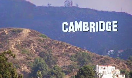
Let's imagine you are an up and coming country, building a new university, and you want to rename the town it is in to give the university instant prestige. What should you call it? Look again at that top six and something fascinating pops out. Look at where the universities are located:
Cambridge (Mass)Cambridge (UK)London (2=)Cambridge (Mass)OxfordLondon (5=)Spot anything? So I look forward to a lot of new towns called Cambridge springing up around the world.
Image from Hollywood Sign Generator
September 19, 2014
Sticky fun
I get sent a lot of press releases, most of which go in the electronic bin within 2 seconds. (In some ways I really miss the old days when I used to get paper press releases through the mail, some of which were really creative. Though there was a lot of fuss, as I recall, about one computing company that sent out a release with lots of tiny pieces of paper that flew all over the floor when you opened the envelope. But I digress.) Occasionally, however, I get one worthy of note.
This one was about cover stickers for Apple MacBooks (other laptops exist, but apparently they aren't worthy of stickers). Now, I ought to come out straight away in 'Ba, humbug!' mode, because I think stickers look absolutely terrible on laptops. It's fine if you're six, but if you are 16 or older, it's time you grew out of it. It just looks a mess. I don't mind a tasteful shell, but no stickers, okay?
However, if you insist on tarting up your beautiful and expensive hardware with paper or plastic tat, a 'virtual design studio' called DesignCrowd has run a contest to design 'useful stickers' and apparently Apple has officially endorsed them being used on MacBooks. So here are some of the best 'decals' (as our US cousins like to think of them), according to DesignCrowd and/or their PR agency:
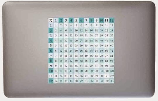
Hmm... a multiplication table. Really useful if you lose the calculator app.

Ah yes, reminders of the Photoshop shortcuts. Mind you, even better if they had been printed back to front so you could read them in a mirror while you work because, guys, you can't see the back of the computer when you use it!
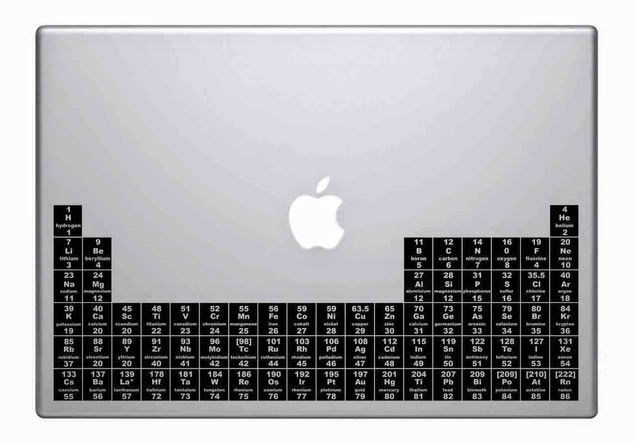
 Periodically useful. Geddit? One teensy problem - about half the elements are missing.
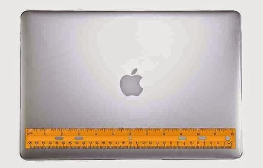
Somehow, this appeals to me most. Perhaps it's the simplicity. And the thought of flinging a £1000 laptop around to use it as a ruler.

No, totally loses me, this one. Just weird.
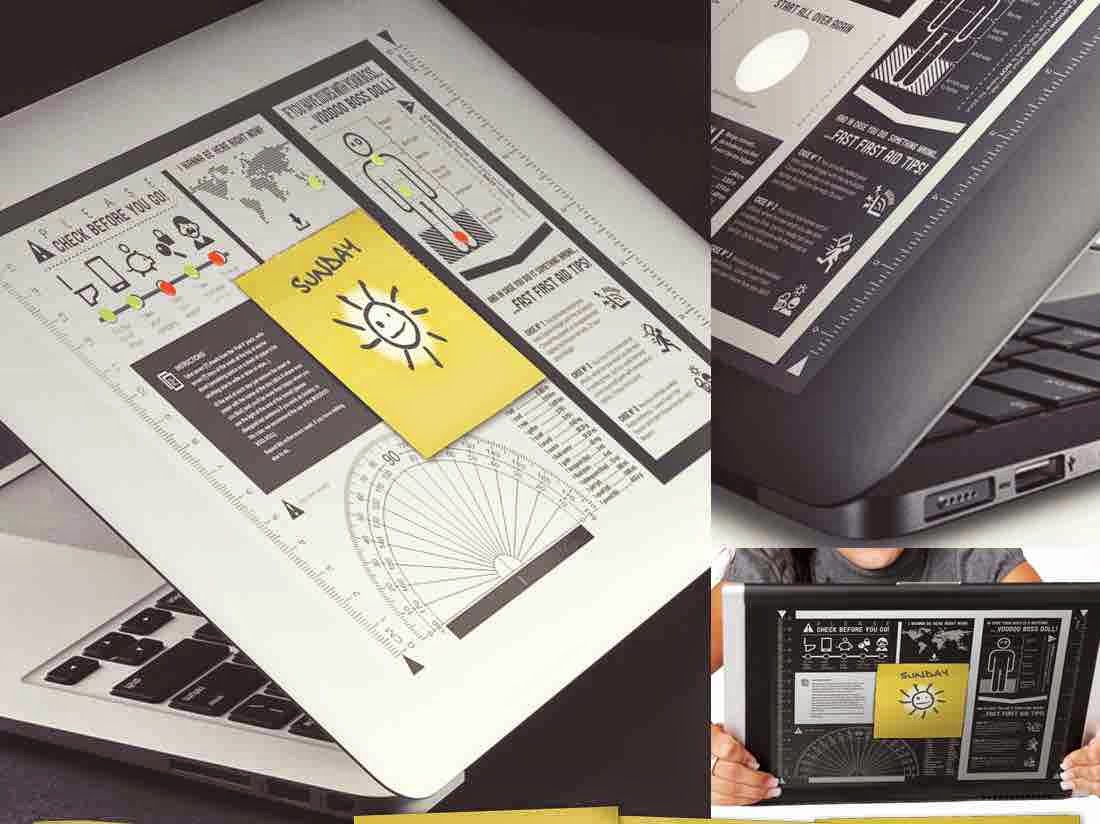
Interesting, certainly... but surely there could be something more imaginative? How about, for instance, a sticker that makes it look like you are seeing through the lid. Or... no, stop me. I don't want any stickers, and that's the end of it.
This one was about cover stickers for Apple MacBooks (other laptops exist, but apparently they aren't worthy of stickers). Now, I ought to come out straight away in 'Ba, humbug!' mode, because I think stickers look absolutely terrible on laptops. It's fine if you're six, but if you are 16 or older, it's time you grew out of it. It just looks a mess. I don't mind a tasteful shell, but no stickers, okay?
However, if you insist on tarting up your beautiful and expensive hardware with paper or plastic tat, a 'virtual design studio' called DesignCrowd has run a contest to design 'useful stickers' and apparently Apple has officially endorsed them being used on MacBooks. So here are some of the best 'decals' (as our US cousins like to think of them), according to DesignCrowd and/or their PR agency:

Hmm... a multiplication table. Really useful if you lose the calculator app.
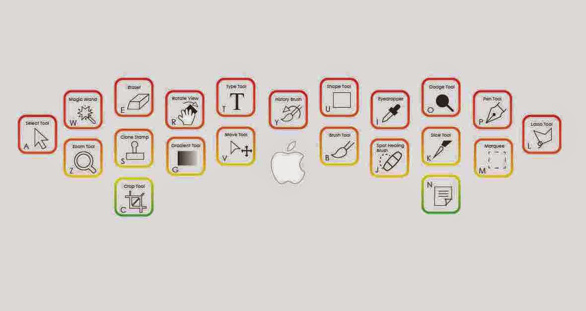
Ah yes, reminders of the Photoshop shortcuts. Mind you, even better if they had been printed back to front so you could read them in a mirror while you work because, guys, you can't see the back of the computer when you use it!
 Periodically useful. Geddit? One teensy problem - about half the elements are missing.
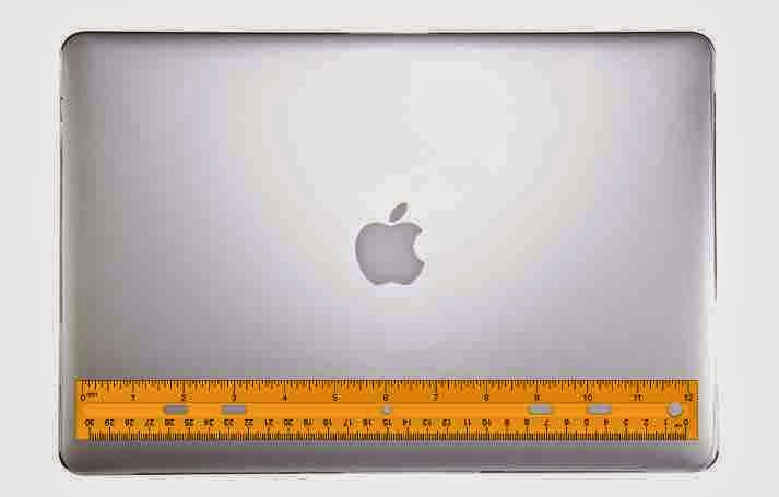
Somehow, this appeals to me most. Perhaps it's the simplicity. And the thought of flinging a £1000 laptop around to use it as a ruler.
No, totally loses me, this one. Just weird.
Interesting, certainly... but surely there could be something more imaginative? How about, for instance, a sticker that makes it look like you are seeing through the lid. Or... no, stop me. I don't want any stickers, and that's the end of it.
September 18, 2014
Come on England, have some pride!
 As the Scots go to the polls, I'd like to direct attention back home for a moment. The fact is, there have been some pretty unedifying scenes down here. We've seen political leaders and celebrities begging Scotland not to leave the union. I really don't understand why these people are so worked up. Perhaps they should put some effort into having pride in being English.
After all, in the grand scheme of things, England has a lot to be proud of - whether it's in cities and countryside, culture and heritage, literary fields, science or whatever. Take universities. It's interesting that the Guardian reported on Tuesday that 'Four British institutions ranked in top six of world's universities.' This is true - but it's also true that four English institutions ranked in top six of world's universities - because those four were Cambridge, Imperial College London, Oxford and University College London.
The fact is that England has around 90% of the population of the UK. For most of the world, England is the UK. Even if the entire union split up, England has the same population now as the entire UK had in 1961. By losing Scotland we're talking less than 10% change in population. Hardly makes us a tiny nation.
Of course there would be losses if Scotland went independent, but there would be plenty of gains too - including the chance for English people (and Welsh and Northern Irish too - I just happen to be English) to feel like they have more of a proper identity. This is not about nationalism. One thing I've learned from the interviews of Scots during the run up to the vote is how many said something to the effect of 'I'm not a nationalist - but I am proud to be a Scot.' For too long we've been scared that the only people who are proud to be English are right wing thugs. But it shouldn't be like that.
It's too late to change what has happened already - but politicians and celebrities, shame on you. Let's let Scotland make the best decision for itself, and start to think about ourselves with as much pride as they do.
September 17, 2014
What's in a cereal?
 The other morning I was staring at the back of a cereal packet on the breakfast table, as you do, and read the contents list. Nothing extraordinary, until I started to look at the numbers involved and discovered the Nestlé seems to have something in common with the X-Factor. They believe that it's possible to give 110%.
In fact there are two significant oddities in that ingredients list. One is the matter of nuts. Because it says that the product (Honey Nut Shredded Wheat, if you must know) contains 10.5% nuts when in fact its only 0.3% - that's quite an error bar. This is because neither peanuts nor coconut are actually nuts. But we'll let them off, because there is probably some sort of convention that allows them to come under this heading. (It can't just because they have 'nut' in their name, as 'Honey Nut Shredded Wheat' has 'nut' in its name. So if that were the rule, the contents should read '100% nuts'.)
But the more interesting oddity is the maths. You might wonder what the problem is. With 84.1% wheat, 10.5% nuts and 2.8% honey, that still allows 2.6% for the other bits and pieces. But ingredients lists don't work like that. They have to be specified in order of weight - so there is more sugar than there is nuts, the list just doesn't mention how much sugar. With a minimum of 10.6% sugar, that makes a minimum contents of 108%.
We can get some idea of the quantity of sugar from the nutritional information. We are told that 100g of the product contains 15.9g of sugar - but we can't just take this number as the missing figure, as it will also include the sugar in the honey and molasses. So reasonably we can guess that the 'sugar' percentage is in the 10.6-12% range.
So what is going on? Thankfully, Nestlé has been helpful on the subject and told me this:
The basic maths does not add up and unfortunately this situation is replicated across many foods as they try to comply with QUID (Quantitative Ingredient Declaration) legislation. The complication comes from the requirement to list the amount of ingredients as they are added to the formula at each step. It is called the ‘mixing bowl’ rules.
In a simple process, this works well and the ingredients add up to 100%. In a process with many steps, and where moisture is lost in intermediate drying and toasting stages, the maths becomes more complex and illogical, and 100% is hard to achieve. Each product must be viewed in isolation, and its manufacturing method affects the final result as well as the ingredients used.
We have to comply with 'The Food Labelling Regulations 1996' and its amendments. There are two amendments which detail how we should declare the quantities of ingredients used, and the key requirement is in the second of these Amending Regulations, which states; 'Where the food has lost moisture as a result of treatment, the indication of quantity of the ingredient or category of ingredients used shall be expressed as a percentage which shall be determined by reference to the finished product”.So there you have it. The percentages can't really be taken as sensible detailed information, just a broad brush guide. This doesn't of course, explain why peanuts and coconuts are nuts (no doubt another regulation), or why there is no percentage against sugar - but it does help us understand what is going on to allow Nestlé (and other food manufacturers) to give 110%.
September 16, 2014
Central heating and the change in watching position for Dr Who
 In a Facebook discussion of the most recent episode of Dr Who (yes, that's the kind of exciting social life I have), Matt Brown expressed (mock?) surprise that people didn't push the sofas against walls in the old days - and suddenly one of the greatest mysteries of the universe clicked into place. It's all about hiding behind the sofa. (If you aren't from the UK, you may need assistance from the Wikipedia page on the subject.)
When I was little, I did, genuinely, watch Dr Who from behind the couch (we weren't posh enough to call it a sofa), so that it was possible to hide when it got really scary. And I was not alone. Most of the young nation used to do this. Yet it is a practice that has pretty much entirely died out. Why?
I had assumed it was because the yoof of today is far more cynical and exposed to horrors that make Dr Who look wimpish in the extreme. But there was no doubt that this Saturday's episode, Listen, was suitable behind-the-sofa material, especially the bit with the bedspread right behind them (you have to have been there). If you haven't seen the episode and have access to BBC iPlayer, I recommend it. And then Mr Brown made that simple remark.
Because the fact is, these days, many people do push their sofas against the walls, while back then they tended not to. There could be various reasons for this - fewer squarish living rooms now, and we have much bigger TVs, for instance. But my suspicion is that it could be central heating related. Like much of the UK, we didn't have central heating when Dr Who first aired. In our case not until 1966. Before then, on a winter evening, you didn't want your sofa miles away from the fire. So the seats tended to be more advanced into the room than they now would be.
Of course, this could be rubbish. But it's a theory. And even better, it's a Dr Who related nostalgic theory. What more could you ask?
September 15, 2014
The Room - review
Sorry, games again! But this is the last of the series.
After my recent dip into the nostalgia of game playing while reading the book on the makers of Doom, I just had to have a go at a game. There was a temptation to revisit the past and fire up a copy of the Seventh Guest or Doom itself (both available on Mac, though sadly my old favourite, the X-Wing series isn't so I would have make to do with Wing Commander III). And I may still do so, though as I pointed out in the piece on Netflix and games, I'm not sure I could make the time for serious playing time any more.
However, while perusing 'best of' lists to see what's recommended on the Mac at the moment, I noticed some 'best on iPad' games and was tempted to spend the enormous sum of 69p on a game called The Room - and I am so glad I did.
If you ever played something like Seventh Guest, this is a bit like the puzzles without all the wandering around. The Room limits you to a single table - but on that table is the most gorgeous, complex puzzle box you ever saw. And if you complete it and open the box - another, even more wonderful box emerges. One, for instance, turns into a gorgeous planetarium and orrery.
 It's a bit murky, but this is a part of the level 2 (or is it 3?) puzzle box. The device on the front is a complex clock that you need to get going. Every flap, button, knob and locked door will eventually contribute something. For me, this is the ideal game for the Netflix generation. You can do it a bit at a time (although it is extremely more-ish, and the temptation is to just do one more clue). And there's no frustrating dying and going back to the start. You can do whatever you like in whatever order it presents itself and it will either not work or take you on a step.
It's hard to describe the puzzles without giving too much away, but they range from simple physical discoveries along the lines of 'if I turn that bit it will open a door in which I will find something', through the need to build a gear chain to get some machinery running to spotting an inscription on the back of a photograph that tells you in an obscure fashion how to position something you will discover later (and only be able to see through a special viewing glass). It is brilliant! And did I mention it was cheap? Even better, it's a couple of years old, so The Room 2 is waiting for when it's completed.
There is a hint system, but most of the time you can make progress without it. I'm so glad I read that book...
September 12, 2014
The Toffler scorecard part 2 - weathering heavy seas
 A little while ago I took a step into Alvin Toffler's bestselling 1970 book Future Shock to see how its vision of the future has held up. Here's the second instalment.
Perhaps the biggest danger was always where science is involved, and in a chapter titled 'the scientific trajectory' we start off with a pair of unlikely projections.
The first concerns the oceans. As has often been observed, there are huge opportunities in the sea, particularly as we use up more and more land-based resources - and there is far more space than on the land - so it was common back then, and Toffler falls for it hook, line and sinker, to assume that we would see far more sea-based industry, and even underwater cities.
Toffler quotes Dr F. N. Spiess, heard of the Marine Physical Laboratory of the Scripps Institute as saying 'Within fifty years man will move onto and into the sea - occupying it and exploiting it as an integral part of his use of the planet for recreation, minerals, food, waste disposal, military and transportation operations, and, as populations grow, for actual living space.'
That 50 years is close - but very few of these predictions are. Yes, we make more use of underwater resources like oil and gas. But living on and in the sea is generally a very expensive and restrictive way of going about things, and there is no sign of it becoming commonplace. Toffler expected 'aqua-culture' to be as frequently used a term as agriculture by now. Maybe not.
I'm not quite sure why, but Toffler links his second dubious prediction to the first when he says 'The conquest of the oceans links up directly with the advance towards accurate weather prediction and, ultimately, climate control.' He quotes Dr Walter Orr Roberts, past president of the American Association for the Advancement of Science as saying 'We foresee bringing the entire globe under continuous weather observation by the mid-1970s - and at reasonable cost. And we envision, from this, vastly improved forecasting of storms, freezes, droughts, smog episodes - with attendant opportunities to avert disaster.' What they didn't realize was that the seeds of the failure of this prediction were already sown.
While it's true that weather forecasting has got a lot better since 1970, so has the understanding that we are never going to be able to predict weather more than a few days into the future. Through the 1970s and 80s an increased understanding of the nature of chaotic systems would make it obvious that it doesn't matter how good Dr Roberts' worldwide weather observation is, the weather system is just too complex and too susceptible to small changes in initial conditions producing huge changes down the line. I suppose I shouldn't be too hard on Toffler as we still regularly see presented as 'fact' forecasts outside the 10 day window, where a guess based on typical weather for the time of year is more accurate that a forecast. But the confidence in the predictions on weather forecasting and climate control vastly misunderstood both the nature and scale of the problem.
Sorry Alvin - this one's a 100% fail.


.jpg#mediaviewer/File:Neil_deGrasse_Tyson_August_3,_2014_(cropped).jpg)