Dibyajyoti Sarma's Blog, page 45
January 12, 2015
Judging Books by Their Cover

 Sometimes competition can be a good thing; it can lead to innovation. Take the publishing industry, for example. As physical books face mounting competition from their digital counterparts (ebooks), publishers are finding ways to make physical books look more enticing. Content is one thing, but printed books are now being marketed as collector’s items. The ‘Meerut model’ of cheap pulp publication, where you buy a cheaply printed book, read it and sell in the ‘raddi’, is now passé. Indian book printers (especially in English language publication) are now waking up to the international standards of book printing, be it the choice of paper size and weight, or how the book is bound and presented, including the choice of fonts and colour.
The Western trend of printing a Collectors’ Edition of a bestseller is also catching on. For example, in 2013, on the occasion of the 25th anniversary of Amitav Ghosh’s landmark novel, The Shadow Lines, Penguin India printed a limited Collectors’ Edition, which came in a brand new cover and a slip case.
There have also been attempts to market a book as part of a multimedia collection. For example, music composer Shantanu Moitra’s book, On the Wings of Music: A Journey, published by HarperCollins India in 2014, also comes with a compact disc of songs composed by Moitra.
Yet, content aside, the most important aspect of a book remains the cover. It is the first thing a reader notices, whether in a bookshop or in an online retail store. Also, a good book needs a good cover to differentiate it from the other books in the market. The cover is the window to the interiors of a book.
In case of a physical book, the cover should not only look good, it should also have great tactile appeal, in terms of the paper used, and so on.
While we cannot honestly conclude that book printing in India as a whole has reach the statures where it can compete with the international standards, there are individual big-name players who are producing consistently stellar works, both in terms of quality production and innovation. Thus, it is not a surprise that printers like Replika Press, Repro India, and Thomson Press, beside local customers, have also attracted a sizable global customer base.
Closer home, in the last few years, a reasonably young publishing house, Aleph Book Company, helmed by David Davidar, has produced books with striking production value, from the size of the books to ingenious cover arts to selection of quality paper, not only for paperback and dust covers, but also the paper for inside pages. The credit for this also must go to Haryana-based Replika Press, which, over the years, has shown commitment to consistent quality. Most books from Aleph are printed by Replika.
While he stresses on the fact that content is the most important aspect of a book, especially for a publisher of children’s books, Apurv Garg, director, Brijbasi Art Press, one of the country’s biggest publishers of children’s books, reiterates that the cover of a book is commercially the most important aspect of the book. So, care must be taken to make it eye-catching. “We use various finishes, including glitters, abrasive varnish, foil (sparkle or regular), matt and gloss covers or spot UV, holographic lamination, emboss and de-emboss, die-cuts, fluorescent and sometimes combinations of this,” says Garg.
He adds, “We are sure of our content, and to be sure the child picks up the correct book for him/her, we make the covers attractive so they don’t miss out the best content!”
This seems to be the general consensus among publishers and printers. A good book must have a good cover.
PrintWeek India talks to people in the know about book covers they liked the best in 2014.
Among international titles, Divya Dubey, publisher of Earth Lamp Journal, an online literary magazine, likes the cover of Japanese master Haruki Murakami’s The Strange Library, for its “minimalist, realistic, fantastic cover.”
Among Indian titles, Dubey likes Mirza Waheed’s second novel set in the turbulent times in Kashmir, The Book of Gold Leaves, which, Dubey says, “is eye-catching without being too loud.” Interestingly, the cover image is a detail from the artwork by the author’s great-grandfather Mirza Ali. The book has been published by Penguin India.
Dubey also likes the 20th Anniversary Edition of Vikram Seth’s The Suitable Boy, published by Aleph, which features three parrots in flight against a worn out old wall, which according to Dubey, is “very appealing.” The cover photograph was by Varanasi-based photographer Laurent Goldstein.
Aleph also published Hansda Sowvendra Shekhar’s novel on the Santhal community in Jharkand, The Mysterious Ailment of Rupi Baskey. Printed by Replika, the cover in yellow and green, inspired by calligraphy strokes, is also one of the most artfully designed covers printed last year.
Shekhar, the author of the book, on the other hand, likes the cover of Kathmandu-based author Prawin Adhikari’s collection of stories, The Vanishing Act. “Of the books I read in 2014, I found the cover of this book quite intriguing,” says Shekhar. “The cover shows a person drowning in water and struggling for life. Perhaps this drowning is the vanishing act the author wishes to tell us about. Perhaps it is something else. Many questions arose in my mind after I saw this cover.”
Published by Rupa, the cover was designed by Maithili Doshi Aphale.
Pune-based author Sucharita Dutta-Asane likes the cover of Kaushik Barua’s novel Wind Horse, published by HarperCollins. “The cover appealed to me for aesthetic and thematic reasons,” says Dutta-Asane. “The book is about a small group of Tibetans who set up an armed resistance against their occupiers. It is about a war that is still going on, in minds and on the ground too. Obviously, the theme involves a degree of bleakness. The cover captures and presents this bleakness and is very evocative. The title in red against this bleak background resonates with the book’s central theme and images--of a mythical hope countered by the gloom of reality.”
Delhi-based poet Ankur Betageri likes the cover of Damon Gargut’s retelling of British novelist EM Forster’s sojourn into India, Arctic Summer, again, published by Aleph and printed by Replika. The cover features a turbaned man throwing pink gulaal in the air, creating a picture of quintessential India. The book recently won the Book of the Year award at 2014 Tata Literature Live! festival.
Meanwhile, Pinaki De, a well known graphic designer with number of book covers to his credit, lists his favourite covers from last year in a daily newspaper. These include The Mysterious Ailment of Rupi Baskey; Kuzhali Manickavel’s Things We Found During the Autopsy, published by Blaft; Gayatri C Spivak’s Readings, published by Seagull Books; Nilanjana Gupta’s Strangely Beloved: Writings on Calcutta, published by Rupa/Rainlight; Damodar Mauzo’s Teresa’s Man and Other Stories from Goa, published by Rupa; Mirza Waheed’s The Book of Gold Leaves; Rana Dasgupta’s Capital: A Portrait of Twenty-first Century Delhi, published by Harper Collins India; Himanjali Sankar’s Talking of Muskaan, published by Duckbill; and Eat the Sky Drink the Ocean, an anthology edited by Payal Dhar, Kirsty Murray and Anita Roy, published by Zubaan.


January 8, 2015
Posting the cover of the book, five years later; proud of...
 Posting the cover of the book, five years later; proud of the achievement, and of the book’s influence…
Question AnsweredIn a dream one night,I asked my beloved,...
Question Answered
In a dream one night,
I asked my beloved,
'Which do you like more:
my town or yours?
My town is Honnuru,
and yours Naviluru:
which do you like more?'
'Which do you like more:
my town or yours?'
Is that a question to ask?
Lounging in bed in my town,
I dreamt of yours:
need I say more?' she said.
'Which do you like more:
my town or yours?
Is that a question to ask?
Quiet, my prince!'
'On the way to my town,
coconut palms beckon,
banana trees wave.
Brides to thorn fences,
swaying buds of jasmine
daub the air with perfume.
Laughing girls from my town
prance to the fair in yours.
My love then stops me to say,
Honnuru it is, happier than Naviluru.'
K S Narasimha Swamy
(translation by S R Ramakrishna)
* Honnuru: Town of Gold; Naviluru: Town of Peacocks
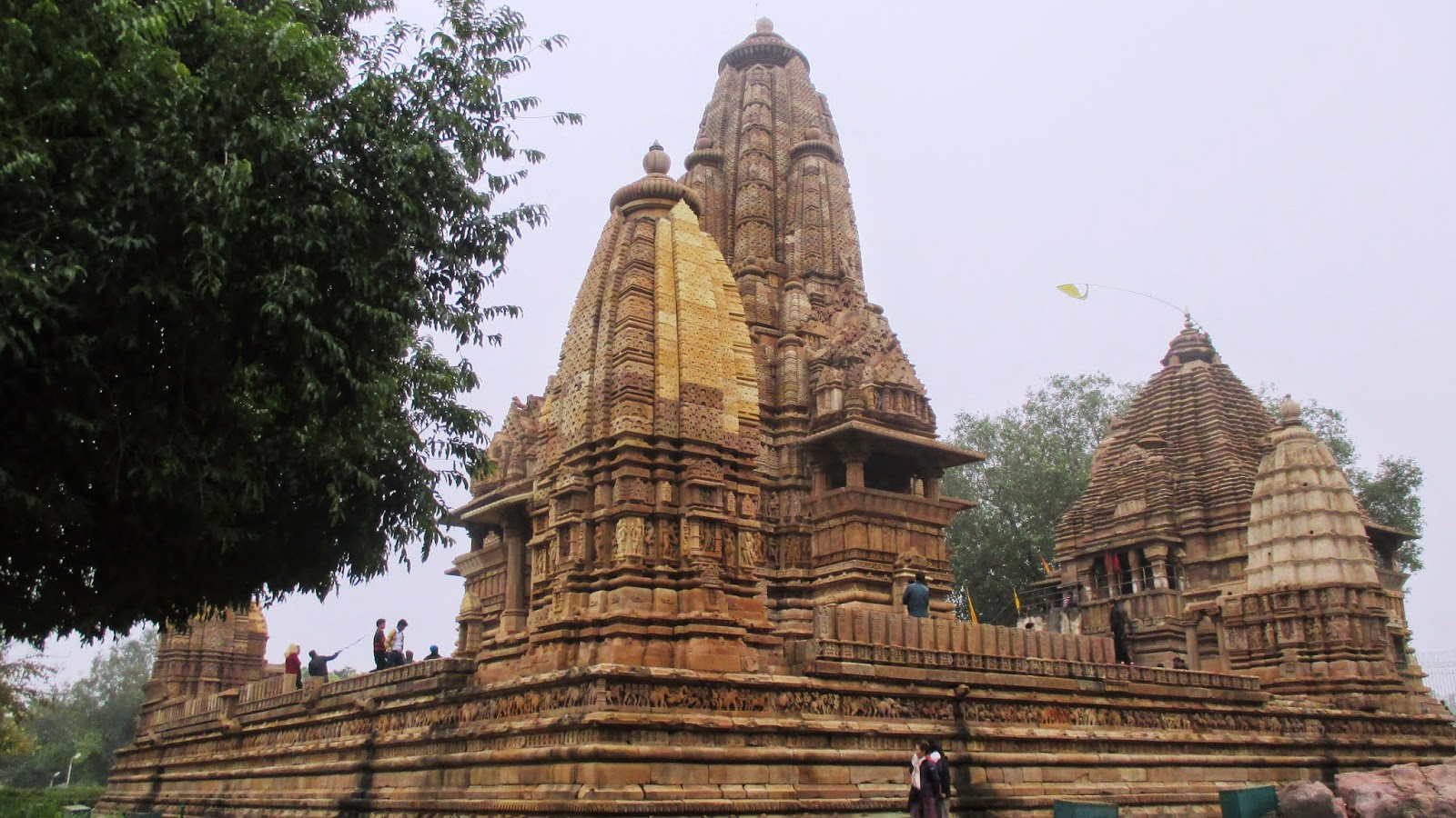
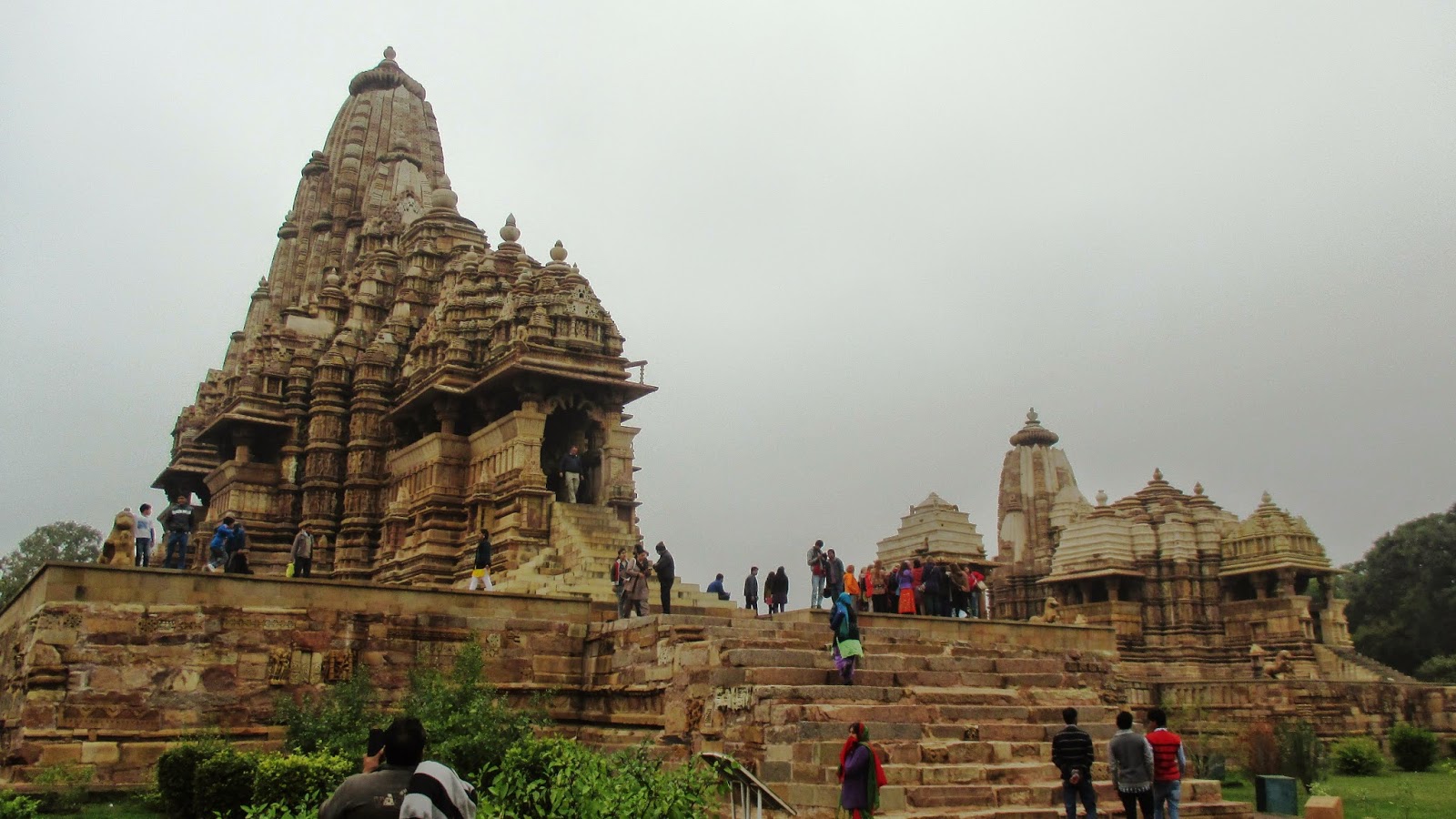
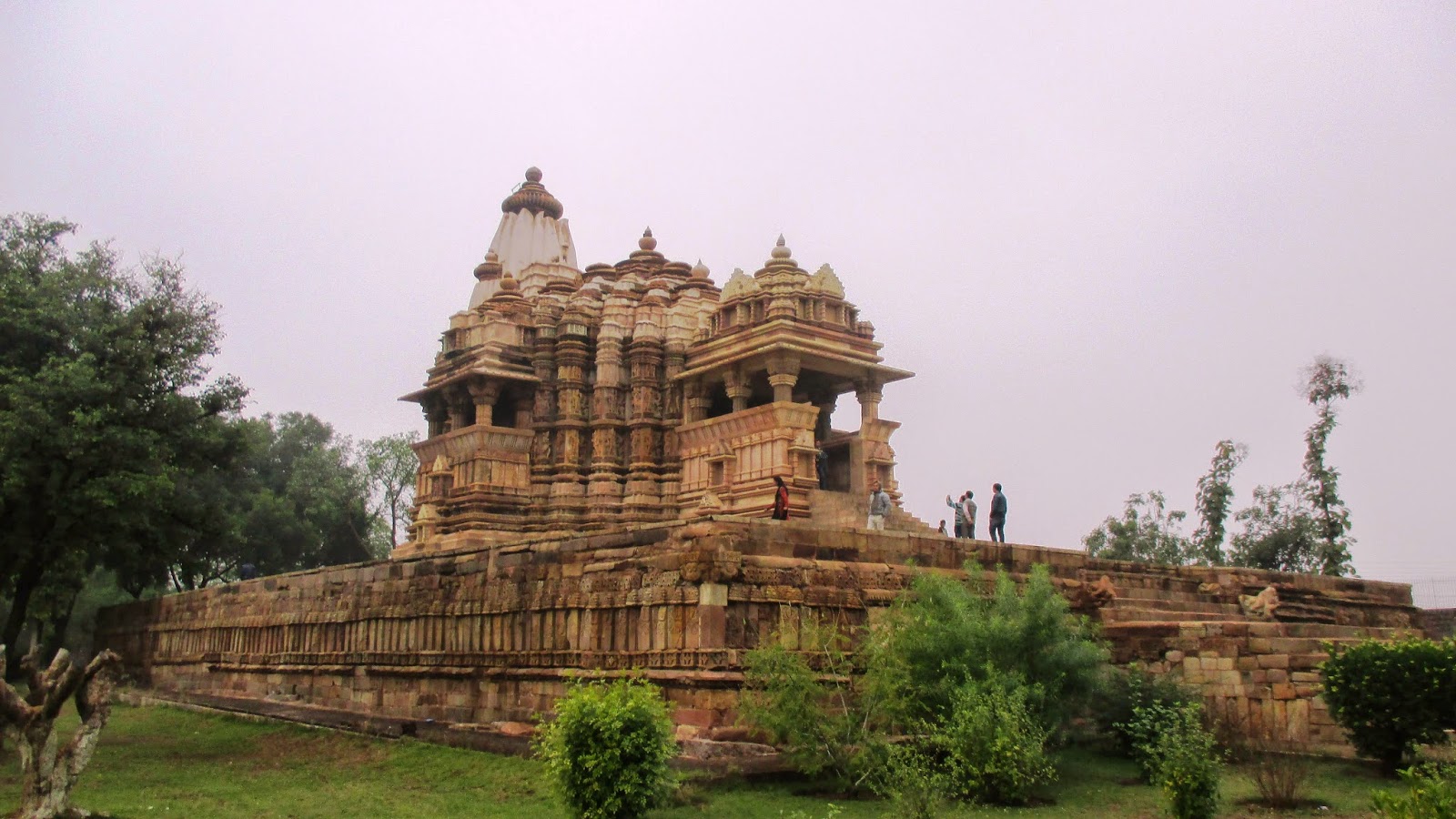
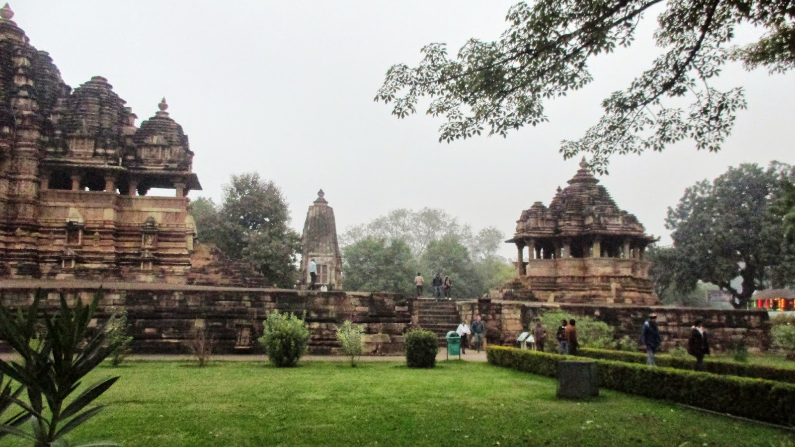
Khajuraho
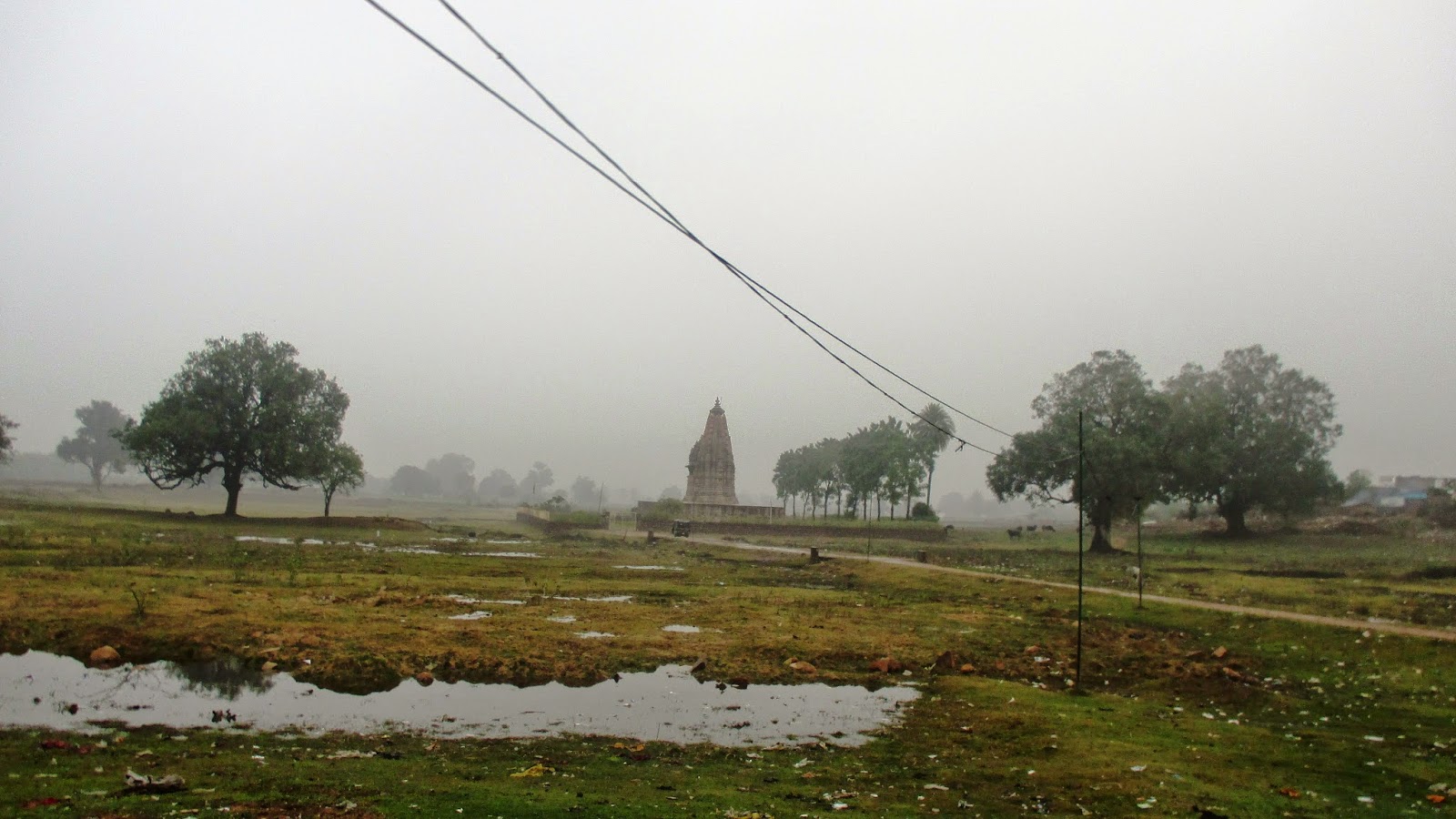
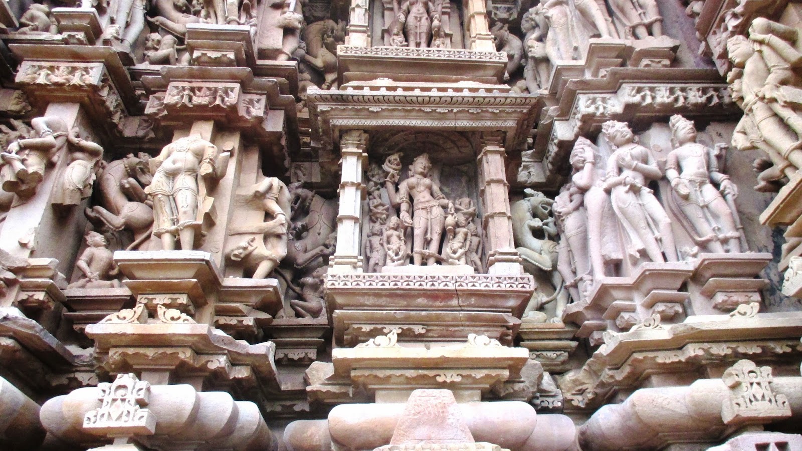


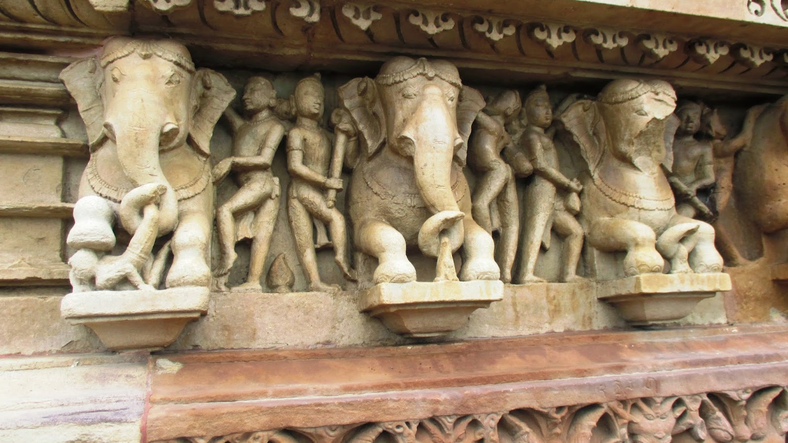

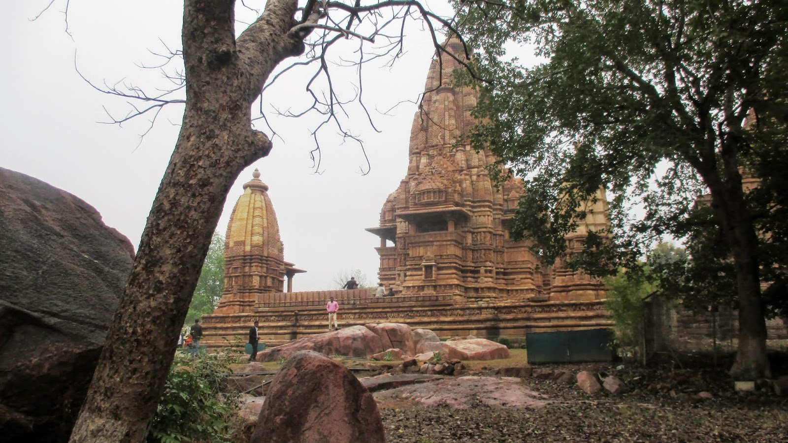

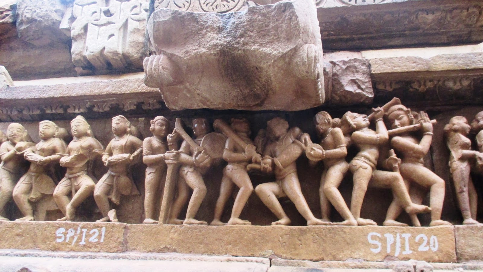


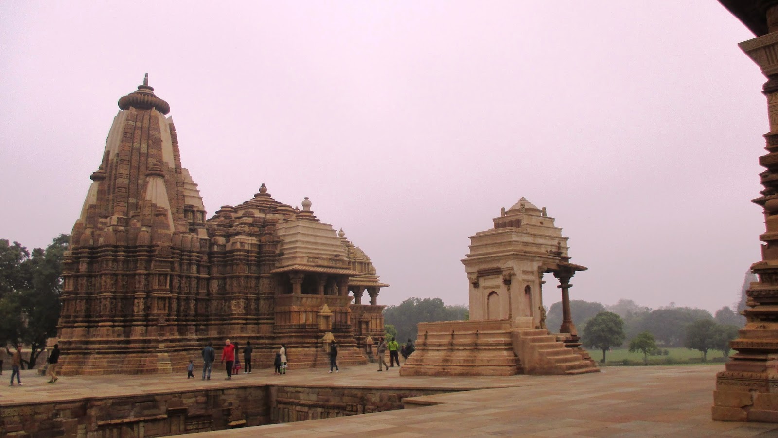
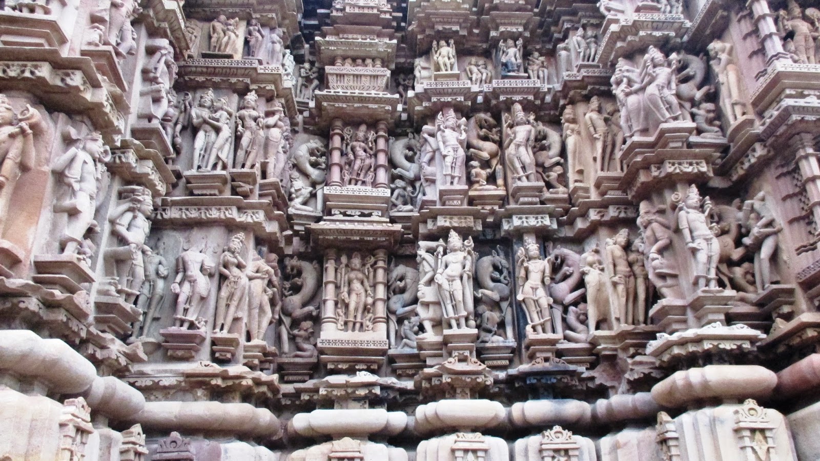
 Truth to be told, I was a tad disappointed. You know, when you talk about Khajuraho, you always talk about those erotic sculptures, and Kama Sutra. There were just a few erotic images, and they were all tucked away among the other, more magnificent, sandstone sculptures, featuring an awful lot of horses and elephants (which perhaps explains the foreign tourists; if not Kama Sutra, they do love elephants!).
Spending two days in this small provincial town, a part of Chattarpur district in Madhya Pradesh, surrounded by a series of 10th Century temple, on the first two days of the New Year, was an experience. The weather was bad. There was fog and rain, and it was cold. It suited us perfectly, for the Khajuraho town was almost devoid of tourist types, except a few white foreign nationals (you will find them everywhere in India; in Khajuraho, more so. Here, we met several tourist guides who can speak fluent Italian, Spanish, French, Russian, German; the most uncanny was a villager type uncle sprouting perfect German!)
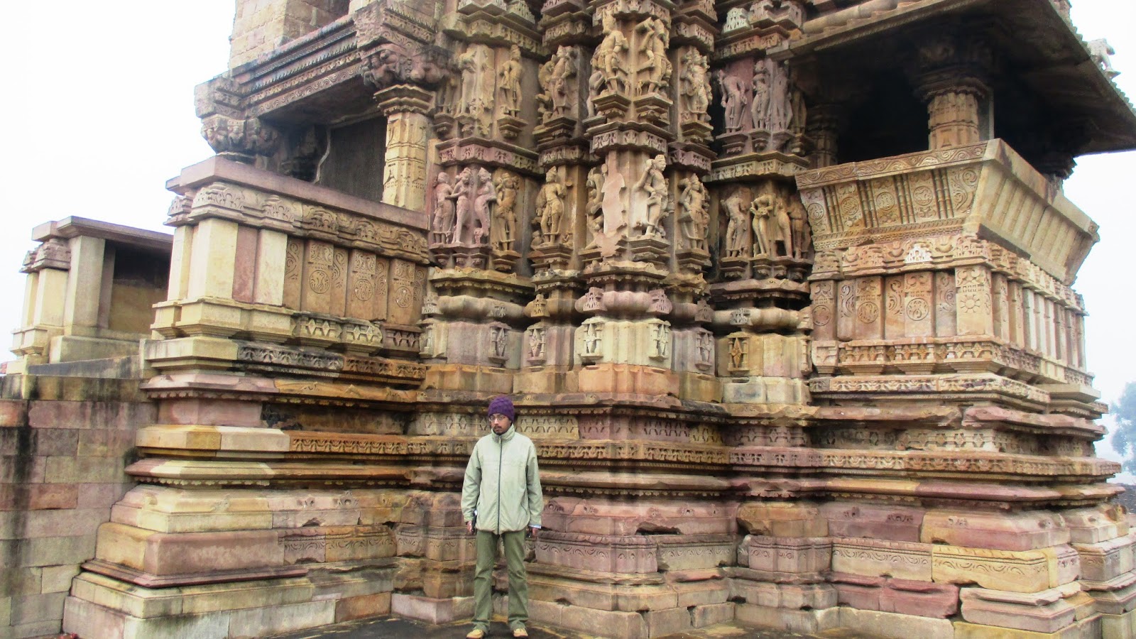
Khajuraho is our Angkor Wat, and equally magnificent. You wonder how a small-time dynasty, almost forgotten by history, the Chandela kings of Bundelkhand, before the Mughals started their dominion on India, could manage to build such magnificent structures. Then you are told that most artisans came from Mathura, the same people who started the famous Mathura school of art during the Kushana and Gupta period, or their descendents. They created the artworks near the river, some distance away from Khajuraho, and then the sculptures were transported and fitted into the temple.
As you admire the craftsmanship, you also admire the ingenuity of those Indian builders and those local architectures, who designed the temples and made sure that each piece of art was fitted in its designated place. The temples, big and small, were raised on high platforms so that they are visible from far away, are dedicated to different gods, including those who are not worshipped anymore, such as Vishnu’s Vamana Avatar and Varaha Avatar, Surya or Chitragupta, and so on. There are also a series of temples dedicated to the Jain tirthankaras.
The temples reminded me of the temples in Puri, Odisha, the same architecture. And the sculptures… forget the eroticism, what strikes you is how lifelike the panels are, featuring apsaras, and gods with the consorts and common men and women, busy in their daily chores, and with their animals. What strikes you is the meticulous representation of the figures, their faces and their limbs… For example, most of the male figures have raised midriffs, to suggest that in those days too, Indian men had bellies; six-pack abs is an unnatural invention.
December 27, 2014

.jpg)
.jpg)
.jpg)
.jpg)
.jpg)
.jpg)
.jpg)
.jpg)

Movie stars read poems. The poem Liberty by Paul Eluard, ...
 Movie stars read poems. The poem Liberty by Paul Eluard, in David Cronenberg’s ‘Maps to the Stars’ (2014).

.jpg)
.jpg)
.jpg)
December 24, 2014
Liberty by Paul Eluard
I don’t think I read this wondrous poem before, perhaps because it was originally written in French. The poem is Paul Eluard’s Liberté. Legend has it that thousands of flyers of the poem were parachuted over occupied France by British RAF in the summer of 1942, to give a hope for Nazi resistance.
I heard the poem, for the first time, in the new David Cronenberg film, ‘Maps to the Stars’ (2014). Cronenberg and his screen writer use the poem as the central motif of their messy and somewhat psychotic narrative involving incest, paranoia and death wish, all within the glitzy world of Hollywood.
And, among the rubble of the film, glitters this poem, astoundingly, even when the film seems to point to this liberty as death by suicide, the only possible escape from this life that doesn’t make sense.
The poem, which reads like a fervent love lyric, however, is much more optimistic, much more life-affirming.
Liberty by Paul Eluard (1895 - 1952)
On my school notebooks
On my desk and on the trees
On the sands of snow
I write your name
On the pages I have read
On all the white pages
Stone, blood, paper or ash
I write your name
On the images of gold
On the weapons of the warriors
On the crown of the king
I write your name
On the jungle and the desert
On the nest and on the brier
On the echo of my childhood
I write your name
On all my scarves of blue
On the moist sunlit swamps
On the living lake of moonlight
I write your name
On the fields, on the horizon
On the birds’ wings
And on the mill of shadows
I write your name
On each whiff of daybreak
On the sea, on the boats
On the demented mountaintop
I write your name
On the froth of the cloud
On the sweat of the storm
On the dense rain and the flat
I write your name
On the flickering figures
On the bells of colors
On the natural truth
I write your name
On the high paths
On the deployed routes
On the crowd-thronged square
I write your name
On the lamp which is lit
On the lamp which isn’t
On my reunited thoughts
I write your name
On a fruit cut in two
Of my mirror and my chamber
On my bed, an empty shell
I write your name
On my dog, greathearted and greedy
On his pricked-up ears
On his blundering paws
I write your name
On the latch of my door
On those familiar objects
On the torrents of a good fire
I write your name
On the harmony of the flesh
On the faces of my friends
On each outstretched hand
I write your name
On the window of surprises
On a pair of expectant lips
In a state far deeper than silence
I write your name
On my crumbled hiding-places
On my sunken lighthouses
On my walls and my ennui
I write your name
On abstraction without desire
On naked solitude
On the marches of death
I write your name
And for the want of a word
I renew my life
For I was born to know you
To name you
Liberty.