Mario Alemi's Blog, page 2
March 29, 2020
COVID-19 Previsioni Regioni Italiane al 29 marzo
Il 15 marzo ho pubblicato questo post, in cui velocemente descrivevo un modello relativamente semplice per prevedere l’andamento dei ricoverati in Lombardia. Ho poi esteso quest’analisi a tutta l’Italia.
Nel post originale spiego perché misuro gli ospedalizzati. Come dice l’Economist questa settimana: “An arguably more reliable figure — the number of infected in hospitals — keeps rising, though the daily percentage increase has fallen.” Tutte le previsioni confermano che il rate sta diminuendo (ultimamente non tanto in Puglia…).
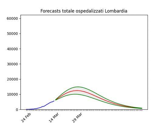
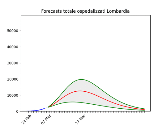
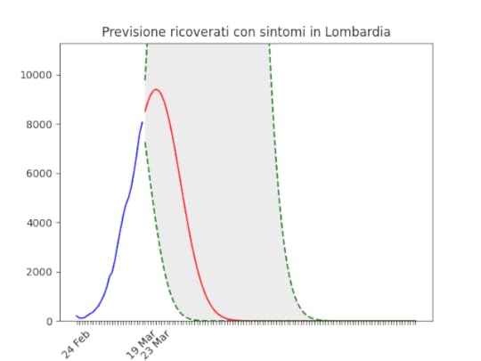
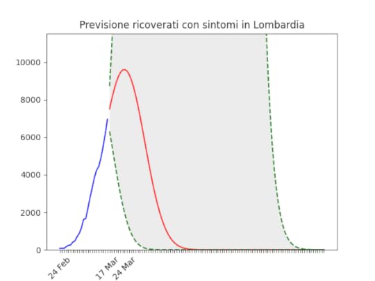
Il modello sembra funzionare. Nel post originale avevo previsto per la Lombardia un picco tra 10 e 13.000 ricoverati a fine mese. Siamo a 12.471 (dati del 28 marzo della Protezione Civile), e in basso la situazione oggi.
Tenete conto che (anche a detta della Protezione Civile) a volte i dati arrivano incompleti, e questo ovviamente falsa le previsioni di alcuni giorni.
La curva blu indica i dati disponibili. La curva rossa la migliore previsione e quelle verdi delimitano lo spazio di “confidenza” del 70%. Le immagini sono animate perché mostrano l’evoluzione delle previsioni: quando la curva blu cresce seguendo la rossa, vuol dire che il modello ha funzionato bene.
Quando scrivo di un miglioramento, intendo dire che l’andamento del rate di crescita sta diminuendo: l’obiettivo è infatti che la crescita si riduca a zero per poi diventare decrescita. Quindi: per ora rate positivo ovunque, “velocità di diminuzione del rate” negativa quasi ovunque (tranne Puglia appunto) e, nei casi migliori, “accelerazione della diminuzione del rate” negativa.
 C’è una andamento altalenante nei dati, ma resta confermato il picco a cavallo del mese o inizio aprile. Il numero di ospedalizzati resta comunque spaventoso.
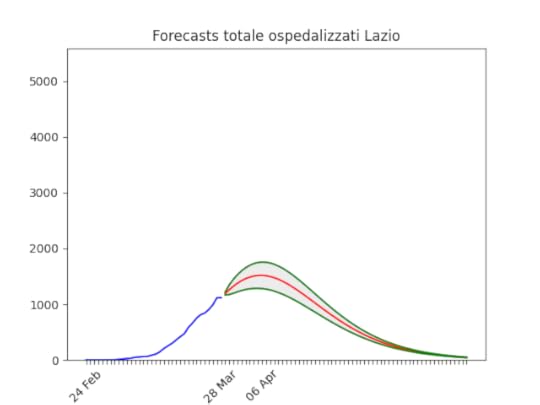 Situazione non differente dal tre giorni fa.
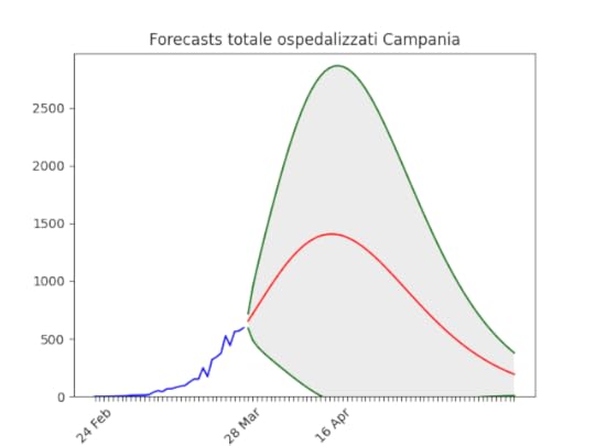 In miglioramento, decisamente. È da escludere che, in assenza di eventi straordinari, si raggiungeranno il numero di ospedalizzati della Lombardia.
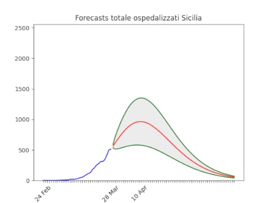 Dopo un pessimo inizio si sta stabilizzando. Notare che la banda di errore (la zona grigia) è ancora abbastanza ampia (qualità dei dati…), ma si sta restringendo.
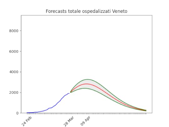 Si vede anche ad occhio nudo un miglioramento enorme negli ultimi giorni: la curva viene “piegata” verso il basso e abbandona l’andamento esponenziale. Anche qui un numero di ospedalizzati alto ma (credo) sopportabile per il sistema sanitario della regione.
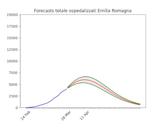 Anche qui andamento in continuo miglioramento dopo l’aumento di due settimane fa. Si conferma comunque la regione più colpita dopo la Lombardia.
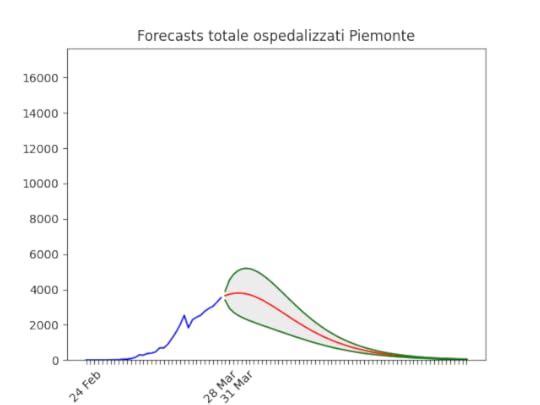 Una delle regioni con i dati più problematici. Purtroppo la previsione è affetta da errori enormi, e la data del 31 marzo sicuramente non sarà quella del picco.
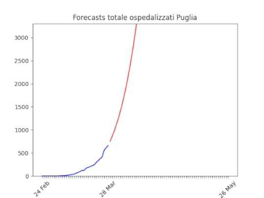 La Puglia purtroppo è in costante peggioramento da più di una settimana, anche questo visibile ad occhio nudo. È possibile che la flessione degli ultimi giorni si confermi, nel qual caso le previsioni si riabbasseranno.
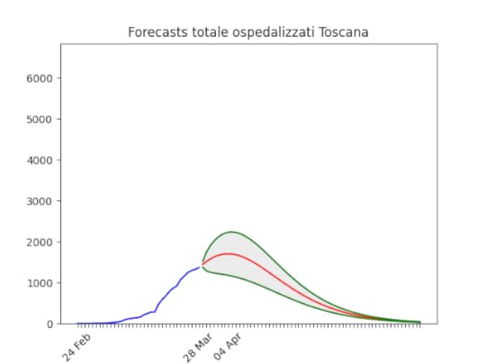 Se la flessione si conferma, la Toscana mostra uno dei miglioramenti più rapidi osservati.
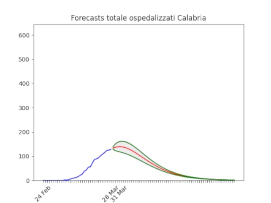 Anche qui, dopo un pessimo inizio un netto miglioramento che sembra confermare un picco vicino.
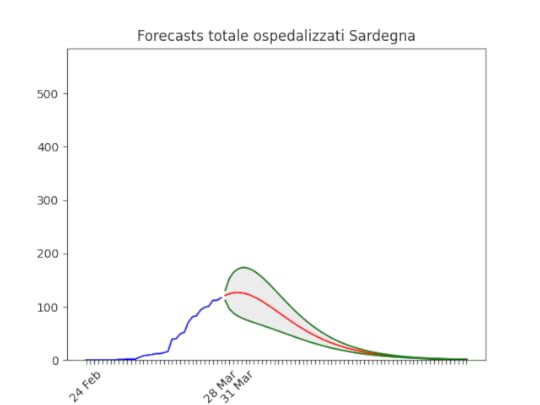 Dati ondivaghi… ma sembra confermarsi un buon andamento (notare l’errore molto ampio però).
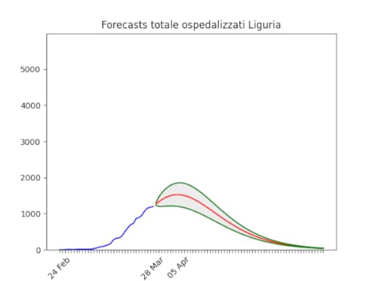 Purtroppo, anche se c’è un miglioramento stiamo sempre parlando di arrivare a 2.000 ospedalizzati. Un numero elevato per una regione così piccola.
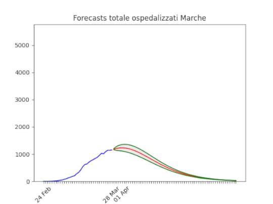 A occhio, il numero sembra essersi stabilizzato. Se il trend si conferma le previsioni tra qualche giorno confermeranno statisticamente l’inizio della discesa.
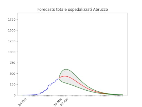 Errore notevole, ma si conferma l’andamento degli ultimi giorni.
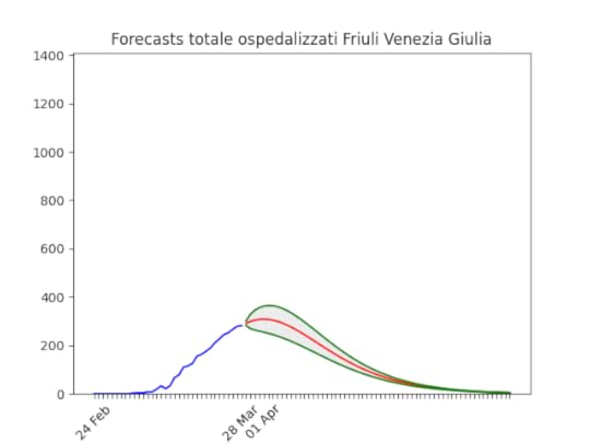 Friuli Venezia Giulia: Come per le Marche.
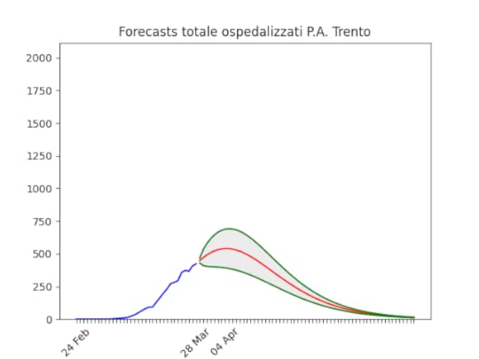 Trento. Dati “ballerini” ma sembra confermarsi il miglioramento.
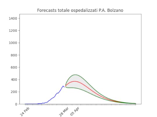 Il calo dell’ultimo giorno ha chiaramente falsato il risultato (è troppo ottimistico), ma comunque ci si avvicina al picco.
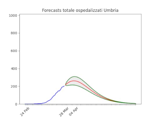 Si conferma in netto miglioramento, visibile anche ad occhio nudo.
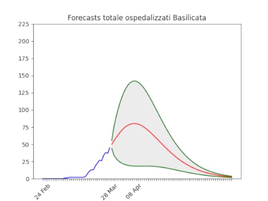 Ampio errore (i dati sono chiaramente sporchi) ma per fortuna la statistica si conferma bassa.
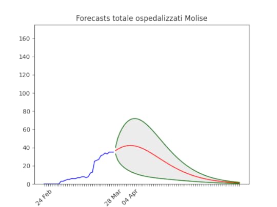 Con una statistica fortunatamente così bassa le previsioni hanno poco senso.
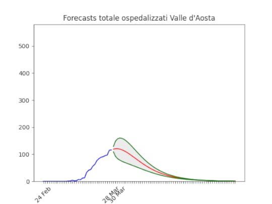 Si conferma il miglioramento.


March 27, 2020
Forecasts for most countries
On March 15th, I started trying to forecasts the development of the epidemic in Lombardy (Italy), where I live.
I did it just because I prefer to understand what I see. I’ve seen other forecasts around, and most of them have been made by people more prepared than me on epidemic.
After almost two weeks, I can say that the method was good. I predicted Lombardy reached the peak and of March, and it looks like (see the original post). Locked at home, like other 3 billion people, I really hope we will soon be able to start thinking having a normal life again.
As more people asked me forecasts for their regions, and then their countries, I developed a more comprehensive code (you can find it here on github) to analyse various datasets, downloaded automatically.
Before looking at the charts, please read the caveats below.
Nothing is written in stoneI built animated images to show that forecasts actually depends on policies. In the image below you have all forecasts made from beginning of February onwards:
In blue the actual data. In red the best projection. In gray, between the two green lines, the 70% confidence band. When no band is present, the error is simply too big to be shown, i.e. the forecasts have little sense. I try not to show those anyway.
The algorithm initially forecasts a huge amount of infectious people, but as lock-down policies are put in place, the forecasts become more optimistic.
Data are not perfect
Rightfully, the priority in hospitals is curing people, not registering data. But data quality is vital to understand if the situation is actually improving or not. Like in the picture above, sometimes data are problematic.
What are we actually predicting?Originally, I looked at the number of infected in hospitals. This looked to me a much better proxy than the reported number of cases. As The Economist wrote today March 27:
[In Italy], the daily count in new cases reached a high-water mark of 6,557 on Saturday. Yet Thursday’s 6,153 was not much better. Epidemiologists warn this is anyway a questionable measure; any rise in positives may be an artefact of the recent increase in testing. … An arguably more reliable figure — the number of infected in hospitals — keeps rising, though the daily percentage increase has fallen.
I am now downloading data from the COVID-19 (2019-nCoV) Data Repository by Johns Hopkins CSSE, and they only report infected, deaths, recovered. I try to predict infectious here, i.e. infected — (deaths+recovered).
It’s not over even if it looks overThe epidemic can start again and again. I’m not saying that as soon as we go down with the number of infectious everything is going back to normal. Have a look at Singapore:
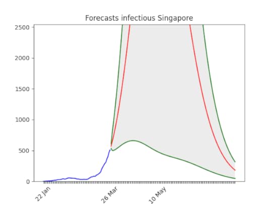
The situation will soon improve, given the state experience with epidemic, but still…
There might be bugsIf you want to check the code, please do it.
ForecastsBelow the forecasts for a few countries (those where people asked me for the projections). You can still find all projections on the github repository.
Italy
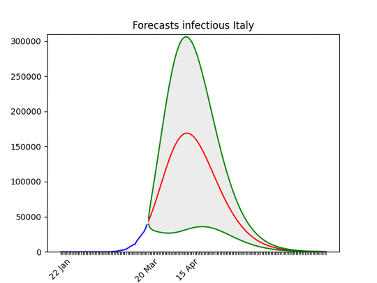 There is little doubt, I believe, that the situation is improving. Of course this is not true for all regions in the country.
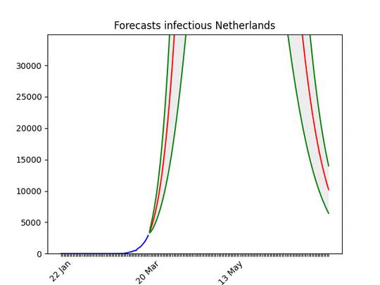 Definitely improving…
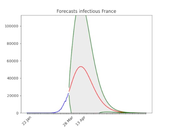 Note that the confidence band is still huge. No animation because of the quality of the data.
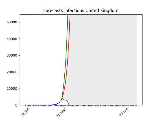 What everyone knows, but the big uncertainty in the results means the situation can soon improve.
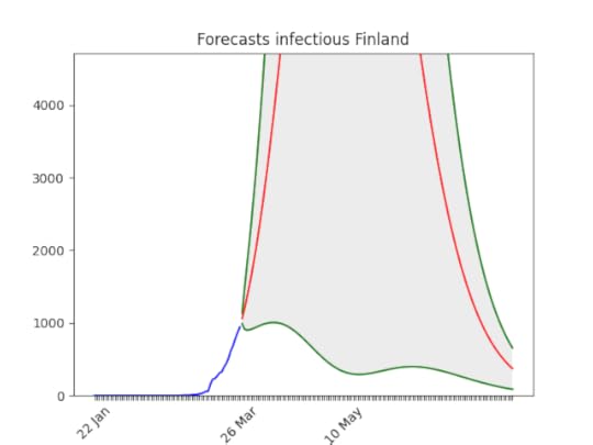 Not good, but huge error still
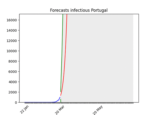 Improving
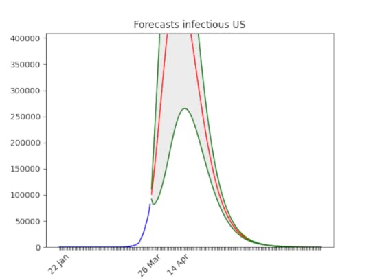 Surely too optimistic about the date of the peak, but it’s improving.
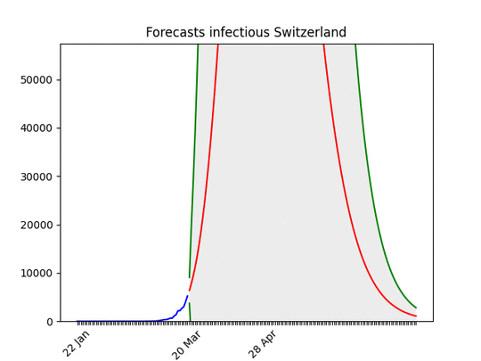 Switzerland is an example of the situation going fast from bad to good.
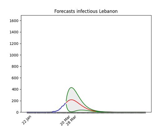 From good (probably a lack of data) to bad…
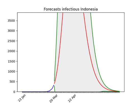 It seems improving, but the error is still huge.
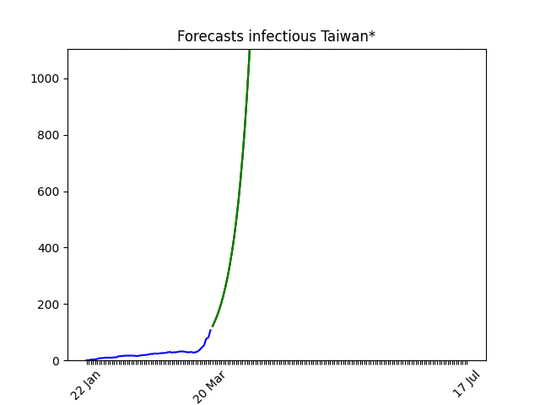 Clearly improving.
March 26, 2020
COVID-19 Previsioni Regioni Italiane al 26marzo 2020
Il 15 marzo ho pubblicato questo post, in cui velocemente descrivevo un modello relativamente semplice per prevedere l’andamento dei ricoverati in Lombardia. Ho poi esteso quest’analisi a tutta l’Italia.
Il modello sembra funzionare. Nel post originale avevo previsto per la Lombardia un picco tra 10 e 13.000 ricoverati a fine mese. Siamo a 10.681 (dati di oggi 26 marzo della Protezione Civile relativi a ieri), e in basso la situazione oggi.
Tenete conto che (anche a detta della Protezione Civile) a volte i dati arrivano incompleti, e questo ovviamente falsa le previsioni di alcuni giorni.
NB1 La curva blu indica i dati disponibili. La curva rossa la migliore previsione e quelle verdi delimitano lo spazio di “confidenza” del 70%. Le immagini sono animate perché mostrano l’evoluzione delle previsioni: quando la curva blu cresce seguendo la rossa, vuol dire che il modello ha funzionato bene.
NB2 Nel post originale spiego perché misuro gli ospedalizzati. Mi è stato giustamente fatto notare che data la scarsità di letti la crescita di ospedalizzati deve necessariamente rallentare. Quindi è possibile che il modello sia un po’ ottimista (ma comunque non di molto, parliamo di qualche giorno di ritardo credo).
 Intorno al 10 marzo il numero di ospedalizzati previsto crolla fortemente. Dopo il 18 marzo sembra molto probabile che il picco non si alzerà più di tanto. NB che l’aumento di nuovi casi di oggi sembra essere dovuto (a guardare i dati della Protezione Civile) ad un aumento del numero di tamponi. Il rapporto “casi confermati/tamponi eseguiti” in Lombardia resta costante intorno al 39%.
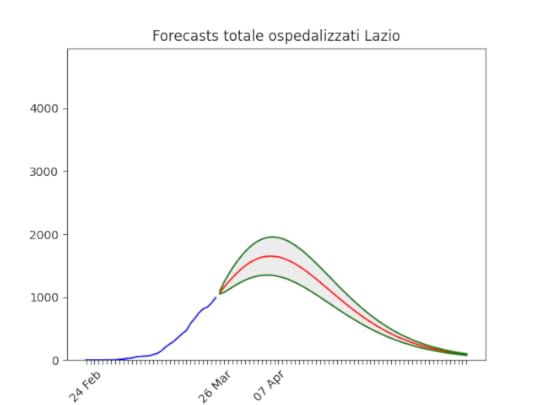 Dal 19 marzo netto miglioramento. C’è qualche problema con i dati (lo si vede anche a occhio nudo, la gobba sulla curva blu), ma rispetto alla settimana scorsa non ci sono paragoni.
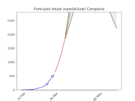 Situazione non ottima, ma dati di pessima qualità (come conferma la Protezione Civile), per cui l’incertezza sulle previsioni è enorme. Comunque meglio del 15 marzo, giorno in cui non c’era scavallamento all’orizzonte…
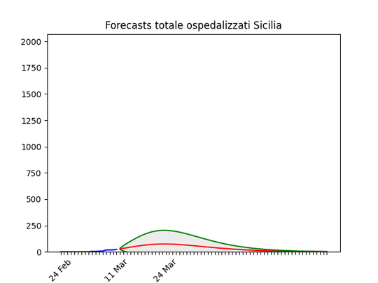 Anche qui dati incerti, ma sicuramente una situazione in netto miglioramento negli ultimi giorni.
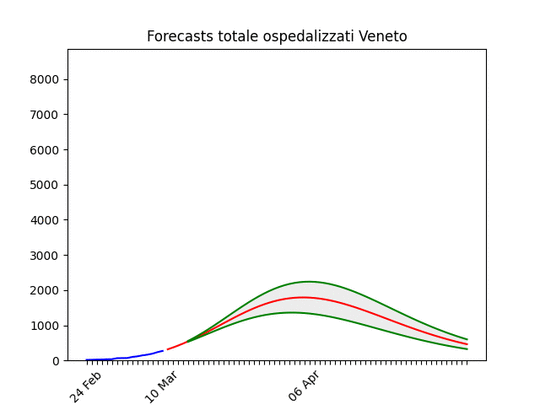 Dopo un peggioramento tra il 18 e il 22 i dati mostrano un netto miglioramento negli ultimi giorni. Se la situazione continua a migliorare (ossia se il trend di crescita continua a scendere) è probabile che il picco si raggiungerà prima di metà aprile.
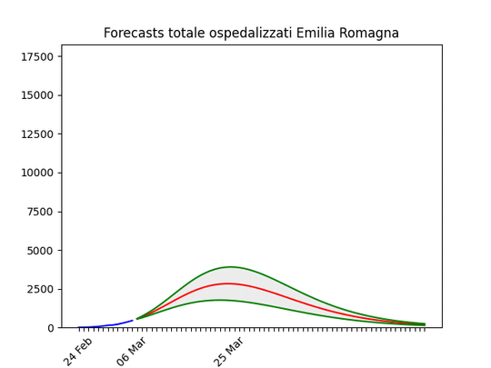 Dopo un buon inizio le previsioni per l’Emilia Romagna aumentano intorno al 15 marzo. Al momento è previsto un picco tra 5 e 7.000 ricoverati la seconda settimana di aprile.
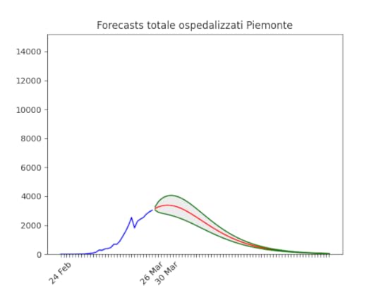 Dati pessimi, ma almeno si capisce perché il modello prevedeva una crescita enorme fino alla settimana scorsa (cfr lo scalino). Se questi dati vengono confermati, il Piemonte non è lontano dal picco.
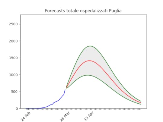 Dopo un ottimo inizio, negli ultimi giorni c’è stata un’impennata. Per quanto il modello “smussi” i dati prendendo gli ultimi 5 giorni, è naturale che le previsioni siano peggiorate.
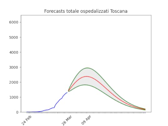 Anche qui dati non molto stabili, è probabile che la banda di confidenza sia molto più ampia di quanto indicato (ossia il picco arrivi dopo, e più alto).
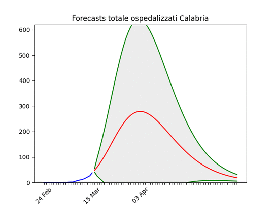 Dopo qualche problema coi dati, se l’andamento viene confermato le previsioni sono ottime. Purtroppo come si vede le previsioni hanno avuto un andamento “ballerino”, indice che i dati non sono di ottima qualità anche qui…
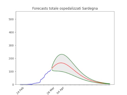 Anche qui dati non stabili, ma la situazione sembra dover volgere al meglio la prima metà di aprile (notare che l’incertezza –la zona grigia– è abbastanza ampia).
 Come sopra.
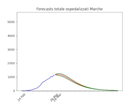 Sicuramente troppo ottimistico, ma per i primi di aprile se continua così le Marche “scavallano”.
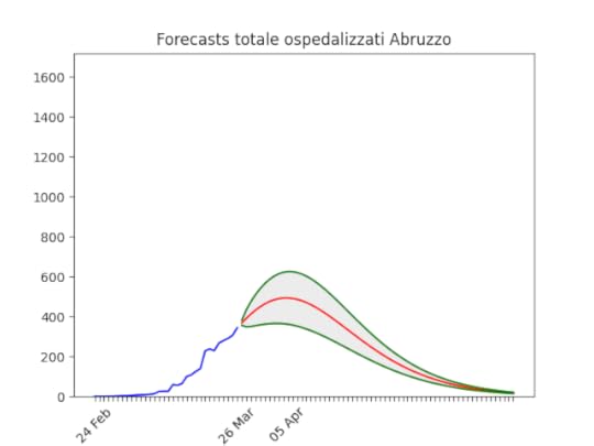 Dati ballerini, ma anche qui si vede la fine.
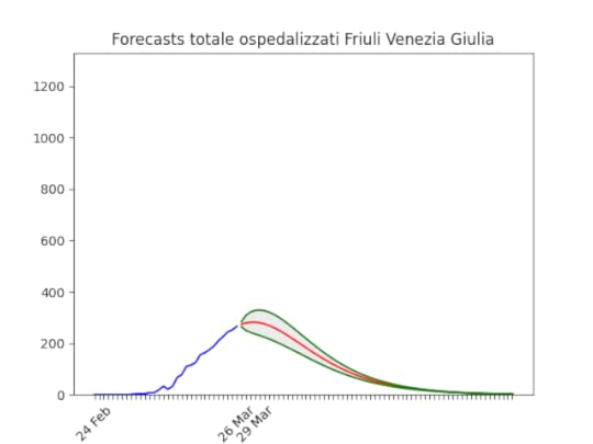 Da qualche giorno, viene previsto lo scavallamento a breve.
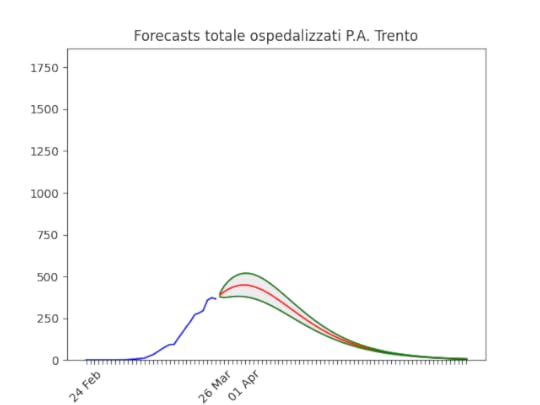 Bassa statistica (per fortuna) ma andamento chiaro.
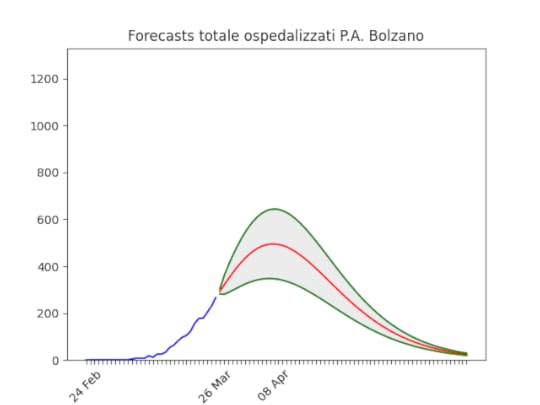 Anche nella provincia di Bolzano, da qualche giorno le previsioni indicano un picco tra circa due settimane intorno a 500 ospedalizzati.
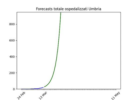 Qui ho voluto mettere l’animazione perché risulta chiaro come le misure abbiano abbassato le previsioni del picco. Come a Bolzano, picco a meno di 500 tra circa due settimane.
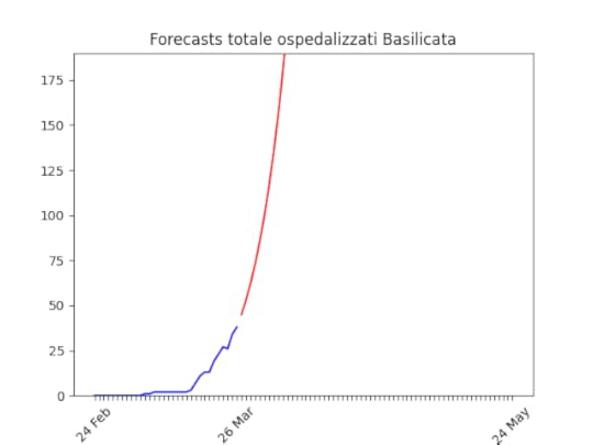 La Basilicata mostra una statistica bassissima. Non è possibile alcuna stima.
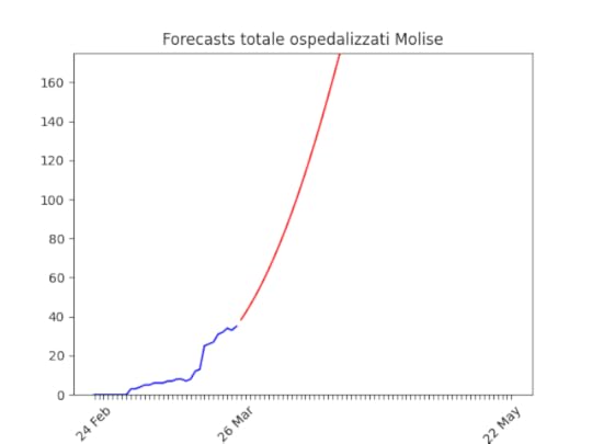 Come per la Basilicata, nessuna stima ma (buona notizia) pochissimi ospedalizzati.
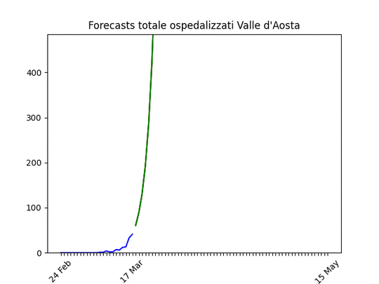 Anche qui, come per l’Umbria, ho voluto mettere l’animazione perché mostra come il picco sia “stato abbassato” dalle norme.
March 19, 2020
COVID-19 Previsioni Regioni Italiane al 19 marzo 2020
La descrizione del processo è in quest’altro post.
La previsione del numero stimato di ricoveri con sintomi da coronavirus (in rosso) dal 19 marzo in poi, con i dati a disposizione il 19 marzo (in blu), per ogni regione italiana in cui ci sono sufficienti dati (il codice). Le regioni non presenti hanno dati o troppo scarsi, o una crescita troppo alta per poterne vedere la fine. Di questi:
Piemonte, Toscana, Abruzzo, Campania, Sicilia: hanno un trend di crescita intorno al 20% che non accenna a diminuire.Valle d’Aosta, Umbria: come sopra, ma una statistica abbastanza bassa, per cui la stima può cambiare in fretta.Lazio: si inizia a vedere una diminuzione del trend, ma ancora troppo piccola.Molise: è passata da 7 a 19 ospedalizzati. Con un numero (per fortuna) così basso un salto simile non può essere considerato come significativo.Basilicata: ha un numero di ricoverati bassissimo (oggi 8).Differenze rispetto ai giorni passati: ho “smussato” i dati, per non essere troppo sensibile alle fluttuazioni giornaliere (per esempio un giorno ci sono stati pochi ricoveri per un qualsiasi motivo, e quindi il giorno dopo c’è un incremento superiore alle attese).
Per ogni regione il grafico con un breve commento.
 Nessun cambiamento. Sempre un picco tra 9 e 10mila ricoverati a fine mese.
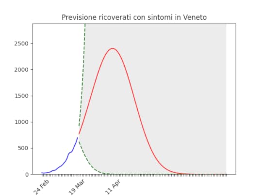 Come sopra. È comunque possibile che, con le misure in atto, si riesca ad abbassare il picco. Ricordiamo che già anche solo il fatto che si veda un picco (con quindi una successiva discesa) è una buona notizia!
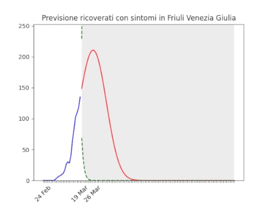 Nuova entrata. Il trend ha iniziato a diminuire chiaramente negli ultimi giorni.
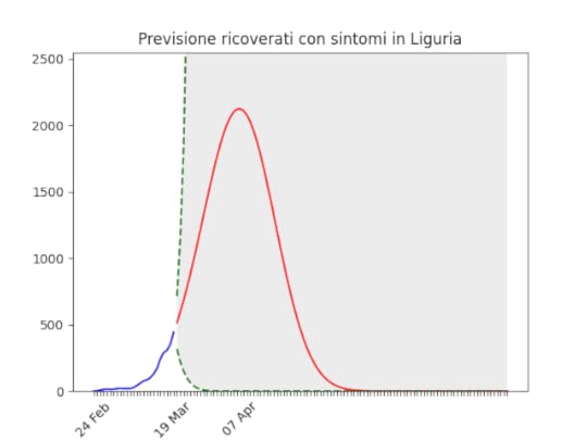 Il trend ha iniziato a diminuire, ma deve farlo più velocemente.
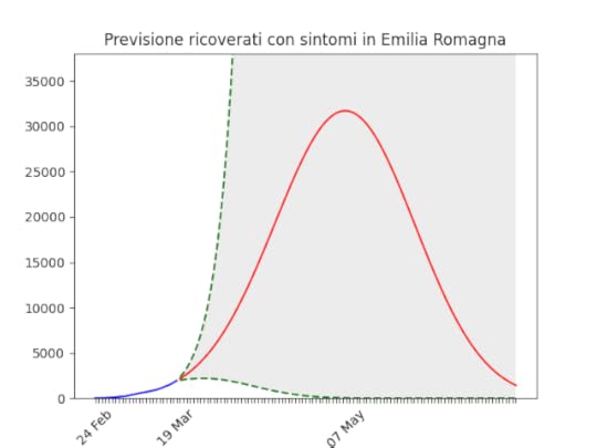 C’è stato un aumento notevole. Metto sotto l’andamento del trend (smussato): negli ultimi giorni è chiaramente salito, dopo un buon inizio. È possibilissimo che tra poco inizi a scendere nuovamente.
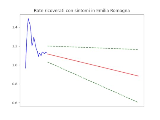 Il trend si era abbassato notevolmente, ci si può quindi aspettare un leggero aumento negli ultimi giorni, con conseguente esagerazione nella stima del picco sopra.
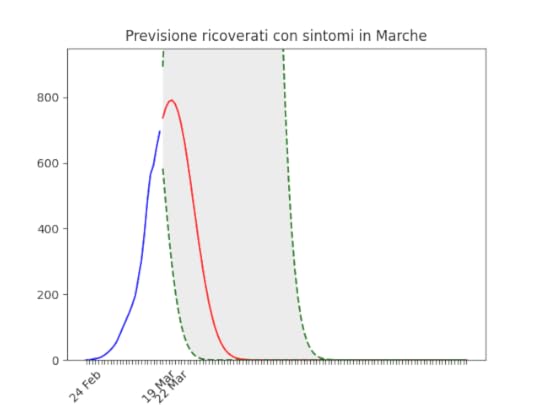 Nessuna novità.
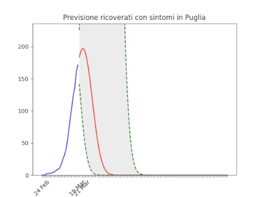 Anche per la Puglia, il trend resta chiaramente in discesa con un picco basso tra poco.
 In Calabria, il trend ha iniziato a scendere da qualche giorno. Se resta in discesa la situazione si potrebbe risolvere presto. Metto sotto l’andamento del trend.
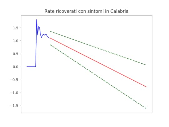 Il trend sembra andare chiaramente verso il basso.
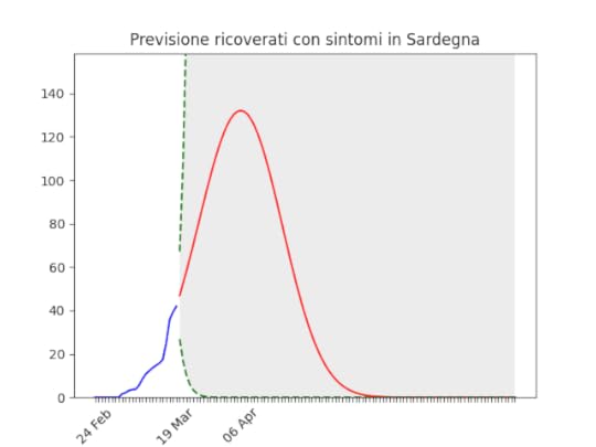 Anche in Sardegna, si vede il picco tra poco.
March 17, 2020
COVID-19 Previsioni Regioni Italiane al 17 marzo 2020
La descrizione del processo è in quest’altro post.
La previsione del numero stimato di ricoveri con sintomi da coronavirus (in rosso) dal 17 marzo in poi, con i dati a disposizione il 17 marzo (in blu), per ogni regione italiana in cui ci sono sufficienti dati. L’errore (la zona grigia) è sovrastimato, ma dà un’idea di dove i dati parlino più chiaramente. Nel post originale è spiegato il metodo utilizzato. (Il codice). Le regioni non presenti hanno dati o troppo scarsi, o con un trend negativo del rate di crescita troppo piccolo o inesistente.
 La situazione non è molto differente da quanto previsto ieri, se non un piccolo aumento e ritardo del picco quest’ultimo previsto per le approssimazioni fatte.
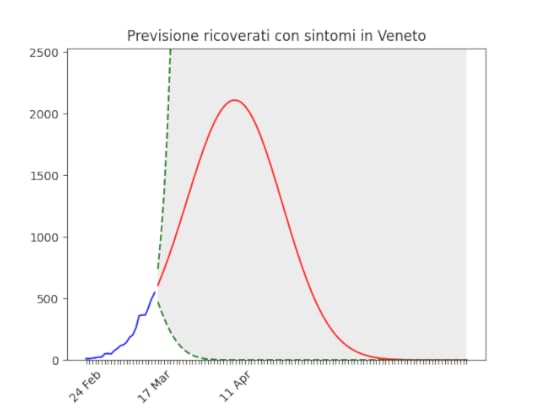 Anche qui situazione non molto differente da ieri 16 marzo.
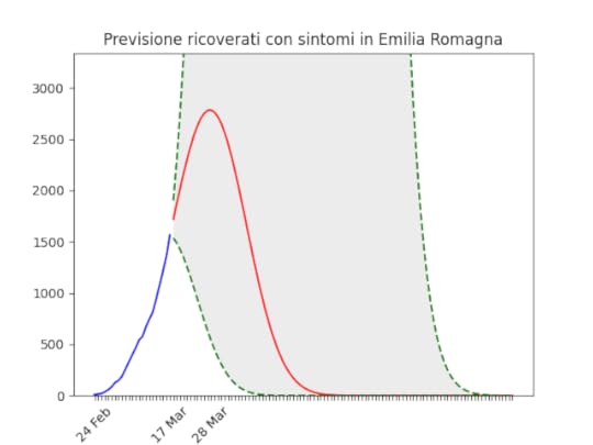 Come sopra, l’aumento della previsione non è assolutamente significativo dal punto di vista statistico.
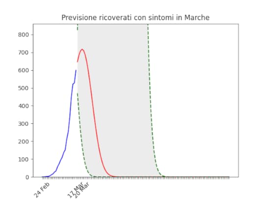 Per le marche sembra continuare ad esserci un picco vicino. Speriamo si confermi…
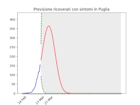 Stessa cosa per la Puglia. L’aumento rispetto a ieri non è significativo.
COVID-19: Evidence that Italy has done it right
Daily monitoring of the forecasts of hospitalised people in all Italian regions (forecasts for other countries here).
Long story short: until Sunday, March 15, the number of infected people in Italy was a perfect exponential. No end in sight.
That day I decided to analyse the number of hospitalised people with COVID-19 symptoms.
Approximating a SIR model (Susceptible–Infectious–Recovered), whose full implementation can be found here on Google Docs, I made a forecasts of the hospitalised people in all Italian regions from today onwards. Data and figures are updated every day. Note that the Italian Civil Protection made all data available on GitHub. Unlike similar entities in other countries. Note also that the number of hospitalised people is what we are really interested in. The problem about COVID-19 is that we risk the collapse of the health system because too many people in needs of Intensive Care.
Below the forecasts animated (i.e. yu can see how the forecasts changed with time). Note that the forecasts rightfully change as the policy changes, and is (or not) respected. Some regions are not present either because the rate there is not diminishing (bad), or because they have too few hospitalised (good).
Unfortunately, going through the peak does not mean going back to normality. It means that with social restrictions the number is going down, but as soon as these are lifted, the number will start growing again. Until a cure / vaccine is developed, the virus won’t disappear unless there will be enough recovered people to “screen” the not-yet-infected ones from the infectious ones. This means (according to experts, not me) 12–18 months.
There is a fluctuating trend in the data, but the peak at the turn of the month or early April remains confirmed. However, the number of hospitalized remains the worse in Italy.Not different from three days ago.Definitely improved. It is to be excluded that, in the absence of extraordinary events, the number of hospitalized in Lombardy will be reached.After a bad start it is stabilizing. Note that the error band (the gray area) is still quite large (data quality …), but it is shrinking.We can also see a huge improvement in the last few days with the naked eye: the curve is “bent” downwards and leaves the exponential trend. Here too, a high number of hospitalized but (I believe) bearable for the health system of the region.Here too, the trend continued to improve after the increase of two weeks ago. However, the region most affected after Lombardy is confirmed.One of the regions with the most problematic data. Unfortunately, the forecast is affected by enormous errors, and the date of March 31st will certainly not be that of the peak.Puglia has unfortunately been steadily deteriorating for more than a week, this too visible to the naked eye. It is possible that the downturn in the last few days is confirmed, in which case the forecasts will drop again.If the downturn is confirmed, Tuscany shows one of the most rapid improvements observed.Here too, after a bad start, a clear improvement that seems to confirm a near peak.Wavy data … but it seems to confirm a good trend (note the very large error though).Unfortunately, even if there is an improvement, we are always talking about reaching 2,000 hospitalized. A large number for such a small region.By eye, the number seems to have stabilized. If the trend is confirmed, the forecasts in a few days will statistically confirm the start of the descent.Big error, but the trend of the last few days is confirmed.Like above.The improvement seems to be confirmed.The drop on the last day has clearly distorted the result (it is too optimistic), but still we are approaching the peak.It is confirmed in marked improvement, visible also with the naked eye.Large error (the data is clearly dirty) but fortunately the statistics are confirmed low.Fortunately, with such a low statistic, the forecasts make little sense.The improvement is confirmed.For those who want to know the origin of the curve …For some time now I have been observing the number of people infected in Italy and in other countries, European and non-European.
What continued to worry me was that the growth rate in Europe, and especially in Lombardy (where I live), showed no sign of decreasing.
The growth rate in Asia and Europe is different. For example, in South Korea they went from a daily growth rate of 100% on February 20 (i.e. at that time the number of infected people doubled every day) to zero growth on March 10.
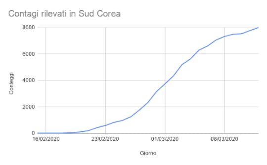 Cases in South Korea until March 14.
In all western countries, however, the rate did not drop below 20%. In Italy we had a daily growth of 20% (i.e. every 100 infected there are 20 of them the next day, now finally down to ~15%), equally in France, while in Germany and the USA they were at 30%. In short, the number of infected people went upwards, without limits!
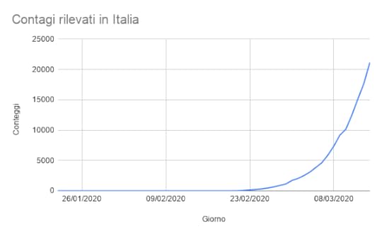 Cases in Italy until March 14.
Then I analyzed the data provided by the Civil Protection, in particular in Lombardy. I hoped that limiting the circulation would make the growth rate go down, but this did not happen.
I then tried to understand why, and I noticed that the data of the Civil Protection show that in Lombardy the numbers of tests performed have increased. Since it is natural that the more one measures, the more one detects, I have concluded that the increase in recorded cases is also due to the increase in tests.
So what should be examined in order to understand the actual growth of the infections? The number of people hospitalized with symptoms seems to be a good candidate. Given that it is always the same fraction of infected people who need hospitalization, the number of hospitalized is proportional to the number of infected people. For example, if a fifth of those infected go to hospital, if I find 100 people in the hospital it means that there are 500 infected.
This data is the data that really matters today for the current health emergency: if a infected person is ill, but does not need to be hospitalized, it is not a problem for the health system. Today the problem is patients in needs of hospitalization, since beds in hospitals are about to end.
So I built a model (I don’t think I was the first) that takes into account:
the probability that a person will infect someone else (which generates an exponential curve)the fact that the number of people who can be infected is not infinite (this generates the “logistics” curve)the fact that there are people who heal (or unfortunately die).those who recover:1. are discharged and no longer among the hospitalized, but not anymore among the possible “targets” of the virus;
2. become immune and act as a “screen”.
The result is this curve:
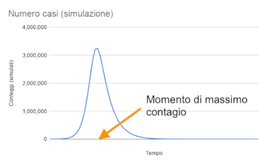 Simulation of cases. Note that the beginning and the tail are not symmetric. It grows fast and grows down slow.
In practice, the curve begins with an exponential growth, then slows down to the “Moment of maximum contagion” and then ends with an exponential decrease.
This is the trend of the growth rate, i.e. the increase or decrease of inpatients from one day compared to the next:
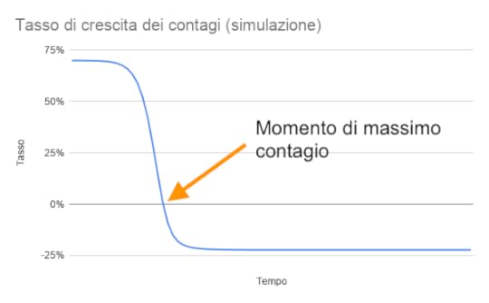
It starts with a growth of 70%. Then the growth rate decreases until it reaches zero (“Momento di massimo contagio”, ie the maximum of the previous curve is reached). Then it becomes negative, i.e. the number of infected people decreases, until it decreases with an exponential rate of 20%.
One possibility is to solve a differential equation to understand the rate trend. But it is very complicated.
Instead, we can simplify a lot, noting that the rate goes from 70% to 20% moving almost along a straight line.
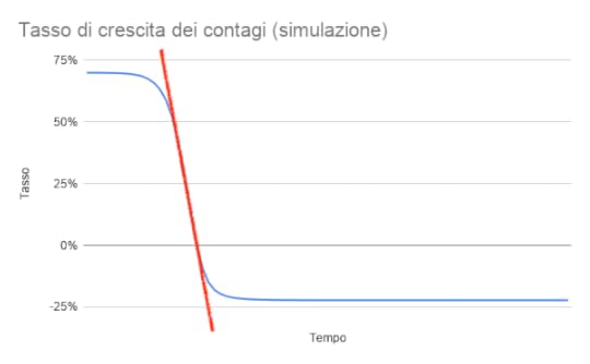
So you could take the real data (the number of patients hospitalised with COVID-19 symptoms) and calculate the “red line” that describes the trend of the growth rate [edit: we now make a fit with an exponential]:
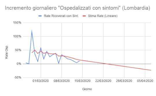 The growth rate of hospitalised people with COVID symptoms in Lombardy. The rate is diminishing.
The estimated trend of hospitalizations that resulted (in red) with the data available on March 15 was this:
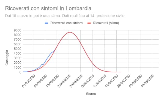
Due to the approximation with a straight line, we are anticipating the peak of infections (8-9,000 people hospitalized in total at the end of March), as well as the return to normal (second half of April). If we had solved the differential equation we would have found the peak of contagions, probably, towards the first week of April. And a return to normal in late April.
On the other hand, the containment measures will certainly have an effect, and this will delay the peak and lower it, or at least this is hope …
linksData and models: https://docs.google.com/spreadsheets/d/1_Qi1SnakzmndwJFUGuq1yraf4qGQ1tmFCtDn8oZygwY/edit#gid=1801341618
The logistic equation: https://swillson.public.iastate.edu/Logistic.pdf
Civil Protection data: https://github.com/pcm-dpc/COVID-19/tree/master/dati-regioni