
Jeffrey Zeldman's Blog, page 107
April 1, 2010
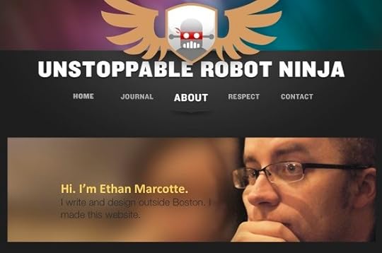
Designing With Web Standards 3rd Edition on Boagworld

There's been a lot more opportunities for just thinking outside the very strict design parameters that we usually work with. Then just thinking about not just designing for any particular device but a particular context. Because even if you are on a mobile phone, if you're viewing something on a subway in the morning versus in the middle of the office at 10:30, your environment sort of dictates how you want to interface with a particular piece of content. That's really what's...


On Basecamp


In an interview at 37signals, I discuss how the Happy Cog team uses Basecamp to coordinate projects across three studios and maintain accurate client communications.
March 30, 2010
What the FAQ?


In Issue No. 303 of A List Apart, for people who make websites, we question the received wisdom about FAQs, and learn that, in the land of the colorblind, contrast is king.
Contrast is King
by LESLIE JENSEN-INMAN
Being colorblind doesn't mean not seeing color. It means seeing it differently. If colorblindness challenges the colorblind, it also challenges designers. Some of us think designing sites that are colorblind-friendly means sticking with black and white, or close to it. ...
March 29, 2010
Test Print

Coming soon to a web store near you.
Brandon Grotesque


Brandon Grotesque is a sans serif family of six weights plus matching italics, designed by Hannes von Döhren.
Influenced by the geometric-style sans serif faces that were popular during the 1920s and 30s, the fonts are based on geometric forms that have been optically corrected for better legibility. Brandon Grotesque has a functional look with a warm touch.
The Regular weight is free through April 15.
March 27, 2010
Content wants to be paid for


Content wants to be free like communism works, like sex is just for fun, like a few days of snow disprove global warming. That the web's existence makes all content free is a Brooklyn Bridge most of us have bought, but it just ain't true, as Erin Kissane makes clear in Content is Expensive at Incisive.nu.
Go there, read it, and understand why (just like newspaper reporting and books), web content costs money and must be paid for or subsidized. Either that or it must serve some ...
March 26, 2010
George Lois Tee


TypographyShop presents the first design in its new series, the Ten Commandments of George Lois, created with the approval and cooperation of the hall of fame art director himself.
The new shirt reads: "Great ideas can't be tested. Only mediocre ideas can be tested." Sport it at your next client meeting. Wear it, live it.
Younger readers may ask, "Who is George Lois?" Typography Shop supplies a mini-bio:
From his groundbreaking work at Doyle Dane Bernbach to his controversial...
March 25, 2010
Blur

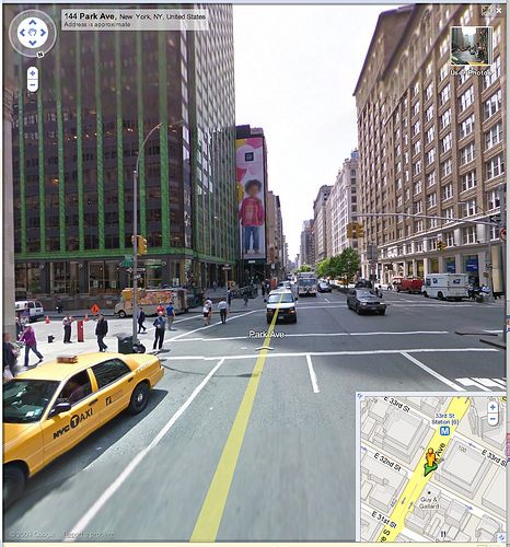
Presumably in order to avoid having to pay the child model and secure a release, Google deliberately blurred the Gap Kid model's face on the giant outdoor Gap Kids poster before uploading this photo (and hundreds of seamlessly interwoven related photos) to Google Maps Street View.
Notice that, unlike the Gap Kids model, the human beings on the street do not get to have their features blurred. Presumably, humans photographed in Google Street Maps don't sue, but models do.
Does...
A List Apart: Just the Stats

Continuing with our "data, and what we can learn from it" theme, here are A List Apart's four most popular individual pages this week (excluding the home page, with 178,270 page views). Pay particular attention to the publication dates:
Page Views This
Flash and Standards: The Cold War of the Web by Daniel Mall, MARCH 9
Drop-Down Menus, Horizontal Style by Nick Rigby, JUNE 29
CSS Design: Taming Lists by Mark Newhouse, SEPTEMBER 27...
March 24, 2010
Love Me Long Time

Those who say web users don't spend time reading web pages haven't met readers like you folks. According to Google Analytics, zeldman.com fans spent five minutes, fifty-five seconds reading the relatively short post, "My Love/Hate Affair With Typekit." If Jakob Nielsen is right, and readers take in no more than 20% of the words on a page, y'all took a hella long time to read 190 words.
But generalized findings like Jakob's are merely one data point in a universe of...


