
Jeffrey Zeldman's Blog, page 106
April 11, 2010
Opera hates my web font


So I've wanted to use a condensed, bold Franklin typeface for my site's headlines since, well, forever. So I bought Fontspring's fine Franklin Gothic FS Demi Condensed and licensed it for @font-face use for a mere $2.99, an incomparable value.
It looks great in Safari, Chrome, and Firefox, but not so nice in the latest version of Opera, where it resembles the inside-out test monkey in Cronenberg's "The Fly." (Okay, okay, it looks like a ransom note, but the monkey simile was...


April 9, 2010
The dog ate my bookmarks


It's been years (or is it weeks?) since something odd, implausible, and inexplicable happened to one or more of my Apple computers that doesn't happen to anyone else's. You know you want to hear this.
So yesterday morning I'm in my hotel, finishing some work on my laptop before leaving for the airport, when MobileMe alerts me that in order to sync the bookmarks on my laptop, it will need to delete some and add some. I click OK. A few seconds later, I have no bookmarks in...
April 8, 2010
Best AEA yet

An Event Apart Seattle, our first three-day show, was our best yet. Not only was every speaker engaging and every topic relevant, but there was a thematic unity between presentations as leading-edge topics came to the fore. What came out at AEA Seattle 2010 will be the best practices of 2012. Fortunately, this year's next four shows will feature many of the same speakers and topics.
Some highlights:
CSS3 media queries are the new hotness. They were explained and demonstrated to...April 7, 2010
Courts Imperil Net Neutrality

In a ruling that could derail the Federal Communications Commission's attempt to craft net neutrality rules, a federal appeals court said Tuesday that the agency lacked authority to sanction Comcast for throttling peer-to-peer traffic.
… Broadband advocates who had urged the FCC to take action against Comcast condemned the appellate ruling, saying that it could prevent the commission from enacting any regulations that could affect how broadband is delivered.
"The consequences...
April 4, 2010

 An Event Apart Seattle 2010
April 2, 2010
Should Publishers Attend SXSW?

In Should Publishers Attend SXSW?, Lorraine Shanley of Publishing Trends answers her own question this way:
Yes, because sxsw offers a chance to see options for the future—amazing gaming, interactive software, inventive marketing, creative content development and deployment. But as Will Schwalbe … said, "If publishers come to sxsw to create their own sessions track, they'll learn nothing. If they come to attend panels on subjects about which they know nothing, they'll learn...

Friday Font: TeeFranklin


Gloriously available for @font-face embedding, TeeFranklin by Suomi Type Foundry at Fontspring is a family of 14 weights/styles that may be perfect when you want to offer something a tad different from Helvetica and Franklin while retaining many of the qualities that make those fonts great.
April 1, 2010
+1


I get just enough brain-dead, sub-literate, off-topic rants here that I'm considering removing comments altogether. Discuss.
Web Standards Trinkets

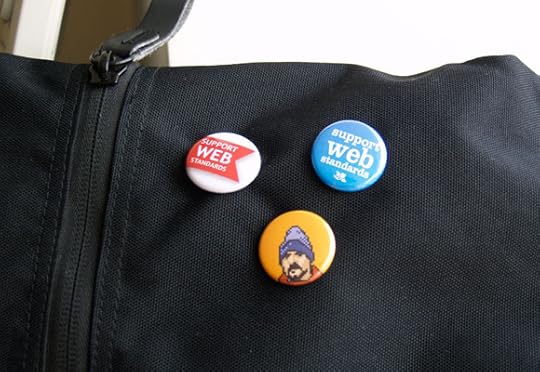
Support Web Standards: A collection of limited edition products, created so you can show your love and support for web standards.


