Ben Jones's Blog, page 4
November 23, 2015
For Fun: Happy Fibonacci Day!
It seems there’s a day for everything, right. National Cashew Day (you guessed it, that’s today), World Philosophy Day (nope, sorry – last Thursday). Heck, you can even register your own National Day of [fill in the blank].
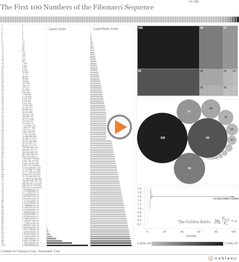
So thanks to MIT’s twitter account, I became aware that today is Fibonacci Day. Makes sense – November 23rd is 11/23, which are the first four numbers in the famous Fibonacci Sequence.
So, to earn my Math Nerd Card for 2015, I created the following dashboard that visualizes the first 100 numbers in the Fibonacci Sequence, starting with 1 instead of 0, as I’m led to understand is the more modern convention:
Math + Data Nerds Unite: know of any other good math vizzes out there? Leave a comment!
Thanks for humoring me,
Ben


November 21, 2015
The Backlash Against Data Dogmatism
Have you noticed it as well? The tide is turning against dogmatism in data visualization, as witnessed by the increasing number of voices speaking out against a rigid approach and closed-mindedness regarding practices that are often ridiculed in knee-jerk fashion. It’s about time.
To which voices am I referring, and which data visualization practices are they defending?
1. Charts with non-zero y-axes
Can you tell Vox’s Johnny Harris and Matthew Yglesias have had it with readers taking pot shots about their choice of y-axis starting points? Their well-reasoned video entitled “Shut up about the y-axis. It shouldn’t always start at zero” says it all:
Harris and Yglesias show that the choice of axis starting point depends on the context, the unit of measure, and on the comparison being made.
2. Artistic approaches to data visualization
In Andy Cotgreave’s recent ComputerWorld article “Why Do We Visualise Data?“, Andy argues that not all data visualizations need to be burdened with the requirement of imparting ultimate precision of comparison. It depends on the purpose.
“The purpose of a visualization will also determine the extent to which you should inform effectively…Sometimes it’s more important to make someone engage with the overall message rather than the minutiae.”
Andy uses the example of Stephanie Prosavec’s “Air Transformed“: a wearable data visualization necklace showing air quality in Sheffield, UK:

Should this project really be ridiculed as “ineffective” and horribly contrary to “best practices”, with no place for it at all in the field of data visualization? Or could it be that this form of expression engages human beings in a way that a rigorous report complete with bar charts and compliant zero y-axis timelines of air quality in Sheffield could hardly do? Maybe both the report and the necklace are valid, each in their own way.
Which should you create? It depends on your purpose and your audience.
3. Pie charts
Oh, the poor, maligned pie chart. The chart type that gets pushed around and bullied on the data viz playground more than any other. Randal Olsen of /r/dataisbeautiful ran a twitter poll asking “Do you think pie charts should be banned from #dataviz?”. Scientific or not, nearly 2 in 5 responded affirmatively:
Another Twitter poll: Do you think pie charts should be banned from #dataviz?
— Randy Olson (@randal_olson) October 29, 2015
That’s amazing if you stop and think about it. Almost 40% of respondents, likely mostly data viz enthusiasts who follow Olsen, think that pie charts should never, ever, ever be used. Hilariously, Andy Kirk of Visualising Data asked whether we should also run a poll about whether those people should be banned, and Irvin Almonte’s response was sheer genius:
.@inivri Exactly, thank you! Pie charts are useful for showing simple proportions like this. pic.twitter.com/Rsg7e6ilBR
— Randy Olson (@randal_olson) November 5, 2015
Again: It depends. Say it with me: IT DEPENDS.
Pie charts, in certain instances, can actually be more effective than bar charts at showing specific part-to-whole comparisons. And if the part-to-whole relationship is far more important to your message than comparing uber-accurately between categories, and if there are a very small number of slices, go ahead, give thought to using a pie chart. Don’t be intimidated by pie chart haters. There, I said it.
4. Word Clouds
I entered the fray last week with my blog post “My 3 Basic Tenets of Data Visualization” in which I argued that rules of thumb, not black-and-white rules, should prevail, along with a spirit of humility and openness to exploration and innovation in data viz.
I also did the unthinkable: I defended the Word Cloud. The poor, lowly pal of the pie chart, united on the playground in mutual fear of the roving data-dogma bully. My point is that if you only had a very short amount of time to impress upon a large room of people the most commonly used passwords, which of these four visualization types would you choose?

The word cloud sacrifices precision for completeness (all of the passwords actually appear on the screen in only the word cloud) and readability (the most commonly used passwords almost shout out at the reader). Is that a reasonable trade-off to make? Maybe. It depends.
Since that blog post, “What are your most used words on Facebook” has gone viral, and we’ve been inundated with over 16 million word clouds as of the writing of this blog post. Of course one can only hope this app is not a gigantic phishing scam, but do you think a bar chart version of your most commonly used words, or a concise and thorough text analytics report would have also gone viral? Maybe, but probably not. And I’m not saying “going viral” is a end that justifies all means, but in this case, ultimate precision of comparison is probably not needed anyway. It actually worked a little too well.
Let’s not let the pendulum swing too far, though.
This casting-off of suffocating restraint and a fearful spirit of ridicule is a REALLY GOOD THING in data visualization, but let’s not let the pendulum swing too far the other way. It’s true that pie charts are very often the wrong choice, and the majority of the time a y-axis that starts at zero is a really good choice.
I’m not a big fan of the word “best” in “best practices”, which seems to promise some optimal solution, but I do like the sentiment in this response by Vance Fitzgerald to my question on twitter about rules of thumb in data visualization:
@DataRemixed @UW Leverage the best practices of the dogmatic experts, but don't be dogmatic.
— Vance Fitzgerald (@vancefitzgerald) November 11, 2015
I’m hopeful that the next phase of data visualization is one that embraces the gray of “it depends” and encourages open dialogue and constructive criticism. In order to get there, we’ll definitely have to shed dogma. Let’s absolutely do so, but let’s also carry forward the principles and rules of thumb that just make good sense, while being open to the possibility that breaking those rules might be a great idea in specific situations.
Wouldn’t this be a more mature approach? Wouldn’t it also be more welcoming, and more enjoyable?
Thanks for reading,
Ben
November 16, 2015
3 Fun Vizzes, 2 Useful Tableau Tips and 1 Dangerous One
I believe in the creative power of play in any discipline. Data visualization is no different. I’ve acquired new skills and grown in ways I would have never predicted, all because I spent a little bit of time playing with a data set I found intriguing. Here are a three recent side projects of mine, and a useful tip that comes from each.
1. Play specific YouTube video segments when users click on corresponding marks
I’m pretty sure most of you were aware that it was (the real) “Back to the Future Day” this past October 21st. To celebrate the occasion, as any data-loving 80s kid would want to do, I created a dashboard using what I call dimension line charts to show all 13 trips the DeLorean time machine took over the course of the trilogy.
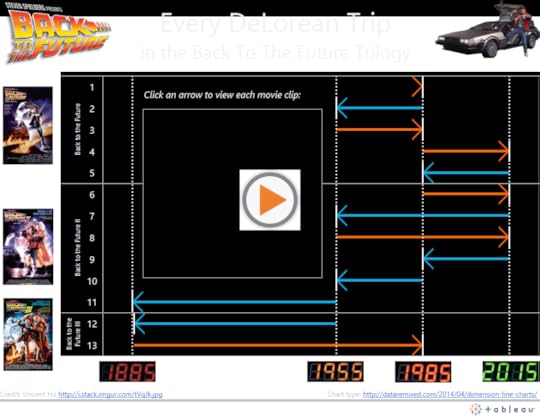
The dashboard gives the reader the ablity to watch the movie clip associated with each DeLorean trip by clicking on the corresponding arrows. To add this feature, I first had to find a video on YouTube that includes each time travel clip back-to-back. Then, I had to grab the embed URL for the video:
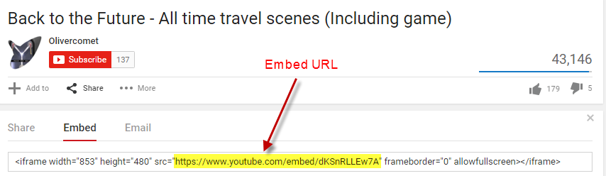
Finally, I had to add the embed URL with the following parameters to each row in the spreadsheet I created:
https://www.youtube.com/embed/dKSnRLL...?start=XXX&end=YYY&autoplay=1
Where XXX and YYY are the start and stop times in seconds, respectively. The “&autoplay=1″ parameter means the user doesn’t have to click the arrow and then click play. Clicking the arrow automatically starts the video clip.
Great Scott, that’s a cool tip!
2. Use the TODAY() function to have a countdown clock in your dashboard update every day
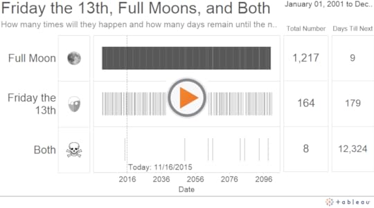
The genesis for this next project came from eyeo. I had the chance to present at the eyeo conference last year, and the day of my presentation happened to be both a Friday the 13th and a full moon. Spooky, right? I wondered how often these two events coincided, so I found a calendar listing of each one, and figured out all the instances in which they occurred or will occur on the exact same day:
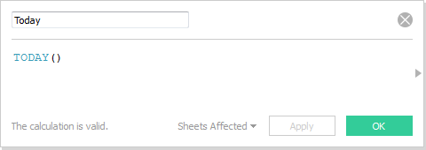
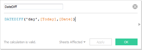
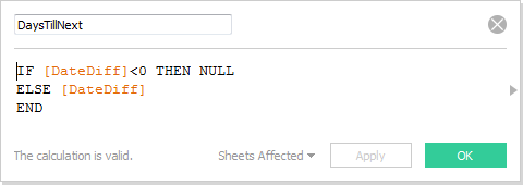
The helpful tip that comes from this side project is the use of the function TODAY(). To create the “Days Till Next” table on the far right hand side of the dashboard, I first created the following three calculated fields, the first to pull in the date value for “today”, the second to compute the number of days between today and each given event, and the third to null out events that have already happened in the past:
Next, I created a new Sheet and placed MIN(DaysTillNext) on the Text shelf, like so: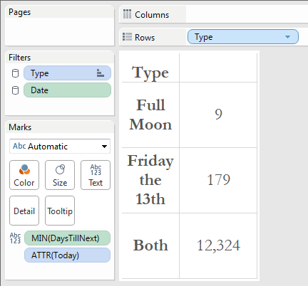
What’s great about this technique is that every day you load the dashboard, Tableau Public server will update all of these calculated fields, including the day that TODAY() maps to, and give you a brand new countdown. Who says Tableau Public dashboards don’t update automatically?
3. Invert the y-axis to stack marks downward — if you dare!
The third side-project was undertaken on the 166th anniversary of Edgar Allen Poe’s mysterious death. It was born out of a simple question: How many works of literature did the revered writer and poet produce over the course of his life? The following dashboard stacks 150 red boxes, one beneath the other, over the course of two and a half decades to visualize his prolific career:
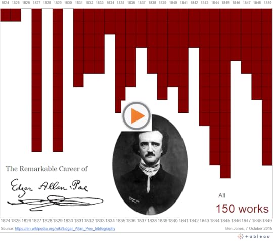
WARNING: This is a dangerous technique! Just ask Christine Chan, who’s “Gun Deaths in Florida” viz, which used a similar technique, drew the widespread and harsh ire of the internet. People called her graphic “misleading” and “deceptive” for making something that was getting worse look to many like it was getting better.
Fair enough. I feel that in this case, the stacked boxes in the Poe viz isn’t as likely to be misinterpreted as a line chart which slopes “downward” from one value to a greater value. We’re just stacking boxes here, and it’s pretty clear that 1845 has “more” boxes than 1844, not less. By why do it at all? Why risk misleading with the inverted y-axis? It’s for dramatic effect – it makes it appear like blood is falling down onto Poe’s head. Dramatic effect is a double-edged sword, though, so tread with caution.
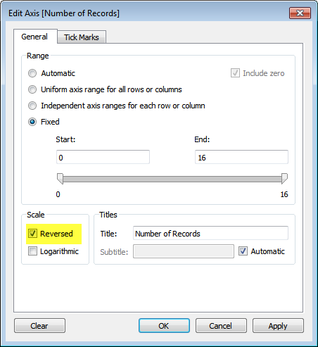
And to open the Pandora’s Box on this technique, simply right click on the axis you want to reverse (it can be the x-axis or the y-axis), and check the “Reversed” box:
Thanks, I hope you enjoy these side projects as much as I did. I hope you find the tips helpful (and that you don’t burn yourself on them!). What side projects have you learned from lately?
Ben
November 12, 2015
Book Review: Storytelling with Data
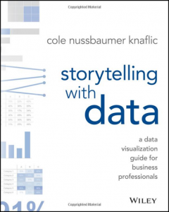 I had the pleasure of reading Cole Nussbaumer Knaflic’s recently released book Storytelling with Data over the past week. I highly recommend it to anyone who uses charts and graphs to convey a data-driven message to an audience – that is to say, basically everyone.
In brief: Cole shows what clear and well-designed visualizations look like, and explains why they’re effective. She also gives sound advice on practices to avoid in most cases, such as pie charts, 3D views and dual axes. She stops a good exit short of Dogmaville, though, explaining that you should be able to give a good explanation why you’re using a challenging chart type if you decide to go that route.
Well beyond merely choosing chart types, the value of this book is that you will learn how to eliminate clutter, focus attention on what matters, and de-emphasize everything else. The pages are filled with high quality before and after images that bring the subject to full color and show you what “good” looks like.
She doesn’t deal with “How” from a tools perspective – her techniques and principles can be put into practice using pretty much any tool from Excel to Tableau to D3. And she doesn’t talk about “data dashboards” that are characterized by multiple charts and graphs placed side-by-side. The book deals entirely with individual visualizations and how they can be designed, annotated, and shown in sequence to tell a story and build to a coherent conclusion.
I especially enjoyed chapters 7 and 8, where Cole gleans lessons from theater, cinema and fiction and then shows how they can be applied to crafting a story with data, including determining flow and storyboarding. Chapter 8 concludes with a great example that I have attempted to recreate here using the Tableau Story Points feature. Note that this interactive graphic is entirely adapted from Cole’s work, not mine, and if you want to understand the principles behind this specific example, I encourage you to read the book:
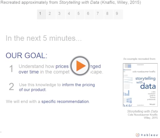
Excerpted with permission of the publisher, Wiley, from Storytelling with Data: A Data Visualization Guide for Business Professionals by Cole Nussbaumer Knaflic. Copyright © 2015 by Cole Nussbaumer Knaflic. All rights reserved. This book is available at all booksellers.
The book concludes with case studies that deal with special topics like survey data, animating visualizations, slopegraphs, alternatives to pies, and strategies to “avoid the spaghetti graph.” In each of these cases, what I really appreciated about the book is that Cole doesn’t merely provide platitudes, she shows with clear visuals what works well and what doesn’t work as well. The book reminded me of Naomi Robbin’s Creating More Effective Graphs in that regard.
If you’ve also read the book, leave a comment below and tell us what you think. I’ve added this book to my Recommended Books page. Note that Cole also has a blog that you can follow if you find her instruction helpful.
Thanks,
Ben
November 6, 2015
A Pew Chart Redesign
I’m a huge fan of the Pew Research Center. They consistently publish interesting statistical insights about society in well-designed visual form.
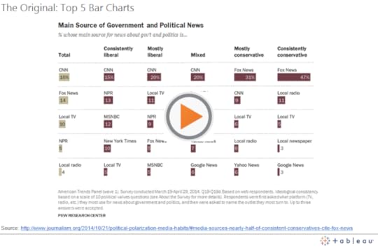
Recently I saw this chart tweeted by Conrad Hackett that Pew published about a year ago showing which news outlets Americans of different political ideologies prefer as their main source of news about government and politics:
Pluses and Deltas
Pluses: It’s a clean design and easy to see the relative proportions for each particular ideology. There is no clutter in this chart. Obviously it’s an interesting data story that is very relevant to the news in the United States today.
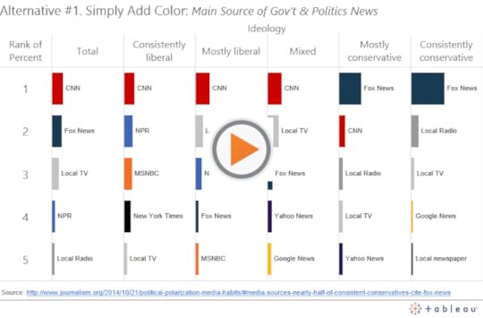
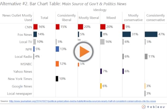
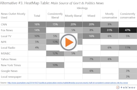
Deltas: I believe there’s an opportunity to improve the ease with which a reader can track the popularity of the various news outlets across the different ideology group columns. Right now it’s tough to see, for example, how the popularity of CNN, or Fox News compares across the ideological groups. You have to scan the bars and read each label to find them. To make this comparison easier, we can use color to link the outlets across the columns, and we can arrange the rows so as to make the relative popularity of particular outlets immediately apparent. Here are three different chart redesigns:
Three Alternatives:
First, we can simply add color to the bars, a hover action to highlight the bars, and a URL action to open the outlet source when a reader clicks on the bars:
Second, we can use the rows differently, so that instead of arranging them by rank, we give each outlet it’s own row. This has the added benefit of showing us how many outlets there are in total, and which outlets aren’t in the top 5 for each group:
Lastly, we can keep the table format and switch the primary encoding from bar length to cell saturation:
I’m curious to know what you think, so here is an informal, unscientific poll of readers of this site:
Loading…
Thanks,
Ben
November 2, 2015
Avoiding Data Pitfalls, Part 3: Confusing Colors
This is the 3rd in a blog post series called “Avoiding Data Pitfalls” (1st, 2nd) that I’ll conclude with this blog post, as I’m turning the rest of the content into a book that I hope to publish next year.
There’s a pitfall that’s quite easy to fall into when creating dashboards with multiple charts and graphs: using color in ways that confuse people. There are many ways to confuse with color, including the oft-maligned red-green encoding that color blind viewers can’t decipher. That’s just one of many, though, and I’d like to use this blog post to illustrate three additional versions of the “confusing color” pitfall that I see people like myself fall into quite often.
Then, I’ll wrap it up by talking about the design goal that I aspire to achieve any time I create a dashboard with multiple views.
Color Pitfall #1. Using the same color hue for two different variables
The example for the first type of this common pitfall comes from a New York City Marathon dashboard (click the “Participation Trends” option at the top) that was created using Qlik. Qlik is a competitor to the company I work for, Tableau, but let me be clear that the product Qlik makes isn’t to blame for the mistake, here. I see this error made with any and every data dashboard product, including Tableau.
Without further ado, here is the portion of the dashboard that I propose could be improved upon by using a different color scheme:
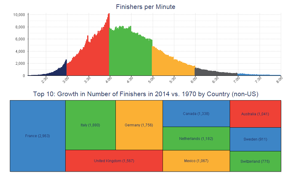
Fig. 1: A NYC Marathon dashboard that uses the same color hue for different attributes
Following my tenet to provide critique with humility, here are some pluses (things I like) and deltas (things I would change) about this dashboard:
Pluses: I like the use of color in the histogram that shows the clear cut-off points, where finishers cross the line in droves immediately before the turning of the hour, especially the 4th hour of the race. This shows how goal-setting can affect the performance of a population, and it’s fascinating.
Deltas: Notice that the same green hue, though, applies to the increase in number of finishers from Italy, Netherlands, people who finished between 4 and 5 hours, and Switzerland. Likewise, the same yellow is used to encode the increase in the number of finishers from Germany, Mexico, and people who finished between 5 and 6 hours after starting. Similarly, red has multiple meanings. Of course there is no actual relation between these particular groups, though it may seem like there is at first glance.
To avoid this confusion, I propose using entirely different color schemes for the histogram and the treemap (and not repeating any colors within the treemap itself), or, better yet, not putting these two charts next to each other at all, as they tell completely different stories.
Color Pitfall #2. Using the same color saturation for different magnitudes of the same variable
Similarly, I’ve made the mistake of using the same color saturation to effectively create two conflicting color legends for the exact same dashboard. Consider this trivial (population?) map that I created with data about mileage of California roads by county to illustrate the point:
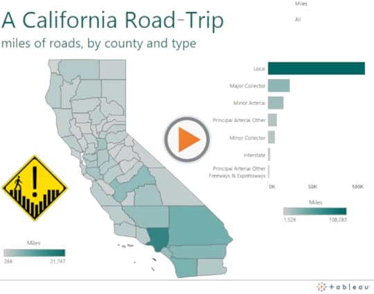
Notice that there are two different sequential color legends on the dashboard that use the exact same turquoise color (R:0,G:102,B:99). In the choropleth, the fully saturated turquoise color maps to a specific county (Los Angeles County) with 21,747 total miles of roads. In the bar chart, the full turquoise color saturation maps to a specific road type (Local roads) with a total of 108,283 miles for the entire state. Just eyeing the dashboard in passing, the viewer may connect Los Angeles County with Local roads, and think they are connected. Or, the reader may look at the wrong color legend (if both are in fact included) and be misled about how many miles of road the county or type actually include.
From a software UI perspective, this error was easy to make because all I had to do was drag the “Miles” data field to the Tableau Color shelf in the map Sheet, and also drag it to the Color shelf in the bar chart Sheet. These two Sheets have totally different aggregation types, but I can easily force the same color encoding if I’m not paying attention.
How to Avoid this 2nd Type of Color Pitfall
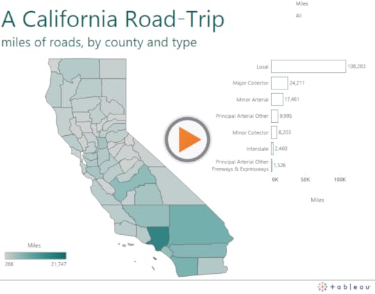
Notice that the color encoding on the bar chart is actually redundant. We already know the relative proportions of the miles of different road types by the lengths of their corresponding bars, which is quite effective all by itself. Why also include Miles on the color shelf, especially considering the fact that the color would conflict with the choropleth map, where color is totally necessary?
My colleague Dash Davidson came up with a good solution: remove color from the bars altogether and just leave an outline around them:
Color Pitfall #3. Using too many color encodings on one dashboard
It’s very common to use too many color schemes on a dashboard, especially with big corporate dashboards where the various stakeholders call for everything but the kitchen sink to be added to the view.
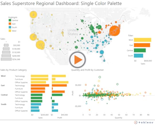
Here’s a dashboard I create to illustrate the point – my first dashboard that uses the Sales SuperStore sample dashboard that comes with Tableau Desktop:
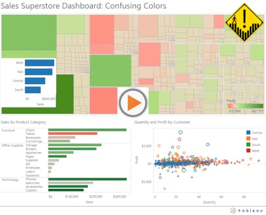
In this dashboard we see not just one red-green color encodings but two, and they have different extremes for the exact same measure (Profit). We also see red and green used in the scatterplot encoding, but now they refer to different regions instead of different profit levels. Finally, we have another bar chart that uses no color scheme, but each bar is blue – the same color as the Central region in the scatterplot.
You get the point. This isn’t what we want to create. I think I broke all of the rules in creating this one.
My Design Aspiration: One (and only one) color encoding per dashboard
This goal isn’t always possible, but as much as possible, I try to include one and only one color scheme on every dashboard I create. The reason is that I find it takes me a lot longer to figure out what’s going on in someone else’s dashboard when they’ve used more than one. It’s that simple.
This means I often have to make a tough choice – which is the variable (quantitative or categorical) that will be blessed with the one and only one color encoding on the dashboard? It’ll become the variable that receives the most attention, so it should be the one that is most related to the primary task the user will perform when using the dashboard.
For example, if the dashboard was created for a sales meeting in which the directors of each US sales region talk about what’s working well and what’s not working well in their respective regions, then the “Region” attribute could very well take the honored place of prominence:
I hope this was helpful! Do you have any pet peeves or recommendations when it comes to using colors on data dashboards?
Thanks for reading,
Ben
October 30, 2015
My 3 Basic Tenets of Data Visualization
I have a few thoughts I’d like to put out there, in the spirit of contributing to the ongoing dialogue within the field of data visualization. I’m still relatively new to this field, having participated as a practitioner, consultant and teacher for about ten years. That decade has left me with more questions than answers, and I find more opportunities than ever to expand my knowledge and skill set, and more people than ever with unique perspectives to learn from.
There are a few things, though, that I feel particularly passionate about. The three concepts I describe below amount to “tenets” that I’d like to humbly propose others in the field consider adopting. I definitely didn’t receive them in the form of a carved stone tablet from on high. It’s just stuff I think is true and important.
1. There are no black and white rules
I don’t believe that we can ever declare that a particular visualization type or design decision either “works” or “doesn’t work“. This binary approach is very tempting, I’ll admit. We get to feel confident that we’re avoiding some huge mistake, and we get to feel better about ourselves when we see someone else breaking that particular rule. I started off in this field with that mindset.
The more I’ve seen and experienced, though, the more I prefer a sliding gray scale of effectiveness over the black-and-white “works” / “doesn’t work” paradigm. It’s true that some choices work better than others, but it’s highly dependent on the objective, audience and context. This paradigm makes it harder to decide what to do and what not to do, but I believe this approach embraces the complexity inherent in the task of communicating with other hearts and minds.
Sometimes the most effective choice in a particular situation might surprise us. Consider two analogous examples: chess and writing. Data visualization is like chess in that both involve a huge number of alternative “moves”. Garry Kasparov decided to sacrifice his queen early in a game against Vladimir Kramnik in 1994. He went on to win that game in decisive fashion. Data visualization is like writing in that both involve communicating complex thoughts and emotions to an audience. Cormac McCarthy decided to eschew virtually all punctuation in his 2009 novel The Road. He won the Pulitzer Prize for that novel. Would I recommend either of those decisions to a novice? No, but I wouldn’t eliminate them from the set of all possible solutions, either. This diagram in Tamara Munzner’s Visualization Analysis & Design illustrates why:
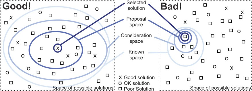
If we start with a larger consideration space, it’s more likely to contain a good solution. On the other hand, labeling certain visualization types as “bad” and eliminating them from the set of possible solutions paints us into a corner. Why do that?
For example, consider the word cloud. Most would argue that it’s not terribly useful. Some have even argued that it’s downright harmful. There’s a good reason for that, and in certain situations it is harmful. It’s difficult to make precise comparisons using this chart type, without a doubt. And using a word cloud to analyze or describe blocks of text, such as a political debate, is often misleading as the words are considered entirely out of context. Fair enough. Let’s banish all word clouds, then, right? Let’s malign any software product that makes it possible to create one, right?
I wouldn’t go so far. Word clouds have a valid use, as well, even if it is rare. What if we had a few brief moments during a presentation to impress upon a large room of people, including some sitting way in the back, that there are only a handful of most commonly used passwords, and they are pretty ridiculous. Wouldn’t a word cloud suffice? Would you choose a bar chart, a treemap or a packed bubble over a word cloud, in this scenario? You decide:
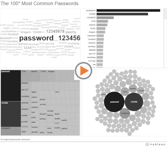
I admit it – I’d likely choose the word cloud in the scenario I described. The passwords jump right off the screen at my audience, even for the folks in the back. It doesn’t matter to me whether they can tell that ‘password’ is used 1.23 times more frequently than ‘123456’. That level of precision isn’t required for the task I need them to carry out. The other chart types all suffer from the fact that only a fraction of the words fit in the view. The audience can’t scan the full list at a glance to get a general sense of what’s contained in it – names, numbers, sports, batman.
If what you take from this example is that Ben thinks word clouds are awesome, you’ve completely missed my meaning. In most instances, word clouds aren’t very good at all, just like sacrificing one’s queen or omitting quotation marks entirely from a novel. But every now and then, they fit the need pretty well. We could probably come up with other scenarios where we would choose one of the other three chart types instead. Choosing a particular chart type depends on many factors. That’s a good thing, and frankly, I love that about data visualization.
2. Critique needs to be given with humility
Since there are so many variables in play, and since we hardly ever know the objective, the audience, or the full context of a particular project, we need to be humble when providing a critique of someone else’s data visualization. All we see is a single snapshot of the visual. Was this created as part of a larger presentation or write-up? Did it also include a verbal component when delivered? What knowledge, skills and attitudes did the intended audience members possess? What are the tasks that needed to be carried out associated with the visualization? What level of precision was necessary to carry out those tasks?
These questions, and many more, really matter. If you’re the kind of person who scoffs at the very mention of word clouds, your critique of my example above would be swift and harsh. And it would largely be misguided.
Open dialogue is necessary in data visualization, and healthy debate should be encouraged. When engaging in dialogue and debate, though, I try to remind myself that I don’t know all the details. Seeking to understand some of these details is an important first step. Then providing a few “pluses” and a few “deltas” almost always works. What works well (pluses), and what ideas do I have to make the visualization work better (deltas)? It’s really not that hard.
3. Freedom to innovate is necessary for growth
Lastly, I enjoy that there are so many creative and talented people in this space who are trying new things. I believe that freedom to innovate is necessary for any field to thrive, and I try to do what I can to make sure such a freedom persists in data visualization.
Making blanket statements about certain visualization types, design choices, tools, or even individuals or groups in this space isn’t helpful, and tends to reduce the overall spirit of freedom to innovate. I don’t have data to back that up, by the way, it’s just the way I feel. You may agree or disagree.
And “innovation” doesn’t just involve creating new chart types. It can also include using existing chart types in new and creative ways. Or applying current techniques to new and interesting data sets. Or combining data visualization with other forms of expression, visual or otherwise. As long as we can have a respectful and considerate dialogue about what works well and what could be done to improve on the innovation, I say bring it on.
Adding the winning ideas to the known solution space is good for us all.
I hope these tenets make sense to you. Let me know if you agree, if you’d change anything about my list, or if you’d add any tenets of your own.
Thanks,
Ben
September 15, 2015
How to Make a Scatterplot with Marginal Histograms in Tableau
First, apologies for the blog post drought! It was that kind of summer. It’s good to be back, though, and I hope you’ve been well.
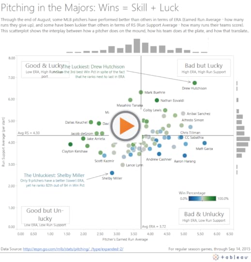
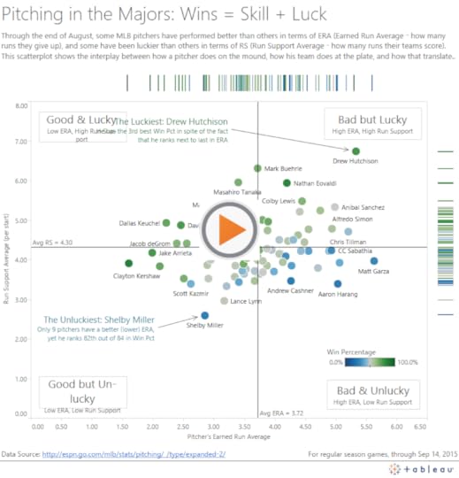
Scatterplots are my favorite visualization type, hands down. From my very first interactive data graphic about The Great One to the most recent visualization below on major league pitchers, I’ve learned a great deal from these Cartesian classics over the years. In this post I’ll show you how to make them even better than the standard ones in Tableau.
Recently, Shine Pulikathara published a scatterplot of NFL player heights and weights that included two marginal histograms – one for each axis. I tweeted that I liked it, and Lynn Cherny replied that it’s pretty common to see this kind of thing in R:
@DataRemixed those are pretty common in R plots
— Lynn Cherny (@arnicas) September 14, 2015

She’s right, and it turns out that it’s also a common convention with other statistical graphing platforms, like Matlab and Plotly. It’s called a Scatterplot with Marginal Histograms. While Tableau has scatterplots and histograms as standard chart types, it doesn’t automatically combine them for you into a single view. The goods news, though, is that it’s fairly easy to combine them using a dashboard with three sheets. There’s only one small trick to make the charts interact the way you want, which I’ll cover below. If you want to follow along, download 2015pitchingstats.xlsx.
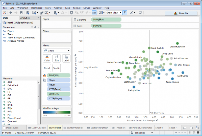
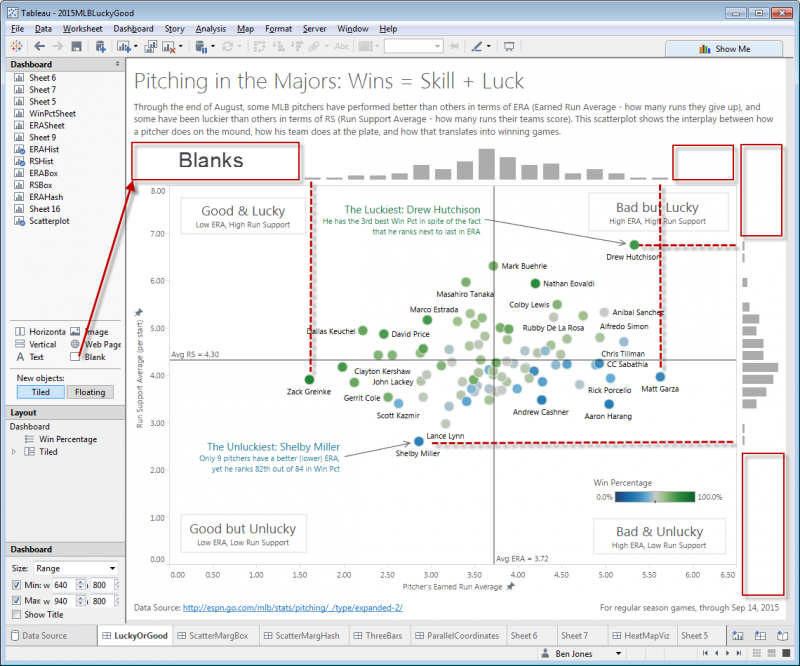
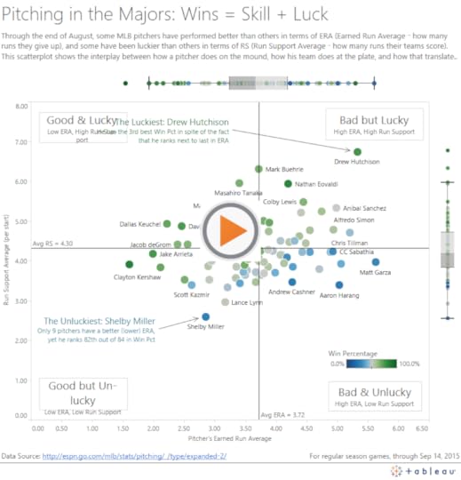
First, here is the finished version, showing pitchers “skill” (Earned Run Average, or ERA) and “luck” (Runs Scored by their team, or RS) so far in the 2015 season:
Now, let’s consider the four easy steps to create a scatterplot with marginal histograms:
Step 1: Create the Three Sheets
This part is fairly straightforward – create a scatterplot and two histograms as three separate sheets in the same workbook. To create the scatterplot, drag ERA to Columns, RS to Rows, W% to Color, Player to Label, and then add two Average reference lines, like this:
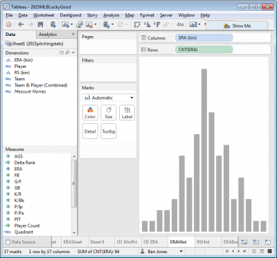
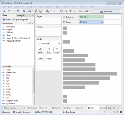
Next, to create the first histogram, create a new sheet, click on the Measure (say, ERA), click Show Me in the top right, and then choose Histogram. Do the same in another new sheet with RS, but click the Rotate icon in the top icon bar to flip the RS histogram 90°. Notice that two new data fields appear in the Measures area: “ERA (bin)” and “RS (bin)”. Right click to edit these fields and change the “Size of bins” to be 0.25 and hide the axes.
Step 2: Add the Histogram Bin Dimensions to the Scatterplot Chart Detail
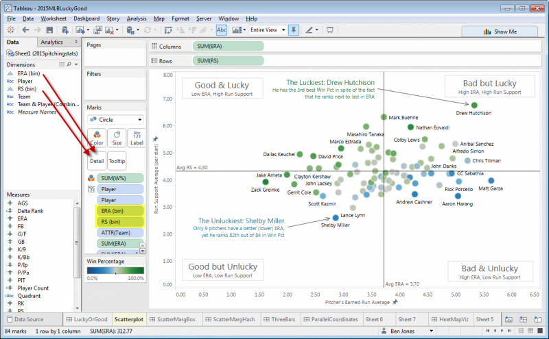
Without this step, you won’t be able to get the sheets to interact together in the dashboard. Go back to the scatterplot sheet you created in Step 1 and drag both “ERA (bin)” and “RS (bin)” to Detail. You should now see these two fields listed in the Marks card area:
Step 3: Add the Three Sheets to a Dashboard
Next, create a new dashboard and add the three sheets you created in Step 1. Aligning the histograms with the scatterplot is the one messy part of this method. Add blanks to the left and right of the ERA histogram, and above and below the RS histogram. Drag the blanks until the extreme bars of the histogram align with the extreme points of the scatterplot:
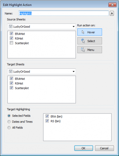
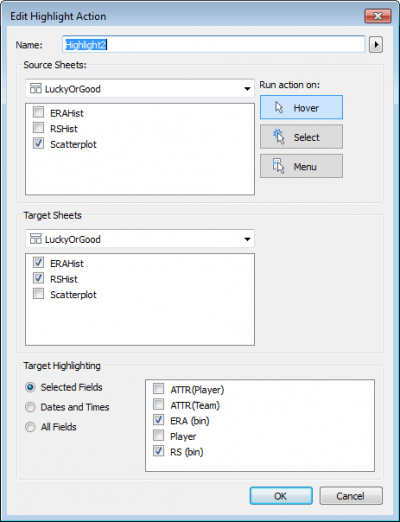
Step 4: Create Two Highlight Actions:
The last step is to get the sheets to interact with each other. There are lots of ways they could potentially interact, but here’s what I’d like to see happen:
When I hover my mouse cursor over any of the histogram bars, the corresponding circles on the scatterplot highlight
When I hover my mouse cursor over any of the scatterplot circles, the corresponding histogram bars highlight
To do this, create two new dashboard actions by clicking Dashboard > Actions > Add Action > Highlight, and fill out the dialog boxes as follows:
That’s it! For finishing touches, I added a title, lead-in paragraph, data source and last accessed note, four area annotations to define the four quadrants, and two mark annotations to call out points of interest. I also edited the two Average reference lines to uncheck “Show recalculated line for highlighted or selected data points”. This was strictly a matter of preference, and you may not decide to modify the reference lines in that way.
Other Variations
Here are a couple other variations that don’t involve the binning concept inherent in histograms, and therefore don’t required Step 2 above:
Scatterplot with Marginal Box-and-Whisker-Plots
Scatterplot with Marginal Hash Lines
Thanks for reading! I hope you found this helpful. Let me know if you have any further tips by leaving a comment. Also, I’m curious, which of the three variations – marginal historgrams, box plots, or hash lines – do you prefer?
-Ben