Ben Jones's Blog, page 2
May 21, 2018
What’s the Biggest Challenge for Data Workers Today?
Those of use who work with data call ourselves many things these days. From the typical and perhaps mundane “data analyst” to the controversial and supposedly sexy “data scientist”, titles abound. Titles aside, though, let’s just call us all “data workers” for a moment – we’re all people who use quantitative information found in spreadsheets and databases to steer our businesses, our communities, and ourselves into the future. Some may use code and sophisticated algorithms to do that, others may use off-the-shelf software and fairly basic analytics techniques. Others use all of the above, and more. We’re living in exciting times of growth and development for many people.
But this post isn’t about titles, or anything like that. You may or may not like me using the term “data worker”, and I’m okay with that. I’m not married to it, and as long as you understand what’s intended by that description, then let’s go with it for now. Because this post is about the biggest challenges that data workers face today. What are these big challenges, and what are we doing about them? I got thinking about this after I saw a tweet from someone named Shane Morris this morning:
I think the biggest problem facing #DataViz today is that so few can think past the capabilities of their tool of choice. Back then their creativity was the only constraint.
— Shane Morris (@ShaneKnowsData) May 21, 2018
Now I don’t believe I’ve met Shane in person before, and I don’t disagree that he has identified a major issue in tool-based limitations to our creativity. But I did get to wondering whether or not this is the “biggest” challenge, and what the other “big” challenges there are, if I were to try to list them. So here’s what came to mind. I’d love to know your thoughts on these, and which other big challenges you have on your list.
What are the biggest challenges?
Challenge #1: Tool-based Limits and Silos
I’ll agree with Shane on the identification of a major challenge, and raise him one sub-challenge: it isn’t just that people are limited by what a particular tool let’s them do, it’s that often times their network is limited to others that use that same tool. So tools don’t just limit what we can create, they often times limit with whom we connect. I’ve been working for Tableau Software for over half a decade now, and Tableau has a very active and passionate community, both online and in person. These enthusiasts share effective practices, support each other in very practical ways, and push each other to improve. All of that is a very good thing, and I’ve benefitted from it in many ways over the years. We should keep doing that.
But there’s no need to make it exclusive. It’s human nature to gravitate to groups where we feel we belong, and in this sense the landscape of data workers is no different from OS users who cluster around Mac, PC or Linux, or sports fans who go to the same bars where people wearing the same jerseys will high five after certain plays but not others. We can’t get rid of that part of who we are, and I’m not saying we need to.
But I do believe that we’d be better off as a whole if software providers, conference planners and meetup group organizers did more to encourage and even facilitate connection to other similar groups. I don’t mean this in some sort of mushy “why don’t we all just get along” kind of way. I mean that much could be learned from conversations between people who solve similar problems with different tools. That has been my experience as co-chair of the Tapestry Data Storytelling Conference (of which more, soon). I’ve been able to meet very talented people who have spent time learning tools and methods that have different strengths and weaknesses as the ones I’ve learned.
There are other such connections happening more and more. For example, I admire what Wes McKinney and Hadley Wickham are doing joining the R and Python worlds with the new venture Ursa Labs, and feel that more initiatives and groups could be formed along these lines.
After all, what science fiction author envisioned a future where we are divided based on the languages we speak to computers?
Challenge #2: Lack of Widespread Data Literacy
If Challenge #1 deals with people in the data worker space, Challenge #2 deals with those who aren’t yet in that space. I think there are a whole lot of them. Those of us over, say, 30 grew up in a world that didn’t really have distinct “data” programs in colleges, and high schools taught us much more calculus than statistics or analytics. Add that to the fact that numerical competencies can be challenging to develop for many, and even tricky for experts to consistently get right, and you have a situation where the majority of people just don’t speak the language of data very well yet.
The “data illiterati” can be divided into those who aren’t aware of their illiteracy, and those who are aware of it. Those who are aware of it can be further divided into those who want to change, and those that don’t. Those that want to change either feel that they can or they feel that they can’t. Those that don’t want to change feel that it’s just not necessary. Based on my anecdotal experience, This last group is shrinking.
The good news is that the group that wants to learn data and feels that they can do it have a ton of alternatives available to them these days. Universities are coming out with data programs left and right, online sites like Udemy and Coursera let you learn via DIY, and tool companies have tutorials that are incredible as compared to only a few years ago.
But the thing that concerns me is the group that feels like they need to learn data, but they feel like they can’t for some reason. I think this is a huge group of people. Either they feel blocked by some perceived innate deficiency (“I’m just not good at math”), or they don’t know where to turn. I’m not sure the alternatives in the previous paragraph do the trick for them. So something more is needed to address this challenge. We’ll have to see what comes next.
Challenge #3: Poor Adherence to Standards of Data Ethics
You can’t read the news today without coming across something about data privacy rights, companies misuse of personal data, and major breaches of data security on a daily basis. From Strava’s “god view” that revealed sensitive locations to Facebook’s Cambridge Analytica scandal to Europe’s recently enacted GDPR legislation, we are in a situation where every organization has a data privacy policy, but few of us feel that our personal data is actually safe.
This is a major issue in today’s data space, because it gets to the “why” behind what we’re doing. What good is it to have high competency and skill working with data if what we’re doing with those capabilities isn’t even ethical? Can we agree on what is and what isn’t ethical in this space? What’s stopping companies from doing what they want with our data in order to achieve their goals, unchecked?
A code of ethics for data workers is needed. Something similar to the Hypocratic Oath for doctors, or Asimov’s Three Laws of Robotics. Something that actually limits what we undertake, and how we go about our profession.
We don’t just need a bunch of fancy words that everyone agrees to but that in effect are meaningless. It’s easy for ethics to become that. We need something substantial that stands in the way of companies and governments using data in inappropriate ways. We need a “Three Laws of Data Ethics”, or something similar to that (Evernote took a stab back in 2011).
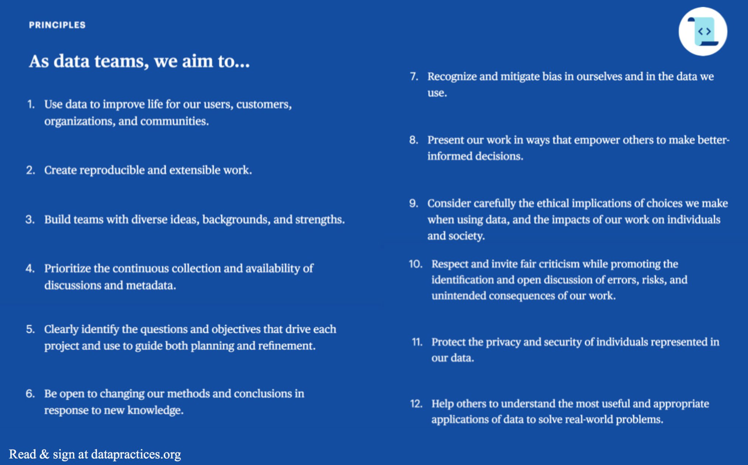
One other group I was a part of recently took a pass at this. In December 2017, the first Open Data Leadership Summit organized by the team at data.world brought together individuals from a variety of specialties and backgrounds, and we spent half of the event talking about this exact issue. What came out of that discussion was the Manifesto for Data Practices, and I recommend you take a look at it. Over 1,400 people have signed their name to this document to date – that’s a small but not insignificant number of people who feel that the values and principles laid out by this group would be helpful to adopt. Here are the principles:
Will this manifesto do the trick? Not all by itself. Acknowledging something as important isn’t the same as adhering to it in practice. So more is needed still. That’s why this remains a big challenge.
Challenge #4: Preservation and Conservation of Records and Insights
I’ll call this one the silent challenge, because I don’t think many are thinking about it. It’s highly important, but isn’t quite perceived as urgent by most. Important but not urgent challenges are the ones that can be the most difficult to solve, because there are so many other challenges that are screaming in our face to fix right now.
So what’s this challenge all about and why is it so big? Within our societies and our businesses, we’re amassing incredible amounts of data, and we’re leveraging that data for very powerful insights and publishing it in various ways and on various platforms. But will all of that survive for subsequent generations?
Everything we build eventually crumbles or gets replaced by something different. Will our data be around for others to see what life was like for us, or will our great-great grandchildren look back on the early 21st century with a whole lot of questions because the files got corrupted, the servers stopped working, the software was no longer supported, the media storage devices couldn’t be plugged in to anything, and there were no backups, no hard copies, no instructions left when the company got acquired or the standards changed or the lights went out.
Does that sound like a crazy thing to worry about, to you? If so, I really hope you’re right. Just don’t think about other technologies that have gone the way of the dinosaur, and how much information got lost when the transition left them behind. We can still buy floppy disk drives on Ebay, Atari 2600 consoles on OfferUp, and a whole host of dongles to convert from this type of connector to that, and there’s always the Wayback Machine to remind us about all those ugly GeoCities sites we made.
But even in the near term, data preservation can sometimes be a struggle. My father passed away a few years ago, and I was delighted to find some old cell phones in a recent move that I was sure contained voicemails from him. I had to dig deep to find some old-style iPhone connectors, and when I did I listened to each recording a few times. That was really nice for me.
But zoom ahead another 30 years, or 40, or 100. What are the odds I’ll be able to listen to those recordings? It’s the long term horizon that’s the concern. It’s more than a little ironic to think that our generation – the selfie generation, the one that posts pictures of every meal for the whole world to see, but prints out none of it – could be the one that future generations know the least about. If they know about us, it’s because people out there – the librarians and archivists – will have come up with redundant solutions to preserve and conserve.
So that’s what I have! 4 “Big Challenges” that I believe we face as data workers. Which of those four is the biggest? I don’t really know, and I don’t have a good way to rank them. Maybe you’re aware of a 5th or 6th that’s even bigger. What do you think?
Thanks for reading,
Ben


May 16, 2018
You Need to Read Hans Rosling’s Factfulness
I just finished listening to Hans Rosling’s posthumously published book Factfulness, in which he and his collaborators, including his children Ola and Anna, advocate convincingly for a cool-headed fact-based world view, but one that’s infused with an empathy for humanity and our planet that spurs us to action, instead of just thinking and talking about the issues we face.
This book is one of the most inspiring and humbling things I’ve ever taken in, and the fact that it was completed between Hans’s diagnosis of terminal cancer and his passing on February 7th, 2017 added a sense of poignancy for me. I had the chance to meet Hans and his wife Agneta a couple years ago when he presented a keynote at the Tableau Conference in 2016. I was thrilled to be assigned the task of buying the toilet paper for his world population presentation at the local drug store downtown. Yep, my data claim-to-fame:
What’s this book about?
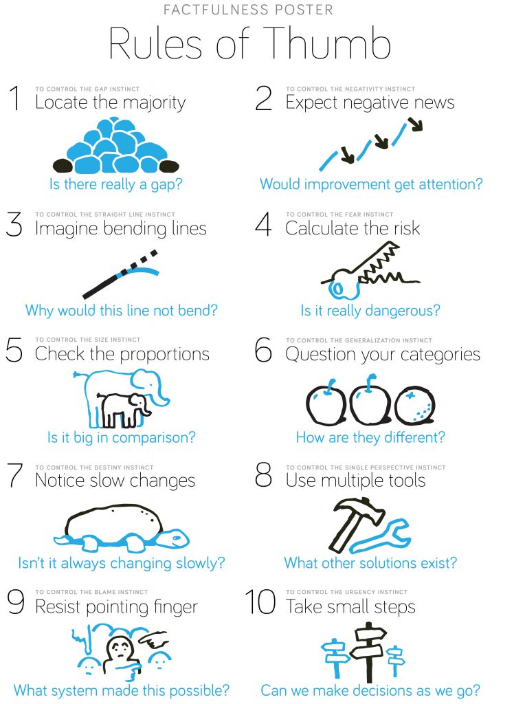
In this book, the Roslings outline 10 defects in the way we humans think and see the world, and they prescribe 10 corresponding rules of thumb that we can use to keep them at bay:
Why did I like this book so much?
These 10 dramatic instincts help explain a lot the reasons behind the social issues we observe around us and fall prey to ourselves – from xenophobia to pessimism about the way things are compared to the past to misconceptions about present and future dangers based on what we consume in the news. You walk away with a deeper appreciation for why and how we fall into these pitfalls time and time again, and how to prevent doing so in the future.
I also loved hearing the stories of his work as a young doctor studying konzo in parts of rural Africa, and of what life was like in Sweden when he grew up there as a child in the 1950s and 60s – not very different from places today that many educated people in the US and Europe would think of as “emerging nations”. Those personal anecdotes helped me as the reader understand the reasons behind his unique and beautiful way of seeing the world. His courage in sharing some of his most disastrous decisions as well as his humility in learning from those mistakes and passing along his insights to us are an amazing testament to his life.
What’s especially awesome about what they’ve put together is that the Gapminder Foundation, which continues his mission forward, has made Factfulness posters and slides freely available so we can both remind ourselves and teach others about how to evolve the way we think and how we act.
Here are a couple quotes that hit me so hard as I was listening to the audiobook that I pressed paused and immediately shared them on Twitter:
"The world cannot be understood without numbers, and it cannot be understood with numbers alone." On looking at both statistics & individual stories, from Factfulness by @HansRosling, Anna Rosling & @OlaRosling.
— Ben Jones (@DataRemixed) May 14, 2018
The world's PIN is 1114. From left to right: 1B people in Americas, 1B in Europe, 1B in Africa, 4B in Asia (rounded). By 2100, it will be 1145 if UN projections hold. From Rosling's Factfulness. Loving this book.
— Ben Jones (@DataRemixed) May 14, 2018
"Data must be used to tell the truth, not to call to action, no matter how noble the intentions." – @HansRosling in Ch10 of Factfulness, in which he discusses climate change, ebola, and how some justify showing worst case scenarios to spur action via fear. Powerful stuff.
— Ben Jones (@DataRemixed) May 16, 2018
To demonstrate the 10th and final dramatic instinct, the Urgency Instinct, I’ll encourage all of my readers – whether you’re “into data” or not – to get this book and read or listen to it right now, BEFORE IT’S TOO LATE! 
May 6, 2018
When Has a Data Analyst Succeeded?
I read a thought-provoking blog post by Roger Peng of Simply Stats (and professor in the Department of Biostatistics at the Johns Hopkins Bloomberg School of Public Health) entitled “What is a Successful Data Analysis?“. It’s an interesting question – data analysis is concerned with measuring performance of people, processes and policies, but is there a widely-accepted measure of success of analysis itself?
It seems like success in data analysis should be relatively straightforward to define, right? We all know good analysis when we see it, or at least we think we do. If you read Peng’s entire post, though, you’ll see that it’s tricky. If you’re tempted to use ‘veracity’ as a yard stick, how do you know whether the analysis is ‘true’ or not? If you feel like adherence to ‘best practices’ should be how we measure success, who defines what’s ‘best’, and would most people agree? In analysis there can be many ways to skin the cat, and multiple different findings can emerge from the same set of data.
Ultimately, he proposes the following definition for success for data analysts:
A data analysis is successful if the audience to which it is presented accepts the results.
What do you think? Do you agree with this definition? As Peng’s audience, do you accept his selection of ‘acceptance’ as the sole criterion for success? If so, can you explain why this definition works for you? If not, do you think there’s another sole criterion, or do you think there are multiple criteria that should be used instead? Or maybe you think it’s not something you can define in general terms.
Here’s my take, off the cuff
I want to like this definition, mostly because of the importance it places on communication and making an impact on other human minds, but unfortunately I just can’t accept it. It’s similar to leadership, in my view: is a ‘good’ leader someone who just gets people to follow him or her? If so, every tyrant and despot in human history would fit this definition. They may have been effective at getting people to follow them, but what good is that if they led them right off of a cliff?
So, too, with analysis: Colin Powell’s February 5, 2003 presentation on the presence of weapons of mass destruction in Iraq was accepted by many in the US government (though not in the UN, ironically), but this has been declared a failure in retrospect. Galileo’s findings in favor of the Copernican theory of a heliocentric solar system earned him rebuke from the Catholic church – a stance the church didn’t officially change until more than 350 years later.
These two examples of analysis that was initially accepted or rejected erroneously are similar to type I and type II errors, as my co-worker Scott Teal pointed out to me as we chatted about Peng’s blog post. The possibility of making such errors, combined with the known propensity of humans to pay more attention to analysis that confirms biases and previously held beliefs lead me to reject this definition.
So what’s my suggestion, then?
I don’t like to shoot holes in someone’s proposal without coming forward with an alternate suggestion, myself. In this case, though, I don’t have one that I’m confident in, so I’d like to hear your ideas. Ultimately, I doubt there’s a single criterion that would hold up to every circumstance, as convenient as that would be.
I believe successful analysis can be described by the following six traits:
Falsifiable: The analysis puts forward statements that are possible to be refuted
Sound: The analysis is conducted using valid techniques, and is generally free from error
Confirmable: The analysis can be repeated, replicated, or corroborated by alternate means
Compelling: The analysis is presented in a manner that is clear and highly convincing
Weighty: The findings matter a great deal
Ethical: The entire activity follows the values and principles outlined in the Manifesto for Data Practices
What do you think – should one or more of these six be excluded from a list of characteristics of a successful data analysis? Are there traits missing?
I’m not so sure these six are easy to measure, by the way. For example, as Peng rightly points out, an analysis may have involved an incredibly expensive experiment, so it may be cost prohibitive to repeat or replicate it. Or perhaps some don’t agree with how compelling the presentation of the analysis was. Or findings may seem weighty in the moment but may be inconsequential within a matter of hours or days due to a changing factor.
Long story short: I agree with Peng that’s it’s challenging to put forward a simple and concise definition of ‘successful’ analysis. I applaud him for trying, and again, I wish I could accept his definition that makes use of a sole criterion – it sure is easier to remember than mine with six distinct factors.
I’d love to hear your thoughts, too. Leave a comment, join the discussion on social using #SuccessfulDataAnalysis, or, better yet, wrote your response on your blog.
Thanks for reading,
Ben
April 25, 2018
It’s International Chart Day. That’s Damn Right It Is!
I thought it was pretty great that Congressman Mark Takano (CA-41) teamed up with Tumblr and the Society for News Design to create International Chart Day – the first of which will be celebrated on April 26th, 2018. Finally, a day just for the data nerds!
Alright, sure, that same day also happens to be Richter Scale Day, which kind of makes sense if you think about it…
…but the fact that it’s ALSO National Pretzel Day is kind of a stretch even if, you guessed it, there’s such a thing as a pretzel chart.
So wait, why is it awesome then? Isn’t there a day for everything these days? After all, weren’t we reminded just a few weeks ago to mark our calendars for “National Walk Around Things Day“? And didn’t we kind of roll our eyes when we found out that the first Saturday in February is “Ice Cream for Breakfast Day“?
Okay, fine, I admit it was pretty tempting to just declare that all such National and International days jumped the shark the moment this happened:
Today is National National Day Day
— Adam Hess (@adamhess1) October 12, 2014
But no, sorry, this one’s different for me. The others are frivolous and silly, even slightly annoying, but International Chart Day is all about data literacy, and data literacy has never been more important. In a world where claims of fake news are rampant, and one in which we can be rightly concerned that people might be trying to mislead us with the data they’re showing us, I think this statement on the official site is pretty refreshing:
“On April 26, chart lovers will unite to celebrate the first-ever “International Chart Day,” an opportunity for the infographic creating community to engage the public by sharing their favorite examples, further explaining the history and value of charts, and sharing insight in to how to create high-quality, visually engaging, informative visualizations.
The goal is to assist the public in becoming better consumers of data, information and news.”
I can get behind that. National Apple Dumpling Day? Not so much, even if it is on my birthday.
So how can we celebrate International Chart Day in a way that helps achieve the goal? By sharing examples of really great visualizations that are both effective at conveying information and engaging to look at? Sure, let’s definitely do that, and let’s using the hashtag(s?) #ChartDay and #InternationalChartDay to track what others are sharing.
But let’s go beyond that, and let’s say why we think each visualization is so effective. What about each one is a stroke of genius, in your mind? How does it convey a message in a clear and compelling way? Say what works. I tried to do that with five recent “Viz of the Day” winners that my team selected this year. You can see which ones I chose and why I like them here.
Let’s take it even one step further. Let’s have a dialogue about each other’s choices in which we allow one another to muse about what could work even better. Because no visualization is perfect, and there is always room for improvement. If I’ve learned anything in the past half decade engaging with the online community of dataviz types, it’s that growth can come from challenging each other and willing to be challenged. Iron sharpens iron.
With that, I wish you a Happy International Chart Day!
Thanks for reading,
Ben
March 24, 2018
Taking Back the Internet
I’m in the middle of writing my second book (I hope I’m at least in the middle), so I haven’t done much blogging lately. This site lay fallow for almost a full year. Okay, I also played a lot of golf and skied a ton, among way too many other hobbies, so I can’t really blame it all on my book, to be fair.
Today’s topic is how we can take back the internet. Holy hyperbole, Batman! Take it back from whom, and why such dramatic language, anyway? Sorry, I’m going to need more than 280 characters for this one. Let me start with today’s post-breakfast coffee hour.
Remember Google Reader?
This morning I saw on Twitter that Neil Richards had published some thoughts about three of his recent visualizations on his site ‘Questions in Dataviz’, and I took a break from writing to read what he wrote. I hadn’t seen the debate about his pet ownership un-map, so it was cool to get his take on it. In the blog post he references another great blog post by Bridget Winds Cogley on the mathematics of the imposter syndrome that she wrote last month. Also a great read. “We are the kraken to our own ships.” Very true. I love how both of these two people write. It’s very insightful writing, and highly personal. You get a sense of where they’re coming from, and you can learn about their backgrounds and what motivates them in general, or in relation to something they’ve created.
This mini weekend blog reading binge made me reminisce about when I first started blogging here back in August 2011. It wasn’t that long ago, but in internet time, it was eons ago. Back then I would publish my thoughts, often with a visualization or two, and then I’d describe how I made it, and what I learned in the process. I’d try my best to research and link to other people who had done related things that I found helpful. It took time, but I know it was a good use of my time. How do I know? Because I have a very bad memory and I’ve been able to reference my own simple tutorials multiple times over the years. It turns out last-year-me is much smarter than this-year-me. That’s true pretty much every year that goes by.
The Great Social Takeover
Thinking back on those early days in the dataviz community, there was a link to an RSS feed prominently featured in the top right corner of our home pages so that people could be notified whenever we published something. Remember RSS readers? I used to use one myself quite often. I think it was called Google Reader. Yep, that was it, and yes, I had to check (I told you I have a bad memory). But Google killed Reader, so we all switched to Feedly. Except the switch never quite happened for me. I think it’s partly because I wasn’t thrilled about learning a new RSS reader and migrating all my links, and partly because right around that time, everything started to switch to social. That good old orange RSS feed icon is still there on the top right corner of my blog posts, but I don’t think anyone has used it lately.
But even with ‘The Great Social Takeover’ in full swing, I didn’t really see Twitter and Facebook as a way to actually share what I had made, but just to share a link to my work and have quick conversations about it. My hope was that people would navigate here, to this now-dusty blog, to experience the data themselves. At first that’s what happened, and social was a suitable alternative to RSS because social feeds were mostly chronologically ordered, if I’m not mistaken. Then, slowly but steadily, algorithms started to modify and reorder our social feeds, and paid content started appearing in the middle of the snippets from our friends and associates. The algorithms aren’t all bad – they alert us to interesting conversations that happen while we’re away. And it’s not like ads are totally unexpected on a free platform – we get that we’re the product, not the customer.
So I’m not trying to tell some dystopian techno-horror story or anything. Well, I hope not anyway. Truth is I’m still not quite sure why I’m seeing what I’m seeing on social, or exactly which actors and incentives are involved in that presentation of content to me at any moment in my digital life. The bottom line is I don’t know how I totally missed the debate about Neil’s un-map viz, because it’s exactly the kind of content I’d like the algorithm to show me.
The Great Mobile Migration
One other huge shift that happened was the shift from desktop to mobile. Call it ‘The Great Mobile Migration’. It happened at the exact same time as ‘The Great Social Takeover’, and it meant that I had to think differently about what I create. What I create suddenly needed to work on tiny screens. It was a thrilling design challenge, and promised to reinvigorate our space. It still does. New innovations, new techniques, even some really old ones like gifs are suddenly useful and relevant. In response to this shift, software vendors like Tableau (where I work) came out with powerful features like Device Designer to help people create richly interactive data graphics that work well on multiple platforms at the same time – Genius! But much more time and effort is required to get it right as an author. To make sure the experience isn’t just “not broken” on mobile, but “works great” on mobile.
So, to be honest, many times I don’t take the extra effort to do that. I just share my work on social media as a static image from a screenshot, or maybe a gif. I’ve more or less given up on the hope that my followers will click on a link in my post and navigate to a more engaging experience. To a place where they can interact with the data in the same way I do. To a place where I can explain what I made, why I made it that way, how I did it, what I learned, and what questions remain. Who has time for that anyway? I don’t have time to write it, and you probably don’t have time to read it. So we don’t.
We see each other’s posts (if the algorithm gods are in favor of it) for 2.5 seconds or so. We click a small icon of a thumb, a star, or a smile, maybe tap the word ‘Nice!’ into our smartphones, and we move on.
So What?
So what? Is that really so bad? Shouldn’t we just embrace these changes and move on with our lives? Let’s consider the impact.
On the bright side, thanks to ‘The Great Social Takeover’ and ‘The Great Mobile Migration’, we’re able to have many, many more interactions with others all over the world. We’re also able to have these interactions on the go, instead of just at our desks. Data dialogues are everywhere like never before. The content I create is discussed by way more people than my first blog post’s two commenters, who also happen to be my brother Matt and my childhood pal Levi. Great guys, by the way.
On the dark side, though, each one of these interactions is far shallower. And “on the go” often means “at the playground while our kids yell ‘Check it out, dad!!'” That’s not super great, is it? I’m sure glad I didn’t grow up in a world with adults who stared at tiny screens. Furthermore, while more interactions with data are taking place, fewer ‘rich interactions’ with data are taking place. Or certainly a smaller percentage of all interactions are rich ones. No, I don’t have data on that, by the way, it’s just a hunch. By ‘rich interactions’, I mean the kind of experiences where we explore the data for ourselves, finding insights beyond what the original publisher found – me building on your knowledge and you on mine. We’re spending a higher share of our internet time on our phones, and it’s just a really tough medium to have those kinds of exploratory ah-hah moments. You tell me if you think I’m wrong about that.
On the darker-than-dark side, we’ve learned that on these social sites we look at on our tiny screens while pushing a kid on a swing at the park, we’re being sent messages that are carefully designed to make us afraid. Messages that are custom-tailored to psychological profiles built about us by people who bought data about us that we didn’t explicitly approve to be gathered. Data that was gathered from otherwise fun personality quiz apps that our friends used and that we may not have even used ourselves.
So what? Well, it’s not the internet we would create if we were to start from scratch now and build it from the ground up. That’s what.
So What Now?
Where do we go from here? How can we, as Tim Berners-Lee, the actual inventor of the internet (sorry, Al) challenged us on a 9-tweet thread on Twitter of all places, ‘remain hopeful’ and ‘fix the bugs in the system’?
Well, that’s a question that’s far bigger than I can answer, especially in one blog post. And as much as I love Rage Against The Machine I don’t know if some drastic revolution is what’s called for just yet. But here are eight things I’m going to try with the goal of placing myself in a position where I feel more in control of what I share, what I consume, and when:
I’m going to return to sharing what I create on this site again, a site I have full control over (and that has no personality quizzes).
I’m going to take the time to make sure it’s a good experience for you, even if you read it on your phone. (I have a LOT of work to do on this one!)
I’m going to share what I create by posting links to my Twitter, LinkedIn and Facebook accounts. If the algorithms show them to you, great! If not, so be it.
I’m going to keep all my social accounts (hey, I’m no Elon Musk), but I’m deleting these apps from my phone. I’m addicted to checking them, anyway. Yeah, even on the freeway. I know, it’s ridiculous. So I may be slower to read or ‘like’ your comment on social. It’s nothing personal.
I’m keeping FB Messenger and WhatsApp on my phone, but because there’s no Twitter Messenger app, I’ll be slower to respond to your DMs. Sorry about that. Lots of people get ahold of me with Twitter DMs right now, so that’ll be an adjustment. Go ahead and text me if you need to get ahold of me quickly. If you want my cell phone number, just message me and I’ll give it to you.
I’m going to try to start using Feedly again. I think it’s still a thing. I hope it’s great and lets me see your awesome content in chronological order. I’ll find out, I guess. If not, I’ll be pretty depressed for a moment or two. Time will tell.
I’m doubling-down on my usage of data.world. I can share my content AND my comments there, and we can have a dialogue in which you post your own version of the data story. Expect to see a link from my vizzes and blog posts to pages on data.world that contain the raw data, the interactive vizzes, and my discussions with readers there.
I’m going to tell everyone who will listen about the Manifesto for Data Practices. I was in the room when the first draft was written, and the group who wrote it were seeking to provide a credo of sorts that would prevent the very types of unethical uses of data that we’ve seen in the news recently. Call me naive, but I’ll choose to believe I’m a member of a species that can get it right. Or at least hold ourselves accountable when we don’t.
Will this help me “take back the internet”, or is the internet even a thing I want to take back, as Neil posed to me just now? Who knows? It feels like these changes could help. They’ll definitely help if you also decide to write more long-form content on your site, too, and if you let me know one way or another so I can make sure to check it on a regular basis. Feedly of 2018, please don’t suck, or I’ll have to resort to good old bookmarks again. Here’s hoping.
Thanks for reading this. It would’ve been SUPER painful for me to turn into a Twitter thread. Maybe one day there will be an app for that. But then again, even if there were….
Ben
February 12, 2018
How the Liberal Arts are Saving Business Intelligence
Wow. A whole year without a single blog post. So sorry everyone, I honestly don’t know what happened. Time files…
Are Liberal Arts useless or important? Google autocomplete seems divided on the question: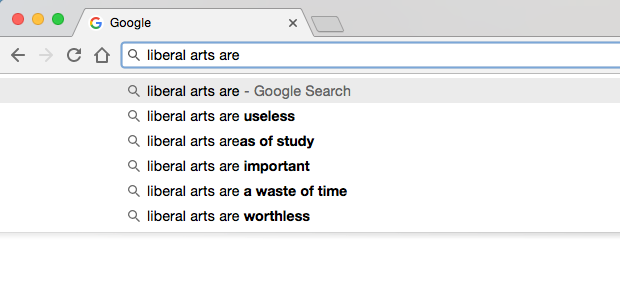
Last week I was delighted to present a webinar along with my colleagues Andy Cotgreave and Michael Correll on how the Liberal Arts are impacting Business Intelligence (BI). The webinar was the second in a series of ten that Tableau is publishing on trends that we are seeing in the BI space. You can watch a recording of the webinar for free (along with a login to Tableau’s website) by clicking here.
Of the ten trends, this is one that is particularly near and dear to my heart.
Why?
Because in my capacity as Outreach Programs director at Tableau, I get to see the work of talented people employing their creative abilities along with their analytical abilities to present data in clever, witty, funny, tragic, and moving ways using Tableau Public. And I also get to interact with professors around the world who are using Tableau’s Academic Programs to teach data to art students. Yes art students.
And I feel that the world of data and analytics are much better off because of the fact that we’re embracing, along with a desire to convey information as accurately as the situation requires, an aspiration to capture and convey the emotion and the human side of the data. Rather than being in conflict with one another, these two elements are actually complementary goals, and the strongest communication evokes them both. It’s facts and feelings. Not one, not the other, but both.
I’ve always been so impressed with data artists because they have mastered the art of communicating to other people via three very different languages: numbers, images and words. They are at once highly numerate, artistic, and articulate. There’s a real beauty to that mixture of those three talents, if you think about it. It’s easy to be great at one or two of those. But to be adept all three, to bring them together into one masterfully crafted message? That’s a real triple threat.
In my presentation, I mentioned that business analysts are learning three different skills from liberal arts professionals:
1. Think Like a Journalist: write great headlines; interview your data; call out your sources; capture the “nut graph” (thanks Cheryl!)
2. Express Like an Artist: embrace good design and aesthetics; employ visual metaphors; enhance memorability by including images and human-recognizable objects, where appropriate.
3. Relate Like a Novelist: have a powerful story to tell, or none at all; capture the human element
A field that leaves room for creativity and innovation is a thriving field. I feel like visual analytics has been moving in that direction in the past few years, and I’m proud to be a part of it. I’d like to thank the following individuals and groups whose work I mentioned or showed in my portion of the presentation:
Giorgia Lupi and Stephanie Prosavec’s Dear Data
Zillow Economic Research – All Negative Equity Isn’t Created Equal
Jonni Walker’s 311 Service Requests for Grafitti Removal – Chicago
Christian Chabot’s Tale of 100 Entrepreneurs
John Schoen’s The History of the Dow 30
Michael Carper’s Who Made the Inc. 500 List?
Borkin et al – What Makes a Visualization Memorable?
Boeing’s 2017 Current Market Outlook Report
Joseph Campbell’s The Hero With a Thousand Faces
KPMG’s Global Automotive Executive Survey 2017
Thanks, I hope you enjoyed the webinar. I’d like to hear your thoughts on this topic, whether you agree with me, or whether you think it’s all a bunch of touchy-feely poppycock.
Ben
February 17, 2017
Hacking Open Data – Dynamic Duo Format
We live in the age of Open Data. Governments, universities and organizations around the world are giving the general public access to data like never before. To what end?
The promise of Open Data is that we’ll come to better understand the world we live in so that we can make better decisions to shape our future. That promise starts with collecting and publishing data about our environment – our climate, our oceans, our communities, our governments, our schools – but it doesn’t end there.
In order for us to progress from accessible to actionable, we need analysis and we need visualization. Perhaps these can be automated to some degree, perhaps there will always need to be a human in the loop. I believe the latter is far more likely in our lifetime.
And so that’s why I’m proud of the data visualization community that I’m a part of. Journalists, researchers, analysts, technologists, designers – people from all of these backgrounds and more are hacking into data sets that shine the light on important topics like global hunger, water sanitation, and the gender gap in education.
To encourage more of this kind of citizen data activism, the Tableau Public team that I’m on has just kicked off a virtual open data hackathon where participants can form dynamic duos, choose their topic of interest – agriculture, climate, education, energy and local government – and get to vizzing. The hackathon starts today (February 17th) and runs until February 23rd. Be sure to register, and don’t worry if you don’t have a partner in mind. The Tableau Public team will be pairing people up if they don’t have a viz partner already.
I can’t wait to see what will come of this activity. The visualizations that these teams will create will help raise awareness to the important topics we need to be discussing. Don’t get me wrong, I love a fun and entertaining viz like anyone else. And not every viz has to be burdened with solving a major social or environmental issue. But we’d be remiss to leave these critical topics out, wouldn’t we? These are the high priority vizzes, and the ones that can deliver a much-needed impact. I’m only speaking for my children and the world we’ll pass on to them.
I’d like to say a special THANKS to Cynthia Andrews for organizing this event, and to Emily Chen, Amanda Patist, Gina Bremer, Corey Jones and Curtis Harris for leading the five respective topic groups. We need leaders for this kind of event, and you all have stepped up.
Now let’s get to vizzing! To track the event’s progress or to get involved in the online conversation, use the hashtag #HackingOpenData.
And thanks for all you do to make the data visualization community a vibrant group to belong to.
Ben
January 15, 2017
In Defense of Sound Journalism
First of all, I am not a journalist. I say that because of the respect I have for those who earnestly and diligently practice the discipline of journalism. I am a data visualization enthusiast and practitioner.
Over the past four years I have had the honor of meeting and working with hundreds of talented journalists from dozens of countries all over the world. As the product director of a technology platform called Tableau Public that has been used for award-winning data journalism, I have presented at their conferences, visited their newsrooms, taught in their college classes, and helped them create interactive data graphics for their articles.
Over and over again, in my interactions with these journalists I have been blown away by their passion and tenacity to tell the stories of our time.
An Honorable Practice Under Fire
Why am I writing this? Because both they and their practice are under attack, both in the country of my residence – the United States – and around the world. The sad truth is that from a global perspective, this is nothing new. The Committee to Protect Journalists reports that since 1992, a confirmed 1,228 journalists have been killed as a result of their efforts to bring us the news, including 800 that have been murdered. The most common beats covered by victims? Politics, war, human rights and corruption. These victims shined the spotlight on the most egregious abuses in our world, and they paid the ultimate price for doing so:
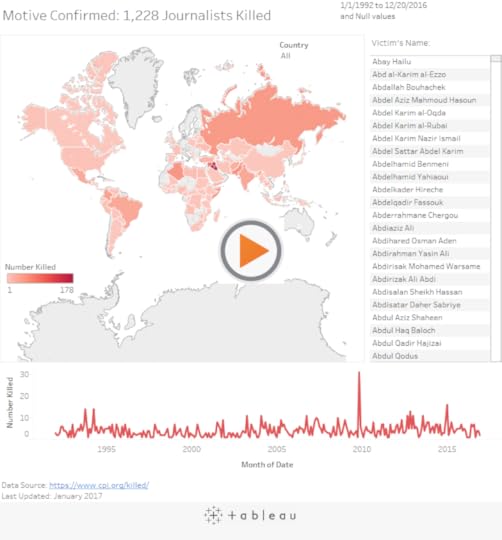
These are the journalists who have paid the ultimate price, but others still living have also suffered. Scores have gone missing, others have been exiled from their homeland, and others have been thrown in jail. Last year alone, 259 journalists were imprisoned, including 81 in Turkey and 38 in China.
And when they put in long hours to publish a hard-hitting story, how do the people they are trying to inform thank them? By lambasting them and showering them with racist, sexist and abusive comments, particularly for women and minority writers according to a sobering analysis by the Guardian of their own comment threads.
This is a perilous, harrowing and sometimes thankless trade. The United States is not immune. Seven American journalists have been killed since 1992 with a confirmed motive, and two more were killed but the motive was not confirmed. The current attitudes towards journalists makes me feel like the situation is trending in the wrong direction.
Economic Pressures of Journalism
And to make it worse, they don’t exactly enjoy high levels of compensation in exchange for taking these inherent risks on our behalf. Payscale, a local online salary, benefits and compensation firm, reports that “pay for Journalists in the United States is very modest at just $39K per year…One-fourth of professionals in this line of work do not receive benefits; however, a fair number report medical coverage and over one-half claim dental coverage as well.”
Journalist (United States)

Compare your salary. Get a FREE salary report »
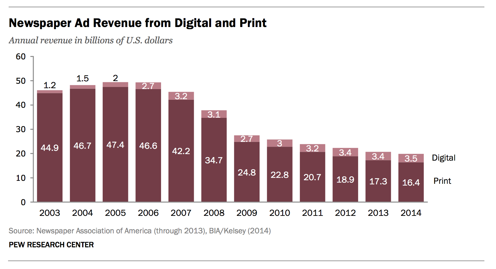
The industry has been upside-down ever since their primary revenue stream – newspaper sales and classified ad proceeds, have greatly diminished in the internet era. There’s just not a lot of money to go around in the newsroom right now. And in case you’re wondering whether digital ad sales are making up for the shortfall in print ad revenue, they’re not, according to a Pew Research report on the State of the News Media in 2015:
It doesn’t stop there. Online job listings company CareerCast produces a “Jobs Rated Report” every year where it ranks 200 different professions in terms of work environment, stress, and hiring outlook. Do you know what has come in 200th out of 200 for three straight years? Newspaper Reporter. And in 2016, Broadcaster wasn’t far behind. It ranked 198th.
The Impact on Journalists
What is the impact of these troubling trends on journalists? I can tell you it’s not fun for them. Even the most talented are struggling. I have personally met Pulitzer Prize winning journalists who told me they haven’t gotten a raise in the eight straight years after winning the industry’s most prestigious award. So what are many journalists doing about it? More journalists than ever are switching to PR, often seeking “better job security and pay“. Do you know what the ratio of PR professionals to journalists in the US is? 4.6 to 1. There are now almost five times as many people in public relations as in journalism, so that says a great deal about the relative career prospects in these two subsections of communications.
I am not trying to say, however, that public relations is inherently bad. PR professionals work to help corporations grow, just like almost every other employee in the private sector, including me. It’s just that good journalists are serving the public good, and there’s something particularly noble about that endeavor. It’s a telling fact that our society doesn’t value that particular service nearly as much as it values other products and services.
Staying Put
But in spite of all of this negativity surrounding their profession, I’ve met many, many journalists over the past few years who aren’t going anywhere. What’s more, Payscale also reports that “most Journalists report high levels of job satisfaction.” Why? Because they believe in what they are doing, and that what they are doing is serving a critical role in the best interests of the public good.
On Accusations of “Fake News”
It’s precisely because of their tenacity in the face of such extreme pressures that I am highly disturbed by the way in which honest and hard-working journalists are coming under fire right now. Lately, the term “Fake News” has been used to refer to sound journalism a lot, including and perhaps most notably by President Elect Donald Trump. These are tweets from Trump from the last week alone:
.@CNN is in a total meltdown with their FAKE NEWS because their ratings are tanking since election and their credibility will soon be gone!
— Donald J. Trump (@realDonaldTrump) January 12, 2017
We had a great News Conference at Trump Tower today. A couple of FAKE NEWS organizations were there but the people truly get what's going on
— Donald J. Trump (@realDonaldTrump) January 12, 2017
Dishonest media says Mexico won't be paying for the wall if they pay a little later so the wall can be built more quickly. Media is fake!
— Donald J. Trump (@realDonaldTrump) January 9, 2017
I would venture to say that people on both sides of the political spectrum are using the term “fake news” to refer to any news article that presents their side unfavorably. Unfortunately, this is taking the focus off of actual fake news (oh, the irony of the “real fake”) being generated by people profiteering off of the human tendency to seek out and share information that confirms pre-held biases. More on REAL fake news can be found here, here, here and here. I also recently wrote about a personal encounter with fake news here.
Fake News, Systemic Bias, or Just a Single Story You Don’t Want to Hear?
So there are two separate issues at hand: there is the issue of “fake news” and there is the issue of bias in news. Let’s not conflate the two. And actual academic research has been done into political bias in news. In one recent example, Ceren Budak, Sharad Goel and Justin M. Rao published “Fair and Balanced? Quantifying Media Bias Through Crowdsourced Content Analysis” in the Public Opinion Quarterly in a 2016 special issue. So did the study find that mainstream news outlets are incredibly biased, or not? The researchers’ overall finding was that “US news outlets are substantially more similar — and less partisan — than generally believed”. The following chart shows the left- and right-leaning tendencies of select news organizations:
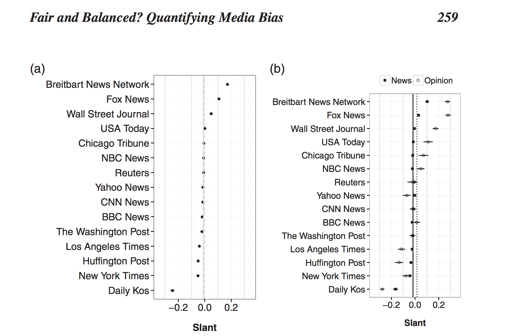
Notice that the study found that NBC News and CNN news, with “slant” scores very, very close to the centerline, are far less biased that organizations like Breitbart and Fox News (heavy conservative slant) and Daily Kos (heavy liberal slant). There are politically slanted organizations on both sides of the spectrum, but the vast majority of news organizations publish balanced coverage of the good and the bad on both sides.
The Journalist’s Creed
In April of last year I visited the University of Missouri’s School of Journalism to present at the annual Walter B. Potter Sr. Conference for community newspapers. Mizzou is one of the top 10 journalism schools in the United States, and I was very impressed with their faculty, their students and their facilities. As I walked from my hotel to the campus in Columbia, Missouri, I passed this plaque near the corner of Elm & 8th:
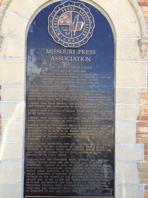
On it is etched the Journalist’s Creed, penned by Walter Williams. It gives you an idea about what these professionals are trying to accomplish, and why they go home feeling satisfied with their efforts. I’m not going to quote it here. You have to read the whole thing as I did standing on the sidewalk that day. But please do so before you take potshots at a journalist who reports something negative about your favorite politician.
And please also appreciate that in order to serve our best interests, sometimes journalists need to tell you and I things we simply wish weren’t true. Thankfully many journalists around the world are still brave enough to do just that. Now will we be brave enough to listen, or will we just close our ears to anything we don’t like and label it “Fake News”?
Thanks for reading,
Ben
November 18, 2016
How to Use Tableau and Plotly Together
I had a chance to attend and present at Plotly’s PlotCon in New York City earlier this week along with Matt Sundquist, co-founder of Plotly. Matt is a truly brilliant person (just check out the work on his Plotly profile), and a great all-around guy, so it was a pleasure to work with him on the presentation.
Matt and I had met at previous data events over the past year and we started a conversation about how we could get Tableau and Plotly to work together. Why would we want to do that? Two reasons. First, like all tools, Tableau and Plotly each have their own strengths. Every now and then a project comes along that can benefit from the best of both worlds. Second, it behooves us all as data workers to find solutions that allow collaboration across tools. This is why Tableau includes a powerful R integration, and it’s also why Plotly makes the Plotly Python Library available, among other things.
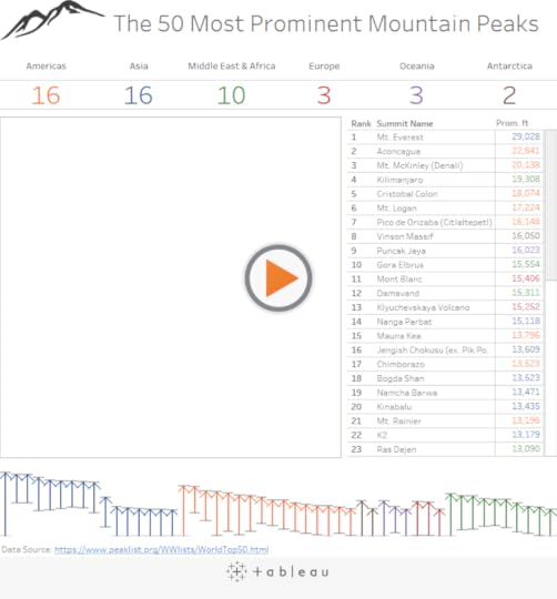
So I came up with an idea for a fun little personal project that allowed me to combine Tableau’s richly interactive dashboards with Plotly’s built-in 3D viz and wide variety of mapping projections. Here’s the finished version, built for desktop only:
So how did I make this hybrid viz?
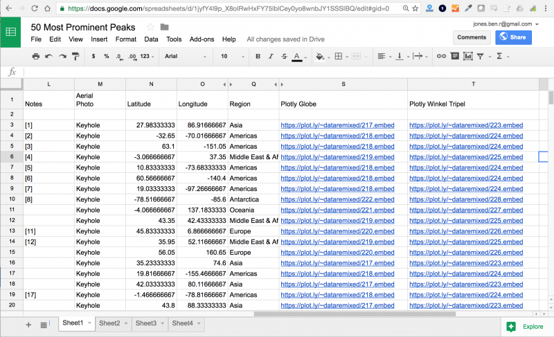
It’s pretty simple, actually. I started with a somewhat outdated (and less than perfect) data set of the 50 most prominent mountain peaks in the world and I imported the table into Google Sheets using the IMPORTHTML function:
=IMPORTHTML(“http://www.peaklist.org/WWlists/World...)
After converting the latitude & longitude for each peak from degrees, minutes seconds to decimal degrees in Google Sheets, I was ready to start vizzing.
I started by creating a variety of maps in Plotly, one for each region in the 3D globe map style, and another in the Winkel Tripel map projection. Here’s the globe version showing all of the 50 peaks:
Each Plotly viz has an embed URL that you can obtain using the Share function – the one above is https://plot.ly/~dataremixed/204.embed. Notice the .embed at the end of the URL. This is key as it provides a webpage with nothing but the viz itself – perfect for adding to a Tableau dashboard. I added the Plotly embed URLs to my Google Sheets file into two columns – “Plotly Globe” and “Plotly Winkel Tripel” – one URL for each row corresponding to the peak’s region:
Next, I connected directly to the data with Tableau using the new Google Sheets connector. Then I built the various sheets in Tableau that I wanted to build around the Plotly map to provide the richly interactive experience that Tableau is so great at delivering. Note that I was sure to drag the fields “Plotly Globe” and “Plotly Winkel Tripel” to Detail in each of the Sheets – that way the Plotly embed URLs I created for my maps would be accessible in the dashboard.
Once I created the sheets, I added them all to a dashboard in Tableau and then dragged out a web page object onto the canvas. I added the URL indicated above and then created a new Dashboard Action, completing the dialog box like this:
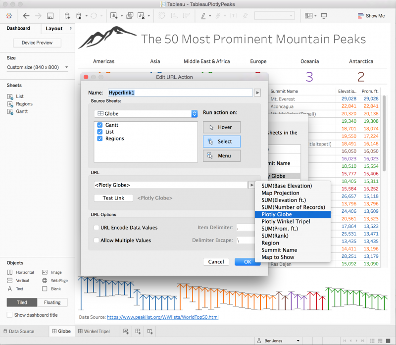
With this URL action created, every time I click on one of the Tableau sheets, it reloads the corresponding URL into the web page object on the dashboard, giving the reader a seamless experience with the Plotly vizzes. One thing that would be great to figure out how to add is a way to highlight a mark or marks on a Plotly viz based on a hover or select of a mark on a Tableau Sheet. There isn’t really a way to do that yet, as far as I know. So some room for improvement.
Matt and I are just staring to brainstorm different ideas. We hope this one is helpful for you. If you find more cool ways to make these powerful tools work together, be sure to let us know!
Thanks,
Ben
November 14, 2016
Fact Check, Fact Check, Fact Check
In the internet era, information is easier to come by than ever before. We have personalized feeds set up for us to continually keep us aware of things happening in the world around us. We have routinely updated data portals set up by local, regional and national governments to allow us to obtain spreadsheets that contain information about the communities we live in. And we have a constant stream of interactive data visualizations created by a whole host of organizations and individuals that give us a powerful picture of what’s going on. That’s a really good thing.
But there’s a huge problem with this Infotopia we live in. Misinformation is also far easier to come by than ever before. There’s a severe quality problem with the information at our fingertips. Or more particularly, there’s a lack of good information about the quality of our information. And it’s way too easy to just run with whatever we read on social media, download from those portals, and see in that viz we come across.
Jumping to Conclusions
Case in point: last week I attended the Tableau Conference in Austin, Texas along with 13,000 other people. Unrelated to our event there were people peacefully protesting the election in the streets of Austin not far from our conference location, and in between where the conference was held and where our evening event was to be held. Tableau had arranged for a fleet of buses to convey conference attendees to the party that night, and the buses were lined up on the street waiting for us. That sets the stage for what happens next.
A man from Austin by the name of Eric Tucker noticed the buses in the area, assumed they were being used to bring in professional protesters, and tweeted photographs of the buses along with the statement “Anti-Trump protestors in Austin today are not as organic as they seem. Here are the busses [sic] they came in. #fakeprotests #trump2016 #austin”:
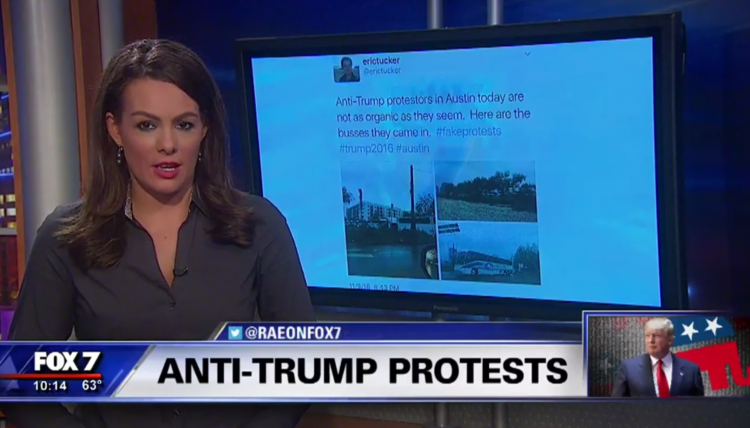
The tweet got picked up by a variety of partisan sites. But 17,000 retweets later, it became apparent to Eric that his assumption about the purpose of the buses was totally wrong, and he deleted his tweet. Local news in Austin covered the situation and interviewed Eric, and Eric himself wrote a blog post about his mistake and why he took down the tweet. Read his blog post – it’s quite impressive. I don’t mean to disparage Mr. Tucker whatsoever. I’ve jumped to similar conclusions many times in my own life. We all have. At least he owned up to it.
But this situation highlights a broader problem with information on the internet in the 21st century. Eric assumed that when supposed “news” organizations picked up on his tweet and spread it, that they would do their homework and research whether he was right about the buses or not. They didn’t. And in a world where 44% of adults in the US get news on social media either often (18%) or sometimes (26%), the lack of fact checking is quite scary.
On Getting Bamboozled by Satire & Fake News
Unfortunately, it goes way beyond honest mistakes like Eric’s. There are entirely fake news sites and “satire” news sites that now exist to profit from the clicks, shares and ad revenue that they generate with their intentionally partisan and provocative articles, and sometimes just click-baity lies.
I actually got bamboozled by one such article myself late last year about a “Map to Multiplication” that Nikola Tesla supposedly created in 1912. I even created a fancy viz about it.
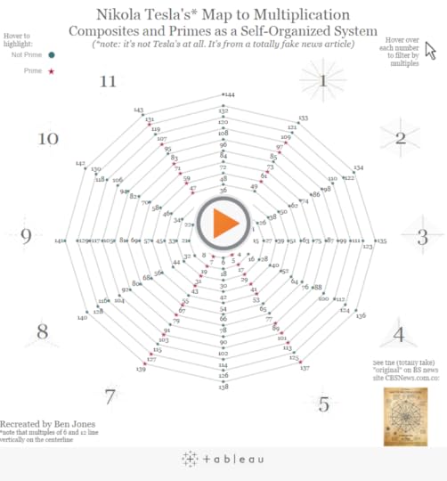
As cool as the map really is (and my fabulous interactive remake, if I do say so myself), the article is complete malarkey. It was published by “cbsnews.com.co”. It’s a complete scam news site. But the article has been shared on social media over 50,000 times.
The map was actually created by math teacher Joey Grethner who admitted to the hoax and who said that the experience of creating the hoax was “enchanting” and declared that it would not be the last time he did it. I’m lucky that I stopped just barely short of contributing to the madness after double-checking the source, but not before I wasted an entire afternoon making a viz. Here’s what the footer of the fake “CBS News” site says. I apologize if you find it crass or insensitive. I find it absolutely moronic:
Copyright 2016 | All Rights Reserved | Powered by HITTEKK | Proudly owned by CBS News President & CEO, Dr. Paul Horner. We need writers! Contact us! Looking to advertise? Contact us! All trademarks, service marks, trade names, trade dress, product names, images and logos appearing on the site are the property of their respective owners. | Do you have a complaint? We love to hear them! You can call our complaint department directly at (785) 273-0325 | Do you have a problem with self-rape? Are you looking to get off the Devil’s playground? Fappy The Anti-Masturbation Dolphin can help! Praise Fappy!
The Importance of Fact Checking in Journalism
It’s ironic to me that during the conference, and just prior to the bus fiasco, I tweeted a link to a praiseworthy discussion between some very talented journalists who routinely work with data:
These journalism tips for avoiding data pitfalls apply to all: Fact check, find the human story, talk to sources https://t.co/63yrIVZEo2
— Ben Jones (@DataRemixed) November 8, 2016
In their discussion, they talk about the importance of fact checking, interviewing your data, proactively seeking out other sources of information that challenge the veracity of what you already have, and reaching out to the individuals who are responsible for creating the data. Anyone who publishes information to the internet should read this. That includes anyone who blogs, creates data visualizations, or shares news on social media.
So basically all of us.
Just How Sure Are You? The Role of Uncertainty
Along these same lines, I was interviewed by the Seattle Times about the fact that Donald Trump outperformed the polls quite handily in the recent election. Now, I’m not a pollster or an expert in political forecasts and election data by any means, and I’m not going to pile on and bash those who tried to make predictions. They have a tough job, and I was as surprised as anyone. But I shouldn’t have been. There are always statistical and systematic errors in polling, and the very nature of predictions is probabilistic. A model that predicts a 70% chance of victory for Clinton means that it also predicts a 30% chance that she will lose. So saying the predictions “got it wrong” is not quite right.
I’ve been fortunate enough to work with data journalists all over the world for almost four years now, and the topic of voting comes up multiple times per year. What I’ve noticed is that we don’t always convey the inherent uncertainty very well. Or we do, but it’s not received properly by our readers. So that’s on us. These concepts aren’t incredibly complicated compared to, say, differential calculus, but they’re certainly not well understood by many. So there’s a problem that we as information purveyors need to correct.
Our readers need to understand that there are sources of error and uncertainty to be taken into account. So do we. And it’s not just voting, it’s every topic.
Taking into account these recent situations and discussions, I’d like to echo the journalists in the article referenced above and relate some important tips to avoid the egregious data pitfall of creating and sharing misinformation:
Check your sources. Where does the data come from? Who created it? What are their incentives? Talk to them.
Rigorously scrutinize the data. Seek to debunk it before others do. What are the limitations of the data? What are the errors in it. And yes there are always errors in it.
Get more than one person to look at what you have found or made. Ask at least one subject matter expert and one complete novice.
Describe your methods and list all of your data and information sources. Don’t be lazy in this regard.
Be clear about any uncertainty in the data. Give your readers the benefit of the doubt that they can understand these concepts.
SLOW DOWN. The urge to share / viz / post / tweet is pretty great. The information is juicy. Your viz is amazing. But it might also be dead wrong. Make sure it isn’t before you share it.
Call out fake news when you see it. On social media, on twitter, wherever. Yes, your grandma will be annoyed that you’re raining on her partisan parade. Just also be nice to her. Yep, she got bamboozled. Next time it could be you.
Support real, professional, thorough investigative journalism. IRE, the Knight Foundation and Pro Publica are good places to start.
In conclusion, it’s on all of us to be watchdogs of the information in our world. It’s on all of us to call out the bullshit that we come across. In our social media streams, on the TV programs and radio shows that we watch, when our leaders open their mouths and cite statistics, when a viz we see is using problematic data or coming to dubious conclusions. Do so tactfully.
It’s on all of us to make sure that what we say, create and share is factually correct and intellectually honest.
Thanks,
Ben