Gail Ingis's Blog, page 20
May 11, 2016
COLOR PSYCHOLOGY
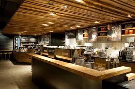
Starbucks decor, warm and woody
We love our coffee. We love the convenience of the coffee store, namely Starbucks. So what does that have to do with color? How much time do you spend in your local coffee store? What is it that appeals to you? Is it the food, the décor, the coffee? The colors that surround you in your coffee store are going to be trendy and warm and the latest, according to what’s popular dictated by the Color Association of the United States, (CAUS) the organization that sets the color trends for products, brands and environments.

Warm colors
Warmth and cheer in the character of a room are found on the red/orange side of the Color Wheel.
Vintage Bloomingdale’s warm tones
Vintage Bloomingdale’s cool tones
Cool and restful are found on the blue/green side of the Color Wheel.

Vintage Bloomingdale’s cool & warm (blue & red analogous scheme)
Color considerations for your home and office are crucial to your emotional well-being. Light tones or blue, green and violet recede and can make a room seem bigger, which in turn gives you a feeling of space and openness. The warmer tones of reds and oranges in light or dark tones seem to move towards you, which could crowd you or enfold you. An office is best in a neutral tone in a light value, but can be in your favorite color, warm or cool. Grey is popular now, it can be warm or cool as well, depending on your color choice. Of course, beige has always been a classic. I happen to love greige, that’s a cross between gray and beige.

Yellow curry spice
Color influences perceptions that are not obvious, such as the taste of food or the effectiveness of placebos. Red or orange pills are generally used as stimulants. Factors such as gender, age, and culture can influence how an individual perceives color. Businesses use color when deciding on brand logos. These logos seem to attract more customers when the color of the brand logo matches the personality of the goods or services, such as the color pink being heavily used on Victoria’s Secret branding. Warm colors (red/orange side of the Color Wheel) tend to attract spontaneous purchasers, despite cooler colors (blue/green side of the Color Wheel) being more favorable.
 Color has long been used to create feelings of coziness or spaciousness. However, how people are affected by different color stimuli varies from person to person. Blue is the top choice for 35% of Americans, followed by green (16%), purple (10%) and red (9%). A preference for blue and green may be due to a preference for certain habitats that were beneficial in the ancestral environment as explained in the evolutionary aesthetics article.
There is evidence that color preference may depend on ambient temperature. People who are cold prefer warm colors like red and yellow while people who are hot prefer cool colors like blue and green.

Julia Roberts
A study by psychologist Andrew J. Elliot tested to see if the color of a person’s clothing could make them appear more sexually appealing. He found that to men, women dressed in the color red were significantly more likely to attract romantic attention than women in any other color. However, for women, the color of one’s shirt made no difference in their level of attractiveness.

Audi
Despite cross-cultural differences regarding what different colors meant, there were cross-cultural similarities regarding what emotional states people associated with different colors in one study. For example, the color red was perceived as strong and active. If you own a red car, you might have found the cops giving you tickets that you never before deserved.
Excitement and fatigue are produced by the use of the primary (red, blue, yellow) and secondary hues (green, orange, purple) in strong, bright values, and by strong contrasts of tonal values. Those colors and tones are great for a game or playroom or even for a powder room (a guest bathroom).
 Give some thought to how you feel on a sunny day, verses a rainy day. Do you love to overlook a mountain terrain or in a garden lush with glistening foliage and flowers, as though embedded with Swarovski crystals?

Pink Rose
Different colors are perceived to mean different things. For example, tones of red lead to feelings of arousal while blue tones are often associated with feelings of relaxation. Both of these emotions are pleasant, so therefore, the colors themselves procure positive feelings in advertisements. The chart below gives perceived meanings of different colors in the United States.
Chart: Functional (F): fulfills a need or solves a problem and Sensory-Social (S): conveys attitudes, status, or social approval
Red
Yellow
Green
Blue
Pink
Violet/Purple
Brown
Black
White
Lust (S)[23]
Jealousy (S)[23]
Good Taste (F)[23]
Masculine (S)[23]
Sophistication (S)[21]
Authority (S)[23]
Ruggedness (S)[21]
Grief (S)[23]
Happiness (S)[23]
Power (S)[24]
Competence (S)[21]
Envy (S)[23]
Competence (S)[21]
Sincerity (S)[21]
Sophistication (S)[21]
Sophistication (S)[21]
Sincerity (S)[21]
Excitement (S)[21]
Happiness (S)[23]
High quality (F)[23]
Feminine (S)[23]
Power (S)[23]
Expensive (F)[23]
Purity (S)[23]
Love (S)[23]
Corporate (F)[23]
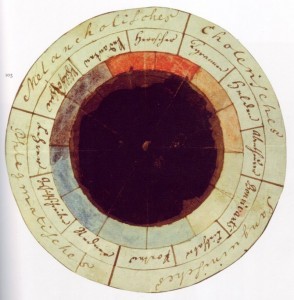
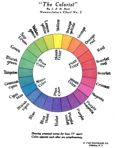
Goethe Schiller, The “Rose of temperaments.”
The “rose of temperaments” (Temperamenten-Rose) compiled by Goethe and Schiller in 1798/9. The diagram matches twelve colors to human occupations or their character traits, grouped in the four temperaments: choleric (red/orange/yellow): tyrants, heroes, adventurers;
sanguine (yellow/green/cyan) hedonists, lovers, poets;
phlegmatic (cyan/blue/violet): public speakers, historians, teachers;
melancholic (violet/magenta/red): philosophers, pedants, rulers.
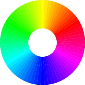
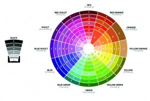
Color Wheel
Do you have a favorite place, room, environment?


May 4, 2016
COLOR FOR INTERIOR DESIGN

Downtown Miami July 4, 2007 — The colors here are analogous, red/white/blue
In the last couple of weeks, my blogs addressed dark tones and color distribution. Color distribution is the industry phrase for the Law of Chromatic Distribution.
In this blog, please note that the discussion is about color basics and its application. The basics are applicable to all the arts, as well as to interior design.
A room is divided up by four areas:
Dominant Areas—Walls, floor and ceiling
Medium Areas—Draperies and large upholstered furniture, bedcoverings, etc.
Small Areas—Small upholstered furniture, chair-seats, pillows, table covers, etc.
Accents—Piping, welting or fringes on draperies and upholstery, lampstands or shades, pattern motifs in wallpapers and textiles.

Sample of a Monochromatic color distribution
A color scheme is principally formed by the color used in the dominant and medium areas. The colors in the small areas and accents add punch, but are of less importance in the general effect of the composition. They can accentuate the colors used in the larger areas and sometimes help to tie the colors together for unity and harmony.
The basic color schemes: Monochromatic, monotone, complementary, analogous.

Monochromatic bedroom design
A monochromatic color scheme uses a single color on most every room surface. In this type of scheme, various darker shades, grayer tones, and paler tints of the main color may be included in the palette. In addition, the one color is often paired with white or another neutral. For example, a monochromatic room in gray might use single shade of gray paired with white. Yet it might also include dark blue upholstery fabric, pale gray walls, medium gray draperies in contrast with the walls, sometimes edging the draperies with a contrasting fringe or piping and welt the seams of the upholstered pieces in the same manner, also use a patterned area rug that includes both gray and white. The window and door trim as well as the ceiling might be painted in white.

Monotone living room
A monotone color scheme uses a single neutral color, such as gray or taupe, in the same tones, values and intensity. Although it is well unified, to avoid monotony, add accents or create textural variety in fabrics, such as velvet, satin, tweeds, linen, tapestries, etc., or in types of furnishings, such as plexiglass, glass, chrome, bronze, or a variety of exotic woods. This type of color scheme can be elegant by its simplicity. It is useful as a backdrop for art of exceptional merit.

The Night Café, (1888), by Vincent van Gogh, used red and green (complementary) to express what Van Gogh called “the terrible human passions.”
A complementary color scheme uses colors opposite each other on the color wheel, or the complement, such as green and red, blue and orange and purple and yellow. The distribution of these colors would vary in tone and value, as in pale green and soft pink, etc. In this scheme, a more agreeable harmony will be attained if each color is slightly tinged with similar colors to make them more appealing. So in that green and red scheme, it’s more visually appealing if the red is slightly tinged with yellow, (red-russet) and the green is also slightly tinged with yellow (citron). Or if the red is on the blue side (re-mulberry) the green should also be on the blue side (green-slate). For color
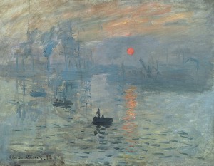
Impression, Sunrise by Claude Monet (1872) featured a tiny but vivid orange sun against a blue background (complementary). The painting gave its name to the Impressionist movement.
harmony, the same principle should be applied to the other complementary schemes and the proper color may be easily selected by inspecting the color wheel. Here’s a great website for you to explore about complementary colors: http://color-wheel-artist.com/complementary-colors.html.
Color wheel 1908

Color wheel
And for my artist colleagues, please note in the color circles what happens when you mix two complementary colors together on your palette. The three primaries when mixed with their secondary colors (complementary colors) all do the same thing, they neutralize each other. Yet, placed side-by-side they intensify each other. The color schemes can also be used in your paintings.

Analogous interior-resource, Pinterest
An analogous color scheme are any three adjoining hues in a 12 color wheel, or any three of six adjoining colors in a wheel of 24, as in the Miami fireworks image above. The colors can be used in any tonal or chromatic (intensity) values, as long as the law of chromatic distribution is maintained, (medium intensity on the dominant areas, etc.). In this type of scheme the colors close to each other always harmonize well. Using three colors of mutual tonal relationship is the safest selection. To avoid monotony, tonal variety is helpful, and it’s usually better to use one of the tones to dominate the others, by limiting the color of the walls to one color and repeat in small accents in other areas.
Pinterest illustration of analogous color scheme. Any three colors from a 12 or 24 color wheel.
A basic color scheme will use two colors that look appealing together. More advanced color schemes involve several related colors in “Analogous” combination, for example, text with such colors as red, yellow, and orange arranged together on a black background in a magazine article. The addition of light blue creates an “Accented Analogous” color scheme.
There is much to explore in the color world, but hopefully, this blog gives you some understanding about how to color your life! Feel free to ask questions . . .
Fireworks: By Averette at English Wikipedia – Digital photo taken by Marc Averette.Transferred from en.Wikipedia; en:File:Miamifireworks.jpg, Public Domain, https://commons.wikimedia.org/w/index.php?curid=10573309
April 27, 2016
THE COLOR, TONE & VALUE SAGA
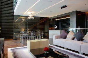
Avant Garde – One of the four themes in The Mansion at Sofitel Macau
Last week Jack and Jill were in a muddle with their choice of a dark paint color. To get out of their jam, they called in a professional. They knew the eggplant color had an edge, but they didn’t know how to use it. The designer explained how color, tone and value can work to their advantage. Together they created an environment that fit their lifestyle.
Dark colors, like eggplant, black and rich dark-chocolate brown can be a brilliant backdrop for art, furnishings, upholstery and more . . . simply by contrast and color. You can see how the light colors pop against the dark walls in the picture above. Any room can be painted in dark colors–living rooms, kitchens, bedrooms, bathrooms, family rooms. These dark colors are not new, they have been used forever. Dark wood walls, beams, wood floors and furnishings were all used in the early centuries.
All the paint manufacturers have rich dark colors, Benjamin Moore, Sherwin Williams, Farrow & Ball all make quality paints. Sometimes, although you’ve chosen a dark color, it takes two coats to cover the paint on the walls to get the cover and depth those tones create. So how do you do this? Houzz, a popular site filled with design and decorating information has the answers with pictures: Here’s the link for you.
Last week’s blog talked about tonal distribution that we are reviewing here. According to Ethel Rompilla’s and the New York School of Interior Design, Color for Interior Design, tonal distribution is a fundamental principle that goes back to the earliest interiors. It is the concept of nature’s distribution of tonal values; people feel more comfortable in a room with a light ceiling, medium walls, and dark floors, which parallel the tonal values of the sky, foliage and earth. However, there are numerous variations on and exceptions to the theory: the walls of the black bedroom at Boscotrecase, dark wood paneling in traditional rooms that date back to the sixteenth century and are still popular, and contemporary spaces that have dark walls and lighter floors.
This week we are also addressing chromatic distribution. A second general rule follows nature’s distribution of vivid color in its accessories, such as birds and flowers, and is also allied to Munsell’s theory that strong colors should not overpower weaker ones. The guideline states that the largest areas of a room, such as floor, walls and ceiling, should be the most neutral. As size is decreased chromatic value can be increased. Furniture or draperies can be brighter, and small upholstered items or accessories and other accents can be the most chromatic. Many successful interiors break this rule, but you should be aware that there is a chromatic range on walls in which, depending on the light, an intense color can become intolerable.
To be continued . . .
Other news . . . My publisher, Soul Mate Publishing, has its blogger hosts C.D. Hersh, who has graciously featured me with my book, Indigo Sky, on their Friday, April 29, 2016 blog. I would be honored if you visit and comment. Here’s the link for Friday, not before: http://wp.me/p1tsn7-16j
April 20, 2016
A FRESH LOOK AT COLOR AND TONE
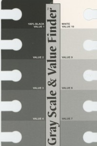
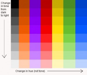
Tonal Values B/W
“Horrors.” Scarlet said as she turned to her friend with her hand covering her mouth. “Why did Jack and Jill choose those colors?”
“Truth tell, they loved purple and white with yellow accents,” said Sandy.
“But, everything—the walls, ceiling and floor are that deep, dark eggplant, which is too much of a gorgeous color. There’s only white and yellow pillows on the dark purple sofa, why didn’t they ask someone to help?”asked Scarlet.
“Dang, it’s so dark in here, they must be planning a Halloween party. Don’t you think?” asked Sandy.
It happens. You love a color but have no idea how to distribute what you love in your environment.
So . . . Here’s the scoop.
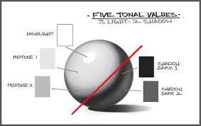
Five Tonal Values
There are basic color schemes that you can pick from. Complementary Scheme, Monochromatic Scheme, Monotone Scheme, Neutral and One-Color Scheme and Analogous Schemes.
There are considerations in choosing. Understand the light in the spaces throughout your home and how the room will be used. What’s your home’s exposure? What is your natural light? You know, the light from outside. Eastern exposure gets the cool morning sun. Western exposure gets the warm afternoon sun. Southern exposure gets the hot sun all day long, even in the winter it’s uncomfortable to have sun beating into your space from sun up to sundown. Northern exposure gets no sun. For example, I built an art studio with three huge windows where the northern light spills into the space. It’s cool and restful, and gives me true interpretation of color for my paintings. It also gives me great light to photograph my work, also great to portrait paint with a live model and set up my own lights.
Light
Of course the amount of natural light in a space depends on the position, number, and size of the windows. Natural light is white. Sunny rooms will be warmer than northern exposure offers. Then of course the windows treatment also affects the light penetration, as well as adjoining buildings, foliage. If natural light is minimal, and you want a cheerful effect, then the principal colors for walls and ceiling should be light in tonal values (usually an 8 or 9 value if possible). See the black and white charts for tonal values. Upholstery materials and color accents may be slightly darker and brighter. Darker tones on the walls (value 4 or less) are possible to use if the character of the room calls for them, but finish in semi-gloss for light reflections that maintain luminosity. If the room lacks natural light, brighter colors will tend to neutralize, toning the colors down. Also be aware that natural light reduces the size of your retina, which darkens and neutralizes the colors.
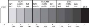
Chart white to black (same tonal values apply to color)
Fundamental distribution of tonal values; light ceiling, medium walls, and dark floors. What we enjoy in our exterior environment, sky, foliage and earth. Of course there are variations and exceptions. A popular concept in contemporary spaces are dark walls and light floors.
https://en.wikipedia.org/wiki/Lightness
Color Tone-all colors
 “They should call an interior designer to help them,” said Scarlet.
“I agree, but maybe they are happy. Who is going to tell them?”
“Uh oh, not me.”
“Me either.”
“I have an idea,” said Scarlet.
“Let’s have them over for tea and ask if they are happy with their decorating colors. We can say the colors are nice, but don’t you find it too dark?”
“Nice is a poorly chosen adjective.”
Avant Garde – One of the four themes in The Mansion at Sofitel Macau. Notice the luminosity and tonal distributions.
Are you inspired?
To be continued . . .
April 13, 2016
SHADES OF GREEN

Shades of Green
Green is the color between blue and yellow on the spectrum of visible light. It is evoked by light with a predominant wavelength of roughly 495–570 nm.
SubtractiveColor
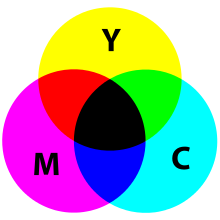
In the subtractive color system, used in painting and color printing, it is created by a combination of yellow and blue, or yellow and cyan; in the RGB color model, used on television and computer screens, it is one of the additive primary colors, along with red and blue, which are mixed in different combinations to create all other colors.
Many creatures have adapted to their green environments by taking on a green hue themselves as camouflage.
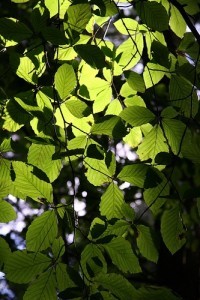
Green leaves
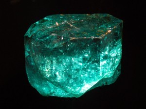
Several minerals have a green color, including the emerald, which is colored green by its chromium content. In surveys made in Europe and the United States, green is the color most commonly associated with nature, life, youth, spring, hope and envy. Green is also the traditional color of safety and permission; a green light means go ahead, a green card permits permanent residence in the United States. Political groups advocating environmental protection and social justice describe themselves as part of the Green movement, some naming themselves Green parties. This has led to similar campaigns in advertising, as companies have sold green, or environmentally friendly, products.
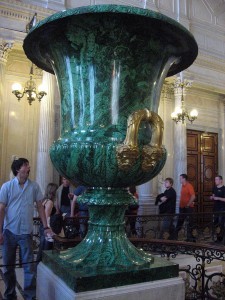
Malachite green. The green giant malachite vase in the Hermitage Museum, Saint Petersburg, Russia.
During the Italian Renaissance, accessories were rampant and palaces were decorated with shades of green accented with minerals and cache pots. Interiors reflected the life styles of that time.
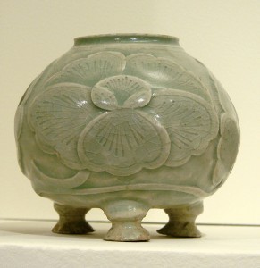
A 10th-century celadon pot from China (Musee Guimet, Paris). Celadon is a pale greyish green which takes its name from a character in the French romance Astrée by d’Urfe (1610).
Emerald
Our lives reflect the world today, no differently than the 16th century, or any century for that matter. If people are concerned about their future and whether or not their job is secure, they tend not to buy items in dusty or dirty tones.They tend to respond to colors that are more upbeat.
Art has impact in our color choices, as does music trends and rock stars. We tend to mimic what we see. Are people saving our planet? If so, obviously greens and blue are important.
There was a time when hospitals thought green was calming, and perhaps it is, but it also can be depressing. Today, color is used to enhance the patients moods. There’s a great deal to discuss about color and the shades of each color.
In the 1990s, the greening of America became a priority. Green was a popular car color. In 1996, green was the number one color choice for cars. I loved my celadon green car and apparently so did other people because their cars sometimes came way too close. But I think they just didn’t see the car. The color blended in with the trees and grasses. We couldn’t wait to get rid of the thing.
If you have questions, please ask away in comments.
April 6, 2016
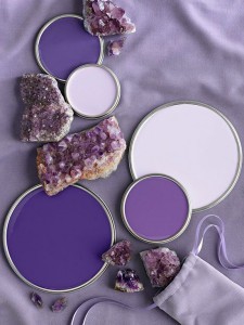
COLOR PURPLE

Tunnel Loop
It was the year AD 975 when the word ‘purple’ first appeared in the English language. Purple is a range of hues of color occurring between red and blue. In additive light combinations it occurs by mixing the primary colors red and blue in varying proportions. It is a secondary color because two colors (blue and red) make up this color.

Kristan’s Shoes
In color theory, a ‘purple’ is defined as any non-spectral color between violet and red (excluding violet and red themselves).The spectral colors violet and indigo are not purples according to color theory but they are purples according to common English usage since they are between red and blue.

Color wheel
In art, purple is the color on the color wheel between magenta and violet and its tints and shades.
Royalty
The color purple’s ties to kings and queens date back to ancient world, where it was prized for its bold hues and often reserved for the upper crust. The Persian king Cyrus adopted a purple tunic as his royal uniform, and some Roman emperors forbid their citizens from wearing purple clothing under penalty of death. Purple was especially revered in the Byzantine Empire. Its rulers wore flowing purple robes and signed their edicts in purple ink, and their children were described as being “born in the purple.”
The reason for purple’s regal reputation comes down to a simple case of supply and demand. For centuries, the purple dye trade was centered in the ancient Phoenician city of Tyre in modern day Lebanon. The Phoenicians’ “Tyrian purple” came from a species of sea snail now known as Bolinus brandaris, and it was so exceedingly rare that it became worth its weight in gold. To harvest it, dye-makers had to crack open the snail’s shell, extract a purple-producing mucus and expose it to sunlight for a precise amount of time. It took as many as 250,000 mollusks to yield just one ounce of usable dye, but the result was a vibrant and long-lasting shade of purple.
Happy combo colors
Clothes made from the dye were exorbitantly expensive—a pound of purple wool cost more than most people earned in a year—so they naturally became the calling card of the rich and powerful. It also didn’t hurt that Tyrian purple was said to resemble the color of clotted blood—a shade that supposedly carried divine connotations. The royal class’ purple monopoly finally waned after the fall of the Byzantine empire in the 15th century, but the color didn’t become more widely available until the 1850s, when the first synthetic dyes hit the market.

This Z-chair made in Lucite allows light to pass through creating value varieties
One interesting psychophysical feature of purple and violet that can be used to separate them is their appearance with increasing light intensity. As the intensity increases, violet appears to take on a far more blue hue as a result of what is known as the Bezold-Brücke shift. The same increase in blueness is not noted in purples.
Lüscher says about violet, The mentally mature will normally prefer one of the basic colors rather than violet. Basic being red, blue and yellow. The mentally and emotionally immature on the other hand, may prefer violet. He goes on to say, in the case of 1600 pre-adolescent school children, 75% preferred violet. Statistics embracing Iranians, Africans and Brazilian Indians showed a marked preference for this color as compared with Euro-Caucasians.
Benjamin Moore colors
Through my years in design, I have found that this statement is more cultural than emotional. In my old standby text, Interior Design and Decoration by Sherrill Whiton, in the chapter Psychology of Color, Psychologists maintain that color preferences are determined by geographical location, religion and socioeconomic background.
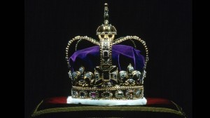
Common connotations of purple include royalty, imperialism, nobility, Lent, Easter, Mardi Gras.
Wikipedia is a great purple resource!
What are your thoughts on the color purple? Do you surround yourself with purple? Do you wear purple? Would you like purple hair, or a streak of purple hair?
March 30, 2016
ELECTROLYSIS

Beauty Therapist
It’s good for women and good for men too. Be happy with beautiful hair-free skin, the skin you’ve always dreamed of. I so believe this is the way to rid yourself of unwanted face and body hair, I decided to write about it today. It’s all about electrolysis, permanent hair removal. With electrolysis, little-by-little the hair follicles disappear. I have been visiting an electrologist for as long as hair appeared on my face, hair that would be better on my hubby’s face, not mine. My visits after treatment dwindled in frequency, now I go only yearly, or if I see one hair, I do not tweeze, I usually visit my electrologist.
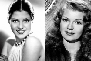
Rita Hayworth before-after-hairline-electrolysis
I know there are other methods of hair removal, but I know that none, I mean none, are permanent. Only electrolysis is permanent. Recently, after being with my electrologist for the last fifteen years, she, Fatima, decided to go back to school. I had to find someone new. Today’s recommendation came from my hair salon, Karen Kolenda, State Licensed Electrologist, who’s office is at the Brick Walk in Fairfield, CT. Karen has good hands. We talked before the treatment when she asked if I ever had electrolysis, and yes, I had. I knew what to expect, and was pleased that it was exactly as I expected. Her office is clean and, although small, is well layed out and comfortable.
From Wikipedia, the free encyclopedia
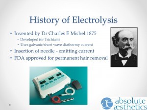 Charles Michel was an American ophthalmologist best known for publishing the first clinical report of successful electrology in 1875. Michel was practicing in St. Louis, Missouri, when he began using a battery-powered needle epilator to treat trichiasis (ingrown eyelashes) in 1869. This direct current–powered method was called electrolysis because a chemical reaction in the hair follicle causes sodium hydroxide to form, which damages the follicle. Electrolysis is also sometimes called galvanic electrolysis.
Do not fear the use of the fine probe that gives off a small amount of electrical current to destroy the hair root permanently without puncturing or harming the skin. The current is adjustable for your comfort, and feels like a pin prick. Some areas are more sensitive than others, but as I mentioned, the current is adjustable and can be lessened.
One of my friends, a young woman, began shaving her facial hair, and now, she has to shave everyday. All methods, except electrolysis, causes the hair to thicken and grow deeper. Facial hair does seem to begin to be prevalent when a woman’s hormones begin to change, usually in the late forties or early fifties.
For more answers to your questions, you can call Karen or visit her. It is not expensive to do this. I usually only need 15 minutes, that cost me today $28 cash or check. So worth every penny. Less than a manicure.
Karen Kolenda Gregory, Suite !-5 Downstairs at the Brick Walk, 1275 Post Road, Fairfield, CT 06824, 203-254-2480.
March 23, 2016
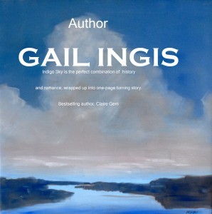
IN PRINT . . . THIS JULY
Dear Readers:
Catskill Brook
5-star reviews for Indigo Sky!
In a whirlwind romance, a lovely New York socialite marries a fêted, debonair author. But beneath the charm is a cheating husband addicted to hasheesh. Her dream marriage turns sour and the simplicity of her life runs amok when a handsome stranger, her husband’s business partner, threatens her staunch loyalty to her wayward husband. When she faces the ugly truth about her marriage, her need to finalize her divorce sends her on a chase across the wilds of nineteenth century America with a handsome stranger–she learns hard lessons of murder, kidnapping and more that almost destroy her.

Indigo Sky
It will be a busy season now that the print version of my book, published by Soul Mate Publishing, is being released in July 2016.
In the near future, a contest to give away a one-of-a-kind prize will be announced, offering a fine print of the image you see in blues above, my painting of the brook in my book, sans the script, of course. Watch for details . . .
I have so much going on, there’s barely time to breathe. We have an exciting photography show, by talented photographer Bruce Dunbar, at Lockwood-Mathews Mansion, celebrating 50 years of Lockwood’s survival, being installed April 1, and open to the public April 7, and then in July, to coordinate with Lockwood’s fifteenth year of its being saved from demolition, my painting project of images from Coney Island, 25 works or more, past and present, will be installed. You will be invited to a smashing catered party on Thursday, September 8, 2016, with a reception for the Coney Island show . . . ballroom dancing demo performed by our amazing instructors, Monika Barska and partner Henry Skoop. Caterer, Susan Kane will be serving her elegant tasty tidbits.
Are you up for a contest? Your comments please!
March 16, 2016
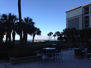
AMELIA ISLAND: A HIDDEN GEM

Ritz Carlton
A hidden gem, right near the beach, boutique shopping and four centuries of history, why not go there? If you are fortunate enough to find out about Amelia Island . . . it’s worth a visit. Last year, we found it by accident on our way home from Florida. This year, we planned a visit. Surrounded by the Atlantic Ocean and the Intercoastal Waterway, this unspoiled barrier island is just two miles wide and 13 miles long.
 With wide white beaches, sand dunes and the oldest lighthouse in Florida, it is a perfect setting to write your next book, paint your beach scenes or sketch the charming waterfront town that serves as an island hub.
 Beachcombing is popular to walk barefoot and feel the cool sand between your toes, gathering shells and shark teeth. Endangered sea turtles are also partial to Amelia Island’s beaches and return every year to lay their eggs in protected nests on the island’s shores.

The 19th century well-preserved Fort Clinch and Park is not the only history to be discovered. With 4,000 years of natural and human history, Amelia Island is the only piece of land in the entire United States that has actually been under the rule of eight different flags, six of which are France, Spain, England, Mexico, Confederate and their own Patriots of Amelia Island. You’ll have to visit to find out more. Or, that pirates once roamed off Amelia Island shores.
 We stay in Fernandina Beach on the northern half of Amelia Island. Honored by the National Trust for its historic preservation, and home to a 50-block Historic District. Fernandina Beach is a lively town that is popularly described as a “tropical Mayberry.”
Gardens in the rear of Ritz Carlton, Amelia Island
We saw golfers challenged by the oceanfront holes and marsh-view greens. The charm of this city is art-inspiring. We have two favorite places to stay, both Marriott, Residence Inn where you can eat in and have a free breakfast or order the best pizza ever from Towne Pizza, or the Ritz Carlton, depending on your mood and wallet . . . country informal or high-brow formal. Jeans are acceptable everywhere!
March 9, 2016
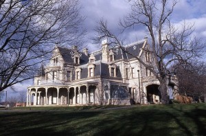
SURVIVAL: FIFTY YEARS A CELEBRATION

Plexiglass in purple, 21st century. Yes, it is comfortable.
Survival of the Lockwood-Mathews Mansion is the impetus for a 50th anniversary celebration to acknowledge the Women’s Junior League that saved the Lockwood-Mathews’ home from demolition. A part of the celebration will be an exhibition, a retrospective of the fascinating and tumultuous decade of the 1960s, which will feature artists’ work based on their interpretations of 1960s.
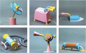
Prototypes. Lower right is a vacuum cleaner! These are reminiscent of the Memphis designs.
The Sixties were the years of throw-away furniture, clothing, drugs, free love and demolishing buildings of significance. Born during this era, new techniques . . . molded, colorful plastics, designs of novelty and glass box-like structures. The industrial aesthetic and high tech became the rage, especially for loft-lovers who enjoyed occupying and living and working in those huge industrial spaces. With the advent of the birth control pill, the decade was labeled the Swinging Sixties because of the libertine attitudes that emerged.
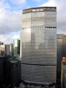
Met life building Walter Gropius completed 1963
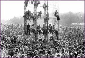
Woodstock 1969
Social change saw the American Civil Rights movement, the rise of feminism and gay rights. The counterculture movement dominated the second half of the 1960s, its most famous moments being the Summer of Love in San Francisco in 1967, and the Woodstock Festival in upstate New York in 1969.
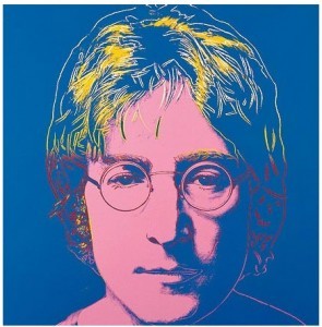
John Lennon by Warhol
 Psychedelic drugs, especially LSD, were widely used medicinally, spiritually and recreationally throughout the late 1960s, and were popularized by Timothy Leary with his slogan “Turn on, tune in, drop out“. Ken Kesey and the Merry Pranksters also played a part in the role of “turning heads on”. Psychedelic influenced the music, artwork and films of the decade, and a number of prominent musicians died of drug overdoses (see 27 Club). There was a growing interest in Eastern religions and philosophy, and many attempts were made to found communes, which varied from supporting free love to religious puritanism.
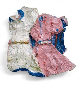
Claes Oldenburg
Along with artists such as Roy Lichtenstein and Claes Oldenburg, Andy Warhol appropriated images from commercial art and popular culture as well as the techniques of these industries. Often called “pop artists“, they saw mass popular culture as the main vernacular culture, shared by all irrespective of education.
Read in Connecticut Plus where Lockwood-Mathews Mansion Museum’s events are spelled out. 295 West Ave. Norwalk, CT 06850 – 203-838-9799. Dates: October 8, 2016 – January 8, 2017. Watch for details.