Chris Gavaler's Blog, page 24
May 31, 2021
Cartooning In and Out of Your Twenties
“Cartoon” can mean a lot of things. As a drawing style, those things usually include simplification. A cartoonist takes a massively detailed real-world subject and extracts the most defining elements and reproduces them through a few well-placed lines. The cartoonist also probably alters those lines, distorting them by selectively expanding and shrinking to create shapes that evoke but don’t match the original content. How simplified and how distorted offer wide spectrums, and every artist’s personal style is its own idiosyncratic cross-point on that simplify-distort grid.
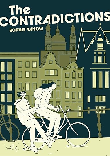
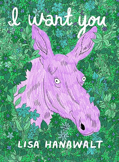
Look at Sophie Yanow and Lisa Hanawalt. Both are renowned cartoonists, each with recent graphic novels (Yanow’s The Corrections and Hanawalt’s I Want You) released a month apart by their publisher Drawn & Quarterly last fall, but their styles occupy very distant locations in what they show to be the vast world of cartooning.
Yanow is a minimalist. Her protagonist—a younger version of herself in college—consists of a small repeating set of identical marks. Her eyes are the circles of her glasses perched on the tinier circle of her nose. Her mouth—sometimes a straight line identical to the straight lines that represent the stems of her glasses, sometimes a slightly curving smile or frown, and sometimes just a perplexed dot—does all of the work of expressing her limited emotions. Her body is even more geometric, elbows and knees often at right angles or undifferentiated in the straight lines of her straight limbs. The proportions are pleasantly odd too, her head a little too small, her torso a little too big, though not so exaggerated that she departs from a feeling of improbable naturalism.
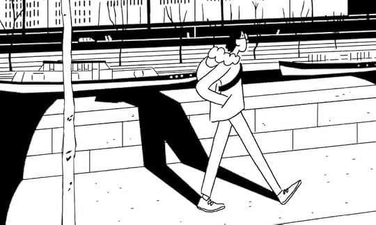
The rest of Yanow’s world obeys the same simplified laws of reality. Some settings are evoked by even fewer lines, each the same unaltering thickness as the frame lines surrounding them. Yanow doesn’t draw a single crosshatch in her entire 200-page memoir. Either a shape is opaque black or empty white. Her layouts are equally consistent: six squares arranged in three rows of two. The few variations (white spaces replace panels during the final train ride home and when Yanow is finally alone and decompressing) are some of the most evocative moments in the memoir.
Hanawalt is a maximalist. Her protagonists—many of whom have animal heads but human bodies—consist of intricate patterns of fur and clothing, offset by comparatively sparse but equally intricate shapes that define their surroundings. Her crosshatching is often meticulous, giving realistic depth and texture to the characters’ exposed heads and limbs and so intensifying the surreal effect. When Hanawalt leaves the interior of shapes unshaded, the pages resemble absurdist coloring books wonderfully inappropriate for humans of any age.
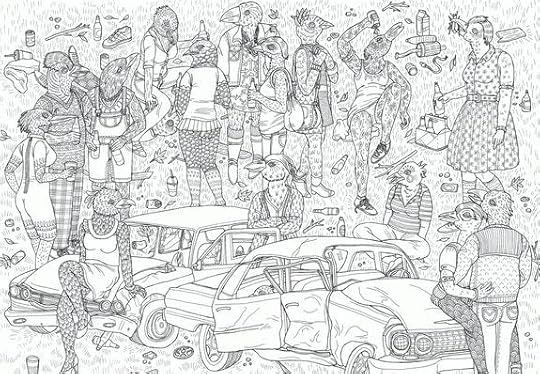
Where Yanow champions blocky consistency, Hanawalt wanders through multiple layout variations. Some pages are single images, some are partitioned into single-line frames, other into gutters, and still others are entirely open-framed. Her rendering style roams just as freely, from thin-lined black to gray washes to opaque grays. While most of her lines are sharply precise, a few pages feature thicker looser art, as if an uncredited guest artist dropped by. Most are clearly Hanawalt-esque, though unexpected undertones of Shel Silverstein and Phoebe Gloeckner stroll through too.
Hanawalt’s free-roaming styles are well-suited to her collection, which (as her bird-headed cartoon self explains in the introduction) compiles her pre-animation (BoJack Horseman, Tuca & Bert) minicomics from 2009 and earlier. Though some characters recur (She-Moose and He-Horse get top billing), most are an anonymous cast of oddball humans and half-humans muddling through early 21st century existence. Though Hanawalt’s humor makes things a little more surreal (list of invented dances, instructions for pretending to jack-off while driving, things you can do nightmarishly wrong in grocery stores), but the baseline reality is uncomfortably familiar.

Though Yanow’s reality is explicitly real—The Contradictions documents a European hitchhiking trip she took while studying abroad—its unrelenting layout and style norms suggest the confused rigidity of her younger self as she struggles to navigate a paradoxically unpredictable world. Where Hanawalt is inventing a hybrid world in order to reflect on ours, Yanow’s younger self seems trapped in her own 3×2 gridded mindset which inaccurately partitions her experiences. She is a quietly unreliable visual narrator, unaware that her mismatched traveling companion and their awkward inability to relate is the source of her gently tragic disconnection.
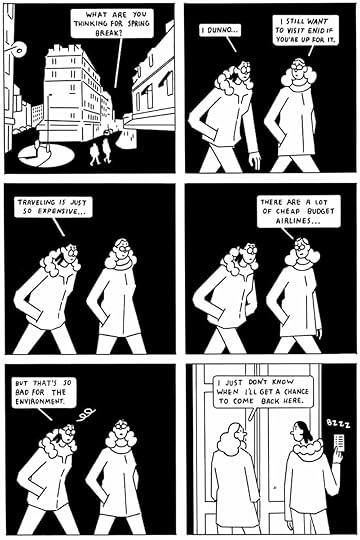
Both cartoonists are drawing self-portraits, Hanawalt indirectly, Yanow explicitly. Their bodies and so their sexualities are part of their imagery. Yanow’s twenty-year-old self is openly gay, but she does not seem especially at ease with that fact—or possibly with any facts about herself. Though there is no overt sexual tension between her and her kleptomaniac anarchist friend Zena, the rules of plotting imply it, even as Yanow’s rules of representation stifle the possibility through a kind of visual asexuality. The characters seem lost inside the flat geometry of their clothes and bodies. The genre is coming-of-age, which Yanow quietly thwarts by allowing her cartoon self so little room for growth.
Hanawalt, however, is overt in her twenty-something sexuality. Where Yanow seems incapable of recognizing let alone expressing physical desire, Hanawalt’s title declares it as organizing principle. There are a few explicit sex acts (penis hula hoop, sexy real estate brokers, children’s dinosaur porn), but the grainy texture of animal fur surrounded by delicately patterned clothes implies what otherwise goes undrawn. Hanawalt’s half-humans are animals all the way down. We all are. Though she sometimes channels the sexual exuberance of Julie Doucet or Fiona Smyth, Hanawalt’s surreal bodies are also horror-tinged, often vomiting inexplicable clumps of noodles or baby chicks. The most disturbingly powerful sequence is She-Mouse’s visit to a surreal abortion clinic.
Despite their considerable differences in genre, style, and character temperament, Yanow and Hanawalt explore the same inexplicable underworld of longing, Yanow from the terrifying entry point of her twenties, and Hanawalt from the ravaged exit point of hers. Wanting and contradiction abound in both.

May 25, 2021
Comics from Creating Comics
I now have statistical evidence to support the claim: “Third time’s the charm.”
The Spring 2021 iteration of Leigh Ann Beavers and my Creating Comics course has produced the strongest batch of student comics yet–and that was already an impressively high bar. I would like to take a little of the credit, but it really comes down to the talent in the room. Look for yourself. Our library featured a row of poster-sized pages for the Spring term festival:


And here’s a closer look at some individual pages:
Arden Floyd:

Audrey Dietz:

Everett Heebe:

Gabriela Gomez-Misserian:

Grace Williams:

Jessy Xu:

Katie Cones:

Lauren Newton:

Maddie Brazil:

Mitchell Roberts:

Naila Rahman:

Nayongi Borthwick:

It was also the first time Leigh Ann and I used our own textbook–which was odd for me, but apparently pretty effective. Of course now we want to scramble the whole syllabus and reinvent a new comics wheel, mainly just for the fun of it. I can’t wait to see what our Spring 2023 students create.

May 17, 2021
Abstract Comics
These are one-page, abstract comics from the students of ARTS-ENGL 215, a hybrid creative-writing/studio-arts course called “Making Comics” that I’m co-teaching again this spring term with my co-author Leigh Ann Beavers.
Nayongi Borthwick:

Naila Rahman:

Mitchell Roberts:

Maddie Brazil:

Lauren Newton:

Katie Cones:

Jessy Xu:

Gabriela Gomez-Misserian:

Everett Heebe:

Arden Floyd:

Grace Williams:

Audrey Dietz:

Leigh Ann and I discuss abstract comics briefly in our textbook Creating Comics, which was published in January. If we ever get to make a second edition, we have so many new student illustrations to highlight!

May 10, 2021
Appropriation/Transformation Comic #1: Picasso, Woman in a Hat, 1935/2021


After spending last month discussing the ambiguous boundaries of appropriation art and what may or may not count as fair use, this week is the first in a series of experiments appropriating a work of art and transforming it into a comics sequence. I assume the final image would not violate copyright law, but I’m uncertain about any of the middle ones. More importantly, is Picasso’s untouched original transformed simply by the change in context? Sadly, the only way to find out is to be sued by Picasso’s heirs.

May 3, 2021
Princes of Plagiarism: Drawing the line for comics copyright infringement (part 4 of 3)
Is this copyright infringement?

The image on the left is the February 2002 cover of Sports Illustrated featuring a photograph of model Yamila Diaz-Rahi taken by Jeff Bark. The image on the right is the May 2003 cover of Sojourn No. 22 drawn by Greg Land. The second image is presumably derived from the first, probably by tracing the first with a stylus to transfer the tracing to a computer program digitally.

I’m not sure what the statutes of limitations on copyright law are, but the Sojourn publisher, CrossGen, went out of business in 2004, perhaps leaving no one to sue if Greg Land produced the image made-for-hire, meaning CrossGen purchased the copyright. Since Jeff Bark was employed by Sports Illustrated who presumably purchased his work outright too, he may or may not have grounds to sue. The image is of Yamila Diaz-Rahi, so she presumably would have grounds, and since CrossGen doesn’t exist, perhaps she could sue Greg Land directly.
Of all of those potential legal battles, I’m not aware of any actually occurring. No one sued anyone. Why not? Even if CrossGen were still in business and Diaz-Rahi, Bark, and Sports Illustrated were aware of the potential infringement immediately after the publication of Sojourn No. 22, I still suspect no one would take any legal action because Land’s use of the Bark photograph would be protected by fair use.
Even though the new image was created as part of a commercial product (and so not exempt due to purpose), “the amount and substantiality of the portion used” probably does not exceed the vague limits suggested by previous court rulings (which I’ve been describing obsessively for the past three posts).
At what I previously described as the micro-level, the second image uses none of the raw materials of the first image directly (which makes it dissimilar to Warhol’s Prince and Fairey’s HOPE). But at the macro-level, the gestalt effect of the new image clearly replicates the source. To paraphrase the Second Circuit Court of Appeals: “the degree to which Bark’s work remains recognizable within Land’s, there can be no reasonable debate that the works are substantially similar.”
And yet, I’m guessing, not similar enough, since it triggered no lawsuits. And neither has Land’s other equally derivative artwork:

And Land is hardly alone. The practice of comics “swipes” originates long before digital tracing made it even easier. Fred Guardineer copied N.C. Wyeth’s 1919 The Last of the Mohicans illustration for Action Comics No. 8 (January 1939).

And Batman co-creator Bob Kane was a notorious swiper, usually of other comics artists.

Comics artists also swipe from themselves. Neal Adams reproduced his cover for Superman No. 243 (October 1971) for his cover of Jonah Hex No. 91 (June 1985).

Since DC published both, copyright infringement wasn’t possible. But what about when an artist swipes his own work after moving from one company to another, as John Byrne did between Marvel and DC?
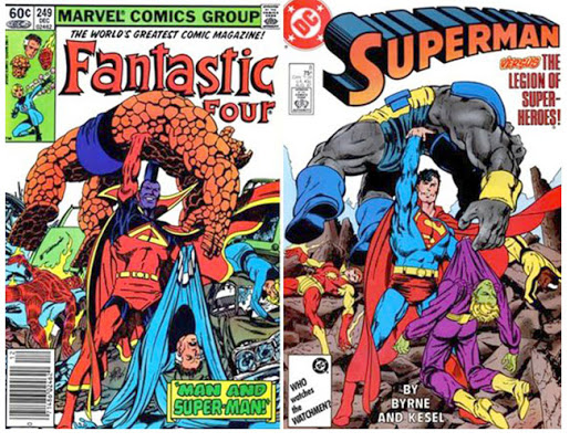
This is distinct from “homages” where the point is to evoke the original:

Including across publishers:
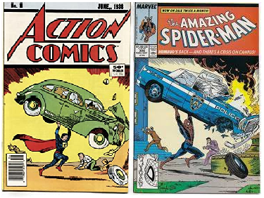
So why are comics seemingly exempt from U.S. copyright law? The short answer is they’re not. But the law requires lawsuits, and if no one alleges infringement, the law is moot. So the more relevant question may instead be: why is it so rare to sue a comics publisher for copyright infringement?
Returning to the first example, I think sometimes it has to do with the degree of transformation. In addition to variously altering the physical content of Bark’s photo, Land uses an image of a real person in order to depict a fictional person. I’ve never read Sojourn, but here’s a synopsis of No. 22:
“The quest continues as Arwyn ventures deep into the desert wastes of Oudubai, but her deadliest enemy may not be the sand, the heat or the troll pursuers dogging her every step. The greatest danger may well come from one of her own companions – a thief who has designs on the very Fragments Arwyn carries.”
I’m guessing, based on the faux mid-eastern veils that Land drapes on Diaz-Rahi, that the image is of the “thief” from “Oudubai” (I’m not going to plunge into an Orientialist critique right now, so I’ll just say that Land’s use of porn for his superheroine swipes may not be his greatest shortcoming). That’s very different from the infringement case that started this now four-part sequence of posts, where Warhol used an image of Prince to create an image of Prince:

That seems to be a self-evidently bad idea, since a primary point of appropriation art is its transformative quality.
According to New York Times art critic Blake Gopnik, the ruling against Warhol “had the effect of declaring that the landmark inventions of Duchamp and Warhol — the ‘appropriation’ they practiced, to use the term of art — were not worthy of the legal protection that other creativity is given under copyright law.”
While the ruling concerns me too, Gopnik performs a rhetorical sleight-of-hand by implying that Warhol’s Prince and Duchamp’s Fountain are essentially alike. They’re not. Duchamp took a urinal, turned it on its side, signed it, titled it, and placed it in an art exhibition, thus transforming it through a change in context that altered the nature of the object itself.
A urinal became a sculpture.

The equivalent for Warhol’s Prince would be if Warhol took a urinal and transformed it into a somewhat different urinal.
Which now makes me rethink my own self-portrait. If my photograph (okay, it’s a Zoom selfie) had been used by another artist without my permission, would I have the basis for a successful lawsuit?

The fact that I still don’t know the answer to that question is evidence that U.S. copyright law is in need of some serious clarification.
April 26, 2021
Princes of Plagiarism: Drawing the line for copyright infringement (part 3 of almost certainly 3)
Last week I looked at two pixilated versions of the same Miles Davis cover art photograph. I think the first likely violates copyright, and the second would fall under fair use.


Why? Because, unlike the Prince, Obama, and Soglin examples discussed two weeks ago, the differences between the mid-range pixilation image and the original involves more than just simplification. The remaining details are also distorted in relation to the corresponding areas in the original. The size of units in ratio to the size of the object that the units combine to represent may matter. Once the size of the pixel-like squares is greater than the regions from the original that they represent, the squares become the primary element of composition. The resulting effect combines simplification with exaggeration.
The squares in the image that triggered the lawsuit are akin to paint strokes. They are the micro-level units that combine to create the gestalt effect of the macro-level image. I suspect the nature of smaller units doesn’t matter matter legally because resemblance occurs at the macro-level. This image, for example, has no representational relationship to its source material:

But when viewed at a different size/distance and within a larger image context, it resembles and so represents my right eye:

If I were suing myself for copyright infringement of only my right eye, I suspect I would lose.
Micro-level units matter when their qualities become dominant, including the macro-level effects they create in combination. Look at three pixilated Miles Davis hands:
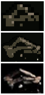
The first is from what I identified as the first likely fair-use version of Baio’s Davis series last week. The middle is from the image that triggered the lawsuit, and the last is from the source photo. All three are made of pixels, but only the first two are considered “pixel art,” which is a misleading term since each large square is made of multiple identically colored pixels arranged in the shape of a significantly larger square to produce the effect of an enlarged pixel.
I also suspect that the top hand would not resemble a hand out of context, while the other two would be more identifiable. That could matter legally. The pixels that combine to suggest the qualities of Prince’s, Obama’s, and Soglin’s faces are essentially identical in the source images and the adapted images.


Fairey’s HOPE does involve some alterations, but the effect does not alter a primary experience of resemblance between the original and the adaption. The more pixilated Davis image moves into different terrain.

It moves into the top right of my four-area self-portrait by combining both simplification and exaggeration. Though there may be cases when an image that only simplifies its source is protected by fair use, I suspect the region generally is in legally dicey waters.
That leaves one area, the top left: exaggerated but not simplified.
And that, not coincidentally, describes my Prince art:

This is also helpful for discussing process, which is often in focus during court cases. And process differentiates actions (performed by an artist) from effects (experienced by viewers). I suspect viewers experience the Prince image as though it were hand-painted by an artist who was looking at the Goldsmith photograph as a visual reference. It wasn’t. The process is similar to Baio’s pixilated Miles Davis series.
I began with a digital version of the photograph, slightly pixilated after enlarging. I then selected a mouse-scribbled jigsaw shape, copied it, and pasted it imperfectly over the original so as to duplicate content along certain edges and obscure other content at opposite edges. I did this multiple times with multiple jigsaw shapes, while periodically saving works-in-progress:

After I settled on a final version in Word Paint, I opened the document in Adobe Illustrator, and saturated the colors, performing a final copy and paste in Word Paint to combine areas.

Although the “raw material” is still entirely the original photo, the final effect is different from Warhol’s adaptation because the placement of the duplicated material exaggerates certain areas, creating caricatural-like facial features. Even though my authorial intent wasn’t initially parody, parody arguably emerged during the process. Regardless, I suspect the resulting macro-level resemblance between my image and its source is sufficiently distant to fall under fair use due to the range of distinguishing exaggerations.
There is still some gestalt resemblance, since the question of infringement wouldn’t come up otherwise, but despite a process that uses the source as digital raw material, the two images bear almost no similarities at the micro level. Looking again at only right eyes reveals fundamental dissimilarities and so presumably no plausible infringement:

Distinguishing between micro-level units (such as paint strokes and pixels) and macro-level effects (experienced only when viewing an entire canvas) is similar to the differences between words and paraphrasable content. Copying words verbatim is a form of plagiarism, but it is still possible to plagiarize without reproducing any words. Ideas are copyrighted, not just the words that constitute them. If I express essentially the same idea (or gestalt image effect) using entirely different words (or paint strokes), I’m still potentially plagiarizing.

Look at the pixilated “Kiss” again. It’s taken from the 2015 film Eadweard about the 19th century photographer Eadweard Muybridge. The film recreates many of Muybridge’s images, including the moment represented in my hyper-pixilated “Kiss.” Since the film uses entirely different actors, the micro-level “raw materials” are unrelated to the actual individuals who appear in Muybridge’ work, but were Muybridge’s photographs still copyrighted, the film recreation would likely be an infringement. My “Kiss” could potentially infringe on both the 2014 film and the original 19th-century images–except that the level of simplification and exaggeration is so extreme, resemblance is minimal. The image is much more about its style (because of the size and shape of micro-level units) than its representational content.
And look at my second self-portrait again. Although the emergent “new expression, meaning or message” seems less prone to parodic effects, I suspect the complete dissimilarity at the micro-level and the partial dissimilarity at the macro-level would place the second image within fair use:

But I could be wrong, since the courts have yet to establish any clear standards, and decisions keep establishing contradictory or ambiguous precedents. Although the 2nd Circuit of Appeals recently warned judges to “not assume the role of art critic,” until the judiciary develops the necessary expertise of art criticism, fair use will remain in legal chaos.
April 19, 2021
Princes of Plagiarism: Drawing the line for copyright infringement (part 2 of probably 3)
Last week I looked at three court cases where an artist used a copyrighted photograph to create a new work: Warhol used a Goldsmith photograph of Prince to create the Prince Series, Fairey used a Garcia photograph of Obama to create HOPE, and a group used a photograph of a Madison Mayor to create a t-shirt mocking him. A judge ruled Warhol was protected under fair use, but the ruling was overturned on appeal. Fairy settled out of court (after falsifying evidence which led to a separate conviction). And a judge and an appeals court both ruled that the mayor t-shirt was fair use.


Although the Second Circuit warned judges to “not assume the role of art critic,” some grounding in visual analysis might be helpful. To start, here’s a self-portrait I created for my forthcoming book The Comics Form: The Art of Sequenced Images (Bloomsbury 2022).

I analyze the representational relationship of an image to its source according to two poles, exaggeration and simplification, producing four combinations: 1) the bottom left corner is an actual photograph, so it is unsimplified and unexaggerated; 2) the bottom right corner is adapted from the same photo by erasing everything but the minimum lines needed to represent a face, so it is simplified but not exaggerated; 3) the top left corner is adapted from the same photo by variously expanding and rearranging details, so it is unsimplified and exaggerated; and 4) the top right corner is drawn using roughly the same number of lines as the image below it and with roughly the same degree of distortion as the image beside it, so it is simplified and exaggerated.
I suspect no judge would question the legal legitimacy of a simplified and exaggerated image (top right), and I suspect any judge would find an unsimplified and unexaggerated image to infringe on copyrighted image (bottom left). That wasn’t always the case though. Roy Lichtenstein duplicated a section of page 3 from the 1963 comic Secret Hearts No. 83 drawn by Tony Abruzzo. Since Abruzzo was employed by Arleigh Publishing, which was owned by DC, DC owns the rights to the Abruzzo image, which Lichtenstein used without permission or attribution. I’m not sure what the statutes of limitations are on copyright infringement, but Lichtenstein’s are well past the half-century mark.

Sticking to this century, a court ruled against Richard Prince for using 30 photographs taken by Patrick Cariou in collage works in 2011. But then in 2013, an appeals court ruled in Prince’s favor, finding that 25 of Prince’s transformed images fell under fair use. The two parties settled the remaining five images out of court, including Graduation:

The appeals course was uncertain whether Graduation fell under fair use because it and the other four questionable works “do not sufficiently differ from the photographs of Cariou’s that they incorporate for us confidently to make a determination about their transformative nature as a matter of law. Although the minimal alterations that Prince made in those instances moved the work in a different direction from Cariou’s classical portraiture and landscape photos, we can not say with certainty at this point whether those artworks present a ‘new expression, meaning, or message.’”
Prince’s In the Garden is one of the 25 works that did not infringe:

Setting Prince aside (because how and how much an image or an image part changes meaning contextually is a wide open subject), the legally contestable and analytically confusing areas of my four-mode self-portrait are the remaining two squares (top left and bottom right).
Most of the above examples fall into the second category, simplified but no exaggerated. Warhol (for both the Prince and Marilyn series), Sconnie Nation, and Fairey removed considerable detail from their source photographs, but did not alter (or in the case of Fairey, altered minimally) the remaining details. The images (as far as how they relate to their raw material) are therefore simplified and unexaggerated. The adaptors also added details (mostly non-realistic colors), but those additions combine with but do not directly alter the details that remain from the sources.
The question then in each of those court cases is how much simplification (removal of detail) crosses the threshold of fair use?
Andy Baio asked the same question when he was sued in 2010 for using a photograph of Miles Davis taken by Jay Maisel. The photograph originally appeared on the cover of the 1959 Miles Davis album Kind of Blue, and Baio used a pixelated version of the image for a “retro videogame music” tribute album he produced titled Kind of Bloop.

Baio believed he was protected by fair use: “With regard to the third factor, although the illustration does represent the cover of Kind of Blue, it does so at a dramatically reduced resolution that incorporates few of the photograph’s protectable elements.” The pixilation also matches the purpose of the album: “to engage both artist and viewer in the same exercise — can NES-style pixel art capture the artistic essence of the original album cover, with a fraction of the resolution and color depth of an analog photograph? It reinforced the artistic themes of the project, to convey the feel of an entire album reimagined through an 8-bit lens. Far from being a copy, the cover art comments on it and uses the photo in new ways to send a new message.”
But litigation is expensive even when a defendant wins, and the risks of losing can be financially catastrophic. Baio settled out of court. He also asks on his blog: “Where would you draw the line?”

The question is difficult to answer in part because the law doesn’t consider under what condition an image is viewed. Consider this abstract grid of multi-colored squares:

If you’re looking at a computer screen right now, move a few yards back. If you’re looking at your phone screen, just extend your arm and squint. Or look at the identical image when reduced in size, and you’ll see why I titled it “Kiss.”

A low-resolution image looks low resolution only when viewed at sizes large enough (or distances great enough) to reveal the distortions produced by the low resolution. If you stand far enough away from Banksy’s Cardinal Sin, pixel-like squares on the face of the statue will look a normal face.

Courts often allow thumbnail reproductions (2003 Kelly v. Arriba-Soft, 2006 Graham Archives v. Kindersley), but even though a postage stamp is smaller than a square inch, the 2010 Gaylord v. United States ruled that the postal service needed the sculptor’s permission to reproduce an image of the Korean War veteran’s memorial. That’s presumably because thumbnails are low resolution, and stamps are high resolution—though you may need a magnifying glass to notice.
Pretending there’s a legal standard for “under what conditions” that accounts for image size and viewer distance, I wonder how Baio’s question applies to Goldsmith’s photograph of Prince. Though any digital enlargement is pixilated, the effect can be so mild that it goes mostly unnoticed:

At the other extreme, when the pixilation is so great the face is no longer recognizably Prince, we should be safely in the zone of fair use.

It’s the middle region that’s ambiguous and so legally treacherous.

With Baio’s examples, I think the first four images likely infringe on copyright, and probably the next two as well.

I think the last four likely fall into fair use, and probably the remaining middle two.

Compare that first (according to me) fair use image to the original and to the one that Baio actually used:


Why draw the line there?
I’ll try to explain that next week.
April 12, 2021
Princes of Plagiarism: Drawing the line for copyright infringement (part 1 of ?)

That’s an image of Prince. I made it. How exactly I made it I’ll talk about later (because process may or may not matter legally), but I “used” a 1981 photograph of Prince taken by Lynn Goldsmith:

Is my use of Goldsmith’s photograph “fair use” or am I violating copyright law? It’s a basic question that lacks a basic answer. As a starting point, the relevant portion of the legal code, 17 U.S. Code § 107, has been law since 1976:
“Limitations on exclusive rights: Fair use
“Notwithstanding the provisions of sections 106 and 106A, the fair use of a copyrighted work, including such use by reproduction in copies or phonorecords or by any other means specified by that section, for purposes such as criticism, comment, news reporting, teaching (including multiple copies for classroom use), scholarship, or research, is not an infringement of copyright. In determining whether the use made of a work in any particular case is a fair use the factors to be considered shall include—
“(1) the purpose and character of the use, including whether such use is of a commercial nature or is for nonprofit educational purposes;
“(2) the nature of the copyrighted work;
“(3) the amount and substantiality of the portion used in relation to the copyrighted work as a whole; and
“(4) the effect of the use upon the potential market for or value of the copyrighted work.
“The fact that a work is unpublished shall not itself bar a finding of fair use if such finding is made upon consideration of all the above factors.”
While all four factors matter, I’m setting aside all but the third (though for sake of argument, let’s say my above image of Prince is of a commercial nature even though this blog clearly isn’t). The question then is: what “amount and substantiality of the portion used” falls under fair use? The answer is difficult to determine because the precise meaning of those words is interpreted by judges case by case.
Sometimes size seems to matter. The 1989 Love v. Kwitny ruling denied fair use after the defendant published half of an unpublished manuscript, while the 1991 Wright v. Warner sided with the defendant after the biographer quoted no more than 1% of Richard Wright’s unpublished letters. A lower judge suggested a 10% standard in the 2014 Cambridge v. Patton, which was struck by an appeals court in favor of case-by-case flexibility. That makes sense since the issue is more than objective quantity. In the 1982 Roy Export v. CBS, the defendant was not permitted to use 75 seconds from a Charlie Chaplin film in part because the selection included “the ‘gems’ of Chaplin’s motion pictures.” Similarly, the defendant in the 1997 Los Angeles News Service v. KCAL-TV lost on appeal because “the use was substantial even though KCAL broadcast only 30 seconds of the four minute, 40 second Videotape [of the Rodney King police beating] because it was the heart of the work.” But in the 1996 Monster v. Turner, the court allowed a biographical film on Muhammed Ali to use 41 seconds from a boxing match, without regard to whether the selection was “the heart of the work” or not.
For the 1994 Campbell v. Acuff-Rose Music (2 Live Crew sampled “Pretty Woman”), Justice Souter emphasized “whether the new work merely supersedes the objects of the original creation, or instead adds something new, with a further purpose or different character, altering the first with new expression, meaning or message.” Because the something new that 2 Live Crew added was parody, the case speaks mostly to the first criteria (purpose), establishing a Supreme Court precedent for evaluating fair use.
Let’s say I did not intend my Prince image as a parody (though given the degree and effect of the distortions I could claim it is), but as a non-parodic work of visual art. The question then is whether that further purpose, the image’s differences in character, and its altered expression, meaning, and/or message is sufficiently furthered, different, and altered to be protected under fair use.
I chose Goldsmith’s photograph because Andy Warhol used it in 1984 when commissioned by Vanity Fair to create an original work depicting Prince. Vanity Fair licensed use of the photograph from Goldsmith’s agent as a “source photograph” attributed to Goldsmith when Warhol’s work appeared in the magazine. Warhol later made additional images, called the Prince Series, which came to Goldsmith’s attention when one was featured on the cover of a tribute magazine to Prince after his death in 2016. The tribute magazine licensed the image from Warhol’s estate, and Goldsmith was not attributed or compensated.

In 2019, Judge Koeltl ruled: “The Prince Series works can reasonably be perceived to have transformed Prince from a vulnerable, uncomfortable person to an iconic, larger-than-life figure. The humanity Prince embodies in Goldsmith’s photograph is gone. Moreover, each Prince series work is immediately recognizable as a ‘Warhol’ rather than as a photograph of Prince — in the same way that Warhol’s famous representations of Marilyn Monroe and Mao are recognizable as ‘Warhols,’ not as realistic photographs of those persons.”
That ruling was appealed and overturned in 2021 by the U.S. Court of Appeals for the Second Circuit. Evaluating the third factor, they concluded: “the degree to which Goldsmith’s work remains recognizable within Warhol’s, there can be no reasonable debate that the works are substantially similar.” The judges also admonished the lower court to “not assume the role of art critic and seek to ascertain the intent behind or meaning of the works at issue. That is so both because judges are typically unsuited to make aesthetic judgments and because such perceptions are inherently subjective.” They instead directed courts to “examine whether the secondary work’s use of its source material is in service of a ‘fundamentally different and new’ artistic purpose and character, such that the secondary work stands apart from the ‘raw material’ used to create it.”
Though I agree with the appeals court that “it is entirely irrelevant to this analysis that ‘each Prince Series work is immediately recognizable as a ‘Warhol,'” Koelt’s point might rest in how ‘Warhols’ contrast and so are distinct from “realistic photographs” like Goldsmith’s. But even when read charitably, Koelt’s judgment is overruled and a new criteria established: if the “raw material” used in the creation of an image remains recognizable, then the image is not protected by fair use (except in special cases, including parody).
That could be a problem for the Warhol estate, since some of the most famous and expensive Warhols apparently are not protected either.

The raw material of Warhol’s numerous “Marilyn” paintings is a photograph taken by Eugene Korman to be used as publicity for the 1953 film Niagara. Korman was employed by 20th Century Fox, who, based on The Andy Warhol Foundation v. Goldsmith, could sue the Warhol estate for financial compensation (Orange Marilyn sold $17.3 million in 1998) control of Warhol’s artwork.
For his Obama political poster HOPE, Shepard Fairey used a photograph taken by Mannie Garcia while covering a press conference for the Associated Press. The Associated Press sued Fairey and the two settled out of court in 2011. (Fairey later pled guilty to fabricating evidence that he had used a different photograph.)
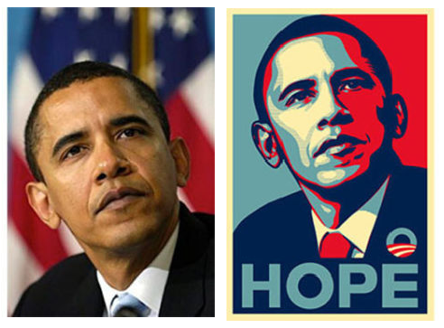
Since the very different purpose of HOPE was to help Obama win the 2008 Democratic primary, factor one (purpose) seems especially significant. Looking only at the third factor though, the degree to which the raw material of Garcia’s photograph remains recognizable is similar to the Warhols.
But Warhol Foundation v. Goldsmith is not the only precedent. In the 2014 case Kienitz v. Sconnie Nation and Underground Printing, the circuit judges ruled in the opposite direction. The defendants downloaded a photograph from the Madison, Wisconsin city website and to use for a t-shirt design ridiculing Mayor Peter Soglin.

The appeals court upheld the lower court’s ruling that the image was protected by fair use. Though they felt “the most important usually is the fourth (market effect),” the third factor, “the amount taken in relation to the copyrighted work as a whole—has much bite in this litigation.” They write:
“Defendants removed so much of the original that, as with the Cheshire Cat, only the smile remains. Defendants started with a low resolution version posted on the City’s website, so much of the original’s detail never had a chance to reach the copy; the original’s background is gone; its colors and shading are gone; the expression in Soglin’s eyes can no longer be read; after the posterization (and reproduction by silk-screening), the effect of the lighting in the original is almost extinguished. What is left, besides a hint of Soglin’s smile, is the outline of his face, which can’t be copyrighted. Defendants could have achieved the same effect by starting with a snapshot taken on the street.”
The court’s description is odd. Only in a hyperbolic sense does “only the smile remain” from the source photograph. Though it’s technically true that “so much of the original’s detail never had a chance to reach the copy,” the amount of detail in the low resolution version is highly significant. It’s also true that the defendants could have taken a snapshot of Soglin on the street and used it as their source material, but they didn’t, and whatever “effect” that hypothetical image might have had seems irrelevant. More importantly, there is considerably more “left” than “a hint of Soglin’s smile” and “the outline of his face.” And most importantly, it seems highly questionable whether the t-shirt image only contains content “which can’t be copyrighted.”
If outlines and hints of features can’t copyrighted, then the Picasso estate cannot control rights to many of the artist’s drawings:

Outlines of faces and hints of their features also describe cartoons. Can the following not be copyrighted either?

What about outline-defined logos?

This would seem to relate to the Los Angeles News Service v. KCAL-TV decision which rejected fair use because the duplicated portion of a videotape “was the heart of the work.” In terms of single-image representation, some details always matter more than others, so “the heart” would presumably refer to only those areas that make portrayed faces recognizable. Yet Warhol Foundation v. Goldsmith and Kienitz v. Sconnie Nation draw opposite conclusions. While the amount of detail contained in the Warhol and the t-shirt appears objectively similar, the two panels of judges described them as diametrically different. For the image of Prince, “there can be no reasonable debate that the works are substantially similar,” but for the image of Mayor Soglin, what remains of the original is so scant it “can’t be copyrighted.”
 I began this post expecting it to run my usual 1000-word range, but I'm close to doubling, with apparently lots more to go. So more next week ...
April 5, 2021
The U.S. Constitution–now with pictures!
How many artists have created their own genres? Robert Sikoryak may stand alone in that category, especially for genres within the comics form. He has an eloquently simple concept: combine a set of words with incongruous drawings in the styles of famous comics.

For his first 2009 graphic novel, Masterpiece Comics, Sikoryak retold classic works of literature, such as The Scarlet Letter, Doctor Faustus, and Crime and Punishment, featuring Little Lulu as Hawthorne’s Pearl, Garfield as Marlowe’s Mephistopheles, and Batman as Dostoyevsky’s homicidal protagonist. In 2017, Terms and Conditions earned Sikoryak greater attention for an even stranger premise: the complete, unabridged iTunes user agreement with Steve Jobs drawn in 94 pages of constantly changing styles. For The Unquotable Trump, released later the same year, he applied his formula to political satire, inserting Donald Trump cartoon images and verbatim quotes into comic book covers, with an appropriate emphasis on supervillains.

Now Sikoryak delves even deeper into American politics by adapting the most central U.S. text. Constitution Illustrated provides the complete, unaltered Articles and Amendments in 114 cartoon vignettes. The book is both Sikoryak’s widest range of comics homages yet and, more oddly, his most practical. Where the iTunes contract was a comically absurd choice because so few people have ever bothered to read it, the Constitution is a keystone of U.S. law and culture. Sikoryak even evokes a pocket-sized edition, that ubiquitous prop used by politicians and pundits in need of something to clench and wave above their heads.

I just used my own copy to check whether the 19th Amendment established the right of women to both vote and hold office or just to vote. The page features a spot-on imitation of H. G. Peter, the first but uncredited Wonder Woman artist. That pairing is a good illustration of Sikoryak’s logic and humor. Though unlike the adaptions in The Unquotable Trump, the page isn’t an exact recreation (like John Romita’s 1975 The Hulk on the Rampage cover), but a formally freer combination of style and subject. (The Amendment was just to vote.)
If you’re a comics aficionado, Constitution Illustrated is also the ultimate pop quiz. I didn’t keep score as I flipped through the first time, but I chuckled when I recognized the logic behind each discordant pairing, especially the superhero motif.
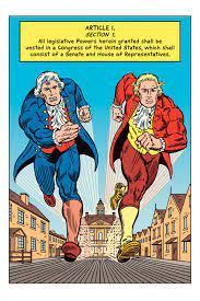
For Article I, Section I describing the division of Congress into the Senate and the House, Sikoryak draws two muscular and oppositely colored patriots sprinting in a mirrored pose cribbed from the 1976 cover of “The Greatest Race of All Time! Superman vs. the Flash.” The two DC heroes are allies on the same team, but they still compete against each other all too often. That antagonism increases when the House’s Super Friends face a row of Senate supervillains, an illustration of the House’s sole power to create tax-raising bills and the Senate’s power to amend them.

Instead of Spider-Man’s antagonists Prowler and J. Jonah Jameson watching Peter Parker fall from a window, Sikoryak draws a presiding Chief Justice and a Senator watching the President in the same pose—an apt illustration for the protocols for trying an impeachment. President Parker bears no resemblance to either Donald Trump or Bill CIinton, but Sikoryak kindly adds tingling spider senses emanata as a helpful clue (something artist John Romita did not include on the original 1969 cover).
A 1943-based colonial Captain America blocks a spray of musket bullets—metaphorically blocking the states’ ability to wage war, a power exclusive to the federal government. Sikoryak leaps to 1992 for Article II, Section 2’s description of the President’s role as Commander in Chief. I admit I didn’t recognize Jim Lee’s Wild C.A.T.s cover, just the decade-defining style which I took for Rob Liefeld. Happily, Sikoryak provides a cheat sheet in the appendixes, listing the source for each of adaption.
The list is dizzyingly eclectic: Alison Bechdel, Garry Trudeau, Roz Chast, Art Spiegelman, Chris Ware, Charles Schultz, Frank Miller, Scott McCloud, Adrian Tomine, and on and on. It’s a master course in comics and cartoon history, featuring some of the earliest creators, like Richard Outcault (The Yellow Kid) and Windsor McCay (Little Nemo), and some of the most recent, like Noelle Stevenson (Lumberjanes) and Bianca Xunise (Six Chix).
Given the current cultural moment of Black Lives Matter (the book was released during protests last summer), I took particular interest in Black artists George Herriman, Jackie Ormes, Matt Baker, Barbara Brandon-Croft, and Aaron McGruder, as well as the presentation of Black characters by non-Black artists. The Jaime and Gilbert Hernandez tribute is the most diverse, implying a hope that the Electoral College which it describes should reflect the same level of diversity.
[image error]Less subtlety, Sikoryak draws a chain-breaking Luke Cage to illustrate the slavery-ending 13th Amendment. His 25th Amendment depicts a Black vice-president assuming the presidency—just as the Black character John Stewart assumed the role of Green Lantern in DC comics.
My disturbing favorite though is Mandrake the Magician turning his African servant Lothar partially invisible beneath the census directive to count only “three fifths of all other persons,” meaning slaves. The image unites the racism of the Article with the racism of the 1930s characters. It also highlights how any contemporary analysis of the Constitution must address its deep flaws too. Sikoryak’s satirical pairings breathe new and sometimes uncomfortable life into the United States’ most living document.
March 29, 2021
Yet Another Reason Why I’m not Andy Warhol
It seems other people have saner hobbies than I do. Instead of picking up a crossword puzzle or a novel when I have a down moment or an urge to mentally recharge, I copy and paste photos into Word Paint and fiddle with them until they don’t look like photos anymore. It’s not the worst habit in the world, but it does feel a little obsessive. I sometimes tell myself it’s a form of research, which it is: I’m exploring the edges of distortion, looking for the sweet spot where an image teeters between representation and total abstraction. I’m especially interested in how simplification and exaggeration at the micro-level relate to the macro-level image, how a pattern of digital strokes can seem to obliterate all content, and yet roll your chair backwards a yard or two and the ghost of the original photograph is still present as a gestalt effect. Brains are particularly good at piecing together broken shards.
Yesterday I read that an appeals court overruled a lower judge’s decision about whether Andy Warhol broke copyright law when he adapted a photograph of Prince without the photographer’s permission. The question is over whether Warhol’s image adequately transformed its source material. The judge said no:
“The Prince Series retains the essential elements of its source material, and Warhol’s modifications serve chiefly to magnify some elements of that material and minimize others. While the cumulative effect of those alterations may change the Goldsmith Photograph in ways that give a different impression of its subject, the Goldsmith Photograph remains the recognizable foundation upon which the Prince Series is built.”

I think “minimizing” and “magnifying” occur in relation to each other and both are aspects of simplification. More specifically, “magnifying” something is an inevitable effect produced by minimizing other things. Warhol simplified the photograph by cropping it and reducing details in the cropped area. He also added contour lines and opaque color.
The first judge ruled in favor of Warhol in 2019, placing his modification within the range of fair use:
“The Prince Series works can reasonably be perceived to have transformed Prince from a vulnerable, uncomfortable person to an iconic, larger-than-life figure. The humanity Prince embodies in Goldsmith’s photograph is gone. Moreover, each Prince series work is immediately recognizable as a ‘Warhol’ rather than as a photograph of Prince — in the same way that Warhol’s famous representations of Marilyn Monroe and Mao are recognizable as ‘Warhols,’ not as realistic photographs of those persons.”
The 2nd Circuit Court of Appeals strongly disagrees:
“We conclude that the district court erred in its assessment and application of the fair-use factors and that the works in question do not qualify as fair use as a matter of law… We feel compelled to clarify that it is entirely irrelevant to this analysis that “each Prince Series work is immediately recognizable as a ‘Warhol.'” Entertaining that logic would inevitably create a celebrity-plagiarist privilege; the more established the artist and the more distinct that artist’s style, the greater leeway that artist would have to pilfer the creative labors of others.”
Arguably, Warhol IS a “celebrity-plagiarist,” since his Monroe series were taken from a publicity movie still and so are vulnerable to the same 2nd Circuit conclusion. I have mixed feelings about both decisions (neither seems quite right to me). Either way, I’m really hoping the Vice-President and/or her photographers won’t be suing me any time soon (I featured a Harris series here in January). I also won’t be suing myself. Some of my more recent transformative adaptations are of a considerably less iconic and larger-than-life figure: me.
I’ll leave others to judge whether and in what sense these are or are not immediately recognizable as Gavalers.


Chris Gavaler's Blog
- Chris Gavaler's profile
- 3 followers


