
ROBUST discussion
Author to Author
>
Developing a right rag typography design for 5x8 inch paperback: the interior
date newest »
 Andre
AndreThat's a really useful and informative tutorial!
Seb
 Mod
Mod
On the more peripheral issues, how do you estimate the demand for a printed version of your ebook?
And what costs are involved in using Createspace? "
Coolmain Press are netside publishers. They're not interested in warehousing, servicing bookstores, paying my expenses to tour, returns, slow-paying bookstores, and all the other nonsense attendant on trad publishing. Nor am I. If they try to make tour, I'll be gone to someone else tomorrow.
For your modern, virtual, independent or semi-independent publisher and writer, there are only three reasons to have printed books:
1. Your sales are strictly local, and you sell more books at fairs and whatnot than via Amazon. I know exactly three people to whom that applies, and one of them is, strictly speaking, a photographer rather than a writer. (My local sales are a few hundred copies to libraries, handled by specialist wholesalers.)
2. You have the right connections in the press, or the reputation from past books, to expect your books to be reviewed in the journals of record, newspapers and magazines. This is me, and they expect paper copies, won't accept ebooks. This is likely to change in time.
3. Customers you especially favour for whatever reason want printed books. This applies to me too, in that I made some friends at the Iditarod who asked and were promised a paperback copy.
Of course, the only way I can do this is if I don't count my time for book design and cover design, etc. A book jacket at my normal rates would be about three grand British, art extra at about a grand and a half, interior design another two or three grand. I shall be printing perhaps ten or twelve copies...
The way to do this is as POD, print on demand. Then the costs, excluding my labour, are nil for origination and, I understand, $40 to get the book listed on Amazon. I don't care how many copies Amazon sells, this exercise is just to keep some friends happy. (Libraries too can buy new copies from Amazon.) Once the paperback is on Amazon, we're finished with it except if it suddenly takes off, in which case we take in some money.
IDITAROD a novel of The Greatest Race on Earth
Mod
So, is that a wonderful design for the interior of IDITAROD a novel of The Greatest Race on Earth, or is it a wonderful design? Well, actually, there's something niggling wrong with it. Not the big risk, not the right rag; that works well for me. Nor the tall face on the type. Something small and irritating. I started out wanting a pocketbook and easy-reading print, and the two desires are incompatible. Amazon's Createspace just doesn't offer a proper pocketbook size. The thing about the larger sizes is that they need some white space to work, and that's before the requirements imposed by a 12 point font's width and reading-line length.
After all that work, I was not satisfied. I kept coming back to this, and eventually spent another two and a half days on this single interior design, trying out various combinations and permutations, with which I shan't bother you, because none of them were as good as what I already achieved. It wasn't a different font I wanted, or to scale it down to 11.5pts, but a smidgin more white space. So, in the end, I just gave up choosing the smallest Createspace standard size — which isn't a pocketbook anyway! — and added the quarter-inch of white space necessary aesthetically to match the rest of the elements by going a size up to 5.25x8 inches. It makes so much of an improvement!

First the 5in wide page, then the 5.25in wide page. Can you feel how much more satisfaction that extra sliver of white space delivers? Now my head rests! (Yadayadayada from accountants. That's why they're accountants, to go yadayadayada.)
A new edition of André Jute's bestselling standard textbook, GRIDS, THE STRUCTURE OF GRAPHIC DESIGN comes out later this year.


***
The Kindle editions of IDITAROD a novel of The Greatest Race on Earth and THE LARSSON SCANDAL the unauthorized guerilla critique of Stieg Larsson have come in for a good deal of favorable comment for the excellence of their typography. That is no accident. I spent weeks developing those templates. Unfortunately, those proven templates won't translate directly to a paperback design, so I had to start from scratch.
Originally there was no intention of publishing a paberback or indeed any printed edition, but it turned out that there was a substantial demand for paperback copies of IDITAROD. Since the customer is always right...
Print on demand will be executed by Amazon's Createspace operation. Their smallest size, 5 by 8 inches, is larger than a standard mass market paperback, but I don't mind, as the larger format will permit me to choose a larger typesize. I'm working in QuarkXPress, still the most powerful layout program available, regardless of the whining of johnnycomelatelies about the admittedly steep learning curve. Of course, when I did the setup, there was no text to start with, just blank space. But it is easier to explain what is happening when I show copy in the spaces in which the typographer only imagines copy.
Here I've set up the margins. POD isn't a particularly precise operation, so extra large clearances are required on the inside (the edges of the pages nearest the binding). That means that on the outside one sets text nearer the edge than is truly desirable. Note the extra guideline through the outer edge of the text. That's where I would like to design to, but cannot because the inside margin is such a space hog that the line becomes shorter than reads comfortably.
I decided on a ragged right edge to the text before I started design. That is what I designed for the Kindle edition, and the detail will tie the two editions together. Furthermore, I'm keen to use a typesize large enough even for older eyes to read comfortably, but with a justified text block that is a recipe for rivers of white space through every page. So, to have the large text and good letter and word spacing, the ragged right is essential.
Here I've decided on the typesize and leading, 12 on 15 point. I always knew that this novel would be set in Times New Roman; nothing else was considered. IDITAROD is a novel for all the family from 12 to 94, set in Alaska, with a substantial market in Alaska and Canada and other icy places with long winters, and perhaps to be read in places where the light isn't wonderful. The designer ego-tripping with fancy fonts and obtrusive design will not be appreciated!
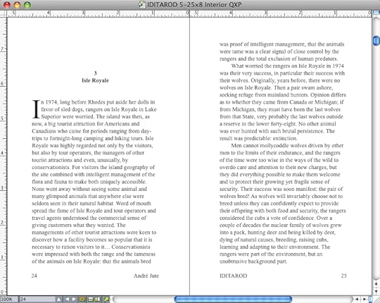
Here are all the grids. Notice that both running titles and page numbers are at the bottom of the page. Once more, the designer who hankers after large, readable typesize, knows in advance that it will put white space at a premium. He will have to squeeze in an extra line or two per page if the book is not to become inordinately thick. One of the extra lines of body copy I squeezed in sits in the space the page number would otherwise occupy.
And here we are, the page of text, with some precious white space distributed to the chapter head. The proportions are acceptably near the golden mean. I could perhaps get closer to the golden mean with the next standard size up, 5.5 by 8.5 inches but that's very big for a pocketbook.
Please feel free to comment on the design. It's made for you, and this is your chance to influence the design. Does it, for instance, look attractive, a book you will want to read? Does it look like it will be easy to read in your usual reading environment? Let me know via the comments box.
A new edition of André Jute's bestselling standard textbook, GRIDS, THE STRUCTURE OF GRAPHIC DESIGN comes out later this year.
If you have a Kindle, or a Mac or a PC, you can see different electronic settings by downloading samples from Amazon:
IDITAROD a novel of The Greatest Race on Earth
Amazon USA or Amazon UK
THE LARSSON SCANDAL the unauthorized guerilla critique of Stieg Larsson
Amazon USA or Amazon UK