
Sword & Sorcery: "An earthier sort of fantasy" discussion
About Sword & Sorcery
>
Cover Art - Defining Sword and Sorcery
date newest »
message 51:
by
Jason
(new)
Oct 02, 2013 09:09AM
 Very nice art, Seth. Additionally, I think the layout, design and placement of the text are nicely balanced and work well with the art. I'm also looking forward to reading your blog posts about the process.
reply
|
flag
 Mod
Mod
It's looking good. I'm actually expecting my cover in a few days as well.
Looking on your site there, I think the Cover B is the right choice. The A doesn't look quite right. I do like the red, but the title on the top doesn't fit quite as well. And in the B it sort of looks like they're standing on the title which I think looks good; makes it look like a hill.
Looking on your site there, I think the Cover B is the right choice. The A doesn't look quite right. I do like the red, but the title on the top doesn't fit quite as well. And in the B it sort of looks like they're standing on the title which I think looks good; makes it look like a hill.
 Mod
Mod
Michael, thanks for checking the site and weighing in. My wife is a designer and created option B, which you prefer (I had proposed the other). She often has a better design-eye than I. Your feedback further pushes me toward agreeing with her. It is nice to see design processes unfold. Please share your art as it comes in.
Periklis and Jason, thanks for the continued support. You guys rock.
Mod
Mod
So it is becoming clear that my wife is a better designer. Thanks!
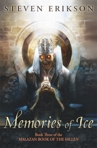
The Erikson cover you posted is lovely. The Malazan books have been stuck in my to-read pile forever; that cover just makes me wish I had more time to try them out.
 Joseph wrote: "Speaking of lovely, lovely covers ...
"
Now that is a truly excellent cover for a book, far far better than the cover art of that particular one that I own.
Mod
My original copy was
 , which I don't think is too bad.
The sad thing is that when I eventually reread the book, I'll probably go with the Kindle edition because the print version is just too darned big.
Joseph wrote: "Peter wrote: "Now that is a truly excellent cover for a book, far far better than the cover art of that particular one that I own."My original copy was
, which ..."Your right its not to bad but the new cover well that is so evocative of the whole series, quite malevolent really.
Got the proof for my cover today. Needs some revisions, but overall it looks good. Hoping to have the finished product in a few days. Can't wait to show it off to you guys. ;)
 S.E. wrote: "Commissioned Ken Kelly for the cover art to my sequel to Lords of Dyscrasia (sequel called Spawn of Dyscrasia, due out in 2014). Just received the painting last week; thought I'd share some one ea..."
A wonderful cover - and the colour-scheme is very s-&-s: rich and strong. I sometimes think the colours of a cover are more important than the image! It's an anxious time, I recall, waiting to see what the artist makes of your words. I was tremendously lucky with both my books (especially since I requested a number of changes on the second, which the artist accomodated willingly). There are two factors at work for the writer, I suspect: is the image striking and does it at least not mislead the potential reader as to content.
This looks great.
Mod
It took a few months and rough sketches/paintings to get an idea where Ken wanted artistic-license/freedom and where he just wanted concrete direction. So there were some anxious times at first; plus he had bigger clients to work for who got priority on occasion (i.e. KISS), so I had to exercise patience when bigger fish needed attention. However, being able to communicate directly to him ensured that the cover was representative of the characters/book. It seems the historic publication process of having middle-men/women between the author & cover artist has led to some odd productions.
Speaking of Ken Kelly and our current Imaro group-read, the 1981 cover by Ken Kelly seems to have some glaring disconnects that he probably would gladly have fixed had someone at DAW intervened (pure speculation): the cover depicts Book Four Horror in the Hills, but has a hero that appears non-African and the creature approximates the primary antagonist...but is of the incorrect gender.

The NightShade edition of Imaro, has a beautiful illustration by Vince Evans, but given the color-palette & the lack of magic & creatures, it appears to showcase a Historical-Fiction novel rather than Fantasy-Fiction.

Perhaps some of those design features were intentional marketing concepts.
I have the 1981 DAW version, and I loved the cover. I was excited to see Imaro battling evil hippo men! I was disappointed to discover how misleading that cover is. :(
The Night Shade cover is kind of drab, and it definitely looks more like a history book rather than pulp fantasy goodness. The first four stories (I haven't read the fifth yet) seem to echo that though. There are supernatural elements within them, but they definitely low fantasy, not unlike a Conan story. They seem more firmly rooted in historical African culture than in a fantastic world.
I feel like both covers are misleading to some degree, but I don't know how you could capture the actual tone of the books since it is a fine distinction, and it's easy to go too far in one direction or the other.
I like the DAW version, but that's also the type of fantasy I prefer.
Mod
Michael, I think our discussion on Imaro covers belongs in the "Imaro" thread (my bad for starting it up here). I will try to import or paraphase our comments into the othe thread... check in to make sure I do that ok.
--> Imaro Discussion Thread
Hope your cover art project is going well.
Thank you! I got the final art and put a cover together. I would love to share it with you guys, but I'm not exactly sure how to do that here. How do I post the picture in the comment like you did?
I think I figured it out. Here is the art for my upcoming book:

What do you guys think?
What do you guys think?
Mod
Wow! That looks outstanding! "Feels" like a renewed version of Weird Tales magazine cover. With the cast of characters it seems to promise "RPG/Horror." Look forward to learning more...reading it.
Thank you! I was trying to create a pulp look for the cover. The series is definitely RPG influenced, and this particular book has a gothic horror theme.
It was a challenge for the artist to fit everything in the frame, but I like the final result. I think it's an eye-catching scene from the book. Hopefully it stands out to potential buyers.
Book should be up on Amazon in about a week, and I'll be getting all my author sites and such setup by the end of the month. I'll have some information up on it in the Promo section when it's ready to go.
 S.E. wrote: "Commissioned Ken Kelly for the cover art to my sequel to Lords of Dyscrasia (sequel called Spawn of Dyscrasia, due out in 2014). Just received the painting last week; thought I'd share some one ea..."
Very cool!
 Mod
Mod
It was a challenge for the artist to f..."
Great cover Michael. Reminds me of the digital art of Clint Langley. Looking forward to your post in the promo section!
Thank you, glad you like it. Still have a number of odds and ends to finish up before publishing, but it should be up this month.
I have a novella coming out next month, and I have two pieces of cover art here I need to choose from. Can you guys weigh in and give your opinions?
New Cover Art for The Corruption
New Cover Art for The Corruption
Mod
Ah, well, I'll give you the blurb if that helps:
"An ancient evil. An opportunistic swordswoman. An unspeakable treasure. A dedicated priestess.
When the Tomb of Izrabol the Vile is unearthed, every would-be treasure seeker in Tahlverden descends on the small village Athaton in search of it.
But more than treasure is buried in the tomb. There is a reason it has remained sealed for millenia...the Corruption!
Six strangers are all that stand between the world of Tahlverden and one of the greatest evils to ever exist!
A sword & sorcery tale of greed, gluttony, and lust from the author of The Relentless Ones!"
 Can i recommend darryl k sweet covers. Some beautiful artwork on great books.
https://www.goodreads.com/shelf/show/...
 Michael:
I like the art in cover 1 better, but cover 2 appears to be a better representation of the contents. Go with what represents the story best - for you & for readers that don't have a clue on what's inside.
Thanks, Jason. That was my concern, that cover 1 might not be what the audience wants or expects which is why I had cover 2 made even though it's the more "boring" cover.
Michael wrote: "Thanks, Jason. That was my concern, that cover 1 might not be what the audience wants or expects which is why I had cover 2 made even though it's the more "boring" cover."Cover 2 gets my vote, also - didn't think it was boring myself, but actually felt more 'adventurous', i.e. more action than horror oriented.
Mod
Goodreads discussion thread: https://www.goodreads.com/topic/show/...
This three post mini-series describes the cover design process, featuring a custom illustration by master fantasy artist Ken Kelly (Spawn of Dyscrasia is due out this year, the sequel to Lords of Dyscrasia):
1) Cover Concept LinkThe first post covers the goal & concept art
2) Cover Art Link The second post chronicles the interactions with master fantasy artist Ken Kelly (from rough sketches to final painting) to yield the key illustration.
3) Cover Design LinkThe last covers the actual design (title placing, masking of the illustration, and overlaid fire)

 Book covers are just as important now as they were when they graced printed paper. However, the dynamics have altered and both, the late, Frank Frazetta, and Boris Vallejo would have to refocus and reassess. Alas, those wonderful expressions of shock, fear or adoration on the face of the obligatory scantily clad warrior femme/distressed princess are no longer a sale clincher because not even the sharpest eyes can see them in their new, virtual galleries.
Less detail and more colour, a fisherman's lure to catch the eye of the online browser, using a 1" x .75" icon of 4kb memory instead of 7" x 4" x 400 microns.
This is now a world where seemingly everyone is looking for an excuse to complain, so an artist has to earn his salt producing something that is relevant to the story and not bland and without soul.
Good luck getting this cover approved, these days, with its apparently high, nude blonde and opium pipe.
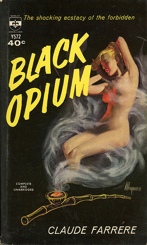
All said and done, I would never recommend anyone using stock covers which 'sort of' relate to the storyline.
Mod
 Joseph wrote: "Speaking of covers: I do really like the ones Bison Press used on their Harold Lamb collections, such as:"
It almost looks like a pre-inked board but is probably fine pencil line art that has been inked over. Effective, low cost, One shilling or One shilling and sixpence in the bookshop and tells you at a glance what you should expect to find, Joseph.
I agree, it is good art and the same style as were in many of our textbooks at school and in 'Dandy', 'Beano' and 'Victor' kids comics when I was growing up.

Sword & Sorcery: "An earthier sort of fantasy"
Books mentioned in this topic
Riders of the Steppes (other topics)Riders of the Steppes (other topics)
Lords of Dyscrasia (other topics)
Imaro I: The Epic Novel of a Jungle Hero (other topics)
Imaro (other topics)
More...
Authors mentioned in this topic
Fritz Leiber (other topics)Roy G. Krenkel (other topics)
Robert E. Howard (other topics)
Frank Frazetta (other topics)
Ken Kelly (other topics)
More...
