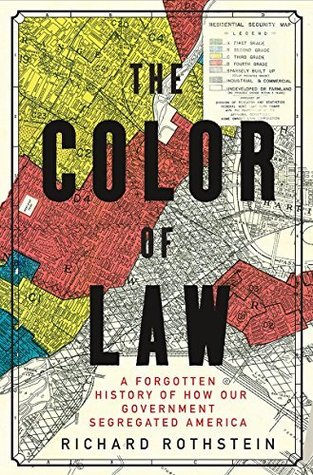
The HOLC created color-coded maps of every metropolitan area in the nation, with the safest neighborhoods colored green and the riskiest colored red. A neighborhood earned a red color if African Americans lived in it, even if it was a solid middle-class neighborhood of single-family homes.