What kind of CreateSpace cover does your paperback need? There are pros and cons to each. Matte is often preferred for novels, gloss often preferred for non-fiction. This video and photos below speak volumes.
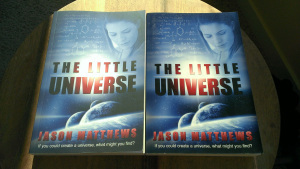 The matte cover is on the left. The text is a bit easier to read and there is a nice aesthetic quality. But the glossy cover has richer tones, most noticeable in the darker colors.
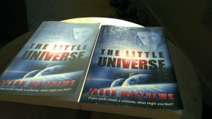 In the 2nd photo (right side), the sheen is much more obvious as seen at an angle with light in the background. Small scratches and fingerprints come out from the thicker layer of gloss in the laminate. However, the cover curl is already worse with the matte book, which is a concern because it’s 2 months newer than the book on the right.
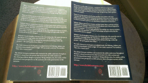 Again, you can see from the back cover (on left) how different the richness of the colors comes across. It’s surprising how much more prominent the darker areas show. This may be more of a deciding factor if your cover has many rich or dark colors compared to one that has mostly white or light colors.
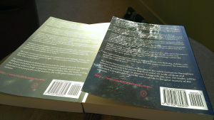 At an angle, the scratches and fingerprints are definitely less desirable. But the durability over time and the ability to wipe it clean with a wet cloth might make up for that.
In the end, it boils down to personal preference. For now, CreateSpace recommends matte for novels and glossy for non-fiction, so that’s my plan. Hopefully soon, they’ll let the buyer select the choice instead of leaving that with the author.
Do you have a clear preference? Let me know in the comments.
–
Home page of How to Make, Market and Sell Ebooks.
Subscribe to this blog for updates on indie authors and self-publishing.
 add me to Google Plus circles +Jason Matthews


Published on December 02, 2013 10:40
 newest »
 newest »
 I still think Glossy is the best bet after looking at the photos.


 add me to Google Plus circles +Jason Matthews


