
Alice Y. Chen's Blog, page 14
November 18, 2014
Now what?
I’ve written, revised and edited my story, drawn and re-drawn illustrations, tested many color combinations and background textures, laid out the images over and over, taken it to the target audience to get initial feedback, agonized over the cover image and chosen a simple but straightforward title that I think shows Centipede Dragon’s character the best....I’ve even stumbled over the name to which I will affix Centipede Dragon for all space and time.
It’s now time to see what the professional industry thinks.
This process, which has been eye-opening and definitely a learning experience, coupled with an overwhelming amount of information to digest, doesn’t mean this is the way it is in this business in general. Just my personal experiences.
There were several pre-steps that first needed to be addressed, to narrow down the seemingly daunting list of traditional publishers I ended up researching in-depth:
1) Did I want an agent to represent me and my book or did I want to do it myself?
2) What size publisher did I want?
3) Did I have constraints on when I wanted it published? How patient could I be?
4) Who is their children’s book editor? What are they looking for?
5) What does their current list look like?
Next week we'll explore these in depth!


November 11, 2014
What’s in a name...part 2
Here’s wishing all a peaceful Veterans and Remembrance Day.
We’ve covered so many aspects that go into developing a children’s picture book, but there’s one more all-important one: the title. Like the cover image, the title must make the book stand out from the tens of thousands of children’s books in print today. Also, the title imparts important clues to the nature of the story within.
My title changed very little from the beginning. My protagonist was such an unusual creature that I felt his name alone held enough “intrigue” to pick it up and thumb through it. And since this book introduces the series, I also felt the title didn’t have to be anything more than a straightforward and bold statement. I did consider a question for the title: "Who is Centipede Dragon?" But then, I used that line in the introductory text in an early draft of the manuscript:
Who is Centipede Dragon?
He is part centipede, and part dragon!
He is a benevolent creature who takes the shape of many forms.
What I wanted to make sure is that the parents, our second (but not secondary) audience, knew that Centipede Dragon was one of the good guys. Sure, we may be more amused and entertained by the antics of the bad guy/gal, but, we also want to have good role models as well. Enter Centipede Dragon, stage left!
I was also pretty adamant about putting the word “benevolent” in the title. Initial manuscript critiques questioned whether the vocabulary might be too intimidating or off-putting...a valid point. But “benevolence” was used in the research to describe Centipede Dragon so, to keep some authenticity, I did not waver on using it.
And, the pre-reading set would hopefully get hooked by the pictures!
Now, take a look at this first crack at the cover for book 2. What are YOUR thoughts on the title and cover image?
November 4, 2014
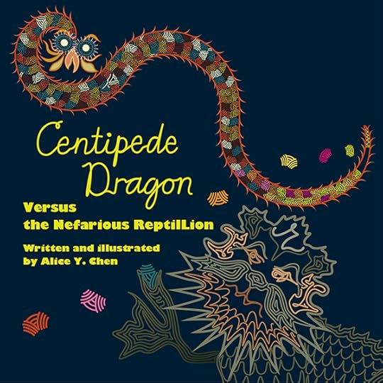
Cover girl…creature…dragon…centipede.
Now that we are entrenched in illustration and layout issues, we have to address two equally important topics: cover design and format.
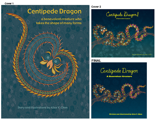
If you don’t have a great cover then all your efforts have gone for “nothing,” from a sales standpoint. The cover is mainly what gets people to pick the book up and page through it. Now, the billion-dollar question is: what makes a great cover? The picture shows that the cover has undergone hardly any changes throughout this arduous process. My first cover was based on an early illustration I had envisioned where his centipede part was separated from his dragon part. From a design standpoint, with the echoing swirls, I thought this image would make a beautiful cover. Then I realized I should stick with a Centipede Dragon in his most recognizable, intact form. I don’t want to freak kids out, after all. How about your thoughts? Did my cover intrigue you enough to open the book? Does it give you a sense of what kind of creature he is? What type of cover attracts you?
Format choice is a bit more tricky. You’ll see I have gone through 3 different shapes, starting out with the vertical format for a VERY practical reason. When books are shelved, the horizontally-orientated ones–called landscape–either stick way too far out of the shelving, or if shelved vertically, then the spine text is no longer apparent, thus leaving the book unidentifiable. Then, as I began the illustration work, I noticed because Centipede Dragon himself is long and skinny, that the landscape format would be more suited to the subject matter. I was actually never pleased with this choice, but felt I was making the best artistic decision for the book. It finally settled into a square format for an insurmountable technical reason. For some reason, Amazon cannot handle the “Look Inside” feature for a landscape book. I suppose it’s really CreateSpace’s fault, the company which I used to self-publish, and which is “affiliated” with, but not a part of Amazon…? Anyway, CreateSpace’s facilities can only manufacture a landscape orientated book if you set it up to have the binding on the top edge, as if it were a wall calendar. I think this is the source of the problem, because in the end what you get is all the displayed pages in Amazon rotated 90° to the right.
How about your thoughts? Which format do you like best, based on the covers alone?
October 28, 2014
A picture is worth a 1,000 words…or 17 at least
This week I want to talk about how to marry the pictures with the words. In the process of writing a story, it’s somewhat necessary to at first be very descriptive and exact about what’s going on. Words paint a vivid picture of setting, give much more insight into character, and describe the action that takes place. So, how can one convey a story without these words?
Let the pictures fill in these gaps! What we’ve learned at various SCBWI (Society of Children’s Book Writers and Illustrators) conferences is that allowing the illustrator to run with an idea that you as the author sets up, not only allows the illustrator’s creative juices to flow, but is also the greatest type of collaborative process that subsequently shows in the final product.
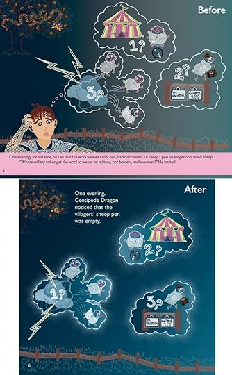
Here’s an earlier version of the final page 6 as an example. I’ve written that the sheep have gone missing. During the writing sessions, the question asked was, what happened to the sheep? At first, I said, “Who cares? Can’t I simply say they’re just missing?!” Then I realized this is a valid point that some kids might get hung up on. At the same time, if I write out the possibilities, it will stop the flow of the storytelling, and thus halt the plot from moving along at the brisk pace that little kids need to stay engaged. To make sure the story doesn’t get too slow and explain-y, there has to be some kind of compromise that gives the reader enough information as to what IS going on, without getting bogged down in explanations. So in the example, the reader gets a good balance between the statement of fact, that the sheep are missing, and what may have happened that led to their disappearance.
In the “Before” version, I also have Ben doing the “imagining,” as to what might have happened. This is not bad, but really isn’t necessary that we explicitly say that Ben does the imagining. The simpler “After” version is enough information to allow the story to continue along its way. But what do YOU think? Should Ben have stayed in this image?
Let the pictures fill in these gaps! What we’ve learned at various SCBWI (Society of Children’s Book Writers and Illustrators) conferences is that allowing the illustrator to run with an idea that you as the author sets up, not only allows the illustrator’s creative juices to flow, but is also the greatest type of collaborative process that subsequently shows in the final product.
Here’s an earlier version of the final page 6 as an example. I’ve written that the sheep have gone missing. During the writing sessions, the question asked was, what happened to the sheep? At first, I said, “Who cares? Can’t I simply say they’re just missing?!” Then I realized this is a valid point that some kids might get hung up on. At the same time, if I write out the possibilities, it will stop the flow of the storytelling, and thus halt the plot from moving along at the brisk pace that little kids need to stay engaged. To make sure the story doesn’t get too slow and explain-y, there has to be some kind of compromise that gives the reader enough information as to what IS going on, without getting bogged down in explanations. So in the example, the reader gets a good balance between the statement of fact, that the sheep are missing, and what may have happened that led to their disappearance.
In the “Before” version, I also have Ben doing the “imagining,” as to what might have happened. This is not bad, but really isn’t necessary that we explicitly say that Ben does the imagining. The simpler “After” version is enough information to allow the story to continue along its way. But what do YOU think? Should Ben have stayed in this image?
October 21, 2014
Getting back to basics
I wanted to go back to the topic I did on Sept. 23 about book dummies. In general, what we gain when making a dummy is learning how to pace out our plot so that all the action/interest isn’t clumped into a few pages of a 32+ paged book. We SEE clearly that when we physically separate out our text, even simply dividing the number of sentences equally over the total number of pages, we might realize that 5 sentences right in the middle of the book contain ALL the action. I then wonder how kids might even get there, and, why they would choose to finish the book afterward. I’m not sure I’d even make it to the action point, and I’m an adult with a supposedly longer attention span!
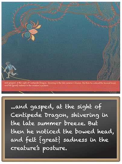
In the example, I wanted to show what happened when I tried this little exercise out. You will see there are 1.5 sentences included on this page, so good that there’s not many words on the page! However, there’s gasping and shivering and bowed heads and sadness…WOW, so much going on in less than 2 sentences! What one picture could capture all that?
For those of you who have the book, you know how I ended up resolving this issue. But this compartmentalization process not only can show you how you might need to “spread” the action or suspense out in some other way, but it also gives you a good way to define a focal point for each illustration.
More on this next week!
October 14, 2014
Taking it to the pint-sized masses
I had just a DYNAMITE experience last week when I did a presentation on Centipede Dragon to the Fairlington Mom's Group and their kids. The age range was a little younger than my book's target, I'd say there wasn't a kid older than 2.5-3 years old. BUT it was a great turnout and if there's anything I've learned, is that you never know who might become a fan!
In this ~3 minute clip, you will see the part of the presentation where I tested out a new activity on them...never did it before and so there were many variables for which I simply didn't know how would work out. And though it was a vortex of movement and chatter throughout, the kids were simply fantastic.
The biggest help was looking out at the attentive and supportive faces of the parents. I have already planned my next visit and activity with them. Thanks again Fairlington Mom's Group. I'll see you soon!
So, if you'd like to see this video, please go to: https://vimeo.com/108895776
October 7, 2014
The BIG picture: part 1
A signature of my book is its color palette, or, the collective color scheme chosen for illustrations. The feedback I have gotten about the colors are for the most part, fabulous…Hooray! Which is truly gratifying given the collage below: those are the original colors from when I began the book in 2005, which may have suited the one review that wanted to see brighter, bolder colors.
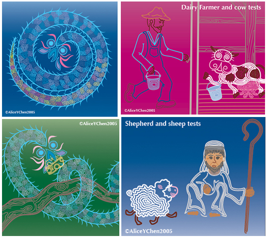
The accepted belief is that bold, contrasting colors capture young children’s attentions longer. So that’s where I started my color tests, having decided to gear my book to a younger audience. That’s one of many factors influencing color choices. Color is CRUCIAL to the overall tone of a book as well, for bold, bright colors are going to stimulate, rather than soothe or relax. Centipede Dragon’s story has some action and suspense, but it’s really a quieter book; would neon really convey that?
The style of illustration also influences color choice. Had I gone with a sketchy, undefined style, I likely wouldn’t have chosen to try out neon colors. Finally, LIKING the colors I choose is important too, because I’m going to be living with them for a LONG time.
In the end, I fell into my final color palette simply by testing color scheme after scheme, swapping out one for another, etc. Take a look at the bottom left corner of the montage, because trying that neon Kelly green was the turning point for me! Coupling that with how some colors “settle” into the background while others scream “Look at ME!” changed my final palette for the better.
Again, thanks to all who have written reviews….Keep them coming!
September 30, 2014
Reviews are NOT just for sales.
Thank you again to those who responded to my request for Amazon reviews! It’s the best advocate for Centipede Dragon, not to mention, a boost for me!
I wanted to talk about a recent review that brought up the question: could I have I meant for Centipede Dragon to represent the Earth, and the villagers mankind? And could the relationship between the two symbolize the interplay of how humans are impacting upon the Earth?
I must admit that this is a different point than the one I was originally intending! My idea was to convey how a sense of community instilled in us is beneficial to all of us, and that being caring is always a good thing whether you are rewarded or not. When Ben and Ariel come to Centipede Dragon’s aid, their actions are instinctual because they understand it is the right thing to do. Furthermore they have no expectation of a return. This particular review definitely highlights a timely topic, as we face numerous environmental crises. I’m not sure how I’d incorporate this theme but I like the idea of trying!
So how would YOU envision a storyline addressing environmental issues with Centipede Dragon? Would there be a draught in which the solution could be to plant crops that require little water in order to feed the villagers? Or would it address ways to conserve water, cleverly disguised within a story?
I am really touched by the thoughtfulness of these reviews, and I LOVE watching the review sections on Amazon and goodreads grow!
September 23, 2014
Who’s a DUMMY?

Before I get to a thought-provoking review I received recently, I want to talk about another step in producing a children’s book: making a dummy.
A what?
Take half as many sheets of paper as the number of pages for your book, stack them, fold them in half, and staple at the fold.
Now with this mock book, divide your text over the pages. And guess what? You have a dummy!
We have accomplished a lot more than you think. A dummy helps us work out the pacing of the action in the book, so that all the action isn't bunched up in 4 pages of a 32-paged book. Dummys also give us a sense of where we can create suspense and tension, to keep the reader turning the pages.
You likely begin your story with setting the scene and introducing your characters. Then you introduce a problem. Then the problem comes to a crisis point. Then there’s the “A-HA!” moment where the problem is resolved, and finally, there’s the wrap-up. This general storyline arc is like a bell-curve of action, but it doesn’t mean that all action takes place at the top of the curve. The dummy helps clarify how changing the placement of information can have a great effect on the storytelling.
Here’s my first formal dummy made in Feb 2012, where I also started generating images to go with the words that were on that page. As you can see, A LOT changed in terms of location of imagery within the book, but what else can you see that I’m working out with this dummy?
September 16, 2014
What’s in a name?
Did anyone notice that my maiden name, Alice Y. Chen, is on the cover of the book? Anyone do a double take?
Along with the 2,479(ish) other decisions to be made in the creation and production of this book, my name also became a significant decision. I started this book when I was Alice Y. Chen, back in 2005. I finished this book in 2012, years after I got married.
Why are names important? How important is it to attribute the work one way or the other? I chose to take my husband’s name to “be” a part of his family, but I included my maiden name in my legal name, so that I’d still have that identity associated with me.

So, why else are names important?
The answer for me surprisingly, is LEGACY.
I have thought about what I will leave behind, on behalf of the family who raised me. All of my father’s male siblings had daughters. So I realized that this generation may see the end of my father’s surname, and that made me a bit sad.
So here is my humble “legacy,” a crazy idea in the form of a children’s book!
Along with the 2,479(ish) other decisions to be made in the creation and production of this book, my name also became a significant decision. I started this book when I was Alice Y. Chen, back in 2005. I finished this book in 2012, years after I got married.
Why are names important? How important is it to attribute the work one way or the other? I chose to take my husband’s name to “be” a part of his family, but I included my maiden name in my legal name, so that I’d still have that identity associated with me.
So, why else are names important?
The answer for me surprisingly, is LEGACY.
I have thought about what I will leave behind, on behalf of the family who raised me. All of my father’s male siblings had daughters. So I realized that this generation may see the end of my father’s surname, and that made me a bit sad.
So here is my humble “legacy,” a crazy idea in the form of a children’s book!


