S.L. Dunn's Blog, page 2
May 27, 2014
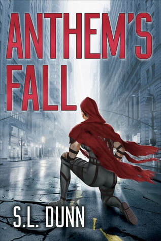
Cover Evolution Pt. 6
Once the illustration was completed, it was time to turn it into an actual cover. Because Anthem’s Fall is the first book of a series, the font I chose was important. It would be represented on future covers as well, so it wasn’t just about choosing a font for Anthem’s Fall, but for the whole series.
I started looking for fonts on websites like Dafonts and others of the like, but nothing caught my eye. Every font felt either too simple or too impractical. Since I already had such a quixotic illustration, I wanted to ground the cover with a straight lined, simple font.
Eventually I stumbled upon Leonardo Gubbioni’s BUILDING typeface, and I knew at once I had found the winner. After reaching out, he allowed me commercial permissions for free—very generous. This step was also completed with the help of Laura Duffy, and without her I would have been utterly lost. Here are some examples of the iterations leading up to the final.

Also some updates on the Anthem’s Fall warpath:
Excerpts read (Wattpad, Scribd, my website, some others): 785
ARCs distributed to reviewers: 62
Goodreads: 326 requesting giveaways, added by 190 as “to-read”, 10 reviews (4.4*)
Farthest geographical reach: New Zealand! (that one might be tough to beat)
Not bad for a book that’s two months away from publication! June is going to see a lot more giveaways, so stay apprised!


May 21, 2014
Cover Evolution Pt. 5
Having settled on a broad theme for the cover illustration, it was now a matter of honing down specifics. I had come to terms with the fact that there was no such thing as a “perfect” cover. But there was a “right” cover, and I was on the track to find it.
To reiterate the points of previous posts, there were a few basic goals for this envisioned illustration (an illustration that would eventually come to represent the entire novel):
1 ) To create a “money shot” image that stood out among others, (especially in thumbnail). Given the choice, I would have preferred it to be too loud than too understated. The goal is to catch attention, nothing more.
2 ) To have that image convey a sense of the novel’s overall tone. The book description talks about a world called Anthem being destroyed by machines. There’s also mention of an entrenched young scientist named Kristen working on a strange new technology. These are well-established premises in the genre. Nothing new. It would therefore have to rest solely on the cover illustration to elevate the tone of those messages and leave the implication that there is something more to Anthem’s Fall. In other words, Anthem’s Fall isn’t merely a story about an advanced empire’s collapse or a scientist in New York working with a dangerous technology. The real story is the collision between those two plots. And the goal of the cover was to capture this collision front and center.
The hope was to create an image that was recognizable yet unfamiliar—just like the novel itself.
Here are some of the drafts that were involved in taking the idea and translating it into an image. The final illustration (on the right) was the brilliant work of Tim O'Brien.

May 16, 2014
Cover Evolution Pt. 4
I loved the eye from the earlier post. It was a great visual to accompany the manuscript, but there were two critical issues.
1) It screamed “attack of the killer robots”, which was not a sentiment I wanted to convey on the cover.
2) Currently, there are about twenty thousand novels on Amazon featuring an ominous blue eye. A cover is about standing out, not fitting in.
It was back to the drawing board. I needed to formally decide what type of illustration I wanted on the cover, so I made a list of thematic images that could work. Most of these will have little relevance to someone who hasn’t read the novel, but oh well. The “final cut” list was as follows:
1) Kristen sprinting with backpack in NYC intersection
2) Gravitas touching down
3) A broken spearhead (*still my favorite one, but ultimately not feasible)
4) Shadowed blonde woman standing in flames. Blue eyes through the fire.
5) Close up of the Blood Ring with a drop of blood on it
6) Vatruvian cell/Double helix design
7) Huge person (Hoff/Darien) standing in otherwise normal city
They all speak to a different aspect of the novel, and the dilemma was deciding which facet to choose for the critical first impression. What made the situation even more difficult was that first drafts of cover illustrations are hard to envision in their final form. The process starts with copy and pasting stock images to create a template, and then going forward one adjustment at a time. This translates to a situation where it’s ultimately impossible to develop upon more than one basic idea at a time.
Here’s some proof. You can see here (and ultimately in the final cover) that I ended up choosing Gravitas for the final illustration.
[image error]This was the starting point for the final illustration, and it ultimately evolved into an image I liked. Next post I'll show the evolution it went through.
May 14, 2014
Goodreads Giveaway!
First chance to get an advance reader copy of Anthem's Fall !! What a great excuse to start an account on Goodreads if you don't already have one!
Goodreads Book Giveaway
Anthem's Fall
by S.L. Dunn
Giveaway ends May 30, 2014.
See the giveaway details
at Goodreads.
Enter to win
May 12, 2014
Cover Evolution Pt. 3
My first foray into cover design was a massive disappointment. I knew that Anthem’s Fall needed a strong, thematic cover. It would be an absolutely essential component of the “book package”. But after last post’s versions, along with a few others, I realized that I wasn’t looking for cover design at all.
Not yet, at least.
I was looking for an image, an illustration. I didn’t need a nuanced cover (like last post’s versions). What I needed was a money shot to grab a potential reader's impression. An illustration had to come first—a big, bold, in-your-face illustration. An evocative and thematic work of art would anchor the cover in the sentiment I wanted to convey. Then I could worry about turning that illustration into a final cover.
This realization sent me on a path that ended up taking a LOT of time. I needed to find an artist. In hindsight this was a much more difficult task than I first would have thought.
Where to begin?
My search started on Deviantart.com, Behance.com, Pinterest, and gallery collections. I more or less roamed any online art assemblage and made a long list of artists whose style I thought might work. I also perused book covers that I liked, and hunted down the names of the artists who created them. Very few publishing houses actually hire in-house artists, so most of the illustrators who do cover art (even for the biggest publishing houses) also do freelance work. The right illustrator was out there, it was just a matter of finding him or her.
Remember, this final artist wasn’t being hired to paint a surrealist piece for my living room. I needed a clear, simple and commanding illustration that would translate well to thumbnail. Over many months, I worked on several types of drafts with different artists.
Here is one example.

May 9, 2014
Cover Evolution Pt. 2
When I finally neared the end of editing and rewriting Anthem’s Fall, it was time to contact a cover designer. Covers are unbelievably important to novels—especially debut novels. When you think about products that generally cost under $10, the novel is an outlier. Unlike most other products in that price range, (a sandwich, a pint of beer, a taxi ride) a book is a product that a given reader will spend hours upon hours engrossed in. Among $10 (or in the case of e-books, $3) purchases, a novel represents a gigantic commitment of time. And when searching for a new novel and weighing out the awareness of that commitment, what does a reader look at?
A blurb, some reviews, the first few sample pages, and the cover. The cover is the only part of the book “package” that isn’t words. Consequently, the cover is a unique opportunity to make a promise to the reader of what lies within the pages.
Think I’m overvaluing the art of the cover design? Check this out…

www.thewrap.com www.awesomenator.com www.techeblog.com
Yeah they’re movie posters, but the idea behind them is the same. What can you infer from these assemblages of movie posters? There are rules! Think about it…you can say in the blink of an eye what each of these three poster-schemes represents: thriller, art house, and superhero.
There are rules that movies with multi-million dollar marketing budgets still adhere to. And there are rules with book covers too. Those rules culminate to…target your audience!
Anyways. Back to my own process.
I didn’t know what to expect as I began my own cover creation, and it was hard to envision what a final product would look like. I knew I had to target my audience, but at the time I couldn't quite decide who my audience was. After a lot of searching, I got in touch with a designer who had done some covers I liked. I took the plunge and sent him a copy of the whole manuscript, a ten page synopsis, a three page synopsis, a pitch, and some notes. These were the first two drafts we created in succession. It was a starting point, but I ended up going in a completely different direction.

May 7, 2014
Cover Evolution Pt. 1
In the spirit of kicking things off, I want to show how the cover illustration of Anthem’s Fall evolved through time. The final cover (as seen in the "books" section) took a lot of planning and consideration. Breathing life into my story with words was a challenge, but creating a singular image that could encapsulate all of those words seemed practically impossible. It wasn’t a 1-2-3 step process to create the cover for Anthem’s Fall, and over the next week or so I will release the different iterations and drafts in daily installments.
In the end, I'll write a post that explains what my logic was for each progression, and what my goals were throughout the process.
These first two “eye” images were the work of Matt Sheridan, one of my beta-readers. For a very long time, these were some of the only tangible visuals that were attached to my growing manuscript. They were a game changer when I first saw them—at long last there was something to look at! I still think they’re beyond epic.

May 5, 2014
Welcome!
Hi Everybody,
Thanks for checking out the website!
Presumably most of the people coming here at this time are friends and acquaintances I know in real life. I’ll address the 800-pound gorilla straightaway:
Yes, I wrote a novel. Yes, my pen name is S.L. Dunn.
Onward . . .
Here you’ll find everything there is to know about Anthem’s Fall as the summer release date nears. I suspect it will be interesting to follow Anthem's Fall over the next few months. If you’re reading this blog currently, this is a rather unique opportunity for you to check in every now and then to track the progress of a young debut novel. To draw a comparison to a tree, most of the novels you’ve probably come across are already fifty feet tall and several decades old (as in, they have already found a niche, already have fans who have suggested the novel to you, and have a lot of attention around them). Anthem’s Fall is a seedling—a rarity for better or worse for most readers.
I don’t intend on hiding much about Anthem’s Fall or what I’m doing on a day-to-day basis as I try to spread the word about it during these next few months. My goal is simple: to reach as many readers as possible. I'll be doing lots of giveaways as the release date nears, so don’t be a stranger. If you’re tenacious, I suspect it won't be difficult to get your hands on a free advanced-reader-copy (ARC). If you’re after an e-book, you won’t need much tenacity at all—just shoot me an email and I’ll see what I can do. I want Anthem’s Fall to be read—the sooner the better—so if you’re perusing this website and finding yourself intrigued, reach out.
Being my first post, I’ll embrace brevity and leave it at this for now.
Thanks,
Sean