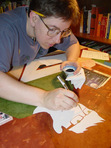
Sue Clancy's Blog, page 33
December 2, 2018
portrait commission of two cats
This time of year most of my art commissions are gifts and are top secret. No blogging about them. Well this time a couple asked me to create a double portrait of their two cats and since it’s a gift to themselves they’ve let me blog about it! (Happy Holidays to all of us!) Here’s how it went:
In September Sue and Dean asked me via Caplan Art Designs, my Portland gallery, to create a double portrait of their two cats. They were pretty sure they wanted it to be 12 inches by 18 inches and on handmade paper to be framed.
A time to meet to discuss the commission was arranged and my wife, Judy, and I went to dinner at Sue and Dean’s house. I brought an example of the 100% cotton handmade paper that I’d use at the size they’d requested and a few other sizes just in case. I also brought my camera, a note pad and an extra pen.
After we’d been there a short while the cats came out. So did my camera. As the cats got used to me, and over the evening, I took over 41 photos of them. Here are two of the photos I took.
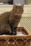
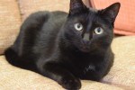
I asked questions of the humans about the cats favorite places, toys and habits. I asked questions about the humans favorite places, drinks and memories. On my note pad I wrote down the answers. Where possible I photographed the answers . For example on of my questions was: “What drink do you reach for most often when you want to relax? And what kind of glass do you have it in?” Here was the answer:
[image error]
Generally we just talked about one thing and another. You know, dinner party talk. I asked questions, kept my ears open, and my notepad ready for recording things that might be relevant to the commission. I like to include in any pet portrait elements from the humans’ lives: favorite objects, drinks, food, anything that sparks pleasant memories. Helpfully, Sue and Dean both volunteered lots of information about themselves such as a favorite artwork that was meaningful to them.
[image error]
They told of past travels that were particularly memorable. Famous people they’d met in Hawaii. All kinds of things were talked about and without interrupting flow I asked more questions and made as many notes as I could. Without being too obvious I also looked around their house noting colors and patterns, writing those notes down too. This is what I call the “data dump” phase of a commission. At this point I have no idea what information will be relevant for the final artwork.
We relaxed into the evening; just talking, having a very yummy dinner with a good wine. Slowly as Sue and Dean talked I began to get ideas… The cats got comfortable too and began doing their “normal” behavior.
Ollie likes to sit in a basket that holds magazines. Tony likes to sit on the couch and watch Nature on television. The cats behavior prompted me to ask which human had the magazine subscriptions (Sue did) and what magazines were favorites. Dean has worked in technological fields…so technological advances (including TV) were discussed..
Later in the evening I floated a general portrait concept: Ollie reading magazines and Tony watching TV…perhaps the basket Ollie likes so much could become a “table” in the artwork, perhaps… They both seemed to like my concept direction. They verified the size of artwork they wanted. I said I’d send them, via the gallery, a sketch for their approval before I began the finished artwork. We enjoyed a bit more conversation (and wine) – I glanced at my notes and racked my brain to make sure I had all the data I needed – and then we said our good-nights.
In the driveway pulling away from their house about 9:30pm I texted the gallery owner with the gist of what size artwork Sue and Dean wanted etc. Then my wife, Judy, and I discussed the evening in the car as we drove home. I still had my note pad out and was writing notes in the moving car by flashlight. (Judy was driving.)
Occasionally it had happened during the evening that I was talking with Sue in one room while Judy was in another room talking with Dean. So Judy filled me in on what I’d missed. At this point I am still in “data dump” mode. I have a rough direction for my design. But the details are very fuzzy. (Over the many years I’ve done special commissions this kind of uncertainty is normal and I trust it as a part of the process.)
The next day I went over my notes and began making 4 x 6 inch size thumbnail sketches. Over several weeks I did this; going over my notes and photos, drawing possible poses of the cats, possible objects, considering composition and colors. I also showed my sketches to Judy discussing the possibilities. At one point Judy said that they had both talked of Nova Scotia, Newfoundland and Hawaii enough that she was sure that they were important. I agreed and adjusted my drawings so that a reference to those travels was emphasized. Slowly an idea began to come together in the small thumbnail size anyway. What works visually at a small size doesn’t always work at a larger size but it’s a place to start.
On my easel I put the 12 x 18 inch handmade paper. Then I covered that with tracing paper and drew a grid (you can see it in the photo below). Then I put tracing paper over the grid and drew one of the thumbnail ideas to that scale. Then another tracing paper was put over that and that drawing tweaked…. And so it went, with multiple tracing paper overlays and re-draws, for a week or more. Tweak, tweak, tweak, until I had something I felt good about. The “good drawing” I sent to the gallery and to Sue and Dean for their approval. Here is what I sent:
[image error]
They approved the drawing! Yippee! I did a happy dance and then I got serious about colors.
Upon arriving home after the dinner with Sue and Dean I had gotten out one of my interior design color swatch books. Flipping through the pages I found a couple of color spreads that I felt had the “vibe” of Sue and Dean’s house. I showed the pages to Judy to get her input. With those interior design book pages as a rough guide along with my photographs taken inside their house I began mixing colors and making color notes. I used my thumbnail drawings to play with color schemes too, painting blobs of color here or there. Anyway, here’s a photo of the interior design book page as well as a few pages of my sketchbook color notes. I did 6 pages of color notes but this one photo will give you the idea.
[image error]
As I decided on the colors I made pencil notes on the approved to-scale drawing where the colors would go. You can see some of this in the photo above.
Then I began on the finished artwork. The actual painting took about 10 days start to finish. As I say often – the sketching/drawing/planning is where the bulk of creation happens. I transferred the approved sketch/drawing to the handmade paper I intended to use for the finished artwork. Then I began to make tiny adjustments to the drawing directly onto the handmade paper in prep for painting. I also discovered gaps in my visual data base.
For example I realized that I didn’t know what the back of a vintage TV set looked like. Not well enough to paint it in detail anyway. Fortunately there are some vintage shops where I live – so a few visits downtown with my sketchbook and the problem was solved!
I also realized that I had an opportunity to make a portrait of Sue and Dean on the front cover of the “magazine” that Ollie, the cat, would be reading in the finished artwork. So I asked for, and got, a picture of the couple that I could use as a reference photo. From the photo I did several pencil drawings on tracing paper to design the magazine cover and to get the humans to look like themselves. I drew until I had a cover design and human portrait that worked. Here it is:
[image error]
Once I had the magazine “cover” drawing ready (drawn to the scale needed in the artwork) I transferred it to the appropriate spot on the handmade paper. At another point I realized that I could include the stain glass windows I’d seen in their house as part of the “back cover” of the magazine. But I hadn’t gotten photos of the window when we visited for dinner. And neither Judy nor I could remember the exact details of the windows. So I contacted Amy at the Caplan Art design gallery and she helped fill in the missing data! Whew!
Here’s what the finished artwork “Ollie and Tony” looks like. I’ve photographed it as it was on my easel when I finished it, so you can see the four deckled edges of the handmade paper. I used acrylic, gouache, watercolor and ink.
[image error]
I sent the photo of the finished art to Amy the gallery owner to let her know it was done. Then I spray varnished the piece with a removable varnish that has UV protection in it.
When that was dry I contacted Amy and arranged for a time to deliver it to the gallery. The date was set and the varnish dry so I slipped the artwork into an archival plastic sleeve and into a cardboard portfolio to protect the artwork from being bent on its travels between my studio and the gallery or between the gallery and the framer. (It rains in the Pacific Northwest – so artwork needs all the protection it can get.)
We delivered the artwork to the gallery and as a nice surprise Sue and Dean were there! Here we all are looking at the artwork and talking about it:
[image error]
Amy will take the artwork to the professional framer the gallery works with and have the art floated on a neutral mat, with spacers so the artwork won’t touch the glass. It will be given a simple black frame.
What a fun project!! I love getting to make highly personal and meaningful visual stories like this! Thank you!! And thank you, Sue and Dean, for letting me share it on my blog!
Happy Holidays Everyone!!
December 1, 2018
recipe illustration progress plus studio secrets
As you know from a recent post (here) I’ve been working on a new recipe illustration project for Chef Sebastian Carosi. I’ve spent the most time designing a character who is doing the recipe “action”. It was a challenge to create a cannabis leaf character with “hands” holding things. But I did it! A photo of my progress is below…
When I’d illustrated Chef Kim Mahan’s recipes and we did a cookbook signing event together the question I was most often asked was “How do you keep your hand steady to handwrite all the recipe text?” The answer is shown in the photograph below that also shows my progress on the current recipe project for Chef Carosi.
Can you see what it is?
[image error]
Yes. A mahl stick. That’s my big studio secret. It steadies my hand both for painting and writing.
However I do something with my mahl stick that I’ve not seen anywhere else. I added a piece of foam pipe insulation that floats freely on the stick – so my wrist slides easily back and forth along the stick as the stick is held steadily in a position. When I’m writing text I need to be able to move my wrist a little along but stay on the same line. When painting sometimes I need to make a long stroke. Either way the foam moves smoothly with me down the length of the stick held in one place.
My mahl stick is hand made. You can buy a mahl stick but I find it easy enough to DIY.
To make mine I cut a small 2 inch portion of foam pipe insulation, taped it to the end of a 36 inch dowel rod, then wrapped that end, completely covering the taped 2 inch foam bit, with a scrap of canvas tying it to the rod so that no canvas fabric ends trail/drag.
The remainder of the foam pipe insulation, about 12 inches in length, was slipped onto the dowel rod. In the photo below you can see the wrapped end of my mahl stick and see how loosely the foam pipe insulation wrist rest is on the rod. The other end (36 inches away!) has a hole drilled in it and a cord looped through it. It hangs on one of my art easel knobs when not in active use.
[image error]
Okay. So the only time my mahl stick is not in active use is when I’m eating, reading or sleeping! Lol!
And now you know.
November 28, 2018
thumb use – an illustrated poem
Thumb Use – By Clancy –
Sissy had extra-large thumbs.
So she cleared the table of crumbs
saying “What else can you do,
in the absence of stew,
but make excellent use of your thumbs?”
[image error]
gouache illustration by Clancy
November 20, 2018
Thanksgiving and The Arts
I remember being told, as a young person, that the arts were “not practical”. Today I thought of 8 ways, both serious and silly, that the arts are useful on Thanksgiving day.
Culinary arts: Making food is considered one of the “fine arts”. Even if the kitchen looks like this: Funny Cooking Fails Compilation | AFV Funniest Videos 2018
Sculptural arts: The Macy’s Thanksgiving Parade Costumes are made by artists in the Macy’s Parade Studio . Over 50 million people had the parade on the TV during their 2017 family holiday. A link for watching the Macy’s Parade in 2018 is here. An on the parade topic, even though it’s film animation, here’s a Cat Parade.
Musical arts: A background music playlist of “20 best Thanksgiving” songs here. And then there’s a funny video of when Dad sings…. Lol!
Visual Arts: Arts and crafts projects to entertain the kids while the adults drink, I mean cook. Here’s a video of some cute kids who had lots of fun with an art project until…oops!
Arts and craft mess clean up techniques (aka Art School 101) outlined here. Btw: I’ve successfully used rubbing alcohol to get marker ink off of wood surfaces and crayon marks off walls. And in this video an adorable kid has Art School 101 down… too cute!
Photographic arts: Here’s some real tips for taking family photos. And here’s some funny dog photos.
Story arts: Serious tips for telling stories here and here. And then there’s a funny video of Grandpa telling a story… here. But Grandma decided to tell her story using the medium of dance… lets watch!
Decorative arts: Here is a silly video of a dachshund decorating … But more seriously Spoonflower is one of my favorite sites for artist-created materials for things such as napkins and table cloths. Below is a photo of a table runner I designed. It looks good with some candles or a wooden bowl with fruit or nuts as a centerpiece. I also think it’d be fun visual joke to put tiny clean, cute birdhouses… and/or some small woven baskets with candy eggs in them, as centerpieces on my “autumn leaf” table runner. But then I’m warped like that.
[image error]
Autumn Leaves pattern design by Sue Clancy https://roostery.com/p/minorca-table-runner/6316427-autumn-leaves-by-sueclancy
Anyway if anyone ever tells you that the Arts are not practical – don’t believe them.
Happy Thanksgiving!!
November 18, 2018
agatha and art
I’ve been reading “Appointment With Death” by Agatha Christie. By page 7 I was rooting for the murderer to go ahead and kill. It’s the villain who deservedly gets killed in this story. While reading I realized that I so strongly disliked the villain and rooted for her demise because of her cumulative (negative) effect upon other (positive) characters more than any one thing the villain said or did.
I realized again that in visual fine art a viewer reacts to the subject of the artwork because of the cumulative effects of the objects, colors, and shapes that surround the subject as much as they react to the subject itself.
There’s an art technique called “positive and negative space in art” where you pay as much attention to the negative spaces, the blank “air” spaces, that surround a subject as you pay to the positive spaces of that subject.
In reading this particular book by Agatha Christie I realize at a deeper level why the writers technique of “show don’t tell” is also true in fine art – we best understand, or perceive, a subject, from the surrounding elements.
[image error]
November 15, 2018
still a character
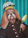
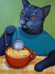
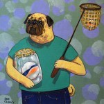
Here are a few of the artworks I’ve recently sent to Joseph Gierek Fine Art (www.gierek.com) for the upcoming Holiday Art Show. I’m sure you’ll notice my “still life” object practice work now combined with characters. Yes, I’m trying to make every element count toward the visual story. You know, like a writer tries to make every word count.
November 9, 2018
shipping art to joseph gierek fine art
Been busy packing and shipping an art exhibit’s worth of my artwork to Joseph Gierek Fine Art (link here). I’m feeling like Santa and the elves in the North Pole workshop. I’ve made the artwork, I’ve carefully sandwiched each artwork between thick sheets of cardboard then delicately wrapped everything in bubble-wrap with love. Now to load it onto the sleigh…
And off you go my precious… may you bring cheer and laughter to all.
[image error]
November 7, 2018
new recipe illustration project
As you know I’d illustrated some of Chef Kim Mahan’s recipes. Well another chef – Chef Sebastian Carosi – saw the work I’d done for Chef Mahan and asked me to come to a photo shoot today. So I went and drew pictures of Chef Carosi’s Roasted Butternut Squash Soup – as it was being professionally photographed.
I took my favorite waterproof ink pen, my watercolors and some paper. I drew and painted – a lot – while dodging to keep out of the way of photographers, assistants and Chef Carosi, who was doing last minute soup garnishing just prior to placing a beautiful bowl of soup under the bright photographic lights.
Here’s a couple of pages of what I did – and a bit of the equipment I did it with:
[image error]
I did many more drawings than what is shown in the photo. During a break the Chef and I talked about what I’d done… He liked my “soup as a sunset” visual story/metaphor. But he really likes my hand-written recipes and characters. So in my studio I’ll do a redesign and create a “character” out of one of the ingredients and hand-write the recipe data.
We finished up the photoshoot (and I did more drawings) and then we all ate soup.
Oh my!!!! Smooth, creamy, earthy… like a hug for tummy and soul. Now how to translate THAT into artwork???
Anyway here’s a link to Chef Sebastian Carosi – he likes to use locally sourced ingredients, some from his own garden, some foraged from the local PNW landscape and some purchased from local companies like Jacobsen Salt and Fairwinds. There was also a local cheese that we sampled. I meant to look at the wrapper or at least ask again for the name of the cheese maker. But in the fast-paced photoshoot food-illustration event I forgot.
Sigh.
Still it’s been a delightful day of drawing soup and soup ingredients and meeting new people! What fun!
Will draw more soup tomorrow…
November 3, 2018
books and creativity
It’s been my experience that one’s reading is the fertile soil from which all other creativity grows. So I find books like this one, “1000 Books To Read Before You Die” by James Mustich, an essential art studio tool.
The Mustich title is especially useful as it’s more like a restaurant guide than most “read-this” books; the suggested titles are sorted alphabetically by author, there are readable book note details about the genre/subject, when it was written, and other notable works by the author are listed. A “further reading” section about the author’s life and work or on the book’s subject is included. There’s a “try this” section listing other books by other authors suggested for the reader if they enjoyed the featured book. Helpfully “adaptions” of the featured title are also noted: films, plays, musical compositions and audio books. Hints are given whether you could read the book “in a sitting” or not. There is also a section of Mustich’s book that lists books sorted by genre/section: my favorites (so far) are “Lol”, “Mysterious Matters”, “Soul Food” and “Animal World”.
I find all of this pre-sorted book sorting helpful by making it easier to find books related to my creative topic. For example I’ve been reading books about objects lately since I’ve been doing some still life paintings. So yes, that has meant reading Marcel Proust and John Ruskin among other authors.
As you know I’ve been doing both food themed fine-art paintings as well as several food-recipe illustrations – so reading mystery novels that have food in them has been a good way to keep the “creative fun” going in my head while I wait for paint to dry. BTW, I found an online source for culinary themed mystery novels; https://www.cozy-mystery.com/blog/cozy-mystery-authors-with-culinary-themes-part-1.html)
One of my favorite things to do is sit for an hour or so before bed and read with my beverage of choice handy. If you follow my Instagram page occasionally I post what I’m reading and what I’m drinking. While it looks (and often feels) like pure indulgence I’d say that my time spent reading is one of the most important things I do to develop and maintain my creativity.
Anyway, here’s a photo of the book by Mustich – alongside one of my favorite wines by Burnt Bridge Cellars. And, don’t worry, I was sharing the bottle of wine with my wife… 
October 26, 2018
paint to learn a pomegranate salad
At a friends house recently we were served a spinach and pomegranate salad. It was yummy and something like this recipe here. As I ate I realized I’d never looked properly at a pomegranate. I also realized I didn’t know cut one open. So later, back at my studio, I found an instruction video here – then I got some pomegranates and began looking and painting. This is what I did:
[image error]
“Oh Seeds!” – by Clancy – 5 x 7 inches – gouache and acrylic on board, framed.
[image error]
“Shared Seeds” – by Clancy – 7 x 5 inches – gouache and acrylic on board, framed.
After the paintings were done (and the pomegranates added to my salad) I submitted the artwork for consideration to the gallery. They were accepted so I framed them and delivered them along with 10 other small pieces for a “Small Works Holiday Group Exhibit” at Caplan Art Designs the months of November and December. www.caplanartdesigns.com
All in all not a bad way to learn how to make a salad!

