
Loni Townsend's Blog, page 38
February 7, 2014
Featured Photo Friday
It’s been a bleak, wintry landscape over here this past week. To remedy that, I bring you water colors!

This is me trying out different angles instead of a straight on shot. My daughter is a wild artist. Tie-dyed strips of glued together paper seems to be her favorite creation as of late.
The post Featured Photo Friday appeared first on Squirrel Talk.


February 5, 2014
IWSG: Chasing Dreams
 The Insecure Writer’ Support Group‘s purpose is to share and encourage. Writers can express doubts and concerns without fear of appearing foolish or weak. Those who have been through the fire can offer assistance and guidance. It’s a safe haven for insecure writers of all kinds!
A decade ago, I watched the movie Cheaper By The Dozen staring Steve Martin. I thought it’d be funny. I may have smiled through parts of it.
By the end, I hated it.
The message I walked away with was you must choose between your dreams and having a happy family. Having both wasn’t an option.
Thanks to that movie, every time I open my laptop and start writing, I hear a niggling voice in the back of my head. You selfish, wretched woman. You’re neglecting your children. You’re going to destroy your family!
Thanks, Cheaper By The Dozen. You’ve ruined me.
Everything takes sacrifices. Sometimes dreams and family clash. I can’t type a chapter and play puzzles at the same time. It all boils down to priorities. Maybe that’s why I only average 900 words a week.
Does that type of writing guilt ever plague you? How do you handle it?
The post IWSG: Chasing Dreams appeared first on Squirrel Talk.
January 31, 2014
Featured Photo Friday
This one is a bit abstract. We recently replaced our shower curtain. The water caught the light just right. I decided snag my phone and snap the picture. Don’t worry, I avoided getting my phone wet.

What do think? Do you like abstract art? What pictures inspire you?
The post Featured Photo Friday appeared first on Squirrel Talk.
January 29, 2014
Typography: The Ellipsis
These three little dots confuse the heck out of me. I’m never sure when to follow the ellipsis with a period. If the thought is drifting off (not interrupted), and then switches in the next line, do I end it with a period?
It was as if …
Derek looked to the side. No, it couldn’t be!
Since technically, the sentence ends, do I follow it with a period? I’m never sure.
Stylistically, Butterick says the three manual dots with the space in between is wrong.
Whoops.
I found it an issue because in Garamond—which is the font I chose for the printed version of my book—the character looks ridiculously tiny and compact. In my opinion, it didn’t look good. (Hrm, it might have been my oh-so-handy auto correct making it ugly. The auto correct periods were smaller than regular periods.) So I opted to use periods and non-breaking spaces (CTRL + SHIFT + SPACEBAR).
The non-breaking spaces appear as open circles when you have formatting marks turned on, while breaking spaces are black dots:
But then the ellipsis mark looks weird when I follow it with a period:
But am I even supposed to follow it with a period‽
Since I went with the non-breaking space in word, I decided to go the same route in my ebook, meticulously changing out my … with . . . (By meticulously, I mean search and replace.) Of course, then I went through and made sure that any sentences that did end in punctuation (like a question mark), also had a between the last period and the punctuation. It was a pain in the rear, and all the while, I questioned the need for the closing period. In the end, I decided to delete them. I didn’t consult my editor on the decision, so if it’s wrong, I have no one to blame but myself.
Using the … would have been easier.
I am currently reading an ebook that did not use either the … or the method, and I’ve seen a period or two get wrapped to the next line. Since I was reading it on my phone and not my Kindle, I could imagine it looked just fine on the other device.
Some characters may translate over, depending on what software you are using to create the ebook. If you’re going at it on your own, here are a few I found helpful:
EM dash – —
Left single quote – ‘
Right single quote – ’
Left double quote – “
Right double quote – ”
What’s your opinion about the periods and ellipses? Do you have any characters you struggle with?
The post Typography: The Ellipsis appeared first on Squirrel Talk.
January 24, 2014
Featured Photo Friday
This featured photo had me grinning as I took it. I debated on different names for it. I settled on: Ignorance Is…

I’ve added a lightbox plugin to my WordPress, so the image should open in a nice dialog now. You won’t be redirected to Flickr anymore.
It turned out grainier than I’d like, but I am doing my photography with a smart phone, so I can’t really complain too much. My husband keeps offering to buy me a “real” camera, but the phone is so darn convenient because I always have it nearby.
My buddy Marlie said it’d be a great marketing shot.
Anyone got any good marketing quotes?
The post Featured Photo Friday appeared first on Squirrel Talk.
January 22, 2014
Typography: Becoming a Better Writer
I’ll admit it.
I judge based on looks.
I was given a book around Christmas time. After a quick flip through, I winced. The book was blatantly self-published.
Now, I’m not saying I’m a pro when it comes to book publishing—far from it. Everything I know, I’ve learned through self-study. But even to my untrained eye, some things stood out. The book, which I have yet to read, has a mix of serif and sanserif fonts within the body. That’s a bit jarring for a genre novel. I’m sure the writer/publisher had a reason for this, but my immediate reaction was distaste and rejection, along with an embarrassed thought of “this is why people snub self-published books.”
Yes, I am a snob.
I’ve spent this past week studying typography, and I’ve come across a wonderful resource. I pass on to you Butterick’s Practical Typography. It’s an online book and it’s given me some new perspective, which really shouldn’t have hit me as hard as it did.
Attention is the reader’s gift to you. That gift is precious. And finite. And should you fail to be a respectful steward of that gift—most commonly, by boring or exasperating your reader—it will be promptly revoked.
Source: Matthew Butterick, http://practicaltypography.com/why-does-typography-matter.html
Okay, boring and exasperating my reader has to do with the writing, right? So how will typography make me a better writer?
Good typography can help your reader devote less attention to the mechanics of reading and more attention to your message. Conversely, bad typography can distract your reader and undermine your message.
Which is exactly what my gifted book did to me. It distracted me.
If you’re going at self-publishing on your own, definitely read Butterick’s book before you do. Butterick compares typography to job interviews, where applying bad typography to your writing is like dressing inappropriately for a job interview.
What about you? Have you come across any books or articles where what you see is detrimental to what you’re trying to read?
The post Typography: Becoming a Better Writer appeared first on Squirrel Talk.
January 17, 2014
Featured Photo Friday
I titled today’s selection Romance Writer.
I have a slight obsession with notebooks, particularly leather bound ones. I received a new one, plus the awesome metal feather pen (it came with it’s own ink well *cheer*), from my sis-in-law for Christmas. The rose was courtesy of my super sweet husband.
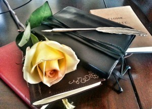
What do you think?
Any quote suggestions?
The post Featured Photo Friday appeared first on Squirrel Talk.
January 15, 2014
Typograwhat?
If you’ve followed me for some time, you’ve probably seen me mention The Book Designer. Halfway through each month, Joel has a post about e-Book cover designs. I’m always looking for ways to improve, so I submitted Thanmir War for December’s collection.
Joel will make comments just below each cover if he has them, and that is what I was hoping for. I’m about halfway down the page, and there are a lot of submissions, so it might be easier just to CTRL + F and search for Loni Townsend. But I’d recommend looking at all of the covers and Joel’s individual comments, if you have time.
Joel’s comments for me:
JF: A great job for your first time out. Keeping a simple palette and focusing on one main graphic element really helps, but you’ll need much better typography to get to the next level.
So I asked him what he meant (you can find this in the actual comment section at the bottom of the page) and he indicated the title didn’t have much of an impact.
Oh.
I have no formal design training, nor would I say I have an eye for it. Pretty much all of my graphical design experience comes from self-taught dabbling and getting feedback on what does and doesn’t work for everyone else. You can read about my cover creation experience here: The Cover.
Typography is something I haven’t studied. But looking at the title again, I can see how it pales compared to the rest of the design. Perhaps it needs to be bigger. Maybe have a background. Maybe remove the shadow. Seeing I only got this feedback a couple days ago, I haven’t figured it out yet. But, like all things books, I am embarking on personal study and intend to improve.
I’ll be sure to post any useful tips/links that I find!
What are your opinions on the cover/title? Do you have any typography suggestions or maybe resources to check out?
The post Typograwhat? appeared first on Squirrel Talk.
January 10, 2014
Featured Photo Friday
Among my goals for 2014 are blogging more often and improving my photography. Since I’ve read it’s best to keep topics light for the end of the week, I’ve decided to undertake Featured Photo Fridays! These will be images from my life (probably tweaked a bit with filters) that I’m particularly proud of.
I kick it off with an image of my daughter in her new wings.
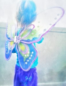
I hope to someday include uplifting or theme appropriate quotes, but until then, I’ll just post pictures.
If a quote does come to mind, I’d love to hear it!
What do you think? Does this image incite feelings?
The post Featured Photo Friday appeared first on Squirrel Talk.
January 8, 2014
IWSG: The Bad Blogger
Visit the main page on Alex Cavanaugh’s Blog.
The term Author Platform twists my gut into a tangle. I know what it is, and I know what I’m supposed to do. But executing things like engaging people online is darn right difficult.
A lot of the times, I read status updates or blog posts and smile–much like I do with conversations (listen and smile). But like with live conversations, I don’t vocalize my thoughts. What do I say? Thank you for sharing because I enjoy reading? Because I do. But then I get caught in a moment of awkwardness. That line–no matter that it’s true–isn’t true to my voice. It sounds sappy and earnest and… well, that’s not quite my personality. But I digress.
What gets me about the Author Platform is providing helpful and informative blog posts, all while knowing your audience. I like being helpful. But my mind acts like a search engine, not a database. I find information, not store it. Which poses a problem with helpful articles. Being a techie, that’s where a good deal of “helpfulness” comes in. But my audience is usually other writers, close friends, and family. Though some of them might be interested in fun CSS:
.ninja {
color: black;
display: none;
}
Many others might not even know what CSS (Cascading Style Sheets) means. So am I really being helpful to my audience? Probably not. Will readers of my book be interested in the fact that ePubs are HTML in disguise? Will they even care? And that, I fear, will kill my author platform. But they say you need a strong author platform, otherwise how will people discover you and find out what a fantastic and entertaining writer you are? *despair*
Here’s to hoping my bad blogging doesn’t drive people away from my writing. Maybe I can be entertaining if I can’t be helpful. Who knows?
To all those other bloggers out there, how do you do it?
The post IWSG: The Bad Blogger appeared first on Squirrel Talk.


