
Susan B. Weiner's Blog, page 39
June 5, 2018
Em dash versus en dash, oh my!
I love my em dashes. In fact, one of my most exciting discoveries in WordPress was the symbols menu that lets me insert proper em dashes instead of double hyphens into my blog posts. Also, my assistant can tell you that I’m a real nag about inserting the proper coding for em dashes into my Constant Contact newsletters.
However, not everyone agrees with me that em-dashes are the right punctuation symbol for setting off text in a sentence. Some people prefer en-dashes (–) to em-dashes (—). If you wonder why I care about this, stop reading now. This post will put you to sleep.
 Beautiful em dashes
If you feel excited about this topic, you won’t be surprised that I took notice when Emmy J. Favilla said in A World Without “Whom,“ “What’s more beautiful than a strategically placed em dash?”
However, I was appalled to learn that her bosses asked her to put spaces around her em-dashes. No! That seems like sacrilege to me. But BuzzFeed is an online publication so, as Favilla said, “Space isn’t at a premium on the internet.” She has come to believe that “spaces on either side of an em dash allow a sentence to breather.”
What is an em dash, anyhow?
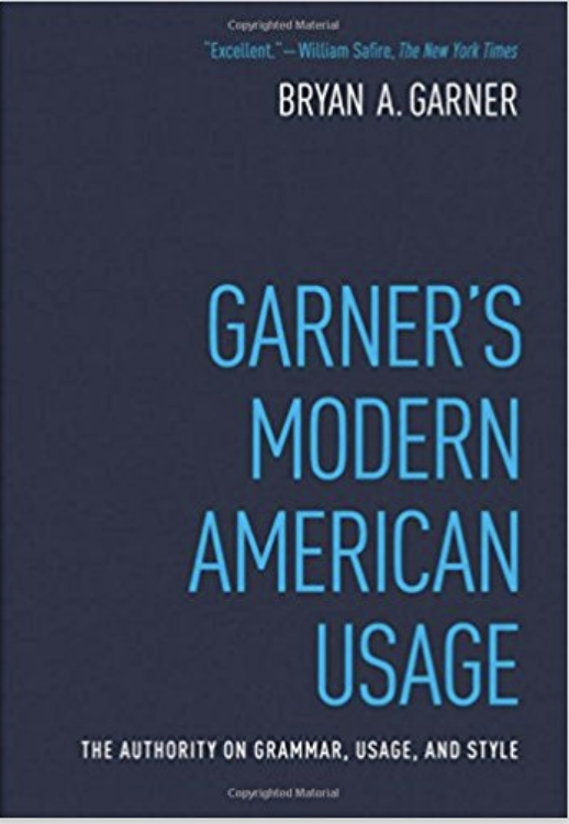 An em dash “is used to mark an interruption in the structure of a sentence,” said Bryan Garner in Garner’s Modern American Usage.
Garner believes “The em-dash is perhaps the most underused punctuation mark in American writing. Whatever the type of writing, dashes can often clarify a sentence that is clogged up with commas—or even one that’s otherwise lusterless.” Way to go!
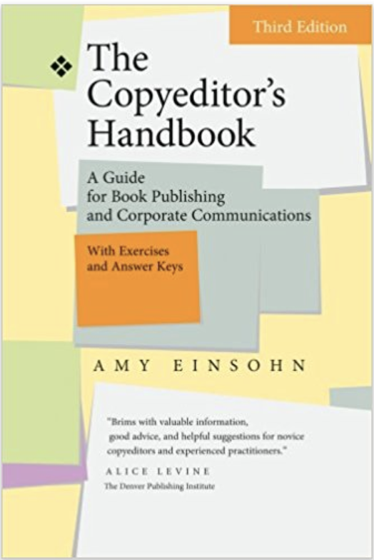
In contrast to Garner, Amy Einsohn’s The Copyeditor’s Handbook suggests that em dashes may be overused. “The dash is best reserved for special effects: to prepare readers for a punchline or a U-turn.”
 En dashes aren’t the same as em dashes
Some publications use en dashes instead of em dashes to set off text. In fact, I’m the editor of a monthly magazine that used to do that. It drove me nuts! I eventually implemented a style change, and converted en dashes to em dashes to my backlog of articles.
I wondered why some publications abused en dashes by using them in place of em dashes. The practice appears to have come from the United Kingdom. I can’t find the page where Favilla said that British publications use en dashes instead of em dashes, but I found some evidence online.
According to a University of Sussex web page, “In British usage, we use only a single hyphen to represent a dash – like this. American usage, in contrast, uses two consecutive hyphens –.”
Similarly, according to Grammar and Style in British English, “The single dash is normally a feature of informal English and is used, especially in narrative, to create suspense or to indicate that what follows is an afterthought or something to be emphasised.”
American usage for the en dash is quite different. “It joins pairs or groups of word to show a range, and also indicates movement or tension (rather than cooperation or unity,” according to Garner.
I confess that until recently, I had no clue that there are times when I should use an en dash instead of a plain old hyphen. In fact, it looks strange to me to write a date range as “August 7–8” instead of “August 7-8.” As Favilla said in her book, “Sometimes an em dash-esque…en dash can look awkwardly long in a modifying phrase, leading en dash noobs to wonder what the hell that hyphen just ate for breakfast.” And, in fact, a colleague questioned my use of the en-dash in this situation. However, my AP StyleGuard software told me that was correct.
Still, some of the en dash rules seem obscure to me. I will probably continue to write “Russo-Japanese War” instead of “Russo–Japanese War,” but it’s kind of cool to understand why the en dash is considered more appropriate.
Disclosure: If you click on an Amazon link in this post and then buy something, I will receive a small commission. I link only to books in which I find some value for my blog’s readers.
The post Em dash versus en dash, oh my! appeared first on Susan Weiner's Blog on Investment Writing.


June 4, 2018
MISTAKE MONDAY for June 4: Can YOU spot what’s wrong?
Can you spot what’s wrong in the Mistake Monday image below? Please post your answer as a comment.

I post these challenges to raise awareness of the importance of proofreading.
I often recommend my “read out loud” method for finding mistakes, that wouldn’t help you to find the error that caught my eye in this week’s Mistake Monday.
The post MISTAKE MONDAY for June 4: Can YOU spot what’s wrong? appeared first on Susan Weiner's Blog on Investment Writing.
May 29, 2018
My newsletter experiment with confirmation requests
I suspect that a significant percentage of my newsletters don’t make it into my subscribers’ email in-boxes. Every month I get a list of email addresses that “bounce,” not reaching their destination. An even larger number of subscribers fail to open any emails—possibly because my emails aren’t reaching them. The data is provided by Constant Contact, the provider I use for sending my newsletters.
Newsletter confirmations
Wondering if the disappointing numbers are partly because new subscribers input bad email addresses, I experimented with Constant Contact’s feature that requires new subscribers to confirm their interest before they join my list.
I didn’t like the results. My weekly list of new subscribers shrank. Also, the list of names in an “Awaiting confirmation” category grew. Looking at the email addresses on the “Awaiting confirmation” list, I saw many email addresses that appeared legitimate.
My assistant suggested that the confirmation-request email went into the individuals’ spam folders. That’s what happened when she tested the feature by subscribing to my newsletter. (Of course, it’s possible that’s where anything sent via Constant Contact goes for those individuals unless they’ve whitelisted Constant Contact.)
I asked Constant Contact if I could re-send the confirmation-request email. No, there’s no way to do that.
Asking people to re-enter subscriptions
The only way I can get those subscribers on my Constant Contact list is to send them an email asking them to re-enter their subscription request. I sent 25 requests in early January. It’ll be interesting to see how many of those people re-subscribe by the time I publish this article.
In the meantime, I’ve turned off Constant Contact’s confirmation request.
The post My newsletter experiment with confirmation requests appeared first on Susan Weiner's Blog on Investment Writing.
May 28, 2018
MISTAKE MONDAY for May 28: Can YOU spot what’s wrong?
Can you spot what’s wrong in the image below? Please post your answer as a comment.
Hint: reading this item out loud would probably help you find the big problem.
I post these challenges to raise awareness of the importance of proofreading.
The post MISTAKE MONDAY for May 28: Can YOU spot what’s wrong? appeared first on Susan Weiner's Blog on Investment Writing.
May 22, 2018
Improve your design skills with this book
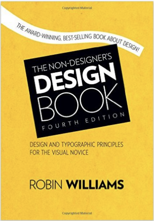 Want to improve your design skills? Would you like to be able to look at something and have ideas about how to tweak its design? The Non-Designer’s Design Book: Design and Typographic Principles for the Visual Novice can help.
4 principles to improve your design skills
I like how author Robin Williams tackles the four main principles:
Contrast
Repetition
Alignment
Proximity
She doesn’t just explain them verbally. She provides before-and-after examples, dissecting different designs. Even better, she challenges you to critique in “Train your Designer Eye” examples. After you jot down your ideas about a specific item, you can flip to her suggestions in the back of the book. These exercises mean you’re more likely to improve your design skills than if you simply read passively.
Centered alignment: good or bad?
Williams challenged my tendency to center titles and similar text. She says, “I guarantee most designs that have a sophisticated look are not centered.” She does, however, say that centered designs are more formal.
I’m mulling over what I think about this. Her comment has me looking more critically at design elements such as centering. I like it when my reading challenges my thinking.
Disclosure: If you click on an Amazon link in this post and then buy something, I will receive a small commission. I link only to books in which I find some value for my blog’s readers.
The post Improve your design skills with this book appeared first on Susan Weiner's Blog on Investment Writing.
May 21, 2018
MISTAKE MONDAY for May 21: Can YOU spot what’s wrong?
Can you spot what’s wrong in the image below? Please post your answer as a comment.
Hint: spell-checking software might not catch this one.
I post these challenges to raise awareness of the importance of proofreading.
The post MISTAKE MONDAY for May 21: Can YOU spot what’s wrong? appeared first on Susan Weiner's Blog on Investment Writing.
May 15, 2018
Audio slideshow: What can bloggers learn from a vacation stroll?
You can learn blogging lessons in some of the strangest places. Hit the arrow on the image below to play the slides and hear the audio.
What can bloggers learn from a vacation stroll?
Some of you know that I’m not a big fan of audiocasts and video. However, I’m doing my best to learn how to accommodate the members of my audience who enjoy those forms.
The post Audio slideshow: What can bloggers learn from a vacation stroll? appeared first on Susan Weiner's Blog on Investment Writing.
May 14, 2018
MISTAKE MONDAY for May 14: Can YOU spot what’s wrong?
Can you spot what’s wrong in the image below? Please post your answer as a comment. This is an obvious mistake.
I post these challenges to raise awareness of the importance of proofreading.
The post MISTAKE MONDAY for May 14: Can YOU spot what’s wrong? appeared first on Susan Weiner's Blog on Investment Writing.
May 8, 2018
Getting things as right as you can with a BuzzFeed copyeditor
“Getting Things As Right As You Can” is the title of a chapter in A world without whom, a book by Emmy J. Favila, BuzzFeed’s global copy chief. As the book’s title suggests, Favila disagrees with strict grammarians, especially if the support rules that are at odds with how people actually use language today. For example, one of her chapter subheadings uses the hashtag #banwhom.
Don’t worry about some rules
Favila’s attitude may horrify some of my readers. She says there are matters of writing style that you shouldn’t lose sleep over. That doesn’t only meaning skipping the use of “whom.” It means not obsessing over issues like “how to spell a word that has acceptable variations, whether to style abbreviations with or without periods, use of the serial comma, whether to capitalize or lowercase words of a certain length in titles, etc.”
I confess that I am a bit horrified because I get excited over some of the issues Favila lists. On the other hand, I value clarity and conversational language over rules that undercut those values. I recognize that some “mistakes” are worse than others in their effect on your readers.
Do be consistent in your usage
Thank goodness, Favila does believe that consistency is important. She says,
…it’s important to strive for consistency (across a publication, yes, but at the very least within a story), and there are certain things, like technical errors and typos, that may not necessarily diminish your credibility as one-off instances but, cumulatively considered, could make your work and the publication you represent look sloppy and careless. All of these things can lead to a lack of respect for stories you produce in the long run—or at least less than you have the potential to garner—because if you don’t care enough about the small things, how are you to be trusted with the bigger ones?
If you’re not a professional writer, I think “getting things as right as you can” and using a consistent style are good goals. You don’t need to drive yourself crazy to adhere to obscure rules. Making your content compelling, clear, and concise matters most.
Should you read this book?
This book is a fun read. I recommend it for writers who care about usage issues, even if you’re a grammar traditionalist.
Favila offers insights into many of the classic questions of writing style. It also delves into many newer issues, such as language usage on social media.
Disclosure: If you click on an Amazon link in this post and then buy something, I will receive a small commission. I link only to books in which I find some value for my blog’s readers.
The post Getting things as right as you can with a BuzzFeed copyeditor appeared first on Susan Weiner's Blog on Investment Writing.
May 7, 2018
MISTAKE MONDAY for May 7: Can YOU spot what’s wrong?
Can you spot what’s wrong in the image below? Please post your answer as a comment. I think this one is easy. What do you think?
I post these challenges to raise awareness of the importance of proofreading.
The post MISTAKE MONDAY for May 7: Can YOU spot what’s wrong? appeared first on Susan Weiner's Blog on Investment Writing.


