K.M. Alexander's Blog, page 89
February 1, 2014
Soon: Title Announcements!
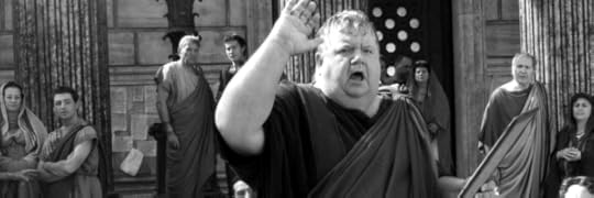
Ian McNeice as the Newsreader/Town Crier in HBO’s Rome
Happy February 1st! I hope everyone is enjoying their Saturday. I’m spending mine working on Old Broken Road, but I wanted to give a few more updates regarding my other projects.
I have mentioned before that I am working on two new titles: the first is the next in the series that started with The Stars Were Right which I am cleverly calling my: Unnamed Waldo Bell Story. This will be the book that follows Old Broken Road and so far I’m really liking where it’s going. The second is a near future sci-fi in a whole new universe. Up until recently it has been operating under the project name: Deep. (You can see some of my inspiration here.) Now, neither of those names are final (some for obvious reasons) and we’re getting to a point where I should change that.
Today, I decided that when I reveal the Old Broken Road cover I will also be announcing the new titles of my next projects! This should all be going down over the next month-ish or so make sure you check back often. I’m getting really excited, cool stuff is coming and I can’t wait to share it all with you.
Have a great weekend. Go Hawks!
Filed under: Old Broken Road, The Stars Were Right, Writing Tagged: Deep, Old Broken Road, The Stars Were Right, Title Announcement


January 31, 2014
Friday Link Pack 01/31/14
It’s time to share a few interesting links I have found throughout the week. Some of these I mention on Twitter, if you’re not already following me there, please do! Have a link I should feature in the upcoming year? Let me know!
Writing:
Mapping the world of Mark Twain
It’s no secret that Mark Twain is one of my favorite authors. I was excited when this showed up in my RSS feed. When I saw the map, I was blown away.
10 Key Fantasy Literature Terms
Nice write up covering the terms for the various sub-genres of fantasy. Everything from Portal Fantasy, Secondary Worlds, to the New Weird (technically the subgenre The Stars Were Right falls inside). It’s good info and worth checking out.
A Novel List of Atypical Sci-Fi from the Seattle Public Library
My home town’s Library compiled a nice list of solid science fiction. There’s a lot of good stuff on here, some of my favorites: Neal Stephenson’s Diamond Age and China Mieville’s The City and The City.
Art:
Joao Ruas’ “Verso”
Thinkspace gallery is featuring the work of one of my favorite artists: Joao Ruas. If you live anywhere near Culver City, California get yourself over to see this stuff. His work is incredible.
I Am Hello Kitty
Very beautiful and fascinating look into the people behind the iconic characters in New York’s Times Square.
Random:
So the new Space Shuttle is amazing…
Meet the next Space Shuttle. It’s tiny. It only needs one rocket, and it can be towed behind a pickup truck.
Art of the Title: Black Sails
Art of the Title interviews the creators of the Black Sails title sequence. I love it, the music, the motion, basically everything. It’s awesome to know the creators were inspired by Kris Kuksi.
Please Advise
Letters of Note shares this quick memo sent in 1969 by record producer Teo Macero to executives at Columbia Records over Miles Davis’ album: Bitches Brew. (In my humble opinion: one of the best jazz albums ever.)
Lovecraft Story of the Week:
The Temple
A german u-boat and its cruel captain face terrors under the sea.
Farewell Gif of the Week:

Filed under: Link Pack Tagged: Black Sails, fantasy, H.P. Lovecraft, Joao Ruas, Mark Twain, Miles Davis, Sci-fi, Space Shuttle, Writing


January 30, 2014
200!
 This is blog post number 200. 200! Unlike twitter where I can blow past 200 tweets over an active week, this felt like something of an occasion here.
I started this blog nearly two years ago when I decided to document my writing experience. I had been writing off and on for a while—finished a few manuscripts that went nowhere—but publically acknowledging my journey towards my goals changed everything for me. It made it more real. I began speaking of my book as an actual book and not just a manuscript I was working on. People other than my wife began to read my drafts. I introduced myself as a writer. I hired an editor. And in the end The Stars Were Right became more than just a concept, it became an actual book you can hold.
Looking back to my first post is amusing to me. In a lot of ways I am still that user experience designer trying to cut it as a novelist, however I also feel like I have come far. I might have a long way to go, but now I can say that I’m a UX designer and a novelist. One year, seven months, and ten days later I’m in a significantly different place: I have a book out on the market, you can buy it, and people seem to like it. I couldn’t ask for a better outcome.
It’s been a good 200. Here’s to 200 more.
Filed under: The Stars Were Right, Writing Tagged: 200, blogging, The Stars Were Right, Writing


January 28, 2014
Encouraging a Readers Imagination

I have had a few readers email and ask me if I will ever include a map or show any character art for The Stars Were Right. It’s been asked enough times that I think my response should be explained in it’s own blog post. Funny enough my answer is a big reason why I went with a more mysterious direction with the book cover rather than stepping in line with traditional urban fantasy cover art.
In short, the answer is: no.
That’s not to say in other books in the future I won’t make a different decision, but with the universe of The Stars Were Right I have specifically chosen to not add my own artistic interpretation into the world. I want to let readers imaginations run wild and encourage them to create on their own. I am a firm believer that anyone’s imagination can be hampered when you are presented with imagery.
Take Tyrion Lannister from George R. R. Martin’s Song of Ice and Fire series. In the books he is described as “an ugly little dwarf with mismatched eyes.” Yet, you’d be hard pressed to find a fan who after watching the HBO series doesn’t picture Tyrion as the handsome Peter Dinklage. A significant departure from the written character. That representation, even innocently, has affected the imagination of many readers.
On the opposite spectrum we have the world of Night Vale. Joseph Fink and Jeffrey Cranor, the creators of Night Vale, have never shown what Cecil, the host, looks like. Likewise they haven’t provided a map of the town. When asked they have remained silent. So the Night Vale fan community has ran with it, and the results are nothing short of amazing.
I like Night Vale‘s approach. I like how it encourages creation and builds it’s community. (Subsequently this is why I love fanfiction as well, but I’ll save that for another post.) I believe the Stars universe is rich and complicated, it’s full of wondrous new races and strange cultures in what is a pretty spectacular setting. What I described is exactly what I wanted to be told in that first book. If I’m doing my job right the pictures swimming about in my head will have been communicated effectively in my prose.
The imagination is powerful and when it comes to The Stars Were Right I don’t want to get in the way of that. Instead I try and encourage fan art as much as possible. I find it both flattering and humbling when I see how readers interpret my characters, what they think the races of the territories look like, and how they picture Lovat’s nine levels. I occasionally call attention to fan art submitted to me. You can check out my collection of The Stars Were Right fanart over on Pinterest or you can check out one of the links below:
The Stars Were Right Cast by Josh Montreuil
The Shopkeep & the Umbra by Sean Cumiskey
The Dauger by Heath Lewis
Lovat in the Sims by Tricia Manly
Have your own fan art? I’d love to see it: send me an email or contact me on twitter.
(Oh, and I’m doing a secret giveaway for a few more signed copies of The Stars Were Right. You can sign up here. Tell your friends, but make sure they know this is a secret. Shhh!)
Filed under: The Stars Were Right, Writing Tagged: drawings, imagination, maps, night vale, reading, Song of Ice and Fire, The Stars Were Right, Tyrion Lannister


January 23, 2014
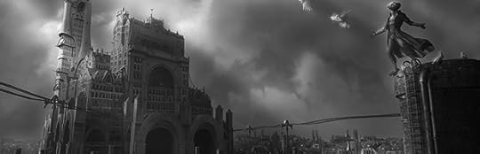
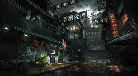
Visual Inspiration by Robin Olausson

My buddy Darby shared concept artist Robin Olausson’s work with me and I had to post it here. It has that blend of grimy realism with a sharp pop of color that I absolutely love ( if you read Stars you’d know why.) Check out a few of Robin’s pieces below (click on them to see ‘em bigger) or check out all his work over on his deviantART page. Good stuff.
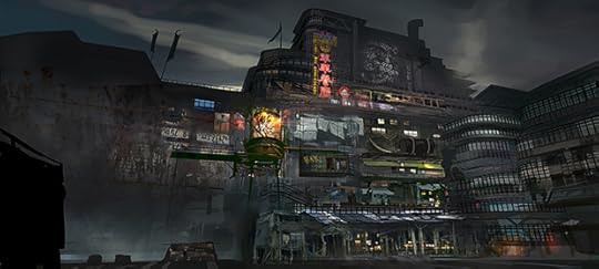
Cargo District by Robin Olausson
King Tong Street YAO by Robin Olausson
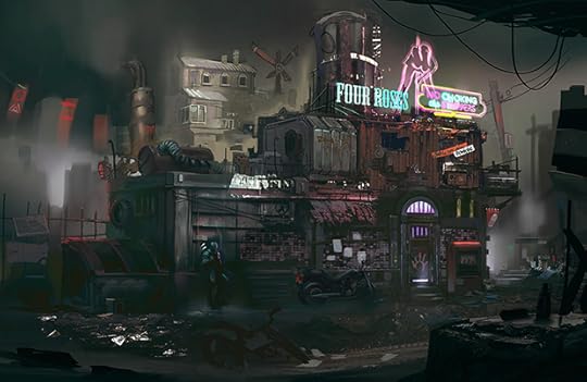
Colors of a new Era by Robin Olausson
Filed under: Art, Inspiration Tagged: Concept Art, Robin Olausson, visual inspiration


January 22, 2014
Metropolis 2 by Chris Burden
If you haven’t seen this kinetic sculpture by artist Chris Burden before do yourself a favor and take time to watch the video. It’s impressive. The level of detail is a good contrast to his subtle commentary on mobility in our modern era. It’s fascinating stuff. You can see more of Burden’s recent work here.
Filed under: Art Tagged: cars, Chris Burden, Metropolis 2, mobility


January 20, 2014
Keep Moving Forward

“If you can’t fly then run, if you can’t run then walk, if you can’t walk then crawl, but whatever you do you have to keep moving forward.”
—Martin Luther King, Jr.
I love this quote and figured today would be a perfect day to share it. Happy Martin Luther King, Jr. Day everyone. Keep moving forward in everything that you do.
Filed under: Inspiration, Quotes Tagged: Martin Luther King, MLK, perseverance, quote, struggle


January 17, 2014
Friday Link Pack 01/17/14
It’s time to share a few interesting links I have found throughout the week. Some of these I mention on Twitter, if you’re not already following me there, please do! Have a link I should feature in the upcoming year? Let me know!
Writing:
Two-Thirds of Kids Now Reading Digitally
Impressive new numbers regarding the ever expanding market of digital reading. In a lot of ways what we seem to be seeing isn’t a replacement of books but a whole new secondary market. Exciting.
22 Reasons Why Commas Are The Most Important Things In The World
Some very valid examples showing why commas are very important. (Thanks to Drew Gerkin for sharing this on Twitter.)
The Onion Reviews ‘The Hobbit: The Desolation Of Smaug’
It’s good. Watch it.
Art:
Timelapse of Austin Parkhill painting “Ringle”
Great video showing Parkhill working on his ultra-realistic paintings at an impressive scale. Beautiful work.
Random:
So Much for Net Neutrality
As a citizen of the internet you should be educated on this subject. It’s bad for the internet and that means it’s bad for you. We’re now just one step closer to letting enormous companies monopolize our open platform.
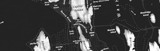
The Seattle Archipelago
Jeffrey Linn, a campus planner at the University of Washington, has created a fascinating map showing what my hometown would look like based on a 240′ rise in sea level should all of the world’s ice sheets melt. Hummm…
The Raddest Scuba Mask Ever
Since I’ll be under water eventually, here’s a scuba mask that created breathable oxygen on it’s own. No tanks. So cool. Just in time.
Lovecraft Story of the Week:
The Hoard of the Wizard-Beast
A team up tale from H.P. Lovecraft and R.H. Barlow. Clearly weird fiction writers like to abbreviate their first names.
Farewell Gif of the Week:

__________________________________________________________________
Like this and want more? Sign up for my occasional newsletter: The Telegram. It’s packed full of news on my books, interesting links, reading recommendations, some writing tips, and even a few guest posts. Sign up today!
Filed under: Link Pack Tagged: Austin Parkhill, climate change, commas, digital books, ebooks, Lovecraft, Net Neutrality, Ringle, scuba, Seattle, The Hoard of the Wizard-Beast, The Hobbit, the onion


January 15, 2014
Lovat: The Board Game
 There has been a recent resurgence in interest in board games among myself and my friends. I’m not talking about the boring simple board games that I lothed to play as a kid. Now we’re all drawn to much more complex games with deep strategic elements.
Imagine my surprise when for Christmas my good friends Steve and Sarah designed and built an incredible and enormous board game based on The Stars Were Right. Yep, an awesome game based on my book! I was (and still am) stunned. Here’s what Lovat: The Board Game looks like:

Lovat: The Board Game (Photo by @Haloform. Table by Steve at Ruby Pear.)
As you play you build the city of Lovat, moving around your pawn (based on the races from the book) and try to nab bits of treasure from the various neighborhoods before other players can get to it. The higher up you go the more power you wield and the more power you wield the more you’re able to build and move. There’s a ton of strategy too it: do you go tall and ignore the bonus treasure, or do you move quickly and try to capture as many bonuses as you can before the game ends? It makes for some interesting and really fun gameplay.
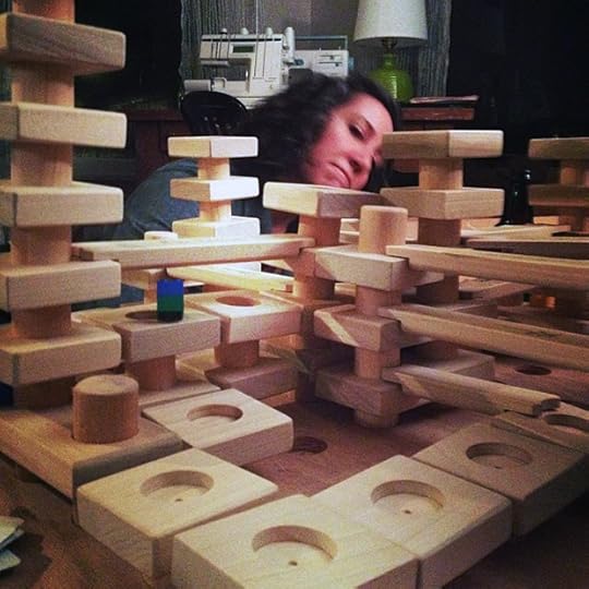
Sarah plotting her sneak attack win. (Photo by @Steveler)
Steve and Sarah put so much work into the creation of the game, between the crafting, the play testing, the custom woodwork, all of it. I’m flattered they would go to all this trouble, and I’m a little overwhelmed that my book inspired two of the most awesome people ever to make me something so great. Thanks you two, you’re the best.
Now I want to convince them to Kickstart this so everyone can play it.
(Oh, and my awesome table in the first picture. Yeah, Steve made that as well. He’s an amazing woodworker and if you’re looking for some custom furniture I highly recommend him. Check out RubyPear.com to see more of his work.)
Filed under: Random, The Stars Were Right Tagged: Board Game, Christmas, gift, Lovat, Ruby Pear Woodworks, The Stars Were Right


January 10, 2014
Friday Link Pack 01/10/14
It’s time to share a few interesting links I have found throughout the week. Some of these I mention on Twitter, if you’re not already following me there, please do! Have a link I should feature in the upcoming year? Let me know!
Writing:
Building A Better Cover
I want to draw attention to this article I posted yesterday where I share some advice on what you can do as an indie writer to create a stunning cover for your book.
20 Most Beautiful Bookstores in the World
Flavorwire assembles a neat little list of some truly beautiful book stores. I want to go to all of them.
Novelist Error Messages
Cute little error messages that might pop up if writers were an operating system as opposed to a novelist. (Thanks to Josh Montreuil for the tip.)
Art:
Einstein’s Camera
Adam Magyar takes stunning motion photos using custom built cameras. The results are shockingly beautiful. If there’s one link you click today, make it this one. (Thanks to Erik Hedberg for the tip.)
Illusion Painting by Daniel Siering and Mario Shu
One tree and a carefully placed wrapping makes for an awesome optical illusion that is just too cool.
Photos of Families Posing With Everything They Own
As you’ll see the actual title ends with: “Will Make You Appreciate What You Have.” For some folks that might be the case, but for me this photo series made me realize many of us have too much.
Random:
The Top 20 TV Songs You Tracked Down This Year
Shazam is an app that helps you discover a song you’re listening too, it’s pretty handy. Here’s the list of the top 20 songs their users discovered last year. Clearly The Walking Dead is doing something right.
Neverending Story Characters Reimagined
Nicolas Francoeur reimagines the classic characters from the 1984 cult classic The Neverending Story if the movie were made today.
Lovecraft Story of the Week:
At the Mountains of Madness
One of Lovecraft’s most loved stories is a good read for the new year. It’s longer than most of his stuff, so if you don’t want to read it online you can get audio editions all over the place.
Farewell Gif of the Week:

__________________________________________________________________
Like this and want more? Sign up for my newsletter: The Telegram. It’s packed full of writing tips, reading recommendations, news on my books, interesting links, and even a few guest posts. Sign up today!
Filed under: Link Pack Tagged: Adam Magyar, At the Mountains of Madness, Book Covers, bookstore, cover design, Daniel Siering, error messages, H.P. Lovecraft, Mario Shu, Nicolas Francoeur, Shazam, The Neverending Story, TV Songs