A.C. Flory's Blog, page 84
October 27, 2018
Fried Rice, from leftovers
I’m sitting here shoveling down the leftover fried rice from last night, but the leftovers began the night before. If you like fried rice and never know what to do with leftover roast chicken, read on.
Recipe – Fried Rice à la Meeka
Ingredients*
Leftover roast or braised chicken, meat removed from bones
Leftover cooked rice [boiled or via the absorption method]
1 – 2 rashers of middle bacon [or ham]
1 – 2 eggs
Capsicum, red [diced]

Spring onion [the white part, cleaned and chopped into small pieces] 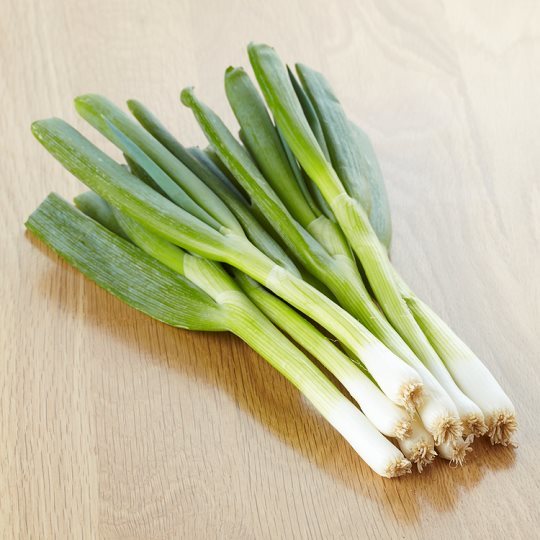
Leftover corn on the cob if available [kernels cut off the cob]
Sesame oil [a drop or two]
Soy Sauce [Light or dark]
Peanut oil for frying [it has a light, clean flavour that’s perfect for Chinese dishes, but I use it for everything]
A large wok
An egg slice or some other tool for stir frying the rice
*quantities will depend upon how many people are to be served and how much they like certain ingredients. As a rule of thumb, you’ll need approx. 1.5 – 2 cups of cooked rice for two medium sized people.
Method
Heat a couple of tablespoons of peanut oil in the wok until you can see a ‘heat haze’ rising from the oil.
While the oil is heating:
beat the egg[s]
cut the rind off the bacon and cut the meat and fat into small cubes/squares.
wash and cut the capsicum into small squares.
When the oil is hot, pour the beaten egg into the hot wok and swirl it around to spread it as much as possible [a bit like making a pancake].
When one side of the egg pancake is done, flip it over and cook the other side until it too is golden. Remove from wok and place on a cutting board. Cut into bite sized pieces and set aside.
Next, place the bacon pieces into the remaining oil along with the capsicum. Lower the heat and allow to cook gently until the bacon is nicely coloured but not quite crisp.
If using, add the corn kernels to the bacon and capsicum. Allow to cook gently for a few minutes more. [This is just to heat the corn through as it’s already cooked].
Remove the bacon, capsicum and corn from the oil. You can add it to the cooked egg.
Add a drop or two of sesame oil to the oil remaining in the wok. Don’t throw this oil out as it contains all the lovely flavours of the bacon etc!
Add the cooked rice to the wok and break up the lumps, tossing the rice almost constantly until the grains are nice and loose.
Return the egg, bacon, capsicum and corn to the wok and toss through the rice.
Add the pieces of cooked chicken.
Keep tossing until all the ingredients are heated through again, and the flavour has had a chance to spread through the rice.
Finally, add the chopped spring onions and a slosh of soy sauce to the rice. Do NOT overdo the soy sauce. 1/2 a tablespoon is more than enough at this stage. People can add more later, to suit their own tastes.
Toss the soy and the spring onions for a minute or two until the rice is slightly…beige? It will get a little colour from the soy, but it shouldn’t be brown. That means there’s too much soy!
Serve as is or braise some Chinese vegetables to serve with the rice.
To reheat the next day, place the leftover fried rice in a pot and add 1 tablespoon of water [the water will steam the rice and stop it from burning]. Cover and heat on a very low flame until it’s hot enough.
Bon appetit!
Meeks


October 25, 2018
Apples, alpacas and some results
First and foremost, to all those who re-blogged and retweeted my ebook free promotion over the last two days…THANK YOU! There were 40 downloads and I’m grateful for each and every one. 
October 22, 2018
2 free days for the KDP how-to books
I should probably stretch these promotions out but…meh, let’s have some fun.
October 18, 2018
How to fudge an Index with Kindle Create
There used to be a number of individual Kindle applications you could download and install, now there’s just one: Kindle Create.
When you open Kindle Create on your computer, you’ll be presented with two options – text heavy novels or graphics heavy non-fiction:
[image error]
The one I use is ‘Textbooks, Travel Guides, Cookbooks, Music books’. It requires a PDF file and allows me to control exactly where and how text and graphics appear on the page [of the ebook].
Termed ‘fixed format’, these ebooks behave almost exactly like print books in that the size of the e-reader screen is the size of the ‘page’, and the text and graphics have to be sized to suit that page.
The screenshot below was taken from within Kindle Create and shows how the fixed format ebook will appear on a Kindle Fire:
[image error]
The three things you should notice are:
The page is in colour,
The page contains a graphic image that fits exactly within the margins,
The page contains a hyperlink.
All three elements, and their placement, were set in the original Word file, before it was converted into a PDF. Kindle Create then imported the PDF and converted it to a proprietary format called .kcb. [When the file is ready to be published to the Kindle, it will be converted to its final format which is called .kpf]. The important thing to note is that all three elements are retained in the .kcb file, including the hyperlink.
You won’t be able to do much in the way of editing, but you will be able to create a Table of Contents. The TOC is bog simple, manual and only allows for one TOC entry per page. It also allows for only one level of TOC. Effectively, this means that you will be able to create a table of chapter headings and not much else. And, of course, there is no option for creating an Index.
The lack of a deep TOC and no Index means that non-fiction ebooks are kind of hard to dip into and ‘browse’. Yet that is precisely what most non-fiction readers need. How was I going to make my e-textbook more user friendly?
The answer was kind of obvious, once I thought of it. -sigh-
As mentioned before, Kindle Create gives you the option of preserving any hyperlinks present in your PDF. This means you can tap a link inside the ebook and be taken directly to that location…both inside the ebook and out.
-cue light bulb moment-
What if I added a list of hyperlinks to my Word document before I converted it to the PDF?
If Kindle Create preserved all those hyperlinks, I’d end up with a list of links in alphabetical order! I’d end up with an Index of Links!
As with all great ideas, mine turned out to be a wee bit harder than expected.
I started by creating a simple two column table in Word.
Then I printed off the Index pages of the paperback and marked the most important Index entries. I then typed those into the left hand column of the table with one Index entry per cell.
Next, I trawled through the print Index a second time, marking the most important ‘Subentries’. They went into the right hand column with one subentry per line.
Finally, I selected a subentry, opened the Insert tab and clicked Link:
[image error]
The screenshot above shows the ‘Insert Hyperlink’ dialog box in Word 2016. If you have text selected before you open the dialog box, Word will automatically make that text the ‘Text to display’ [see two linked orange circles]. In other words, you will see that text rather than the hyperlink itself.
The orange circle labelled as ‘A‘ shows that ‘Place in This Document’ has been selected as the general location of the hyperlink.
The orange circle labelled as ‘B‘ shows the TOC sub-heading selected to be the actual location of the hyperlink.
Wait…’TOC sub heading’?
Yes. When you create a link within a document, Word looks for the same heading styles that are used to generate a Table of Contents. As my document contains five levels of heading styles – i.e. from Heading 1 through to Heading 5 – those headings are the locations I can use for my hyperlinks. Effectively, I’m using all the TOC levels Kindle Create won’t let me put into its Table of Contents to create an Index of sorts. It’s not perfect, and this work around does entail a lot of work, but…a fudged index is better than no index at all.
In case you’re wondering, this is what the Index of Links looks like in Kindle Create:
[image error]
Apologies for yet another how-to post, but I was kind of pleased with my little solution.
October 16, 2018
Sakura festival…in Melbourne!
Despite loving all things Japanese, I’ve never been to Japan, but now I can say I’ve been to a Sakura [Cherry Blossom] festival. Ta dah:
[image error]
[Apologies for the size of the photos. I wanted them to be as lovely as possible]
[image error]
These are ornamental cherry trees gifted to Melbourne by the government of Japan. The grove was planted in Banksia Park, which is situated on the boundary between the suburbs of Heidelberg and Bulleen.
Not all of the cherry trees survived the harsh, Australian conditions, so the Japanese community in Melbourne took the fledgling grove under its wing, saving as many trees as possible and caring for the whole grove. The photo below shows one of the cherry trees that was saved:
[image error]
You can see how close this poor tree came to dying.
Thanks to the efforts of the Japanese community, people like me can now enjoy a little taste of Japan without having to leave home.
Arigato gozaimasu!
Meeks
October 10, 2018
Melbourne – wind direction
Just checked the VicEmergency website and took this screenshot of the wind-direction[s] around Melbourne at the moment:
[image error]
The little arrows indicate where the wind is coming from, and where it’s going to. The bottom of the picture is ‘south’ so you can see that in the lavender coloured areas down the bottom, wind direction is a steady ‘south easterly’ – i.e. coming from the south and east. In the pale areas, however, the wind is all over the place. Literally.
Why bother with wind direction?
Because you need to know whether a bushfire is being blown towards you or away from you.
To see the wind direction overlay on the VicEmergency map, click the Filter option as shown:
[image error]
This will open a drop down list. Scroll down the list and click ‘wind direction’. This will display the lavender map at the top of this post.
To get rid of the wind direction overlay, open the Filter menu again and select ‘None’.
If you’re looking at the VicEmergency app on your phone, you have to tap your watch zone first. Once it opens, the Filter option is located up the top on the right-hand side of the screen [next to the ?].
Tap Filter and select the option for wind direction as for the website.
Given how dry and horrible this Spring has been, I think I’ll be keeping that wind direction overlay on at all times.
Stay safe,
Meeks
October 8, 2018
Flash Mob – Ravel’s Bolero
Installed a new browser – Vivaldi – which allowed me to finally watch the first episode of the new Doctor Who! So how better to celebrate than with one of my favourite classical pieces?
I could have found a slick orchestral video, but I thought you might enjoy this flash mob version instead. Enjoy!
cheers
Meeks
October 7, 2018
How to work with images in Word 2016 (Part 1)
Strictly speaking, Word is a wordprocessor not a graphics application. Neverthelss, it does offer a small, but functional range of tools for do-it-yourselfers. So whether you’re an Indie creating a cookbook of favourite recipes, a student putting together a thesis, or simply someone with a report to write that includes a lot of graphics, this series of posts is for you.
Changing Word defaults
As mentioned in the introduction, Word is primarily a wordprocessor. More importantly, it is a wordprocessor for business applications, so it automatically reduces image quality in order to provide the best overall result for business documents. To control the quality of the images in your document, you have to change two of the Word defaults: image compression and image resolution. Both of these settings can be found in File/Options.
To begin, open your manuscript in Word and click the blue File tab on the Ribbon.
Select ‘Options’ from the navigation pane on the left:
[image error]
Word now displays the Options dialog box:
[image error]
Click Advanced to display the Advanced options on the right hand side of the dialog box. Scroll down until you see ‘Image Size and Quality’.
Tick the box next to ‘Do not compress images in file’.
Next, click the small arrow next to ‘Default resolution’. This will display a drop down list.
Select the option for ‘High Fidelity’ as shown in the screenshot above.
Click the OK button to exit the Options dialog box.
Now, when you add an image to your document, you will be in control of the quality of the image.
Inserting an image
If you are working with images, chances are you already know how to insert an image into a Word document. Still, it doesn’t hurt to cover the basics so this is how you place an image in a document.
Click the cursor at the location where you want the image to go [roughly].
Click Insert on the Ribbon and select the ‘Picture’ option:
[image error]
Note: the ‘Picture’ option is for images saved to your computer. ‘Online Pictures’ allows you to search the internet for pictures and paste them directly into your document. Quite apart from copyright issues, ‘Online Pictures’ is not a good option because you can’t control the size or quality of the image you import into your document.
Locate the required image on your computer and select it.
Word will automatically resize large images to fit the space available. It will also place the image ‘In Line with Text’. This is the default ‘Wrap Text’ setting, and it will ‘lock’ the image to the text at that location.
Wrap Text Settings
The ‘Wrap Text’ settings determine how the image will interact with the text. If you leave ‘In Line with Text’ as the setting, you will be able to change the size of the image, but you will not be able to move it.
There are two ways of changing the ‘Wrap Text’ settings of an image. The first is via the Ribbon. The second is via the small icon displayed next to the image.
Wrap Text via the Ribbon
Click an image to select it.
This will open the Picture Tools/Format menu:
[image error]
The available ‘Wrap Text’ settings show ‘In Line with Text’ at the top of the list. Next to each setting is an icon that represents the function of that particular setting. The same icons are shown on the mini menu available next to each image.
The Wrap Text mini menu
[image error]When you select an image, it is displayed with ‘handles’ around the outside and a small icon to the right:
Click that icon to display the mini menu of ‘Wrap Text’ settings.
The mini menu displays the same icons as the ‘WrapText’ option on the Ribbon, but it does not label those icons so it’s only useful once you know what each icon represents.
The Wrap Text Icons
[image error]In Line with Text
This is the default option for each new image. It does not allow the image to move freely.
[image error]Square, Tight & Through
[image error]
These three options make the text flow around the image on four sides. There are minor variations, but the image will look as if it’s ‘boxed’ in by the text.
Note: click-hold-and-drag the image to position it horizontally in the paragraph from the far left through to the far right.
[image error]Top & Bottom
[image error]
This option pushes the text above and below the image, like bread in a ‘sandwich’.
Note: the image is locked to the paragraph that comes before it. If text is deleted above this paragraph, and there is not enough room for both paragraph and image to ‘move up’, neither will, resulting in a gap on the page. To fix: reduce the image size or change the text wrapping.
[image error]Behind Text
[image error]
This option allows the image to become the background with the text sitting on top of it.
Note: the image can be hard to select if you need to do any editing.
[image error]In Front of Text
[image error]
This option allows the image to float over the top of the text. It will also obscure any text beneath it.
To select any of the ‘Wrap Text’ options, simply click the icon that represents the setting you wish to use.
cheers
Meeks
October 2, 2018
Places I’d like to see
Yet another jigsaw adventure, this time to the Writer’s Museum in Edinburgh, Scotland:
[image error]
Strange, quirky buildings like this one are like a cattle prod to my imagination. I start wondering who built the building, in that spot to that style. And why. Was the quirkiness deliberate, or an accident dictated by the location?
And then, of course, I start day dreaming about the inside and how the original inhabitants may have lived…
Oddly enough the one thing I’m not curious about is the building’s current purpose. I mean, really…a museum for writers? What would it contain? Cabinets full of quills, pens and ink? Illegible, hand-written first drafts?
-cough-
Anyway, another beautiful building thanks to my jigsaw hobby. Now if only I were rich enough to visit it in the flesh. I could quite see myself as a globe-trotting old lady, maybe with my own Lear jet…
[image error]
Every girl should have a little black number in the garage. 
October 1, 2018
CLIP – a new kind of 3D printing
The one problem with printing ‘layers’ of material is that it leaves ridges. Those ridges can be seen quite clearly in this example of super large scale 3D printing:
But 3D printing is still in its infancy. Allow me to introduce CLIP, a new kind of 3D printing invented by ‘…two chemists and a physicist, ..[who].. came in with a different perspective.’ That perspective is ‘continuous liquid interface production technology’, CLIP for short.
‘To create an object, CLIP projects specific bursts of light and oxygen. Light hardens the resin, and oxygen keeps it from hardening. By controlling light and oxygen exposure in tandem, intricate shapes and latices can be made in one piece instead of the many layers of material that usually make up a 3-D printed object.’
That’s the gist of it, but if you go to the Washington Post article here, you can get a much better understanding of the process. You can also watch two amazing time-lapse video clips that show the magic of CLIP at work [pun intended].