
Meredith McClaren's Blog, page 242
October 7, 2016
I realized when doing my Practical Silhouette that I missed an...

I realized when doing my Practical Silhouette that I missed an opportunity. She could totally go around on those acrobatic crutches. Can you imagine the fight choreography? It would be BEAUTIFUL.
Silhouette belongs to Marvel . Artwork by Meredith McClaren


October 5, 2016
Practical Clothing for Powerful Ladies: Dani MoonstarDani...
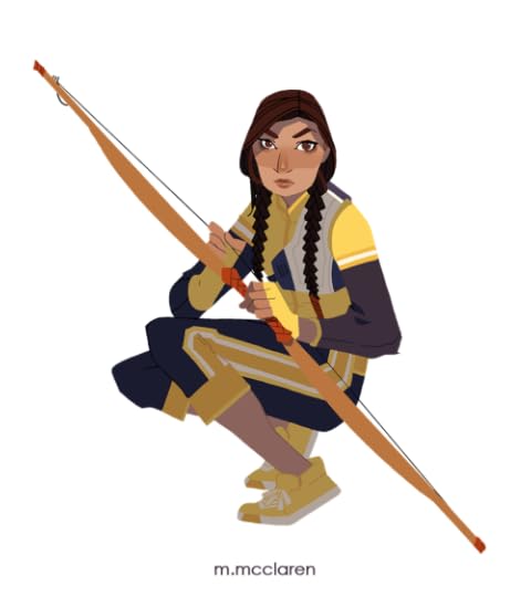
Practical Clothing for Powerful Ladies: Dani Moonstar
Dani Moonstar belongs to Marvel . Artwork by Meredith McClaren
October 3, 2016
Quick note!I’m gonna be chilling at NYCC this weekend at booth A-3a. Swing by.
Quick note!
I’m gonna be chilling at NYCC this weekend at booth A-3a. Swing by.
MSM 10.03.16 . Artwork by Meredith McClaren

MSM 10.03.16 . Artwork by Meredith McClaren

October 2, 2016
Hi, Just want to say that I love your work and as an aspiring animator your work has had a lot of influence on me. I just have two quick questions for my studies: How do you pick your colour schemes for the graphic novels you work on? and do you think that
Hello!
I’m so flattered to hear that my work has had an influence on you! I hope you do very well in your studies!
To answer your questions: Coloring is often a happy accident for me. I do have a vague idea when I start with a piece how the colors should look when it’s done, but whether or not that’s where I end up is not always a sure thing.
Usually I figure out a flat base, which is just what materials, skin, clothes, anything would look like devoid of any lighting. It’s not necessary that all the colors harmonize with each other just yet, because the second step, lighting, should take care of that.
When I approach lighting I usually first consider what time of day it is, and what the emotional tone is. Sad=blues. Anger=reds. The predictable tones. I also make sure to consider the action of the scene. Calm scenes can have a softer contrast between colors. Action scenes should probably yield a higher contrast.
I lay down shadows, lights, and depth on top of the flats using layer options like ‘multiply’ or ‘soft light.’ (I use photoshop so…)
When this is done, I usually have something that is in the ballpark of what I wanted. But sometimes I still fool around with the layer options, hue adjustments, etc, because it might yield a result I hadn’t expected and really like.
I think that this answers both your questions..?
I pick colors by way of trial and error. But they definitely push and pull a story by way of making the audience feel calmer or anxious, sad or frustrated.
Sorry if this is a bit confusing. I really ought to do a tutorial at some point.
September 30, 2016
stthenightshift:
IT. IS. NOMAD.
ST:TNS S2.03 The Changeling is...
IT. IS. NOMAD.
ST:TNS S2.03 The Changeling is a companion episode to the ST: TOS episode of the same name. Watch them alongside one another. It’s better that way.
This is parody.
We do not own Star Trek.
twitter: @stthenightshift
I feel like Jetta and Roxy are the kind of people who bond over...
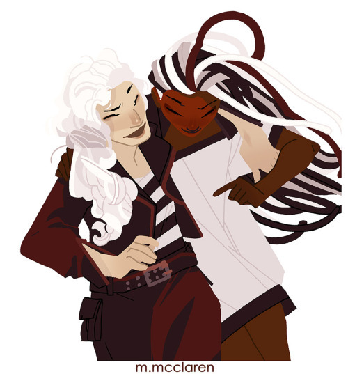
I feel like Jetta and Roxy are the kind of people who bond over property damage…
Jetta and Roxy belong to JEM AND THE HOLOGRAMS . Artwork by Meredith McClaren

Meredith McClaren's Blog

- Meredith McClaren's profile
- 97 followers

