
Cecilia Tan's Blog, page 40
September 13, 2011
Pottermore!!
So, last night I got in to Pottermore finally! The email came, followed by a few hours where it kept telling me the site was too busy. THEN it showed the screen I'd seen before saying the bit about how they weren't taking sign-ups. But that's the screen one wants, apparently — just use the login box and it worked.
I spent the next two hours tooling around the site. You follow the plot of the books to do things like open your account at Gringotts, buy your school supplies, get your wand, and then get Sorted at Hogwarts!
I'm sure you will all be shocked, SHOCKED to learn I got Ravenclaw. Apparently my recent change to Slytherin is just a phase I'm going through or something, and I'm still a Ravenclaw at heart. :-)
My wand, alder with dragon heartstring, "surprisingly swishy!"
There is some great background stuff about wand woods and cores that I will definitely be ganking for fanfic and RPG purposes.
The best thing I've read so far on the site after all the wandlore stuff, though, is the background history of Minerva McGonagall. Lots of great stuff there — I won't give it away. Just go read it when you get in!
Anyone who's on and wants to friend me, I'm ScarletQuest204!


September 12, 2011
Magic University back-to-school week… Day One!
So the big one is coming, the finale of my Magic University series. Yes, Kyle has reached his senior year, but before he graduates there's a lot to do… like figure out a thesis topic, find true love, and… maybe save everyone from the magical cataclysm prophesied in 3rd century…?
Each day this week I'll give away the winner's choice of a signed copy of book 1, or an ebook collection of books 1-3, to get folks psyched up for the release of the final volume.
Each day I'll also reveal something about the magical universe, or post some other fun thing to get you ready to go Back to School at the Magic University.
Today's post, have you noticed how Veritas sneaks into the news? Check out this article from the Boston Globe: 10 most sexually active cities." Clearly this is the influence of the Esoteric Arts department…?
Quality Health says: "This academic hub, which houses both Harvard and M.I.T., is also the city with the most relationship savvy: 58 percent of its romantic Amazon.com purchases are books about relationships. Cambridge's lower-than-average birth rates kept it from earning a top spot on our list, but it's interesting to note that in 1991 Massachusetts became the first location to institute a statewide condom availability program in its high schools."
And now, today's contest!
Comment here or email your answer to ctan.writer AT gmail DOT com with the subject line: MU Contest Day 1 (You must be 18 to enter.)
I'll pick a winner at midnight Eastern from all the correct answers (or whoever comes closest) to the following. Match the quote to the character who says it! These are all from the upcoming book!
EIGHT QUOTES:
"I'm, um, I'm more of a top, myself."
"I'm going to castrate you myself with a rusted garden stake."
"Please make sure you have Master Brandish's mobile on speed dial."
"So, speaking as your metaphorical bodyguard, your highness, I must say, me likes not this turn of events."
"I am so not doing the thing of being that girl who only talks about her 'man' as a way to pump up her self-worth."
"I'm willing to do a lot of things for the house. But you aren't one of them."
"She's allergic to boy cooties, you know."
"On the slim chance that the world does not end, you also have the matter to deal with that you have unfinished coursework from previous semesters, you know."
EIGHT CHARACTERS:
Alex
Dean Bell
Frost
Kyle
Jeanie
Marigold
Master Brandish
Persephon Cavendish
Each one is used only once! Have fun guessing!
September 1, 2011
Google Analytics on the Daron's Guitar Chronicles web serial
Here's a post for those of you interested in how weblit and serialized fiction work on the Internet. So, now that August is over, I've been looking at the Google Analytics stats on the Daron's Guitar Chronicles website, because it's interesting to me to speculate about visitors and patterns and what brings people to the story.
There's a definite difference between the stats while I was posting fresh content 2-3 times a week, and the current hiatus. Here's what I'm seeing:
History
The site was launched in November 2010. Posting of the story was never below 2 posts a week, and peaked at 4 per week when bonuses were in full swing. About half the time there were three posts a week.
The average number of visitors went fairly steadily up from the start right through May 2011, peaking around 250 per week. There were temporary bumps in traffic some months where I ran Project Wonderful ads, which would bring several visitors per day.
Before Hiatus vs. Hiatus
The three months before going on hiatus were of course the best traffic ever, since things just kept climbing. There appears to always be a bit of a lull on all my websites in July. (My guess is that the number of people who are traveling or on vacation and not surfing the net creates that effect. Though why it rebounds in August, I'm not sure.)
I expected that traffic would fall off to nearly nothing while I was not posting new content, since previous readers of the site would probably not be visiting until new content appeared. However I've been pleasantly surprised that traffic has only dipped a little. Compare last year's traffic to this year's:
In visitors per month:
Month
2010
2011
Jan
709
1633
Feb
555
1211
Mar
716
1198
Apr
813
1170
May
879
1203
June
1020
1110
July
702
872
Aug
1196
974
The three numbers in particular I want to compare are Mar-Apr-May from this year and June-Jul-Aug of this year. The total number of visitors does go down, but the numbers stay quite respectable.
So who are these folks and why are they visiting the site.
Some come from ads running via Project Wonderful's network, on webcomics and blogs all over. But some significant number of them are coming from Amazon, where book 1 of the ebook versions of DGC is free to download, and books 2 and 3 are $2.99.
Check out these comparisons:
Mar/Apr/May
June/Jul/Aug
3571
2696
total visitors
23%
33%
new visitors to the site
6:50
14:57
average time on the site
61%
51%
bounce rate
3.3
5.5
pages per visit
The folks visiting the site now are more likely to be first time visitors, they stay on the site (and don't bounce immediately away), and when they do, they stay for twice as long as previous visitors.
That makes sense since if people are new to the site they might sit and read a large chunk at one time, whereas when I was posting regularly, the regular readers could just catch up on a chapter or two per visit.
The most important thing about this is simply that the free ebook, which was downloaded about 3000 times the first month it was offered and which is now going at a rate of about 500 a month, is clearly bringing interested folks to the site to read.
The most intriguing thing is that far more of the commenters in the population of new folks are male than we ever had before. Several of the recent commenters are either male or using male pseudonyms (which is the same diff to me).
For those who are curious about how a free ebook spurs SALES on the Kindle store, well, right now volume 1 is going at a 500/month clip, while both vol 2 and 3 each sells about one copy per day (~30/month). The one copy a day rate is really really steady, surprisingly so, except during the weekend of Hurricane Irene, when it jumped to 3-4/day. Amusingly, a LOT of people must have been buying Kindle books that weekend because although the sales rate tripled on both books, their Amazon sales rankings dropped! So they must have been seriously outsold by other books.
I don't know if having the serial still free to read online spurs more people to buy the ebooks or if fewer do because after reading volume one, they just come to the site to read. There were probably a few who would have bought instead of reading on the site, but hopefully when new content starts to flow (at the end of September, at least, that's my plan) some of those folks will become donors & supporters, or tell their friends who will, et cetera. Giving stuff away has absolutely worked as both a community-building move and as a marketing/sales/pr move. Maybe in these days of online media, the difference between those two things no longer has meaning.
I have no plans to take down the site or previous chapters. Ideally the entire thing will remain free to read in the blog format, while the ebooks will be for folks who want to pay for the privilege of having them packaged nicely for their ereading device.
I don't rule out doing a print edition at some point, or even selling the print rights to another company, but I wouldn't want to have to take down the site. Any publisher who is interested hopefully is savvy enough to know that the site is a gateway for new readers, just as a library would be.
August 30, 2011
Got my hotel room for Ascendio 2012!
 The online reservation system is open for hotel reservations for Ascendio!
Details are here: http://ascendio2012.dreamwidth.org/1041.html
The con hotel is the Loews Portofino Bay at Universal, home of the Harry Potter theme park.
The con is July 12-15, 2012 in Orlando, FL.
In fact, join the Ascendio Dreamwidth community here: ![[community profile]](https://i.gr-assets.com/images/S/compressed.photo.goodreads.com/hostedimages/1380449063i/1818354.png) ascendio2012
ascendio2012
Heidi says online registration for the con is already almost at 200 people — and the first 200 to register get the $25 off "early bird" discount. So to register for the con visit here: http://hp2012.org/?page_id=131
There are single-day passes as well as full packages and the "Merlin's Circle" packages. Details are forthcoming later about Night of A Thousand Wizards (inside theme park) and other events to add on, I believe.
Type and Design Tips for self- and small publishers POST #6
DIGITAL BOOKS VERSUS PRINT BOOKS
All the previous posts in this series have been about producing printed books, especially trade paperbacks.
But now let's talk about ebooks. Some people say you don't have to "design" for ebooks. Well, some people are wrong…?
Right now the most popular format for download is still the PDF. This boggles my mind, given that I would think other formats would be much more usable on digital reading devices. But a lot of people either still prefer something that really looks like a book and not like a Word document. Many who are reading on iPads can even make a two-page spread which looks book-like.
Then there are folks who are printing the dang things out to read. I was actually shocked to find people purchase PDFs from Circlet.com and then print them out. I thought it would make so much more sense for those people to just… um… BUY A PRINTED BOOK?? But if the people want PDFs, then PDFs they shall have.
When designing a PDF to sell as a download, if I'm doing a print edition, I will usually try to use the same file as my basis, so it follows all the regular print design rules, but I may make the following adjustments for the digital only version, depending on the design:
-Technically we no longer need the thumb margin, but it's nice to keep SOME margin just to make it easy on the eye which is used to seeing a strip of white. I might reduce the size of the margin some, though.
-Undo the facing pages. I usually keep the verso and recto headers, but I will undo the gutter margin and center the pages.
-Get rid of the blank pages, don't always start New Right. Note that if you do this, you will need to adjust page numbers in the table of contents.
-Insert live links. Using Adobe Acrobat you can make that URL to the author's blog mentioned in their bio an actual link. I try not to go crazy with this, though. You want people to enjoy reading the book, not have a stray click accidentally bring them to some web page instead.
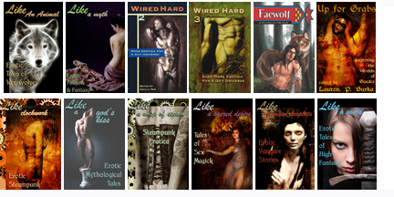
Typically the other big adjustment to make is with the cover. Here are the guidelines I give to artists who want to submit cover art to Circlet Press:
"Art needs to look good when small (100×150 pixels, 72 dpi) and also large (600 x 900 pixels, 72 dpi). For this reason, bold simple images tend to work better than scenes with a lot of detail in them."
Lots of the sites where the book may be sold will be displaying only a postage-stamp size thumbnail of the cover. So you want it to look good when teeny. However, it has to still look good when the customer clicks on it and blows it up to actual size.
For this reason bold colors or contrasts are also recommended. And the type, as mentioned in the previous post, needs to be BIG. If you thought it had to be big before, it's even more important now.
I'm not the world's greatest designer, and many of the covers shown below were created using stock photography from istockphoto or dreamstime, where the selection of fitting images is sometimes limited. But here's a sample of the thumbnail sizes:
And I think that's it. There are probably some secrets out there on how to "design" better for the Kindle or ePub files, but when the user can change the font to what they like or adjust the size with a click, a lot of regular design goes out the window anyway. Someone else will have to take up that topic. Or maybe I'll start another series later after I've played around with those things more. Also if folks have questions that were not answered by the preceding, comment with them! Chances are other folks have the same question(s). I'll either answer in comments or it'll spawn more posts…
Here's the recap though:
1. Farming Out to Professionals
2. Elements of Book Design
3. Page Layouts
4. Widows, orphans, and hyphenation
5. "Smart" quotes, section breaks, and fleurs
6. Ebook design versus print design
August 29, 2011
Type and Design Tips for self- and small publishers POST #5
Before I get to today's topic, I just found out that John D. Berry's ebooks on type and design are free for download:
Dot-Font: Talking about Fonts and Dot-Font: Talking About Design
From here: http://johndberry.com/blog/2011/08/27/free-amusing-book/
They're collections of his dot-font columns and might be of interest to some of you.
SMART QUOTES AREN'T SMART ENOUGH
You know how it seems like no one can get "its" versus "it's" right anymore? Well, the typesetter's version of that is no one can seem to tell the difference between when to use the single open quote versus the single CLOSE quote, also known as the apostrophe.
The single open quote looks like a teensy numeral 6. The close-quote/apostrophe looks like a teensy numeral 9.
Software thinks that the apostrophe goes in the middle of words like didn't or O'Leary. It thinks that whenever a quote mark (single or double) comes after a space, it should be an OPEN-quote, not a close-quote.
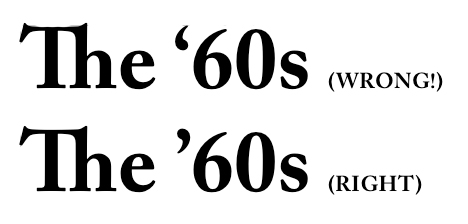
But what happens when a sentence starts with 'Tis? Or you want to talk about back in the '70s? Those are apostrophes, too. But "smart quotes" doesn't know that. So you have to go in and fix them by hand. Common usages I search for include dialogue where characters use 'em for "them", decades like '50s, '60s, anything else that may come up.
In ebooks we've often just reverted to "straight" quotes, which are symmetrical right/left open/close and look basically like sesame seeds. (I once had a nightmare I had to type a manuscript on a manual typewriter and the quote key was broken, so I had to glue black sesame seeds onto the page.)
SECTION BREAKS: TO FLEUR OR NOT TO FLEUR
And now let's talk about section breaks.
These are those gaps in a manuscript where it's not time for a new chapter yet, but the author indicates a break. In manuscripts these are often indicated with three asterisks.
You could keep those same three asterisks in your typeset, but what might look better is a fleur. Another word for fleur is dingbat. There are whole fonts who are nothing but little squiggles, symbols, pictograms, and such, intended for this purpose.
*** fleurs.jpg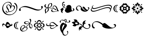
Above are some typical fleurs. These are from the Minion Ornaments font from Adobe.
Should your fleur be centered, or on the left edge? It can be either. What it should NOT be is indented like a regular paragraph.
And of course, you can make the break without any fleurs. You can do it with just a GAP of white space.
Typically when you do that, the first paragraph after the gap is NOT indented. Sort of like how the first paragraph of a chapter or story is also NOT indented (especially when a drop cap is used… see earlier post about that).
In most programs you can even define a style sheet that says okay, my post-break paragraph is non-indented and preceded by three-quarters of an inch of white space. The problem with defining the size of the gap this way is that you want it to work out to equal a certain number of lines. Otherwise you'll get a text block on your page that is too short compared to its facing page. Imagine your gap is the size of two and a half lines… the result would be at the bottom of the page you end up with a paragraph that is a half line short of the facing page, unless that page has the same number of section breaks in it.
While we're discussing fleurs, one other place you'll sometimes see them is next to the page number or in the running head. I'm not fond of that usually, but sometimes it can work. All I can caution here is USE SPARINGLY. If you're already using a fleur for your section breaks, don't also use one by the page number, and between the author's name and the title. You don't want it to look like confetti on the page.
Tomorrow, final post? (Unless you guys ask more questions I should be answering!) Some stuff specifically about ebooks, including tips about cover design and interiors. (Click here to continue.)
August 28, 2011
Hurricane has largely missed us…
So yesterday the rain started exactly at 2pm, when the first of the very outer bands of Hurricane Irene reached us. Around 3pm was the worst, when it was so dark the streetlights came on and we had a downpour so thick we couldn't see the house across the street. You can see the radar picture below that I took 22 minutes before the first rain — we're at the white crossed-circle on the map. At that point the eye of the hurricane was still something like 400 miles away (Baltimore).
By 4pm, when we were trying to get out barbecue grille into the basement, it was back to just light rain.
The rest of the day and evening alternated light rain and very still, windless, rainless conditions.
This morning I woke up to find we hadn't lost power in the night, Internet is still on, and it's not even raining at all now — and Irene was downgraded to a tropical storm. The eye took a northward track after hitting New York City and they are currently being hammered by heavy rains and wind in upstate New York. The eye is missing us by about 180 miles, and the way the rain bands have formed… we're being especially spared. Check out the radar photo below to see what I mean! We're where that red pin is in the map.
I haven't checked all the news reports yet on how much flooding may have happened at the coast or in the harbor, but right now, it's actually ALMOST sunny, not raining at all, and although it's windy, even the gusts don't seem as strong as we get in a typical winter nor'easter. High tide this morning at 11am was supposedly 9.7 feet, and they're expecting the 11pm one to be around 11 feet in Boston Harbor. (Several feet above normal.)
My thoughts and prayers to those who are still in the storm track. That's still a lot of water, folks. (A tweet from friends near the eye say they've gotten 5 inches already today and it's still coming down.)
Photos under the cut!

22 minutes before the first rain began to fall on Aug 27. 1:38pm. We're the white circle.

About 24 hours later, the storm is passing us by, far to our west. We're athe red pin in this map.
Now I get to eat all the brownies and cookies I baked yesterday as comfort. :-)
August 27, 2011
Type and Design Tips for self- and small publishers POST #4
Let's start with hyphenation today.
USE HYPHENATION: DON'T AVOID IT
I see a lot of small press books where they try to solve the problem of a word processor's hyphenation mistakes by just turning off hyphenation completely. Please do not do this. Remember you have justified the text on your Body Text Pages (right?). Allowing no hyphenation forces the software to make too much space between some words and can lead to what's known as the River of White. The River of White is BAD. It's like you can see white cracks in the page there's so much space between the words. The River of White is not only kind of ugly, it disturbs readability. (I read recently a blog post from a dyslexic woman who said rivers on the page make it impossible for her to even read a page. Her eye keeps getting drawn away from the words.)
ELIMINATE EXTRA SPACES
Speaking of the River of White, avoiding it is also why you should never put two spaces after a period. Chances are you or your authors are in the habit of typing two blank spaces after a period. (If you are, please stop doing it if you can. Just think about all the time you'll save not typing that extra character a few thousand times in every manuscript.) Before you start typesetting a manuscript, strip out ALL those extra spaces. Just ONE space after a period or other punctuation. And never, ever use a tab to indent a paragraph, or worse, five blank spaces in a row. NEVER. Even in MS Word. Use the paragraph format settings to give yourself a first line indent of about a quarter inch, no more.
INDENTS SHOULD BE SMALL
That's worth repeating. The default first line indent in Word is a HALF INCH. That's HUMONGOUS. On an 8.5×11 inch manuscript page, which is double-spaced and all, a half inch doesn't look like much. But on a regular book size page, which is HALF the size of the manuscript page? At 5.5″ x 8.6″ or 6×9″, that half inch on a book page is huge. More importantly, it's LARGER than a small word. That's too big. I use .25″ or even .23″ for most of my jobs. Open a professionally typeset book from Random House or Penguin or HarperCollins and measure the indent. I just did on the one on my desk and it's a mere point-one-eight inch (.18″).
The indent should be smaller than a small word like "her" or "fit."
BACK TO HYPHENATION…
Okay. So you've set up your Body Text Page to allow hyphenation. In both Quark and InDesign there are settings where you can tell it "don't hyphenate three or more lines in a row". Once upon a time (like 15 years ago) you could also tell software not to hyphenate Proper Nouns and not to hyphenate the Last Word of a Paragraph. Somewhere along the way we LOST these capabilities. (Maybe they were never in Quark or Adobe products and were only in the late, lamented Ready,Set,Go!) Instead, nowadays, you must input the proper names of your characters into the Hyphenation Exceptions menu. Yes, I'm serious. If you have a character named Daniel, you never want to see a line end with "Dan-" and the next one start with "iel".
While you're adding things to hyphenation exceptions, add all the contractions: don't, won't, isn't, ain't, didn't, wouldn't, couldn't, shouldn't, aren't, weren't, can't, doesn't, hasn't, hadn't, could've, would've, should've, you'll, she'll, he'll, et cetera. I have no clue why these aren't standard in the built-in exceptions. If you're using Quark there is a way you can set them to apply to all future documents, though. (Set them with no document open. If you have a document open it will only apply the exception to that one.)
You also never want to see a paragraph end with a hyphenated word. Like if the last word of the paragraph is "locomotion," you don't want to see the second to last line end with "locomo-" and then just "tion." on a line but itself. But you don't want to make that word a hyphenation exception, as you do want it hyphenated in most other cases. You have to go through and fix them BY HAND.
DO NOT HYPHENATE:
proper nouns
contractions
last word of a paragraph
more than two lines in a row
A typesetter I was talking to recently said that it's normal to have to touch EVERY PAGE in a book at least once. Yes, in a 250 page book, you can expect an average of 250 adjustments to be made by hand. (And that's if the manuscript was nice and clean to start with.) You'll find a bad hyphen or something needing adjustment on almost every page. Perhaps a widow or an orphan.
WIDOWS AND ORPHANS
Most likely if you've talked typesetting, you've heard the terms widows and orphans. If you haven't, you really need to know this.
Let me begin by saying that a lot of the rules of typesetting are being ignored wildly by the big publishers in some books. I've been seeing things like bad hyphenations (like hyphenating across a page break — ugh!) in mass market paperbacks for years and years. But you almost NEVER see actual widows or orphans, although there are exceptions.
I know someone will ask: what's the difference between a widow and an orphan? Both describe a situation where some text looks abandoned (orphaned or widowed) on the page. If you try looking up which are which, though, you'll find some contradictory definitions. The basic point is this:
You don't want a single short word on a line by itself at the end of a paragraph. This one gets ignored a lot, though, in pro type jobs, so maybe it's a partly the designer's taste (or hourly fee) that determines it.
You DEFINITELY don't want just a portion of a word after a hyphenation on a line by itself.
Even worse, you don't want a single word, portion of a word, or a line shorter than a full line at the top of a page, "widowed" from the rest of the paragraph it's supposed to be married to.
When using a two column format, you also don't want just the first line of a paragraph by itself at the very bottom of the left column, although they say it's generally acceptable to have a full first line at the bottom of a regular page. That one's probably at your discretion, then.
Here are some examples from two small press books sitting on my desk. I've made them kind of blurry to obscure their identities (I hope) since my intent is not to make fun of specific publishers. These are very good books! They're just typeset by folks who didn't seem to know better.

Here's an orphan that also shows how huge the indent is. On this book the indent is half an inch. That's the word "city" circled there and completely surrounded by whitespace because of the combination problem of too large an indent and also being orphaned on a line by itself. You know how there are rivers? There are "lakes" and "puddles" too, which you should avoid.

Here's one with an even worse "lake" around it!
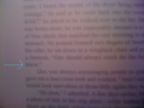
Here's one at the end of a block paragraph. That little word "know" shouldn't be allowed to be on a line by itself, as far as I'm concerned. Some typesetters would let this stand, though, so this one's at your discretion. However with a nice big block of text like that, it could easily be adjusted not to be like that.
But wait, I hear you asking: how do I fix it? There are a couple of possible ways, some better than others.
FIXING ORPHANS & WIDOWS
If you're the author, you might consider rewriting a word or a line, or breaking up a big paragraph into two, but that way can lie madness…! You're supposed to be designing now, not endlessly rewriting your text. And if you're not the author yourself, the author almost certainly does not want a typesetter messing with the prose!
Generally speaking, you want to either get that lone word to go back up with its brothers in the block of the paragraph, or you want some siblings to come down and keep it company so it's no longer orphaned. My preferred fix in this situation is to adjust the Tracking. Say I've typeset this in Joanna 11.5 point type, or Garamond 12 point, or even Palatino 11 point. The human eye will not be able to discern a Tracking adjustment of up to +3 or down to -3, and sometimes you might be able to go all the way to +5 or -5.
Start with +1. Did that make everything in the paragraph reflow to send another word or two down with the orphan? No? Then try -1. Did he go up with his sibs? No? Then try +2. Then -2. Then +3. Then -3. If none of those 6 attempts fixed it, then I might try adjusting the actual wording.
It can get even worse, though. You can end up with the dangling text all by itself on the top of the next page! Viz:
In this case, anything that is less than a full line needs to either go back to the previous page or a whole line needs to come join it on the next page. Here's another:
FACING PAGES SHOULD BE SYMMETRICAL (AND SO SHOULD BACK TO BACK)
Here's the thing. You can't just stick a carriage return in at the bottom and create a bunch of blank lines at the bottom of one page and start the paragraph at the top of the next, because then you've screwed up the symmetry of your text blocks. Now you'll have a white gap people will see the shadow through the page, and you'll have a verso-and-recto pair that aren't the same size.
Use the same technique, only look for a paragraph that precedes it, perhaps by several pages, that looks like a good candidate for a -1, -2, or -3 tracking adjustment, which will result in the paragraph being shortened by a whole line. You might even have a spot where you "fixed" one orphan by making a word go down and join it, but now you need it to go the other way.
And needless to say, having a widowed line that is completely alone like the above is really, really bad.
Other techniques for fixing them, when Tracking adjustment fails? If the orphan is caused by the last word being hyphenated, insert the non-hyphenation character before the word and only that one incidence of the word will be unhyphenated. Sometimes the entire paragraph will adjust to suck up the fragment.
Sometimes you just can't seem to get it resolved, though — every time you fix one, you create another. A three line paragraph that crosses a page is often a problem. One cheat I've done sometimes is to shorten or lengthen the text block on the chapter opening page by a single line, either at the top or the bottom of the block. Since that page won't be a mirror image of the one facing it, it's possible to make an adjustment there that won't be noticed except perhaps by the shadow coming through the page just where the line was removed. But sometimes you have to make a judgement call of what's worse. Not every puzzle has a good solution.
Next post: what's not so smart about "smart" quotes, section breaks, and fleurs. (Click here to continue.)
August 26, 2011
Type and Design Tips for self- and small publishers POST #3
Ok, now we get to the real stuff that no one tells you. Let's say you're using Quark or InDesign, you've flowed all the text of your novel or stories into the pages, and you're done, right?
No, you've just started.
It's a bit like you just pulled your cake out of the oven, but you haven't even started to frost it or decorate. And just like with cake, frosting isn't just some frivolity. It's an expected part of the cake-eating experience. And as anyone who has looked at the Cake Wrecks website knows, there's a huge difference between a well done professional frosting job and a crappy one (whether amateur or not).
A book is the same. If the frosting is applied by someone who doesn't know what they're doing, you end up with the titles in Papyrus or Comic Sans–or worse, the body text of the stories…! And that's just the beginning.
First let's talk about FOUR types of pages you have to design.
1. Blank
2. Chapter Opening or Story Opening
3. Main pages of the book — left-facing pages and right-facing pages
BLANK MEANS BLANK
No. 1 is easy. When we say blank we mean no design elements at all. The copyright page, for example, should be blank, which is to say free of headers, page numbers, or other design elements. That means if you have a running header on your No. 3 style of page that has the author name or title of the book, it should NOT appear on your copyright page.
ALL PAGES that are not specifically a chapter opener or a flowing text of story/main content should be BLANK. Title page, acknowledgements, dedication, copyright page, "also by…", and other front matter pages of that type should be blank. In the back matter, thing like advertising pages should also be blank.
CHAPTER OPENING PAGES
No. 2 should also be pretty easy. You pick a font for the chapter headers to be. You might want this to be a font that blends with the title font, or maybe it's even the same font as your body text, just larger, or italic, or otherwise used creatively. (Small Caps is an easy way to get a very different look out of a font you've already picked, sometimes.)
The placement of that chapter title should have at least an inch of white space above it and at least an inch before the paragraph of the actual text starts. And usually the only acceptable place for the page number to appear in that design is centered at the bottom of the page. No header should appear above the title, no page number or running head like one finds on the main pages of the book.
Are you going to use Drop Capitals, also known as Drop Caps? Many software layout programs have the ability to put this in the paragraph format, and specify how many lines tall the drop cap is, as well as what font it should be. (They're often not the same font as the rest of the text and may match the title text.)
If you are going to use drop caps, let me tell you now: when you do that you don't indent. Mixing drop caps with first line indents is like mixing plaids and prints. It's one or the other, not both, please.
Yes, the above is an example from an actual book on my desk. Great book (I've made it blurry so hopefully you can't tell what it is) but clearly typeset by someone who didn't know the rules.
BODY TEXT PAGES
No. 3, the main pages of the book, are ALL pages that aren't blank or chapter openers. These pages contain any actual content, including the introduction or foreword, and all the pages of the various stories or chapters except the chapter opening pages. That means if the author's bio is only one page long, then it gets a chapter opening page and that's it. Whereas if it runs to two pages, page one is a chapter opening page and page two is a No. 3 style page.
No. 3 style pages are actually TWO styles of page though. One right facing, and one left facing. Quark and Indesign will keep track of which side of the page you are on if you have set them to "facing pages." A basic fact of printed books is that the paper comes with two sides and there is no way around it. Typically the left facing page header will have the author name, the right will have the title, or vice versa, and the page numbers will be placed to mirror image each other (i.e. upper left corner on a left page, upper right corner on a right page).
Next decision you have to make, do I start "New Right"? That means does each new story or chapter always start on a righthand page (aka "the recto")? If so, then what happens if I have a chapter that ends on the recto? In order not to start the next one on the verso (left/reverse side of the paper), I must put in a blank page. That means a completely blank page, not a page with a lonely header sitting there by itself, or just a page number sitting there like a pimple. I see that a lot. YUCK. The page should be COMPLETELY BLANK, a No. 1 page. Then the next happy chapter starts on the recto.

The above book has a lot of blank pages in it because the chapters open New Right. Every single one of the blank pages, though, isn't blank. It's got this lonely little number sitting there. Aghhhh…..
Make sure if you put in blank pages like this that your manufacturer knows you are intentionally leaving the pages blank! When you output a PDF to send to the manufacturer/printer, be sure you have set it to "Include Blank Pages." Otherwise your carefully inserted blanks may disappear, your page numbers will get screwed up, and your left/right layout will be munged.
There are only two reasons you wouldn't start everything new right. One is that you're actually making a digital PDF for sale and a blank page just makes no sense if the reader is just reading off the computer screen one page at a time and not seeing left/right spreads. The other is if you need to save money and the finished book comes out a few pages too long. Each page you cut saves you money. This is less urgent in POD where they can do any page count divisible by two. In traditional printing, it's vastly cheaper to print a 224 page book than a 232 page book, for example (but might be the same price for 192 pages as for 224, because both require the same number of signatures).
ONE MORE THING ABOUT FACING PAGES
We haven't even talked margins yet. The gutter margin (i.e. the margin on the page that is int he center of the two page spread — the right margin on the verso and the left margin on the recto) should be larger than the one on the outside edge of the page. The one on the outside edge of the page is there so you have a place to put your thumbs while reading the book that doesn't cover any of the text. (This means on an ebook, you don't need such big margins since the ereader device has the place to put your thumbs!) The thing is, you want the text to look centered, but in the gutter, where the pages are glued, because of the way the page bends, unless you are spiral binding or cracking the spine (ouch), you lose about a quarter inch to a half inch in the gutter. So if you want the margin to look like it's a half inch all the way around, set the outside margin to half inch and the inside margin (on a paperback book) to 3/4 inch to correct for the gutter loss.
Some printers (like Lulu and Lightning Source) may require a margin of a minimum size. Use their recommendation but don't forget to add more to the gutter if they don't remind you themselves.
Next post, the nitty gritty of widows, orphans, hyphens, dashes, and section breaks. (Click here to continue.)
August 25, 2011
Type and Design Tips for self- and small publishers POST #2
Okay, so you've decided you're going to design and typeset your own book.
The first thing to note is that I have never come up with a way around needing either Quark Xpress or Adobe InDesign. Anyone who says you can do perfectly good, professional page layout in Microsoft Word is either lying, ignorant, or a Microsoft shill of some kind. (The same goes for OpenOffice and the Word clones out there. They're very sophisticated, but they're NOT PAGE LAYOUT SOFTWARE. And yes, you can drive a nail into a board using the handle of a screwdriver, but why would you want to?)
I've been using Quark for about 17 years now, and I've tried to make the switch to InDesign twice, and ended up back at Quark both times. But both programs have the powerful ability to make the specific adjustments necessary for professional typesetting that Word and other word processors don't.
There are a million video tutorials on how to use these programs out there, and although the software is expensive to shell out for ($700 to $1200 last I looked…) both programs let you download a fully functional trial version that works for 30 days. If you're a savvy Internet user you probably also know that Google-fu might turn you up free or pirated copies of both programs. Here's my hope. In the spirit that we are all in the publishing business hoping that our creative endeavors will be rewarded with money as well as fame, I urge you to purchase your software. I'm not a saint; I've definitely done the trick of downloading the trial version, using it for 29 days, then downloading a new copy to a different computer, using that for 29 days, and so on… until my business reached the point where I could reasonably pay for the software legitimately.
However, if you're only doing one book because you're self-publishing, use the trial version, it doesn't cost you anything, and it will look a LOT better than MS Word would.
Let's say what you're designing is a collection of short stories. Here is a brief checklist of design decisions you need to make:
Title Font (used on: front cover, half title page, and title page)
chapter or story title font
header font for title & author's name
body text font and size
placement of the page number (corner? centered?)
header: include author and story or chapter title? or just book title?
what size should the header be, does it include other design elements?
margin size (partly determined by the requirements of your printer)
leading (rhymes with "sledding" — the space between lines)
style of section breaks — asterisks? fleur? do you leave out the indent?
is the first line of each chapter indented or not?
what size indent?
drop capital at the start of a story or chapter or no?
Yep, if you hire a designer, s/he is going to be having to figure out answers to all those questions and come up with unique answers for each book and each client. If you're doing it yourself though, here is some initial advice:
Picking fonts that don't look dumb is hard. Generally speaking, don't go with anything too cute or too elaborate. At the other end of the extreme, whatever you do, don't use ANY of the standard fonts that came pre-installed in your computer (Arial, Geneva, Helvetica, Times, Calibri, Verdana). At Circlet Press I've settled on a few specific fonts that work well for various uses, purchased them (cheap, like $15 each), and stuck with them. In particular:
Title Font — Don't pick something stupid or crazy. The title on the cover should be large enough to be read from at least 10 feet away OR the illustration has to be so striking that people should want to cross a bookstore to pick it up to see what the title says. (I'll talk about ebook versus print book covers in a future post.) On the interior of the book, though, the title shouldn't be too humongous or it looks silly.
Author's Name — If the author is well known enough that their authorship is the selling point, then their name goes closer to the top of the cover, and the title closer to the bottom. Otherwise, title nearer the top, author's name nearer the bottom and in a slightly smaller type size. You might be amazed to find there are books out there where you can't tell which is the title and which is the author. It does matter. Also, do not use the word "by" on the cover. Look at the books on your shelf. Does it say THE SHINING by Stephen King? No. It just says THE SHINING Stephen King. (Well, actually, it says STEPHEN KING The Shining, because in King's case, the author's name is way more important than the title.) Likewise in the interior, though, it shouldn't be clownishly large.
You will think that the title on the cover is Too Big. You will be Wrong. Assuming a 5.5″ x 8.5″ book cover (trade paperback size) you're probably looking at fonts between 42 point and 72 point on the cover. Yes, there are covers that break this rule and break it well in the bookstores. But you're an amateur designer — start with the rules before you break them.
Body text and font size. Pick a font that has serifs and that is reasonably compact. Don't use Times (aka Times New Roman) unless you have no other choice. One of the painful things about Times is that it's so universally used that the multiple versions out there can create conflicts from one version of your book's file to another as it moves from computer to computer. I use a font called Joanna as my standard body text font, but I'm the only one I know who prefers it. I would avoid Palatino as another over-used one. I see a lot of Garamond, Bookman, and New Century Schoolbook, but they seem to work well, so that's why people use them.
Next post, we'll talk about how to actually compose a page PROPERLY. Does your software do the right thing to hyphenate all words? I bet it doesn't. Are you using the "keep together" preference to try to stop widows and orphans? DON'T. Do you not even know what a widow or orphan is? We'll cover it. (Click here to continue.)


