
Tosh Berman's Blog, page 180
July 22, 2016


July 19, 2016
The Evening Series : Volume Two
Evening Series: Volume 2
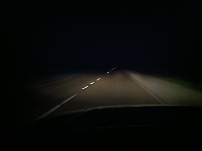
One night I was in the desert, on my way to Las Vegas, when all of a sudden my car died. I didn’t want to get out of my car, because I felt that it would be like walking on Mars without a spacesuit. The car’s battery was dead, or it was playing dead - either way, I sat in my car and pretend this wasn’t happening. My headlights were out of course, so the only reflection of light that came, was a passing car speeding across the two lane highway. There was no way I could flag a car down, because I didn’t exist, due to the speed of the passing car. When I finally got out of the car from the passenger side, I saw nothing but blackness on blackness. Blackness itself was endless and after a while I started to see shapes or something of a 3D effect. I really couldn’t see the hand in front of my face.
When my car died I think it was around 11:00 PM. But I’m not sure, because when I drive on a straight highway I lose all sense of time, due to the road itself as well as the blackness that is out there. One thing I noticed when I stepped out of the car was the sound of tumbleweeds tumbling across the landscape. I didn’t feel there was anything alive out there, yet, I felt logically there must be something breathing on the blank vista in front of me. The air was non-existent. I could breathe easily, but I felt there was no wind or even a breeze. Yet over time, I could feel that there was movement in front of me, when I faced away from the highway.
There were very few cars going by. Due to keep my mind on something I counted up to six cars, but got bored, because there was a lot of time (or that seems to be the case) between cars. I tried to think of a melody, but oddly enough nothing came to mind. I became hyper-aware of the sounds of the desert. Everything was low-volume, but now I noticed that there were consistent sounds.
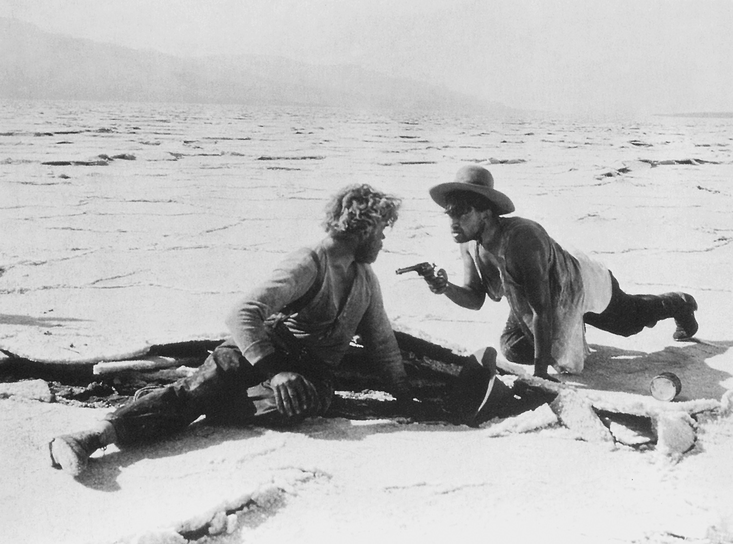
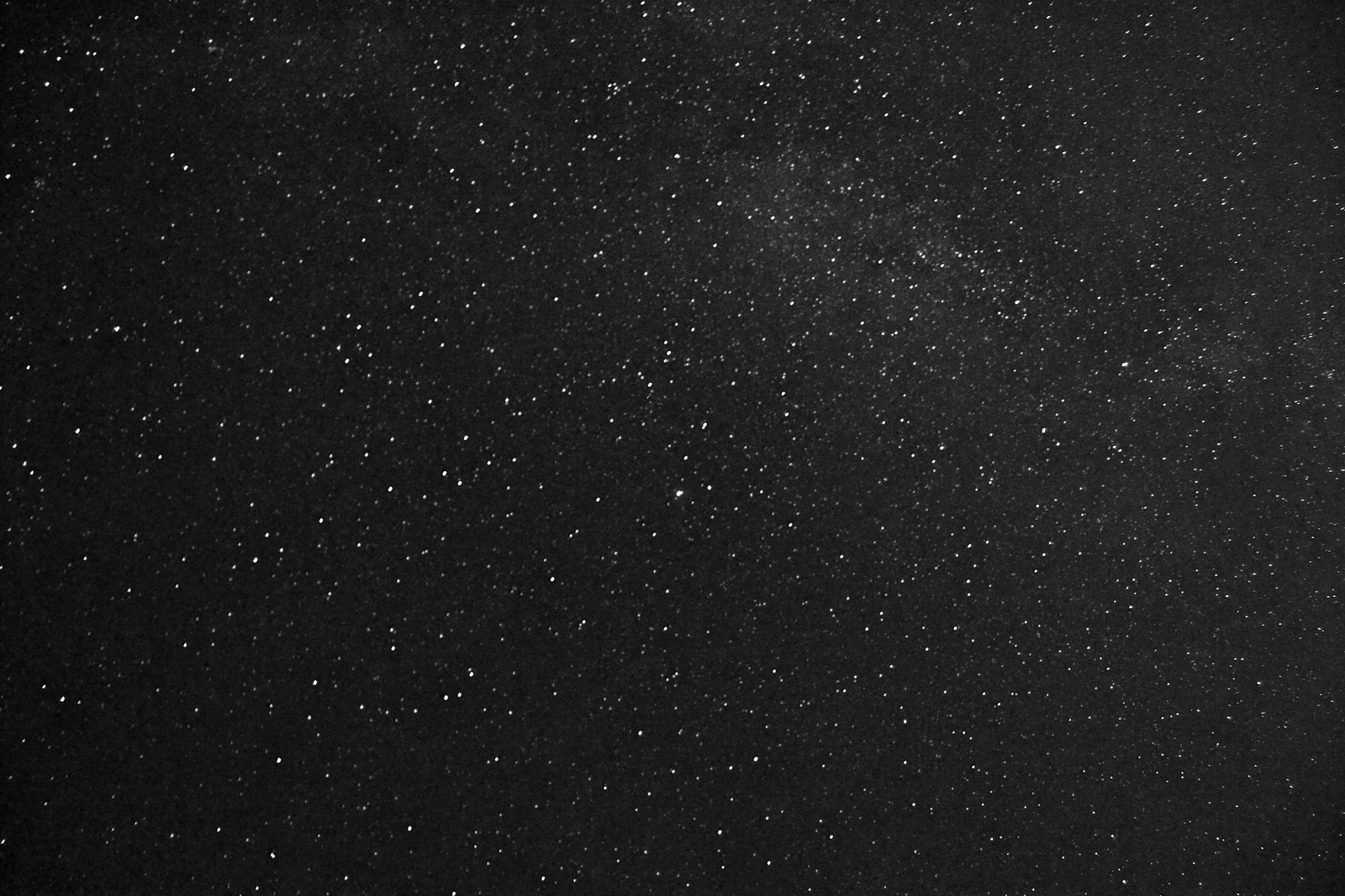
When I looked up in the sky, there was nothing but stars, and then more stars. There were no clouds and since I was only wearing a white American Apparel t-shirt, Levi 501’s and black tennis shoes, the temperature was quite comfortable. I started to think if I die right now, it will be OK. But I was worried to see the sunrise, because I felt I was trapped here, and I may die under the exposure of the sun. All of sudden, I had thoughts of Dr. John McTeague and his one-time best friend, Marcus Schouler, from the film “Greed, ” fighting to the death under the hot sun and in the desert. I have only read about "Greed," and seen its film stills, but if you asked me at a party if I have seen it, I for sure would tell you I not only seen it, but saw the original five and a half hour version.
As I stood there, leaning on my car, it was the first time I really thought about dying. I had Arrowhead water in a plastic bottle, so I felt I could make it last throughout the night, still, I had a hunch my life would either be totally changed or by morning I’ll be dead.
I started to imagine vultures eating my meat, and I wondered if they peck you while you’re still alive or you have to be dead. I have read that a vulture can’t really eat a healthy animal or human. They usually wait till another animal or larger scavenger attacks the body. After they are finished with the meal, then they go in and take what they need. Also, it seems that they projectile vomit, not as a weapon against another beast, but to unload their stomach so they can fly off easier.
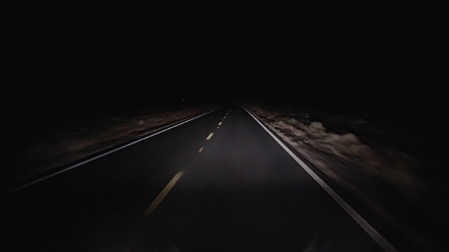
I don’t know how long I stood there and just thought about this. All I know is I looked into the darkness hoping to see myself, or a reflection. But the landscape does not acknowledge you. The viewer is really in the mercy of the landscape. I was thinking of going back inside my car to find a pencil and piece of paper and perhaps write my final words, but all of sudden, I just didn’t care anymore. I finally accepted that I exist in darkness, and therefore I wanted the night to swallow me before the daylight. I have nothing more to say.
-Tosh Berman (8:30 PM - 9:30 PM)
La Notti Bianche (White Nights) by Luchino Visconti

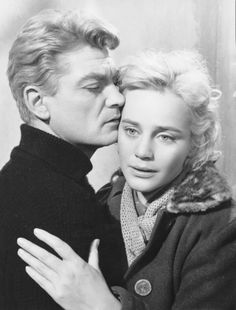
I saw the most amazing film last night. La Notti Bianche (White Nights) by Luchino Visconti. For one, I can't imagine having Marcello Mastroianni and Jean Marais in the same room or scene. Two different visions of male beauty. The Mastroianni character is great. He's sort of the typical Italian guy in a new town, looking for an obsession. He finds it in Maria Schell, who in turn is obsessed with Jean Marais. The Marais and Schell characters are much more complexly than Mastroianni - and it's interesting to see how he is placed in this remote yet seductive world. The cinematography is brilliant, and I believe the story takes place in Venice, Italy. If so, the landscape of that Italian city is a separate character in the film as well. Another highlight is a great dance scene in the middle of the film. When Italians rock, they rock (dance) hard. I haven't seen such a great film in a long time - so it was a shock to come upon Notti Bianche, to remind me that the cinema arts is superb.

July 18, 2016
The Evening Series : Volume 1
The Evening Series: Volume 1
Cocktail hour comes at 7PM, just as the sun is heading behind the mountain range. It is the last moment of my sobriety. It is at this time that I look forward to my drunkenness. One of the things I have learned in life is that to be drunk, is better than be sober. The straight life. I lift my drink to sobriety as I get my dueling pistol to shoot the soberness in its face. Which reminds me, I need to replace the mirror in the bedroom.
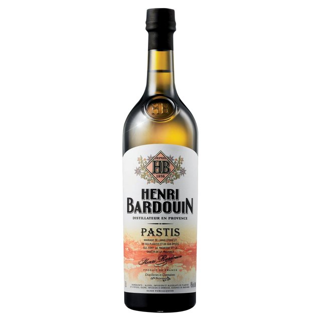
I only drink the drink that French gangsters drink. Henri Bardouin Pastis. It contains more than 65 different herbs and spices. At least 21 of its ingredients are secret. It is a confidential matter between the supplier and the drinker. Yet, the beauty of drinking such a liquid is dwelling in its secrets. The purity of having an edge, is when you really start feeling alright. And I do feel right, man, right in my head. The clothes on me are weighing me down. I’m by my self, so I don’t see why I need to wear the job uniform that one wears whenever they leave their home. The steel framed chair feels good on my skin, and I have nothing on except my watch. It’s important to notice the passing of time. “My name is Bill and I’m a head case.” What song is that? Good god, it’s 7:43 and I’m feeling a tad light headed.
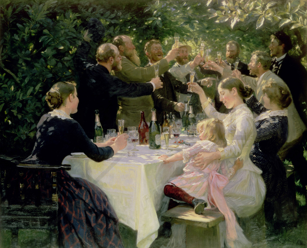
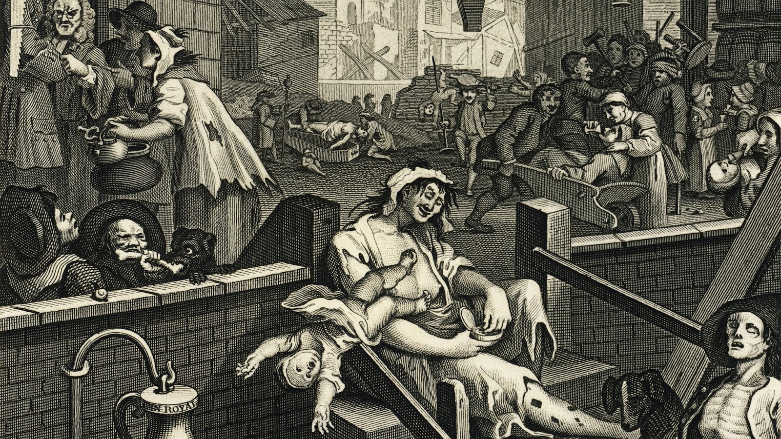
In the room, where I do most (if not all) my drinking, I have two images on my wall. One is a knock-off print of a painting by Peder Severin Kroyer “Hip Hip Hurrah!” Artists Party at Skagen, 1888. I like it, because it makes me happy. It looks like a family setting, where they’re drinking champagne to toast some happy occasion. The appeal to me, is that it’s not tied to a particular holiday or incident, such as a wedding. It can be just friends out in the backyard (nature?) and enjoying the day without a thought in their heads, of the misery that will come around the corner. The other is an etching by William Hogarth called “Gin Lane (1751) ”. A street scene where it is literally hell on earth. A drunken woman who is sitting on top of a steep staircase is dropping her baby, as another is passed out drunk, with his chest exposed, showing his rib cage. Food is not part of the Gin Lane world. These two images remind me of the duality in life. As I sit there in my chair, focusing on both paintings from a distance, I feel like I’m walking on a tightrope between the two works. So, the two works of art express the best and worst, within my world.

The duality I feel that is within me, is like a beast that refuses to go to sleep. It rests quietly, but I’m fully aware that it's awake. Drinking combines both parts of me, and eventually it joins as one. The sense, of coming together, finally gives my anxiety some much needed rest. I’ll drink to that!
- Tosh Berman (July 18, 2016; from 8:10 PM to 9:30 P.M.)
July 15, 2016
Music Listened to on July 15, 2016

When I need to focus on a blank piece of paper, and I need to add words to that blankness, this is the album that I have been listening to. There's a purity to the sounds that frees my mind up. I enjoy Steve Reich's music quite a lot.

The brand new Mick Harvey album is pretty fantastic. All Serge Gainsbourg covers. Side two is mostly devoted to the music Gainsbourg did for "Anna." So, this is the third Harvey album that's devoted to the Gainsbourg world. Great arrangements as well! A must-have!
July 14, 2016
The Disappearance of Dennis Cooper's Blog
Over two weeks ago, Dennis Cooper's longstanding blog, The Weaklings, disappeared into thin air. One would want to visualize it as disappearing into the mist, or smoke. The truth is he opened up his computer and simply couldn't access his account on Google. His G-mail and his blog on Google’s Blogger platform were totally gone. All he (or we) could see is the sentence: "Sorry, the blog at denniscooper-theweakling.sblogspot.com has been removed. This address is not available for new blogs." Like it never existed. And to this moment, this is the only message from Google regarding the disappearance and perhaps the loss of Dennis Cooper's work on his blog.
I have been reading it on a daily basis for the past ten years or so. Not only did his blog exist, but many writers and artists were attached to reading his daily thoughts on all sorts of culture - but all seen through the eyes of Dennis Cooper. He has a sixth sense, with respect to others who are doing new and fascinating work in various mediums. There are certain individuals, such as Dennis, who are sign-posts for those who share a taste, or at the very least, an interest in the experimental arts. On this blog, we were invited to make comments, not only about the contents of the blog, but also to Cooper, regarding his work, or taste in music, literature, and cinema. For a long time, his blog was a popular destination for those who write or read the kind of experimental literature that is not always Publisher's Weekly friendly. The sex and violence in Cooper’s work are often disturbing, but never taken for granted, and always commenting on the culture they arise from. Dennis used his blog as an on-going canvas to express, think, and offer art in its many forms. In a way, visiting and reading his blog is like going to a classroom with a very brilliant teacher, except here the teacher listened to his students and their their thoughts were equally weightedThere are zillions of blogs, but there is only one Dennis Cooper blog, and to say it was (or hopefully "is") unique is putting it mildly.
Many authors/artist benefited from Cooper's creative work and in-turn, having their work on his blog. That his blog has been zapped out, is an act of cruelty, not only to Dennis Cooper, who has had ten years of his creative work vanish, but also to his readers, who often contribute to this website. Google, Facebook, Twitter, and Instagram exist because they are private property of sorts. We, the public, are invited to participate in these platforms for free, but alas, we have to give them something back. If not our souls exactly, at least our personal information. It's a pact made with a digital Satan. Most of us feel that the work we upload on these platforms belong to us, but perhaps that is not the case at all. They don't use the “material” for their purposes, but also, they really don't have any respect for the content that the viewers and users bring to that platform. They clearly understand that they need the “content” to attract attention, but in the end of the day, it is their property that we live in, and for some reason we don't pay the rent, or perhaps in this case, post works that are questionable (to a certain viewer or audience) then they have the right to tear it down.
I grant them that Google is a private company, yet one hopes that as an internet-landlord, they will give you good reason if they terminate your lease. My feelings are multifaceted: For one, I'm a huge fan of Cooper's work as a writer, and his blog is an incredible portal to his mind. And again, as viewers and participants, we were allowed to show our work on his canvas. Now all that work is seemly gone with no explanation whatsoever. The second thing that bothers me is that I too have a Google blog, but now I’m concerned that when I take a nap Google will trash the contents. Like Dennis, my work would simply stop existing. I think any writer or artist that uses either Facebook, Google, or any other platform would feel the same. It sends a chilling message that technology giants can stomp on your work just for the sole reason that they can.
For further updates on the issue of Dennis Cooper's blog - go to Facebook page: https://www.facebook.com/Dennis-Coopers-Blog-214073142012494/?fref=ts
- Tosh Berman
July 12, 2016
Music Listened to on July 12, 2016
Such a beautiful record. I love the fatality of it all.
It is like you are taken to the cliff's edge, and your looking down, and the person behind you, pushes you over.

Jacno, a total mystery to me as of last year. I'm thrilled to discover him. This specific album is superb. On the surface he's a combination of Serge Gainsbourg and Jacques Dutronc, but I suspect he has his own thing going.
July 10, 2016
Elyse and Stanley Grinstein
Not to be so cliché, but hearing about the passing of Elyse Grinstein, was like Proust's character biting into his cookie, and the memory is unleashed. I don't remember my first meeting with Stanley and Elyse exactly, since I was a mere child, but I guess it was at their Gemini G.E.L. - either in their office, or perhaps an opening at their premise. What I do remember is the big picture. The Technicolor memory of their numerous parties that took place in their home in Brentwood. Thinking back, a lot of my most pleasant memories are located in that house. I don't think my parents ever turned down an invitation to their home. To be invited, and to actually be there, was a very good thing.
The Grinsteins' were the focal point of the artist's landscape - which included of course, the artist, but also anyone associated within that world. It wasn't a private club. Their parties were way much more than that. To enter their home, one is exposed to other artists from other parts of the world, and also to experience something you wouldn't have, without the assistance of Stanley and Elyse Grinstein, this would or could not happen. In other words, it wasn't solely a party for Los Angeles based artists. It was a portal hole to another world.
Elyse and Stanley collected art. They collected art because they obviously loved art. They also loved artists. Their relationship with artists was magical. My father and mother, Wallace and Shirley Berman, often went to their home for either dinner or the parties. Stanley and Elyse were consistently doing fascinating things, or going to interesting places. My mom told me that she went over to their house with my dad to see Elyse's photographs of her trip to China, which I think was focused on that country's architecture. The only other person there beside the Grinsteins and my parents was David Hockney.
Parties are meant for the purpose for relaxation but also for people to meet-up. My memory is in a haze, but I clearly remember being in the presence of The Dalai Lama, Robert Raushenberg, Jasper Johns, Judy Chicago, the entire Los Angeles art community, a traveling SUMO wrestling team from Japan, Bryan Ferry, The Tubes, Toni Basil and the Lockers, and every major curator/museum/gallery owner on the planet. To be in a room full of strangers can often be awkward, but for some reason, once you go pass their doorway, it becomes a home. They had an active juke-box full of dance music, and the dancing got crazy. I have a faint memory of Merce Cunningham dancing near the jukebox as well.
The common sport-love was basketball and the Lakers. The Ginsteins had season tickets, and often invited artists, such as my dad and mom, to either go with them, or just hand them out if they couldn't make it for some reason. I can't speak for the other artists, but Lakers season tickets are not something normally that my dad could afford. So, the games were an incredible luxury and treat. I clearly remember Wallace being incredibly buzzed about going to the game. In fact, Wallace purchased two life-sized posters of Jerry West and Wilt Chamberlin, that was hung over my parent's bed. There were also pick-up games in the parking lot of Gemini G.E.L. as well. At times, artists would come over to the parking lot, to take a rented van to the Laker game.
Even now, and I'm feeling terribly sad about Elyse's passing, the memory of her life, was in one essence: fun. Whether they were doing either community political work, or just hanging out - it all had a very serious purpose - and that purpose was to have fun. I don't think I have ever been in a more joyful existence than at the Grinstein's home. Everyone who was invited, was put in a world that was in one word, perfect. The food that they served was consistently low-brow - but incredible. Huge Italian sandwiches, tailor-made to feed hundreds. I remember a lot of finger-food, and of course, the bar seemed to never be empty. Nor the food.
What one reads about Elyse and Stanley it is usually the party. Which seems such a surface type of subject matter, but in their case, it was not. It would be impossible not to have a great and memorable time at one of their get-togethers in their home. And again, it was the combination of people who attended their parties. It was usually a theme of some sort - a party for so-so from New York or Europe or even Asia. Or to watch something - either a slide show or maybe a short film. It was consistently a place to obtain information of all sorts. And everyone there, was on a neutral ground of importance. In other words, as a child, who couldn't possibly offer anything to this world, was made to feel at home, and I could wander freely around their house. The artworks they had up were all exquisite and of course by well-known artists, but they were up for the sole purpose of them being excellent works of art. Yet their sophistication was how they lived their lives. They were not just matrons of the art world, but actual people who participate in that world just as much as the artists and art institutions. And it wasn't just a money thing. It went beyond money and into a genuine relationship with them and the rest of the world.
Stanley and Elyse had a lot of artwork by my dad in their personal collection, including "Topanga Seed," which to be exact, was a huge rock, weighing over a ton, and Wallace hand-painted hebrew lettering all over the rock. A beautiful piece of sculpture that was also conceptual in its concept. Nevertheless, it made perfect sense for Elyse and Stanley to buy this work, because he owned and operated a forklift company. So there is film footage (from Russ Tamblyn) of them picking the rock and transporting it back to their home, which to be exact was 11.9 miles, and the forklift was going 3 mph, from the Berman house to the Grinsteins. Wallace and Russ followed the rock, as if it was following Jesus through Jerusalem.
It's a fact that the art community would be a very different type of landscape without the presence of Stanley and Elyse. If you are thinking of terms of art history, one has to imagine that Louise and Walter Arensberg as being the first serious collectors of modern art in Los Angeles, but I feel that Elyse and Stanley even went beyond the legendary Arensberg, in that they really focused on not only the visual arts, but 20th century culture.
Their house was the second home to people like William S. Burroughs, Allan Ginsberg, Phillip Glass, Gregory Corso, and others visiting from New York. It is almost like that there was a secret underground tunnel from Soho New York to Brentwood. That pathway led to a great many things to happen in Los Angeles. I can't really speak for every artist in Los Angeles, but I do know that my father (and mom) treasured every second with this dynamic duo - either separately or together - and I have a hunch that a lot of artists feel that way. I guess physically Elyse and Stanley are not here, but their DNA, taste, and support will always be felt whenever one visits a museum here in Los Angeles. Thank you Stanley. Thank you Elyse.
- Tosh Berman
July 7, 2016
"Masculine, Feminine, Neuter" by Roland Barthes (Translated by Chris Turner) Published by Seagull Books
 ISBN: 978-0857422422 Seagull Books"Masculine, Feminine, Neuter" by Roland Barthes (translated by Chris Turner) Published by Seagull Books
There are book reviews, and then there are book reviews written by Roland Barthes. "Masculine, Feminine, Neuter" is a compilation of his writings that deals with the subject matter of literature. The beauty of his critical thought is that he really gets into the text and culture of the book that he's focusing on. I have always found his writings on the New Novel, in other words, the novels by Alain Robbe-Grillet, fascinating. Robbe-Grillet and others, were working in a different format, of being very objective, yet of course, being subjective at the same time. The writing is factual, but the reporting of that fact will always be subjective. Which is a reminder how one should read the news these days. There is also commentary on Marcel Proust regarding his masterpiece, and how that book is really about writing as well. Life happened, but the writing part is another form of life. Seagull Books should be congratulated for publishing this series of Barthes' writings that hasn't been issued in english before. And again, reading Barthes is a bit like having a really good friend whisper in your ear as you are reading a text that he's interested in. A good friend indeed.
- Tosh Berman


