
Will Pfeifer's Blog, page 49
October 4, 2011
Advance Team Tuesday: Say, look what's available on Amazon...

... it's only for pre-order, of course, but if you'd like a copy of that graphic novel "The Advance Team" you've been hearing so much about, get out your credit card and click here.
And you save 32 percent off the cover prize. Wotta deal. So be sure to order early -- and, of course, order often.


October 1, 2011
Will Elder Weekends: Robinson Crusoe!
 This week's panel comes from the Kurtzman/Elder adaptation (well, sort of) of "Robinson Crusoe!" from the thirteenth issue of Mad. I especially love how the story begins like the original (well, sort of), with our hero scavenging items from his ship (especially rum) and building "crude" shelter on the island upon which he's stuck. As you can see by the above panel, by the end of the story, crafty and resourceful Robinson has constructed a complex system of highways, a jet-powered car and a robot driver.
 Of course, there's one more bit of the story, with Crusoe using the brain of Friday (who, naturally, Elder draws to look like Joe Friday of "Dragnet") to create one final item ... WOMAN! It's the perfect sick twist for a perfectly twisted tale.

September 27, 2011
Advance Team Tuesday: Special Rock 'n' Roll Hall of Fame Edition
In honor of the announcement of this year's nominees to the Rock 'n' Roll Hall of Fame in Cleveland, I thought I'd share a moment from my upcoming graphic novel "The Advance Team" that combines (a) rock 'n' roll and (b) the city of Cleveland.
And, because there's nothing I like more than including a scene of a youthful sniper in comic book, there's that, too. Enjoy?
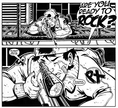 "The Advance Team," as if I need to remind you, features art by German Torres, writing by me and hits stores this spring. Start saving those pennies now!

And, because there's nothing I like more than including a scene of a youthful sniper in comic book, there's that, too. Enjoy?
"The Advance Team," as if I need to remind you, features art by German Torres, writing by me and hits stores this spring. Start saving those pennies now!
September 24, 2011
Introducing ... Will Elder weekends!
As part of my continuous (and continuously failing) effort to get some content onto this blog, I'm kicking off a year-long series in honor of my all-time favorite cartoonist, Will Elder.
Huzzah! Huzzah!
Elder, one of the original artists on Harvey Kurtzman's Mad and a lifelong collaborator with Kurtzman, died in 2008, but his legacy remains secure. His work on Mad alone makes him a pop culture icon, but he also created amazing drawings (and paintings!) for Kurtzman's later magazines, including Humbug, Help and Trump. And, of course, he worked with his old friend Harvey for decades on the Playboy comic strip "Little Annie Fanny." As satire goes, it was a step down from Kurtzman's earlier efforts, but as far as the art goes, it was often among Elder's best.
So, to mark the man's recent birthday (Sept. 22 -- I can't be timely with anything on this blog, can I?), I'm going to post something by Will Elder each weekend. Many of the early pieces will be from those classic Mad comic book days, but I'm planning to cover his entire career -- and it was a long, rich (and very funny) one.
First up, a panel from my favorite Will Elder story and, I'd argue, one of the greatest pieces of pop culture satire of all time. It's from Mad #12, released way back in 1954, with script (of course) by Harvey Kurtzman. Ladies and gentlemen, I give you the comic that scarred me for life (in the best possible way) when I first read it in fourth grade, "Starchie"....
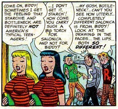 Like most (all?) Elder panels, this one has a ton of stuff going on, but I especially like how Elder draws Biddy and Salonica. Not only are identical (which is the main joke of the panel) and not only are they inappropriately attractive (which keys off the wonderful seediness of the entire strip), but they're draw in a way no high school comic book girls are ever drawn -- namely with bad skin and acne... you know, just like real high school girls! It's a small thing, but it's the sort of thing that elevated Elder's art past a mere imitation. He really brought something more to the equation -- something that made the original look different (and usually fake) in comparison.
Huzzah! Huzzah!
Elder, one of the original artists on Harvey Kurtzman's Mad and a lifelong collaborator with Kurtzman, died in 2008, but his legacy remains secure. His work on Mad alone makes him a pop culture icon, but he also created amazing drawings (and paintings!) for Kurtzman's later magazines, including Humbug, Help and Trump. And, of course, he worked with his old friend Harvey for decades on the Playboy comic strip "Little Annie Fanny." As satire goes, it was a step down from Kurtzman's earlier efforts, but as far as the art goes, it was often among Elder's best.
So, to mark the man's recent birthday (Sept. 22 -- I can't be timely with anything on this blog, can I?), I'm going to post something by Will Elder each weekend. Many of the early pieces will be from those classic Mad comic book days, but I'm planning to cover his entire career -- and it was a long, rich (and very funny) one.
First up, a panel from my favorite Will Elder story and, I'd argue, one of the greatest pieces of pop culture satire of all time. It's from Mad #12, released way back in 1954, with script (of course) by Harvey Kurtzman. Ladies and gentlemen, I give you the comic that scarred me for life (in the best possible way) when I first read it in fourth grade, "Starchie"....
Like most (all?) Elder panels, this one has a ton of stuff going on, but I especially like how Elder draws Biddy and Salonica. Not only are identical (which is the main joke of the panel) and not only are they inappropriately attractive (which keys off the wonderful seediness of the entire strip), but they're draw in a way no high school comic book girls are ever drawn -- namely with bad skin and acne... you know, just like real high school girls! It's a small thing, but it's the sort of thing that elevated Elder's art past a mere imitation. He really brought something more to the equation -- something that made the original look different (and usually fake) in comparison.
September 20, 2011
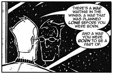
Advance Team Tuesday: A genuinely cosmic moment
Here's a cosmic moment from "The Advance Team" where a mundane moment with our hero, Zack, becomes something a bit more mind-expanding...
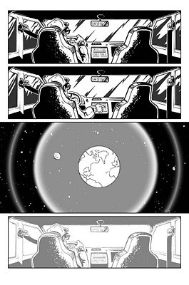 Look familiar? It should. You've seen it before -- specifically here. But this time around, as a bonus, here's a genuinely cosmic moment. Check out this video taken from the International Space Station as it orbits the Earth at night.
It begins at the Pacific Ocean and passes over (according to the official notes) "North and South America before entering daylight near Antarctica. Visible cities, countries and landmarks include (in order) Vancouver Island, Victoria, Vancouver, Seattle, Portland, San Francisco, Los Angeles. Phoenix. Multiple cities in Texas, New Mexico and Mexico. Mexico City, the Gulf of Mexico, the Yucatan Peninsula, El Salvador, lightning in the Pacific Ocean, Guatemala, Panama, Columbia, Ecuador, Peru, Chile, Lake Titicaca, and the Amazon."
I really like those bursts of lightning as seen from above. Now that would be something to see.
This blog post -- and all the blog posts in the "Advance Team Tuesday" series -- are brought to you by "The Advance Team," the graphic novel Tor/Forge will be publishing in the spring, with script by yours truly and art by German Torres. Read more about it here.
Look familiar? It should. You've seen it before -- specifically here. But this time around, as a bonus, here's a genuinely cosmic moment. Check out this video taken from the International Space Station as it orbits the Earth at night.It begins at the Pacific Ocean and passes over (according to the official notes) "North and South America before entering daylight near Antarctica. Visible cities, countries and landmarks include (in order) Vancouver Island, Victoria, Vancouver, Seattle, Portland, San Francisco, Los Angeles. Phoenix. Multiple cities in Texas, New Mexico and Mexico. Mexico City, the Gulf of Mexico, the Yucatan Peninsula, El Salvador, lightning in the Pacific Ocean, Guatemala, Panama, Columbia, Ecuador, Peru, Chile, Lake Titicaca, and the Amazon."
I really like those bursts of lightning as seen from above. Now that would be something to see.
This blog post -- and all the blog posts in the "Advance Team Tuesday" series -- are brought to you by "The Advance Team," the graphic novel Tor/Forge will be publishing in the spring, with script by yours truly and art by German Torres. Read more about it here.
September 12, 2011
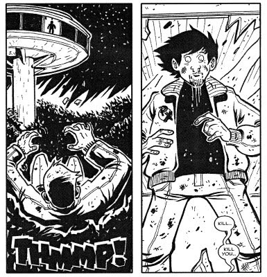
Advance Team Tuesday: Five more random panels
Here's another set of five panels (some of 'em grouped) to whet your appetite for the release next year of my graphic novel "The Advance Team." When it hits the stores, there will be hundreds of panels for you to peruse, all of them beautifully drawn by German Torres.
So, without further ado, here's some out-of-context violence, intrigue and romance...

So, without further ado, here's some out-of-context violence, intrigue and romance...
September 11, 2011
Why movies still matter after 9/11

I don't have anything to say about 9/11 here at X-Ray Spex, but I did devote this week's Register Star Movie Man column to that subject...
"Back in September 2001, in the first column I wrote after the Sept. 11 attacks, I struggled to form some sort of response to what had happened.
"Naturally, being the DVD reviewer — and a lifelong movie fan — I tried to tie the news of the day into the films of recent years. Here's what I wrote 10 years ago:
I've seen planes crash and buildings collapse. I've seen terrorists strike America, and I've seen America strike back — hard, usually with a cigar in its mouth and a machine gun in its hand.
People die — extras mostly, or the hero's best friend/beloved partner. Then, the hero — America — grits its teeth, grabs its gun and kills the bad guys, often with a witty remark. Everyone cheers. The credits roll. The end.
I didn't hear any witty remarks Tuesday. Did you?
Of course you didn't. The remarks, witty or otherwise, didn't arrive until a few weeks later, when comedian Gilbert Gottfried joked at a Friar's Club roast that he couldn't get a direct flight because his plane "had to stop at the Empire State Building first."
Read the whole column here.

September 6, 2011
My favorite Love & Rockets panel
From issue 24, released sometime in late 1987. I had just fallen head over heels for the Replacements and their "Pleased to Meet Me" album, so imagine my surprise when Maggie and Daffy wound up at Ray's apartment and the radio was playing "Valentine"...
 As it turns out, that was a landmark evening, kicking off the long and complicated relationship between Maggie and Ray. But all that mattered to me, back in 1987, back in college, back reading that original issue off the stand, was that two of my worlds -- comics and music -- were finally colliding. I'll never forget how surprised and happy that panel made me. Still does, in fact, even after all these years.
And it didn't hurt that the issue also happened to have my favorite Love & Rockets cover. No, strike that -- my favorite comic book cover...
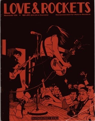
In "The Art of Jaime Hernandez: The Secrets of Life and Death," Jaime says he started this image by drawing Terry's foot and working from there. Amazing. It's so perfectly structured, perfectly balanced between blacks and whites (or, in this case, reds) and just so damn perfectly drawn that you'd think it would take years of planning before you could even put pencil to board.
And yes, in case you were wondering, that's my original copy of the issue, big fold in the bottom corner and all. I've since acquired virtually all those Love & Rockets issues in various collections (in fact, my rereading of that story in "The Girl from H.O.P.P.E.R.S" trade and seeing that panel above is what inspired this post), and I've gotten rid of many of the original issues. But I could never part with No. 24. Every time I saw that cover, I picked it up and paged through it, then I inevitably stumbled onto that panel, and back into the box it went.
The panel itself means a lot more surrounded by the others on the page, and the story means even more when it's read in the midst of all those other Maggie-and-Ray (and Maggie, and Ray) stories -- several years' worth of them, in fact. But for some reason, that single image, with those three characters, two word balloons and, most importantly, that curving stripe of lyrics extending across the panel, somehow that sums up everything I love about Love & Rockets ... and music, and comics, and pretty much everything. Thanks for drawing it, Jaime.
As it turns out, that was a landmark evening, kicking off the long and complicated relationship between Maggie and Ray. But all that mattered to me, back in 1987, back in college, back reading that original issue off the stand, was that two of my worlds -- comics and music -- were finally colliding. I'll never forget how surprised and happy that panel made me. Still does, in fact, even after all these years.And it didn't hurt that the issue also happened to have my favorite Love & Rockets cover. No, strike that -- my favorite comic book cover...

In "The Art of Jaime Hernandez: The Secrets of Life and Death," Jaime says he started this image by drawing Terry's foot and working from there. Amazing. It's so perfectly structured, perfectly balanced between blacks and whites (or, in this case, reds) and just so damn perfectly drawn that you'd think it would take years of planning before you could even put pencil to board.
And yes, in case you were wondering, that's my original copy of the issue, big fold in the bottom corner and all. I've since acquired virtually all those Love & Rockets issues in various collections (in fact, my rereading of that story in "The Girl from H.O.P.P.E.R.S" trade and seeing that panel above is what inspired this post), and I've gotten rid of many of the original issues. But I could never part with No. 24. Every time I saw that cover, I picked it up and paged through it, then I inevitably stumbled onto that panel, and back into the box it went.
The panel itself means a lot more surrounded by the others on the page, and the story means even more when it's read in the midst of all those other Maggie-and-Ray (and Maggie, and Ray) stories -- several years' worth of them, in fact. But for some reason, that single image, with those three characters, two word balloons and, most importantly, that curving stripe of lyrics extending across the panel, somehow that sums up everything I love about Love & Rockets ... and music, and comics, and pretty much everything. Thanks for drawing it, Jaime.
September 5, 2011
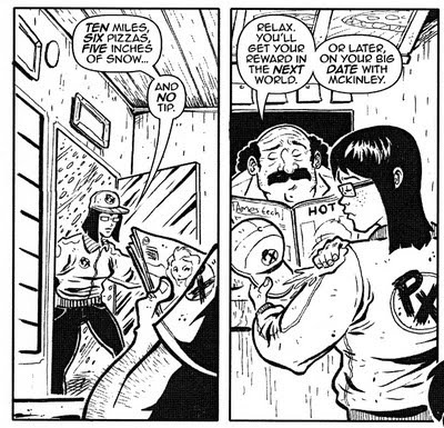
Advance Team Tuesday: Young hearts, beat free tonight
I don't want you to get the idea from previous Advance Team Tuesday posts that the graphic novel "The Advance Team" is nothing but fight scenes, nasty villains and weird aliens. It's mostly that, sure, but I made sure to include a little romance, too...
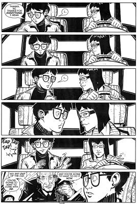
That's out hero, Zack, almost sharing a tender moment with his co-worker/would-be girlfriend, Vic, when he's -- of course -- interrupted by his "uncle" Archie. All will be explained within the pages of the book, of course.

That's out hero, Zack, almost sharing a tender moment with his co-worker/would-be girlfriend, Vic, when he's -- of course -- interrupted by his "uncle" Archie. All will be explained within the pages of the book, of course.
September 2, 2011
Start your Christmas shopping now
In case you're worried about what to buy me for the holidays to pay me back for all this insightful (and, ahem, free) blogging, worry no more. The advertisement for the ultimate gift arrived in last Sunday's newspaper...
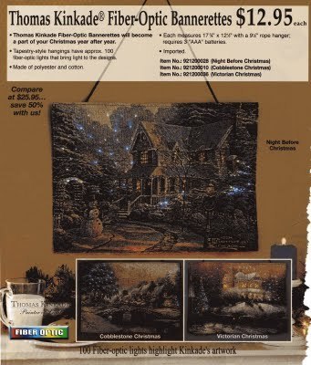 Yes, it's the "Thomas Kincaid Fiber-Optic Bannerette." Not a banner -- not exactly -- but a smaller, cheesier, tackier simulation of an actual banner. And the fabled (and trademarked) "Painter of Light" doesn't just paint the light this time around, he (well, his underpaid minions) actually attached actual lights to the actual banner -- excuse me, the actual Bannerette. Let's take a closer look at that artwork, shall we?
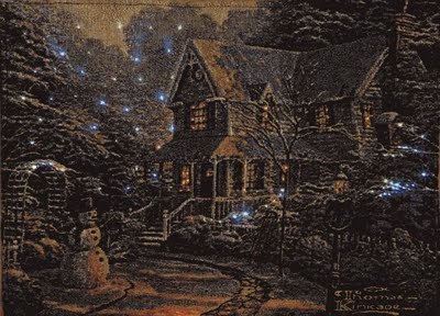 Sorry if this image is a little dark, but I didn't want to lighten it up in Photoshop. The combination of (a) fiber optic lights, (b) a backlit computer display and (c) the majesty of the actual Painter of Light has the potential to blind us mortals, so I felt it was safer to leave well enough alone. Just bask in the beauty of Kincaid unleashed!
As glorious as the "artwork" itself is, it's not my favorite part of the ad. That instead would be the bottom left corner...
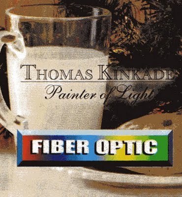
I love, of course, the official Thomas Kinkade slogan, "Painter of Light," rendered as it is in a very, very classy font. But even better is the rainbow alert that this artwork does, in fact, use FIBER OPTIC technology. Apparently the company really, really didn't want us to miss that little fact. I wonder if I could buy a print of just that logo? (And what's in that glass? The milk of human kindness, I'll bet!)
Finally, as long as I'm discussing the great American modern artist Thomas Kinkade, I suppose this is as good a time to remind everyone that, yes, he really did urinate on a Winnie the Pooh statue back in the 1990s. It's true! Just imagine that heartwarming scene made even more magical with the addition of -- you guessed it! -- fiber optics.
It would be the merriest Christmas of them all!
Yes, it's the "Thomas Kincaid Fiber-Optic Bannerette." Not a banner -- not exactly -- but a smaller, cheesier, tackier simulation of an actual banner. And the fabled (and trademarked) "Painter of Light" doesn't just paint the light this time around, he (well, his underpaid minions) actually attached actual lights to the actual banner -- excuse me, the actual Bannerette. Let's take a closer look at that artwork, shall we? Sorry if this image is a little dark, but I didn't want to lighten it up in Photoshop. The combination of (a) fiber optic lights, (b) a backlit computer display and (c) the majesty of the actual Painter of Light has the potential to blind us mortals, so I felt it was safer to leave well enough alone. Just bask in the beauty of Kincaid unleashed!
As glorious as the "artwork" itself is, it's not my favorite part of the ad. That instead would be the bottom left corner...

I love, of course, the official Thomas Kinkade slogan, "Painter of Light," rendered as it is in a very, very classy font. But even better is the rainbow alert that this artwork does, in fact, use FIBER OPTIC technology. Apparently the company really, really didn't want us to miss that little fact. I wonder if I could buy a print of just that logo? (And what's in that glass? The milk of human kindness, I'll bet!)
Finally, as long as I'm discussing the great American modern artist Thomas Kinkade, I suppose this is as good a time to remind everyone that, yes, he really did urinate on a Winnie the Pooh statue back in the 1990s. It's true! Just imagine that heartwarming scene made even more magical with the addition of -- you guessed it! -- fiber optics.
It would be the merriest Christmas of them all!
Will Pfeifer's Blog

- Will Pfeifer's profile
- 23 followers
Will Pfeifer isn't a Goodreads Author
(yet),
but they
do have a blog,
so here are some recent posts imported from
their feed.

