Kimberley Anglesey's Blog, page 2
June 27, 2013
And nothing but the truth
Yesterday I was talking with a gal who works at a local magazine who had recently taken on the task of editing/reviewing her friend’s first novel. Her friend asked her because she felt she could get honest feedback about all the important things: plot, character development, quality of writing.
I told her that constructive feedback is hard to come by, and her friend was lucky she was willing to take on the job.
When I wrote my first novel, Mer Si Raen Ambush, I was fortunate that my best friend was willing to give me painfully honest critiques, without sugar coating the truth. She was also qualified and dedicated to the task of editing. It was invaluable help.
If you’re thinking about writing your own first book, the most important thing you can do if find a qualified person to read your rough drafts and give you the truth about how you’re doing. Matching the right person to the story is something to keep in mind. Not everyone enjoys the same kinds of stories, and you don’t want to ask someone to read something they wouldn’t normally find entertaining or interesting.
Having been in the position to critique others recently as a member of Scribophile, I better appreciate how difficult that honesy is, and how much of a gift my friend gave to me. If you don’t have a friend who can assist you, Scribophile is an excellent resource for new authors, with helpful articles, advice and editing from fellow members. It’s also a place where you can find people who will agree to read your book offline and share their reactions.
Sometimes it can be hard to hear what others have to say, and you may not always agree with their opinions, but I’ve learned that anyone willing to read your work and share their thoughts is to be appreciated.
June 1, 2013
Mer Si Raen Ambush in Print
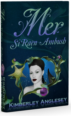
Here is a sneak peak at the new cover for Mer Si Raen Ambush print edition coming soon. Setting up the book for the print version turned out to be more challenging than I had anticipated, but I am pleased with the final result. For all those folks who don’t have e-readers and have been reminding me that you want a good old fashioned book, here you go!
The book is 479 pages. I chose the 5.5 x 8.5 size. I prefer a sightly larger paperback when I read, and they fit nicely on the shelf beside my hard bound books, so it was an easy decision. The image of the mermaid is one that I created myself using DAZ 3D and several other graphics programs, include Photoshop and Paint Shop Pro. Also utilized on the cover were images purchased from Jaguarwoman.com. If you are not familiar with Dana’s art, you will want to visit her website. I have been a customer of hers for many years. She consistently created beautiful design resources.
I’d love to hear your opinion of the new cover. Drop me a line and let me know what you think.
May 13, 2013
Favorite New Font
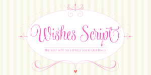 Being an artist, I spend a good deal of time working with fonts and have for over twenty years, before the days of the desktop computer and way after Gutenberg.
I love fonts. I have a rather large collection after so many years, but I never fail to get excited when a designer publishes a new font that tickles my fancy.
Today I fell in love with Wishes Script by Sabrina Mariela Lopez. It reminds me of my own quirky handwriting, half cursive, half print. I must not be the only person who had fallen into mixing the two! If only my own scrawl was this pretty.
Programmed with Open Type, Wishes offers the designer a complete range of possibilities: frames, ribbons, hearts, flowers, ornaments, swashes, endings, ligatures and all the alternates you need to make a wonderful work. With delicate and flowing curves which blend English style with lettering, Wishes Script not only works aesthetically in logos, packaging, and greeting cards, but would be a lovely font for a book cover and associated promotional materials. Perfect for a romance or chic lit title.
Additionally, it can be used in large or small formats, due to its Display and Text styles. It scales easily in all sizes, preserving the delicacy of its thin strokes and ensuring they print accurately.
Besides the font, there are 990 glyphs available for purchase that can be used to create complimentary graphics.
So if you’re looking for a sassy, classy and fun font to add to your design collection, I reommend you take a peek at Wishes Script! You’ll be glad you did!
May 11, 2013
Stock Covers
You may not have noticed that I am also a photographer. You can find my photography at Kimberpix.com, on sereral stock sites, including Shutterstock, and on Fine Art America.
I decided it would be fun to take some pictures and play with creating stock book covers. This is my first attempt at a cover. I think it turned out pretty nice. It would work well for a story about a black widow woman. The text is just a sample of what someone could put on the cover. If you like it and want to license the cover, drop me an email.
There are additional images from this photo shoot that are available to be licensed as suplimental pictures for marketing. I am happy to work out a package price.
I can also arrange a custom shoot if you like this image but would like to do an alternate post. I can also design the entire cover for you, set the type and add your information on the spine and back.
April 28, 2013
Headshot
What does your headshot say about you?
I can’t tell you how often I click into an author’s profile on Amazon and find they have used a poor quality snap shot to introduce themselves to potential readers. It makes me wonder what consideration they gave this photo choice? What were they thinking?
When you consider the thousands of books people have to choose from, if they happen to land on your title, you have an opportunity to not only make a sale, but establish a fan. What do you plan to do with this golden opportunity?
As a self published author, part of your job is self promotion and creating an interesting press kit. Marketing is a multi faceted job and every bit as important as writing a good story. The same way your book needs an attractive, eye catching cover, you need a great headshot. More than just a flattering photograph, a great headshot is a powerful tool for making people remember you. This is because facial recognition is hard wired into every human brain. The truth is, people judge a book by the cover, they also judge you by the quality of your headshot. What does it say about you if you throw up a poor quality image? What will they assume about the quality of your writing? What is the first impression you want to make?
How do you compose a compelling headshot?
Your headshot should be a clear picture of your face with natural makeup (for the ladies.) Many headshot photographers have a makeup artist with whom they like to work. The fee for this artist may be included in the price of your session, or it may be extra. A professional photographer can Photoshop away blemishes and add a hint of glamour to your picture.
It’s best to wear simple, color coordinated clothing in your headshot. Your outfit should be age-appropriate with a flattering neckline, and it should be somewhat neutral (i.e. don’t wear clothing that is overly detailed or trendy). It’s best to avoid t-shirts with words or distracting designs, formal/semi-formal (prom) dresses, and large jewelry pieces. You can opt for a black and white image, but the same rules of dress apply.
Your eyes are the most communicative feature in your headshot. They should be engaged and expressive, giving readers a glimpse into your character and personality. It’s best if your headshot makes you look friendly. If you are most comfortable with a non-smiling shot, you should still have a “twinkle in your eyes.”
Keep the pet out of the photo. It’s fine to have additional photos on your website that include your favorite animal companion, but the headshot needs to be your portrait. Readers enjoy seeing you in other pictures, and it’s nice to share more about yourself through assorted images, but there is no substitution for a quality headshot for your marketing materials.
You don’t have to spend a fortune on your headshot. There are plenty of choices for simple portrait photography. Nearly every town has a studio that takes photos for senior pictures, the fee for a single headshot image shouldn’t be more than $50.00. Check with a local realtor and ask who took the photo for their business cards. Be careful about finding your photographer on Craig’s list. If you do choose a photographer without a studio, take someone with you to the shoot, never go alone to meet a stranger. Check for photo studios in Walmart, JC Penny’s, Sears, or in the local mall. These places are affordable and can provide a choice of neutral backgrounds.
At the minimum, you want a photo that is sharply focused, properly lit, with your face centered. You DON’T want a photo that is grainy, poorly lit, faded, has a cluttered background, etc. If you’re looking for an example of a good headshot, take a look at the jacket of any professionally published book. How does your photo stack up?
April 8, 2013
To Pin or Not to Pin?
10.4 million people currently use Pinterest, and that number climbs daily. Pinterest is the fastest growing standalone website ever published to the web.
In the event you don't know about Pinterest, let me fill you in.
Pinterest is a digital cork board where you "pin" whatever interests you. People from anywhere can find your pins on the main Pinterest feed, and if they like what they see, choose to re-pin your image and all the linking details that go with.
What that means to you as an author is simple. Your book cover can be seen by thousands of people you may never connect with anywhere else. Pinterest offers you a free, easy and effective opportunity to have your title found and shared with other book lovers. Excited yet?
So how do you take advantage of this wonderful marketing opportunity?
Pinterest is an easy and fast way to build your author brand, share creative ideas, and showcase promotional content that supports your book marketing efforts. When done right, your boards can be visually dynamic, compelling and bring your book a new audience.
Think of it like this, you're creating a scrapbook for you as an author and/or for your book and its characters. The great news is, Pinterest allows you to create an unlimited number of boards, so your content is easy to manage and label.
Here are a few ways you can use the site:
1. Create a Pinterest board for the main characters or theme in your book. Pin images that help your reader envision the character. How do they dress? What do they like to eat? What kind of car do they drive? What makes your character unique? Pin pictures to the board and bring that person to life.
Do you have a special location in your story? In my first book, the majority of the story happens in Hawaii. Pinning for me includes sandy beaches, palm trees, surfers riding huge ocean waves, and many other iconic images that invoke Hawaii in the minds of my readers. See my example here .
You can even enlist the help of fans to add pins to your boards by adding them as contributors.
2. Allow your fans to get to know you. Show images of your writing space, your favorite coffee cup, or something that stimulates your creativity. Share your favorite recipes, favorite movies, the books you like to read, what music you listen to for inspiration. Who are you? Share a little.
One of my favorite things to do is to select images that sparked my imagination and Pin them to my Story Inspiration board with short little captions that hint at what the photo represents to me. One of those may turn into a future book.
3. Promote other authors. Share the books you enjoy reading. One of the most popular questions asked of authors is who inspired them? What are their favorite books. Pin those to your site and share the love.
Take the time to re-pin, like and comment on other people's content. Follow the boards of people who bring content you admire to the site.
Remember to add a Pinterest icon to your site, blog and Facebook page, linking back to your board. Tweet your followers and let them know where you can be followed on Pinterest.
Give your boards exciting titles that catch the eye. Use eye popping images at the cover for each board.
Choose large images with vibrant colors to draw people in. Pinterest is eye candy, make your boards visually flavorful.
4. Invite your family and friends to follow you on Pinterest and ask them to help you get started by participating on your boards.
Remember, like any other social media, it's not a one way street. Engage on other boards and have fun. If you enjoying creating the board, others will enjoy following you.
January 29, 2013
How important is the book’s cover?
We’ve all heard the saying “Don’t judge a book by its cover.” The truth is though, most people do. Some people think that the ebook trend is going to sound the death knell for the importance of an eye catching cover, but I couldn’t disagree more. When I am choosing a new Kindle book, I look at the cover and I still expect quality images. Just because it’s sitting on my digital shelf doesn’t matter.
For me, reading has become a luxury, where I spend my valuable free time on something I want to enjoy — immensely. When I shop for a book, in the store on online, I am looking at covers. When a cover looks like little to no care went into it, then I assume the same is going to be true of all the things that matter on the inside. The grammar, the character development, the plot. That may or may not be true, but if you are an author that I’ve never read, and I haven’t been refereed by a friend, then your cover is the first chance you have to catch my attention. Make that chance count!
In today’s world, people have a huge selection to choose from. From the traditionally published book to the indie option, thousands of new titles hit the market daily. So how are you going to make your book cover stand out from the crowd?
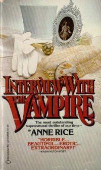
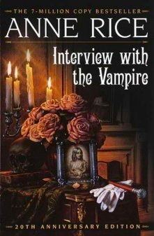
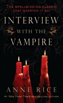
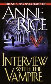
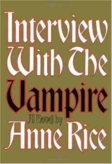
I can’t speak for the world, of course, I can only tell you what catches my eye and what doesn’t work for me. I’ve decided to show you some cover examples using a book that I read when I was a teenager and have followed the author since. Anne Rice’s Interview with the Vampire. Now Anne is a prolific writer and she’s incredibly successful. So I don’t mind giving honest opinions about the cover, which has had 10 incarnation that I could find. I’ve arranged the images from the one I like the most to the one I like the least.
The first five are the better cover choices in my opinion. You may disagree. But what they all have in common is that they look professionally done. That’s important. People want to feel they get their money’s worth, and a professional cover is part of that. These five covers capture the eye and they invoke a response. The first three do the best job at making me think vampire. The fourth suggests action and at the though the fifth cover is simple, it’s easy to read and gives equal weight to the author and title.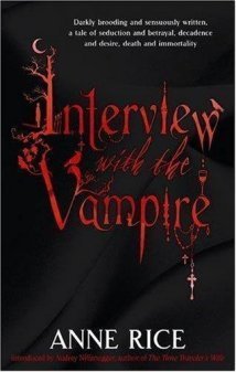
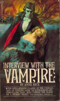
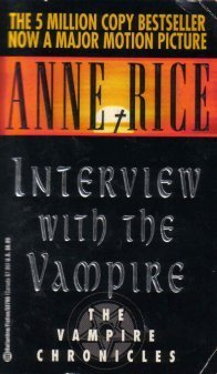


Now the second set of five are less appealing to me. The first of the five has a good color scheme and I do think vampires when I look at it. The second of this set looks like a romance novel which may or may not serve you well, depending on the audience you are after. The third one just doesn’t do anything for me and the last two are so bad I probably wouldn’t have picked up the book if I was not already a fan.
If your budget is thin, you may be worried about the cost of having a cover designed. This is a valid concern. It can be expensive. I have done three covers of my own and I have invested in two different methods for creating them. Because I already had graphic design programs and lots of design experience, I was able to do my own type setting. But for my second novel, The Golgotha Covenant, I hired an artist to create the image. I surfed around on Deviant Art.com until I came across an image that I loved and then I contacted the artists and worked out an agreement. In my case, he was in Germany and the difference in the Euro made the cover art pricey. But there are many talented artists on Deviant Art who are excited to take on a commission for a reasonable price.
A second option is to go with a photograph. There are several websites that offer stock photos that can be used for covers. Unfortunately, those stock photos could cost more than hiring an artist to paint the image. In my case, I needed a specific image that would not be easily staged with models and so I chose to have it painted. But in many cases a photo would work just as well. Phat Puppy Art is a sight that has quite a large selection of stock images for book covers. I won’t kid you, they are not cheap, but very well done images. The artist who painted my latest cover can be found at Creative Warrior.
If you can’t afford to hire an artist or photographer, consider a cover like the gold one above. Choose a nice font and make it big and bold with bright eye catching colors. What ever you do, don’t publish with a cheap looking cover!
January 16, 2013
A Rose by any other name gets lost.
Are you an aspiring author preparing to self publish your first title? If so, please pay attention to this friendly bit of advice.
After completing your labor of love, you will work to promote yourself as an author almost as hard as you did writing the book itself. Let's face it, garnering those reviews and capturing new fans is an uphill climb for every author starting out. Don't make the job any harder than it already is by confusing your readers about who you are.
What do I mean? Your pen name, however you decide to present it, becomes your brand.
I regularly run across authors (while volunteering for Faerytale Magic) who are inconsistent about how they credit their prose. They do not understand the concept of branding. This can cause them to lose out on both sales opportunities and increased fan following.
As an example, if your pen name is Jane Marie Doe then you need to be Jane Marie Doe on Amazon, Barns and Noble, Smashwords, GoodReads, janemariedoe.com, Facebook, Twitter, etc. Not J.M. Doe on Amazon, Jane M. Doe on Barns and Noble, J. Marie Doe on GoodReads and Janie Doe on social media.
Why? you ask.
Let's say I liked your book after finding it on Amazon and I told all my friends that J.M. Doe's science fiction adventure was the best science fiction book in the world. Further, I recommended they buy a J.M. Doe book right this very minute. Some of my friends have a Kindle and some of my friends have a Nook and others only read in paper form. That is the way of the world. Who is my Nook friend going to find when searching Barns and Noble for J.M. Doe? Not you, because on that site, you are J. Marie Doe. Search results are specific to the search term. In other words, they only give you what you asked for.
The goal of your brand is name recognition. Name recognition is one of the keys to successful Word of Mouth advertising. And that form of advertising is FREE. If you fail to be consistent with your branding, you will fail in this important area of book marketing.
Let's consider one of the most successful authors of all time. Joanne (no middle name) Rowling, aka J.K. Rowling. J.K. Rowling is always J.K. Rowling everywhere her books are sold. She is not J.K. Rowling on Amazon, Joanne K. Rowling on Barns and Noble, Jo Rowling on Smashwords and Joanne Rowling on her website, etc. When she agreed with her publisher to become J.K. Rowling, that became her brand and she uses it consistently, on everything, everywhere, all the time. So should you.
Remember, a rose by any other name may smell as sweet, but if that rose is lost amid the myriad of other roses due to inconsistent naming, it will never get a good sniff.

